Writer and curator Paul Carey-Kent collects various writings here, including his weekly column for FAD art news, monthly interviews for Artlyst and texts from the shows he has curated. He currently writes freelance including for Art Monthly, Seisma, STATE, Border Crossings and World of Interiors. See Instagram for his daily choice from current shows. Some non-art content, such as photo-poems, is also included.
The sudden death of Rebecca Fairman (1960-2020), who ran ArthouSE1 from 2014-20, dismayed the artists and curators connected with the gallery, witness the many who attended her funeral last week. The congregation heard how Rebecca had taken on a succession of challenges with the fierce independence which was her trademark. She’d precipitately abandoned ‘A’ levels at 16 in order to train as a designer, gone on to build up her own successful business, and used that to fund a return to college 2006-09 to study art – she became an interesting ceramicist, but not one to promote herself – then bought a vast run-down town house in Bermondsey. That was done up – with Rebecca’s imagination and partner Adrian’s muscle, according to her stepfather’s eulogy.
View of ‘Secret European Studio’ at ArthouSE1 (2016), showing works by Simona Brinkmann (Italy) and Willem Weismann (Netherlands)
The top floor then became one of the best-lit galleries in London, and certainly the most sociable. Rebecca proceeded to put on 60 substantial shows – each with a beautiful catalogue – in six years. What always struck me was how selfless that commitment was: her home and time, with net cost more likely than profit, were at the disposal of artists because she, as a creative individual, wanted to support and give a platform to other creative individuals. Moreover, Rebecca combined her particular sensitivity and wicked sense of humour with a good eye and a willingness to allow others to experiment. That led to a varied programme featuring many worthwhile artists who got few other chances. Even if I set aside the shows I curated, I would cite:
‘Shape_Shifters’ (2016), ‘Eccentric Geometric’ (2017) and ‘Iterations’ (2019), three explorations of architecture, geometry and repetition which particularly suited the space;
Solo shows by Jake Clarke (‘Cul-de-sac’, 2016), Richard Ducker (who took the space over ‘with an alien presence’ the same year) and Sasha Bowles (‘Hairy Interventions’, 2018);
‘It’s Offal’ (2016) which looked ‘from excrement to innards’ at the work of artists who explore what lies within; and
‘You People’ (2015) which presented Rebecca’s own work in the context of that of her widely creative family: Sheila Fairman (mother), Robert, Jon and Sean Fairman (brothers) and Georgia Fairman and Jackson Fairman-Gilkes (niece and nephew).
Happily, Adrian would like to reopen the gallery at some stage in Rebecca’s honour: I’m sure that’s what she would have wanted, but it will be far from easy to replace her practical contributions, never mind her personality and passion.
349: The Residency Effect – with Helen Cammock and Jenny Morgan
Jenny Morgan: to be titled, 2020
Not many artists can make a living purely from producing their art. One part of the support system which helps artists to carry on is the large number of residency opportunities. They come with the implicit challenge: will the residency visibly feed in to the work – not so that it comes across as a striving for relevance, but so that it feels like more than a subsidised opportunity to do what you would have done anyway? It can do so in contrasting ways:
Helen Cammock: ‘They Call It Idlewild’, 2020 (still) – Wysing Arts Centre
Helen Cammock, a member of the collective which shared last year’s Turner Prize, has been in residence at the Wysing Arts Centre, just outside Cambridge. I guess she could have laid around doing nothing – another option – but instead she made a film about lying around doing nothing. The voiceover for ‘They Call It Idlewild’ reflects on the distinctions between idleness and inactivity. For example: ‘The fisherman may look like he’s idle as he sits intent on his line, but at that moment he’s constrained not free. When he isn’t fishing he may go for a walk, and look more active, but he’s actually free to do anything in that moment, and so is idle in evolutionary terms’. That leads her on to racial stereotypes of laziness, the status of sleep, the drive to minimise it, and the sinister objective of creating a sleepless soldier. Meanwhile, we see a series of shots from around Wysing itself – thematically suggesting she was too idle to leave. It’s a fascinating film, the visuals tie it very directly to the residency, and it was particularly good to see it on site, having just seen the studio details, grounds, art works and buildings which feature…
Helen Cammock: ‘They Call It Idlewild’, 2020 (still) – Wysing Arts Centre
On the other hand American artist Jenny Morgan, in residence at Windsor & Newton’s Elephant Lab in West London, found a less specific new direction in five paintings made during her month in Britain. They’re smaller and greener (despite their red grounds) than she was making in New York. She attributed that partly to working on a smaller scale in a smaller space, and partly to what had come differently to her attention in London. These two – hot off the easel and untitled when I spoke to her – feature a sort of Nostrildamus of a cat, and an alien body with headspace – ‘uncanny valley’ was her term for where the art was heading during the residency.
Jenny Morgan: to be titled, 2020
Art writer and curator Paul Carey-Kent sees a lot of shows: we asked him to jot down whatever came into his head
348: Portrait special
It’s easy enough to ignore the genre of portrait painting in the age of the camera, but the best examples do plenty apart from that. David Hockney carries on the tradition in his new show at the National Portrait Gallery, but it isn’t hard to find interesting portraits on elsewhere. Here are three…
Rembrandt: Agatha Bas, 1641
The Queen’s Gallery exhibition of art collected by George IV includes this: unusual for Rembrandt in its play with space such that the fan and left hand appear to intrude beyond the picture, usual in the conviction and empathy of the characterisation. As Prince Regent, George ran up debts equivalent to over £30m in today’s money, but it wasn’t all wasted. And if you’ve ever wondered what a partlet is – Agatha is wearing one over her shoulders.
Nicolaes Maes: Portrait of a Young Man, possibly Simon van Alphen of Leiden, c 1677.
One of Rembrandt’s most successful pupils has a show at the National Gallery. Here he makes the most of the luxuriant hair which was a la mode for men at the time, combining it – anachronistically I suppose – with an imagined antique costume. The original frame (walnut veneer decorated with gilded tin floral ornaments) is also of note.
Francisco de Goya: Doña Isabel de Porcel , before 1805
This is hanging in Room A of the National Gallery, effectively the reserve collection where scores of paintings are crowded in together. Not bad for a reserve, you might think, looking at how the black lace of her mantilla is handled. It’s probably down there because of doubts about its attribution. But does that really diminish the bravura?
347:The Trinity Buoy Wharf Drawing Prize on tour
The Trinity Buoy Wharf Drawing Prize is on tour, the last stop being Leicester (21 Feb – 18 April). 1800 entries were whittled down to the 60 artists shown, with their primary motivations across technical accomplishment, working drawings towards a future purpose, exploration of expanded techniques (eg film of drawing) and the expression of potentially media-neutral ideas. Alice Motte-Munoz won the first prize of £8,000 with Shelley Tregoning second, though unusually a subsidiary prize is worth more: Penny McCarthy won the Evelyn Williams award of £10,000 and a future show at Hastings Contemporary. It’s natural to wonder, wandering round such shows, what you might have chosen, and I rather liked the following:
Hannah Wooll:Seasons, 2019 (top)
People are the dominant subject of the show – maybe that’s linked to Chantal Joffe’s presence as a judge. This face – from a series on pages from a 1970’s book aiming to explain such homemaking projects as the use of house plants and needlepoint – is particularly intense. The title, says Wooll, is a melancholy nod not only to the style and era of the book, but also to the unknown women who pored over such volumes. Incidental question: why is there only one ‘W’ in her almost perfectly double-lettered name? ‘Hannah W Wooll’ would be a neat name…
Fiona G Roberts: ‘Love hurts (147 women, January to December 2018)’, 2019 – detail top
I see less logic in that middle ‘G’, but Roberts combines skilful use of the bleeding qualities of ink with a wider implication of blood-letting. She shows – not as portraits, but as representations month by month of their range of age and ethnicity – the sobering number of women killed by men in the UK in one year, most of whom knew their killer. There’s more to murder than knife crime…
Jonathan Bennett: ‘Discarded Helmets’ 2019
Bennett has developed ‘hand characters’ who act as his figures, going so far as modelling them in Plasticine so he can draw their various positions. These are evidently bikers enjoying the countryside: it seems they have discarded their helmets and are preparing to shake hands, which I take to be an act of maximum intimacy in their world.
346: Alicia Paz at School Gallery - Value and Trees
The more that orthodox places close in challenging market and cost conditions – Blain | Southern being the latest – the more reason there is to appreciate alternatives spaces. School Gallery, attached to a studio complex near Wimbledon, and managed by artist Michael Hall, is one such example. Currently it has a concise show by the Mexican-born London artist Alicia Paz: two monochrome paintings in ceramic-linked hues – the red of iron oxide and the blue of cobalt oxide – either side of a giant ceramic necklace titled ‘Love’ in acknowledgement of how it unites the paintings either side. Both paintings show trees, which Paz, talking to Craig Burnett – formerly, as it happens, of Blain ! Southern – identified as a particularly rich subject which had appealed to her ever since, as a child, she decorated the family Christmas tree. Alicia mentioned how their root systems mirror what is above ground, so as much is hidden as is on view; how roots imply origins linking to her interest in hybridity; how both languages and families are often depicted diagrammatically as trees.
All of which feeds into paintings which fully exploit the load-bearing ability of trees by filling their branches with characters and props, including some ‘real items’ as well as paintings made from found images of puppets – on the red tree (The Lake House, 2020) – and gargoyles – on the blue tree (A Spiritual Visitation, 2020) which housed the people in her family, such as the in-laws above! The resulting cacophony of voices, said Paz, was a ‘chattering community of neurotic characters’ which evoked the multi-layered aspects of the typically modern identity. The ceramic necklace also referred to Maupassant’s short story ‘The Necklace’, in which a woman’s life is eaten away by guilt, having lost a diamond necklace she had borrowed, only for her to be told when she eventually organises recompense that the stones had been fakes. Trees, however, as we are increasingly aware, are truly valuable…
345: Eric Fischl: Life is a Beach but Art is Like Tennis
American painter Eric Fischl’s new show at Skarstedt (‘Figures’ to 9 April) presents, approximately life-sized, people on the beach. They come from Fischl’s own photographs of characters and poses which interest him – ‘I can’t tell people what I want’, he told me, ‘but I know it when I see it’, from which he paints figures which he has cut out and collaged against simplified backgrounds and in new combinations: the man in one painting, for example, was actually looking at the woman in another. ‘I paint on photo paper’, he explains, ‘which is a very slick surface. The background is acrylic but the figures are oil paint, and just the way the brushstroke reacts is exciting for the way it moves and how it dries’. Fischl achieves some wonderful suggestions of how bodies are by channelling the semi-accidental. He controls the outside boundaries of the figures, while letting the paint ‘do what it does’ inside so as to find a description in which ‘the audience will feel there is something going on which isn’t arbitrary – even though it’s a straight-up fiction’. The beach operates as an arena in which private meets public, and gives him the chance to exploit how paint and water alike can splash, flow and drip. He’s also able to explore what he terms – at 70 – ‘the humiliations of age’.
And I know that Fischl, like me, plays tennis. He hasn’t often painted it, though ‘The Changeover’,1992, shows John McEnroe changing ends in a match he lost to the young Swede Niklas Kulti that year, marking the approaching end of his career. Fischl is a friend of McEnroe’s, and they have played without Eric making ‘any pretence to be competitive’.
Moreover, Fischl goes on to suggest that painting and tennis are rather alike. Both:
* take place inside a rectangle;
* are about gestures produced through extended reach – of the brush or racquet;
* feature the resistance of an opponent – canvas and materials have a way of being stubborn, of not doing what you want them to do;
* will have days when you are ‘in the flow’ without overthinking, and days when you are not;
* have differently expert types of audience. In tennis the opponent who watches for your intentions, as well as an audience that comes to watch, who cares more for a good game than for who wins, and who won’t help you get better. Likewise in art: viewers are there to see something they like, but you can’t go to them to find out how to get better, you have to go to other artists.
And how was it playing against Mac? Such is his variety that ‘every ball that came back to me would look different – you never know what would come next. That automatically puts you on his side of the court, thinking about what he’s doing, not what you’re doing…’.
Art writer and curator Paul Carey-Kent sees a lot of shows: we asked him to jot down whatever came into his head
344: Non-binary Fischli and Weiss
Let’s suppose people can be split into those who believe that the world is essentially binary and those who don’t. The former group might readily agree that exhibitions can be divided into those by living artists and those by dead artists*. Yet the Fischli and Weiss show at Sprueth Magers (to March 14) offers a nicely non-binary alternative. David Weiss died in 2012, but Peter Fischli is still very much around to talk about what the pair were up to.
Spruth Magers’ three main floors are well suited to showing three bodies of work. In the basement is Kanalvideo (1992/2008), an hour of footage sourced from those responsible for inspecting the sewers under Zurich. Dull in a way, apart from the appearance of a rat halfway through, yet oddly painterly and hypnotic – and a chance to think, explained Fischli when we toured the show, about the subconscious beneath society.
The gallery’s ground floor has the duo’s first work in polyurethane, a material that Fischli and Weiss became known for through their trompe l’oeil renditions of behind-the-scenes gallery detritus. The cargo on the overloaded The Raft (1982-30) lands, said Fischli, somewhere between the negative of clichés and the positive of archetypes. There’s also a fantastical element to the combinations on The Raft, and that recurs on the first floor.
Fischli explained that the 360 images from Fotografias, 2005, displayed on eight tables, were newly selected from the full archive resulting from Weiss and him spending 18 months photographing paintings on the outsides of funfair rides throughout Europe. The analogue images of big colourful, somewhat amateurish paintings were deliberately underexposed then printed small in black and white on coloured paper. That transformation makes them look rather like Polaroids taken in the dark of a ghost train ride. And like the sewers, said Fischli, these might be seen as portals – albeit faked – to an alternative world, even if they also revealed how repetitive and stereotyped the apparently free play of fantasy can be.
* I detect, incidentally, a swing among gallerists from representing the living (who can helpfully explain their work, but may be demanding) towards the dead (unavailable but undemanding)
343: Belgians in Brussels!
The 133-gallery Brussels Antiques & Fine Arts Fair (26 Jan – 2 Feb) is wide-ranging: more ancient, classical and modern than contemporary, but covering many areas and eras of art, design and collectibles. You could argue that the sign of quality in such a gathering is whether a sub-category can maintain its interest, and to that end I chose Belgian painting. It’s a while since I heard the hoary cliché that there are no famous Belgians, and the nation has had some art significance at most times from Bruegel, Van Eyck and Rubens on to Ensor, Magritte, Broodthaers, Akerman, Tuymans, Alys… The most widely represented artists at BRAFA, though, all worked in Paris in the 1950’s: there was lots – too much in some cases – of the non-Belgians Hans Hartung, Sam Francis, Paul Jenkins, Bernard Buffet, George Mathieu and Bernard Vernet – as well as the home player Pierre Alechinsky. But it wasn’t hard to find ten Belgian artists of interest, so I guess BRAFA passed that test. In chronological order:
Clara Peeters: ‘Still Life with Mallard, Hare, Squirrel and Basket of Grapes’. Antwerp-born Clara Peeters, active 1607-21 in the Netherlands and Spain, is the best-known female Flemish painter of the 17th century. This demonstration of the trappings of her wealthy patron’s lifestyle, with overflowing grapes and game partially plucked for the table, is enlivened by a particularly characterful rodent.
Frans Verhas: ‘The Fiancée’ at Berko Fine Paintings, Knokke. Verhas (1827-97), based in Paris for much of his career, specialised in elegant women in luxurious interiors. Here there’s a narrative: it looks as if his subject caught the bridal bouquet thrown into the crowd of wedding guests, and that the traditional effect of that leading to a further marriage took an exceptionally rapid course.
René Magritte: ‘Promenade a trois’, c. 1935 at Galerie de la Presidence, Paris. This nicely deadpan small drawing of a couple walking a fairly adult-looking child on a leash might have any number of Freudian interpretations, but I thought of it a commentary on those who prefer pets to children, or on how to deal with those grown-up children who fail to leave home.
James Ensor: ‘La Belle Assiette’, 1938 at Samuel Vanhoegaerden Gallery, Knokke. From a large solo stand of Ensor – all of which I’d have said looked atypical if that made any logical sense, with no odd subjects – comes this quiet but cunningly cross-patterned still life from late in his long life (1860-1949).
Bram Bogart: ‘Hek’, 1963 at Lancz Gallery, Brussels. Bogart (1921-2012) was born in Delft and worked in Paris in the 1950’s, only moving to Brussels in 1961 and becoming a Belgian citizen in 1969. So this somewhat chocolatey confection is early in both his Belgian period and his arrival at a semi-sculptural mode of painting with a mix based on mortar, powdered chalk and raw pigment, applied to a wooden backing structure. What the hek is the title about? I think it translates as ‘fence’. He has a show opening at White Cune on 28 January, by the way…
Paul Delvaux: ‘Les Deux Amies’, 1967 at Galerie Fleury, Paris. In this watercolour, fairly typical of Delvaux (1897-1994), the affectionate relationship of the two foreground figures throws the metaphorical spotlight on the third in the background shadows. What does she, standing in for the picture’s viewer, make of what’s going on?
Guy Vandenbranden: ‘Abstract Composition’, c. 1973 at Whitford Fine Art, London. Few British dealers attend BRAFA. Frank Whitford did most among them to return Belgians to their homeland. Vandenbranden (1926-2014) was new to me, but fits nicely enough into the constructivist trajectory, which is locally strong. Here he delineates colour fields in a manner somewhere between Piet Mondrian and Peter Halley.
Pierre Alechinsky: ‘Green Sleeves’, 1980 at Galerie Guy Pieters, Knokke. When the CoBrA group of artists was active (1948-51) Alechinsky was part of the Br for Brussels (other artist being from Copenhagen and Amsterdam) but he has lived in Paris since then. He likes to apply acrylic to thin Japanese paper then fix it to canvas to generate a refined luminosity contrasting with the rough urgency of his mark making. The title is nicely evocative without any English folk element being obvious.
Dirk Braeckman: ‘Hinge-#-1-2006’, 2006 at Bernier / Eliades, Athens / Brussels. There is hardly any lens-based work in BRAFA, but here’s an earlyish work from Belgium’s 2017 Venice Biennale representative: not his subsequently typical large and mysterious gelatin prints intensively manipulated in the darkroom, but a curious intersection of ‘picture within picture’ and sexual suggestion which perhaps equates two categories of creative act.
Harald Ancart: ‘To Be Titled’, 2016 Perhaps, four years on, this never will be titled, but I like the way this oilstick drawing achieves maximum contrast of bird forms: one standing, somewhat anthropomorphically clumsy and potentially sardonic; the other a jagged sky disturbance as the essence of an avian dive.
Thomas Lerooy: ‘Berry Nice’, 2020 at Galerie Rodolphe Jansson, Brussels. There are only a handful of contemporary specialists at BRAFA. The typically mordant, though witty, Thomas Lerooy seems to have lightened up in a recent turn towards painting rather than sculpture and drawing: this is from a luscious series in which figures are seen through fruit – a novel way to combine the traditional genres of still life and portraiture which they cite.
342: William De Morgan and Maths
William De Morgan: Black Swan and Daisy Tile, produced 1872-1907
Pre-Raphaelite painting can often come across as inert, but the designs of the tendency’s primary ceramicist – William De Morgan (1839 -1917) – are always full of characterful life and implied movement. You can catch him permanently in the Watts Gallery (where the De Morgan Foundation is based), Ashmolean, British Museum, V&A and at Pitzhanger Manor in Ealing – but he’s also having something of a wider moment.
William De Morgan: Seahorse Tile Panels, produced 1872-1907
He will feature with his painter-wife in ‘William and Evelyn De Morgan: Two of the Rarest Spirits of the Age’ at the Laing Gallery, Newcastle (14 March – 20 June), and is currently on show at the Russell-Cotes Museum in Bournemouth (to 2 Feb). That show is titled – accurately enough – ‘Sublime Symmetry’, but it’s stated the theme is to explore ‘The Mathematics behind De Morgan’s Ceramic Designs’.
William De Morgan: Fish and Net Vase, c.1882-88
That led me to expect something like calculated ratios or computational bases for the number of repetitions. Yes, although De Morgan’s admired Euclid, his father was a Professor of Mathematics and his brother formed a mathematical society, the maths turns out to be no more than symmetry, repetition and geometric shapes. You can dress that up as mathematical, but in that case lots of art – Donald Judd’s and Bridget Riley’s, for example – is mathematical and it seems a little superfluous. None of which is to diminish the pleasure to be gained from how ingeniously and attractively De Morgan uses those devices: the Russel-Coates is certainly worth a visit. There are plenty of flowers and birds, but I have chosen watery examples, including perhaps his neatest combination tile (top and bottom) in which four corners make – as you might not guess from one tile – a swimming swan…
William De Morgan: Black Swan and Daisy Tiles, produced 1872-1907
Art writer and curator Paul Carey-Kent sees a lot of shows: we asked him to jot down whatever came into his head
341: The Art of Motherhood
Athene Grieg: Blueberry sketch, 2020
Birth is obviously a rather important event in all lives, yet outside of the nativity, it hasn’t received commensurate attention as a subject for art – compared with the less creative matter of death, for example. Maybe that will change as the place of women in the canon receives some overdue adjustment. At any rate, Richard Saltoun’s last show in its year of ‘100% women’ looks at motherhood from many perspectives through 20 artists. The second part, ‘Maternality’ (to 15 Feb) focuses on the materiality of maternal bodies. Much of it is suitably in-your-face, such as Annegret Soltau’s stitched image of a pregnant body and Helen Benigson’s video layering of arcade consols over her own lactating breasts.
Aimee Gilmore: Milkscapes, 2016
Aimee Gilmore’s contribution looks more like tasteful abstraction, but ‘Milkscape’ (2016) blows up the result of breastmilk spilling onto a polyester sheet in the artist’s studio. As the show’s curator, Catherine McCormack, says, ‘
the visual traces of something passing from inside to outside the body are seen to produce a language ‘known or felt only by, and in, the embodied relationship between nursing mother and child’. Moreover ‘breastmilk – despite its rich potential as a sign – has been conspicuously absent’ from the established discourse of body fluids as an artistic medium
– she cites Piero Manzoni’s excrement, Marc Quinn’s blood, Andres Serrano’s urine, Vito Acconci’s semen…
Athene Greig: installation view at The Stone Space
There’s a quieter coverage of the postpartum territory at The Stone Space in Leytonstone. It’s nine months since Athene Greig gave birth, and the indirect presence of her baby can be felt throughout ‘Til Morning Wakes, not simply in its title. Greig adopts the parenting home as a studio, and presents works made with its materials (sculptures of soap, casts from packaging, paintings with food) alongside her day to day notes and the books she’s reading. So, for example, Athene mentions Sounds of pram toy jingle, Paintings like blinds, Use colours from domestic setting, Notes of poo pee, Alabaster vase, Lengths of time long days short rests and Fractured reading. That last is seen to range impressively from ‘Hypnobirthing’ to Clarice Lispector. You can look at her installation (to 2 Feb) while listening to a yearning rendition of ‘Silent Night’ and take in a sensitive exploration of the third way of an artist dealing with motherhood – let’s say the others are ‘stop making art’ and ‘do your best to ignore the baby’. Next up, perhaps: how much art has fatherhood produced?
340: Post-Cubism? Maria Helena Vieira da Silva
Ballet or the Harlequins, 1946
We’ve all heard of Post-Impressionism and Post-Modernism, but what about Post-Cubism? The Portuguese-born painter Maria Helena Vieira da Silva (1908-92) is a leading candidate for the label, as she took the multiple viewpoint in a persuasive new direction from the late 1930’s onward. Vieira da Silva lived most of her adult life in Paris, but her paintings are often inspired by the cityscapes and characteristic patterning of tiles found in the Lisbon of her youth. She has been shown little in the UK, so Waddington Custot’s substantial survey is well worth catching (to 15 Feb*). Lyrical geometric abstraction melds with evocations of architectural interiors and game-playing in her intricate work. The cubist aspect stems from a shifting perspective which complicates the viewer’s orientation in the space of the painting, and suggests an analogy with how perception and memory function differently between individuals. Consequently her paintings seem to be structured not so much by grids, as by nets thrown over multiple abstractions from reality. Viera de Silva spoke of trying to see the machinery that organises people, and in line with that, habitation is for the most part implied rather than visible. Viera de Silva spoke of trying to see the machinery that organises people, and in line with that, habitation is for the most part implied rather than visible.
Untitled (or the gully), 1952
‘Sans titre (ou Couloir)’ , 1952, is fairly typical, while ‘Vers la lumiere’, 1991, shows her closing in on pure abstraction.
Towards the Light, 1991
When people do appear it’s in the form of playing cards (as in the early ‘Le jeu de cartes’, 1937) or as figures merging with the architecture (see ‘Ballet ou les arlequins’, 1946, top).
The Game of Cards, 1937
* actually a commercial touring show, which is unusual: 20 September – 16 November 2019 at Jeanne Bucher Jaeger, Paris, 30 November 2019 – 15 February 2020 at Waddington Custot, London, and 26 March – 29 May 2020 at Di Donna Galleries, New York
Art writer and curator Paul Carey-Kent sees a lot of shows: we asked him to jot down whatever came into his head
339: Ridiculous?
It is perhaps a little ridiculous for me to set out my own forthcoming show, but then it is called ‘Ridiculous!’. The cool new venue of Elephant West, 100 yards from White City tube station, presents in exhibition, film and performance – my choice of 18 artists who are not afraid to look stupid.
‘The True Artist’, runs the statement famously caught in neon by Bruce Nauman in 1967, ‘Helps the World by Revealing Mystic Truths’. In the same spirit, the true artist is prepared to present the ridiculous, to work in an apparently ridiculous way, or to appear ridiculous themselves. Questions their works might help you to answer include: ‘Why was I so ridiculously embarrassed as a teenager?’ , ‘How can I turn my boyfriend into a washing machine?’ and ‘Who opposes Brexit on the grounds that freedom of movement is fundamental for a good fuck?’ In case that sounds frivolous, underneath the show’s witticisms you will find serious consideration of such matters as identity formation, epistemology, sexual attraction, class conflict and mental health. Below, I introduce two of the eighteen artists.
Jemima Burrill: stills fromThe New Model, 2013 – film, 7.51 mins
‘The New Model’ might be described as a feminist parody via the car industry – combining the stereotypical male fixation on having the latest marque, with the hopes of a woman seeking to escape a conventional role. Jemima Burrill herself emerges from a car boot with scarlet lipstick, pinafore and rubber gloves, ready to be given a thorough cleansing-come-makeover in a car wash. Cue the slapstick of her being vacuumed, hosed and dried until she emerges clean and natural, smiling in the sunshine of a fresh start without the lipstick, pinafore and gloves. It doesn’t last. The carwash attendant reapplies the lipstick and replaces the pinafore and gloves: the ‘new model’ is ready to return to the boot. That might also, says Jemima, be read as questioning the worth of the torture that woman put themselves though to feel younger. Her performance on 31 January will also home in on inappropriate norms: as Megaphone Woman she’ll tackle how women get to speak less and get interrupted more than men.
Mauro Bonacina: images from @MAUROBONACINA, 2014-20
Instagram can be bad for art, encouraging the immediate, flat and colourful over the subtle, textured and intimate. But can it be used as its material? Mauro Bonacina revisits the surrealist love of the found conjunction through the exhibition presentation of six years of his daily photostream at one second per image. You can only just keep up with the connections made between the 1,800 pointedly ridiculous images, sourced from the net using a sophisticated battery of search mechanisms. The title suggests that ‘@MAUROBONACINA’ acts as a self-portrait of sorts. If so, that’s quite a mind we’re looking into, one which takes the limited attention span to a limit which challenges us in turn. Meantime, I recommend theInsta-streamitself.
At Elephant West, 8 Jan – 2 Feb, event evenings on 8, 14,22 and 31 Jan. With Mauro Bonacina, Brian Bress, Jemima Burrill, Leah Capaldi, Paul Cole, Emma Cousin, Liv Fontaine, Rosie Gibbens, Oona Grimes, Adam Hennessey, Andy Holden, Rand Jarallah, Karen Knorr, Ansel Krut, Dale Lewis, Ryan Mosley, Anna Perach, Katarina Rankovic – Curated by Paul Carey-Kent
338: The Chichester Multiplex
There are two ways to go if you have a large museum space available: one or two big shows or the combination of several smaller shows. Either can work (one might say that the Hayward tends towards the former, the Whitechapel towards the latter). Pallant House in Chichester is one of the best programmers of the variety box approach. Go now, for example, and you can see various display of the excellent permanent collection and also:
Radical Women: Jessica Dismoor and Her Contemporaries
The biggest of the current not-huge shows contains many little-known but worthwhile works from the circle of Jessica Dismoor (1885-1939). The surrealist collage at the top is ‘Family Tree’ 1937, by Edith Rimmington.
Jann Haworth: Close Up
The American artist best known in England for collaborating with her ex-husband, Peter Blake, on the Sergeant Pepper album cover. That tends to be to disregard her extensive practice, which includes textile sculptures as a means of deflating the pretensions of heroic materails such as marble. In the case of ‘Old Lady II’, 1965 it takes the form of a figure who becomes the art she is making.
Prunella Clough: Centenary
A one room survey but covering plenty of ground over a life which started in 1919 (-1999). ‘Small Gate Painting 6’ 1980 moves a little Mondrian back towards the quotidian detail of the world: it’s unusually geometric for Clough but hints at her love of construction work as a subject.
Henry Moore: The Artist and His Patron
Reverend Walter Hussey (1909-1985), who was Dean of Chichester Cathedral, left a substantial art bequest to Chichester District Council, including some high quality Henry Moore which forms the basis of a display from which ‘Bird Head’ 1934 is taken – one of a group of drawings which show how Moore incorporates elements of the abstract and the surreal.
337: Heavy in Bilbao
These days Bilbao’s art fame rests mainly on Frank Gehry’s iconic Guggenheim, finished with 33,000 titanium sheets and containing eight of Richard Serra’s massive works from the series Torqued Ellipses, 1996-98. Gehry and Serra fit with a – rather macho – tradition of working sculpturally in heavy materials consistent with the Basque region’s industrial base. Eduardo Chillida (1924-2002) and Jorge Otieza (1908 –2003) are the most famous Basque artists of the 20th century, but last week I found contemporary practitioners, too:
Eduardo Chillida: ‘Meeting Place IV’, 1973. This (top image), outside the Museum of Fine Art, is typical of Chillida’s exploration of architectural space through sculptural form, less typical in its hanging orientation. Put me in mind, given the title, of a heavyweight Liam Gillick discussion platform.
Jorge Oteiza: ‘Empty Box with Large Opening‘, 1958 (top). From a series in which variations on the cube aim to highlight the space within, consistent with what the Guggenheim describes as his ‘notion that all artistic practice surges from a void that is nothing yet eventually reaches a Nothing that is Everything’. A summary statement, as Otieza stopped making sculpture for his remaining 44 years after his series of ‘Empty Boxes’.
Vicente Larrea: ‘Homage to Ricardo Bastida’, 2004. There’s plenty of sculpture in public round Bilbao, notably the big beasts next to the Guggenheim. Vincente Larrea (born 1934) brings a distinctive language – sort of organic folding of bronze waves – to three forms around the Plaza Iglesia San Jose. Each is dedicated to an architect of the city we see now.
Alberto Salcedo: ‘Izar’, 2018. In the Basque Museum, dedicated to local history and culture, Alberto Salcedo goes directly to the industrial source but shifts the register by making ceramics inspired by industrial machinery. He presents the original pipe-heavy forms alongside.
336: Deep Time in the Netherlands
How can art accommodate the burning issues of global warming in the context of our history and the possible end of it? Several shows in a recent visit to the Netherlands seemed to touch on such matters…
Imagine a huge church, pitch black except for chandeliers of candles which have descended to the floor, filled with vast banks of sandbags around which you navigate to the sound of an eight-hour cycle of animal calls and more, building to cyclic crescendi. Or visit Adrian Villar Rojas‘ installation ‘Poems for Earthlings’ (top) in the Oude Kerk, Amsterdam. Not just the most atmospheric installation in the city, but a deconstruction, says the text, ‘through sonic introspection’ of our species’ preservation culture, and designed to ‘help us go back to our minds in search of primal connections with universal noise.’
Emma Talbot has four substantial installations at GEM in The Hague, which show her drawing-based style extending on a large scale into sculpture, textiles and sound as well as painting, and tackling suitably large themes starting from the point that for all the universality and importance of birth and death, we can’t remember or imagine them. She’s also 1/3 of the best group show I saw in Amsterdam, in which the artists (with Gijs Frieling and Derk Thijs) at Galerie Onrust go back to the past to find answers for the future and Talbot finds a winning way – as shown above – to indicate age in her figures.
Craigie Horsfield: ‘Malgorzata Tusiewitz, Szlatchtowskiego, Kracow, 1978’, 2019, has a considerable aura when fastidiously printed at over a metre high. Marsha Plotnisky, curator-director of The Merchant’s House in Amsterdam, told me that no-one ever asks her who Horsfield’s portraits are of, such is their apparent universality.
Richard Learoyd: ‘Crashed, burned and rolled (1)’, 2017, is from a survey which covers his recent move from using a room as direct-to-paper camera obscura to outdoor photography. He uses a custom-built enlarger to turn 20 x 24” negatives into a comparably-scaled 64 x 95” images, to make possibly the largest single-sheet gelatin silver prints ever produced. Of his crashed and burned vehicles, Learoyd states: ‘The idea is that the world is shaped by catastrophic events. It goes back to that idea that we are all patiently waiting for the end of the world, sometimes, not literally’.
335: Pieter de Hooch and Everyday Life in Delft
Peter de Hooch: The Mother, c. 1661
Pieter de Hooch (the Dutch say ‘hoe-k’) was born in Rotterdam in 1629, but lived in Delft during the 1650’s, where he painted 40 of his 150 known works before leaving for Amsterdam in 1660, where died around 1680. In Delft now, only the second solo show ever of his paintings* aims to lift him ‘out of the shadow’ of Delft’s most famous son, Vermeer. De Hooch’s four brothers all died young, enabling his parents to support his art education – he went on to five children himself, though there he is definitely bested by Vermeer’s fifteen (on the other hand, De Hooch often included children in his compositions, whereas Vermeer did not.
Pieter de Hooch: Cardplayers in a Sunlit Room, 1658
40 works are excellently presented at the Museum Prinsenhof – backed up by considerable original research into de Hooch’s life, subjects, techniques and reputational trajectory. Which does leave the question: how good are the paintings? You don’t feel the presence of the people the way you do in Vermeer, but maybe that’s a merit in order to fit their undemonstrative presence into a concentration on space, light and architecture. No-one is better at orchestrating transitions between internal and external, and their relative distances and lighting conditions; at integrating the abstract and perspectival patterns of geometric floors into compositions; or at describing walls and their various states of deterioration with an engaged precision suggestive of the bricklayer’s son which de Hooch was. And his settings – courtyards, interiors, gardens, grand buildings – are more varied than I had appreciated. The result is a luminously calm, beautifully organised view of everyday life which values quotidian tasks as virtuous.
Floris Boccanegra: ‘Out of Business (The Diagonal)’ 2 + 3, 2017
And that everyday life is picked up in ‘Extra Ordinary’ an imaginatively curated show of contemporary art across four spaces around the town**. Stand-out works by two famous artists – Erwin Wurm and Shana Moulton – are complemented by lesser-known favourites of mine – Paola Ciarska and Koos Buster – and 18 other choices of considerable wit. Desiree de Baar knits architecture out of wool, then folds it up. You can ride in Maze de Boer’s bumper car but the rink is hardly bigger than the vehicle. Peter de Krom films a gang of mobility scooter riders, Priscila Fernandes the goings-on at Kidzania, a theme park in which children can pretend to be adults. Anne Marie van Splunter shows children opening curtains onto the day’s new world. Natasha Caruana has brought together wedding photographs – designed to sell the dresses – with the bride’s face edited or redacted for anonymity. Leo Gabin compiles found footage – of mysteriously purposed origins – of young women cleaning their rooms. And there’s room for directly troubling aspects: the distressed abstract aesthetic above, which might make you think of how Gedi Sibony appropriates the backs of lorries, is caused by bullets and shrapnel: they are shop shutters which Floris Boccanegra brought back from Mosul, Iraq.
I’ve lived in Southampton for 25 years, and it has now reached its best state yet for art tourists:
The City Art Gallery is celebrating its 80th anniversary this year. It has an excellent permanent collection – most famously, perhaps, Edward Burne Jones’ Perseus Series. The new show ‘Beyond the Brotherhood: The Pre-Raphaelite Legacy’ expands from there (to 1 Feb – note however that the gallery has the oddest opening hours I’ve ever encountered, closing at 3pm every weekday)
The John Hansard Gallery, linked to Southampton University, moved off the campus to an expanded city centre space in 2018. You can currently (to 11 Jan) immerse yourself in several installations by Haroon Mirza, including ‘Dreamachine 2.0’ 2019, a mesmerising psychedlic scrambling of the brain frequencies at room scale, and ‘/\/\/\/\/\/\’ (above).
Southampton Solent University has a more modest but equally central space. To 20 Dec that has an interesting reflection on the history of ‘Shebeens’ – blues parties – in the local black community in the 70’s and 80’s. It mixes documentary records with the art of Gerard Hudson.
God’s House Tower, Southampton, exterior. November 2019. Courtesy of ‘a space’ arts / God’s House Tower.
God’s House Tower is a new conversion – seven years in the making – of a 700 year old building which was a key part of Southampton’s defences in its days as a walled city of strategic importance. It’s a tourist attraction in its own right, and has live events and an amenable cafe – but is also running a distinctive art programme in three gallery spaces: historic work with local links plus new commissions by local artists for which the materials of the building are made available as a resource. The image below is from Kane Applegate’s ‘Transition’, a sculptural installation of objects uncovered during the renovations.
Transition, a new exhibition by Solent graduate artist Kane Applegate Images courtesy of ‘a space’ arts / God’s House Tower.
So Southampton is well worth an art visit – and I would say ‘see you there!’ – were I not more often in London, Berlin, Basel, Paris etc…
333: Hailing Hans Harting
Hans Hartung (1904-89) seems to be an increasingly highly regarded artist, whether measured by market or exhibition profile. The Musee d'Art Moderne de Paris currently has a spectacular retrospective, which marshals archival material, technical explanation, film and narrative expertly. It shows Hartung’s remarkable fertility within what might seem a narrow range through hundreds of works, and incorporates lots of unusual material: pre-abstract paintings, expressive wartime heads, woodcuts, his excellent photography and his only sculpture. And it's always good to go to Paris... But at Mazzoleni in London (and come to that, at their gallery in Turin as well) there is an excellent smaller show. 'Hartung and Art Informel' (to 18 Jan) puts Hartung in the context of a dozen paintings by other artists in his circle in Paris during the 50's - 60's , and includes a well-judged anthology of his main methods from then on through a further dozen works. So, for example:
T1958-7 is from the 'classic' Hartung technique of making a small ink sketch which he magnified in oil, As he said, the challenge was 'to convey the impression of unprepared improvisation while seeking to achieve convincing perfection'. T1962-E28 shows Hartung scratching into wet paint. As he said 'What I love is to act on the canvas. To act? That is to scratch, to tear, to stain, to invade the canvas with colour, in brief everything which is not “to paint”. T1980-E46 is made by using olive branches cut from the trees around his studio to apply the paint. T1988-E18 is a late work made by the increasingly frail artist from his wheelchair (he lost a leg in World War II). it was made with a light spray gun designed for gardeners.
Art writer and curator Paul Carey-Kent sees a lot of shows: we asked him to jot down whatever came into his head
332: Acceptance: Alice Anderson at the Atelier Calder
Alice Anderson in the 30m studio
Residencies can provide artists with valuable financial sustenance as well as the time and a fresh environment likely to facilitate their creative agenda. The Calder Foundation offers three months in the house and studio which Alexander Calder designed for himself just outside the small village of Saché – near Tours in central France – in 1963. This is a highly regarded opportunity, previously accepted by such as Marina Abramovic, Ernesto Neto and Sarah Sze.
One view from a window in Calder’s studio
I visited the current recipient, Alice Anderson, and it was immediately obvious what can be gained. The spacious house is isolated in a classic Loire Valley landscape. The natural world, from which Calder abstracted many of his forms, is right up close through the extensive windows of the thirty metre long studio. Not surprisingly, Anderson is taking the chance to work on a larger scale than her London studio allows, and has been directly inspired by Calder’s architecture: the timbered roof, long windows and especially a double door with triangular patterns. It was fascinating to see the developing work next to the source of its inspiration.
Alice Anderson: ‘Spiritual Machines’ 2019, which weave such items as a camera battery, USB hub and pin card
Anderson is hard at work during all the hours of daylight, yet her output so far can, paradoxically, be described as unintentional. How so? Anderson is known for film, performance, sculpture and drawing. Her best-known strand of work involves the ‘memorisation’ of objects by weaving them in copper wire (here’s my fuller account). Yet she trained as a painter. All that comes together at the studio as she makes the shapes of the studio into templates, over which she paints – dancing round the templates – on the floor. Thus she arrives, through the intermediate steps of sculpting and performing – at the painterly gesture which record both the space, and her experience of the space through her actions: painting the windows, for example, requires a different range of movement from painting the door panels. Her principal products, however, are not the shapes she paints, but the marks left on 11 metre long rolls of paper which cover the floor as she paints over the shapes. The by-product becomes the main event, as it often does in Anderson’s wider practice, which is often about accepting what you can’t control and may not even want. I reckon Calder, who reinvented sculpture as a dance driven by the chance factor of airflows, would have approved.
New work in progress, using the studio’s architectural shapes
Art writer and curator Paul Carey-Kent sees a lot of shows: we asked him to jot down whatever came into his head
331: Rising in the East? Chinese Abstraction
Fong Chung-Ray: ‘Untitled’,2015
The western profile and marketability of contemporary Asian art has risen sharply in recent years, principally through the Japanese Gutai (‘concrete’) and Mona-ha (‘school of things’) and the Korean Dansaekhwa (‘monochrome painting’) schools, with their distinctive titles. They have developed through artists born in the 1920’s and 30’s, and tend towards abstraction. But what of China? Many of the comparable generation of Chinese artists relocated abroad, given that such work was frowned upon under Mao. Several of the most interesting relocated to Taiwan, where they formed the Fifth Moon Group in the late 50’s. The group embraced both the Chinese traditions in ink painting and the western influence made very present by the US occupation of Taiwan: their spirit was not rebellious, so much as accepting, reflected in art which seeks harmony. They were, then, equally aware of American Abstract Expressionism, European Tachisme and the abstract aspects of the long tradition of Chinese art – such in calligraphy. Should they be as renowned as their Korean and Japanese counterparts?
A partial answer can be formulated from a substantial solo show at the Vazieux Gallery in Paris* of prominent Fifth Moon member Fong Chung-Ray. He relocated to San Francisco in 1975, and has kept a low profile – sticking to the Chinese community and not speaking English – and is little known in America or Europe, his principal market being China. Chung-Ray remains prolific at 85. Indeed, he may well have made his best work in the past decade.
‘Composition’, 1964
Chung-Ray used oil – at the time a novel medium for a Chinese painter – in the 50’s, then switched to the longer established ink during the 60’s but applied with his own invention of a brush made from palm tree fibres: the gallery has some examples showing the lyrical yet slightly rough results of employing this technique on its own. Chung-Ray concentrated on acrylic in the 70’s, adding the innovations of gluing on collage elements in the 1980’s, and inscriptions in the 90’s. He has found a late style this century – on which the show concentrates – which synthesises all those elements.
Chung-Ray employing his ‘stiff and random’ palm fibre brush
The result is complex all-over surfaces which can resemble by turns a map or aerial view; a wall, sometimes as if covered by the remnants of old posters; or an ancient manuscript. Some works feature palimpsestic writing which, while taken from canonical sutras, I am told make little more sense to Chinese readers than to me. They operate as semi-abstract components which evoke the atmosphere of spiritual and meditative contemplation to which Chung-Ray seeks to connect less explicitly in all his paintings. Visual interest is created at a detailed scale by the adhesion of some sections – evident only if you look carefully; and by the semi-controlled effects of different applications – oil, acrylic and ink – responding to each other as they dry. In particular, what looks like a geometrical craquelure develops in many passages: Chung-Ray achieves this by an elaborate process of painting colour onto a plastic sheet, scraping off the colour, painting black on top (so it seeps through the scratched marks), sticking that sheet to the painting and finally – once it is fully ‘cured’ – peeling it off to leave what he calls ‘crackling acrylic’.
These recent works, blending calmly balanced overall composition with teeming visual incidents when you get close, made me think of a possible recipe for life: keep your bigger goals in mind as you deal with everyday vicissitudes. That combination of simple and complex, macro and micro, marks out Fong Chung-Ray’s late work as painting of some distinction. Whether – to return to my original, question – the same can be said of the overall output of the Chinese abstractionists of his generation is less clear. The helpful survey book ‘From China to Taiwan 1955-1985’** features 16 artists who fuse eastern and western techniques and thinking in various ways. I’m not convinced by them all, but Richard Lin and Hsiao Chin in particular also appeal to me. Who knows, given a catchy explanatory label – what’s the Chinese for ‘abstraction across the sea’? – theirs may yet become the next Asian tendency to achieve wider recognition.
Detail of ‘Untitled’, 2005 above
* Fong Chung-Ray: Wakes of Time, 26 Sept – 18 Nov 2019
** Documenting a show curated by Sabine Vazieux (Racine/Lannoo, 2017)
330: Golden Fiac
If the various editions of Frieze and Art Basel are the market leaders in fairs, then FIAC in Paris (16-20 Oct) is not far behind. It offers the established mix: blue chip galleries, part-subsidised young gallery sector, various special projects and performances. 200 galleries provide enough material to make any number of groupings, but after a while I noticed that my eye was caught by quite a few yellow or gold items. Maybe that was the colour of FIAC 2019:
Stefan Tcherepnin: ‘Canvas Wrap (Yellow)’ 2019 at Galerie Francesca Pia, Zurich. The American artist and musician is known for his friendly monsters, so this painting looking at us was not a particular surprise. Sweet? The gallery told me this particular type craves sugar, so the goggle eyes may be pleading.
Jean-Michel Othoniel: ‘Precious Stoneware’ 2019 at Kukje Gallery, Seoul. No leading Art Fair is without some delicately monumental Othoniel glass bead works. Moreover, he has a show in the Louvre and the look has spread to its Metro entrance. I suspect his glass bricks, new to market and prevalent at FIAC, will also become Fair staples. They arise from a wish to honour the humble brick in the context of the tendency to demolish traditional housing in favour of concrete high rises, especially in India, where Othoniel had a residency recently.
He Xiangyu: ‘Nine Lemons’ 2016 at SCAI THE BATHHOUSE, Tokyo. Ripe lemons are archetypally yellow, so it’s a neat trick that they are the only non-yellow areas in this painting. This is from the Berlin-based Chinese artist’s long term ‘Lemon Project’, based on research across 24 countries showing how the etymology of ‘yellow’ and of ‘lemon’ are entwined historically across cultures.
Kathleen Ryan: ‘Green Eyed Monster’ 2019 at Francois Ghebaly Gallery, LA. Ripe yellow and beyond… This oversized (70cm wide) mouldy lemon is made by adding countless beads and semi-precious stones to a polystyrene foam base, its rotten yet alluring state acting as a comments on the culture of consumer excess and waste.
Joseph Kosuth: ‘A.A.I.A.I (Yellow) (Eng-Latin)’ 1968 at Galerie 1900-2000, Paris. Even this classic black and white work is yellow. This is photostat at Kosuth’s required 4 feet square in order to make a pictorial impact with a definition he clipped from a dictionary (the clipping is for certification, not display). If art is about meaning, here’s some. But are art and colour conceptually different: one subjective, one objective? The cross-cultural variation in colour terms here suggests not…
329: Mandala Zone
If two’s a tendency and three’s a trend, then mandalas – orient-originated schematized circular representations of the cosmos through intricate geometry – are in fashion at the moment.
Tiwani’s excellent introduction of American artist Maren Hassinger’s long-running practice to UK audiences includes the mandala-like Hand in Hand, 2019, made by bundling and twisting thousands of pages of the New York Times, so suggesting that some order and maybe even tranquillity has been brought to the avalanche of happenings reported.
One suspects several seconds’ thought were required before Damien Hirst hit on the idea of expanding his ‘butterfly paintings’ from stained glass window formats of the Christian tradition to the mandala of the Hindu and Buddhist. One might ask whether the display of dead insects is fully in tune with the spiritual principles alluded to, but there’s no denying the visual impact at White Cube Mason’s Yard. One odd point: the materials are described as ‘gloss paint and butterflies’, but there are no butterflies present, only their wings. Compare reducing a person to their sexual parts… (Ordinance, 2018 – top and above).
Mandalas are your lot at White Cube, but Song Dong’s Same Bed Different Dreams at Pace has several streams of work using quotidian materials in what may well be the best commercial show in London now (Mona Hatoum at the other White Cube is one rival). In the Mandala series, his reference is the ritual whereby the circle is in a painstakingly created by laying down intricately patterned granules of crushed coloured stone, only to be swept away once completed. Song twists this by using pulses, seeds and spices, elevating seasoning to spiritual significance and suggesting the parallels in the preparation and consumption of food. The presentation is dramatised by knives, not only summoning the kitchen but also a fight he once had in stark contrast to meditative calm (Mandala 07, 2015).
Art writer and curator Paul Carey-Kent sees a lot of shows: we asked him to jot down whatever came into his head
328: Climate Change in Retrospect
It’s a sign of the pervasive effect of global warming on our current thinking that as I wandered round Frieze Masters, I found works from the 70’s, 80’s and 90’s which seemed plausibly related to the theme – whatever their original agenda:
OHO: ‘The Melting of the Snow and Ice in Yugoslavia’ 1969 (top image). In this witty conceit from the Slovene collective (active 1962-71), the remaining snow takes the forms of the Yugoslav national outline and of the Adriatic Sea, implying that both were once fully frozen. What could have been a Cold War jibe at the time seems more connected now to the ice-to-sea-conversion of climate change.
Bill Woodrow ‘Electric Fire with Yellow Fish’, 1981. Yet another of the seemingly endless supply of those brilliant early works by Woodrow in which new forms emerge from metal items. Is this one way to cook your supper? I guess, but it’s also another old work which might now be recast as carrying a message about global warming.
General Idea: ‘Hope Chest#, 1992. This consists of acrylic ‘fun fur’, three stuffed acrylic toy Harp seal pups, plus found polystyrene cooler with laminated placemat. This was made in the early days of protest against seal culling: the hope proved justified as that was controlled, but maybe the cubs will now be stranded on disappearing ice. It also acts as one of many self-portraits of the Canadian collective active as General Idea from 1967 to 1994: Felix Partz, Jorge Zontal and AA Bronson. It is, rather tidily, self-packing, brought to the fair in the cooler which forms part of the work and becomes a ‘hope chest’ (the trans-Atlantic equivalent of the ‘bottom drawer’ traditionally used to collect items such as clothing and household linen, by unmarried young women in anticipation of married life).
327: Frieze London 2019
Frieze London – the more contemporary half of the fair – seemed in good health this year. Here are seven works that interested me. We start uncomfortably:
Kaari Upson: Seven at Sprueth Magers, Berlin / London (top image)
Kaari Upson does trauma powerfully. She was born in the San Bernadino, east of LA, a challenged community in which crystal meth started out, and which follows a policy of felling trees on account of wild fires. Returning to her childhood home, she found only one tree standing: she casts it in a form which merges trunk and flesh – including the shape of her mother’s knee. Why seven tree-legs, I asked? It’s just a better number, I was told, then than six or eight…
Angela Su: Satin Stich and Feather Stitch 2019 at Blindspot Gallery, Hong Kong
Angela Su demonstrates different embroidery stiches in the special feature section ‘Woven’. If that sounds domestic, her medium and subjects are charged: human hair forms images of body parts sewn up in political protest: here the eyelids and vagina. Moreover, these works were made during the three recent months of protest in Hong Kong.
Claudette Schreuders: In the Bedroom, 2019 at Jack Shainman Gallery, New York
The South African artist works mainly in wood, but has cast these figures, on the edge of cartoon and children – in bronze, with the skin painted a pallid grey which heightens the unease they generate. It’s from a series which investigates how coupledom has been shown throughout art and broader cultural history. If this is sex, it looks awkward enough to be inappropriate – and carries a political overtone in a nation in which public and private are often inappropriately blurred.
Thomas Demand: Towers, 2019 at Matthew Marks Gallery, New York
Thomas Demand typically takes photographs which at first glance reproduce real scenes, often politically charged, but on closer inspection are evidently of models made of card. His latest series plays with our knowledge of his practice by taking – from a dramatically low viewpoint – a photograph of an architect’s model for a building which remained unconstructed (here a proposal by Gio Ponti). Demand doesn’t need to make a cardboard version, because there never was never another version.
Sterling Ruby at Gagosian Gallery, various sites
One of the best stands was an obvious one: Gagosian’s solo of Sterling Ruby, complementing his simultaneous solo show at the Kings Cross gallery. Here ‘Helios Boat’ 2019 takes centre stage, a large ceramic made by filling a basin form with cast-off and broke scraps and then firing the entire assembly together. Ranged behind are some of the WDW (2016- ) series of paintings which suggest windowscapes using cardboard, patterned fabric and paint. The whole proposes an archaeological view of Ruby’s studio practice.
Nicholas Pope: Yahweh and the Seraphim, 1995 at The Sunday Painter, London
Bu the biggest ceramics on view, my pick of the project section, and top revival aside from Frieze Masters, came from Nicholas Pope. The Sunday Painter recently retrieved this set of seven 4.3 metre high ceramics, made in three sections each in a giant kiln, from many years of storage in his studio. They were to form part of a non-denominational chapel, but have their own authority.
Claudia Comte: Quarter Circle Painting (from peach to pineapple), 2019 at Koenig Gallery, Berlin / London
Swiss artist Claudia Comte often combines wooden sculptures with abstract wall paintings. This attractive painting operates independently, but there is a twist: the four quarter circles are separate, and so can be reconfigured in other arrangements, including to make a more orthodox abstract tondo.
There are fewer ‘extra-creative’ / ‘gimmicky’ stands than in some years. Perhaps the solo show is the commonest ‘risky’ approach, and outside of the special sections, whihc encourage that, I also enjoyed Jonathan Lasker (at Timothy Taylor), Ivan Morley (at David Kordansky) and Bernard Piffaretto (at Kate MacGarry). I’d say look out, too, for the overall excellence of Max Hezler, Seventeen, 303, Casey Kaplan and Hyundai
326: Comfort Stops
Spend a day wandering round a large art fair or a city's galleries, and you will need the odd 'comfort break'. In Berlin recently, however, there were also several interesting works featuring the process itself.
Dana Widawski: 'Artist's Rest I - III' 2014 (top) is a self-portrait on kitschy ceramic tiles, making it a practical - as well as thematic - to install them in the room least likely to have art already. There one can contemplate Widawski trying to discover herself as she takes the piss out of any remaining notion of artists as higher beings. At Art Mur in the Positions fair.
Iman Issa: still from 'Proposal for an Iraq War Memorial' 2007, in her retrospective at the DAAD gallery. This impressive show has plenty of Issa's signature 'lexicon' series - subtle combinations of present and absent (but described) works of art. It also reveals her wider range from sound pieces to short stories to videos. Indeed, this image is probably as atypical as it gets: she herself outs it as almost intrusively memorable ...
Andreas Slominski: 'Pissoir mit Korken', 2016. Urinals rendered disfunctional are bound to reference Duchamp, but Andreas Slominski also summons his own stream of 'trap' works, though here it is liquid trapped rather than an animal, unless there's a fly stuck in there. The cork also hints perversely at the possibility of a potable product. At Galerie Neu in the Art Berlin fair. Marjetica Potrc: ‘Caracas: Dry Toilet (2003-19)'. What is art? This attractive installation, inoperative for gallery purposes, is the 9th instantiation of an ecologically safe waterless toilet - designed for dry zones by the Slovenian artist-architect Marjetica Potrc. The key is to collect the faeces for composting separately from the urine (that runs to ground: it’s the combination which smells so bad). The design emerges from local collaboration, in this case with residents of the la Vega barrio in the Dominican Republic. At Galerie Nordenhake. Art writer and curator Paul Carey-Kent sees a lot of shows: we asked him to jot down whatever came into his head 325: New at Art Berlin What are art fairs good for? They get a bad press, but I particularly like the chance to catch up with developments in the work of familiar artists. Art Berlin (11-15 Sept) gave plenty of such chances. Here are five directions which were new to me: Elmgreen & Dragset: ’Berlin since 1989’, 2019 at Koenig Gallery. Berlin has four airports: the iconic, but long-closed, Templehoff where Art Berlin was held; the small, dated and embarrassingly ramshackle Tegel and Schoenefeld; and the sparkly new Brandenburg which is running eight years behind schedule so far with no sign of opening. I guess that’s the sort of thing the Scandinavian duo, long resident in the city, had in mind when making this coffee table book. The bronze slug is as well placed as us to learn of the city’s progress: the volume is solid wood. Christoph Ruckhäberle: ‘untitled (Sitter)’ 2019. Ruckhäberle has established an upbeat painted vocabulary for the human form which distinguishes him from other Leipzig school artists, and has enabled him to take his intensely patterned figures into increasingly diverse yet directions while keeping them recognisably his. This 6m tall figure, made with linoleum over wood, dominated not just Galerie Kleindiest’s stand but that of their partner, Choi/Lager. Huma Bhabha: 'Leochicospeedy', 2016 at Borch Gallery. These two prints from the set of ten combinations of photogravure and etching look like expressionist portraits of other-worldly beings, comparable with Huma Baba's well-known sculptures made of clay, wire, cork and construction materials. In fact, the underlying photographs are of dogs at play - ad they belonged to the artist's brother, who dies in 2015. So they represent his legacy, and a possible means of mediation between humanity and nature. Michelle Grabner: ‘untitled’ 2019 at Gallery Gisela Clement. An impressive installation included a recent collaborations with Brad Killam, the sculptor-husband of the Wisconsin mistress of check patterning which tends not to be quite what it seems. These small works, painted on bronze, cheekily mimic the size and look of ‘Bonne Mamman’ jam jar tops. But where they try to pass off factory products as homespun and handmade, Grabner reverses the process: these look at first like bulk productions, or if you know her work like eccentric canvases, but are actually all individually painted on bronze. Peter Zimmermann: ‘same same’ 2018 at Michael Janssen wasn’t quite the same same to me, not just because the colours are luminously various, but because this is an oil painting with very visible brush work from an artist I’d previously known only for his elegantly layered and just as bright poolings of epoxy. In fact, he‘s had a parallel oil painting process for some time. The effect is a little like the texture of fur, and indeed the second image (below) is 'Fur' 2019. Art writer and curator Paul Carey-Kent sees a lot of shows: we asked him to jot down whatever came into his head 324: Tribal Taster The first fair of the new art season (Sept 3-7 at the Mall Galleries) covers an area I find interesting without knowing much about it. In Tribal Art London, twenty dealers present a good mix. Figures, masks, textiles and baskets are present as expected, but so are less usual items: headrests, a coconut scraper, paddles, a circumcision knife… Here are four items which caught my eye.
Mask, Congo 1940’s at Mark Eglinton (USA). Not only is the raffia surround – often removed – still present, the earth-painting of hands and stars is particularly subtle and reminded me somewhat of how Richard Long works mud with his hands.
Squash Blossom Necklace, Navajo 1950’s / 60’s at Kenn Mackay (UK). This is a traditional design which has been made since the 1870’s. I liked how I read the pattern as silver fish with coral eyes before I realised that the flowering of the unglamorous Cucurbita was being celebrated. Ceremonial skirt, Cameroons, c. 1900-50 at Bryan Reeves (UK). As mounted, this would-be-ephemeral item operates as an abstract painting with the sound of its own dancing suggested by the row of bells incorporated. There was also a tunic made of porcupine quills, presumably requiring more cautious movement. Sailing boat, Mollucan Islands, Indonesia c 1900 at Gallery Lemaire (Netherlands). This fragile vessel was made for the Dutch colonial souvenir trade by the arduous process of piercing and stringing together hundreds of cloves. Even given that cloves were readily available on the so-called ‘spice islands’, it seems a perverse choice of material. 323: Life in Perm
The Russian city of Perm, 1,500 kilometres east of Moscow, is the start of Europe if you travel from Asia. Photographer John Peter Askew has visited regularly for two decades after the chance introduction of being granted an exhibition there. From an archive of 20,000 negatives, he has selected 199 for a book and linked show ‘We’ at the Northern Gallery for Contemporary Art in Sunderland. Staying with the same family, Askew has clearly developed an attachment, reflected in his stated aim of seeking ‘intimacy with people, place and time’. That might make him sound like, say, Nan Goldin – but it looks to me as if it is the formal properties of a potential image which lead Askew to take photographs, not their emotional potency. And yet the project also avoids the documentary or anthropological tone, which wouldn’t fit the inclusive title, and yields an interesting position ‘in between’ the objective and subjective: Askew’s nuanced engagement emerges incrementally as he elevates what is ordinary in his chosen locale. One way of reading the whole collection is as a paean to the simple life, one which has moved on from communist constraints yet not bought in to the environmentally damaging capitalist assumption of an entitlement to rule the world. The exhibition* presented that social whole by displaying variously sized photographs not just on the walls but on tables containing grids of up to 42 images. The book** has equally sized reproductions of C-prints from film, a further resistance to the 21st century, differently sequenced but also stressing the connectivity in Perm’s alternative model of society. Here, for example, is a sequence of five images with flowers: ambiguously insubstantial between inside and outside; countering the masculinity and accentuating the supine vulnerability of four sleepers; as a support act for fruit which is indeed their natural place; as a pattern among patterns in gentle rest; and – finally for real? – as a paradoxically surreal face replacement. Whether in the gallery or on the page, this is commonplace beauty to make you think. John Peter Askew: Flowers and Window, 2011 / Men Sleeping in Summer, 2008 / Watermelon, 2008 / Child Sleeping in Flowers, 2010 / Autumn Lunch, 1996 * 15 June – 18 Aug 2019 ** John Peter Askew: ‘We’, with texts by Alistair Robinson, John Peter Askew, Anya Chulakov, Ian Jeffrey, Lee Triming and Fatos Ustek. Kerber, March 2019, £40. 322: Saatchi change...
Anna-Lena Krause: Katie from 'The Aftermaths', 2017 If you haven’t been to the Saatchi Gallery lately, the current shows might surprise you. Free presentations of Saatchi’s own acquisitions, typically foregrounding big paintings, are absent. The two main shows are pay-to-enter affairs presenting works from disparate sources. Photography, film and installation predominate, but the sheer presentational chutzpah is the most striking feature. That’s consistent with the hard labour which Saatchi’s technicians often put in temporarily taking down substantial shows in order to allow fairs to occupy the building, but both ‘Sweet Harmony’ and ‘Beyond The Road’ take that to another level. The former presents a multi-sponsored history of rave across two floors through sociological, artistic and musical lenses. The latter converts the whole top floor into a linked sequence of staged tableaux in which sound and lighting take equal billing with the art. ’Sweet Harmony’ includes DJ performance, a car suspended upside-down, and many documentary photographs and associated ephemera. It all gives some sense of what the 80’s-90’s rave scene was like, updated to consider what current protests – such as Extinction Rebellion – draw from its culture. For example, I liked James Alec Hardy’s TVs - laid on hammocks and hacked to generate light shows – which swing before a ‘morning after’ forest scene; Liam Young’s cityscapes filmed by laser scanners; Chelsea Louise Berlin’s extensive collection of flyers; and Anna-Lena Krause’s application of something like the Bechers’ typological aesthetic to portraits of the bleary and stunned after event in Berlin. 'Beyond the Road' - installation view of one scene Beyond The Road (‘created by Colin Nightingale & Stephen Dobbie (Punchdrunk) and James Lavelle (UNKLE) in collaboration with the Saatchi Gallery’) is an immersive experience with psychedelic and haunted aspects. Original artworks, by such as Nathan Coley, Doug Foster, and John Stark, are presented in unusual conditions; along with what I took to be free adaptations of other artists’ language – pseudo Emin, Hirst and Boyce, for example. The result may be more spectacular than profound, but the spectacle gets it quite a long way.
Art writer and curator Paul Carey-Kent sees a lot of shows: we asked him to jot down whatever came into his head 321: I found myself in Colchester I found myself in Colchester last week. Obviously, it's known mainly for its Roman history, but there is also contemporary art interest. At the purpose-built Firstsite, there are four shows well worth seeing.
Mark Titchner's 'Some questions about us' explores the tensions between the different belief systems, be they religious, scientific or political. Above is one side of 'Everything that I am not' 2019 - a two-sided banner which says 'US' on the reverse. On the one hand the distancing 'IT' and the inclusive 'US' represent negative and positive for immigrant communities which Titchner consulted in conceiving the work. On the other hand, both I.T. and U.S. could stand ambiguously for control and freedom. Quite a lot to get out of four letters!
Elsa James's 'Black Girl Essex' provides assertively entertaining filmed reenactments of Carribean lives from local history.
Siobhan Coen's installation 'Unknown Knowns' gives an animated psychedelic setting to the word of Donald Rumsfeld, expanding beyond his known known identification of unknown knowns...
Lilah Fowler: 'Code Clay, Data Dirt' (one installation view above) operates by treble trans-historical analogy: the Roman use of clay chimes with modern IT’s reliance on the earth’s rarer mineral resources such as copper and platinum; the weave of textile parallels computer coding; and dishes of algae forecast the future of an organic technology. All of which feeds nicely into visually seductive installations.
The Minories - which was Firstsite's first site - still puts on shows of a more local nature. I like how Andy Greenacre (above) skewers the impact of the 520 items of plastic which the typical Briton consumes in a year by turning each into a sandcastle, the grouping of which reminded me of the trays on which chocolates rest in a box. A good deal of such waste, after all, is washed onto beaches. Colchester Gallery may not be as grand as it sounds - just the gallerist's front room - but also had an interesting show. For may years Tony McCorry has painted blocky cityscapes which combine typical features of commonplace architecture: more recently he fell on hard times and had the style ready for an effective documentation of homelessness. Below is 'Sanctuary', the relief of a caravan. .
320: Frank Bowling: colour, tactility, chance, control
Lee Krasner has been bowling everyone over at the Barbican. Rightly so, but Tate Britain has just as good a show with a similar template: 50 years of an abstract painting which has tended to be relatively sidelined until recently - due, one suspects, to the sex/race/personal positioning of the artist, rather than the merits of the work. Yet Frank Bowling hasn’t generated the same publicity, though he has arguably been consistently good over a longer period than was Krasner. I reckon he’s developed five substantial modes of work since he found a mature mainly abstract style in the late 60’s, all of them full of colour and tactility, chance and control:
1. The Residual Screenprints in the 1960s - images from his background (his mother’s house in Guyana, ancestral slave history) are almost obliterated to leave a vestigial personal inflection (above is 'Middle Passage' 1970).
2. The Map Paintings, 1967-71 – an assertion of the southern hemisphere emerges from seas of colour overlaid with stencilled maps ('South America Squared' 1967)
3. The Poured Paintings, 197o's - layered colours result from employing a ‘tilting platform’ to pour paint from heights of up to two metres ('Flambourianischoice' 1983)
4. The Encrusted Grounds and Pools, 1980's- Acylic gel and foam extends the volume and all manner of objects and pigments are added into a surface which becomes the land it depicts – or, in a variant from the late 80’s, the water on which things float ('Spread Out Ron Kitaj' 1983)
5. The Cut-Ups, 1990's onwards - collages of cut, stitched and stapled canvases - material yet rickety ('Jamsahibwall', 1990).
And he’s still going strong at 85: the most recent work in the show ('Wafting', from 2018, top of the page) suggests that ‘The Fabric Inserts’ could become a sixth major strand.
Art writer and curator Paul Carey-Kent sees a lot of shows: we asked him to jot down whatever came into his head
319: Modes of Performance
Performance is present in many – maybe even all – artworks in some way, given that making is itself a performance. Here are three performative works I’ve liked recently:
Nina Saunders’s performative extension of her Sculpture in the City piece ‘Abstract Mass’ was titled ‘A Really Cosy Little Home’, but was anything but (photo by Nick Turpin).The sculpture, installed in a wind funnel between towering office blocks, presents two armchairs made of concrete. That’s already an unsettling version of domesticity. In the ten minute action on 20 July, a disconsolate violin accompanied a man who drags a huge cushion-come-package onto the courtyard stage. Both are dressed in a floral fabric such as might very typically adorn an armchair. He sits down for ten minutes, eyes often closed, before dragging his burden away again. What’s in the bag? The baggage of his life and its memories, I suspected. The mystery suits, as we can never truly experience someone else’s life. There’s also something unbalanced about becoming so at one with your furniture. What sort of identity is that?
Charlie Fox's intoxicating dracula-and-darkness shows across Sadie Coles and Rodeo galleries include Sue de Beer’s first video work, 'Making Out with Myself' 1997. The visibly low-fi three minutes of her apparently kissing herself has, as de Beer says, ‘the weirdness of it being live and being fake’. There is a thwarted intimacy to the self-kiss which could stand in, if you want to be glum about it, for the impossibility of truly inhabiting anyone else’s body or thoughts…
Can a sculpture perform? It seems so. Michael Rakowicz fills the Whitechapel with nine thought-provoking installations. Another early work is ‘Dull Roar’ (2005), an inflatable model of Pruitt-Igoe, the infamous failed housing project in St Louis, Missouri. That was demolished after just 16 years in 1972, the rubble recycled into building luxury homes. Racowicz’s model inflates and deflates every few minutes, suggesting that the architectural and planning problems, and the racist behaviours which lay behind the decline, are a cycle which is set to continue indefinitely.
317: Portrait of the NPG
The National Portrait Gallery’s mixture of history, people and art can is currently at its strongest. The pay-for exhibition, of Cindy Sherman, is a convincing presentation of 40 years of self-images which includes some fascinating rarely-seen early works and new-to-Britain late works as well as her most seminal series, including all 70 ‘screen tests’. This 1977 triptych from 'Cover Girls', for example, gives us a magazine cover as was, with Sherman substituted straight, and with Sherman ‘goofing’ to mock the original’s lifestyle aspirations.
The 17 photos of ‘Air Shutter Release Fashions’, 1975, see a naked Sherman wittily ‘dressing herself’ in a wide range of clothing created simply by manipulating the shutter release lead integral to self-portraiture at the time. Various free offerings are also worth mentioning.
John Stezaker’s new film ‘Portrait’, layers faces on top of each other at a dizzying 24 per second, and is complemented by a display of collages ('Marriage One' 2018 above) which use alternative means to confuse faces.
Nina Mae Fowler finds an innovative and compelling framework for her ‘luminary drawings’ of leading British film directors - such as Ken Loach, above - by portraying them as they watch their own choice of favourite film. Coincidentally her husband, Craig Wylie, has large portrait of athlete Kelly Holmes in an overview of previous BP Portrait Award winners. That award show is always popular, and though it tends to be largely anodyne, there’s always the odd persuasive painting. This year I favour French painter Thomas Ehretsmann’s grisaille in which he channels his inner Hammershoi – open door and interior light to the fore - into a particularly intense view of his model:
315: Destination Bracknell
Samuel Zealey: 'Onyo' 209 (picture Steward Turkington www.stphotos.co.uk)
I like it when art takes me somewhere I might not otherwise go. Bracknell, the Berkshire new town of 100,000 where many IT companies have their offices, has something of Slough’s unglamorous cachet without the double-edged compensation of having been the setting for ‘The Office’. Go there by train, though, and before you’ve even worked out how to reach the comprehensive range of big brands occupying the rather airport-like High Street, you will come across a striking new public sculpture. I can imagine Samuel Zealey’s ‘Onyo’ being nicknamed ‘The Leaning Tower of Lego’, and I don’t doubt the challenge of scaling it will prove irresistible to plenty of teens. Such channels of engagement are just what you want in a public sculpture – it’s strong enough for the climbers - but Onyo is also worth a proper look. The structure is jaunty, bright and stable, consistent with the optimism of urban regeneration. That, perhaps, is where the Duplo / Lego /Jenga echo comes in as a playful take on building projects. Yet there is a darker side. The key is in the many materials, which – as you ascend the structure – present a timeline: a granite bedrock from prehistoric times; York stone, slate, marble, Portland stone, as used in traditional buildings; the tropical woods which arrived as sea trade developed; and metals from the copper, bronze and iron of their respective eponymous ages to modern alloys such as stainless steel and aluminium. The angle of lean represents a tipping point after all that history, such as we so often read we are reaching through our cumulative impacts on the environment. That just leaves the matter of the title. 'Onyo' is the West African word for ‘precarious’, a fair description of the position of our civilisation. Will there be another generation of materials? We have been diverted, entertained, warned – and given a reason to stop off at Bracknell.
Bracknell Art writer and curator Paul Carey-Kent sees a lot of shows: we asked him to jot down whatever came into his head
314: Textile Arts of Peru
Pancho Fierro: Las Tapadas, 1850-60
Textile art has an increasing profile, witness Phaidon’s new ‘Vitamin T: Threads & Textiles in Contemporary Art’, which presents 100 current practitioners. A logical place to see it must be the Fashion & Textile Museum in Bermondsey. ‘Weavers of the Clouds: Textile Arts of Peru’ combines Peruvian geographical and historical background with costume designs from one of the world’s oldest cultures, and brings the story up to the present with a selection of contemporary designs and recent Peruvian art. Among the interesting features are a remarkably well preserved pre-Hispanic tunic created in orange, yellow and blue macaw feathers in a highly intricate production; the uniquely Andean Scaffold weave, a process of discontinuous warp and weft to create tapestry-like designs; and the striking clothing of the Tapada Limeña, which covers up all but one eye of the wearer and was worn regularly in daily life in Lima in the 18th and 19th centuries. The older art given context by this includes some fine photographic documentation of ‘clothing in action’ – notably by Cuxco-based Martin Chambi, one of the earliest indigenous Latin American photographers, and by Mario Testino, perhaps the most famous living Peruvian. Few of the 17 contemporary artists (chosen by Claudia Trosso) are well-known in Britain – I was aware only of Ximena Garrido Lecca, Lizi Sanchez and Ishmael Randall Weeks, – but, for example, Mariella Agois’ tapestry-styled abstract painting and Ana Teresa Barboza´s merging of textile with photography are also very effective. A visit to Bermondsey (the show runs to 8 Sept) makes art and fashion sense.
Ana Teresa Barboza: ‘Trama Dicontinua’, 2019
313: Looking up and down the Royal Academy Summer Show:
This year’s RA Summer Show features several rooms more obviously ‘curated’ than I recall previously: animals; climate change; abstraction; politics; light and time… But the essence isn’t about to alter: the visual overload of almost 1,600 works of variable quality. One risk artists face is to be ‘skied’ – hung too high to be seen properly. Maybe that factor led me to noticing several interesting works which dealt with upward or downward points of view: three broadly ‘up’ and three ‘down’.
Wolfgang Tillmans RA – ‘Liam and TM Jumping Up The Cliff’ (top image – work 463 in the RA list )
Could be personal and desirous, but knowing Tillmans’ fierce anti-Brexit views the combination of coats and cliff and freedom of movement might have a different aspect…
Suzanne Moxhay – ‘Passageway’ (232)
That’s a nice twist at the top of the stairs in one of Moxhay’s atmospheric images of the stage set collages she builds.
Peter Jones – ‘Mole’s Last Breath’ (24)
A witty view – looking up at an animal that lives down below, and mourning the death of a cuddly toy.
Covadonga Valdes – ‘Homeland 4’ (265)
The trick of this small but beautifully rendered oil on panel is that the reflected branches take on the look of roots.
Edward Burtynsky – ‘Saw Mills #2, Lagos, Nigeria’ (370)
The Canadian is master of the aerial landscape – from helicopter or drone – freighted with environmental issues.
Peter Barber Architects – ‘Village VK 4A’ (577)
There’s always a room of architectural work. This year sees not only some outstanding presentations of Thomas Heatherwick’s projects but also the chance to look down on this model made, surprisingly but winningly, in ceramic.
Art writer and curator Paul Carey-Kent sees a lot of shows: we asked him to jot down whatever came into his head
312: Four from Thousands at Art Basel
Art Basel is, I’d say, a bit safer than usual this year: hardly any film, plenty of ‘another one of those’ moments, artists from the Venice Biennale out in force. But if course there are plenty of works of fresh interest. Here are four things I liked among the thousands at 290 galleries:
Rebecca Ackroyd: ‘EAVE!’, 2019 at Peres Projects, Berlin (Image Above)
This is the – necessarily long-legged – body as tower block, the title suggesting the biblical Eve as well as making an oddly singular reference to the edge of a roof. The windows and visor set up gazes and exclusions. Ackroyd’s figure seemed to be taking shelter in a separated-off part of the Peres booth – perhaps a take on homelessness, of your house and being simply your body.
Evan Holloway: ‘Lyre Form’, 2019 at David Kordansky Gallery, Los Angeles
What are the bulbous shapes animating the surface of this classical myth-referencing bronze, part of a recent move into ‘outside sculpture’ by LA artist Evan Holloway? They are casts of spent batteries, which he has previously employed as the ultimate useless item, and one speaking to environmental concerns. Here, though, the batteries’ chemical decay is perversely memorialized to make for a charged – and yet uncharged – take on what will last.
Tacita Dean: ‘The Lady Painters’, 2019 at Marian Goodman Gallery, New York, London, Paris
One stream of Tacita Dean’s practice uses old postcards typically sourced from the flea markets of her home city, Berlin. Finding six which were identified as ‘lady painters’ in a male fantasy presentation of female dalliance, she intervenes to asserts the primacy of the paint over the restricting construction of the artist’s image.
Carl Cheng: ‘Alternative TV #5’, 1974 at Philip Martin Gallery, Los Angeles
The widely travelled Asian-American Carl Cheng made a range of ‘nature machines’ in LA, Japan, Indonesia and China during the 1970’s. He stated, rather presciently, that they were intended to ‘model nature, its processes and effects for a future environment that may be completely made by humans’. They included an erosion machine, which wears away hand-made ‘stones’, and this restful alternative to television, which proposes a return to nature I preference to the artificial worlds in which we get lost.
Venice: Beyond The Consensus
Vesko Gagovic: ‘Odyssey’ 2019
The 58th edition of the Venice Biennale – open through to late November – has been greeted by critical consensus: France, Lithuania and Ghana are the national pavilions of choice; Ralph Rugoff’s central curation ‘May You Live In Interesting Times’, with 80 artists each appearing in two sites, is excellent; Tuymans at Pallazzo Grassi and Arshile Gorky at Ca’ Pesaro are ‘must-see’ shows. But the ‘My Art Venice’ guide lists 85 other countries with pavilions, plus 21 ‘official’ and 86 other collateral shows, plus 40 permanent spaces – which isn’t to mention the heritage in churches. So what else should you look out for from those 232 exhibitions? Here’s my top ten others:
India: ‘Our Time for a Future Caring’. Six top artists intelligently curated to reflect on Gandhi’s legacy: includes Atul Dodiya’s cabinets of socio-cultural and personal collections, text on mist by Jitish Kallat and Shakuntala Kulkarni’s pointed cage dresses.
Helen Frankenthaler: ‘Italian Beach’ 1960
Helen Frankenthaler: ‘Panorama’. Only 14 paintings, but less proves more – and if you want another sort of more, you get to see the rather astonishing Palazzo Grimani: Frankenthaler is in the exhibitions rooms above the palace’s own rooms full of art and objects.
Scotland: ‘SaF05’ the third – 40 minute – part of recent Turner Prize winning Charlotte Prodger’s film trilogy about her own identity formation.
Günther Förg: ‘Untitled’ 2008
Förg in Venice: the German artist had a close relationship with Venice, and though it might seem an odd match-up, his knowingly late take on modernism plays nicely against the particularly faded classicism of the Palazzo Contarini.
The Netherlands: De Stijl, Surinam and stanley brouwn are connected in the appropriate setting of Gerrit Wietveld’s modernist masterpiece via Remy Jungerman’s Mondrain-influenced contructions and Iris Kensmil’s portraits of female black utopians.
Sean Scully: ‘Opulent Ascension’ 2019
A trip to San Giorgio: Sean Scully (in the magnificent 16th century Church of San Giorgio Maggiore), Alberto Burri, master glass maker Maurice Marinot and seven contemporary Chinese artists all have revelatory shows on this small but simple reached island.
Montenegro: ‘Odyssey’ is basically three room-sized rectangulars, but Vesko Gagovic generates considerable intensity by floating Kubrick references on plinths of light in cinematic dark.
Peter Halley: Heterotopia I at the Accademia di Belle Arti – an imaginative sequence of rooms which forgoes Halley’s signature painting style in favour of architectural installations and art and text by invited guests.
Navid Nuur: ‘The Tuners’ 2005-19
Parasol Unit: The Spark is You at the Conservatorio di Musica Benedetto. Nine Iranians are given the spaces to make powerful installations. And you can see the other half in London…
Pino Pascali at Palazzo Cavanis: 50 years after his death, the Pascali Foundation shows some of his most effective works, and persuasively traces his inspirations back to the photographs he took.
311: Confusing Times at the Venice Biennale
Ralph Rugoff’s theme for the 58th Venice Biennale (to 24 November) is ‘May You Live In Interesting Times’. There was plenty of work to confuse on show, and that may well be a consequence of such an age. So I found myself asking…
Which way out?
Roman Stanczak turned a private jet inside out for ‘flight’ in the Polish Pavilion: the cabling was outside and the wings folded in. Ah yes, the problems of an economy going into reverse even as the rich get richer.
Which way up?
Ludovica Carbotta’s ‘Monowe (The Terminal Outpost)’, 2017 is a watch tower, but upside-down. That stands for a world in which their function is redundant – which sounds positive until you realise that the imagined condition informing her body of work: that she is the last person in the city of Monowe.
Why isn’t it finished?
Maria Loboda’s ’Lord of Abandoned Success (L’Argile Humide)’, 2017 is a group of clay lumps which seem ready to be shaped into heads. Are they unfinished? No, they must be completed sculptures posing as unfinished, and wittily half-dressed to boot.
Is that really possible?
Djordje Ozbolt’s excellent Serbian Pavilion, themed around how memories become unreliable with the passage of time, included a sculpted figure apparently standing on its penis. Quite a distortion of the event recalled, I suspect. In some sort of mirror reflection, by the way, the salacious words to the Brazil Pavilion’s extravaganza of ‘swingueira’ dancing – at least as sub-titled – said at one point ‘Tonight I’m gonna throw my pussy in the air’!
What the fuck?
Alexandra Bircken’s ‘Eva’ 2013 is a gleefully oppositional version of a sex doll: being cast in bronze, I think we can take it to be impenetrable. And I can include her twice, because the hacked motorbike ‘Incubo’ 2019 seems to be set up to carry its own engine, rather than a passenger.
Art writer and curator Paul Carey-Kent sees a lot of shows: we asked him to jot down whatever came into his head
310: Ravens and Red Lipstick: Japanese Photography since 1945
Miyako Ishiuchi: ‘’Mother’s #38’, 2002
Why are there so many good Japanese photographers? Lena Fritsch, talking at the Japan Foundation launch of her impressive book ‘Ravens & Red Lipstick’ (Thames & Hudson, £35), didn’t feel any ‘national style’ could explain that – rather she cited the diversity of approaches and thought it more likely a numbers game: such was the interest in photography with the development of cameras (Canon, Fuji, Nikon, Olympus, Pentax…) and thousands of camera clubs set up to explore them, there was a vast population of enthusiasts in 60’s-70’s Japan. We should not be surprised if some stars emerged. The most famous in the west are probably Nobuyoshi Araki, Daido Moriama and Hiroshi Sugimoto * (the tradition was decidedly male, incidentally, though female photographers have emerged this century).
But the book reveals plenty of other artists of interest. Slightly contrary, perhaps, to Fritsch’s denial of any national style, three types of photograph are prevalent: the diaristic, apparently casual, approach in which the photographer’s life may be foregrounded (Araki and Moriama fit here); theatrically staged photographs, typically implying a narrative (eg Elko Hosoe features prominently); and, perhaps most characteristically, documentation of objects or places which disguise a more subjective angle than is immediately evident. Let’s take images by four photographers I would associate with that last tendency, though of course there are crossovers. They include the two series referenced in the book’s title:
Shomei Tomatsu: ‘Nagasaki, Bottle Melted and Deformed’ 1961 is a ‘portrait’ of a bottle mutated by the heat and radiation of the blast so as to resemble a carcass or a surreal creature.
Kikuji Kawada: photobook ‘The Map’ (1965) addresses the scars of post-war Japan, featuring dark, grainy photographs of dumped American products such as Coca-Cola, and images of stains from the Atomic Bomb Dome in Hiroshima.
Masahisa Fukase: ‘Kanazawa’, 1977 from his ‘Ravens’ series, in which the recurrent birds set a darkly melancholic tone. Fukase, lonely following the break-down of his marriage, called himself ‘a raven with a camera’.
Miyako Ishiuchi: ‘’Mother’s #38’, 2002 (top image) from a series which combines close-up photographs of the artist’s late mother’s body with her possessions, such as lipsticks.
* Fritsch reverses those name orders, so that the ‘surname’ comes second in British style. I’ve stuck with the more usual order, though I suppose that should be read, Japanese style, from right to left).
Art writer and curator Paul Carey-Kent sees a lot of shows: we asked him to jot down whatever came into his head
309: Photo London: All the Nudes Not Fit to Put On Instagram
The nude is potentially difficult territory in the #MeToo era, the more so as almost all of the examples at Photo London are of women. Instagram doesn’t allow them anyway, so my stream’s choices from Photo London were landscapes and portraits. And yet I found myself drawn to several interesting nudes, mostly from the rear…
This is a recently printed composite version of what were originally pairs of photographs showing the impact of iconic Italian chair designs on a classical Italian arse. In this departure from trained architect Gabriele Basilico’s renowned core practice of photographing buildings, body modification meets abstract gridding via witty use of a printing process we’ve all experienced.
Chloé Jafé: from the series I give you my life, 2014-2017 at Akio Nagasawa Gallery, Tokyo
The surprising name in a very Japanese booth is as French as it sounds, but Chloé Jaffé lives in Tokyo and is sufficiently integrated to have worked in a hostess club and met a boss who agreed that she document the women associated with – they cannot be part of – the Yazuka organised crime syndicates. They were typically keen that Jaffé photograph their ‘irezumi’ tattoos, made painfully over years by hand with a wooden handle and a needle: they are a source of pride, still associated with outsider status, not fashion, in Japan. As such, they represent a strong commitment to their gangster partners.
Danielle Van Zadelhoff: Paradise (Adam and Eve), 2016 at Project 2.0 Gallery, The Hague
The surprising colour here isn’t down to Photoshop, but the use of grey light to suggest an early renaissance tonality. Add the jocularly genital foliage and fantastical freckles, and the Amsterdam artist’s life-sized first couple make for an original spin on one of the oldest subjects. Though perhaps it carries the contemporary question: what are we doing with the garden now?
Alix Marie: French Kiss, 2014 at Roman Road, London
How many people is that? It takes a moment to realise that a man is smuggled into that hair in one of the London-based French artist’s explorations of how to represent bodily intimacy. It’s as if he’s being consumed. No wonder Marie has said: ‘I am investigating the similarities between skin and the photograph: both surfaces, both fragile, both filled with secrets and taboos’.
Edouard Taufenbach: Impression Nue de Dos from the series Spéculaire, 2019 at Galerie Binome, Paris
Edouard Taufenbach shows cut-ups of photographs from the collection of anonymous images that film director Sébastien Lifshitz has been gathering for several decades. They feature bodies in leisure, pleasure and desire,and are shaped to the form Taufenbach finds in the original. He introduces movement and complexity, here with the suggestion of multiplication in a bathroom mirror. The erotomane transvestite Pierre Molinier is bound to come to mind…
Art writer and curator Paul Carey-Kent sees a lot of shows: we asked him to jot down whatever came into his head
308: Let’s Talk About Normal: Peter Fischli
If you attend exhibitions of contemporary photography – or Photo London, opening today – it won’t be long before you see what look at a glance like everyday images of everyday subjects presented as art. What’s that about? By way of a good example, Peter Fischli provided an illuminating commentary on an apparently commonplace photography project, ‘Agglomeration’, which he undertook with his late collaborator David Weiss. Luxembourg & Dayan hosted the event, and showed 24 photographs from that extensive 1992 project documenting the suburbs of Zurich. It came about, said Fischli, because after spending two years in the studio making ‘The Way Things Go’, they wanted to get outside, and there was the city, answering their interest in ‘how the world is around us’.
Fischli & Weiss were interested in how shifts in power occur, and the city’s recent architecture, he felt, was at the end of the modernist project, at a low point at which its original utopian aspirations – the aim of changing society – had been lost. Developments were being driven by entrepreneurs rather than architects who, said Fischli, ‘would have hated the ‘ugly flatness’ of the buildings’. He added that his father was an architect who studied at the Bauhaus, so he was very much connected to, rather than estranged from, the aesthetic. He described the project as to do with ‘photographs as an emotional vehicle’ rather than a simple critique. Relevant to that vehicle, the images are also from the end of the mainstream tradition of analogue photography.
Fischli was aware, of course, that they were exploring the normality of a specific – and affluent – place, and that similar subjects would have played quite differently in, for example, the UK or France, where social problems and material deterioration would have come to the fore; or in Germany, where the memories of Nazism and war would have affected the interpretation. Rather than seeking out such concerns, Fischli pointed out that the photographs consistently examine the interplay between nature, the seasons and those manmade objects in the landscape, generating a cumulatively compelling aesthetic. ‘Agglomeration’ forms part in turn of Fischli & Weiss’s photographic practice of emphasising the surface of normality in a way which suggests something is hidden: the larger project ‘Visible World’ includes, for example, airports, flowers and tourist destinations. In all of them, commonplace photographs act as triggers for various possible conversations.
Art writer and curator Paul Carey-Kent sees a lot of shows: we asked him to jot down whatever came into his head
307: Through a Glass, Clearly
Peter Dreher: from ‘Day By Good Day’ 1974-2014
It’s hard, you might think, to get too excited about a glass of water. Yet not only did Michael Craig-Martin famously present such a glass as an oak tree, the subject of a simple glass without so much as a still life to complement it crops up pretty often in paintings. In order of ascending scale, here are three who all happen to be German. The grandmaster of the subject is undoubtedly Peter Dreher (look out for him at White Cube Bermondsey from 10 July). For Dreher, the water glass – even without the water – is a pretext for apparently repetitive yet ever-fresh painting of the same subject, day and night. The results generate a meditative intensity.
Rene Wirths: ‘Dirty Water’ 2018
A little more broadly, René Wirths has painted various liquids in glasses. His ‘Dirty Water’ turns the subject back to painting in a very different way from Dreher. He depicts, on a much larger scale than the latter’s standard 25 x 20 cm – the water in which he has washed his paint brush – which is still in situ. It’s murky, but the painting it facilitates is crisp.
Dieter Krieg: from an installation of ‘The Void is Nothing’ at Kolumba, Cologne
Dieter Krieg (1937-2005) made the glasses even bigger in his masterful six painting series ‘The void is nothing’ 1998. The title’s words are distributed across images of glasses falling, bringing spillage and death into play at a scale to make glasses stand as people. Moreover, Krieg attaches panes of glass to the paintings – but, paradoxically, not to assist in describing the glasses. In a potential play on Craig-Martin, this is another way in which the glass isn’t the glass (it’s the paint – which isn’t glass either). Simple subject, giddying possibilities…
306: Sophie Layton’s Japanese Prints
Sophie Layton aligning the paper for a Japanese woodblock print
I recently visited Sophie Layton the Artichoke Print Workshop in Brixton. It operates on a hot desk basis so that some 30 print makers can share the impressive facilities. Having travelled to Japan in 2014, Sophie became interested in traditional Japanese techniques of making woodblock prints with watercolour, and returned to Japan to study the method in 2017. I had the chance to try my hand at the processes involved: making sure the Japanese paper is kept moist; dropping the colour, together with some rice glue, onto the blocks; ensuring alignment when placing the paper; and then hand rubbing the block with a mounted bamboo leaf, as is traditional.
Sophie Layton: ‘Refracting Light VI’, 2019
Layton proceeds from a preparatory drawing to cut all the different forms to be used in different parts of a single block of plywood (for easy storage, and so that one element of a whole print cannot get separated and lost). Sophie’s fiancée is the glassblower Tim Rawlinson, who is noted for making cubes with complicated interior geometric colouring. Sophie’s show (opens Wednesday 8th May at Eames Fine Art, Bermondsey) will include some of his cubes, and work by Sophie herself which takes them – rather touchingly – as a starting point.
Preparing to apply paint with a roller, European style
First, the woodblock abstractions which start out by depicting the cubes. Second, monoprints made in a more European style with oil based inks, but based on photographs of Japanese flower arrangements (something else Sophie has studied) onto which she shines a light through one of Tim’s cubes to produce prismatic lighting effects. Both printing methods allow for very painterly results. The three intimately related bodies of work should look good together, and I will appreciate them all more for understanding something of the history, skill and care which lies behind them.
Sophie Layton: ‘Ikebana’, 2019
Art writer and curator Paul Carey-Kent sees a lot of shows: we asked him to jot down whatever came into his head
305: Hair Today
Celine Bodin: ’19th Century’ from The Hunt series, 2018
Hair is an interesting subject for art: of the body, and yet at a remove; and its own aesthetic area in the day to day. The most famous sustained body of work featuring its styles is probably the work of the Nigerian photographer J.D. Okhai Ojeikere (1930 – 2014), who from 1968 onwards documented around a thousand African styles.
His carefully formalised black and white anthropological records bring an almost architectural aspect to the hair designs. I was reminded of them by two other practices I came across recently. Young New York based Jamaican-American painter Jessica Spence makes the versatility of hair a focus of her explorations of black female identity: she hopes viewers who make assumptions about racial types will be ‘intrigued to learn more about these women’, leading them to ‘question their own beliefs, about who these women are and why they have these limiting ideas and why these are more destructive than not’. Jessica Spence: ‘Braids and Barrettes’, 2018
Celine Bodin (above and below), a French photographer living and working in London, includes her series ‘The Hunt’ in her current solo show at Purdy Hicks (to 4 May). Here white Western culture is the cultural frame for an anthology of female hairstyles from various periods. The critique operates differently, as the styles suggest stereotypes from art history, reducing the anonymised women to trophy status. Hence, perhaps, the use of positive and negative prints for each image: the signification of the type is independent of the substantive reality. All three bodies of work have substance – but also point up the aesthetics of hair. Celine Bodin: ’60’s (inverted)’ from The Hunt series, 2018
Art writer and curator Paul Carey-Kent sees a lot of shows: we asked him to jot down whatever came into his head
304: Social Media In Painting
There’s an obvious danger that painting – even in its expanded sense which uses the language but doesn’t necessarily involve paint – might feel rather old-fashioned in the face of the rise of social media. One response would be to say: no bad thing. Another is to incorporate such media directly in making the work. The third way – to feed its omnipresence into the themes which painting tackles – was the one most evident at Art Cologne at the weekend. Here are three examples:
Joëlle Dubois: Bad Post-Sex Habit at Thomas Rehbein Gallery, Cologne (top)
The Belgian painter complains that ‘communication between people today is increasingly becoming superficial, fleeting, impersonal and anonymous’. Hardly news, but her gleaming little acrylics under resin take the thought in charmingly witty yet slightly cruel directions by showing phones inappropriately used: not just after sex, but during it too, alongside all sorts of other activities from yoga to eating.
Christine Wang: Angelina Jolie, 2018 at Nagel Draxler, Cologne
The US artist makes paintings from found or collaged Internet memes. This diptych perplexed me, but can be explained. ‘HODL’ was a mis-typing of ‘HOLD’ which became a cool term to demonstrate being in the know among those investing I the volatile world of crypto-currencies. It became attached to Jolie online, perhaps to mock her failed attempt to hold on to Brad Pitt. Wang plays on both aspects with her addition of a text, found elsewhere, which diagnoses some sexual frustration in the actress.
Michelangelo Pistoletto: Smartphone – seated woman and standing man, 2018 at Giorgio Persano, Turin
I guess it had to happen: Michelangelo Pistoletto’s latest mirror pieces bring the viewer into the zone of figures with mobile phones. So here is my self-portrait, taken the same way of course, together with gallery staff who appear to be rather less thematically communicating with each other in pre-digital style.
Art writer and curator Paul Carey-Kent sees a lot of shows: we asked him to jot down whatever came into his head
303: We are still mused
John William Godward: ‘Tranquility’, 1914
There seem to be plenty of idealised beauties-come-muses, 19th-century style, in London galleries just now – though maybe there are always some around if you look. Either way, here are three artists who may not be great, who can be variously criticised for academicism, clichés or ignoring contemporary social concerns, but who are technically brilliant at doing what they do.
John William Godward: ‘Tranquility’, 1914 at Trinity House. Hardly the date to be so escapist, but in 1912 Godward had alienated his family by moving to Rome when his favourite model Dolcissima, shown here, decided to return to Italy. He saw the war out there, but by its end the fashion had turned away from his technically brilliant, if somewhat empty, brand of beauties in classical dress with marble, flowers and sea. He returned to England in 1919, but commited suicide in 1922.
Eugene de Blaas: ‘The Unseen Suitor’ 1898 at the MacConnal-Mason Gallery. Eugene Von Blaas (1843-1932), an Austrian in Venice at a time when the city was part of the Habsburg Empire, changed his name to ‘de Blaas’ to make himself sound less Austrian. The marketing tactic seemed to work, as his paintings sold for high prices and remain popular. Nearly all feature his brunette wife Paola Prina or her blonder sister, both preserved throughout his long career in their most pearlescent youth. Here we get both.
Joaquín Sorolla: ‘Female Nude’ 1902 at the National Gallery. ‘Pearly skin caresses blushing silk’ says the National Gallery – breathlessly but accurately – of this reimagining of the Rokeby Venus in the form of the artist’s wife, Clotilde, looking at her wedding ring rather than in a mirror. That said, the Valencian ‘master of light’ (1863-1923), famous in Spain but subject of a revivalist exhibition from a British perspective, exhibited the work only as an anonymous nude or as ‘A Gypsy Woman’
Art writer and curator Paul Carey-Kent sees a lot of shows: we asked him to jot down whatever came into his head
302: Art of the Franz Jest
The Tate’s Franz West retrospective (to 2 June) catches the irreverent humour of the Austrian artist – and how his art often lay in its pretending not to be art. Above, for example, is Desiderat, 1988: typical of West’s papier-mâché works, often made from old phone directories and painted casually – with a circularity of sorts – while he was on the phone. This one looks like a sandwich grinning back bigtime at its consumer.
Trunkenes Gebot, 1988: West liked to use non-art materials and he was a heavy drinker: no wonder he incorporated alcohol bottles into his ‘refreshment’ series, such as this ‘Drunken Attempt’. He didn’t want to throw them away because their form reminded him of the pleasure of their contents, so ‘in order to emancipate the original container, the bottle was sublimated into art’.
Etude de couleur, 1991/97: Here West takes the piss out of Duchamp’s famous urinal and Warhol’s Oxidation paintings by providing the relevant site with a long runway, colourful steel walls and attractive views to enhance the business. This, he seems to suggest, is the real way to make urination an aesthetic experience.
Untitled, 1988: West loved collaborating, as with this stupidly enjoyable 1988 set of Heimo Zobernig’s already-irreverent plinths under and on top of his own contributions.
Eo Ipso, 1987 Not only is this stretched version of a washing machine set up for two people to sit on without making it easy for them to converse, it appears to have been wrung out in the manner of freshly washed clothing. It’s also typical in using furniture as ‘an everyday ‘Passstücke’, referring to the ‘Adaptive’ sculptures which West made with the idea that viewers could interact with them. It’s shown in front of a view of it in the studio, and behind Sarah Lucas’s Franz-styled crowd control ropes. The title is Latin, something like ‘on its own account’.
Rrose/Drama, 2001 as installed outside the Tate: West’s outdoor sculptures of lacquered aluminium use cheesy colours (his pink is from children’s pyjamas) to make glossy forms like huge turds – the deliberate opposite of all that public sculpture is expected to be, but somehow attractively ugly.
301: Graciela Iturbide’s Mexico
Graciela Iturbide: ‘Pájaros en el poste’, Carretera (Birds on the Post, Highway), Guanajuato, México, 1990. Gelatin silver print.
I’ve had the chance to look comprehensively at the work of Graciela Iturbide, through an extensive show of her work in Frankfurt (which itself has a sizable catalogue) and the sumptuous and informative catalogue of an even bigger show in Boston. Iturbide developed in the context of a powerful tradition – Edward Weston, Tina Modotti, Paul Strand, Henri Cartier-Bresson and Manuel Álvarez Bravo – to whom Iturbide acted as assistant – which tended to emphasise Mexico’s ‘exotic’ and ‘fantastic’ qualities. And though she rejects the labels of surrealist or magic realist, she often makes what may be perfectly everyday seem simultaneously otherwise. That’s at its strongest in what is justifiably her most famous single image: Our Lady of the Iguanas. A woman crowned with live iguanas, which she was bringing to market – they are considered a gastronomic delicacy – is promoted to an iguana goddess and enacts a fusion between human and animal which has an element of Medusa but also of humour. Iturbide says she chose the particular image from her contact sheet because the iguanas themselves appeared to be posing for the camera.
Graciela Iturbide: ‘Nuestra Señora de las Iguanas’ (Our Lady of the Iguanas), Juchitán, Oaxaca, 1979.
That is something of a one-off, whereas Iturbide has more typically explored particular subjects with many images which help to build up their symbolism. Early on in her career, following the tragic loss of her young daughter, Iturbide obsessively photographed angelitos—a Latin American term for dead children who are, according to custom, dressed up as angels and buried in white coffins. Other themes include birds, often pictured as harbingers of death in line with her originally photographing them at cemeteries; the women of Juchitán, depicted as strong, independent and politicised; the Seri Indians – ‘those who live in the sand’; fiestas and rituals, notably the annual sacrifice of hundreds of goats in the Mixteca Mountains; and Frida Kahlo’s bathroom, to which she was the first to have access when it was opened 50 years after her death. Both exhibitions also pay particular attention to the less expected theme of botanical gardens. As the Frankfurt catalogue puts it, they represent an interrelation of nature and culture through ‘a natural domesticated space that suffers from a profound vulnerability; a garden whose autochthonous species ironically cannot survive if not specifically tended’. Accordingly, Iturbide’s images reflect the caretaking aspect of the garden, often with plants in a state of healing, which she finds ‘very human’. I’ve chosen a fence of órganos – organ pipe cacti – with newspapers wedged between the plants to protect them. They are in convalescence, reversing the healing process through which cacti are used medicinally, and suggesting wider metaphors give that Mexicans also use cacti on a daily basis for food and alcohol, and one appears on the national flag.
Iturbide’s world certainly repays examination through these excellent exhibitions and books:
Graciela Iturbide’s Mexico: Museum of Fine Arts, Boston to May 12 with accompanying publication by Kristen Gresh, with an essay by Guillermo Sheridan ($50)
Graciela Iturbide: Fotografie Forum, Frankfurt to 30th June 2019 with accompanying publication in English by the Fundacion MAPFRE, Madrid with texts by Marta Dahó, Juan Villoro and Carlos Martín García (€55)
Art writer and curator Paul Carey-Kent sees a lot of shows: we asked him to jot down whatever came into his head
I was in my leisure time Editor at Large of Art World magazine (which ran 2007-09) and now write freelance for such as Art Monthly, Frieze, Photomonitor, Elephant and Border Crossings. I have curated 20 shows during 2013-17 with more on the way. Going back a bit my main writing background is poetry. My day job is public sector financial management.
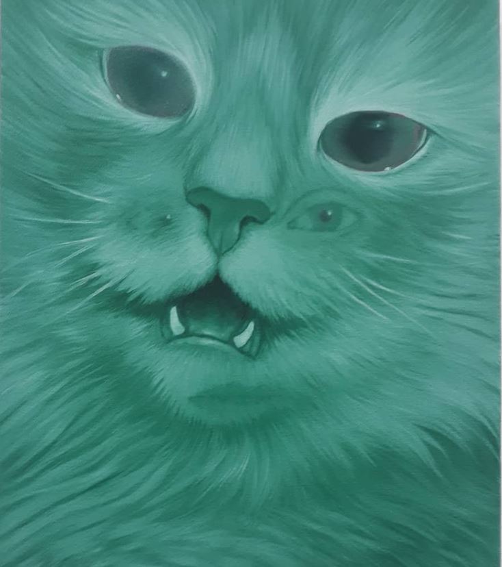
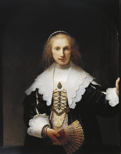
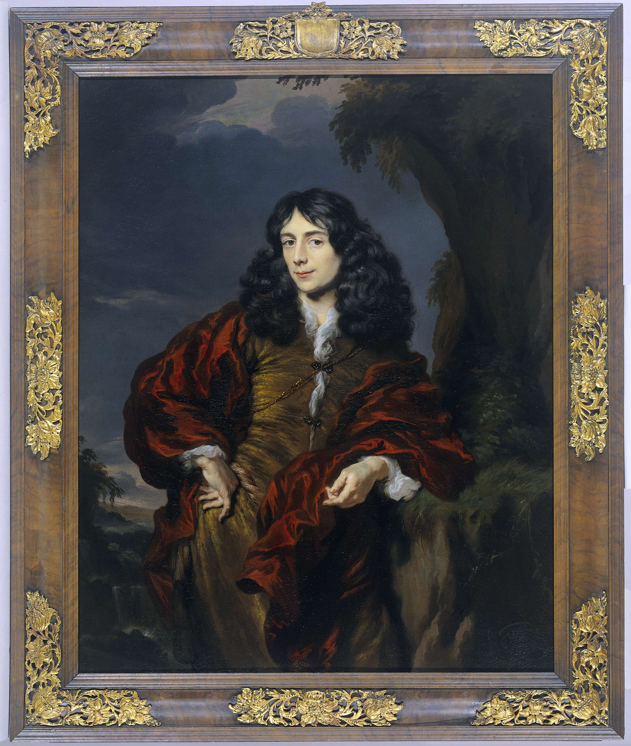
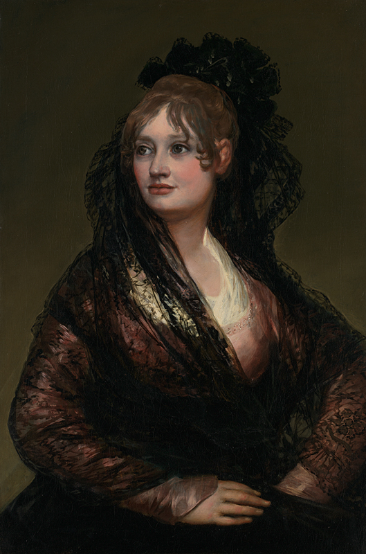
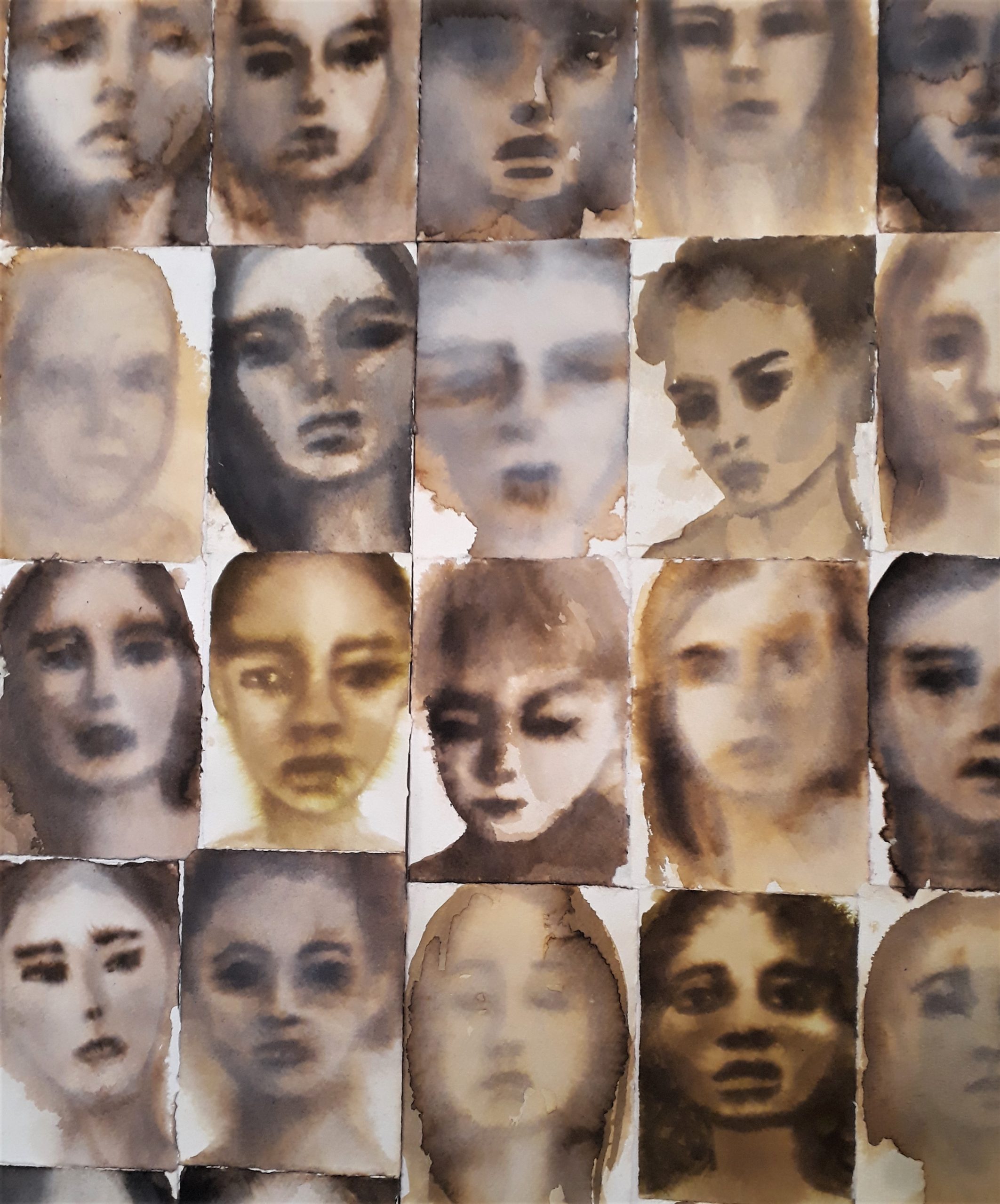

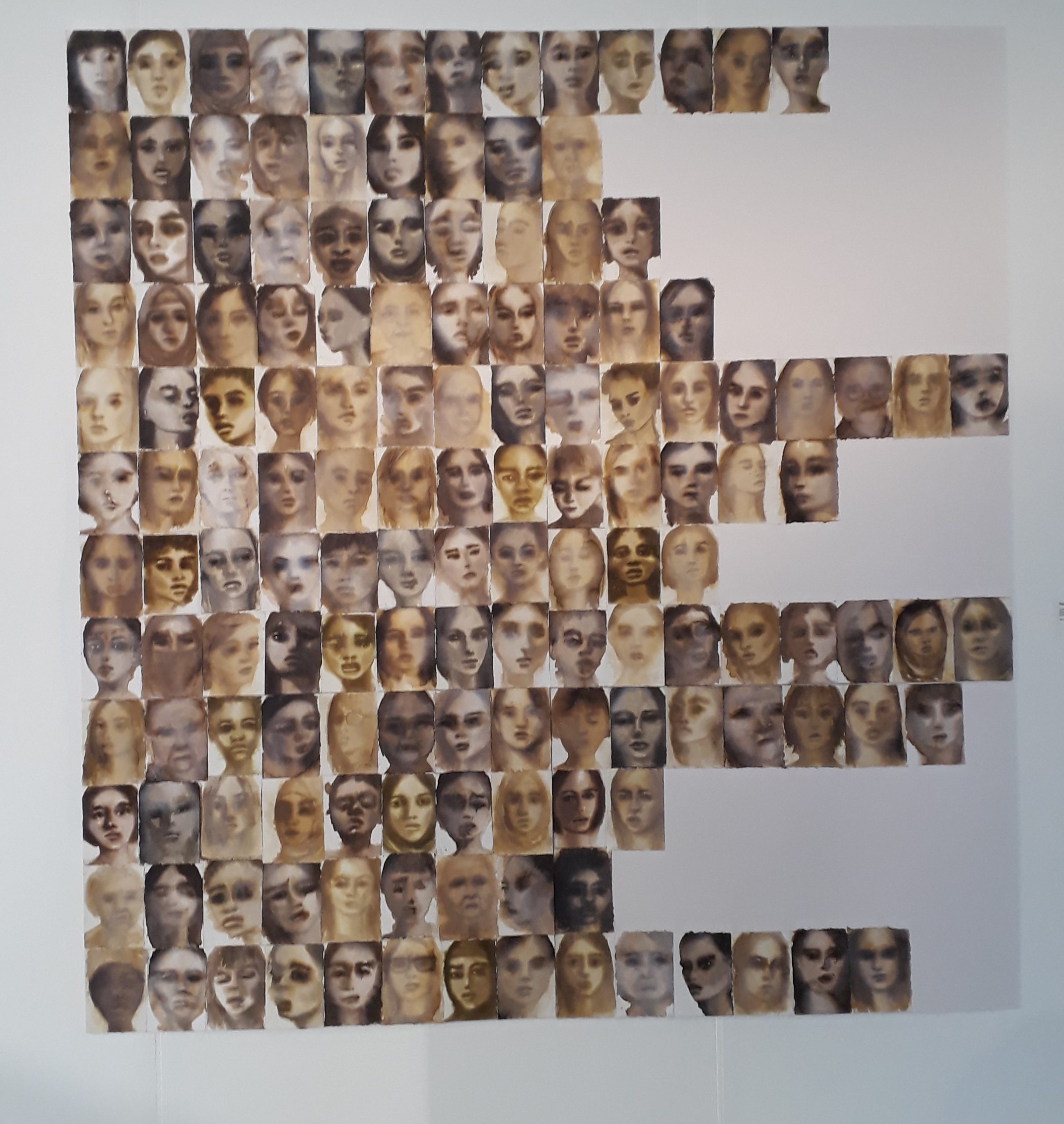
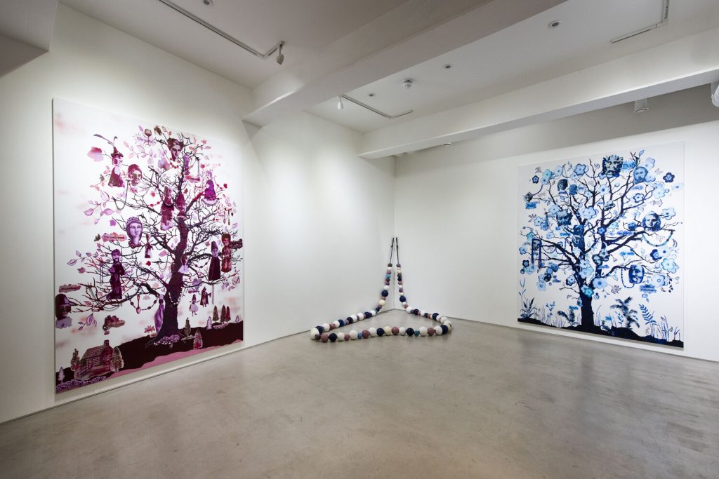 The more that orthodox places close in challenging market and cost conditions – Blain | Southern being the latest – the more reason there is to appreciate alternatives spaces. School Gallery, attached to a studio complex near Wimbledon, and managed by artist Michael Hall, is one such example. Currently it has a concise show by the Mexican-born London artist Alicia Paz: two monochrome paintings in ceramic-linked hues – the red of iron oxide and the blue of cobalt oxide – either side of a giant ceramic necklace titled ‘Love’ in acknowledgement of how it unites the paintings either side. Both paintings show trees, which Paz, talking to Craig Burnett – formerly, as it happens, of Blain ! Southern – identified as a particularly rich subject which had appealed to her ever since, as a child, she decorated the family Christmas tree. Alicia mentioned how their root systems mirror what is above ground, so as much is hidden as is on view; how roots imply origins linking to her interest in hybridity; how both languages and families are often depicted diagrammatically as trees.
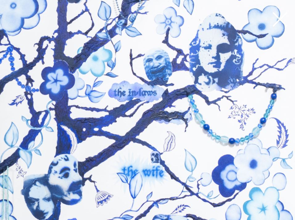 All of which feeds into paintings which fully exploit the load-bearing ability of trees by filling their branches with characters and props, including some ‘real items’ as well as paintings made from found images of puppets – on the red tree (The Lake House, 2020) – and gargoyles – on the blue tree (A Spiritual Visitation, 2020) which housed the people in her family, such as the in-laws above! The resulting cacophony of voices, said Paz, was a ‘chattering community of neurotic characters’ which evoked the multi-layered aspects of the typically modern identity. The ceramic necklace also referred to Maupassant’s short story ‘The Necklace’, in which a woman’s life is eaten away by guilt, having lost a diamond necklace she had borrowed, only for her to be told when she eventually organises recompense that the stones had been fakes. Trees, however, as we are increasingly aware, are truly valuable…
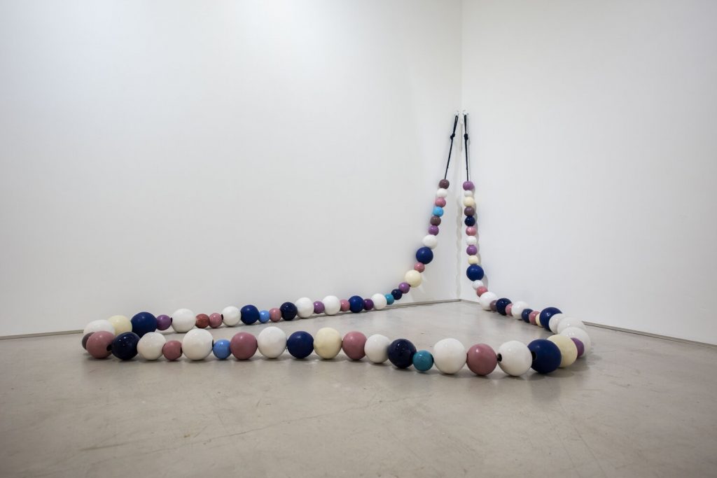


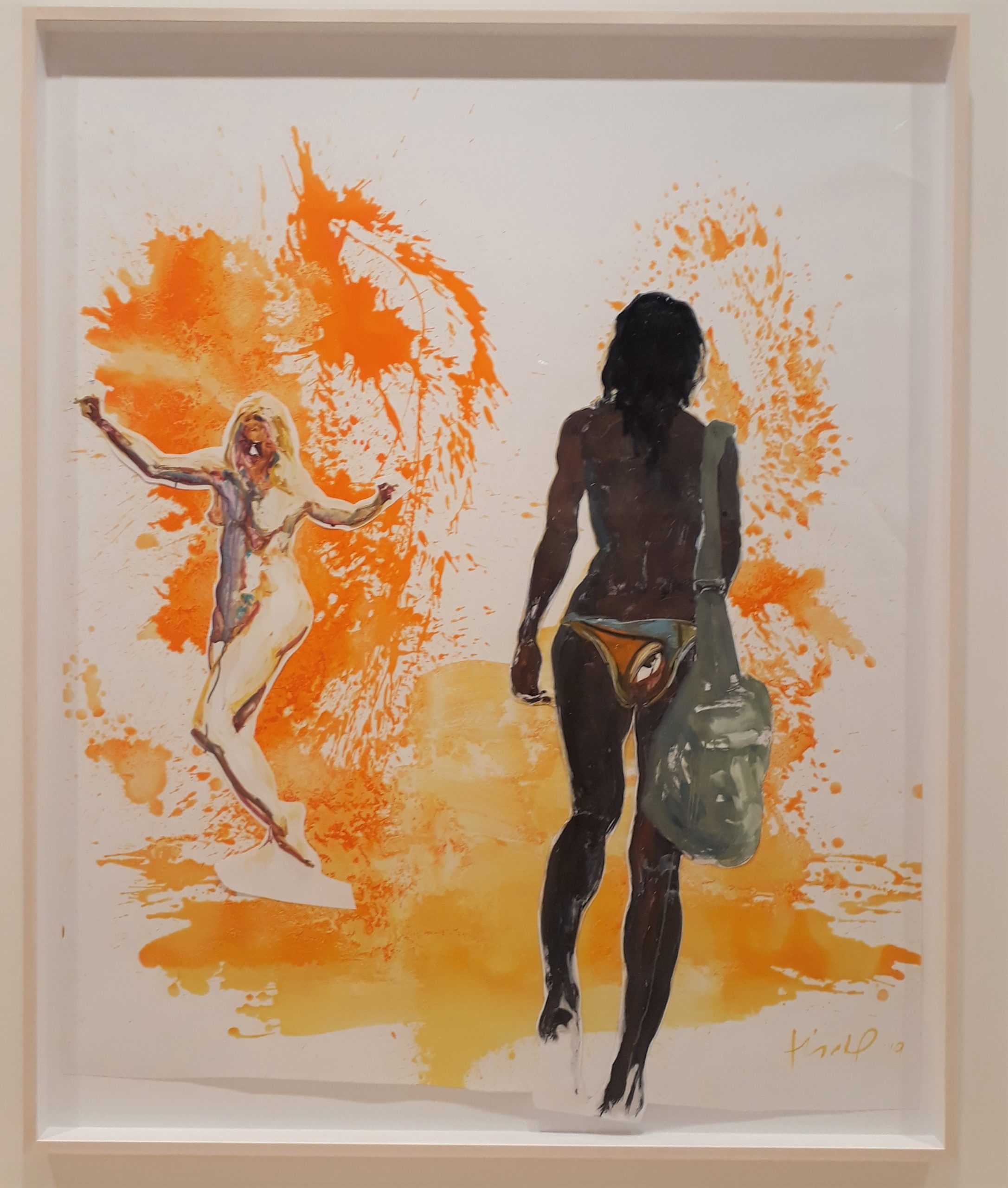
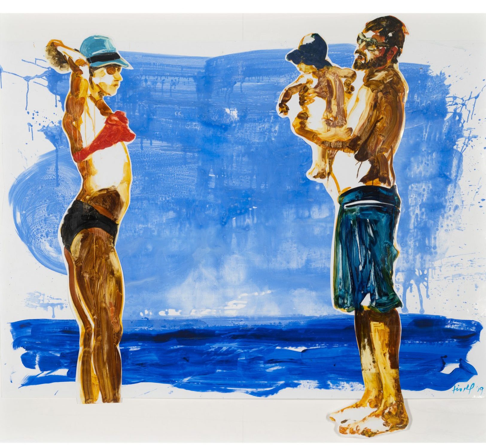
 Let’s suppose people can be split into those who believe that the world is essentially binary and those who don’t. The former group might readily agree that exhibitions can be divided into those by living artists and those by dead artists*. Yet the Fischli and Weiss show at Sprueth Magers (to March 14) offers a nicely non-binary alternative. David Weiss died in 2012, but Peter Fischli is still very much around to talk about what the pair were up to.
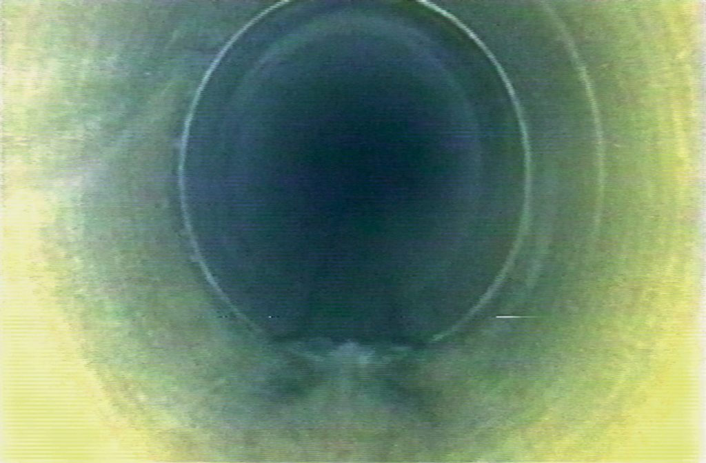 Spruth Magers’ three main floors are well suited to showing three bodies of work. In the basement is Kanalvideo (1992/2008), an hour of footage sourced from those responsible for inspecting the sewers under Zurich. Dull in a way, apart from the appearance of a rat halfway through, yet oddly painterly and hypnotic – and a chance to think, explained Fischli when we toured the show, about the subconscious beneath society.
 The gallery’s ground floor has the duo’s first work in polyurethane, a material that Fischli and Weiss became known for through their trompe l’oeil renditions of behind-the-scenes gallery detritus. The cargo on the overloaded The Raft (1982-30) lands, said Fischli, somewhere between the negative of clichés and the positive of archetypes. There’s also a fantastical element to the combinations on The Raft, and that recurs on the first floor.
 Fischli explained that the 360 images from Fotografias, 2005, displayed on eight tables, were newly selected from the full archive resulting from Weiss and him spending 18 months photographing paintings on the outsides of funfair rides throughout Europe. The analogue images of big colourful, somewhat amateurish paintings were deliberately underexposed then printed small in black and white on coloured paper. That transformation makes them look rather like Polaroids taken in the dark of a ghost train ride. And like the sewers, said Fischli, these might be seen as portals – albeit faked – to an alternative world, even if they also revealed how repetitive and stereotyped the apparently free play of fantasy can be.
* I detect, incidentally, a swing among gallerists from representing the living (who can helpfully explain their work, but may be demanding) towards the dead (unavailable but undemanding)
Fischli explained that the 360 images from Fotografias, 2005, displayed on eight tables, were newly selected from the full archive resulting from Weiss and him spending 18 months photographing paintings on the outsides of funfair rides throughout Europe. The analogue images of big colourful, somewhat amateurish paintings were deliberately underexposed then printed small in black and white on coloured paper. That transformation makes them look rather like Polaroids taken in the dark of a ghost train ride. And like the sewers, said Fischli, these might be seen as portals – albeit faked – to an alternative world, even if they also revealed how repetitive and stereotyped the apparently free play of fantasy can be.
* I detect, incidentally, a swing among gallerists from representing the living (who can helpfully explain their work, but may be demanding) towards the dead (unavailable but undemanding)


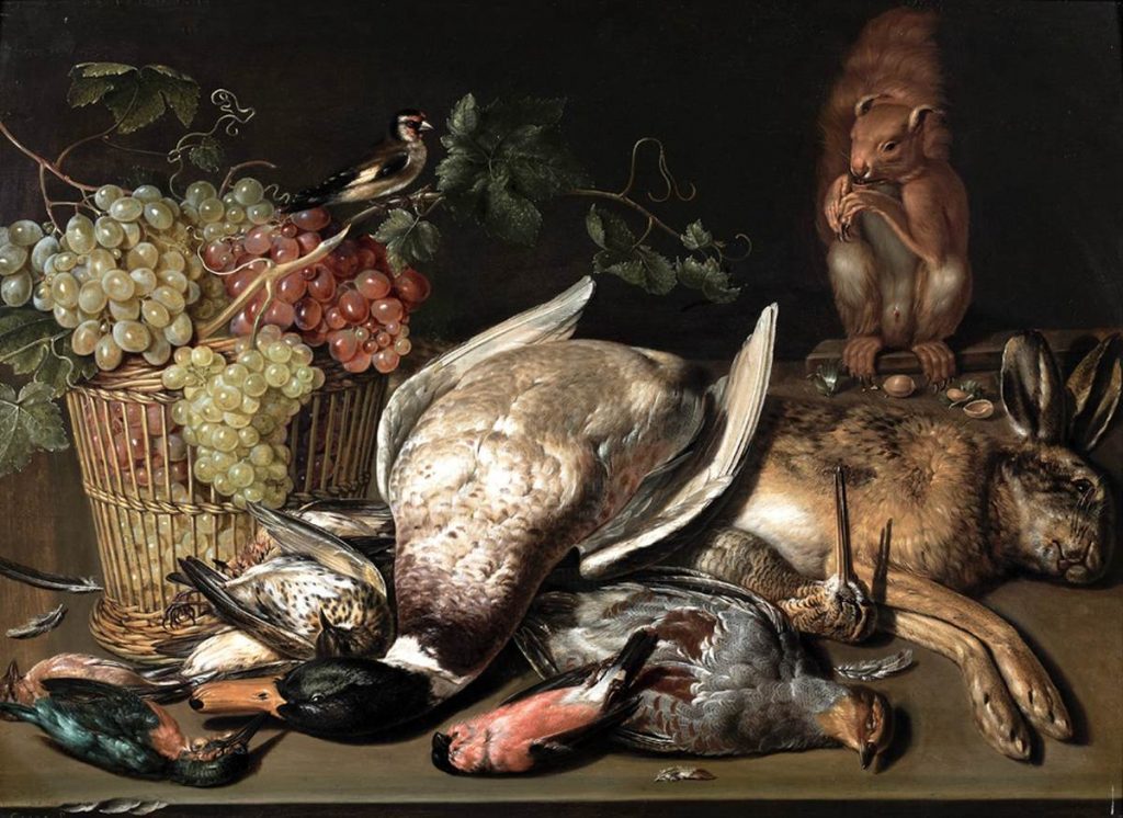 Clara Peeters: ‘Still Life with Mallard, Hare, Squirrel and Basket of Grapes’. Antwerp-born Clara Peeters, active 1607-21 in the Netherlands and Spain, is the best-known female Flemish painter of the 17th century. This demonstration of the trappings of her wealthy patron’s lifestyle, with overflowing grapes and game partially plucked for the table, is enlivened by a particularly characterful rodent.
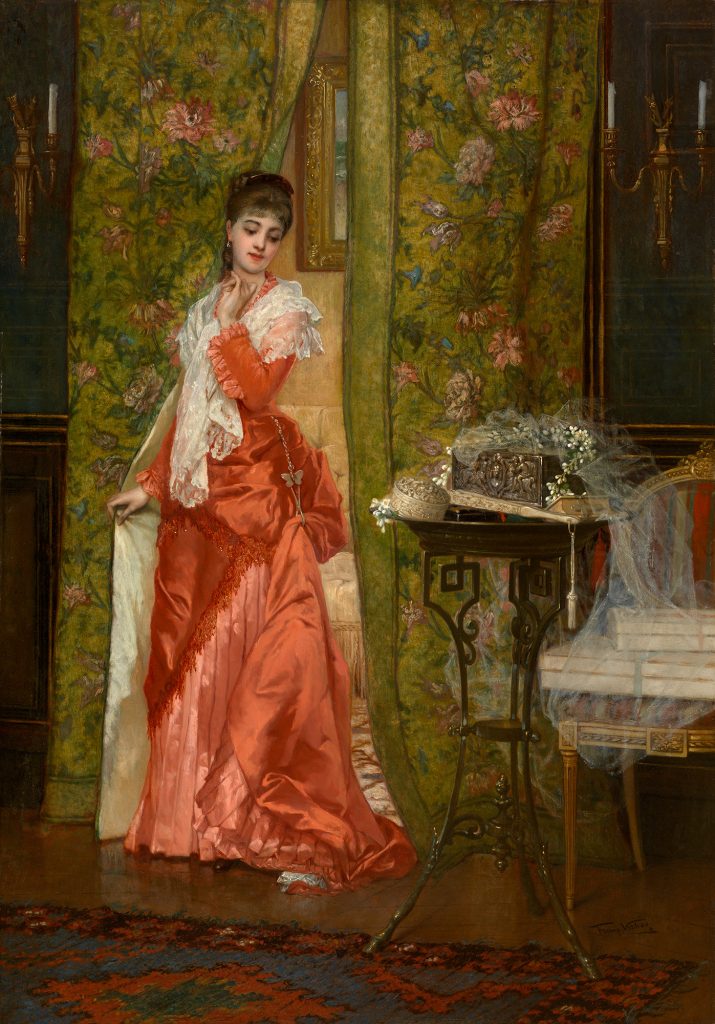 Frans Verhas: ‘The Fiancée’ at Berko Fine Paintings, Knokke. Verhas (1827-97), based in Paris for much of his career, specialised in elegant women in luxurious interiors. Here there’s a narrative: it looks as if his subject caught the bridal bouquet thrown into the crowd of wedding guests, and that the traditional effect of that leading to a further marriage took an exceptionally rapid course.
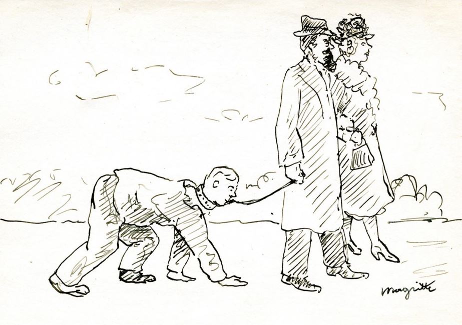 René Magritte: ‘Promenade a trois’, c. 1935 at Galerie de la Presidence, Paris. This nicely deadpan small drawing of a couple walking a fairly adult-looking child on a leash might have any number of Freudian interpretations, but I thought of it a commentary on those who prefer pets to children, or on how to deal with those grown-up children who fail to leave home.
 Pierre Alechinsky: ‘Green Sleeves’, 1980 at Galerie Guy Pieters, Knokke. When the CoBrA group of artists was active (1948-51) Alechinsky was part of the Br for Brussels (other artist being from Copenhagen and Amsterdam) but he has lived in Paris since then. He likes to apply acrylic to thin Japanese paper then fix it to canvas to generate a refined luminosity contrasting with the rough urgency of his mark making. The title is nicely evocative without any English folk element being obvious.
 Dirk Braeckman: ‘Hinge-#-1-2006’, 2006 at Bernier / Eliades, Athens / Brussels. There is hardly any lens-based work in BRAFA, but here’s an earlyish work from Belgium’s 2017 Venice Biennale representative: not his subsequently typical large and mysterious gelatin prints intensively manipulated in the darkroom, but a curious intersection of ‘picture within picture’ and sexual suggestion which perhaps equates two categories of creative act.
 Harald Ancart: ‘To Be Titled’, 2016 Perhaps, four years on, this never will be titled, but I like the way this oilstick drawing achieves maximum contrast of bird forms: one standing, somewhat anthropomorphically clumsy and potentially sardonic; the other a jagged sky disturbance as the essence of an avian dive.


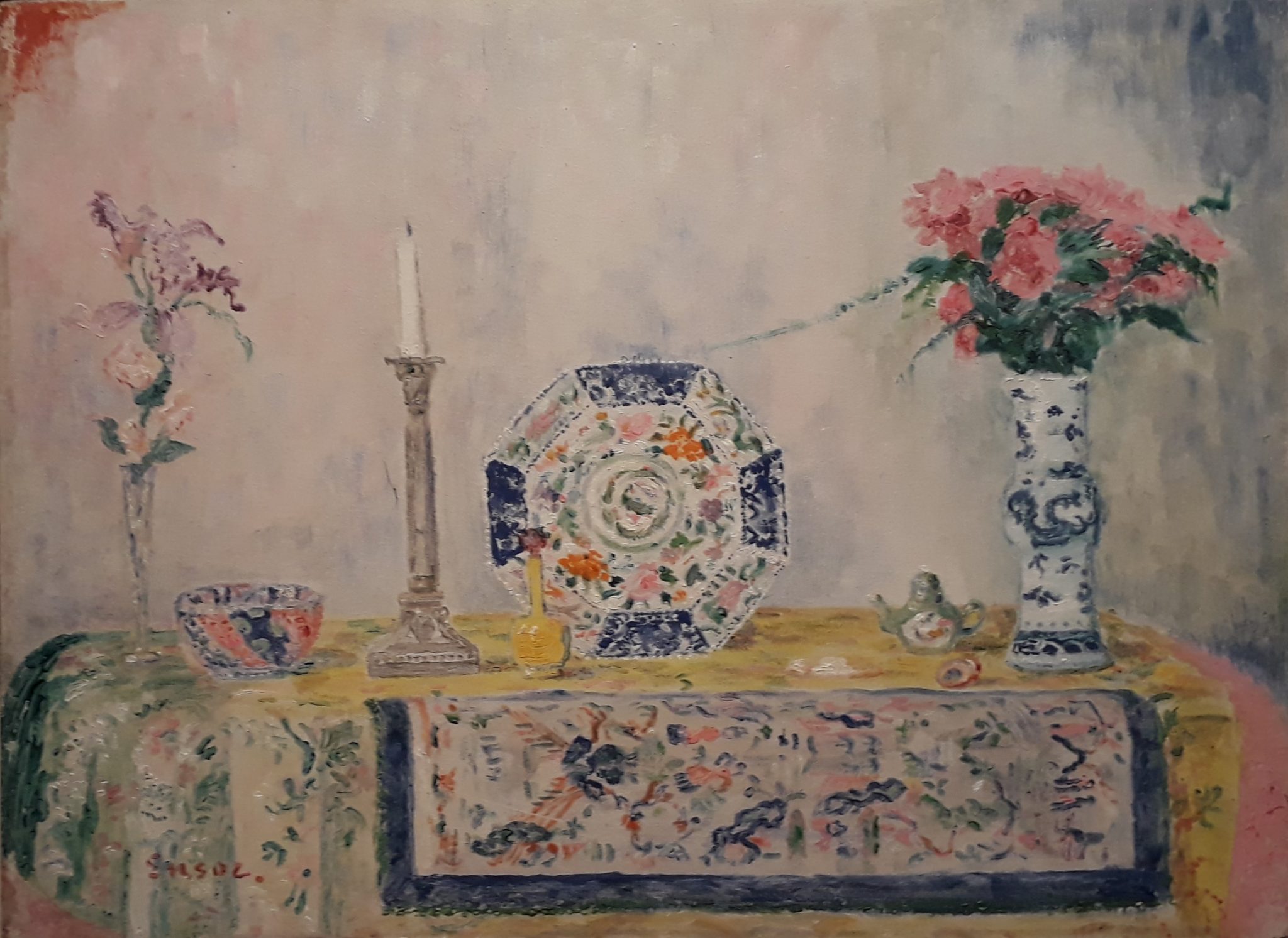


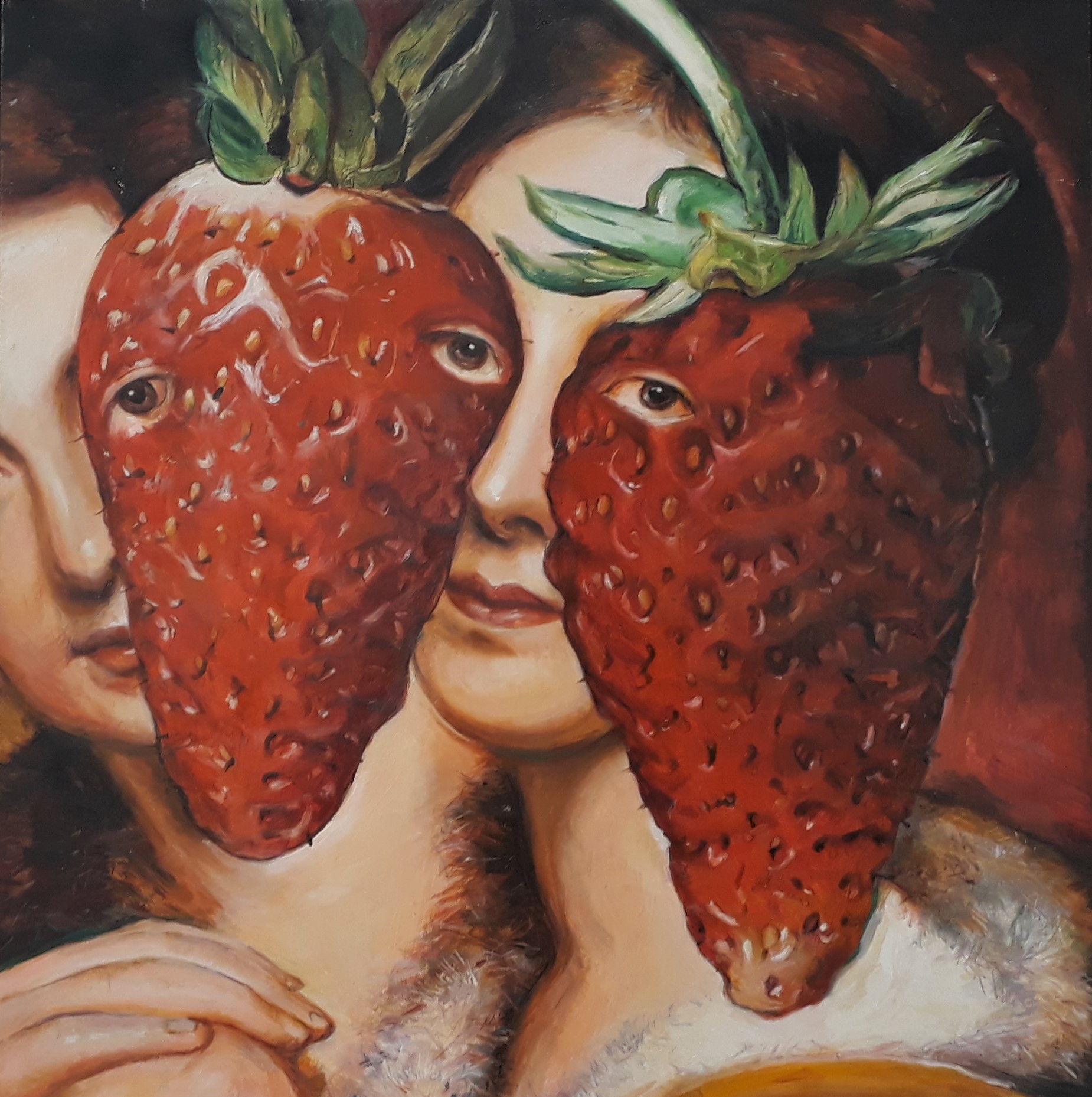
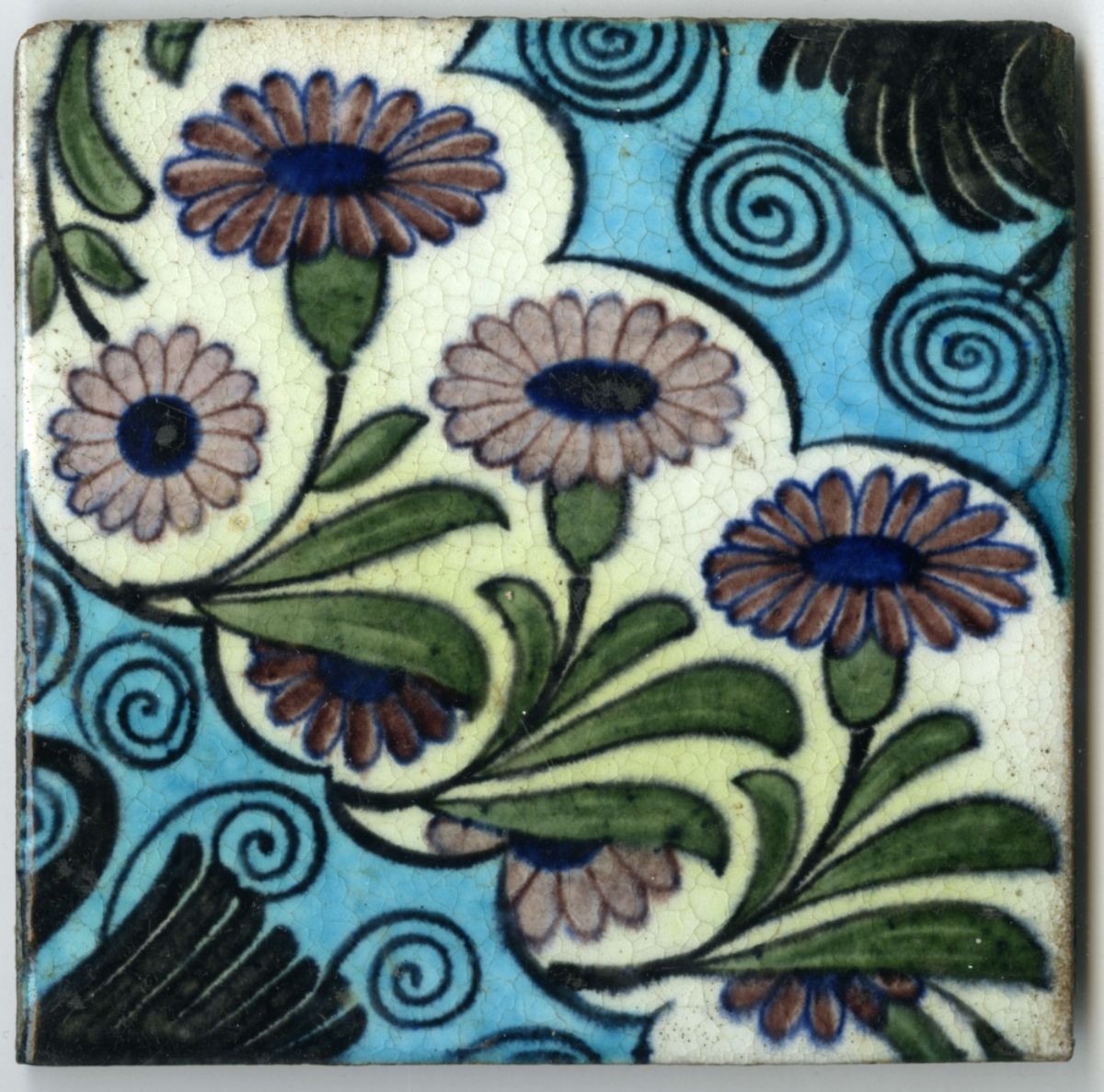
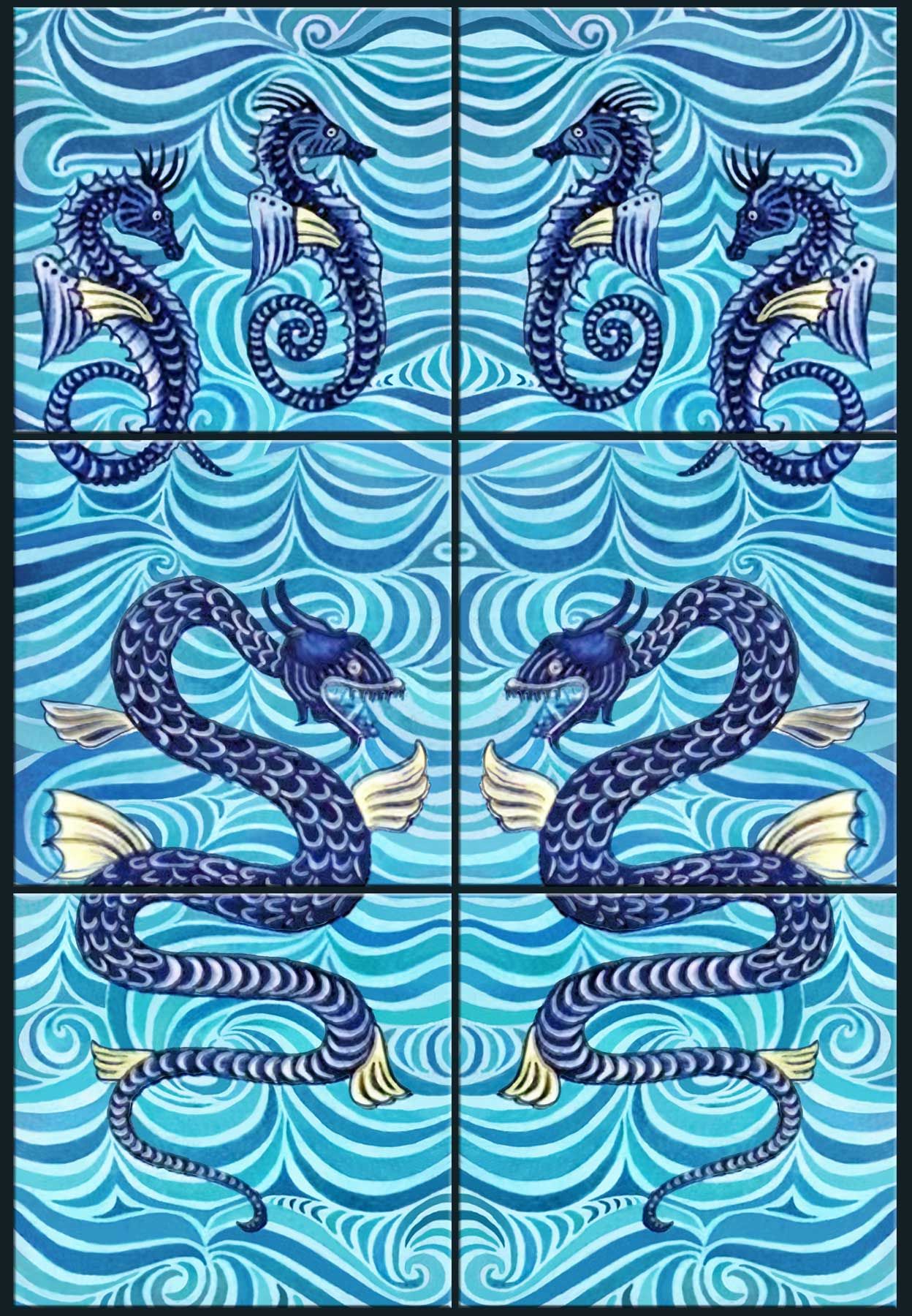
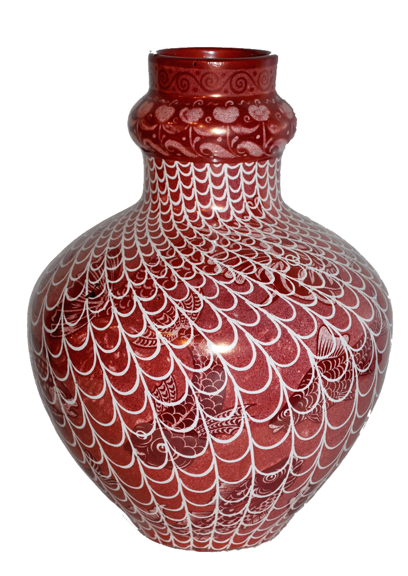
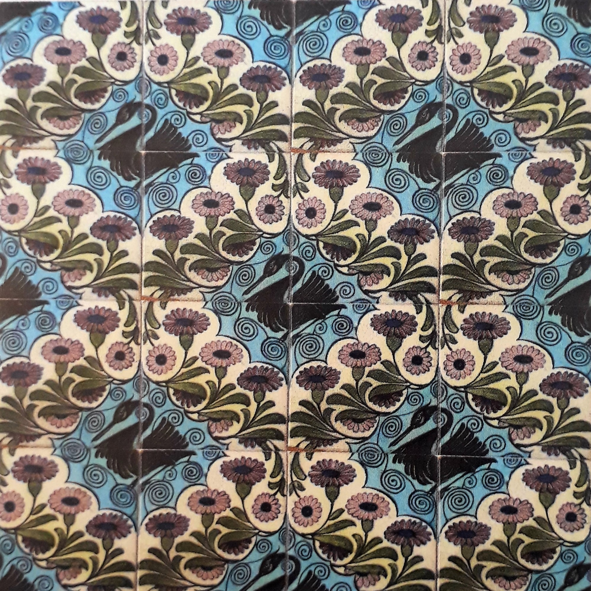
 Athene Greig: installation view at The Stone Space
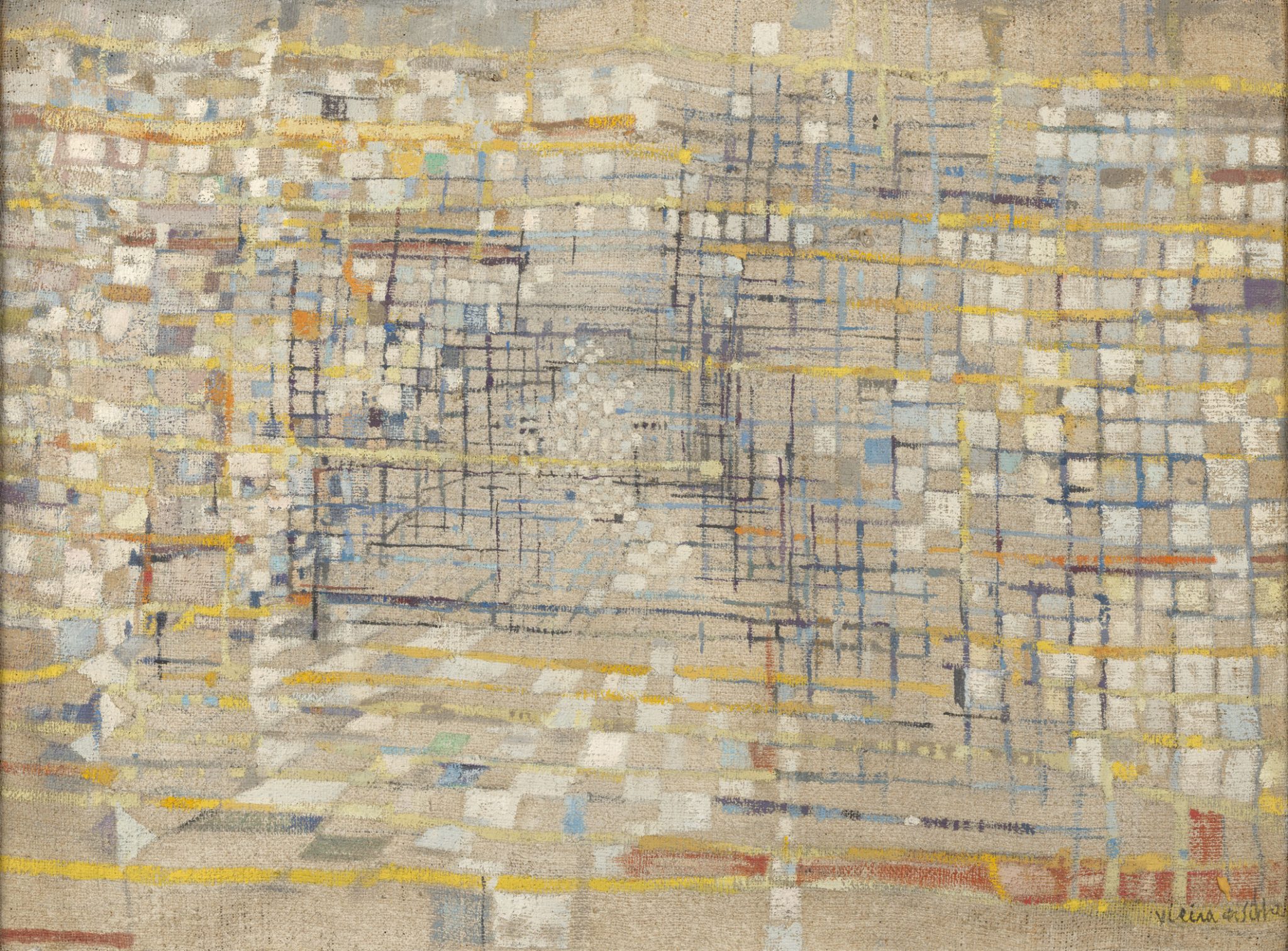

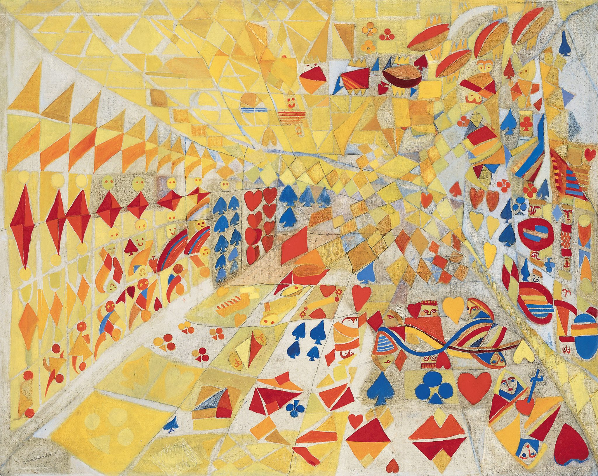
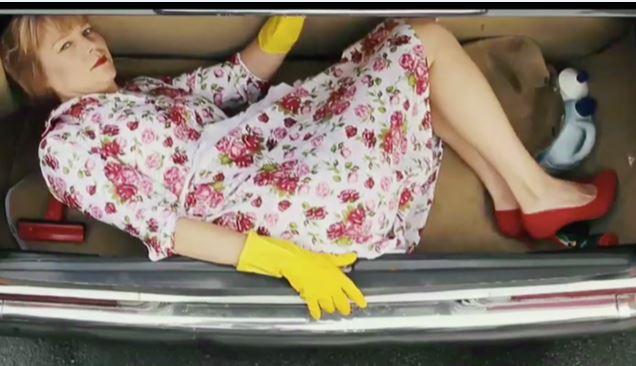

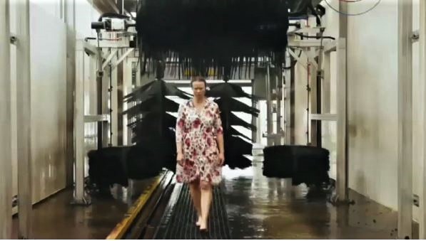


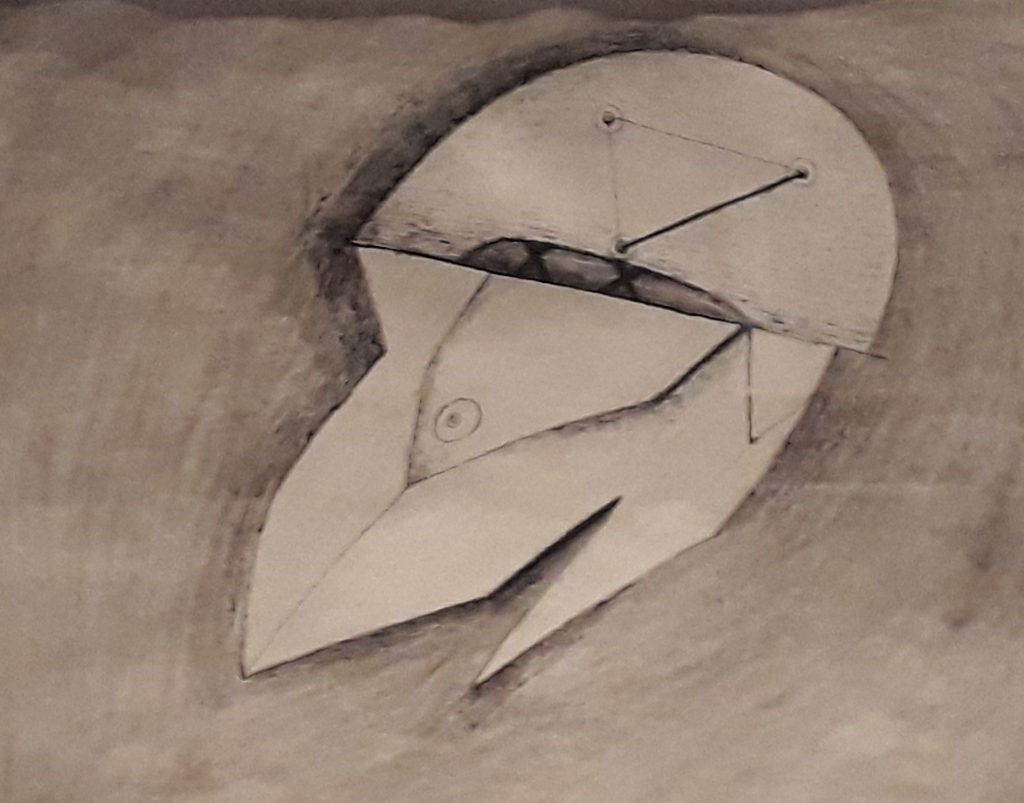
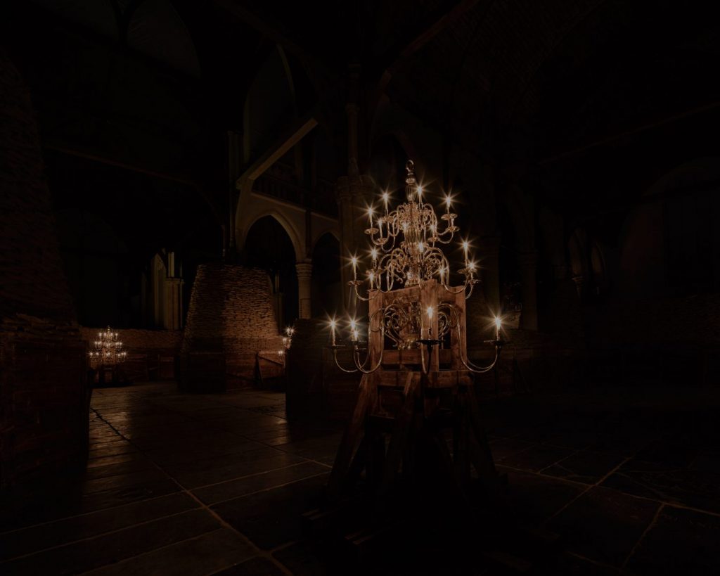
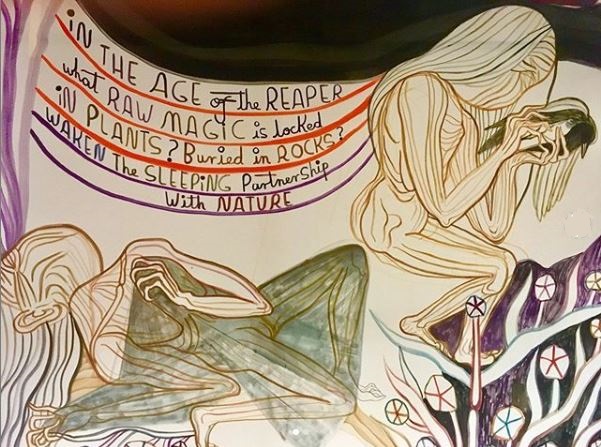
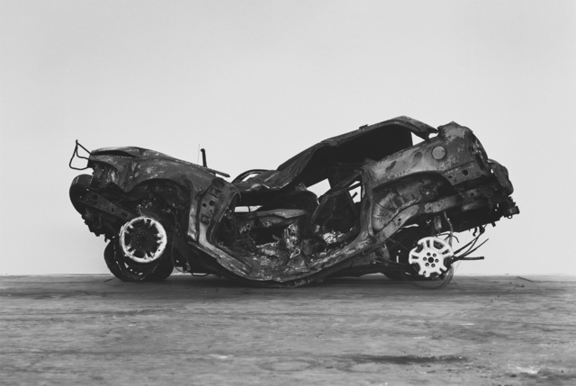
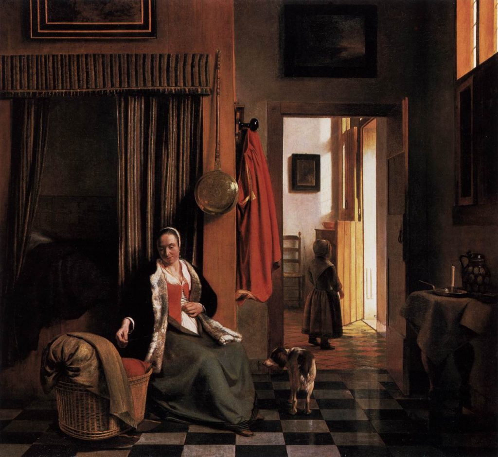
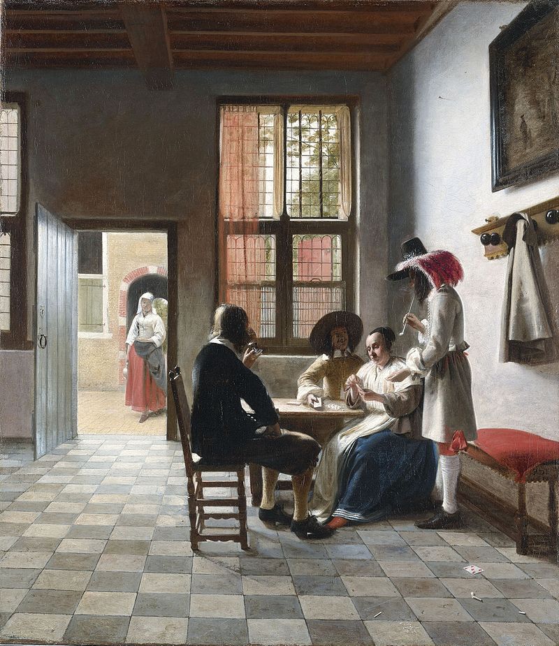


 These days Bilbao’s art fame rests mainly on Frank Gehry’s iconic Guggenheim, finished with 33,000 titanium sheets and containing eight of Richard Serra’s massive works from the series Torqued Ellipses, 1996-98. Gehry and Serra fit with a – rather macho – tradition of working sculpturally in heavy materials consistent with the Basque region’s industrial base. Eduardo Chillida (1924-2002) and Jorge Otieza (1908 –2003) are the most famous Basque artists of the 20th century, but last week I found contemporary practitioners, too:
Eduardo Chillida: ‘Meeting Place IV’, 1973. This (top image), outside the Museum of Fine Art, is typical of Chillida’s exploration of architectural space through sculptural form, less typical in its hanging orientation. Put me in mind, given the title, of a heavyweight Liam Gillick discussion platform.
These days Bilbao’s art fame rests mainly on Frank Gehry’s iconic Guggenheim, finished with 33,000 titanium sheets and containing eight of Richard Serra’s massive works from the series Torqued Ellipses, 1996-98. Gehry and Serra fit with a – rather macho – tradition of working sculpturally in heavy materials consistent with the Basque region’s industrial base. Eduardo Chillida (1924-2002) and Jorge Otieza (1908 –2003) are the most famous Basque artists of the 20th century, but last week I found contemporary practitioners, too:
Eduardo Chillida: ‘Meeting Place IV’, 1973. This (top image), outside the Museum of Fine Art, is typical of Chillida’s exploration of architectural space through sculptural form, less typical in its hanging orientation. Put me in mind, given the title, of a heavyweight Liam Gillick discussion platform.
 Jorge Oteiza: ‘Empty Box with Large Opening‘, 1958 (top). From a series in which variations on the cube aim to highlight the space within, consistent with what the Guggenheim describes as his ‘notion that all artistic practice surges from a void that is nothing yet eventually reaches a Nothing that is Everything’. A summary statement, as Otieza stopped making sculpture for his remaining 44 years after his series of ‘Empty Boxes’.
 Vicente Larrea: ‘Homage to Ricardo Bastida’, 2004. There’s plenty of sculpture in public round Bilbao, notably the big beasts next to the Guggenheim. Vincente Larrea (born 1934) brings a distinctive language – sort of organic folding of bronze waves – to three forms around the Plaza Iglesia San Jose. Each is dedicated to an architect of the city we see now.
 Alberto Salcedo: ‘Izar’, 2018. In the Basque Museum, dedicated to local history and culture, Alberto Salcedo goes directly to the industrial source but shifts the register by making ceramics inspired by industrial machinery. He presents the original pipe-heavy forms alongside.

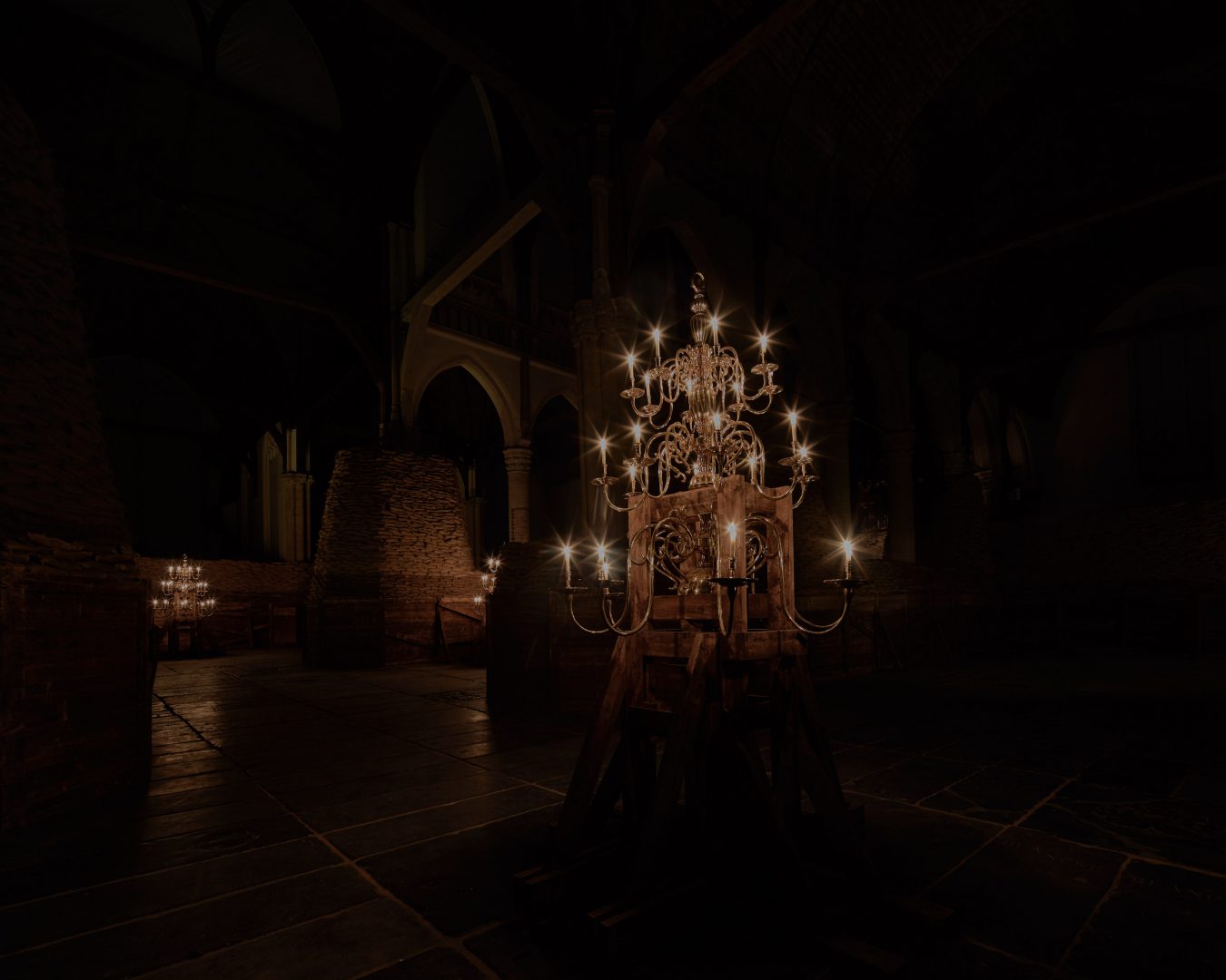

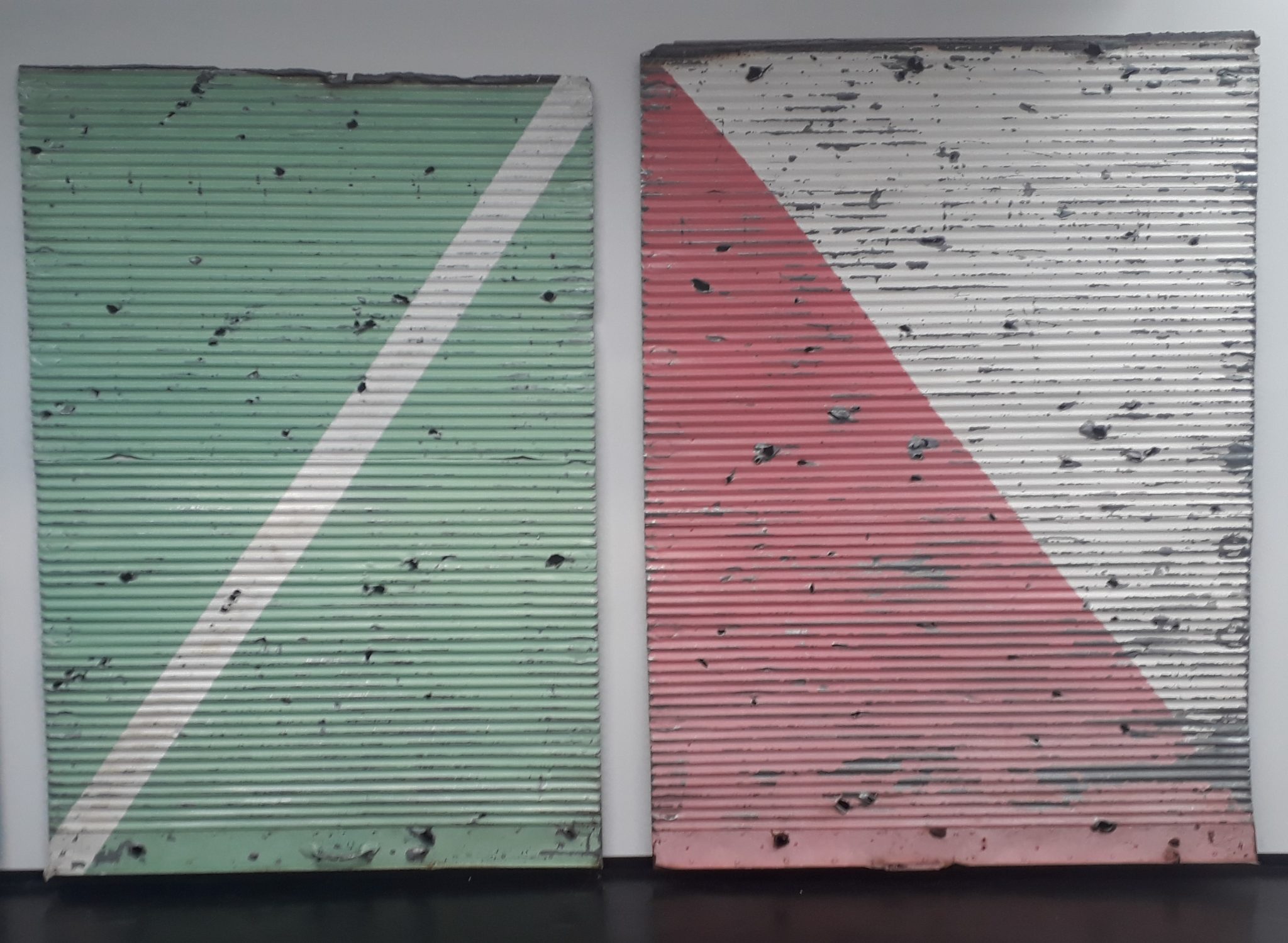

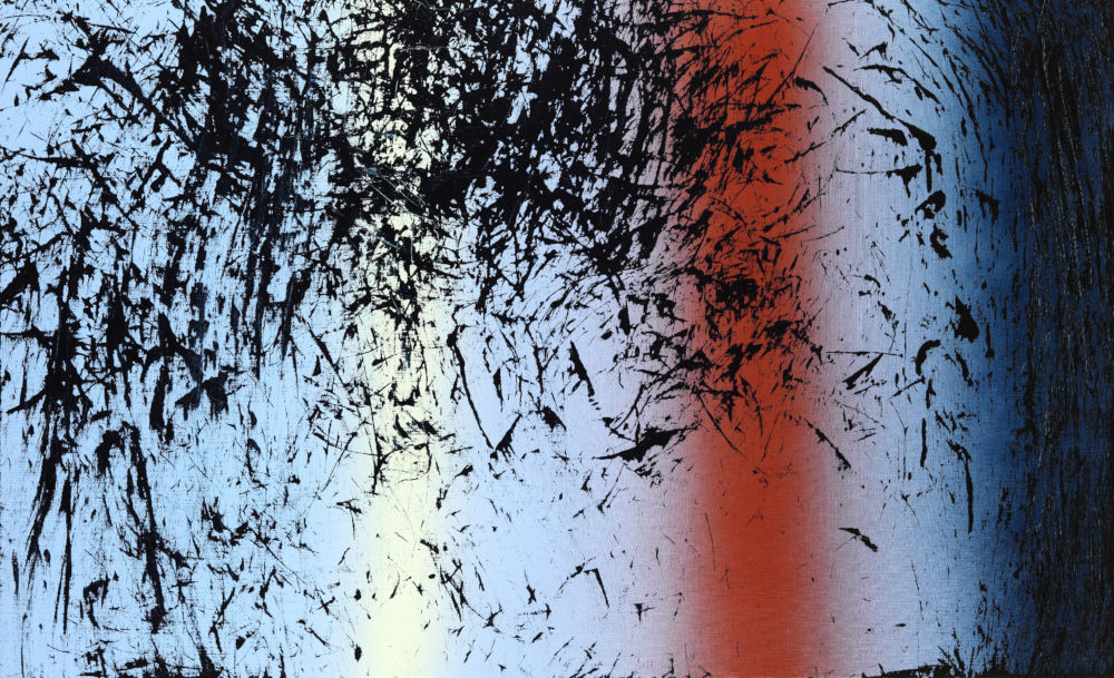
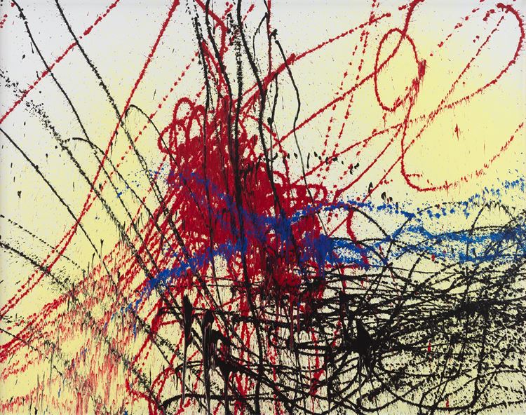
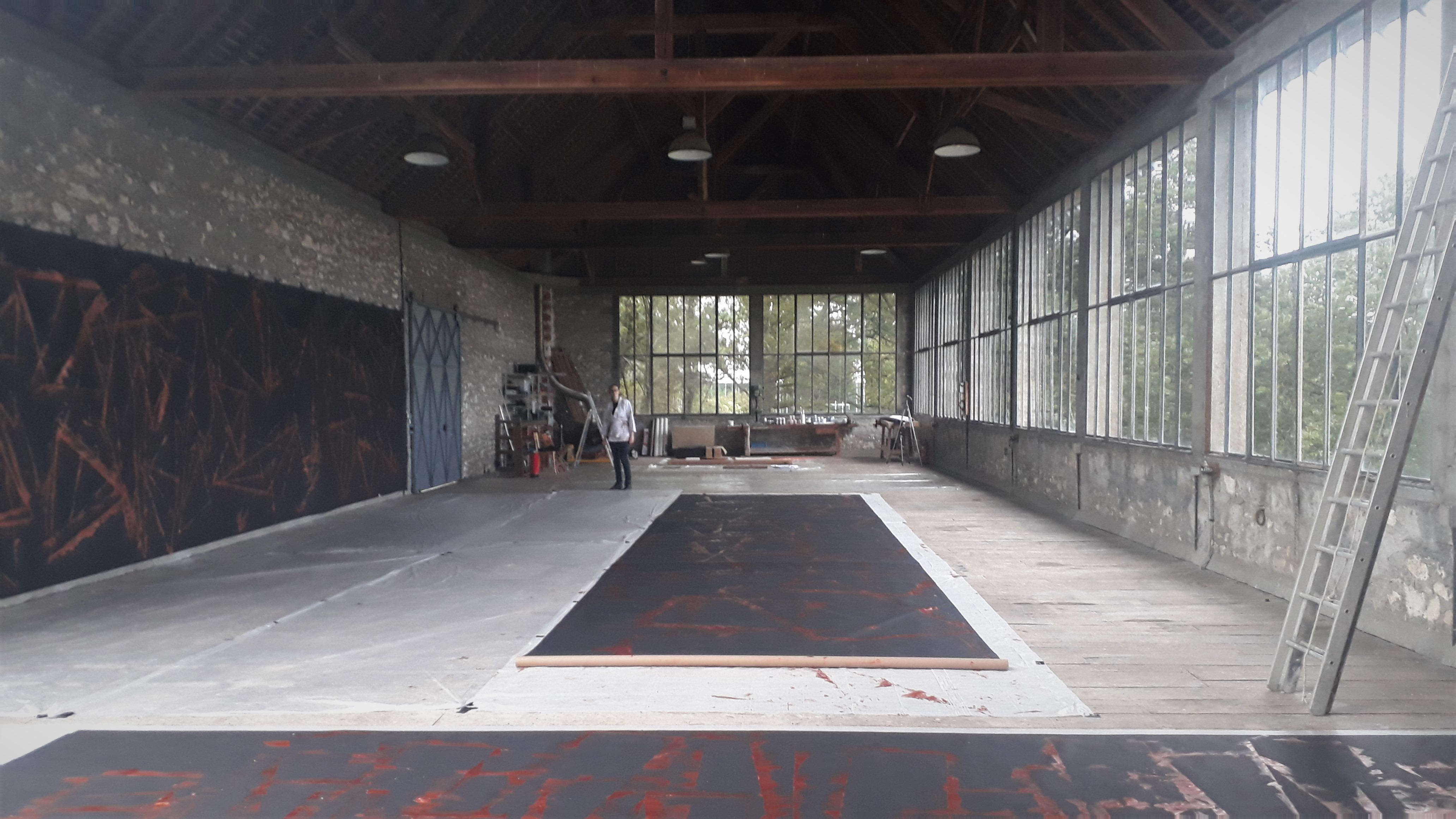
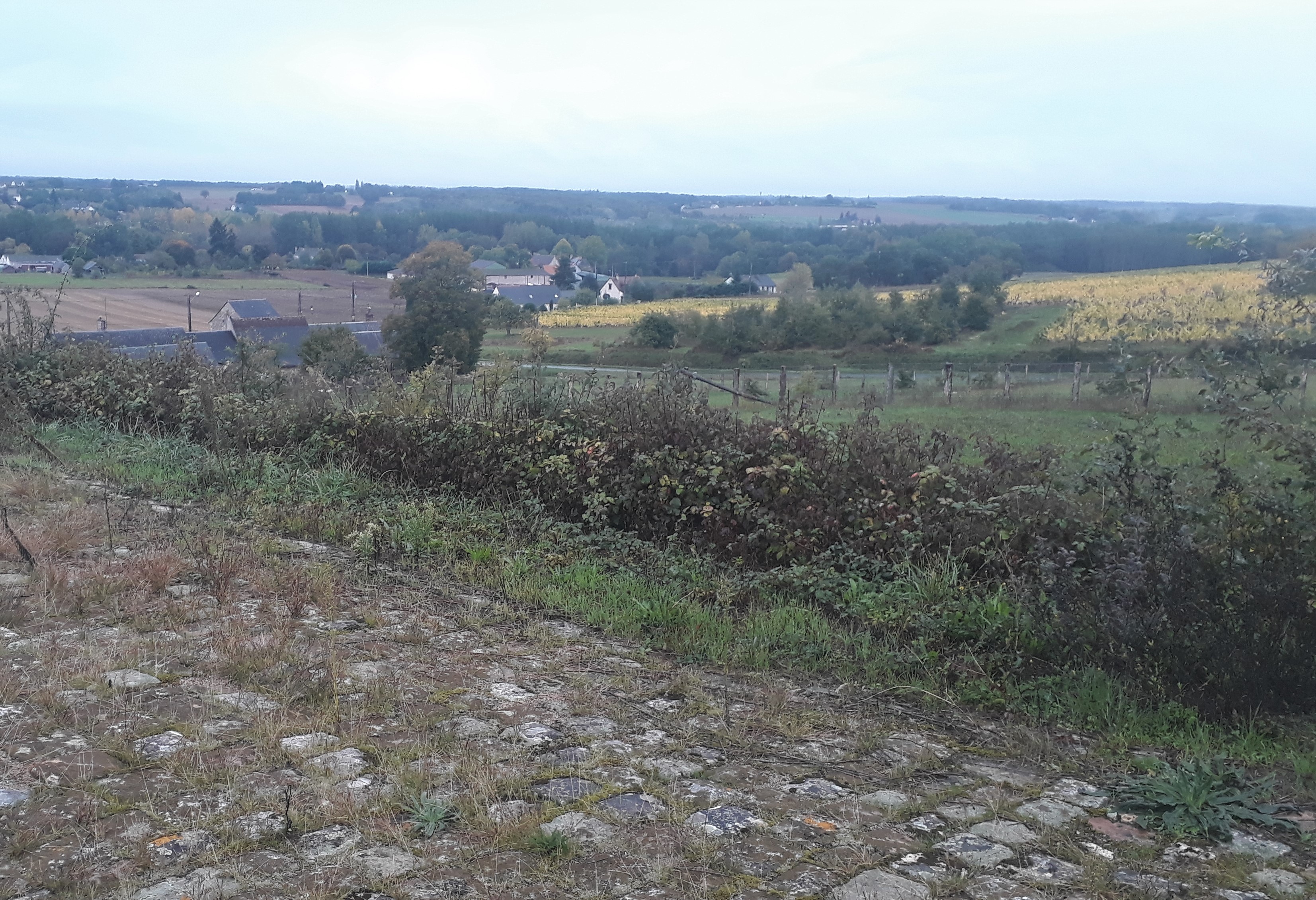

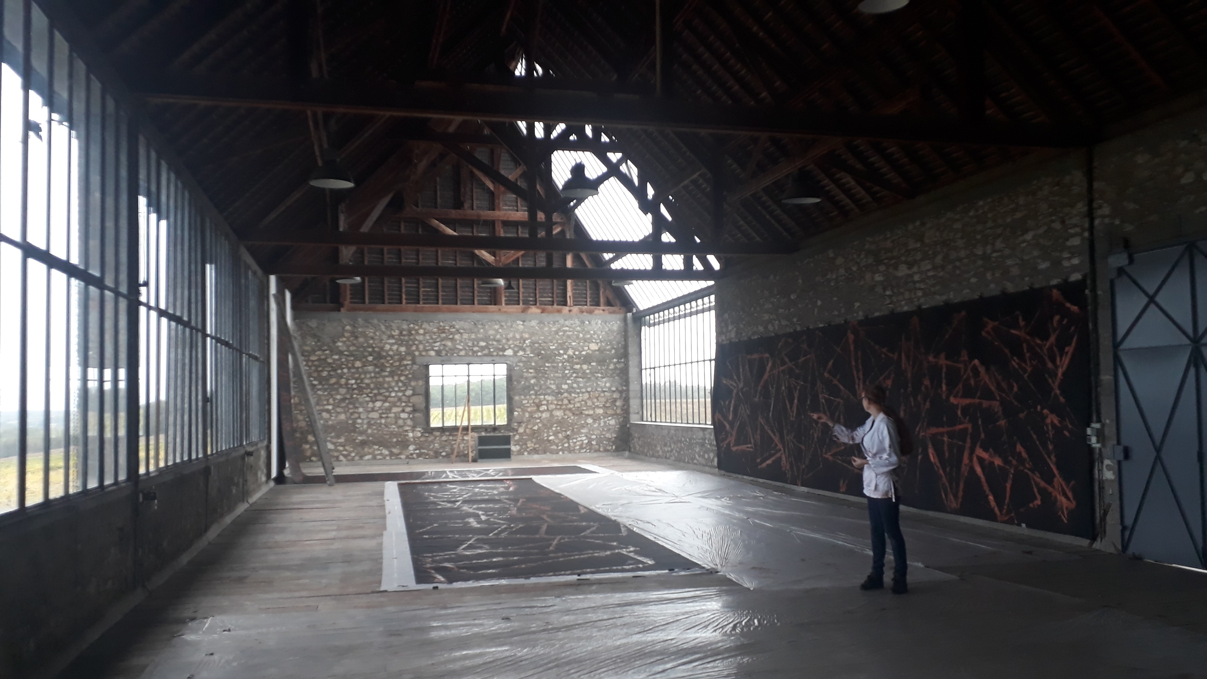
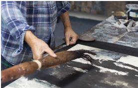
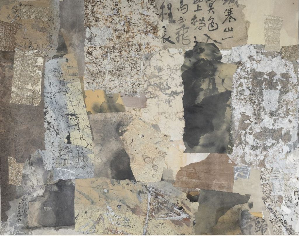 These recent works, blending calmly balanced overall composition with teeming visual incidents when you get close, made me think of a possible recipe for life: keep your bigger goals in mind as you deal with everyday vicissitudes. That combination of simple and complex, macro and micro, marks out Fong Chung-Ray’s late work as painting of some distinction. Whether – to return to my original, question – the same can be said of the overall output of the Chinese abstractionists of his generation is less clear. The helpful survey book ‘From China to Taiwan 1955-1985’** features 16 artists who fuse eastern and western techniques and thinking in various ways. I’m not convinced by them all, but Richard Lin and Hsiao Chin in particular also appeal to me. Who knows, given a catchy explanatory label – what’s the Chinese for ‘abstraction across the sea’? – theirs may yet become the next Asian tendency to achieve wider recognition.
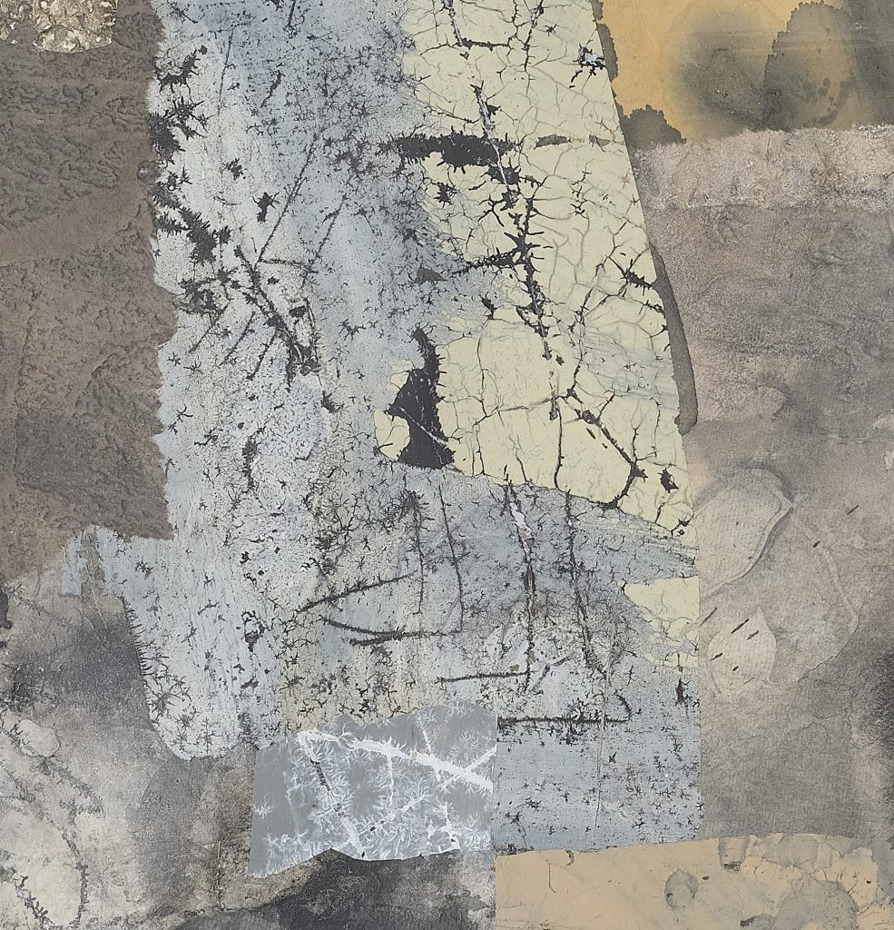
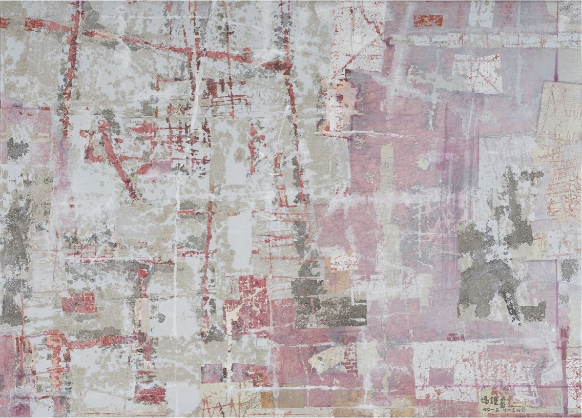
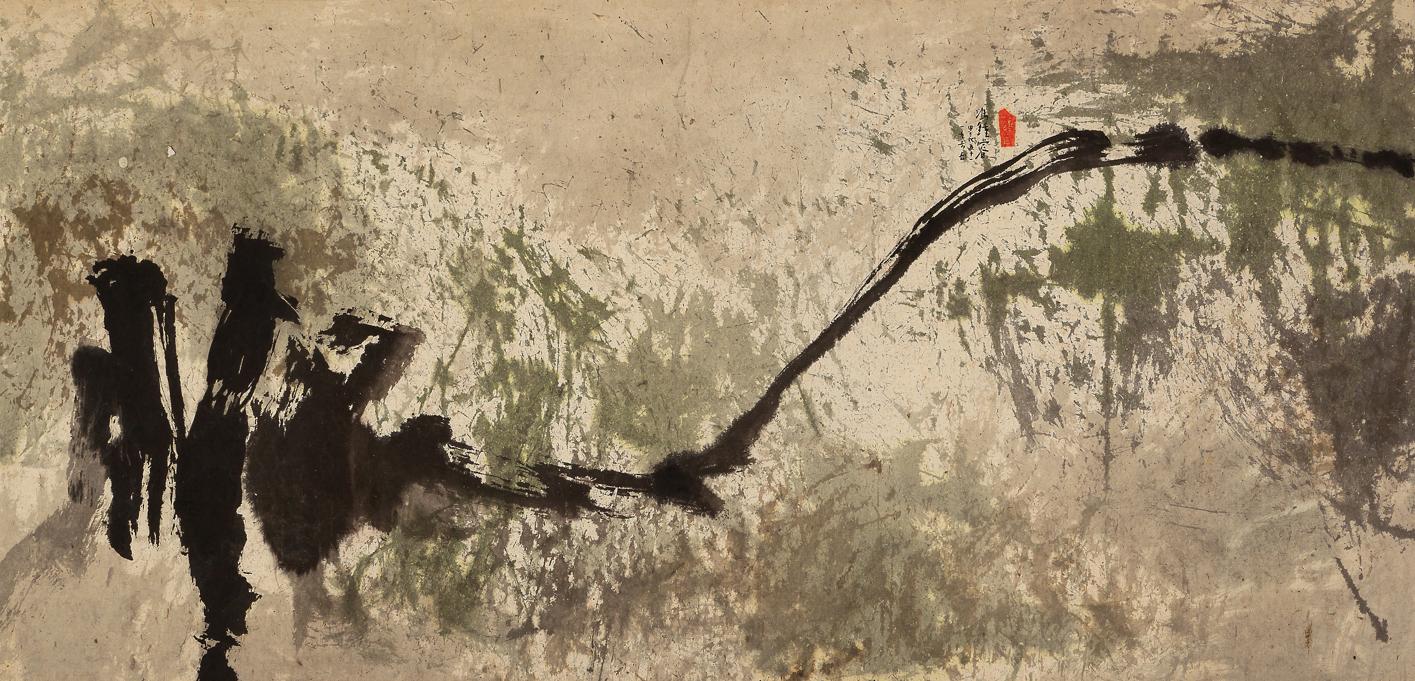

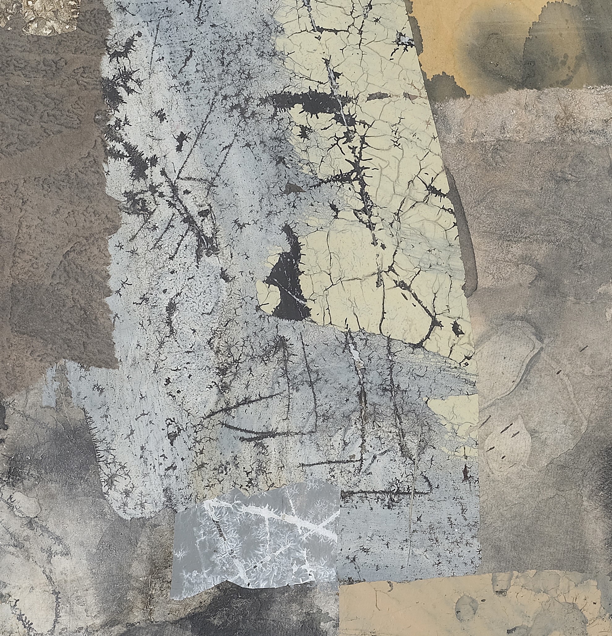
 Stefan Tcherepnin: ‘Canvas Wrap (Yellow)’ 2019 at Galerie Francesca Pia, Zurich. The American artist and musician is known for his friendly monsters, so this painting looking at us was not a particular surprise. Sweet? The gallery told me this particular type craves sugar, so the goggle eyes may be pleading.
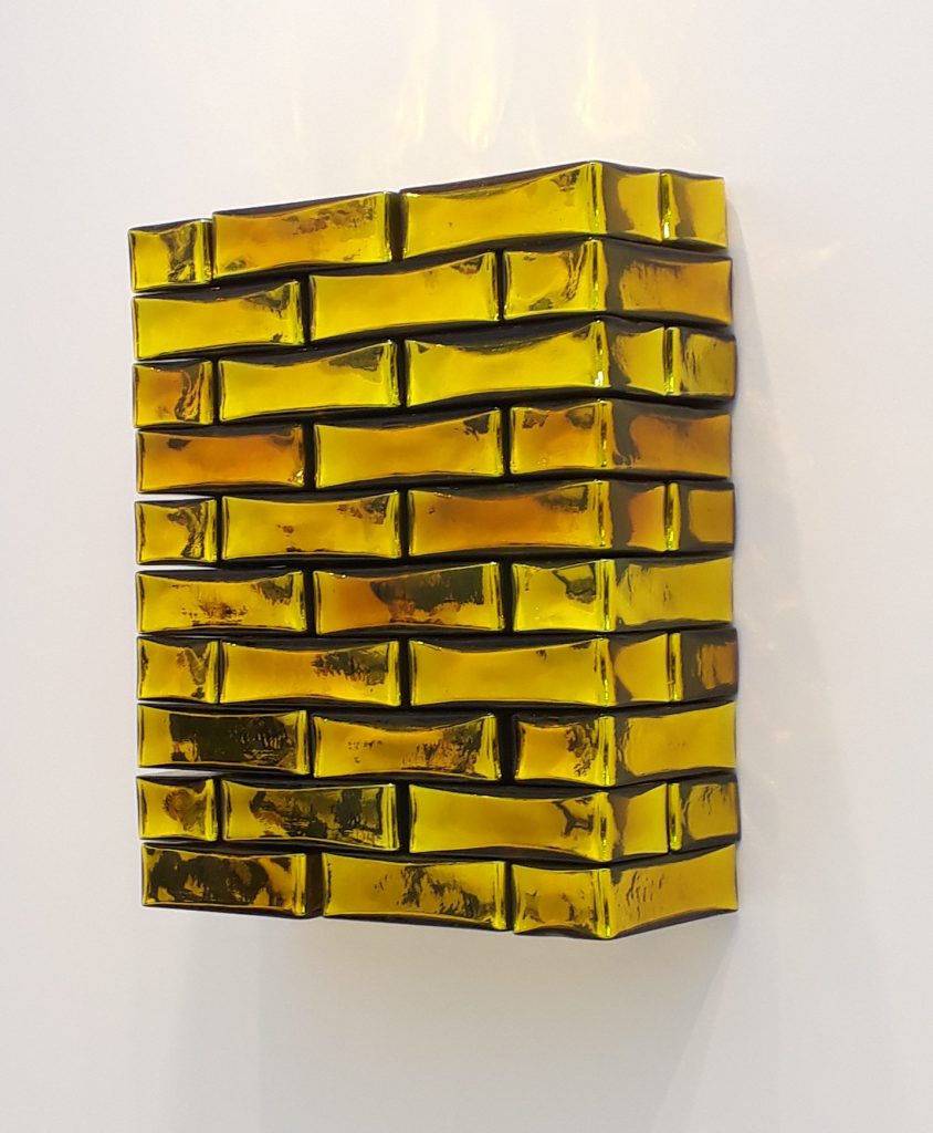 Jean-Michel Othoniel: ‘Precious Stoneware’ 2019 at Kukje Gallery, Seoul. No leading Art Fair is without some delicately monumental Othoniel glass bead works. Moreover, he has a show in the Louvre and the look has spread to its Metro entrance. I suspect his glass bricks, new to market and prevalent at FIAC, will also become Fair staples. They arise from a wish to honour the humble brick in the context of the tendency to demolish traditional housing in favour of concrete high rises, especially in India, where Othoniel had a residency recently.
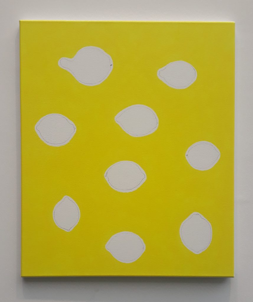 He Xiangyu: ‘Nine Lemons’ 2016 at SCAI THE BATHHOUSE, Tokyo. Ripe lemons are archetypally yellow, so it’s a neat trick that they are the only non-yellow areas in this painting. This is from the Berlin-based Chinese artist’s long term ‘Lemon Project’, based on research across 24 countries showing how the etymology of ‘yellow’ and of ‘lemon’ are entwined historically across cultures.
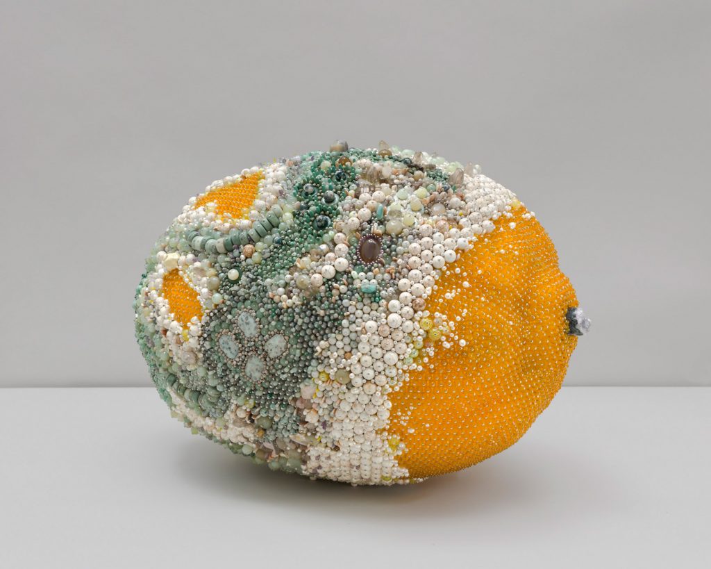 Kathleen Ryan: ‘Green Eyed Monster’ 2019 at Francois Ghebaly Gallery, LA. Ripe yellow and beyond… This oversized (70cm wide) mouldy lemon is made by adding countless beads and semi-precious stones to a polystyrene foam base, its rotten yet alluring state acting as a comments on the culture of consumer excess and waste.
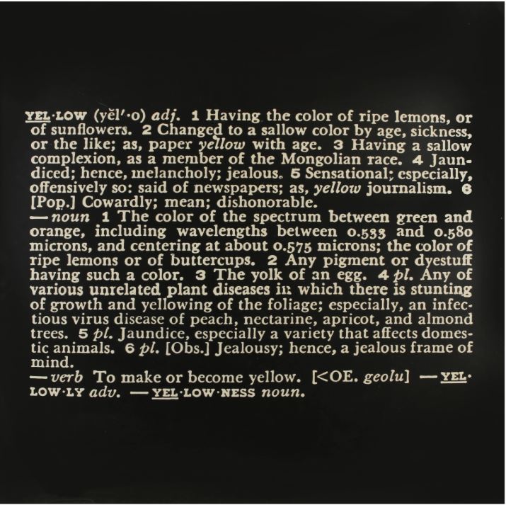
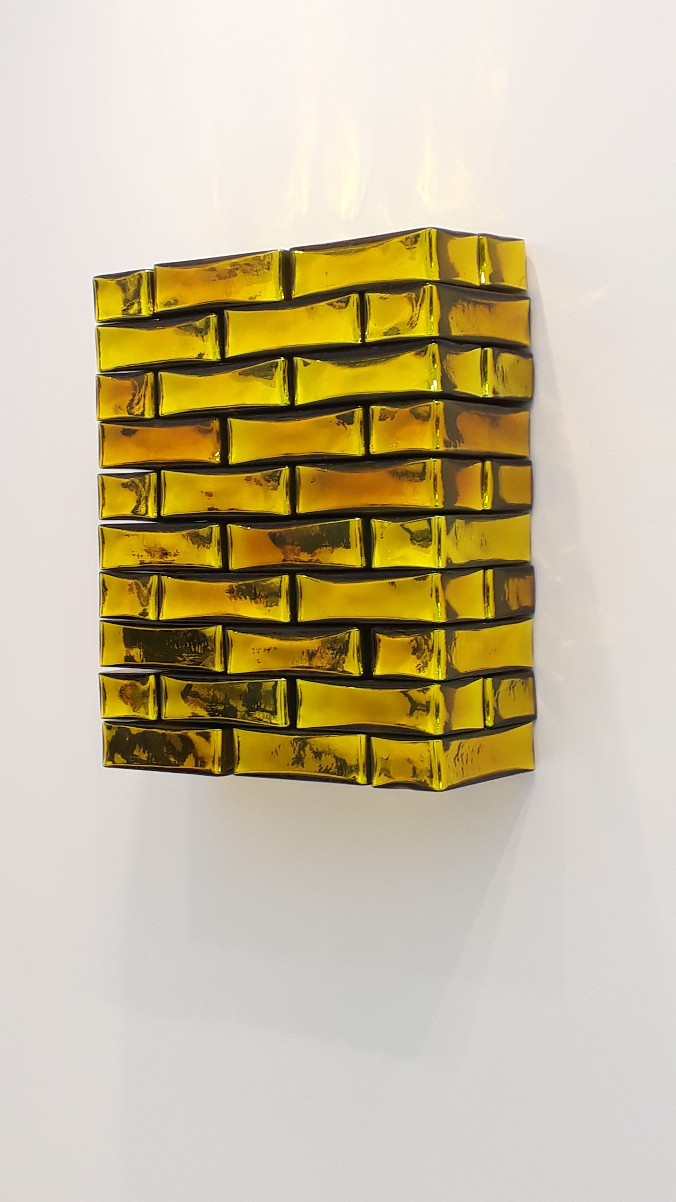
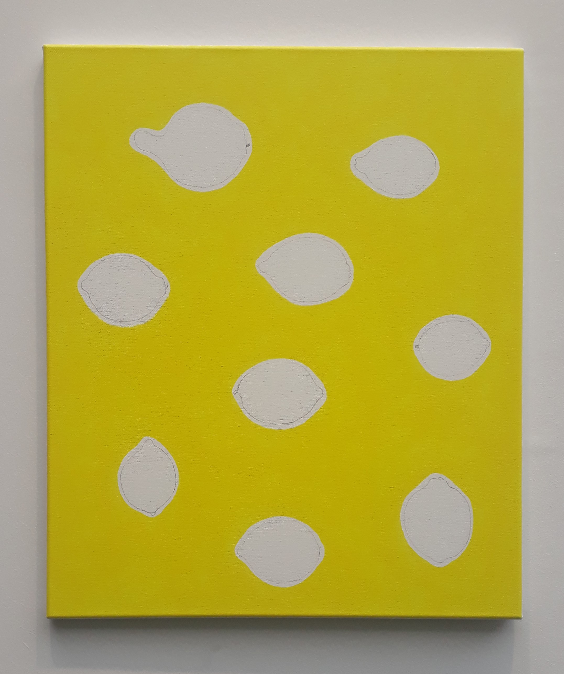


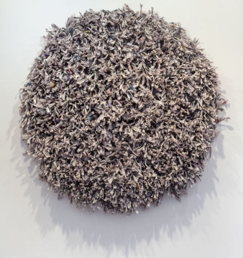 Tiwani’s excellent introduction of American artist Maren Hassinger’s long-running practice to UK audiences includes the mandala-like Hand in Hand, 2019, made by bundling and twisting thousands of pages of the New York Times, so suggesting that some order and maybe even tranquillity has been brought to the avalanche of happenings reported.
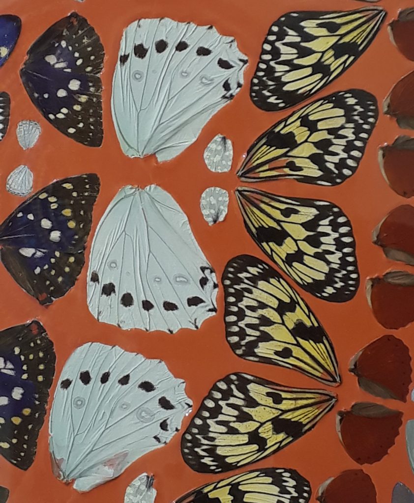
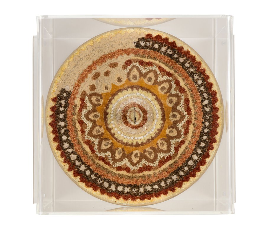 Mandalas are your lot at White Cube, but Song Dong’s Same Bed Different Dreams at Pace has several streams of work using quotidian materials in what may well be the best commercial show in London now (Mona Hatoum at the other White Cube is one rival). In the Mandala series, his reference is the ritual whereby the circle is in a painstakingly created by laying down intricately patterned granules of crushed coloured stone, only to be swept away once completed. Song twists this by using pulses, seeds and spices, elevating seasoning to spiritual significance and suggesting the parallels in the preparation and consumption of food. The presentation is dramatised by knives, not only summoning the kitchen but also a fight he once had in stark contrast to meditative calm (Mandala 07, 2015).
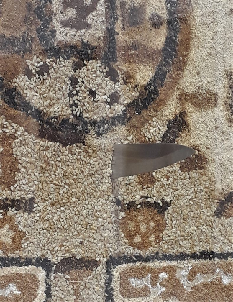
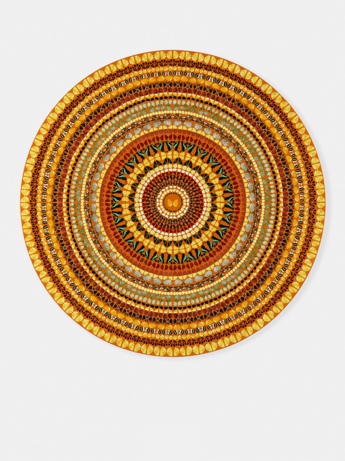
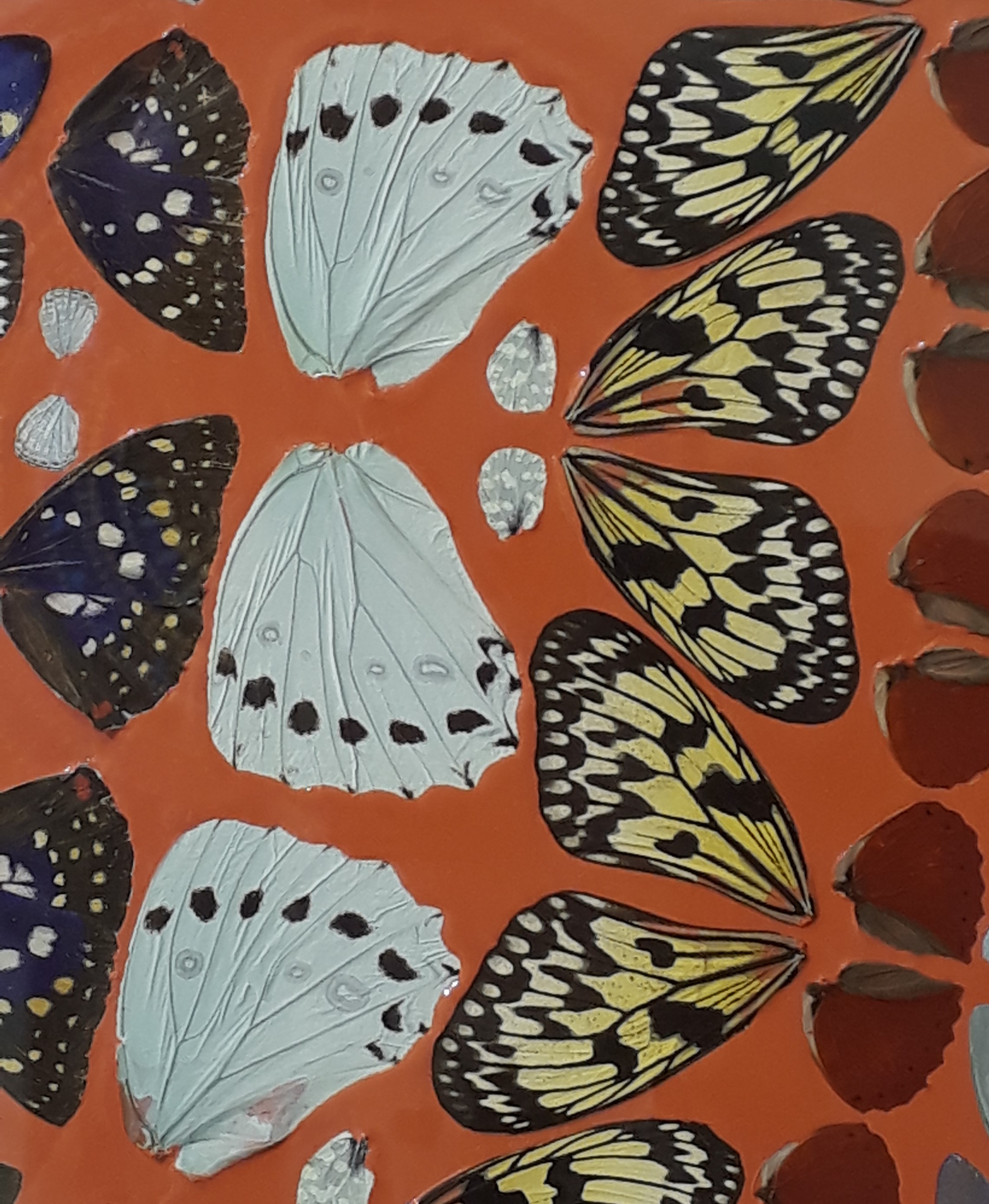
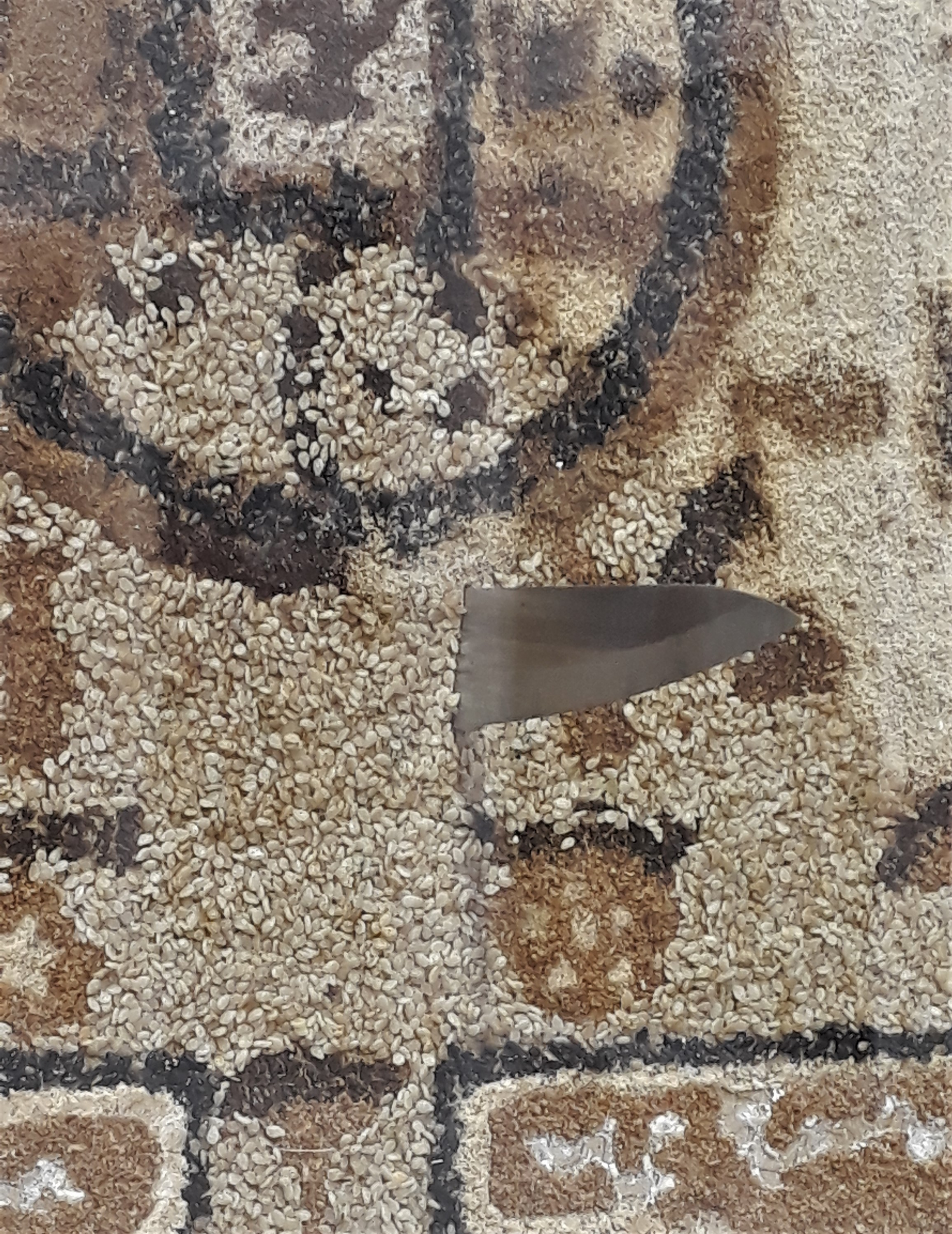
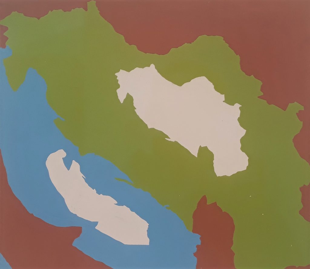 It’s a sign of the pervasive effect of global warming on our current thinking that as I wandered round Frieze Masters, I found works from the 70’s, 80’s and 90’s which seemed plausibly related to the theme – whatever their original agenda:
OHO: ‘The Melting of the Snow and Ice in Yugoslavia’ 1969 (top image). In this witty conceit from the Slovene collective (active 1962-71), the remaining snow takes the forms of the Yugoslav national outline and of the Adriatic Sea, implying that both were once fully frozen. What could have been a Cold War jibe at the time seems more connected now to the ice-to-sea-conversion of climate change.
It’s a sign of the pervasive effect of global warming on our current thinking that as I wandered round Frieze Masters, I found works from the 70’s, 80’s and 90’s which seemed plausibly related to the theme – whatever their original agenda:
OHO: ‘The Melting of the Snow and Ice in Yugoslavia’ 1969 (top image). In this witty conceit from the Slovene collective (active 1962-71), the remaining snow takes the forms of the Yugoslav national outline and of the Adriatic Sea, implying that both were once fully frozen. What could have been a Cold War jibe at the time seems more connected now to the ice-to-sea-conversion of climate change.
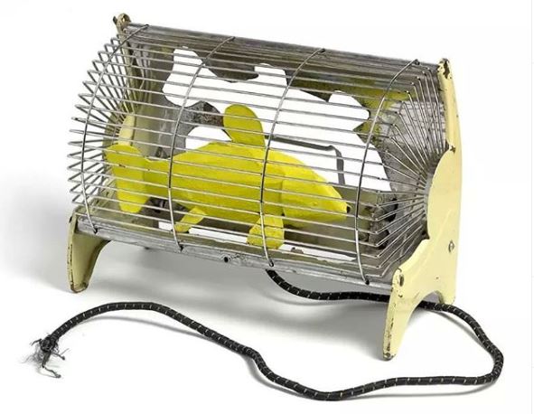 Bill Woodrow ‘Electric Fire with Yellow Fish’, 1981. Yet another of the seemingly endless supply of those brilliant early works by Woodrow in which new forms emerge from metal items. Is this one way to cook your supper? I guess, but it’s also another old work which might now be recast as carrying a message about global warming.
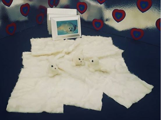 General Idea: ‘Hope Chest#, 1992. This consists of acrylic ‘fun fur’, three stuffed acrylic toy Harp seal pups, plus found polystyrene cooler with laminated placemat. This was made in the early days of protest against seal culling: the hope proved justified as that was controlled, but maybe the cubs will now be stranded on disappearing ice. It also acts as one of many self-portraits of the Canadian collective active as General Idea from 1967 to 1994: Felix Partz, Jorge Zontal and AA Bronson. It is, rather tidily, self-packing, brought to the fair in the cooler which forms part of the work and becomes a ‘hope chest’ (the trans-Atlantic equivalent of the ‘bottom drawer’ traditionally used to collect items such as clothing and household linen, by unmarried young women in anticipation of married life).
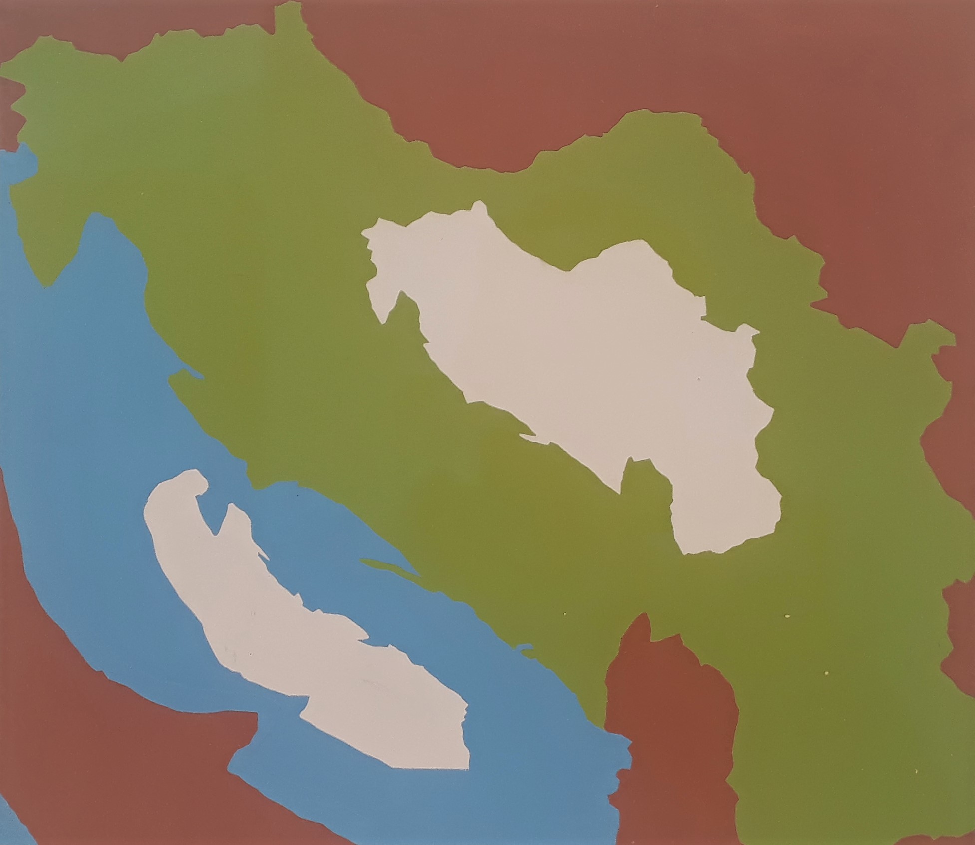
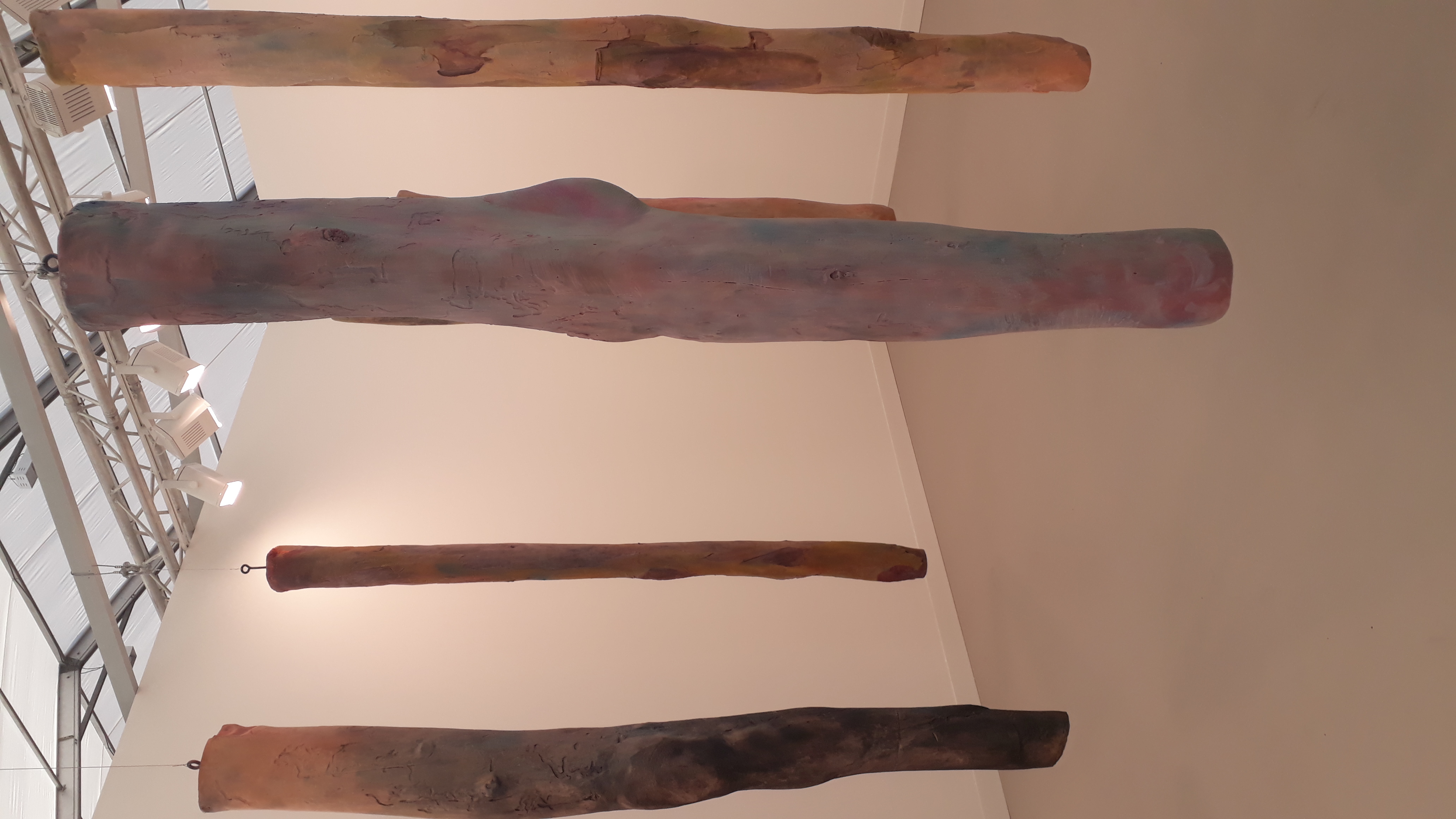
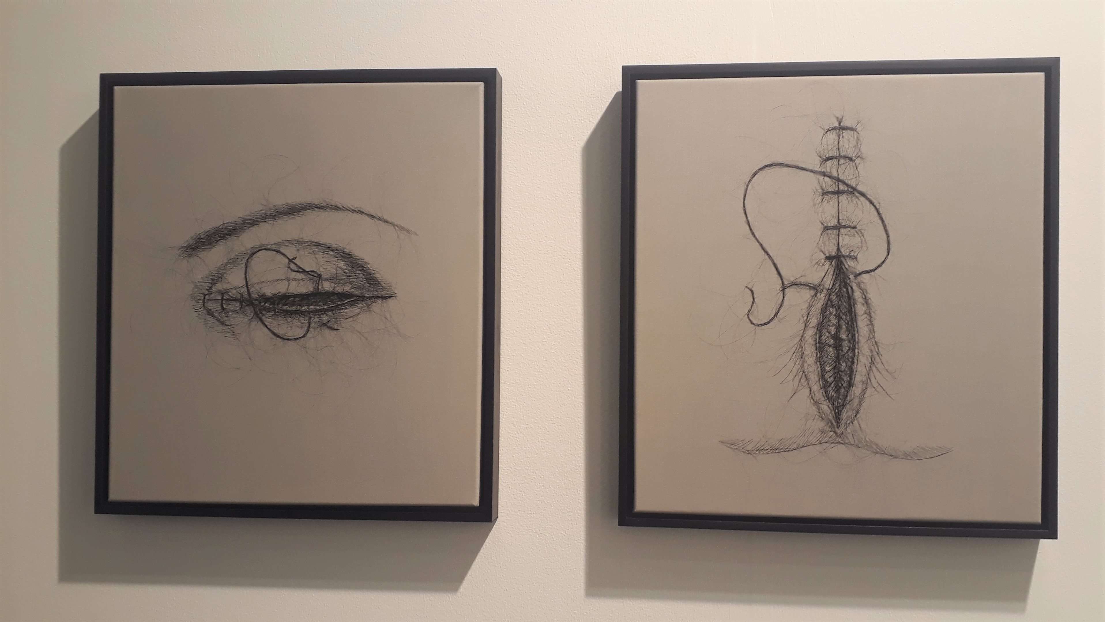

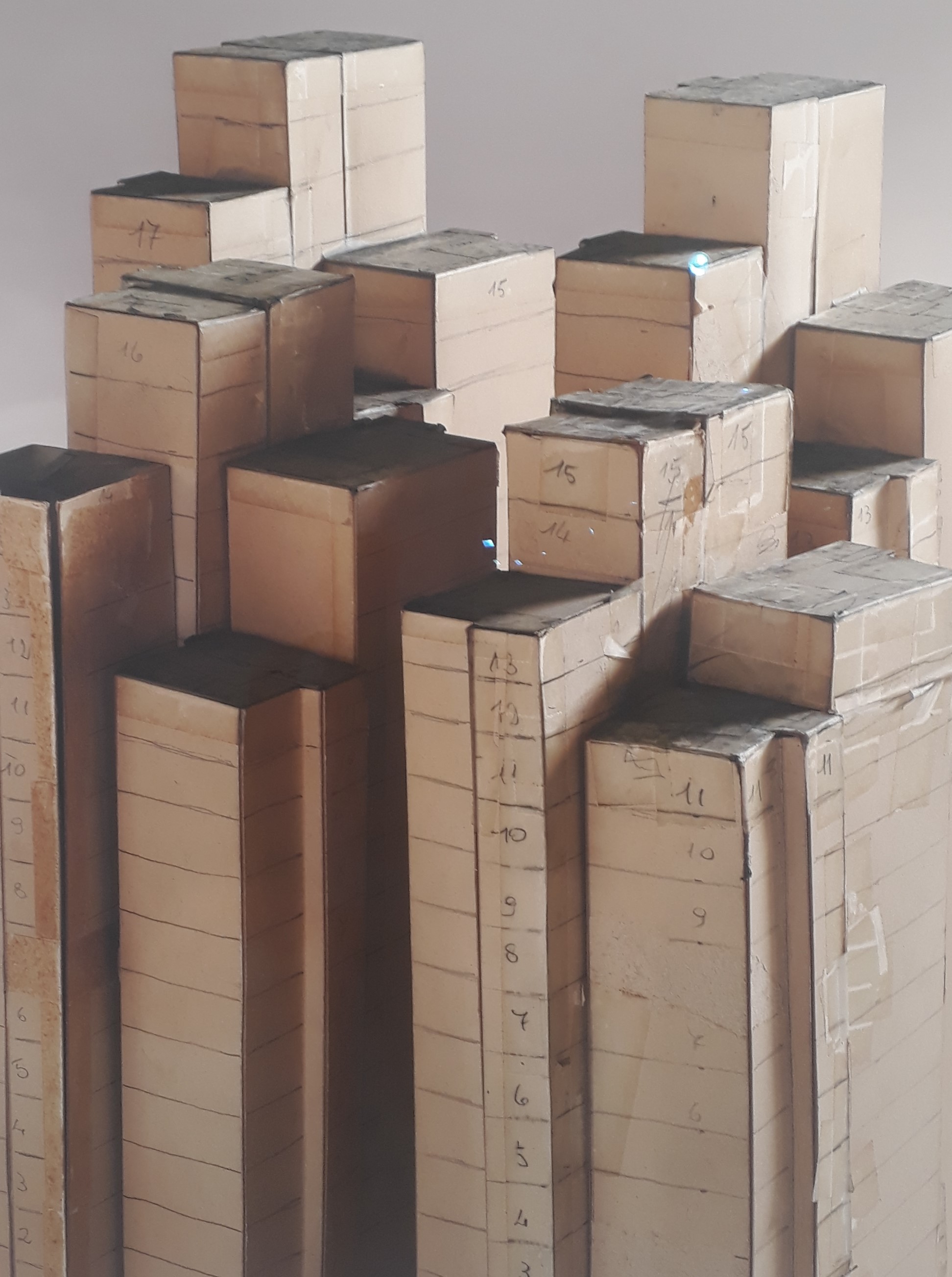

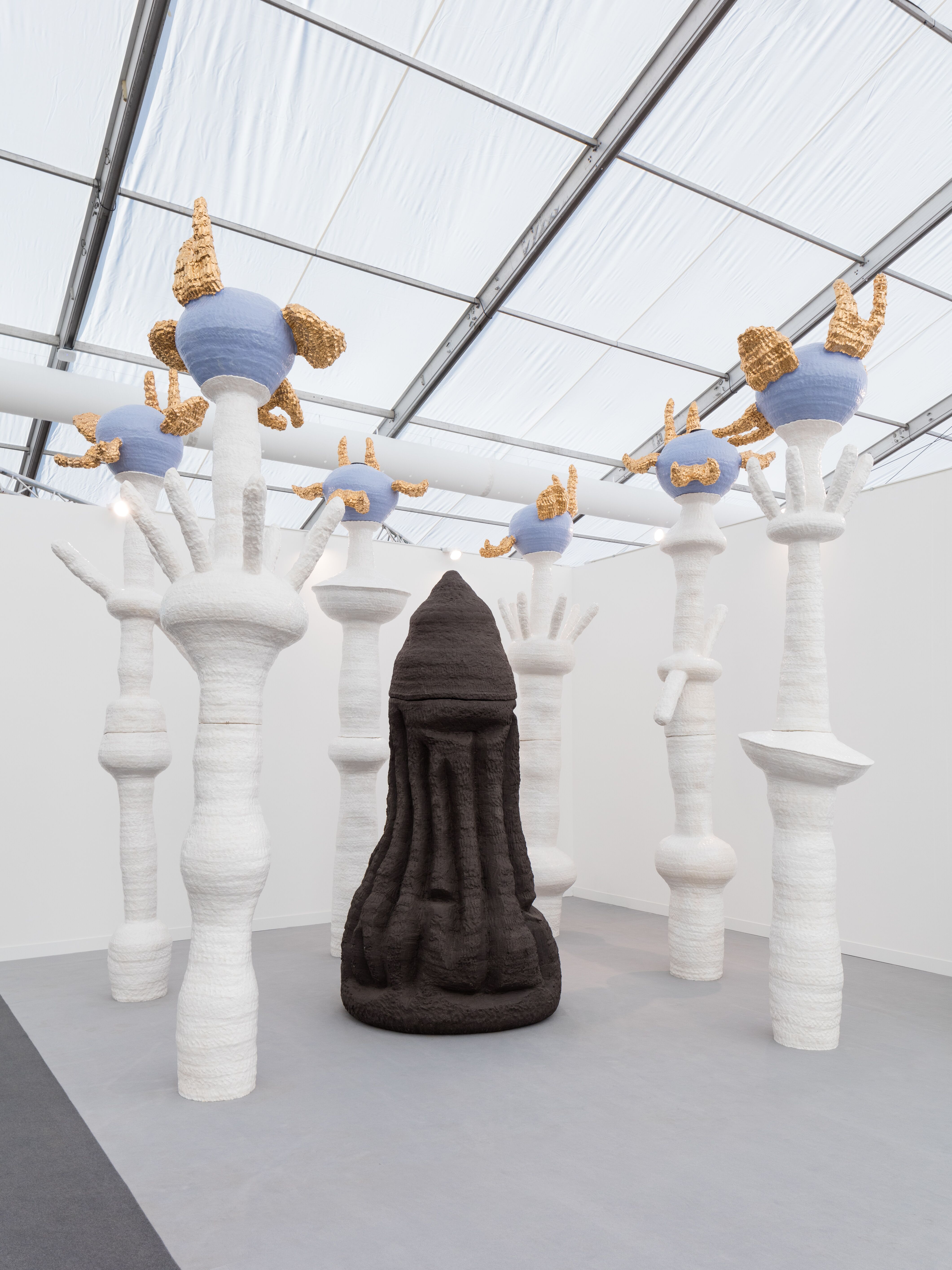
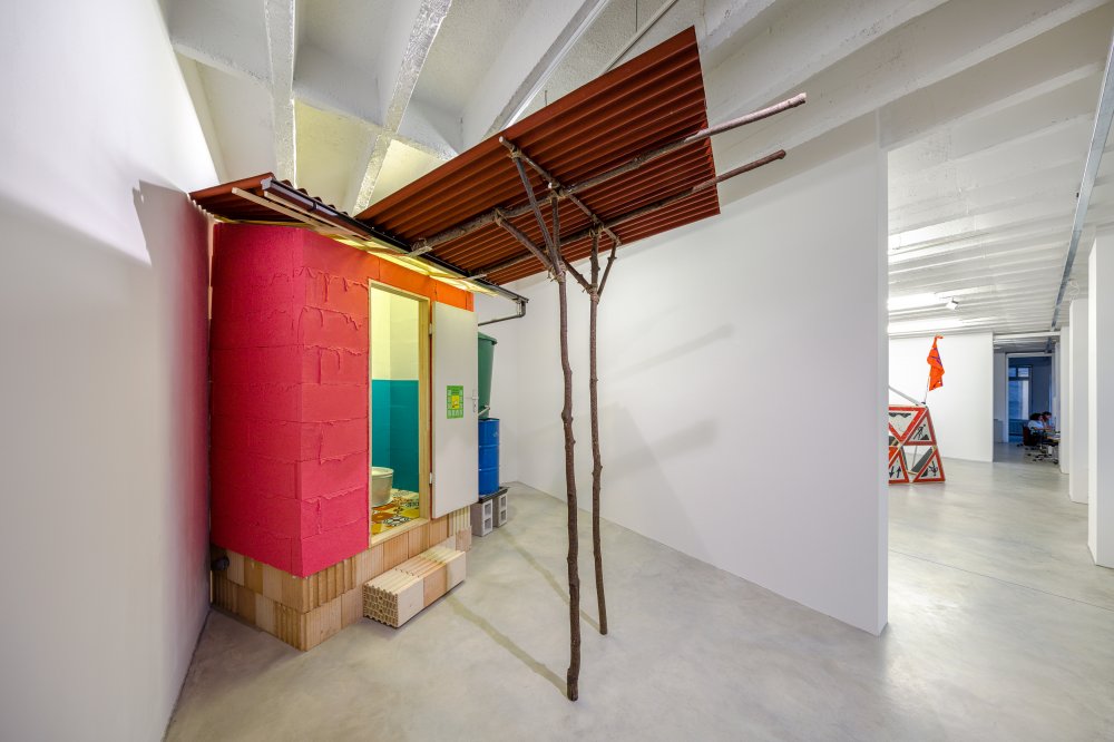
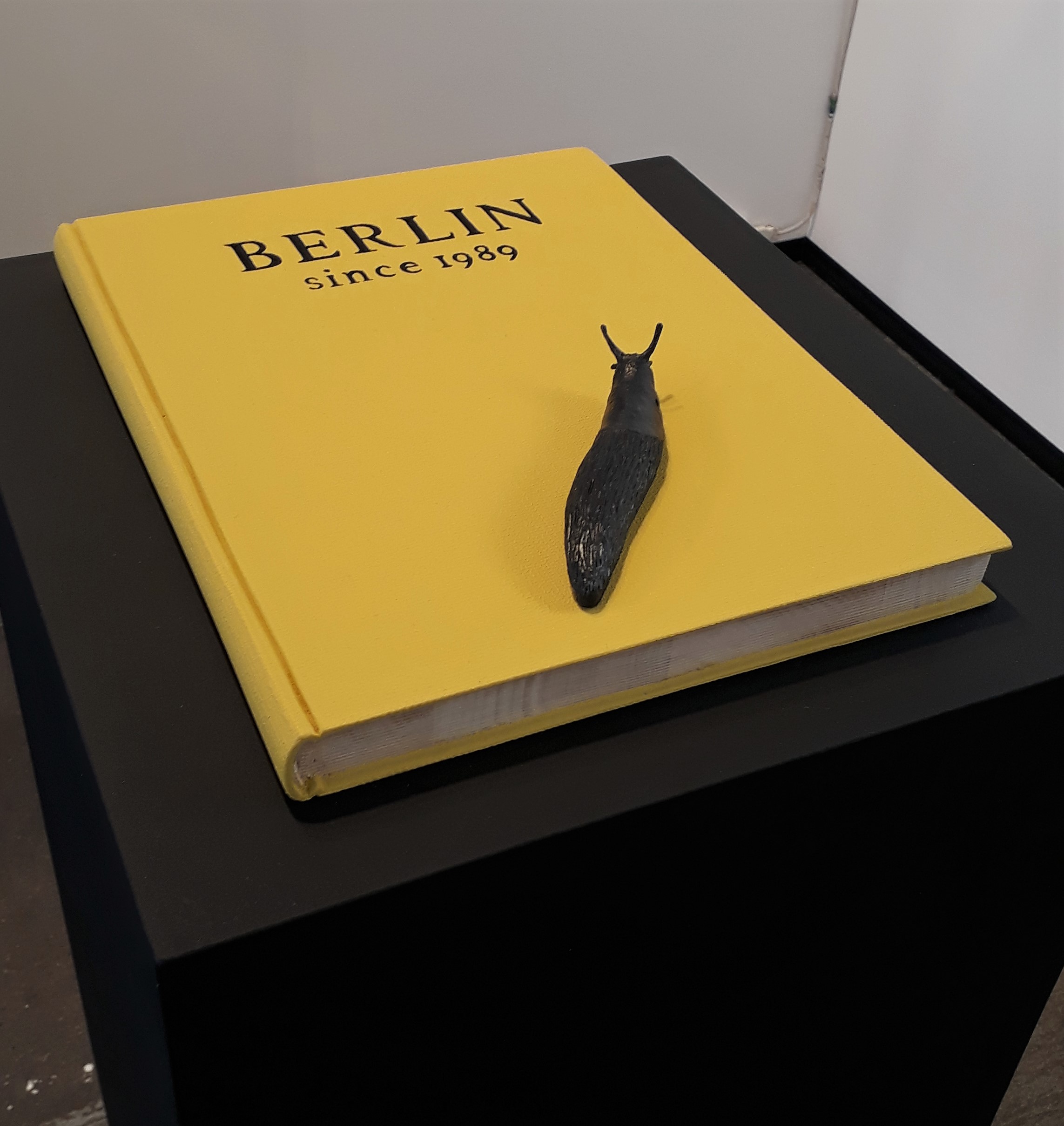
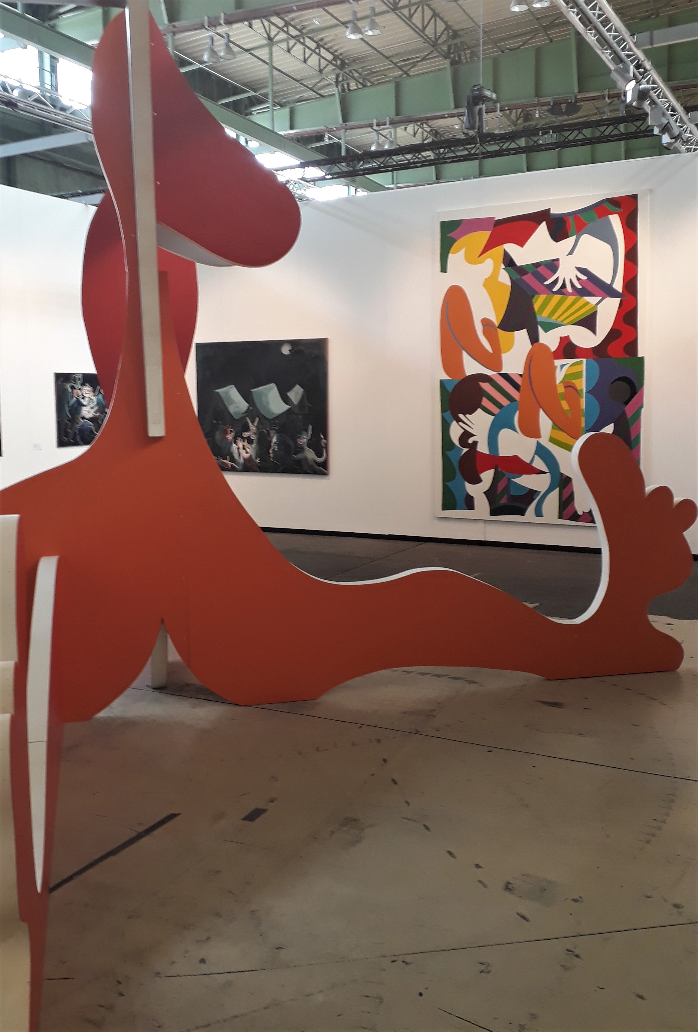
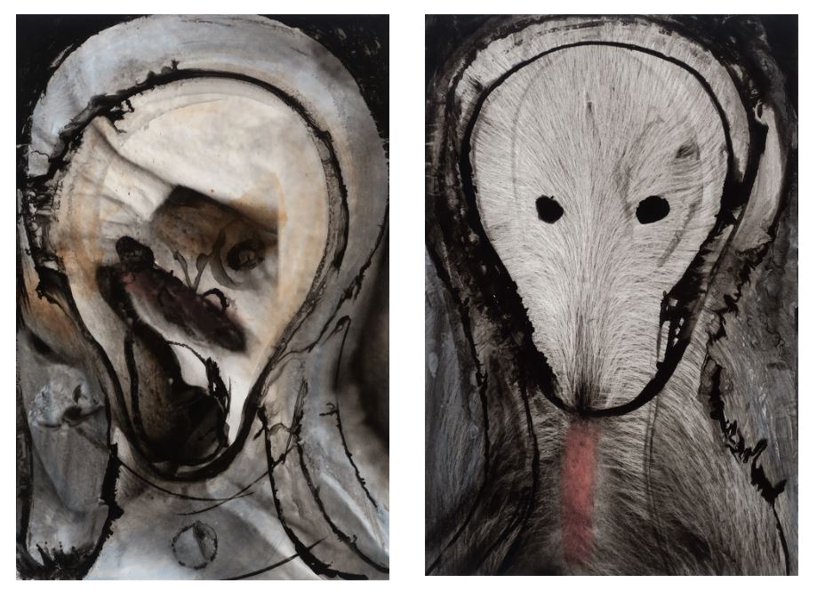

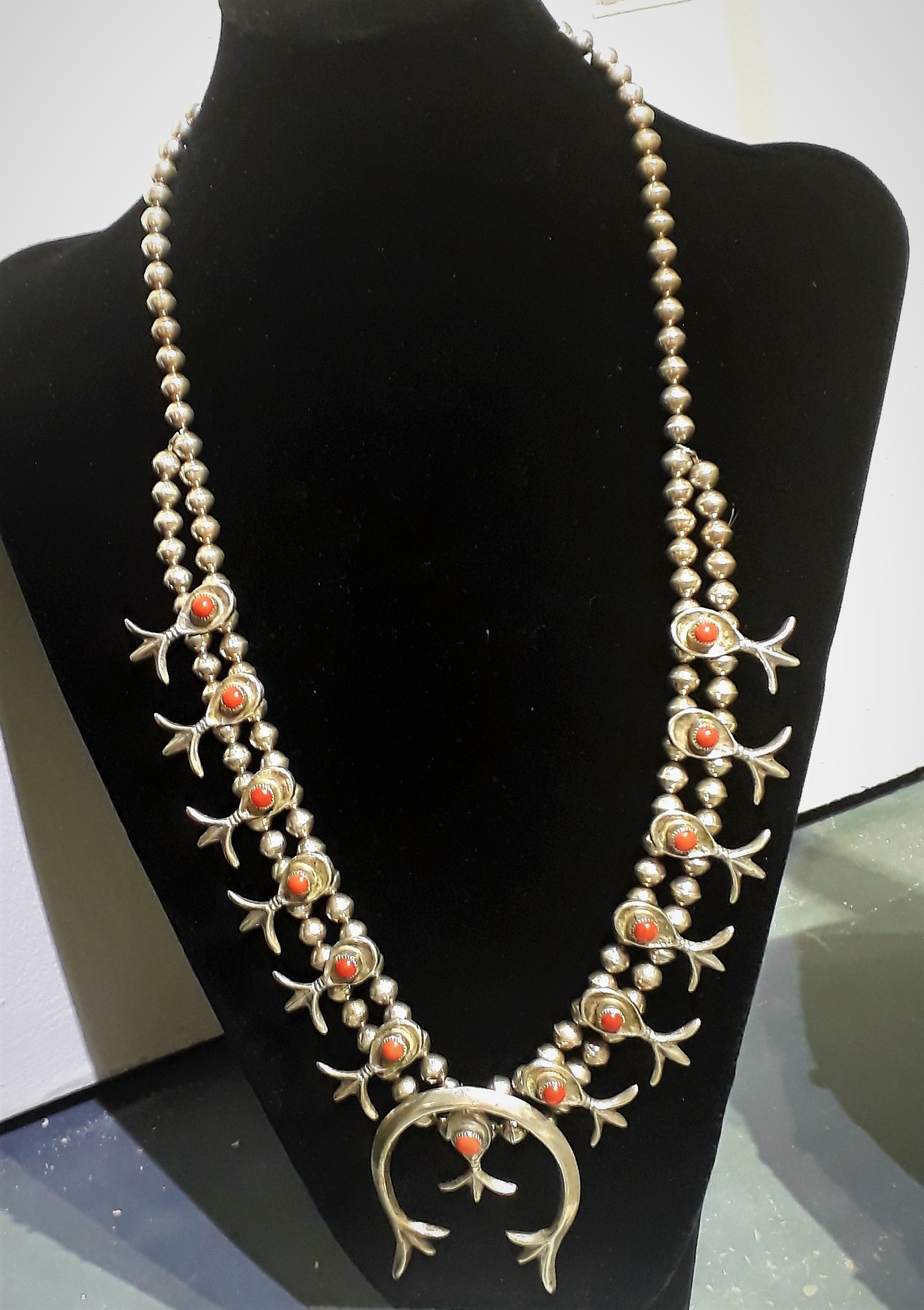
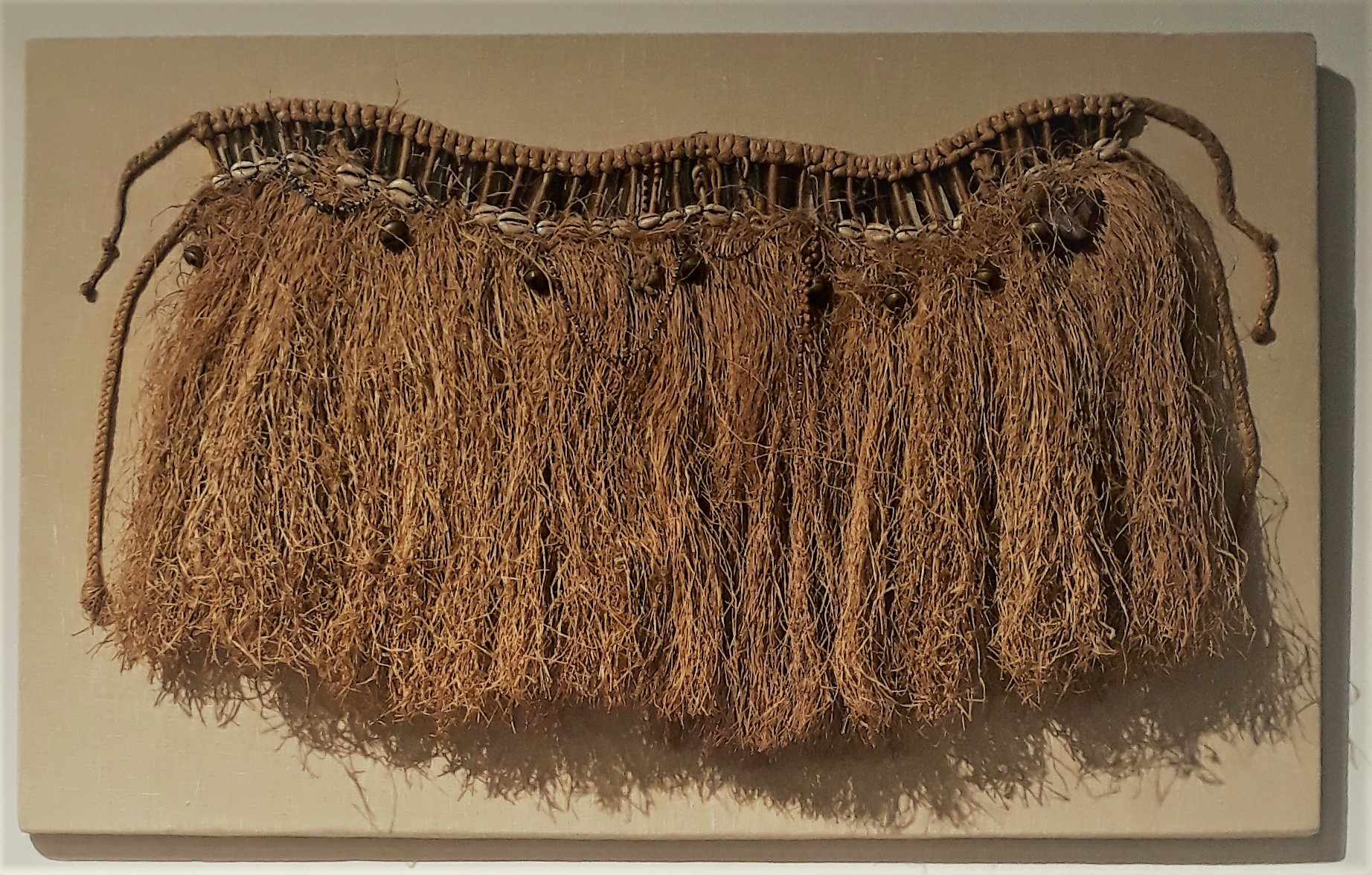
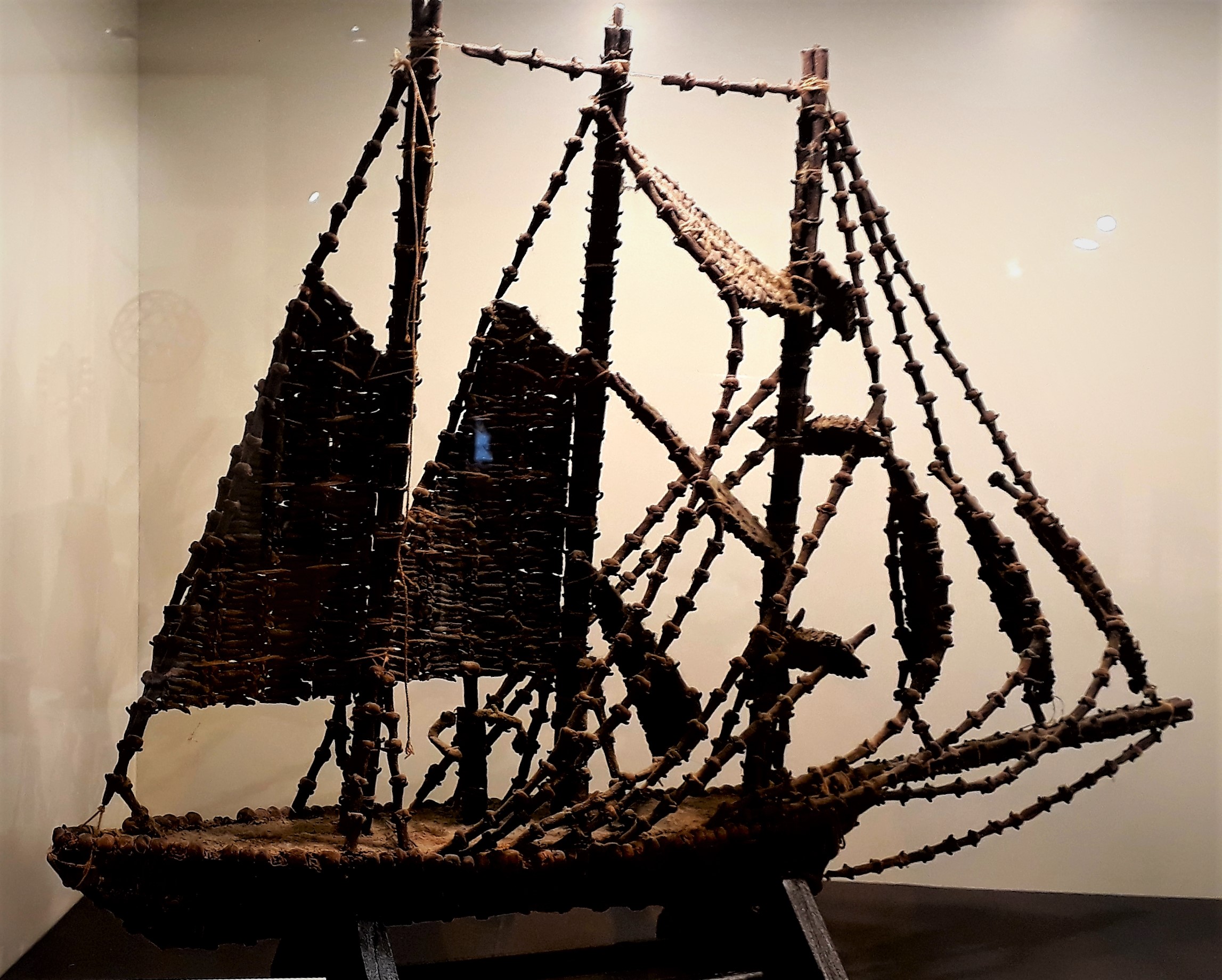
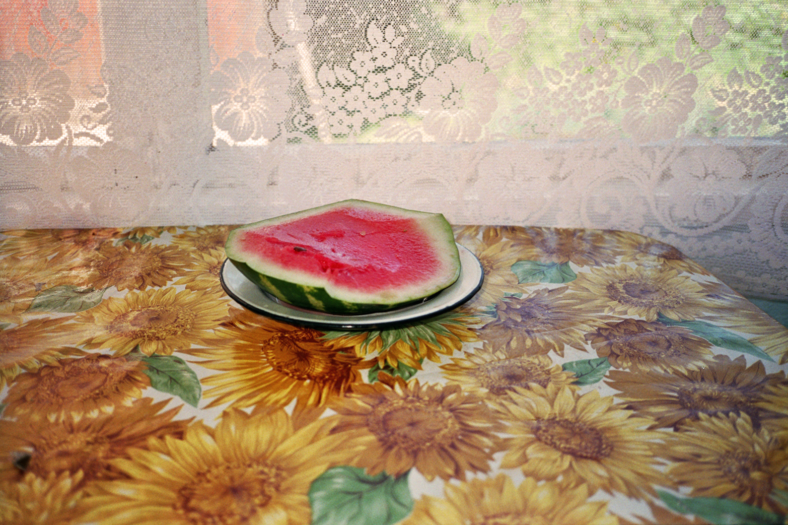
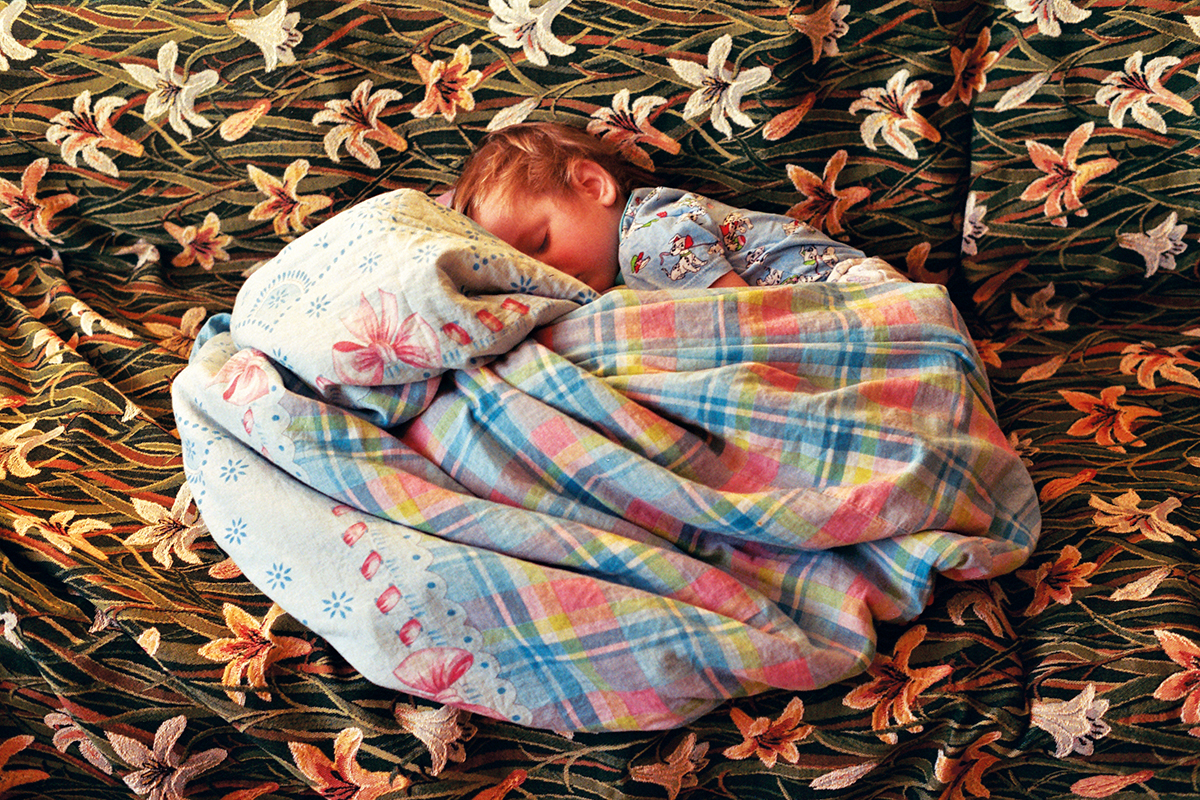
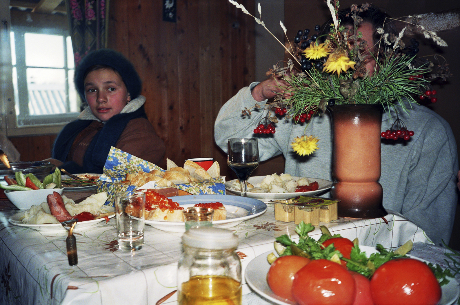
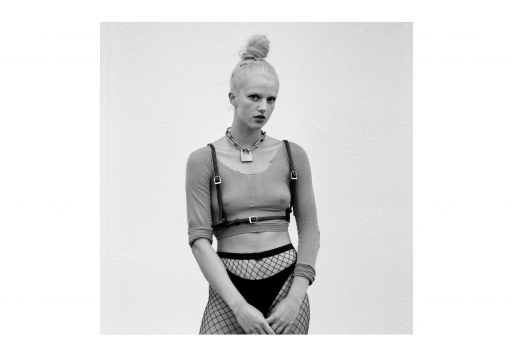
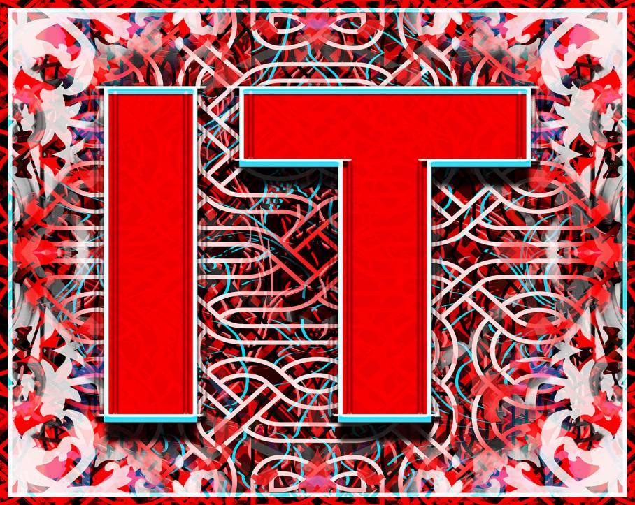
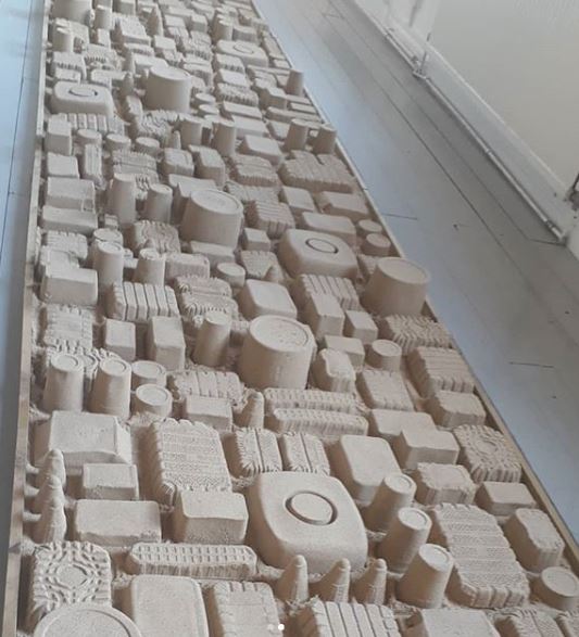
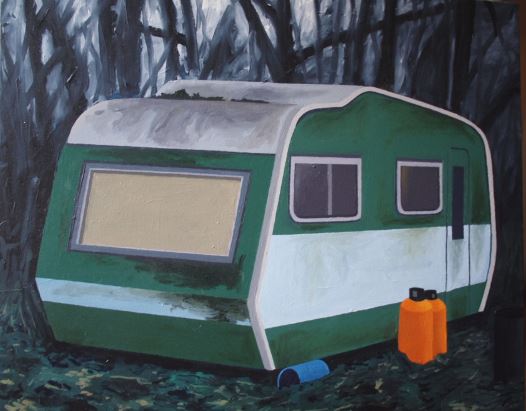 .
.


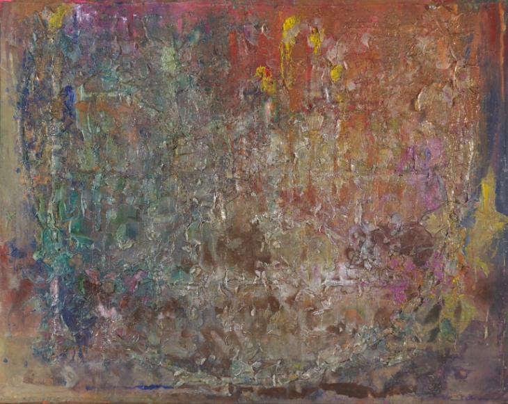
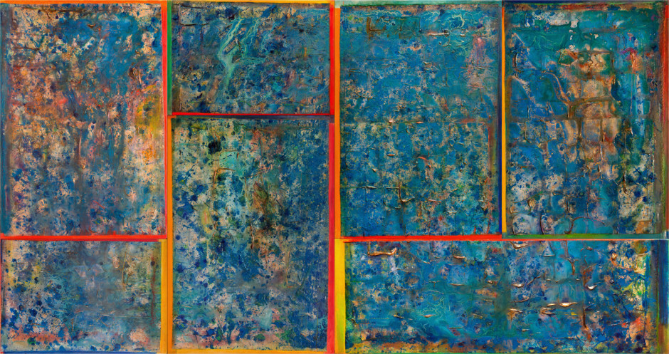


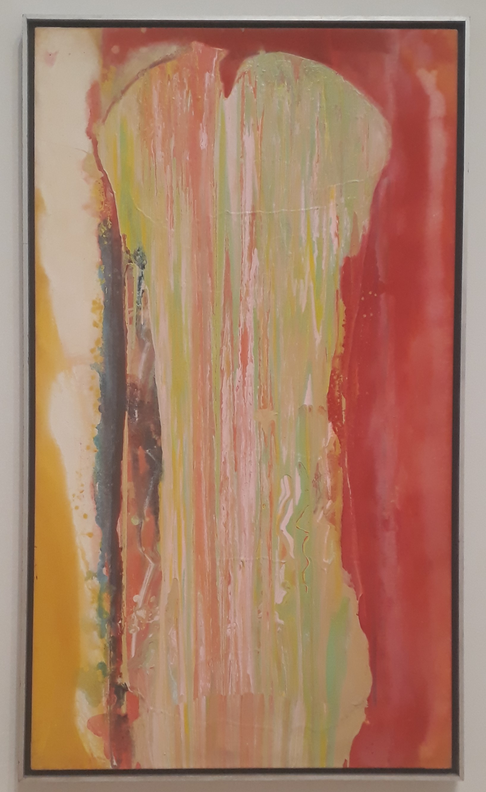

 The National Portrait Gallery’s mixture of history, people and art can is currently at its strongest. The pay-for exhibition, of Cindy Sherman, is a convincing presentation of 40 years of self-images which includes some fascinating rarely-seen early works and new-to-Britain late works as well as her most seminal series, including all 70 ‘screen tests’. This 1977 triptych from 'Cover Girls', for example, gives us a magazine cover as was, with Sherman substituted straight, and with Sherman ‘goofing’ to mock the original’s lifestyle aspirations.
 The 17 photos of ‘Air Shutter Release Fashions’, 1975, see a naked Sherman wittily ‘dressing herself’ in a wide range of clothing created simply by manipulating the shutter release lead integral to self-portraiture at the time. Various free offerings are also worth mentioning.

 Art Basel is, I’d say, a bit safer than usual this year: hardly any film, plenty of ‘another one of those’ moments, artists from the Venice Biennale out in force. But if course there are plenty of works of fresh interest. Here are four things I liked among the thousands at 290 galleries:
Rebecca Ackroyd: ‘EAVE!’, 2019 at Peres Projects, Berlin (Image Above)
This is the – necessarily long-legged – body as tower block, the title suggesting the biblical Eve as well as making an oddly singular reference to the edge of a roof. The windows and visor set up gazes and exclusions. Ackroyd’s figure seemed to be taking shelter in a separated-off part of the Peres booth – perhaps a take on homelessness, of your house and being simply your body.
Evan Holloway: ‘Lyre Form’, 2019 at David Kordansky Gallery, Los Angeles
Art Basel is, I’d say, a bit safer than usual this year: hardly any film, plenty of ‘another one of those’ moments, artists from the Venice Biennale out in force. But if course there are plenty of works of fresh interest. Here are four things I liked among the thousands at 290 galleries:
Rebecca Ackroyd: ‘EAVE!’, 2019 at Peres Projects, Berlin (Image Above)
This is the – necessarily long-legged – body as tower block, the title suggesting the biblical Eve as well as making an oddly singular reference to the edge of a roof. The windows and visor set up gazes and exclusions. Ackroyd’s figure seemed to be taking shelter in a separated-off part of the Peres booth – perhaps a take on homelessness, of your house and being simply your body.
Evan Holloway: ‘Lyre Form’, 2019 at David Kordansky Gallery, Los Angeles
 What are the bulbous shapes animating the surface of this classical myth-referencing bronze, part of a recent move into ‘outside sculpture’ by LA artist Evan Holloway? They are casts of spent batteries, which he has previously employed as the ultimate useless item, and one speaking to environmental concerns. Here, though, the batteries’ chemical decay is perversely memorialized to make for a charged – and yet uncharged – take on what will last.
Tacita Dean: ‘The Lady Painters’, 2019 at Marian Goodman Gallery, New York, London, Paris
What are the bulbous shapes animating the surface of this classical myth-referencing bronze, part of a recent move into ‘outside sculpture’ by LA artist Evan Holloway? They are casts of spent batteries, which he has previously employed as the ultimate useless item, and one speaking to environmental concerns. Here, though, the batteries’ chemical decay is perversely memorialized to make for a charged – and yet uncharged – take on what will last.
Tacita Dean: ‘The Lady Painters’, 2019 at Marian Goodman Gallery, New York, London, Paris
 One stream of Tacita Dean’s practice uses old postcards typically sourced from the flea markets of her home city, Berlin. Finding six which were identified as ‘lady painters’ in a male fantasy presentation of female dalliance, she intervenes to asserts the primacy of the paint over the restricting construction of the artist’s image.
Carl Cheng: ‘Alternative TV #5’, 1974 at Philip Martin Gallery, Los Angeles
One stream of Tacita Dean’s practice uses old postcards typically sourced from the flea markets of her home city, Berlin. Finding six which were identified as ‘lady painters’ in a male fantasy presentation of female dalliance, she intervenes to asserts the primacy of the paint over the restricting construction of the artist’s image.
Carl Cheng: ‘Alternative TV #5’, 1974 at Philip Martin Gallery, Los Angeles
 The widely travelled Asian-American Carl Cheng made a range of ‘nature machines’ in LA, Japan, Indonesia and China during the 1970’s. He stated, rather presciently, that they were intended to ‘model nature, its processes and effects for a future environment that may be completely made by humans’. They included an erosion machine, which wears away hand-made ‘stones’, and this restful alternative to television, which proposes a return to nature I preference to the artificial worlds in which we get lost.


 Roman Stanczak turned a private jet inside out for ‘flight’ in the Polish Pavilion: the cabling was outside and the wings folded in. Ah yes, the problems of an economy going into reverse even as the rich get richer.
Which way up?
Roman Stanczak turned a private jet inside out for ‘flight’ in the Polish Pavilion: the cabling was outside and the wings folded in. Ah yes, the problems of an economy going into reverse even as the rich get richer.
Which way up?
 Ludovica Carbotta’s ‘Monowe (The Terminal Outpost)’, 2017 is a watch tower, but upside-down. That stands for a world in which their function is redundant – which sounds positive until you realise that the imagined condition informing her body of work: that she is the last person in the city of Monowe.
Why isn’t it finished?
Ludovica Carbotta’s ‘Monowe (The Terminal Outpost)’, 2017 is a watch tower, but upside-down. That stands for a world in which their function is redundant – which sounds positive until you realise that the imagined condition informing her body of work: that she is the last person in the city of Monowe.
Why isn’t it finished?
 Maria Loboda’s ’Lord of Abandoned Success (L’Argile Humide)’, 2017 is a group of clay lumps which seem ready to be shaped into heads. Are they unfinished? No, they must be completed sculptures posing as unfinished, and wittily half-dressed to boot.
Is that really possible?
Maria Loboda’s ’Lord of Abandoned Success (L’Argile Humide)’, 2017 is a group of clay lumps which seem ready to be shaped into heads. Are they unfinished? No, they must be completed sculptures posing as unfinished, and wittily half-dressed to boot.
Is that really possible?
 Djordje Ozbolt’s excellent Serbian Pavilion, themed around how memories become unreliable with the passage of time, included a sculpted figure apparently standing on its penis. Quite a distortion of the event recalled, I suspect. In some sort of mirror reflection, by the way, the salacious words to the Brazil Pavilion’s extravaganza of ‘swingueira’ dancing – at least as sub-titled – said at one point ‘Tonight I’m gonna throw my pussy in the air’!
What the fuck?
Djordje Ozbolt’s excellent Serbian Pavilion, themed around how memories become unreliable with the passage of time, included a sculpted figure apparently standing on its penis. Quite a distortion of the event recalled, I suspect. In some sort of mirror reflection, by the way, the salacious words to the Brazil Pavilion’s extravaganza of ‘swingueira’ dancing – at least as sub-titled – said at one point ‘Tonight I’m gonna throw my pussy in the air’!
What the fuck?
 Alexandra Bircken’s ‘Eva’ 2013 is a gleefully oppositional version of a sex doll: being cast in bronze, I think we can take it to be impenetrable. And I can include her twice, because the hacked motorbike ‘Incubo’ 2019 seems to be set up to carry its own engine, rather than a passenger.
 Art writer and curator Paul Carey-Kent sees a lot of shows: we asked him to jot down whatever came into his head

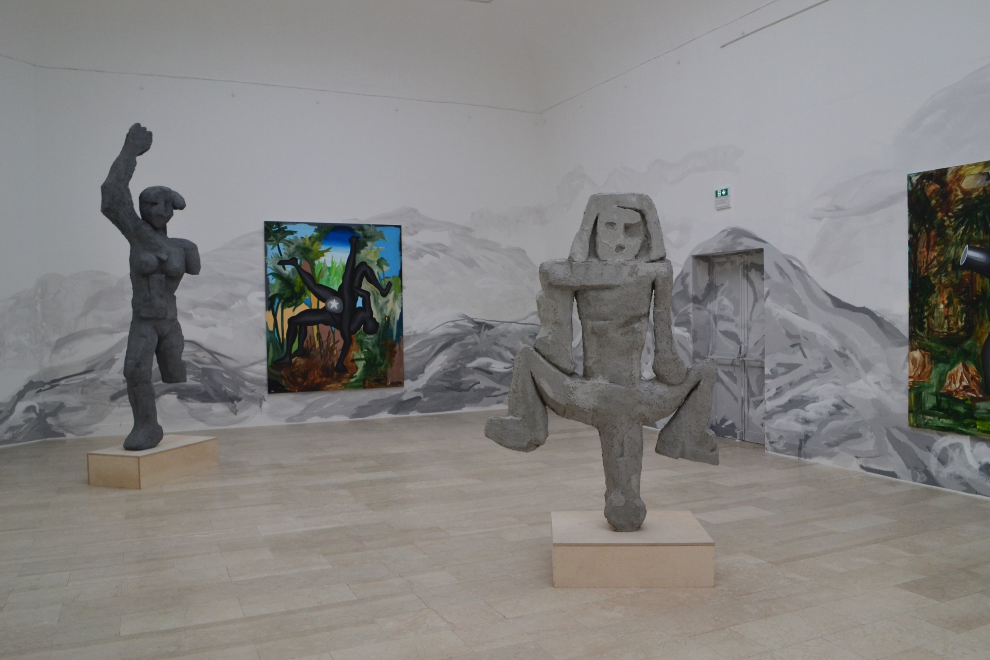
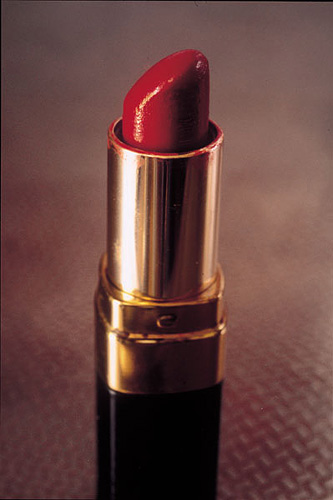
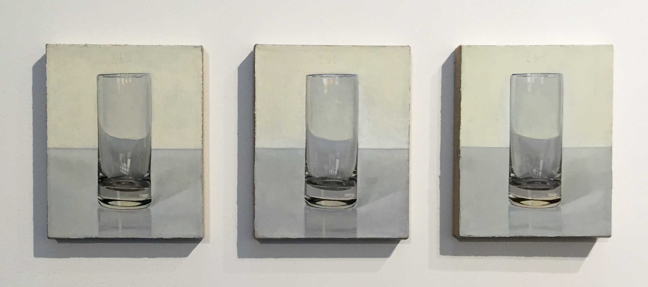
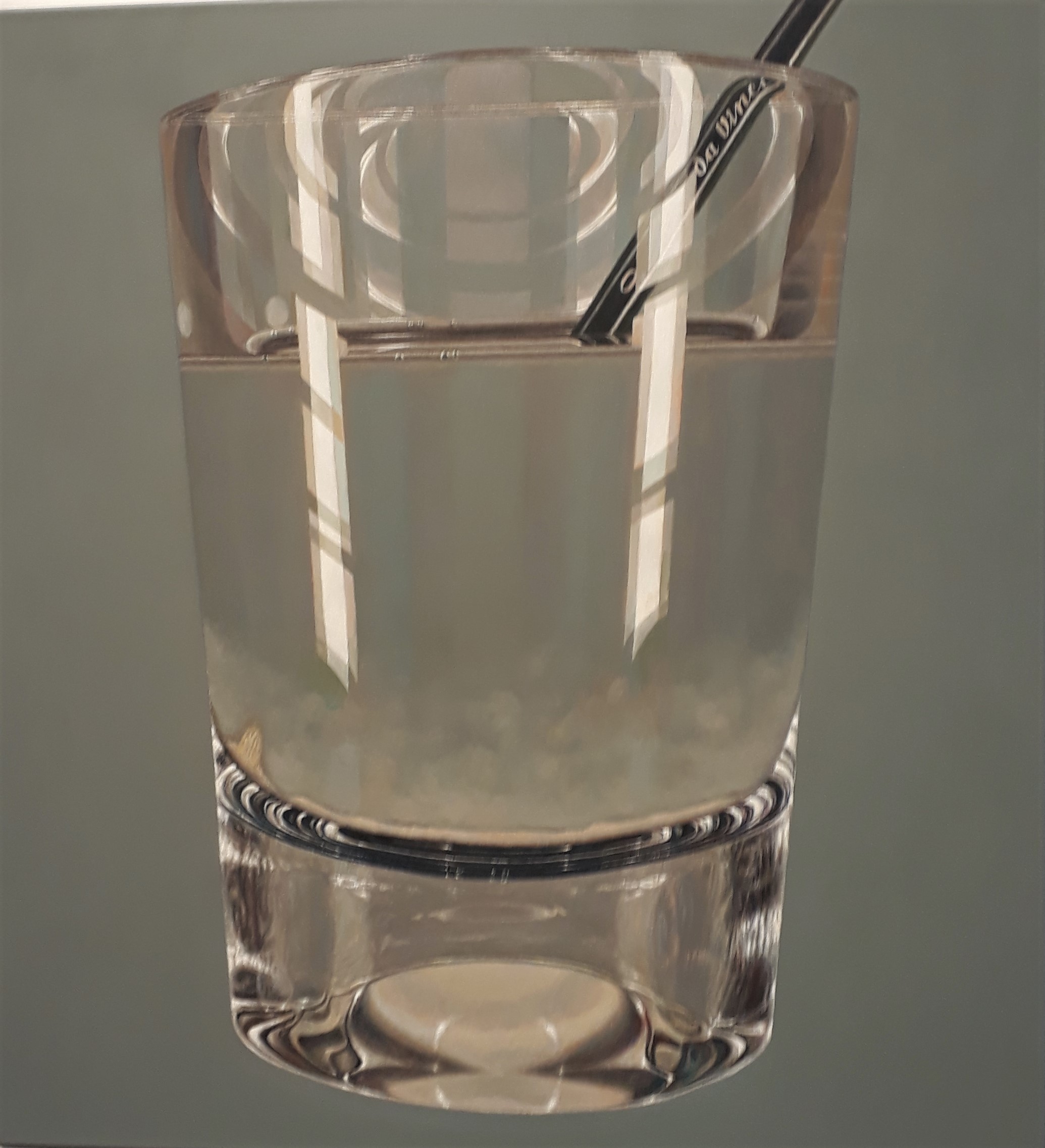
 Dieter Krieg: from an installation of ‘The Void is Nothing’ at Kolumba, Cologne
  Sophie Layton aligning the paper for a Japanese woodblock print
 Sophie Layton: ‘Refracting Light VI’, 2019
 Preparing to apply paint with a roller, European style
 Celine Bodin: ’19th Century’ from The Hunt series, 2018

 Jessica Spence: ‘Braids and Barrettes’, 2018
  Celine Bodin: ’60’s (inverted)’ from The Hunt series, 2018