Writer and curator Paul Carey-Kent collects various writings here, including his weekly column for FAD art news, monthly interviews for Artlyst and texts from the shows he has curated. He currently writes freelance including for Art Monthly, Seisma, STATE, Border Crossings and World of Interiors. See Instagram for his daily choice from current shows. Some non-art content, such as photo-poems, is also included.
There’s a surfeit of new things to see just now, as pretty much every commercial gallery in London – and there are a couple of hundred worth seeing – has opened a show which, even if isn’t new, I haven’t seen before. It’s lucky, perhaps, that institutional spaces don’t open until 17 May, so spreading the glut out…
The locked down viewing experience is different:
Less convenient, as you may need to make an appointment or queue, though you can in practice just walk into many shows
No old-style sociably crowded openings with drinks and the artist present
Fewer paper print-outs, more need to read your phone
Facemasks will be worn
But those features – masks apart – have their merits:
No danger that the number other visitors will diminish the experience of the art
Easier to talk to gallerists / artists if they are there
Although it’s more awkward to read via your phone, the quality of online documentation of shows has undoubtedly been enhanced
There are also some advantages for gallerists: having gone to the trouble of making an appointment, people are likely to stay longer and engage with the art; and both printing paper and old-style openings represent a cost avoided, as does flying foreign artists to Britain – ‘installation by Zoom’ is the thing now.
Anyway, here’s a sample from enjoyable ‘locked down viewing’.
Lucy Sparrow at Lyndsey Ingram. The gallery becomes a fully stocked chemist filled with a vast range of felt pharmaceuticals served by the white-coated Lucy Sparrow herself. This opened on 12 April but could, presumably, have opened earlier as an essential shop. The pre-booked slots are all taken, but I had to queue only briefly to get in without one. Shown: imitation products (top image)
Rafal Zajko at PUBLIC Gallery: the space on Middlesex Street allows for convenient gathering outside, with the artist able to talk to visitors while up to six people are allowed inside in turn – not a bad opening model (and a fascinating show across three floors). Shown: installation of (what else?) works melting frozen synthetic urine.
Conditions favour the smaller galleries, e.g. Yamamoto Keiko Rochaix and Union Pacific – next to each other on Goulston Street in Aldgate – have interesting exhibitions with crowds unlikely. Shown: Katherina Olschbaur: ‘Humility and The Other One in Me’ 2020-21 at Union Pacific (above) and Magda Stawarska-Beavan install shot at Yamamoto Keiko Rochaix (below)
Martin Kippenberger: ‘Fred the Frog Rings the Bell’, 1990 – wood, steel nails 130 x 111 x 23 cm
Skarstedt’s fascinating new exhibition Painter / Sculptor brings together a sculpture and a painting by nine artists who, says the gallery, ‘have mastered both painting and sculpture to formulate a unique artistic language’: Alberto Giacometti, Willem de Kooning, Martin Kippenberger (see his startling ambiguously-toned vision of himself as a persecuted heavy-drinking artist), Georg Baselitz, Eric Fischl, George Condo, Jeff Koons, Dana Schutz and KAWS. The highlight is a room in which Giacometti’s plaster of his brother, Diego, looks across to a painting of his mother; and de Kooning’s ‘Large Torso’ (one of only 22 bronzes he made) faces a late painting. Both were masters of both media, but there’s no doubt that the former was first and foremost a sculptor, the latter primarily a painter.
Installation view at Skarstedt with Giacometti and de Kooning
That raises the question: just how many great artists are genuinely equal in the reputations of their painting and sculpture? Perhaps Leonardo would be, had more of his sculptures been realised or survived, but the only pre-modern figures I can think of as plausible contenders are Michelangelo and Degas. In more recent times, you could make a case for Picasso, Modigliani and Rauschenberg, or if you expand ‘painting’ to mean ‘2D work in general’, Bourgeois and LeWitt. It would probably be more accurate to describe Matisse and Warhol, like Kippenberger and de Kooning, as painters who were also sculptors; and Duchamp, like Giacometti, as a sculptor who also painted. Koons and Hirst make – or, at least, ask to have made – plenty of paintings, but it’s not the defining area of their work. Skarstedt’s show could plausibly have included Yayoi Kusama and Takashi Murakami as the most ‘balanced’ current practitioners. And a recent possible addition is sculptor Thomas Houseago, who has just recently started to show paintings.
As non-essential shopping becomes a normal activity again, one question is: which businesses won’t reopen? No doubt some galleries will close, but to counter that there are some new developments. Sticking with the Mayfair zone:
Cork Street has its mojo back, with gallery businesses helpfully prioritised by planning policy. Lisson’s extra space, Saatchi Yates, Holtermann Fine Art and South Africa’s top gallery, Goodman, have arrived to complement such established presences as Waddington Custot, The Mayor Gallery, Redfern, Messums – all of which have shows worth visiting at the moment. My illustration is from Flowers’ solo show of recent work by Bernard Cohen: his works are abstracting rather than abstract, and ‘Clown’ derives from a performance he saw as a child – he’s 87 – in which Kelly the clown stood in a multicoloured pool of overhead lighting that was adjusted to match his actions in seeming to sweep it away with a broom.
Ebecho Muslimova: ‘Fatebe Gift Basket’, 2020 at Galerie Maria Bernheim
Zurich gallerist Maria Bernheim has taken advantage of a shoe shop closure to mount – on Mount Street – a planned year of shows. Russian-born American artist Ebecho Muslimova features in the opening group show – she has made a strong impact with her corpulent alter ego Fatebe (say ‘Fat Eebee’) whom she describes as ‘like a surrogate sister who can do amazing feats that I physically or socially can’t’.
Thomas Dane have, for the first time, put on a show (revisiting Michael Landy’s ‘Break Down’ on its 20th anniversary) in the lower floor of their 3 Duke St space: add the ground floor (Arturo Herrera) and the first floor of 11 Duke St and there is the potential for three exhibitions.
Stephen Friedman has not only expanded into a third space on Old Burlington St, you can also see many of their artists at the House of Modernity, 14 Cavendish Square.
Rudolf Stingel: ‘Kirchner Wald im Winter 1925’ at Sadie Coles, 8 Bury St
Sadie Coles has opened another separately located space: next to Modern Art in Bury Street. The first show is decidedly deadpan: from the street you see what looks like a large painting by Kirkner. Entering, you find it is the only work in the show, and is actually Rudolf Stingel’s depiction of a Kirchner painting on the cover of a catalogue, complete with creases. And it’s much bigger than the original painting, let alone the catalogue.
Raphael Egil: ‘Gegenhang’, 2020 at Cassius & Co., 63 Kinnerton St
Talking of Kirchner, he’s an inspirational figures for Raphael Egil, who has a solo show at Cassius& Co., a brand new space in Belgravia. The white lines above are taken from Kirchner’s woodcut Der Baum (1920)
Commercial galleries are open again – as non-essential shops: mostly they advertise that as being by appointment, but simply turning up tends to allow admission most of the time under the ‘rule of six’. Curiously, my first two visits without appointment on my first trip to London this year featured three part vertically-stacked abstractions – that though I reckon you could go for years without coming across the form, and the only other example I could call to mind was by Ellsworth Kelly…
Armando, Jan Schoonhoven and Henk Peeters: Triptych (Nul): Rood-Wit-Blauw, 1964 at The Mayor Gallery
This collaborative twist on the theme combines the most characteristic languages of three Dutch artists involved in the loosely affiliative early 60’s ‘Zero’ group, active 1960-65: Armando’s painted sheet metal with nails, at once violent and reconstructive; Schoonhoven’s corrugated cardboard painted white in a regular, controlled but visibly handmade relief; and Henk Peeters’s feathers on cotton, sensitive yet impersonal. It acts as the ideal leitmotif for ‘Three Colours, Red-White-Blue’, in which 37 other abstract works take on those colours in mostly monochrome iterations which make up a cheering whole.
Ellsworth Kelly: Green Black Blue, 2004
Kelly (1923-2015) is the pre-eminent multi-panel colourfield painter, using separation and – sometimes, but not here – unusual shapes to give added substance to his colours. All the same, three panel conjunctions of this type are rare in his oeuvre.
Ugo Rondinone: zweiundzwanzigsterdezemberzweitausendundzwanzig, 2020 at Sadie Coles (top)
The Swiss artist on his own has three triple abstractions over five metres high, one strand from several in his spiritual-in-the-natural mode on show across both main galleries. But maybe they’re not so abstract: Rondinone completes a loop with his well-known series of ‘Mountains’ – rocks balanced precariously on each other, painted in dayglo colours, as per the example below. But where they are, perhaps, mountains pretending to be paintings, these are paintings pretending to be mountains.
Ugo Rondinone: red silver yellow mountain, 2015
Art writer and curator Paul Carey-Kent sees a lot of shows: we asked him to jot down whatever came into his head
There’s something enticing about knowing what artists look like, even though it isn’t usually relevant to the work. Performance artists often appear in their own work, and there is of course a long tradition of the artist’s self-portrait. Here are some other depictions of artists…
Holly Stevenson (top): this striking image of the ceramicist accompanies an online selection of her work at Richard Saltoun currently. It was taken by her husband, portrait and fashion photographer Charlie Gray, during the making of a film called ‘Acting Painting’ in 2009.
Mel Bochner by Dan Fisher, 2012. Dan Fisher’s graphite drawings celebrate artists who have inspired him. Up close it is apparent that the original graphite copies of his ‘Xerox Realism’ reproduce the idea of reproduction: they are based on photocopies – taken from an ever-expanding archive – which he overlays with a grid with the aim of moving beyond the treble mechanical distancing of camera to printing press to photocopier, to generate an aura through rich hand-generated textures.
Pia Fries by Thomas Ruff, 1984. One of the studiedly neutral and expressionless portraits for which Thomas Ruff first became known in the early 80’s was of the Swiss artist Pia Fries, then studying at the Kunstakademie Düsseldorf, now a well-known abstract painter based in Munich (but not shown often enough in London).
Keith Haring by Hugh Mendes, 2018. One of a long-running series of life-sized paintings of obituaries as if cut out of newspapers, recently shown by Charlie Smith. They incorporate genres with ease: history paintings; Trompe-l’œil still lives in the manner of the quodlibet (for Mendes actually depicts the newspaper cutting, not just the text); and portraits of both others and – through the accumulation of what has mattered to him – the painter himself, in the Wordsworthian way of tracking the ‘Growth of a Poet’s Mind’.
Elpida Hadzi-Vasileva is the subject of my latest survey article freely available online at Seisma Magazine. This shot is from a break in the installation #djanoglygallery in Nottingham, 2016, and hints at her surprising use of visceral materials, such as caul fat, pig’s hearts and sheep’s testicles. But what struck me here was: it’s not so often that you see shoes and shirt so well coordinated with a ladder!
Who’s the most important Dutch photographer of the 20th century? I’m a fan of the largely street-based work of Ed van der Elsken (1925-90). People were his primary subject, often reflecting on friendship, romance and lust. Here are five images of male-female couples.
Guadalajara, Mexico, 1960
‘Love in Guadalajara’, said van der Elsken of this image, ‘very sweet on a bench in the Zocalo, the town square.’ I think we can be confident they didn’t realise they were being photographed.
Durban, South Africa, 1960
These are brother and sister Zulus. ‘We exchanged few words in English’, says van der Elsken. ‘They were all dressed up in their best clothes – the girl in anklets, bracelets, necklaces, beaded corselet, ribbons in her braided hair, flaming orange sweater, enormous breasts, two or three capes; the boy just as colourful in his own way, with his riding breeches, carved walking stick, fancy sweater and scarf, satin-faced jacket, broad brimmed hat.’
Taipeh (poster), 1973
This, from van der Elsken’s substantial body of commercial work, edges into the surreal. It was a poster designed for the window of a watch store in the Taiwanese capital, Taipeh. Probably quite hard for them to tell the time…
Marseille, 1974 (top)
From the book ‘Eye Love You’ (1977). Abandon is characteristically caught, but also the almost-disturbingly green nails on long fingers, clunky watch and a purple flash of light which adds just the right colour note. It was the appearance of this in Annet Gelink’s ‘Click and Collect’ sale that recently reminded me of van der Elsken.
Amsterdam, 1970’s
Friends of van der Elsken from a time when he took a lot of nude pictures – also a time when hair contained a lot of photographic interest, and the combination here seems very much in the 60’s-70’s mode of the musical Hair.
‘If I were called in / To construct a religion’, wrote Philip Larkin, ‘I should make use of water.’ Some artists appear to empathise: Hiroshi Sugimoto’s photographs of the sea come to mind, or those – such as Peter Matthews, Emma Critchley and Alexander James Hamilton – who work with the sea or make substantial use of immersion. More obsessively, perhaps, Peter Dreher (1932-2020) painted the same water glass 5,000 times over 50 years – though there wasn’t any water in it. The first posthumous solo show of Kim Tschang-Yeul (1929-2021) is now open – virtually – at Almine Rech’s London space, and reveals a similar persistence. In 1971, he flung water across a work in frustration and was suddenly inspired. He painted a single drop holding a reflection of the moon.
Kim Tschang-Yeul: ‘Waterdrops’, 1980
From then until his recent death, the water droplet was Kim’s constant subject – alongside the later accompaniment of the water stain and calligraphic mark-making. The styles vary from impressionist to hyper-realist, but the predominant mood is of abstraction meeting pop. As for their metaphorical potential, Kim moved to Paris in the late sixties to escape the repressive South Korea of Park Chung-hee (president 1961-79), which may explain why he saw his work as a ‘requiem song’ and said that ‘Thinking about transparent water drops is an act of making bad things go away. I’ve dissolved and erased horrible memories by painting them countless times.’
Kim Tschang-Yeul: ‘Récurrence’, 2013
Art writer and curator Paul Carey-Kent sees a lot of shows: we asked him to jot down whatever came into his head
Considering it’s fairly small (750,000) a lot of interesting work is made by artists in or from Winnipeg in Canada – as I discovered on a visit back in the days of travel. And one of the best art magazines is published from the city: Border Crossings. So here are some works I like from the online auction in aid of its running costs, which runs 20-28 Feb and is well worth a look.
Sarah Anne Johnson: ‘Three Gold Rectangles’, 2019 (top)
Here Sarah Anne Johnson, says her Toronto gallery, Stephen Bulger, ‘plays with the connection between photographic object and reality’ by adding materials which also ‘mock our traditional ideas of high and low art, and magnify the dark truths about our relationship with the environment’
Michael Dumontier and Neil Farber: ‘Don’t look at the clouds, look at how they change’, 2020.
Dumontier and Farber were part of the Royal Art Lodge collective (which ran in Winnipeg 1996-2008 – Marcel Dzama is the best-known former member). They still practice together, as well as separately, and this is typical of conceptual slapstick which comes out of their weekly meetings.
Andrew Valko: ‘Edie Sedgwick Hindsight is 20/20’, 2020
From a long-running series of drive-in movie paintings, this one has a rather neat title-date resonance. ‘Drive-in theatres’, says Valko, ‘are icons of nostalgia, gathering places from where the optimism of America, the fast food, car and film culture has long since been drained. What is left are vacant lots of unfulfilled promises.’
Erica Eyres: ‘Untitled’, 2020
See Border Crossings 134 for my article on the Glasgow-based Canadian, who has retained some of the uncanny vibe typical of Winnipeg, not least in her discomforting drawings: their actors seem to relate awkwardly to each other or to themselves, often exposed in vulnerable situations such as crying or nakedness.
Kelly Mark: ‘For Some Reason I Have Two Copies of this Book’, 2017.
I guess we’ve all been there: this is a self-published book, always sold as a pair by the wide-ranging and witty Kelly Mark. Her embroidered ‘Strategy for Immortality’, 2016, for example, reads ‘I Added Dying / To My Lists / Of Things To Do / That Way / I’ll Probably / Just Never Get / Around To It.’
Art writer and curator Paul Carey-Kent sees a lot of shows: we asked him to jot down whatever came into his head
In a fair the size of FIAC – 215 galleries, normally in Paris in October but also online in March this year – there’s no shortage of themes one can bring together. Here are four offerings across which I detected some sort of connection:
London-based Argentine Santiago de Paoli makes oil on wood paintings of what may be ordinary things but are combined in ways which takes them in pretty weird directions. Whether this one mocks the role of the penis in the evolution of man to an upright animal, or pictures masturbation as a first step in sexuality is unclear…
Who’s the Daddy? It’s not too hard to work out in this trio, which the Irish artist found dead together and cast in bronze. Perhaps his wittily improbable appendage points up to the crustacean version of heaven they’ve gone to, presumably in the region of the Crab Nebula.
This strap-on dildo blown from Murano glass is typical of Bonvincini’s presentation of artworks as fetishes. Does the thought bring tears to the eyes? Perhaps, but any phallic pretensions to power are undermined by its material: too fragile to withstand much action.
Sarah Lucas: One’s nob (iii), 2006 at Sadie Coles HQ, London
Lucas’s series of beer can genitals, initiated in 1993, are well-known parodies of masculine motivations, and she has often covered objects with cigarettes. I hadn’t noticed before, though, that – as the gallery puts it – ‘the orientation of the cigarette butts… delivers an incisive visual pun’.
Art writer and curator Paul Carey-Kent sees a lot of shows: we asked him to jot down whatever came into his head
SOUTH SOUTH is an online community to bring together galleries with at least 40% of their artists coming from the ‘Global South’. Its lockdown-driven first commercial initiative with 50 galleries runs to March 7, entitled ‘Veza’ — Zulu for ‘show / reveal / produce’. Consistent with the spirit of perspectival shift implied, I was attracted to three works which turn things upside-down:
Iman Raad: In Her Sweetest, Saddest Plight, 2020, at Dastan’s Basement, Tehran (top)
The achievement of desire proves fatal in the New York based Iranian’s witty avian equivalent of a wasp drowned in sugar water. Plenty of metaphorical potential, I’m sure.
Glenda León: Mirages: The birth of a tree, 2010, at Instituto de Vision, Bogotá
This lightbox is from a series that the Cuban artist has based on fractals – the repetition of similar geometries across nature. Here the match-up might suggest that a tree hit by lightning might relate to it too, through shared energies or even some form of evolution.
Dalton Gata: Florero, 2020, at Galeria Agustina Ferreyra, San Juan
The Cuban, a former fashion designer who turned to art, effects an Afro-Caribbean surrealism, in the case of this coloured pencil drawing of a vase making the Freud in the mix entertainingly explicit.
Art writer and curator Paul Carey-Kent sees a lot of shows: we asked him to jot down whatever came into his head
What is it like to be an octopus? Would that be a better model for how an AI might be regarded as ‘intelligent’ than assessing how its responses differ from the human? And what would that mean for the way people look at the world? The collaborative artist 0rphan Drift has captured the attention of both scientific and artistic communities by exploring such questions, and I spoke recently with the collective’s founder, Maggie Roberts, to learn more.
Roberts considers octopuses ‘the most beautiful thing I’ve ever seen’, and has been drawn since childhood to how they contrast ‘the incredibly tender and the slightly repellent – like the tiny furling ends of arms touching so lightly with this hugely protean slimy body.’ She talks of how they communicate through colour, see through their skin, and take in more oxygen than most marine animals. The oxygen feeds what has been variously described as their nine brains or their distributed brain: either way ‘a lot of stuff goes on in the eight arms – like chemo-tactile checking things out and deciding what to move towards – through local processes, without needing to send the message back.’ That resonates with the increasingly distributed approach taken in AI, which aims to solve reasoning, planning, learning and perception problems by distributing the problem to autonomous processing nodes, allowing bottom-up and top-down processes to occur simultaneously. If you want a living animal as science fiction, or to represent the possibility of an alien being, then the octopus is best, says Roberts.
Go to Seisma Magazine, a new interface between science and the arts, to read about three projects in detail:
Becoming Octopus, 2020, a solo work by Roberts, takes the form of eight ‘meditations’ which transport the viewer into the body, sensory attributes and liquid environment of a Common Octopus. A speculative and scientific voiceover is combined with cephalopod footage distorted by experiments with LiDAR scan, visual coding and Blender.
If AI were Cephalopod, 2019, is an installation, made with Ranu Mukherjee, of film and text which uses broadly similar content to imagine an embodiment of AI, using the octopus as access point.
The new project, ISCRI (Interspecies Communication Research Institute),a collaboration currently in development with Machine Learning designers Etic Lab, will seek to create an AI programmed by an octopus’s movements and colour changes in a liquid environment, as a radical counter to the human biases which typically find their way in to such systems.
Art writer and curator Paul Carey-Kent sees a lot of shows: we asked him to jot down whatever came into his head
Thurston Moore and Mary Weatherford at Gagosian, London
Normally, I see virtually everything. Now I see everything virtually. But it’s not all bad. Not surprisingly, the big galleries have upped their game: see for example White Cube’s current presentations of Emma Cousin and Rachel Kneebone; Phyllida Barlow touring her Hauser & Wirth show with Jennifer Higgie; or Thurston Moore performing in Mary Weatherford’s installation at Gagosian.
Kara Chin: detail from ‘You Will Knead’ 2021
But smaller galleries have also stepped up. Vitrine, who already have a Covid-friendly window-only means of display, have neatly dovetailed physical and online aspects of to make up Kara Chin’s new show.
The ideal physical experience of an exhibition is to tour the show one-to-one with the artist, but that takes some arranging outside of a crowded opening (remember those?). But it’s easier for all online, and Bosse & Baum set up the opportunity for anyone to arrange an online tour of Miriam Austin’s recent exhibition with Miriam, who was potentially available from her studio much of the time. Add that their online presentation of the gallery is one of the least clunky, and online might even have been ‘better than being there’ in some cases. And it was an interesting place to be, too. Austin’s installation includes mainly silicone casts of – for example – buttercups, bodies, hyacinths and parts of a Teslar car. You can see as beautifully evocative tools and costumes for unknown rituals in an alternative society – or as an entry point for what she had in mind: specific imagined places and communities; and narratives relating imperialist legacies to the natural world.
Gift for Arturo, 2020 – mixed media, 79 x 53 x 25 cm photo Joshua White
In a playful yet pointed counter to the human-centric view of the world, London-based Italian artist Ludovica Gioscia collaborates with her cat, Arturo. I was pleased to obtain an exclusive interview with him just as they opened a major show at Baert Gallery in Los Angeles.
PCK: What does your mistress do?
Arturo: I should make it clear that she is my slave, not my mistress. She gathers stuff, including contributions which I bring in from the garden – my flowers and leaves are particularly appreciated. In the evening, she strokes me and puts my hair in a glass jar. She does the same thing every few days with the crunchy white stuff on the floor, in which I love to play*. She takes all of that into a different space – I’ve never been there but I’ve heard her call it ‘the studio’. So what she terms ‘sculptures’ are pretty much down to me.
Message from Arturo 2, 2020 Watercolour on paper, 25 x 19cm photo Charles White
Can you talk about the watercolour ‘Message from Auturo 2’?
Yes, that’s a great example of how I exercise my power. When I’m sleeping, she slips her hand under my paw and dozes with me. That’s when I plant my messages into her dreams, to change what she will do. In this case I caused her to make colourful shapes on paper as soon as she woke up. Of course, humans cannot fully decode my meanings – but don’t ask, I won’t be giving my secrets away to you.
Arturo and the Vertical Sea, 2020 – Watercolour on acid free paper, 21 x 30 cm photo Charles White
What about ‘Arturo and the Vertical Sea’?
That also comes from a dream I influenced: in it my two slaves – her partner Neill is actually Slave No. 1 – were at the seaside with me, when I flipped the sea to vertical. I felt so happy with that, I multiplied myself so that several of me could enjoy playing in the water at once.
Are you rewarded for your work?
I do get full board and lodgings and the run of the place 24 hours a day. Beyond that, though, I like to think that my slave is making work which carries our relationship in her mind. And when she’s doing that, she gives me extra attention, plays with me lots and replaces my favourite white scrunchy stuff more often – the newer it is, the more I like the sounds it makes.
* Ludovica tells me that this is tissue paper, which absorbs Arturo’s joy and is then made into the Papier-mâché prominent in many of their sculptures. They also feature his fur, sometimes distilled into a liquid by means of ‘vibrational medicine’. The full list of materials in ‘Gift for Arturo’ is extravagant: Pine cones, dried flowers, ceramic digits, wood shelf made from Horse Chestnut and Southern Yellow Beech from Kew Gardens and papier-mâché made from pulps of: CBD tea, Mary’s handmade paper, distilled joy, Arturo’s purring, natural pigments, distilled affection, Arturo’s hair, cork, commercial and screen printed wallpaper, surface attractor GIF paper, electricity cards, studio draw mixed papers, iridescent and gold paper, The Economist, Fabriano and Canson paper, tissue paper, screen printing ink, Indian ink, glitter, hessian, wood shavings from Seb’s workshop, dried flowers, mica flakes, paper found in recycling bag, wallpaper paste and PVA glue .
Ludovica Gioscia is represented in Europe by Vitrine Gallery
Art writer and curator Paul Carey-Kent sees a lot of shows: we asked him to jot down whatever came into his head
389: HUMAN RELATIONS IN THE TRINITY BUOY WHARF DRAWING PRIZE 2020
The annual Trinity Buoy Wharf Drawing Prize exhibition – virtual, of course, this year – includes plenty of drawings directly referencing the locked down circumstances of their making. But I was most taken by three artists who poignantly explore human relations in a more timeless manner, though all were made in 2020 and pick up an added inflection from the ongoing situation.
Nancy Haslam-Chance: Teeth, 2020
Almost all artists need to earn from other sources, and Nancy Haslam-Chance also works as a carer – so combining the roles seen as the ‘most essential’ and ‘least essential’ in a well-publicised survey in June 2020. Her ‘Caring Drawings’ series make it clear she is good at both. ‘I am interested in the practicalities of these relationships’, she says ‘my clients require support and it is my job to support them. Yet within these practicalities there are moments of intimacy, tenderness and companionship. These are the moments I try to capture in my drawings, which I do from memory whilst travelling between shifts or when I get home from work in the evenings.’
James Robert Morrison: There is Never More Than a Fag Paper Between Them – Leo & Brian, 2020
The medium here is pencil on cigarette papers and the image is taken from pornography – a crass-sounding combination that turns out to be touching and nostalgic. 40 year old James Robert Morrison explains that when he overheard a gay teenager describe a gay couple as ‘never having more than a fag paper between them’, he was taken back to how at his age he didn’t know anyone gay and there were no ‘out and proud’ public figures either, so the couples in his collection of pornographic magazines ‘were who I had to look up to’.
Akash Bhatt: Shak Rotli, 2020
Akash Bhatt explains that, in this maternal tribute portrait, ‘the writing comes from the freezer labels that I have saved in a book over the years from my mother’s food containers, which she freezes for me to use at a later date.’ They include plenty of Shak Rotli – Gujarati for curry and chapattis. It sounds as if the service continues as the son approaches fifty: let’s hope stocks were at a good level when lockdowns began.
The London Art Fair’s online edition runs 18-31 Jan. As in the physical versions, the best material is fairly evenly split between 20th century British classics and contemporary work – so here are two picks from each category:
John Piper: Forms on White Ground, 1935 (above) – Richard Green
Piper travelled to Paris in 1934, which fed into his turn to diagrammatic abstractions in 1935, with the influence of Mondrian evident in the choice of a white ground. Their clarity disguises that they’re more complicated than they look: here not just oil on canvas, but also household ripolin, which explains the glossiness of the black form; and with the canvas laid on board, which enabled the way some sections are cut away to vary the literal depth.
This scene sets the winning tenderness of its splinter removal in a lush combination of real and not-so-real vegetation. It’s UK-based American artist Grace O’Connor’s 40 painting series ‘Scenes from a Marriage’, which interprets the passion of millionaire poet and Surrealist collector Edward James and Austrian dancer Tilly Losch – but also its dwindling during their unsuccessful marriage (1930-34).
Paule Vézelay: Ten Forms (black, brown, grey and white on tinted paper), 1966 – England & Co.
Paule Vézelay (1892–1984), the most European of British artists, lived for several years in Paris with André Masson. This typical pastel of amorphous forms plays a nice little game with grouping through what might be termed anti- pareidolia: my instinct was to read the form of three figures into it, but yes there are ten separate elements.
Martha Pachon Rodriguez: Sea Urchins, 2019 – Made in Britaly
Stuck at home in need of some feel-good design? These porcelain urchins by a Colombian based in Italy are inspired by the sun and sea of the Amalfi coast. They make use of Nerikomi, an ancient Asian technique whereby the surface pattern is made by the intricate positioning of coloured porcelain tiles cut into thin filaments.
Art writer and curator Paul Carey-Kent sees a lot of shows: we asked him to jot down whatever came into his head
Back in the days when people asked ‘does my bum look big in this?’ rather than ‘does my bum look big enough?’, they were certainly large in John Kacere’s paintings, generally at 3 x life-size. I credit Julie Verhoeven’s admirably eccentric Instagram stream (see my weekly column ‘Creative on Instagram, 20 May) with reminding me recently of the obsessive oeuvre of Kacere (1920-99).
‘Jutta’, 1973
For thirty years from 1969, he focused almost exclusively on the photorealist depiction of lingerie-clad midriffs of the conventionally idealised white female – with just a few fuller bodies in the 80’s. But was he the Morandi of the arse, finding abstract qualities in a figurative subject while also channeling elements of landscape, still life and portrait? Or is the whole enterprise a narrowing and objectionable objectification?
‘Lorena’, 1991
Kacere, presumably thinking back to Courbet’s ‘L’Origine du monde’, explained that ‘Woman is the source of all life, the source of regeneration. My work praises that aspect of womanhood.’ I guess the British comparator is Allen Jones, who says he is a feminist who realised his sculptures of women as furniture ‘would be seriously irreverent. But I was only interested in what impact it would have on art language.’ The jury is out on both, I reckon.
‘Anne’, 1988
Art writer and curator Paul Carey-Kent sees a lot of shows: we asked him to jot down whatever came into his head
386: AN ARRAY OF ARRAYS
There’s a mode of work, developing from the found object tradition, which simply presents lots of something to potentially transformative effect. Allan Kaprow’s gathering of tyres (‘Yard’, 1961) and Arman’s accumulations of everything from cutlery to clocks via violins and vehicles, are early examples. Four is well short of an array, but here all the same are four recent examples I like:
Mary Miss: Knots, 1969 (top) as currently installed at Thaddaeus Ropac, London brings the traditional symbol of a conundrum meaning to a minimalist-styled geometric layout. Apparently, those are still the original bits of rope from more than 50 years ago.
Darren Almond: Tide, 2008. 600 digital wall clocks are controlled via two GM5 modular master clocks which enable all the clocks to be completely synchronised so that all flip over together in a striking reinforcement of the relentless passage of time.
Ghada Amer: Cactus Painting, 2018. The New York based French-Egyptian artist planted 16,000 cacti in the contemporary art centre of Tours, on the one hand referring to the male-dominated history of abstract painting, on the other hand protesting at the exclusion of women by the prickly phallocracy.
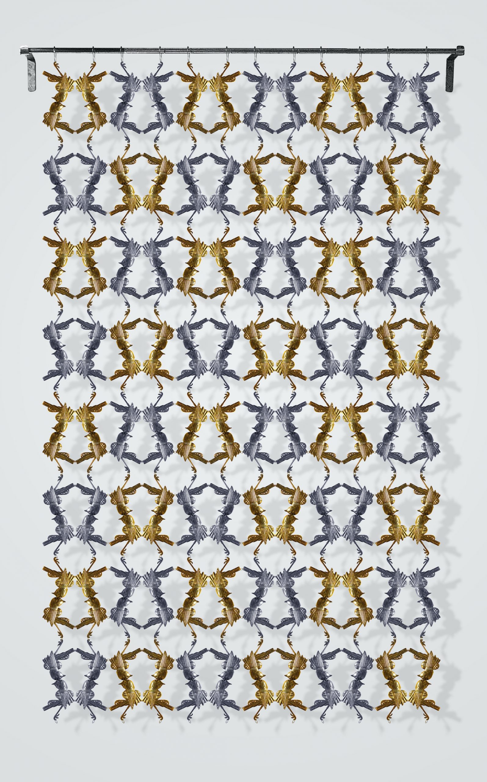
Matt Bryans: Cache, 2020 shelves over 600 rifle stocks – elaborately carved samples from around the world ranging from the 18th century to now – as if they were books. According to the hosting Kunstmuseum Stavanger, ‘this library contains a complex body of knowledge about craftsmanship, the history of firearms and various uses of wood.’
Just how long does Christmas last? Maybe it’s because covid time passes oddly, but I’ve recently noticed some artworks which might be taken as stretching it out somewhat…
Nicola Morley: Grandma on Christmas Day, 2018 (top)
This empathetic image by the London/Lancashire based realist portrait photographer Nicola Morley was due to make an unseasonal contribution to the 2020 Royal Academy Summer Exhibition. Seven months later – its poignancy increased by the isolated Christmases of many a grandmother – it is still up in what is now the Winter Exhibition, beckoning summer from the other side…
Philippe Parreno’s series of Christmas trees present them as objects that – like Christmas in general – get given a time-limited license for opulence and kitsch. Take the tree out of the home and month, and those aesthetics may seem dubious. Parreno’s title refers to just that temporal displacement. Right now, then, it isn’t art – we’ll have to wait. Then again – being made of paint and marble, and diamond powders on cast aluminium and stainless steel – it isn’t a conventional Christmas tree, either.Philippe Parreno: Fraught Times: For Eleven Months of the Year it’s an Artwork and in December it’s Christmas, 2010-15
Fischli/Weiss: Snowman, 2020 (designed late 90’s, first realised 2016)
Fondation Beyeler, just outside Basel, has just installed an archetypal friendly snowman which will stay on display throughout 2021, courtesy of a glass-doored, solar-powered fridge. So the sun keeps the snow cold in an appealing use of science to invert nature. It’s also neat that the snowman, not normally classified as art, is turned into art more by how the institution preserves it than by what the artists did. the Swiss pair had form with snowmen: their 1990 photograph makes a nice contrast as the heat warms rather than cools the snowman.
Art writer and curator Paul Carey-Kent sees a lot of shows: we asked him to jot down whatever came into his head
One characteristic of the computer is its potential to cause glitches. That’s been of interest to artists, either as a direct computer effect or for how that relates to analogue equivalents. I’ve recently come across three artists who might be described as ulitising the equivalent analogue effect (John Stezaker), the digital glitch (Gordon Cheung) or using analogue means to impersonate the digital effect (Ste?phane Graff). And all three involve time travel of a sort…
John Stezaker often obscures one image with another, exploring how new conjunctions combined with a shift from past to present change the original meanings, here he reorders and repeats one source – from a 1950’s naturist publications, one of Stezaker’s less frequently-seen streams of work. It’s typical in that the historical ‘truth’ of photographic reality collapses into a modernist hybrid, and also in dealing with the voyeurism of the lens, here with the repeated grass and deconstruction of the form making it teasingly tricky to sort out quite what is being glimpsed.
Gordon Cheung:Jan van Huysum II (Small New Order), 2014 (edition at Cristea Roberts)
Gordon Cheung discovered an open source algorithm code which creates what he calls ‘sand dune effects’. That doesn’t destroy or copy any of the pixels, it simply rearranges them rather beautifully, so enabling the result to stand as a metaphor for re-ordering the established way of things. He has often applied the method to golden age Dutch still life paintings, mindful of how they ‘represent the romantic language of futile materialism and the fragility of life, but also hide the fact that they are really about ostentatious depictions of wealth, power and status.’
Ste?phane Graff: Baillements Hyste?riques, 2018 (in solo show at Mucciaccia Gallery – above and detail at top)
Ste?phane Graff makes paintings on horizontal wooden strips that can slide and be repositioned in a manner which was inspired by a computer glitch – and which Graff plans on a computer before embarking on the laborious process of working on up to 150 such strips. Graff says the resulting time shuffles aim to ‘totally deconstruct’ the paintings and infuse them with ‘a kind of chaos’ – which then fits in with his ongoing interest in the psychoanalytical traditions of Freud and Jung; and themes and distortions of identity, concealment and memory.
383: JEWELLERY BY ARTISTS
Artist jewellery isn’t rare, but it is normally produced by specialists in collaboration with the artist using the artist’s motifs, as in the extensive collections by such as Louisa Guinness or Elisabetta Cipriani. For example, I rather like the Jannis Kounellis ‘Lips’ from the latter (top, 2012), which recreates a gold sculpture from 1972 as a ring. It was interesting and seasonally appropriate, then, to come across the brooches recently created by Rand Jarallah, who is more associated with performance-related work but has hand-made range of one-off brooches using recycled silk thread, beads and gems in a deliberate contrast to less sustainable and more industrial methods of production. One could easily imagine these operating the other way around – converted from jewellery to sculptures.
This whimsical flamingo’s first layer is embroidered with silk thread followed by gem embellishments through which Jarallah aimed to capture ‘the colour gradient which you’ll find if you closely examine a flamingo’.
The playful beaded kite linked by a silver chin to its pilot is a paean to childhood in the pre-digital world; Jarallah recalls colouring newspapers to turn into kites which she would fly with her brother.
This, says Jarallah, is for ‘the brave-hearted’ to wear, and was inspired by the juxtaposition of the beauty and horror she feels ‘when really examining the spider’s majestic nature’. Louise Bourgeois is the artist most famously associated with the arachnid, and she did indeed collaborate (in 2005) on the spider brooch – very different from Jarallah’s – with which I finish…
Art writer and curator Paul Carey-Kent sees a lot of shows: we asked him to jot down whatever came into his head
382: PLATES
Plates are a rather convenient way to display art, somewhere between ceramic – for the most part, though metals are possible – and painting. Ceramics are in vogue anyway, and as functional objects go, plates are easy to display. In ascending order of price, here are three recent initiatives which have stepped up to the plate:
Jeremy Deller: Dude Plate Large, 2020 (top)
2004 Turner Prize winner Jeremy Deller has designed a collection of bone china plates and mugs that display different graphics inspired by Stonehenge and Neolithic sites in and around Wiltshire. This Dude Plate Large showing the Cerne Abbas Giant graphic in gold leaf and black is nicely accompanied by a Willy Plate Small, which extracts the phallus. It’s made in Stoke-on-Trent in collaboration with Aries: £80.
Julian Opie: Running plate, 2020
The Coalition for the Homeless in New York has arranged for 50 star artists to make charitable editions of 175 plates per design, sold for $175 with the promise that ‘one plate purchased can feed 75 homeless New Yorkers’. Some – such as the instantly sold-out one by Yoshimoto Nara in the selction below – are re-presentations of old paintings, which I find less appealing than new-for-the-purpose designs such as this one by Julian Opie, in which his schematic people rush around at their business, suggesting a race against the clock despite the tease of there being 13 figures rather than 12.
Pablo Picasso: silver platter, 1956
London’s Masterpiece Art present the full-set of twenty-four limited edition silver platters by Picasso, cast from a characteristic range of his terra cotta designs in collaboration with François Hugo at the Ateliers Hugo, Aix-en-Provence in 1956-61. Most are instantly recognisable Picassoesque faces. These, from an edition of 20, have tended to fetch around £60,000 each at auction.
381: SHAPES OF SCIENCE
In this selection, which came out of research for the arts-meets-sciences magazine Seisma, five international artists use the theories and methods of science to generate art with distinctive shapes. Every year Jean-Bernard Metais captures the living yeast in his wine vats; Jean-Luc Moulène applies the generic structures of René Thom’s catastrophe theory to a sculpture; Dan Holdsworth uses pixels from topographical mapping data to form seemingly abstract structures out of the landscape; Douglas Levere reveals the ultimate detail in a snowflake by combining up to fifty microscopic images, and Alicja Kwade’s grid of rocks implies parallel worlds with varying timescales.
The Life of Fermentation
Jean-Bernard Metais: Le Cuvier de Jasnières, 2016 – Pigment print, 104 x 104 cm
French artist Jean-Bernard Metais has been growing grapes and making wine for over 40 years, capturing its gestation annually from the same overhead point of view with a rigorous yet sensual minimalism. Pictured this way, the process suggests multi-coloured irises as if the vat is alive – which of course it is, as yeasts are single-celled microorganismsclassified as members of the funguskingdom. Courtesy the artist and La Forest Divonne, Paris
All Types of Catastrophe
Jean-Luc Moulène: ‘Catasphère, Fonderie de Coubertin, Paris, 2019’ – bronze patina, 60 x 50 x 70 cm
You can walk into Alicja Kwade’s three-dimensional grid structure, in which differently sized solid spheres of natural stone float in apparent weightlessness. Each individual cubic metal boundary implies a different reality, so that parallel worlds with varying timescales are implied by the use of rocks of different ages from around the world. Lineland, then, poetically represents a multiverse, which many scientists believe likely – for example because if space-time goes on forever it might start repeating eventually. Courtesy the artist and König Galerie, Berlin / London.
Art writer and curator Paul Carey-Kent sees a lot of shows: we asked him to jot down whatever came into his head. He is visual art editor for Seisma magazine.
380: DALE LEWIS’ DISCERNING EYE
The Discerning Eye is a show – usually in the Mall Galleries, online only this year – of small works chosen by six prominent figures from different areas of the art world: two artists, two collectors and two critics. The selectors make their choices independently, so there are effectively six separate exhibitions, and they do so from both the publicly submitted works – 6,000 this year – and works by personally invited artists. Consequently unknown artists line up with famous names. I spoke to painter Dale Lewis, who explained that it took him two days solid to look through the 6,000 images. He ended up with 60 of those plus 16 artists he invited, and focused very much on work which shared his own interests: urban, figurative, priority to emotional impact over technical exactitude and detail. No doubt his original vision of a physical room hung salon style, and teeming with people, would have been compelling. I selected four of Dale’s picks from the submissions, and asked what drew him to them:
Luke Vinnicombe: Angry Knitting
‘I imagine knitting as a serene and peaceful activity, so it was nice to see this old woman losing it as the knitting gets faster and more aggressive. You can also think of it as representing the emotional frustrations of lockdown in an isolated activity.’
Jan Vajda: The smile by Bluebeard 1
‘This looks like therapy art from an outsider perspective but it also gives a sense of the turmoil of deciding what to do as a painter. There were many conventional self-portraits submitted, and this was a refreshing contrast.’
Sandra Trgagus: Walkies
‘I imagine them to be American biker-chick kind-of-killers. What I liked most was how the dogs are looking away – men would be looking at the women with ‘animal lust’, but the animals ignore them. And I like those black boots coming up so far…’
Julia Hamilton: Cool
‘ The girl catches your eye with a touch of youthful arrogance as the boy leads her on. You’re not sure where you are – at home, in a nightclub, on the street. But they have the sort of casual contact we haven’t had this year, and there’s a feeling of anticipation.’
Dale Lewis: Truffle Butter, 2019
379: CLARE PRICE: TRAUMA, GLAMOUR AND LUCK IN ABSTRACTION
s. 2019 – Acrylic on Canvas, 153x178cm
I like it when you can track an artist’s development through their own account…
Clare Price hasn’t followed a conventional path: she grew up in the North West before moving to London to study painting at St Martins in 1990-93, but then worked as a secretary, in the shoe department at Marks and Spencer and creative in TV motion graphics – during which time she made some films of her own. She returned to painting in 2004 – after some ‘heavy life events’ – and to education, completing an MFA at Goldsmiths in 2012-16. She says that ‘stripped both myself and the work back to the core. It was tough but it was amazing.’
Untitled, 2008 – Acrylic Gouache, spray paint and household lacquers on canvas – 147 x 207 cm
Abstract painting has remained central to Price’s practice and thinking, but has changed with her: from a language which merged digital and analogue (projecting and drawing antiquated computer outputs onto the canvas) to a looser – more fragile and sensuous – style. More recent work is sized to the body’s reach and evidences the pouring, spilling and movement of its making. Paintings such as s. (2019) have been seen as evoking galaxies, explosions and orgasms. That performative turn became more explicit when Price set up an Instagram account for her degree show, which evolved from documenting the work to photographing herself in relation to the paintings during 2016-20. She credits her Goldsmiths tutor Mark Leckey as a huge influence on her work when saying that ‘art comes through the body and the life experience’.
#Needs, 2018
In the Instagram posts, Price strikes dance-like poses in front of the works, wearing studio clothes which themselves bear the accidental results of her actions, and labels the images with hashtags indicating emotional vulnerability: ‘needs’, for example, ‘fragile’ and ‘refuge’.
Images on Instagram 2018
Those hashtags developed into longer poetic streams of consciousness. Price describes herself ‘making dens as interim hiding places, lying in the stretcher bars in foetal positions, thinking about containment, hiding under canvas and chairs’ and says that ‘in the photographs I was interested in performing the affect that is present within the work…. The photographs have been posted on a private Instagram which created a digital safe space or “container” that heightens the forces within and allowed for experimentation and growth.’
Posted on Instagram July 2019
The posts, says Price, were ‘raw, emotional and, deeply personal’ and ‘became as important as the paintings in terms of my practice and have taken both myself and my work to a very different place’.
Posted on Instagram July 2020
More recently, Price has altered the studio environment and moved it to her home, making it into a more explicit set through props such as sequin threads picked up from Peckham pound shops, so extending her painted language into the surrounding space. She has also made a private spoken word performance separately from her photographic documentation of actions, adorning the studio with ‘healing threads’ and ‘facets of the painting practice, hanging and wrapping stretcher bars using the bubble wrap as sculptural forms, binding the furniture in bondage-esque ties.’
Silver Furred Buds, 2020 – Acrylic on canvas, 25x30cm
Now Price has written an eclectic account of how she arrived at what you might term her way of painting in the expanded field. This explains the impact of a diverse roster of influences including Marianne Faithfull, The Sisters of OZ, Sharon Kivland, Doris Lessing, Audre Lorde, Girls about Peckham and walking through the doors of the Haçienda at the age of eighteen. Price acknowledges trauma whilst beginning to unfurl the many instances of luck in her life. She also explores the use of dress as armour, claiming the power of glamour as a choice, and asserting its potential seriousness. All of which: the trauma, the luck, the inspirations, the dance, the glamour – is embodied in the work.
Exhibition making has got more complicated: not only is there the matter of what to show and how, there is the question of how to adjust the display to Covid-19 circumstances. Innovation kudos, then, to the Photoworks Festival in Brighton, which ran 24 Sept- 25 Oct. ‘Propositions for Alternative Narratives’ adopted a double-pronged strategy based around avoiding both the historic ‘inside buildings’ model and the increasingly prevalent switch to online as primary. There was an events programme – but the main presentations were by post, and on the streets of Brighton, Hove and Worthing. Whilst neither could claim the full materiality of photographic prints, both allowed for a physical encounter with the work.
For the ‘festival in a box’ – in Director Shoair Mavlain’s words – ‘the artworks travelled to people’s homes, classrooms and community spaces’, so eliminating the reliance on personal travel ‘which itself relies on economic privilege’ and allowing the viewer to ‘become the curator’ by choosing how to hang the work. It would probably be more accurate to attribute the installation phase to the audience, given that the eleven artists and their works were pre-selected, but the box and accompanying wide-ranging texts were imaginatively presented and did make for an interesting alternative means of engaging with the material.
The use of the streets also makes sense: that can engage the passing public who might not enter gallery contexts. It also provides increased scale, and has the potential to generate an exploratory experience, and to increase the images’ relevance through their siting. Those advantages remained mainly in the theoretical category: the advert-sized posters were far from prominent; few meaningful relationships occurred between what had been photographed and where it was placed; and I found it more of a frustration than an adventure to track down the poorly identified sites – added to which, heavy rain reinforced the comfort of gallery spaces!
As for the content of those two modes of installation, it was excellent. I liked the contributions of Farah Al Qasimi, Alix Marie, Roger Eberhard and Alberta Whittle – interesting artists with whom I was already familiar – but I focussed my own home install on the new-to-me Pixy Liao, Ivars Gravlejs and Guanyu Xu. All three undermine usual logics to present ‘alternative realities’:
For ‘Experimental Relationship’ Chinese artist Pixy Liao photographs her younger Japanese boyfriend, with or without her own presence, in ways which reverse ‘normal’ role expectations, just as the ‘normal’ age gap and the ‘normal’ Sino-Japanese antagonism are reversed by their partnership.
Ivr Ravlejs’ ‘Shopping Poetry’ presents purchases laid out on supermarket conveyor belts in the order of their accompanying receipts, arriving at a new mode of still life by subverting the normal purpose of shopping.
Guan Yu travelled from the US – where the artist, who is gay, now lives – to his childhood home in China, and installed his photographs there to queer the conservative family setting. Here’s my photo of his photos of his photos in his home in my home…. As in Open Closets’, 2019.
Art writer and curator Paul Carey-Kent sees a lot of shows: we asked him to jot down whatever came into his head
378: Do’s and Don’ts of Instagram
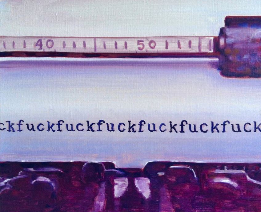
You can’t put everything on the increasingly central art medium of Instagram, as it’s censored. Specifically, any photographic image of genitals, naked buttocks or bare female breasts are out. The fact that it’s art isn’t held to make any difference, which has caused some annoyance. Paintings ought to be OK, though Betty Tompkins notoriously ran into trouble despite the apparent policy when posting her well-known ‘Fuck Paintings’ from 1969-74.
Sophy Rickett: ‘Pissing Woman (test)’, 1994
Anyway, sticking with photographs I’ve seen lately, I posted from this series by Sophy Rickett, which is perfectly OK as a way for a woman to poke fun at the supposedly unique privileges conferred by possession of a penis.
Sally Mann: ‘The Three Graces’, 1994
But this, in which Sally Mann triples the stream (what was it about 1994?), is un-postable – not because of that, nor due to the sometimes-questioned way she worked with her children, but simply because female nipples are visible really, the most innocuous aspect.
Michelangelo Pistoletto: ‘Messa a nudo – C’, 2020 Silkscreen on super mirror stainless steel
Another prestigious artist whose latest work won’t fit Instagram is Michelangelo Pistoletto. His ‘Laid Bare’ series is the latest to use silkscreen on mirror, doubling the space and bringing in the viewer – in this case, to interact with naked figures who, according to the artist ‘represent human kind in all its different biological, ethnic and aesthetic aspects… the same humanity that, coming from all over the world, clothed, fills the space in front of the mirrors’. Pistoletto sees in these works ‘the possibility of being able to embrace each other once again after the conditions, which throughout history up until today, have divided and distanced us in the world.’
Peter Hujar: ‘Self-portrait’, 1966
The censorship has led to various ingenious cover-ups. Though you could argue that no-one has improved on Peter Hujar’s nude self-portrait from 1966, taken 44 years before Instagram was launched.
377: Small was Splendid: Tintype 2010-20
Neal Tait: ‘Turquoise Boat’, 2018
I was sorry to hear that the small but splendid Tintype Gallery is sailing into the sunset. The press often presents the art world as driven by finance, but the commoner reality is of small businesses driven by enthusiasm, keen to do the best for their artists against lengthening odds – even before the extra challenge of Covid-19. As such, better to celebrate the achievement of an adventurous ten year programme than to be too surprised that it was not possible for owner Teresa Grimes to continue the gallery longer. I saw most of the shows across three sites: a converted furriers in Redchurch Street, Shoreditch; upstairs in the old jewellery quarter of Hatton Garden; and, from 2013, a former haberdashery shop on Essex Road in Islington.
Jo Addison: ‘Odea’, 2020
The last address took on an unusual significance through the six annual commissions which each invited eight artists to make a short film in response to the mile-long thoroughfare from Angel, Islington to Balls Pond Road. The idea stemmed from Tintype’s wider interest in public engagement, and the results were screened in the gallery window over what would have been the Christmas break.
Beth Collar: Installation view, 2014 – with drawings of Casein Lactic & earth pigments on acetate/diacetate and Props – Tripod, hazel poles, tape.
They will remain available online at Tintype, where they make a rich and distinctive archive. Among the excellent solo shows across the years, Joby Williamson, Alice Walton, Suki Chan, Jost Münster, Jo Addison and Beth Collar also come to mind – that last, in 2014, under the memorable title ‘Some Chthonic Swamp Experience’. 2018 was particularly strong year, with exhibitions by Milly Peck, Neal Tait and Jennet Thomas as well as Essex Road 5. The most fun by way of a group show was back in 2012: ‘Crazee Golf’, curated by Teresa together with her sister, artist Oona Grimes, presented eighteen wacky responses to ‘the faux world of Crazy Golf; an absurdist version of risk and danger, a diversion, a corralled time-out’. And, unsurprisingly, I was also pleased with what turns out – online only – to have been the last show: ‘Unstilled Life: Artist Animations 1980-2020’ was put together by Teresa, painter Emma Cousin – and me.
Clunie Ried: Untitled (Grey, Darker and Freed), 2012 from ‘Crazee Golf’
376: Jacqueline Poncelet’s Multiplicities
The New Art Centre in Wiltshire combines the ideal socially distanced art experience – sculpture in the landscape – with three indoor galleries. The biggest of those (to 10 Jan 2021) currently surveys the last four decades of Jacqueline Poncelet’s near-50 year art career. She began in ceramics in the 70’s before branching out in many directions – often using complex patterning and modulated repetition, including her exceptional 2012 commission, ‘Wrapper’, for the District and Circle line Edgware Road underground station. She seems to have turned pretty much every utilitarian item from the home into art: pots, shirts, carpets, wallpaper and blankets all feature, as well as paintings and sculptures. Here are four:
Tartan, 1993/4
This was borrowed from Poncelet’s house: it’s in a house again now, but as an artwork, not as a carpet. Tartan is made up from offcuts straight from the shops. Poncelet sent a friend out to get them, so she couldn’t censor the choices through her taste, and got a truer reflection of society’s tastes. She then used them all, just cutting and arranging them in a multiple combination which is ‘how I experience life – as lots of things at once. My home is full of stuff too and I think ‘it’s all right! – I don’t need minimalism.’
21 + 1, 1995
At this time Poncelet was making small paintings, weavings and found tapestry extracts with the aim of combining them without hierarchy. ‘It would have been too easy to call it 22’, she says, setting up the game of what the odd one out might be: the photograph? The monochrome? ‘It represents how we move through the world’, says Poncelet, ‘We might go from A to B via a brick wall, a front garden, an orange front door, a broken paving stone and twelve cars – we don’t think about that, but we do experience it.’
Heap, 2017
Poncelet didn’t want the title to give it away, but says ‘My studio in Wales is by the river, and I have become obsessed by how we can represent water – of course this is not like water, but it has that restlessness.’ It’s actually a heap of the forms used to shape the handles of mugs.
Jacqueline Poncelet unfolding Bryn 1, 2020
During lockdown, Poncelet has been making hand-woven narrow-loom woollen blankets, a now-redundant Welsh tradition which, like much of her work, puts art into craft. ‘I’d meant to do some weaving for a long time, but when I saw the Anni Albers show at Tate Modern, I thought: I’m old, I’d better hurry up!’, says Poncelet. Now ‘I love lying in bed in the morning and looking at my landscape of blankets.’
375: A Big Hand for Baselitz
Georg Baselitz: ‘Manopola – Fausthandschuh’, 2019
The past few years have tended to see Georg Baselitz in fine, adventurous form, at least in the studio (less so in the interview room, where his ludicrous generalisations about female painters have tended to put people off). And you have to hand it to him here: well into his ninth decade, Baselitz has come up with a series of works quite unlike anything he has done before – a whole show of hands, many of them monumental. They have, as the show’s title has it, ‘Darkness Goldness’ (at White Cube, Mason’s Yard to 14th Nov). They could be his own ageing hand painting itself – he isn’t one for assistants.
Having said which, Baselitz does distance his hand through a neat manoeuvre: these are not direct paintings, but monotypes made by painting on a different canvas, then pressing that against the canvas to be shown. That reduces the realism likely, but then Baselitz says they’re not of particular hands – his or anyone else’s – they’re more in the nature of symbolic representations, and though some are titled for other artists, they are homages, not hand portraits. Most of them appear to be dangling down, but that subverts the trope for which Baselitz is most famous: inverting his subjects in order to emphasise the abstract qualities of the work. Here, by way of a little joke perhaps, is a subject for which we can’t tell if they are ‘the right way up’ or not. Nor are these just drawings and paintings, there are also a set of wall-based sculptural reliefs, the first Baselitz has made since 2013. Baselitz modelled these in clay, 1.8 metres long, on tables in his Munich studio, then sent them away to be cast into fire-gilded bronze.
Baselitz also has a solo exhibition at Michael Werner gallery to 24th October 2020
374: London Grads Now
It’s obvious enough that this year’s graduates have missed out on the traditional benefits of a degree show. But the Kristin Hjellegjerde Gallery has teamed up with the Saatchi Gallery to do something about it by facilitating students to curate a ‘best of ‘ selection through an open call to all those graduating this year. London Grads Now brings together over 200 works by 150 graduating artist in one central location, proving a convenient overview of work from the RCA, Slade, Goldsmiths, UAL (Wimbledon, Chelsea, St Martins and Camberwell). The handsome ‘white cube’ style presentation of selected works at the Saatchi Gallery (£3 to 25 Sept) contrasts with the hurly-burly of traditional all-in degree shows – indeed, there’s no reason why it wouldn’t be good to have just such a curated summary as an extra in ‘normal years’. Oddly, though, it is ‘wall-based work only’, even though sculpture is perfectly well-suited to the space.
As for trends in the work: not that much was easily pigeonholed as ‘lockdown work’, but there was plenty of content – and as many personal stories, often told through domestic materials such as textiles, as there were works directly addressing broader events and histories. Here are four artists – out of many – who caught my attention.
Yang Xu (RCA): ‘Missing you is like Fire’, 2019. Yang took the dressing up commitment prize in presenting an interior painted on carpet evoking the rarity value of that luxury being present in her uncle’s house in China and also suggesting through the melodramatic title and the detail of a dropped champagne glass some traumatic romantic occurrence. @_xu.yang_
Tsan Huang (Camberwell): still from ‘Violence Towards a Piece of Paper’, 2020, a six-minute film in which the violence of a memorable title is at the meditative end as Tsan employs a glue gun to draw in ink, then washes and scrapes the paper clear with acid to end up with a ghostly absence. @its_canart
Giles Thackway (Goldsmiths): ‘Holder’, 2020. Personal loss meets global warming: what look somewhat like Sol LeWitt-style variations on a geometric theme are based on the beam architecture of Australian houses destroyed in recent bush fires. They’re drawn using the charcoal which also frames the work. @giles.giles.giles
Gail Theis (Wimbledon): ‘Flesh and Blood’, 2020 (detail below). The domesticity and craft traditions of a quilt turned to an examination of mixed marriages through photographs of such couples – from the artist’s own parents to celebrities – along with sperm, egg and chromosome motifs woven into the diagrammatic presentation. @gailtheis
Art writer and curator Paul Carey-Kent sees a lot of shows: we asked him to jot down whatever came into his head
373: Why Visit the Eden Project?
Jenny Kendler: ‘Bird Watching’ 2018-19
I guess no one visits the Eden Project in Cornwall to look at art: to enjoy the plant life, take in the biomes and reflect on environmental sustainability, yes; to zip across the half mile SkyWire, maybe. But there is an art trail, along with a map identifying sixteen works to see, and I followed it last week. One work I couldn’t find, and two were out of action: Ryan Gander’s edgily playful fountain bust giving visitors the chance to drink from his wife’s mouth was understandably dry for reasons of Covid-19. Nor was Julian Opie’s huge LED of a walking crowd operative, though I assume that was down to a technical issue rather than an illogically zealous interpretation of social distancing rules. On the other hand there are as many sculptures dotted round the grounds which don’t get on the list: an orangutan by James Wild and various outsized insects, for example. They tend towards the jokily illustrative, but the same could be said of some of the inclusions: David Kemp’s metallic flora punningly titled Industrial Plant, Heather Jansch’s driftwood-based horses and Robert Bradford’s Bombus the Giant Bee. Nor was I much taken by the figures of Peter and Sue Hill and of Tim Shaw, though they worked well as diversions to come across. Still, that left a worthwhile core of works which struck me as impressive regardless of location, yet which gained from the connections made at Eden and would consequently enrich the experience of all visitors, art lovers or not.
Seven remaining artists may not sound many, but their impact is disproportionate. Indeed, one large building is dedicated to just two huge, cinematically presented works.
Peter Randall-Page’s 70 tonne granite Seed, 2007, has its own atrium, in which its 1,800 nodules hum gently in their Fibonacci sequencing. That separation saves it from being improbably dwarfed by Studio Swine’s Infinity Blue, 2018, a nine metre high ceramic representation of the microscopic cyanobacteria – the basis for plants producing oxygen through photosynthesis – which emits vapour to mimic that natural role.
It has real presence, as well as educational value, and is an absolute favourite with children.
The rain forest biome also has two worthwhile art stops.
Aziza Gate, 2004, El Anatsui’s characterful group of totem faces formed out of charred timbers from the nearby Falmouth Docks, deftly conjoins narratives of recycling and the history of colonialism. And Peruvian herbalist-artists Don Francisco Montes Shuna and Yolanda Panduro Baneo have made a set of twenty murals on the rock face, showing their versions of tales associated with the plants with which they work (below is ‘The Spirit Woman of Ajo Sacha’, 2001).
Not only are these wittily charming, they are very much in tune with the need to allow nature more agency – and the paintings gain from a location which leads many to be occluded by leaves which segue into the images.
My other three favourite works are easily missed. In the absence of any notice (labelling is generally erratic) Chris Drury’s Cloud Chamber, 2002, might be taken for a domed hut by anyone not following the art map. Which it is, but in the meditative spirit of a James Turrell skyspace.
Jenny Bevan’s fifteen Cores, 2016, hide in plain sight at the entrance to the ‘Wild Cornwall’ section: many must have taken them for spindly tree trunks, but they are actually ceramics which impersonate the layering which might occur were they cores lifted from the ground of Eden, with plant life imprinted in the tops and colouration representing the descending geology beneath them. Finally, along the road half a mile out of the pay-to-enter zone and so likely to be only glimpsed from a moving car, is the most unusual sculpture here. Jenny Kendler describes herself as ‘an interdisciplinary artist, environmental activist, naturalist and wild forager who lives in Chicago and various forests’. Her Birds Watching, 2018-19 (top and below) is a chromatically-organised array of one hundred reflective eyes on aluminium, each representing a bird threatened by climate change. The flock is presented like a motorway barrier, making good sense of the admittedly inconvenient location at which we, as a bird watching species, become the accusatorily watched.
It would be eccentric to visit Eden if you were unmoved by nature, but given the kernel of impressive and site-resonant art, it wouldn’t be ridiculous.
Art writer and curator Paul Carey-Kent sees a lot of shows: we asked him to jot down whatever came into his head
372: Parasol unit 2004-2020
Martin Puryear: Big Phrygian, 2010–14
It’s a coincidence that Parasol unit hasn’t reopened after the coronavirus closures: founder–director Ziba Ardalan had already decided to move on to a less fixed model for her selfless support of artists. Parasol unit foundation for contemporary art will be organising exhibitions and artistic projects in the UK and around the world, but without a fixed location. It did mean that the end of the Wharf Road programme in London came rather unnoticed, but a handsome tome* now commemorates more than 50 major exhibitions held over the sixteen years 2004-20. I saw most of them. There were some excellent group shows, notably of Iranian artists last year, but what stays in the mind is how single artists could be shown in unusual depth across two floors, and with a substantial publication. So, for example, the best London shows of the following dozen artists have all been at Parasol unit: Darren Almond 2008, Robert Mangold 2009, Adel Abdessemed 2010, David Claerbout 2012, Bharti Kher 2012, Navid Nuur 2013, Katy Moran 2015, Julian Charrière 2016, Rana Begum 2016, Martin Puryear 2017, Lisa Milroy 2018, Heidi Bucher 2018. It’s a little invidious to pick one from such a line-up, but though it seemed right that Martin Puryear’s USA Pavilion was widely lauded at the 2019 Venice Biennale, I thought Parasol unit’s presentation of his work had been even better. It will be interesting to see what comes next as the Parasol unit foundation for contemporary art changes direction.
Martin Puryear: Night Watch, 2011
* Parasol unit London 2004-2020, 290 pages, limited edition of 500
Shane Bradford’s Authentic Editions
An original artwork will naturally tend to materially exemplify the reasoning behind its production, though even that is complicated by outsourcing. The same isn’t true of editions: whereas a woodcut, for example, is conceived for reproduction and made in a manner attuned to that, some prints are simply paintings which have been turned into something rather like a signed poster: the thinking and technique behind the art isn’t reflected in the edition. So the use of materials is one way to achieve that authentic link between creative origin and the outcome. Another, proposed as the leitmotif of the new edition-driven project ‘Assembly Line’ by Shane Bradford, is to use the fact of multiplicity as the inherent driver of editioned art.
How does that operate So far, we have only three artists’ examples to go on, and Bradford’s own work predominates. One strand of his practice is to ‘dip’ objects into paint. The 32 hand-dipped model cars which make up the edition ‘Twilight (Factory Reset)’ – complete with exhaust flame drips – relate much more convincingly to factory assembly line production for being multiples. And the edition of 15 dipped hardbacks ‘Judge a Book by its Cover’ reinforce each other’s impact: we suspect the books’ contents are likely to be different, but the blank monochrome covers effectively give the same basis for judgment in all the disparate cases – which wouldn’t operate comparably in a one-off. The neat underlying joke is that, although we normally say that ‘you can’t judge a book by its cover’, that is all one can judge by in this case – and it still doesn’t help, except in concluding that they make attractive abstractions. Which may, however, be all we need…
Bradford aims to generate comparable thinking from additional artists in future: it will be interesting to see how that works out.
Art writer and curator Paul Carey-Kent sees a lot of shows: we asked him to jot down whatever came into his head
370: Ceramic Paintings
The ceramic painting seems to be a form on the rise. Ceramics have been a trend for some years now, triggered perhaps by a desire for the visibly hand-made in the era of outsourced and / or digital production. Painting shares some of that, so why not meld them? Leaving aside Julian Schnabel’s way of painting on smashed crockery such work has tended to be abstract – Mary Heilmann, Liz Larner, Arlene Shechet and Mai-Thu Perret come to mind. But here are three lively young artists making figurative ceramic paintings:
Stephanie Temma Hier: ‘Green grass finely shorn’, 2020 (top) – oil on linen with glazed stoneware sculpture. The twist I like in the Canadian painter’s use of eccentric ceramic frames to provide bespoke contexts for her oil on canvas still lives is how the potentially heightened realism of three dimensions actually operates to undercut the veracity of the relatively traditional illusionism of the two dimensional surface. She got the idea from drinking water: ‘My experience of the water changed based on the glass which carried it to my lips, and so I wanted to similarly change the experience of painting with its own contextualizing vessel’. Shown by Brooke Bennington.
Lindsey Mendick: ‘A fish out of water’, ‘Spilling my guts’ and ‘Hung out to dry’, 2020. One of five narrative triptychs which act as a comic strip of paintings encapsulating the messages implied by the journeys of flowers and food towards entropy. Given that ceramics are the natural material of plates and vases, and that human clay travels towards the endpoint of the Vanitas, there is logic to Mendick’s wit. Part of her show ROT at Cooke Latham Gallery
Jesse Wine: ‘Still Life’, 2015. This looks like a combination of historical precedents from its genre: Giorgio Morandi’s meditations on vases and pots – another case of clay depicting clay – join a mug such as Ben Nicholson sometimes featured. We come down to earth once we spot that the latter is actually from Sports Direct, introducing the somewhat less revered figure of Mike Ashley.
368-9: Virtual with Virtue - six artists to see IRL too
Three months of lockdown… that’s a lot of online art. It’s easiest, for sure, to appreciate the virtual offerings of artists whose work you have already seen ‘for real’. But I have also been newly interested in artists now on my list of ‘see IRL when you get the chance’. Such as these six…
Kinke Kooi: ‘Sweet Care’ 2014.
I discovered Kinke Kooi’s 40 year back catalogue via a show of new work at Exile, Vienna: the wonderfully-named Dutch artist’s softly visceral microcosmic drawings, some with such as buttons, shells and Q-tips (as above) attached, make up a tempting garden of desire from an interior bodily perspective.
Albina Mokhryakova: ‘Maybe Therapy?’ 2020.
The young Russian artist’s performatively-based practice has included crawling round an art fair, tennis actions without balls and the aestheticisation of bruises. ‘Maybe Therapy?’ arises from a performance which criticised pharmacological treatments for depression by proposing that the best use of such pills was to lay them out into a beautiful pattern as part of a more spiritually-based approach. Here the pattern makes a mask of sorts, evidently ineffective in a Covid-19 context but alluding to the potential for lockdown regimes to increase mental health problems. At the Museum of Contemporary Art Metelova in Ljubljana.
Pere Llobera: ‘Rococo Guardrail’ 2018
This shows the side of a road where the crash barrier has been transformed into a golden ‘Rococo’ frame, all curls and shine. According to the artist he painted the spot where motorcyclists find their death, making it at least a beautiful place. I also like how the barrier takes on the writhing form of the trees, as it resists its more natural art allegiance to the controlled contours of geometric minimalism, leaving that to the road markings. At Hidde van Seggelen in Hamburg.
Mostafa Sarabi:Untitled, 2019
Tehran-based Mostafa Sarabi (born Iran 1983) integrates abstract patterning into representational scenes to joyful and distinctive effect – a knowing naivety, I’d say – which works particularly well in his pictures of mass swimming…
Fanny Sanín:Acrylic No. 4, 1980
At 82, New York based Colombian Fanny Sanín has been making distinctively symmetrical geometric abstractions for five decades without achieving the profile (at least in Britain) of the New York based Cuban Carmen Herrera. Maybe Sanín is due her time in Europe, just as Herrara – still active at 105 – remained somewhat under the radar until her 90’s.
Sébastien Gouju: Oies de Barbarie, 2015.
The simple move whereby the French artist / ceramicist Sébastien Gouju pots his birds proves an entertaining way to remove the vase function in favour of them acting as oddly enveloping sculptural plinths or, here, cutely individual nests for a family of Barbary Geese. I did have the darker thought that there might be a reference to constraining the geese for gavage but it’s the Barbary (and Muscovy) Duck which is mainly used for foie gras…
Art writer and curator Paul Carey-Kent sees a lot of shows: we asked him to jot down whatever came into his head
367: Running Around the Park with Richard Schur, John Peter Askew and Emma Cousin
Well, sort of… Each day during lockdown I have been running around a small park just opposite my home in the New Forest. What’s in the park has been ‘talking to me’, leading to a series of ‘Isolated Dialogues’ – playful yet Covid-tinged six line photo-poems – which you can seehere. Three artists mentioned that they liked the poems, and Richard Schur titled a painting after one of them. Then I asked the other two if they would like to link a work to a poem, so here I am virtually running around with three of my favourite artists, replacing my photos of the park with their art:
Air
I fill the park
and nobody notices, most of the time.
Not that I crave prominence:
knowing how much I matter is enough.
Yet I wouldn’t be human were there not times
when I feel a certain pressure to show off.
(John Peter Askew – ‘Boy by River’, 2017 – top image)
View
Am I an entity? Discuss…
Visibility is my all,
but therein lies a problem:
I look like the air, which is invisible.
Not so much an entity
as a conundrum.
(Richard Schur: ‘View’, 2020)
Night
I don’t discriminate
based on colour.
I like to think I wouldn’t if I could.
He does, though!
How often does he
run around in me?
(Emma Cousin: ‘Black Marigolds’, 2018)
As it happens, all three artists have significant shows coming up soon:
John Peter Askew: We at Pushkin House, London, mid Sept – mid Nov (exact dates TBC)
Richard Schur: Everything at Kristin Hjellegjerde gallery, Berlin, 30 July – 29 August 2020
Emma Cousin: in SOLOS at Goldsmiths CCA, London, 18 Sept – 13 Dec
Art writer and curator Paul Carey-Kent sees a lot of shows: we asked him to jot down whatever came into his head
366: Surprises from Art UK
Art UKis the online home for every public art collection in the UK, recently represented to make 250,000 works easily searchable with a facility to curate your own show. Faced with so many options, I took the simple approach of looking for less usual examples from some of my favourite C20th artists.
John Armstrong(1893–1973) ought to be much better known. ‘Composition: Balloon Abstract’, 1942, one of 68 of his works held in the collection, is at theRoyal Air Force Museum. An exploration of illuminated forms using his typical tempera on wood takes on a sinister undertone which, like many of Nash and Agar’s works, infuses the landscape with an understated surrealism.
Oddly, perhaps, the collection has fewer works (44) by Francis Bacon than by Armstrong. The Sainsbury Centre in Norwich has the largest holding by the greatest artist working in Britain in the 20th century, including ‘Head of a Woman’, 1960, which looks likely to be based on Muriel Belcher, one of three women often painted by Bacon – along with Henrietta Moraes and Isobel Rawsthorne. As for the distortions suffered by their faces, ‘If they were not my friends’ , said Bacon, ‘I could not do such violence to them.’
Isabel Rawsthorne’s own art has been somewhat eclipsed by her profile as a subject, but she has six works in the national collection. This ‘Study of a Ballet Dancer (2)’ is at the Fry Art Gallery in Saffron Walden. Her husband from 1951-71 was the composer Alan Rawsthorne: he worked at Covent Garden, and Isobel often sketched and painted the ballerinas in the rehearsal rooms. If some suggestions of Giacometti’s style are visible, that fits in with their close artistic and on-off romantic relationship in Paris during the 30’s and 40’s.
Paul Nash’s ‘View R’, 1940, one of 96 publicly owned works by him, is owned by Rugby Art Gallery. I doubt if the ‘R’ stands for Rawsthorne or Rugby, but its mysterious moonlit presence, seen in reverse, is fully in line with Nash’s typical way of infusing a landscape with a folklorical yet disquieting element.
Eileen Agar‘s ‘Slow Movement’, 1970, one of 25 works by her on view, is at the National Galleries of Scotland. It was inspired by the Throne of Ludovisi, a Roman marble panel which shows Aphrodite being raised from the sea by two women: Agar (1899–1991) – who was, incidentally, Paul Nash’s lover in the 30’s – takes the chance to maximise the blue harmonies.
There’s something human about this ‘Small Fish’, 1956, one of 49 publicly owned works by John Craxton (1922–2009). It’s in the Ingram Collection of Modern British and Contemporary Art. Living near the sea in Greece, Craxton often drew the local fishermen and their catches – he loved seafood, and would have relished this gunard for taste as well as its characterful expression.
365: Trouble Online at Art Basel
Art Basel’sonline viewing roomscan be visited until 26 June. There is plenty of trouble in the world for that art to reflect: not just the virus, the economy, wars, terrorism and global warming but also bad attitudes. Here’s my selection of work which addresses the anti-discriminatory agenda so effectively foregrounded by ‘Me Too’ and ‘Black Lives Matter’…
Gordon Parks: At Segregated Drinking Fountain, Mobile, Alabama, 1956 – Archival Pigment Print, 109 x 109 cm – at Alison Jacques Gallery, London (top)
Pioneering African-American photographer Gordon Parks (1912-2006) documented culture and everyday life from the early 1940s to the 2000s. This is from the series ‘Segregation in the South’, which presents marginalised lives and associated injustices quietly, yet consistently with Parks stating: ‘I saw that the camera could be a weapon against poverty, against racism, against all sorts of social wrongs’. The motor for that is the creation of empathy: he held that ‘it is the heart, not the eye, that should determine the content of the photograph’.
Hilary Harkness: Multi-Vortex National Disaster, 2020 – gouache on twelve ‘Liberty Series’ U.S. postage stamps, 6.7 x 10.2 cm at P·P·O·W, New York
This tiny painting on stamps from 1959 might have been easily overlooked at a physical fair but appears appropriately monumental online. Of her ‘US Issue’ series altering stamps commemorating Andrew Jackson (President 1829-37), Hilary Harkness says: ‘Whenever I hear about ‘the good old days,’ it makes me want to redirect the flames of racism and discrimination that are ravaging black communities today. I want to burn that fucking privileged nostalgic amnesia down to the ground. These Jim Crow Era stamps commemorate Andrew Jackson’s plantation home ‘The Hermitage’ where he enslaved 300 people. To me, it’s a symbolic missing link between the wrongs of the past and the present. It felt only right to paint in the flames and smoke that I’ve been seeing ever since I bought them.’
Kehinde Wiley: Rumors of War, 2019 – patinated bronze with stone pedestal 835 x 777 x 482 cm – at Sean Kelly Gallery, New York
Kehinde Wiley’s monumental sculpture is from an edition of three, the first of which was unveiled in Times Square, New York last year and is due to be permanently installed in Richmond, Virginia. Wiley subverts the visual rhetoric of the South’s many confederacy monuments by presenting not the white general as war hero but a young African-American subject dressed in urban streetwear. He states that ‘Rumors of War attempts to use the language of equestrian portraiture to both embrace and subsume the fetishization of state violence.’
Do Ho Suh: Public Figures, 1998 – Stone and bronze, 284 x 209 x 275 cm – at Lehmann Maupin, New York / Hong Kong / Seoul
This is an old work given fresh relevance by current statue-toppling activity. Do Ho Suh says he ‘displaces radically the site of the (heroic) individual by taking the figure from above to below the pedestal, reducing its size, making it anonymous, and multiplying it.’ Moreover, the online presentation includes an animated version, in line with Suh’s original conception of mechanising the figures so the sculpture moved, challenging the notion of site-specificity and the authority granted to permanence.
Mickalene Thomas: Hot! Wild! Unrestricted! , 2009 – Chromogenic Print, 61 x 76 cm – at Yancey Richardson Gallery, New York
Mickalene Thomas says hers is ‘unapologetically the gaze of a black woman looking at black women’, a gaze which she developed by photographing herself as women she idolised, looking for ‘a different way to perceive beauty – not just the surface but also the action – how they define themselves and how they persevere’. Here she gives equal prominence to the orgy of patterns against which that attitude is struck – Thomas creates backgrounds which allude to both the tradition of studio portraiture in African photographic history and the 1970s lifestyle of her glamorous mother, a central muse in her work.
Carolee Schneemann: Forbidden Actions – Museum Window, 1979 – Photo silkscreen on paper, 82 x 112 cm – at mfc-michèle didier, Brussels / Paris
This reproduces six photographic documents of a guerrilla performance at the Kröller-Müller Museum, Netherlands. Schneemann waited for the attendants to change shifts and quickly disrobed for a series of nude actions in the gallery. She described the project as an effort ‘to take the nude off the wall, in a way to de-sacralize or re-consecrate this iconography.’ As Mickalene Thomas says, it’s about the action, not the surface.
Yael Bartana: Patriarchy is History, 2019 – neon, 198 x 156 cm – at Annet Gelink Gallery, Amsterdam
This seemingly simple statement, developed out of collaborative workshops with a group of female activists from Sao Paolo, resonates with ambiguities. Is it simply recognising an historical reality, or optimistically declaring that patriarchy is already restricted to the past? Or is it set in the future, in which case how many years ahead? Whatever, the gallery declares that ‘the work acts as a symbolically combative agent in the struggle against the mechanisms that shaped the history of our world’.
364: Return to the Pledge
Perhaps the most heartening coronavirus development in art has been the development of the Artist Support Pledge, whereby works are offered for sale for up to £200, and when an artist sells £1,000-worth they pledge to spend £200 supporting another artist. Over 250,000 works have now been posted on Instagram at #artistsupportpledge, generating over £20m! Naturally, quality is variable at that quantity, but it is easy enough to access artists you like through their own Instagram accounts. I posted some examples in my 22 April column. Here are three more who appealed to me…
Karen Knorr: Emptiness No Other Than Form, Obai-in, Kyoto, 2017 (top)
Most days during lockdown Karen Knorr is releasing a small format edition of five from her back catalogue of wonderfully fastidious digital insertions of wildlife into architecture. Each day they are rapidly snapped up. Most feature highly ornate interiors, suggesting how the human world fails to suit the animal. This, though, is from a series set in a Japanese temple which reflects the wabi-sabi aesthetic emphasising the beauty in simplicity and imperfection.
Robin Tarbet: Waffle-Henge, 2020
Robin Tarbet couldn’t get to his studio during lockdown, so the mould for this cheeky 12cm-high reimagining of the monumentality of Stonehenge as a paean to fast food was made on his kitchen table. That was appropriate, for it consists of three concrete cast potato waffles fixed together. Just to be on the safe side of the potential for broken teeth, we’re keeping it in the library.
Markus Vater: Storm with white horse, 2020.
This appealing vision of calm in the face of a storm has personal element both ends: it is based on a pony called Lotte which London-based German Markus Vater used to own, and it resembles Flynn, my wife’s New Forest pony. She did ask, on seeing it, why the mane was so little affected by the tree-bending wind. Markus explained that its hair is wet from the surf, though it also ‘might have to do with the fact that it is a drawing and not an actual pony’.
363: The Way Mark Manders Thinks
Mark Manders makes striking work which originates in a unique way of thinking. Antwerp’s Zeno X Gallery is currently showing two typical pieces in the online version of Art Brussels.
Composition with Two Ropes, 2020 (?) has a three unusual features which are par for the Belgian artist’s course.
First, he would sooner date it 1986, for that is when (at 18) Manders started making his ‘Self-portrait as a Building’, a fictitious place filled with his work. Manders sees that as a “super-moment” extending through time, in the same way that the words of an encyclopaedia or dictionary always exist in the present, and insists that all his works over the past 30-odd years were made in that moment. ‘In the beginning’, he says, ‘I actually put the same date on all my works, but then I realized that if I continued doing that I would not be able to function in the world, because museums could not accept it’.
Second, though it looks like peeling dry clay, rope and wood, creating the sense that it may not last long, it is all bronze. What seems a paradoxically fragile, if unfinished, survival of a timeless archetype is actually a highly robust and fanatically precise work tied only to 1986. The illusion isn’t easily achieved: Andrew Maerkle reports that ‘it takes two weeks to paint a bronze with seven layers Manders requires: during one step the assistant actually removes paint to give the appearance that the sculpture is worn and, in another, uses a dry brush technique to gently graze the uneven surface so that pigment is only applied to the raised parts of the piece’.
Third, there seems to be a lump of would-be-wood stuck into the classical would-be-clay form. According to Manders ‘I was thinking, if you take a few pieces of wood and put them on the table with a certain amount of clay, then how could you say as much as possible with only those materials? So I came up with the idea of a head stuck between vertical panels, and I only had to use a little bit of clay to make a sliver of face, and then it became this composition of verticals…. I have an interest in how a form can be language – how a group of verticals can be like language’.
This acrylic and offset print on paper mounted on wood, Perspective Study, 2020, is from an ongoing series which also emerges from the logic of avoiding time other than 1986. Manders says he ‘needed to use papier-mâché for a different work, and papier-mâché requires newspapers, but I am not allowed to use real newspapers because then I would bring time into my work, and I don’t want to have dates because everything is made all in the same moment. I solved the problem by making fake newspapers’. He makes them by taking words from an English dictionary and placing them in a random order. Each word is used only once*. Then, in timeless manner again, he turns them into perspective studies, that being a technical endeavour which he feels every artist since the Renaissance should attempt.
* once is probably enough for the prominent titular word ‘Eucaryote’, a variant spelling of ‘Eukaryote’, that being an organism composed of cells characterised by a discrete membrane with a nucleus, or – to put it another way – all life forms except bacteria, given that amoebae have a membrane. I guess there’s nothing in this newspaper for the simplest single-celled community.
362: Abstract Rainbows
The rainbow has become a ubiquitous symbol of support for health and care workers, but it has of course long been a staple means for artists to import upbeat colour – so much so that it doesn’t have to be curved or follow the strict colour content to pick up the vibe. Here are three rainbow-channelling works which I like: superficially similar concatenations of rectangular blocks which have many underlying differences.
Ellsworth Kelly’s Spectrum IV (2015) recalls the colour juxtapositions he developed in Paris during the 1950’s, including previous treatments of the rainbow theme, but this late work is a subtly muted conjunction of 12 thin rectangular panels. Kelly (1923-2015) was gay, and one thing which emerged in the gap between those rainbow engagements was the LBGT ‘rainbow flag’, adopted from 1978 onwards. I wonder if that was in his mind in returning to the theme…
Kelly said he didn’t want to paint an overlap of colour, making it an illusion, so he used separate panels to produce real overlaps. In Jonathan Parsons’ I Love the World (Simple Cubic Array), 2000, the bands of colour appear to weave between one another, creating a sense of overlap and depth, but he’s actually with Kelly: the bands merely abut one another, existing side by side. The complete grey band, which looks as if it was painted last, was in fact the first to be laid down. Moreover, in this ingenious work, each hue occupies an equal surface area and, as paler and darker shades, is used twice.
A ‘dyade’ is an ensemble of two elements, and although Bernard Frize has said that his chooses titles to avoid any connection to the painting signified, this ‘vanishing point perspective painting’ (to adopt Terry R. Myers’ classication) Dyade, 2012, may be an exception. does combine not just oil and resin (as is usual in Frize’s work, explaining the characteristic look of colours not quite taking hold) but the frontal view with the illusion that we are not placed frontally after all. Is it, perhaps, anamorphic if approached from the side? Just one of the remarkable number of ways Frize has found over forty years to, in his words, ‘find ideas for which the paintings become the manifestation’.
Art writer and curator Paul Carey-Kent sees a lot of shows: we asked him to jot down whatever came into his head
How many are there? Some 3,000 from the first (4 Jan 1966) to last (12 Jan 2013).
Are they all the same, apart from the date? Not really, though they’re all liquitex on canvas, and lettering is always in white. Kawara chose from eight different canvas sizes and three background colours – red / grey / blue – but the shades varied due to his mixing the colour fresh each time. And the language used for the month matches that of the location he painted in – he visited some 130 cities in the course of the series. It might be closer to say no two are alike.
Always in the Roman alphabet, though? Yes, as Esperanto is used when the first language of a given country isn’t in a Roman alphabet. That may not be instantly obvious, given that the Esperanto abbreviations for the months are close to the English: jan, feb, mar, apr, maj, jun, jul, a?g, sep, okt, nov, dec.
How long did he spend painting them? Each one took 4-7 hours, depending on size. Sounds slow, but four coats of paint are carefully applied, allowed to dry, and then rubbed down to make the ground. The came rough and fine brushes for the background; outline texts drawn with ruler and set square; several coats of white paint with tapered brushes to fill in the text; then the fine tuning. If Kawara failed to finish on the stipulated day – evidently possible – he scrapped that attempt and started again the next day. If he’d painted one every day, there would be 12,000. If we assume an average of 5.5 hours and a modest 20% failure rate, he spent some 20,000 hours painting them. Long enough to get the hang of it…
Are the paintings the whole process? No: many are accompanied by a boxed newspaper from the day in question. Kawara also kept two records: a one hundred year diary marking off what he did on each day (above); and a chart recording the exact hue of each painting through swatches made at the time (below).
What’s the point? They’re existentialist meditations on existence which home in on the present as the only knowable reality in a world filled with doubt. And, objective as they look, they come out of Kawara’s personal circumstances – where he was , what was going on in the world – and depend on his long term commitment.
Can I have one? I guess: expect to pay £500,000 – £1,500,000 at auction, depending on size.
Isn’t that a bit steep? You could opt for a similar-looking work by Chinese painter Lu Pingyuan (above, not easily passed off as a fake). He started a series in homage in 2014, following a dream in which On Kawara asked him to continue creation of the Today series. Around £3,000.
360: Creative on Instagram
Instagram has become the default means for artists to present themselves online. Mostly, that’s to show new work, how it comes about, inspirations, recommendations – all of which can be interesting. But some go further: their Instagram account becomes, in effect, the platform for creating new work, perhaps at a slant from the work for which they’re best known. Here are four artists whose posts I look forward to from that less usual angle.
The six years of Mauro Bonacina’s Instagram stream revisit the surrealist love of the found conjunction. Each day the painter and multi-media artist posts a pointedly ridiculous image, sourced from the net using a sophisticated battery of search mechanisms. And each day the image is linked in some way to the previous and subsequent image. Bonacina has shown also shown them – at one image per second – as the artwork ‘@MAUROBONACINA’, suggesting a self-portrait of sorts.
Julie Verhoeven, known equally in the worlds of fashion and art, bridges them in another connective day-on-day Instagram stream. Her linkages develop, she says, through ‘what would complement or contrast the previous image visually at micro size, mosaic style (I like pattern !), and then I try and find something that is less palatable on a taste level, or at least hovers on the border, the goal always being to merit a double take / look’. That frequently operates across time, by placing the retro in a new context.
Rand Jarallah describes herself as ‘a weirdo interested in understanding human behaviour and how the mind works’ who shares her insights ‘through artivism, storytelling and makeup’. She often asks her followers questions, and takes the dialogue into such dark areas as self-worth, mental illness and suicide. As part of her exploration of such issues, Jarallah uses surprising makeup to dramatise her online self-portraits. The screenshot of posts above includes, more straightforwardly, her repurposing of the carer-supportive rainbow, with the caption ‘spread love (virtually) not corona’.
Abstract painter Clare Price used Instagram to add a performative aspect to her practice by staging her self in front of her works, accompanied by hashtags indicating emotional states – ‘#fragile’, for example – which enact a healing process. In recent posts the paintings have given way to hanging lines tracing the space in an absent painting, and the hashtags have expanded to a full stream of consciousness, one extract being… dull dried cadmium painted slurps of road markings violet bells high leather boots and furs in the sun harry said people did used to talk dirty before tinder you know…
Possibly that selection is biased, as all four have been in shows I’ve curated – but I prefer to conclude that I ask interesting artists to be in my shows!
Art writer and curator Paul Carey-Kent sees a lot of shows: we asked him to jot down whatever came into his head
359: What are artists doing during lockdown? (Part II)
What are artists doing during lockdown? Here are some further examples, following on from last week.
Canadian painter Wanda Koop is known for her environmentally aware landscapes, but during lockdown she has developed (see top and bottom) a stream of robotic humanoid heads. She sees them as ‘portraits of uncertainty – sort of like MRIs of the human psyche – for the past, present and future’. There’s a darkness to them, but not only that, and just now they resonate with how much of our contact is mediated through technology…
Sweden-based British painter Alex Hudson started Old Habits Die Hard, a fantasy of primates taking on human traits, just as the corona virus impacted. He ‘imagined it to be about my own demons, ‘monkey’s on backs’ for example, and the perpetual search for transcendence and well-being’. A modern take on absurdity receives a staging which evokes both Frida Kahlo’s self-portraits and Frans Snyders’ mischievous monkeys from the 18th century.
Michele Ciacciofera‘s Untitled, 13.4.2020 is from the impressive sequence of ‘Confinement notes’ which the artists of Paris/Brussels Gallery Michel Rein is posting daily. On the one hand, a delicately tentative geometric abstraction which could have been made at any time; on the other hand the materials – ‘watercolour, gouache, red wine (Saint Nicolas de Bourgueil), salt, sodium bicarbonate and pencil on paper’ – are redolent of time at home rather than in the studio.
George Condo says of the drawings he’s made in lockdown: ‘I’m imagining figures who are distanced from each other… invented to resemble those I can’t see, and they somehow reflect my inner feelings about how it is to be left alone in the wilderness’. I guess Condo’s condo might be a fairly comfortable wilderness, but the multiple viewpoints work nicely to reflect different emotions occurring simultaneously, including fear, paranoia, claustrophobia, panic and distress. This is Parallel Lives.
Recently announced Max Mara prizewinner Emma Talbot has started making animations in lockdown, but also continues with her wider practice, which sometimes includes pure text works in which the words are not pre-planned but emerge as she paints them. Here she finds herself ‘forced to turn inwards’ and unable to ‘compute the emptiness of days passing without feature. Episode 10 season 4’. It’s not her everyday handwriting, by the way, but a mixture of upper and lower cases and differing sizes which she has developed to enable the maximum variation of emphases.
358: What are artists doing during lockdown?
What are artists doing during lockdown? It’s potentially a reinforcement of ‘studio time’ – albeit that may be in the house without access to the studio as such – and a chance to move in new directions without the pressures of particular deadlines to finish work for a show. Sometimes the work will directly reflect the unusual circumstances, thriving perhaps under a different form of pressure, as art often has. Sometimes it supports particular causes. This week and next I will feature work made in last couple of months which reflect some of those factors.
Peter Liversidge: Sign Paintings for the NHS. Peter Liversidge has previously addressed forms of protest through installations of signs, but here his placards, which he adds to daily in his East London neighbourhood, are celebratory and have become an evolving sight for the presumably reduced number of regulars passing by. @peterliversidge
Cindy Sherman is among those artists quick to take up charitable causes in response to the crisis. This is Cindy Sherman’s response to a call to support foodbanks in New York by making art featuring the currently ubiquitous rainbow motif. @cindysherman #rainbowsinwindows
Bedwyr Williams regularly posts his satirical drawings of art world on his Instagram account. Not surprisingly, the lockdown has given him a fresh context to lampoon such characters as the ‘tells artists that art isn’t important during a crisis artist’ and the ‘posts quotes and stills from obscure books and films without saying where they are from artist’ and – here – the false bonhomie of networking for a purpose. @bedwyr_williams
Paola Ciarska holds one of the art-laden interiors in which her naked avatar lives the isolated life in some luxury. The presentation demonstrates both the intricacy of Ciarska’s working process, ideal for confined circumstances, and the impressive maintenance of her fingernail standards during lockdown! @paolaciar
Art writer and curator Paul Carey-Kent sees a lot of shows: we asked him to jot down whatever came into his head
357: Mel Bochner, Plain as the Nose on Your Face
Lockdowns have been in place long enough by now that galleries have had time to home their digital content beyond simply putting up what would have been in the gallery. Simon Lee’s Mel Bochner viewing room, for example, gives us various texts, a film and a discussion with the New York based artist which, alongside the images, provides a comprehensive overview of his practice (to 17th May). By no means does Bochner always paint text, but here are six works which give a quick overview of his engagement with language:
‘3’, 1966 – ink and pencil on graph paper
Bochner says this drawing on a sheet of triangular graph paper led him to turn to the thesaurus for the first time. ‘I thought it would be interesting to look up the etymology, synonyms and definitions of the word ‘three’… and I saw it could exist simultaneously as numeral, word or image’.
‘Nothing’, 20o3 – oil on canvas
Bochner merges painting with language because, he says, ‘language is a covert means of smuggling ideology into discourse’ and he’s interested in how ‘language structures thought and thought in turn structures what we see.’ ‘For me’, says Bochner of the thesaurus paintings, ‘they are about the journey that the mind goes on from the first word to the last word’. Pffft!
‘Blah, Blah, Blah’, 2010 – Oil on canvas
‘Blah blah blah is a way of shorthanding a conversation’, says Bochner, ‘you know what I’m saying, so blah blah blah’. It’s a form of agreement. But it also carries a contradictory and critical meaning – what you are hearing or saying is in fact meaningless, it’s simply blah blah blah. It’s about the emptiness, the endlessness and the darkness of the discourse’.
‘Obvious’, 2019 – montotype (image at top, obviously)
Bochner’s work has become increasingly painterly and rich in colour and texture – something which extends into editions, such as this monoprint in oil paint with collage, engraving and embossment on hand-dyed Twinrocker handmade paper.
‘Ha Ha Ha’, 2018 – oil on velvet
Like ‘blah’, ‘ha’ can operate positively or negatively. It also allows Bochner to play with the sincerity of his endeavour, as if laughing at the legacy of conceptual art he himself has helped to shape.
‘Mistakes Were Made’, 2019 – oil on velvet
This is one of Bochner’s most recent word paintings, from a series moving on from the thesaurus as source to isolate set phrases so that we attend to their ambiguities. Right now, some might find it hard not to pin the phrase to Matt Hancock …
356: Artists in Lockdown
Fiona Grady at pledge work
The scheme initiated by Sussex-based painter Matthew Burrows has proved a roaring success: over 70,000 works have been posted for sale via Instagram at #artistsupportpledge, and business has been brisk. Works are offered for up to £200, and when an artist sells £1,000-worth they pledge to spend £200 supporting another artist. I gave myself a budget of that same £1,000 as a way to support artists whose works I like, and in several cases the covid-appropriate charitable causes towards which they in turn are donating some of their receipts. The set also acts a commemoration of these strange and alarming times.
Mimei Thompson: Untitled (cave), 2020.
The ultimate isolation space, perhaps, but not necessarily the healthiest: I guess it’s rather damp down there among the mosses, ferns and liverworts which seem to have tinged the space beyond the entrance area in which they normally thrive. We are all, you might say, in our mental caves just now, and maybe there’s a sickly green aspect to many of them.
Sarah Roberts: 3 walls, 2020
Another cooped-up artist, judged by this collage with photo and watercolour, is Sarah Roberts. As is her way, she provides accompanying words: ‘She stared at the tiny blue blemishes until they became UFO’s. Blue dots in front of her eyes, swimming – as the walls closed into a crisp sheet of A4. She breathed her daily breaths through a painted lip, recognising the notable importance of keeping up appearances’. So a photo of a wall on a wall of A4 which mimics it leaves the protagonist’s inner wall just about in place…
Aly Helyer: Untitled gouache, 2019.
This antithesis of social distancing features, when you take a second glance, five people in a fairly small space, lit eerily green by a single bulb. What’s going on? And why is the frontal figure wearing a see-through fish scale costume? A satisfyingly puzzling example of Helyer’s way of infecting classical and mannerist inspirations with a somewhat surreal twist, open to interpretation as emotional states.
Gordon Cheung: Isolation (after Gaspard Dughet 1638-1640), 2020.
Gordon Cheung’s paintings on a collaged backdrop of stock listings link to an interest in the way we move between the physical world and the virtual realities of communications technology, global finance and the Internet – and on to another strand of his practice, which disrupts the data files of various image sources. Here Cheung’s algorithm reorders the photo pixels in Gaspard Dughet’s Italian Landscape, 1638-40 (original at bottom), which features figures at the currently approved two metres from each other.
Fiona Grady: Rainbow (yellow, orange, red) III, 2020
Fiona Grady’s work is at its most characteristic when installed on windows, where the light floods through her colourful vinyl geometries to intoxicating effect. So there’s a sense in this lockdown production (as per image at top) of the artist stuck inside. Her motif in a seductive new series of ink drawings is upbeat, it’s true, but let’s not get carried away: these are only partial rainbows, and feature only some of their usual colours.
Guy Allott:Dark Green, 2007
This intimately-scaled oil has a paradoxically monumental presence and is rich with suggestion. A rocket form with hints of cactus, phallus and portrait head plays the sphinx role in a landscape of pyramids. Is it, perhaps, a retro-styled vision from the future beaming back a message of hope to our troubled times?
Jost Munster:2020 #3, 2020
This is from a series of small oils on canvas in which the languages of geometric abstraction and colour combination nod to Japanese greats On Kawara and Tatsuo Miyajima. The idea of a painting standing in for the electronic sequencing of a digital clock or calendar is inherently absurd, but by freezing time so literally, ‘2020 #3’ will come to act as a memorial to the corona year.
Gaspard Dughet: Italian Landscape, 1638-40 – before corruption by Gordon Cheung
355: Dallas Art Fair from the Sofa
The Dallas Art Fair has taken a hybrid position in response to the coronavirus: it has stuck to its original dates of April 14-23, but only online, postponing the physical fair to October 1-4. Here’s a choice of six works you can see and buy in advance at dallasartfair.com/online should you happen to have the requisite amounts to hand…
Scott Reeder:Bread & Butter (Tropical Beach), 2020, at Canada Gallery, New York – $12,000
Canada says of Michigan artist Scott Reeder that ‘the drive to cover uncomfortable terrain is the bread and butter of his work—in some cases literally’ – this being the case here, one of a series of deadpan paintings inviting us to anthropomorphise the basic food pairing in scenarios ranging from a disco to an intimate meal to a therapy session.
Mathew Tom:Looking for Love,2019, at Christine Park Gallery, New York – $5,500
Christine Park, who moved her gallery from London to New York in 2017, shows an artist who has a Chinese father and American mother and has trained in Florida, Chicago, London and Korea. Mathew Tom combines elements from Asian and European traditions to create his own version of a utopia in which human and animal, real and symbolic take equal roles in a universal vision of harmony. I guess it shouldn’t be too hard, then, to find love there….
Beat Zoderer:Crystalline Interlacing, 2020, at Taubert Contemporary, Berlin (also at top) – $45,000
Beat Zoderer is a Swiss artist whose background includes architecture, often apparent in how he brings order to the potential chaos of found materials which he combines with a blend of chance and control. The key to this resin on plywood wall sculpture is the contrast between back and front colours viewable from the side as one moves around its complex intersections of geometry.
Fred Tomaselli:March 14, 2020, 2020, at James Cohan, New York – $25,000
Since 2005, Fred Tomaselli has been altering the front page of The New York Times, highlighting the day’s catastrophes and nightmares with layered collages and detailed paintings. So I guess it was easy enough for him to decide how to react to being quarantined: in his words “I think that maybe the Times collages are quietly political, in that I can riff on anything I want, while the horrors of the world become the background buzz. Maybe I’m saying that the world may be going to hell, but I still keep painting.”
Betty Parsons:The Moth, 1969, at Berry Campbell, New York – price on application
Although known primarily as a gallerist who championed Abstract Expressionism, Betty Parsons (1900-1982) has recently been gaining increased recognition for her own art, including a solo show at Alison Jacques in London. This is certainly a radical way of tackling figure / ground issues, and one which we can now see presents an unimpeachable degree of social distancing.
Marcin Dudek:The Open Crowd, 2019, (detail below) at Harlan Levey, Brussels – $30,000
Brussels-based Pole Marcin Dudek’s title refers to Elias Canetti’s pre-distancing theory of the natural crowd as an open one with no limits to its growth, and it shows broken windows with strip-collaged images of riots and animated crowd behaviour from video games. The connection is Philip Zimbardo’s 1969 social experiment, which showed that – even in the richest neighbourhoods – a broken window can trigger a wave of vandalism.
354: At least it isn’t 1666
Want some consolation during the lockdown? Covid-19 is far from being as lethal as the bubonic plague which, for example, killed a quarter of London’s population in 1665-6. The plague’s main vector was the flea, which transferred it to carrier rats. Yet when the business of hunting for fleas made it into 17th century art, it tended to be for Eros, rather than Thanatos. Here are two examples, both by tenebrist followers of Caravaggio who are best-known for their skill in depicting candle-lit scenes: Gerard van Honthorst (Dutch, 1592 –1656) and Georges de La Tour (French, 1593-1652). Both allude to the long-standing use of the flea as a symbol for intimacy, in the context of the prevalent view that sex led to a mingling of bloods. That provided plenty of scope for nudge-nudge, as when John Donne wrote in the 1590’s: ‘It sucked me first, and now sucks thee, / And in this flea our two bloods mingled be’.
In Honthorst’s ‘The Flea Hunt’, 1621 (top) the well-lit breasts, assumed procuress, apparent enjoyment of the hunt, and presence of two potential customers as voyeurs make the parallels pretty clear.
De La Tour’s ‘Woman Catching a Flea’, 1630’s, is more sober and ambiguous. The burned-down candle, serious expression, less sexualised breasts and swollen belly might indicate the consequences of illicit sex. Moreover, the woman seems about to crush the flea between her thumbs, perhaps standing in for some other revenge she’d like to take.
353: Touching from a Distance
My heading comes from Joy Division’s ‘Transmission’, and given that the band also recorded ‘Isolation’, they must be the go-to musical precursors of our current ‘social distancing’. What about visual artists?
Well, Sam Jackson’s ‘Touching from a Distance’, 2019, incorporates Ian Curtis’ words along with Joy Division song titles. It’s typical of Jackson’s way of conjoining public and private – suggesting internal thoughts through fragmented quotations, and possible appearances through corruptions of received images – so that, as Christine Coulson has put it, you ‘see souls and hear voices’.
Edward Hopper’s paintings are often interpreted as depicting loneliness. ‘Eleven a.m.’ 1926 might be seen as going a little further than that, restricting of female sexuality by locking a nude into her domestic interior. These days, of course, everyone’s probably staring out the window, still naked, in the middle of the self-isolating morning.
Japanese artist Tsubasa Kato’s short film ‘Listen to the Same Wall’, 2015, sees three musicians play on adjacent patios, separated by 10-foot walls which prevent the usual use of visual cues when making chamber music.
And William Cobbing’s seven minute performance / film ‘Long Distance’, 2018, demonstrates one way to ensure you keep an appropriate gap in place… It’s a development from his well-known ‘The Kiss’, 2004, in which the clay-heads are allowed to get a little closer.
352: Online World
Will the enforced move from physical to virtual exhibitions and fairs during the corona restrictions accelerate a permanent shift in the balance? It’s hard to say, but there is certainly plenty of online content available. Here are four things which came to my attention in the first few ‘stay at home’ days.
Sussex-based artistMatthew Burrowslaunched the ‘Artist Support Pledge’ last week, an Instagram-hosted scheme whereby artists offer work for £200 or less and agree to spend part of any earnings on work by other artists.#artistsupportpledgenow has over 11,000 posts, and close on £10m of sales have been generated!Greg Rook, for example, is offering prints of ‘fuckfuckfuck’, 2011. What now seems all too pertinent to current times originated, he says, in how ‘over the years I’ve lost many paintings to frustration and over painting’.
Nicola Tyson: ‘Dancing Figure II’, 2016 is a work I came across on the excellent Petzel gallery site (she also shows with the just-as-good-online Sadie Coles). I’ve never seen her wood sculptures for real, and the New York based Briton has shown them mainly in America. They are made by piecing together dried, chopped up firewood. ‘The act of building’, says the gallery,’can be seen to be parallel to her drawing; the artist intuitively finds and creates the figure through the process of making it’.
Mohammad Ali Talpur: ‘Untitled – 9’, 2017 is one of the Grosvenor Gallery’s offerings in the online-only Art Dubai fair. Lahore-based Mohammad Ali Talpur says he has ‘developed a kind of colour phobia. For example, red has a history and so does green, and putting these colours on a surface would lead to a plethora of meanings. But a plain, black mark on white surface is more essential and closer to the primary idea’. That has led him away from an early pop style to a practice based on the line, originally from drawing one to follow the flight of a bird, which arrives at something akin to early Bridget Riley by a quite different route.
Diego Ibarra Sánchez, a Spanish photographer based in Lebanon, has a powerful practice documenting politically troubled areas and an online exhibition arranged by the Cervantes Institute in Beirut. This isn’t an extreme corona response, but an image of cadets in training at a military college in Nagorno-Karabakh, an enclave of 150,000 Armenians within a mountainous region of Azerbaijan (see map below). The Republic of Artsakh has been a de facto, though internationally unrecognised, independent state since a war over it ended in a ceasefire of sorts in 1994.
351: Virtually Hong Kong
Art Basel Hong Kong’s online experience (available 18-25 March following the cancellation and return of 75% of fees) shows no particular platform innovations in allowing galleries to showcase what would have been at the fair. Not all took part, and the back-up information varies between galleries from notional to helpful. There’s an option to indicate prices or just ranges of price for each work, and enough opted for the former to make that a potential focus less readily available at the physical fair. I couldn’t help seeing some works – anachronistically, of course – as indicative of the state of the world which has caused the fair to go virtual. Above is David Shrigley’s ‘Untitled’ 2015 at Stephen Friedman Gallery, which seems very cheerful about the problems piling up. Here are some other examples:
John Baldessari: ‘I’, 2017 at Mai 36 Gallery. Baldessari (1931 – 2020) died at 88, just before he could be classified as vulnerable to Corvid 19. This over-painted and varnished windmill image is apparently titled to suggest a self-portrait of the artist sadly depleted of sailcloth, or else implying that he tilts at windmills. In fact, it’s from a series for which he ‘chose’ all the titles by sticking a pin into a copy of Cervantes’ ‘Don Quixote’ and using the word or phrase so stabbed. But, in Baldessari, random connections between image and word are the norm, and carry their own meaning. $400,000.
Do try this at home – for this is the time to keep yourself fit and flexible without going out to the gym. That said, the gallery has little idea what to say about Rødland’s photographs, falling back on citing ‘their visual qualities, and the differing ways that physical textures respond to light’ which ‘lends the work a painterly, abstract quality that connects it to the development of photography as a bona fide art form in the Modernist period’. Edition of 3, $16,000.
This combination of collage, digital technology and traditional printmaking techniques sees Marclay, with Munch evidently at the front of his mind, cut out fragments of screaming mouths from Manga books and other comics to collage them into new, composite faces. Marclay often pictures sound in some way, her to express an existential trauma that is seen but not heard. $80,000
Peng Jian’s uses traditional jiehua, or ruled-line ink painting with a specially-designed Chinese brush and ruler, to represent objects on the border of abstraction. Relevantly, if you’re wondering how to pass the time while stuck at home, these include Rubik’s cubes, building blocks and books, juxtaposed against each other in a mathematical grid-like composition. In $25 – $50,000 range.
No surprise, I suppose, that no-one is getting off this plane. Not only might the flight have been cancelled, but it is of course an image of a replica scene made out of paper and cardboard, introducing a slippage into the déjà vu. The source image for this photograph was from a more optimistic time: the first visit of Pope John Paul II to Berlin in 1996. Edition of 6, $100,000
Adeela Suleman: ‘After All It’s Always Somebody Else Who Dies’, 2018 at Sullivan+Strumpf. True, everyone’s life contains only one exception to Suleman’s rule, but it’s arguably the exception that matters. Anyway, Suleman ‘juxtaposes her intricate, initially pastoralized scenes as rendered in the filigree tradition of Islamic art against the hard, formidable qualities of the stainless-steel medium’ to speak of ‘the precarious nature of the human condition inherent in the flux of societies’. Just so, we are lured into death here, as the initially abstract patterns of this ornate steel screen with gold plating turn out up close to be is made out of birds strung-up. $16,750
Art writer and curator Paul Carey-Kent sees a lot of shows: we asked him to jot down whatever came into his head
I was in my leisure time Editor at Large of Art World magazine (which ran 2007-09) and now write freelance for such as Art Monthly, Frieze, Photomonitor, Elephant and Border Crossings. I have curated 20 shows during 2013-17 with more on the way. Going back a bit my main writing background is poetry. My day job is public sector financial management.
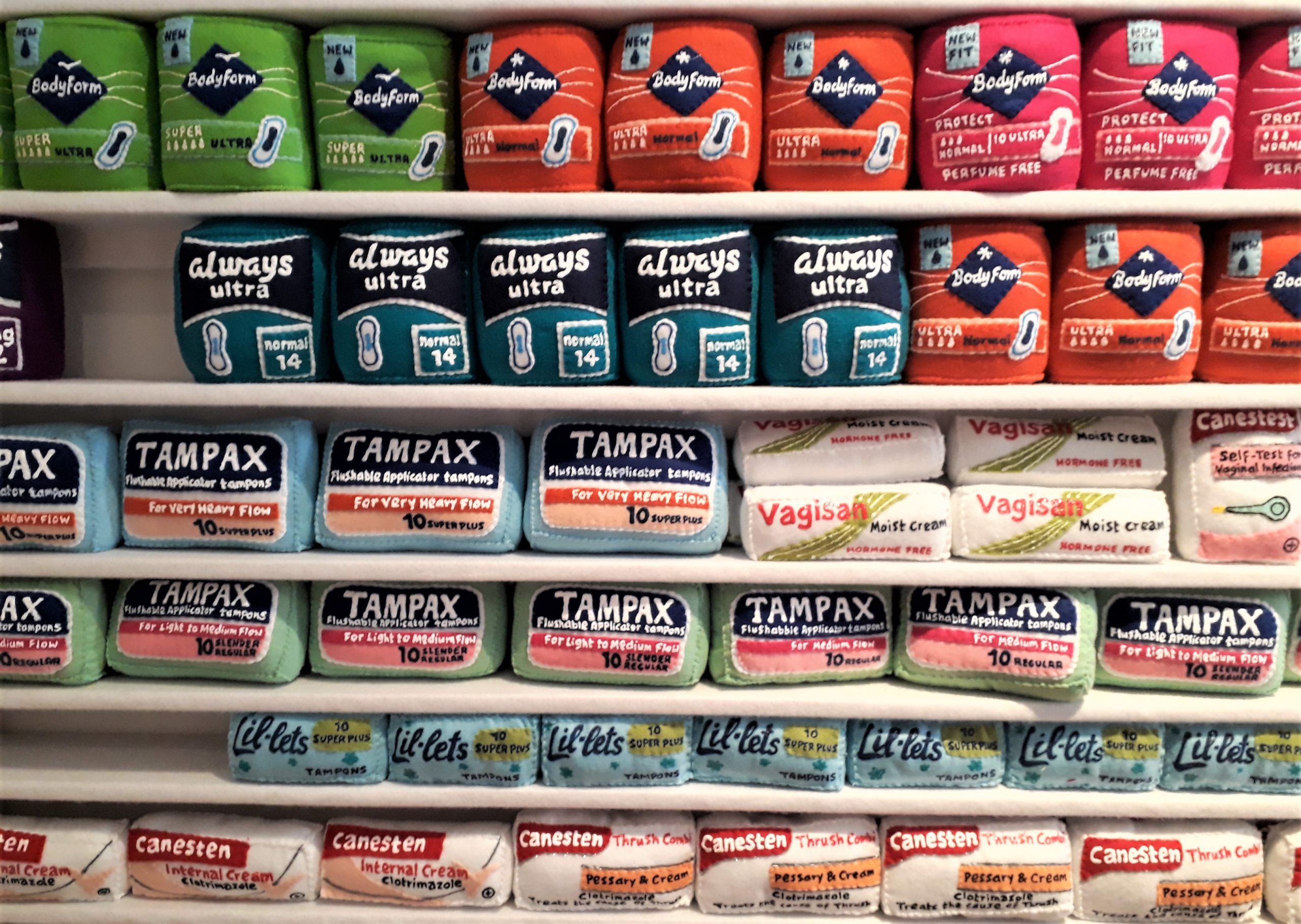

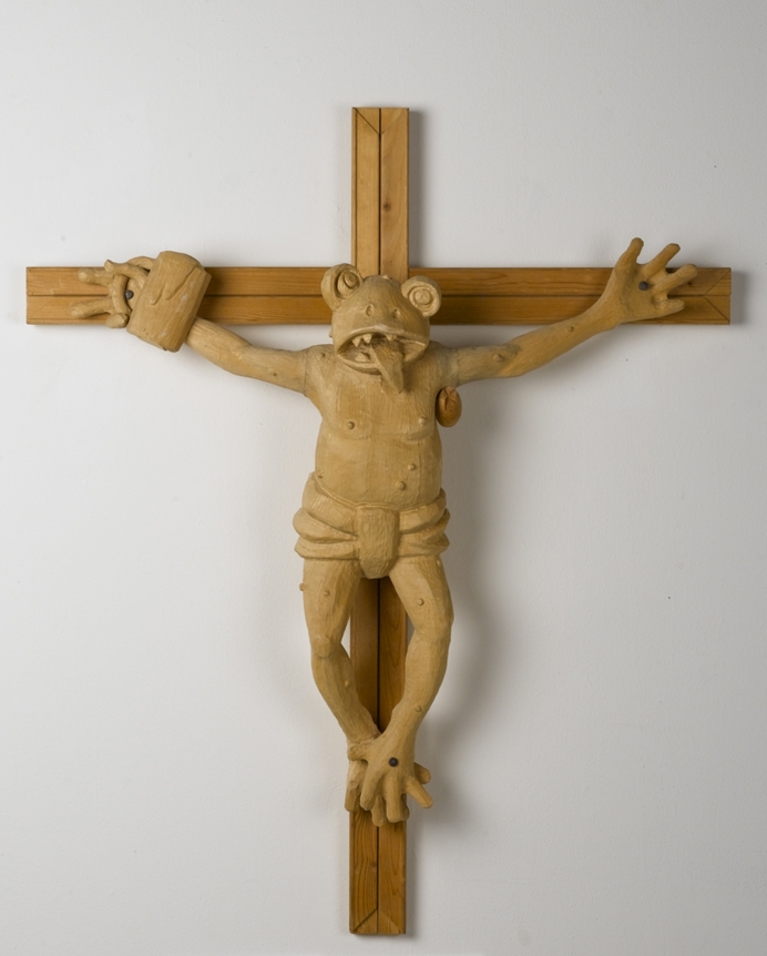
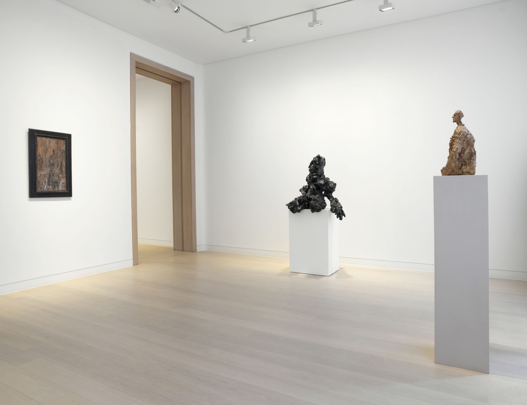
 Bernard Cohen: ‘Clown’, 2019 at Flowers
 Rudolf Stingel: ‘Kirchner Wald im Winter 1925’ at Sadie Coles, 8 Bury St
 Bernard Cohen: ‘Clown’, 2019 at Flowers
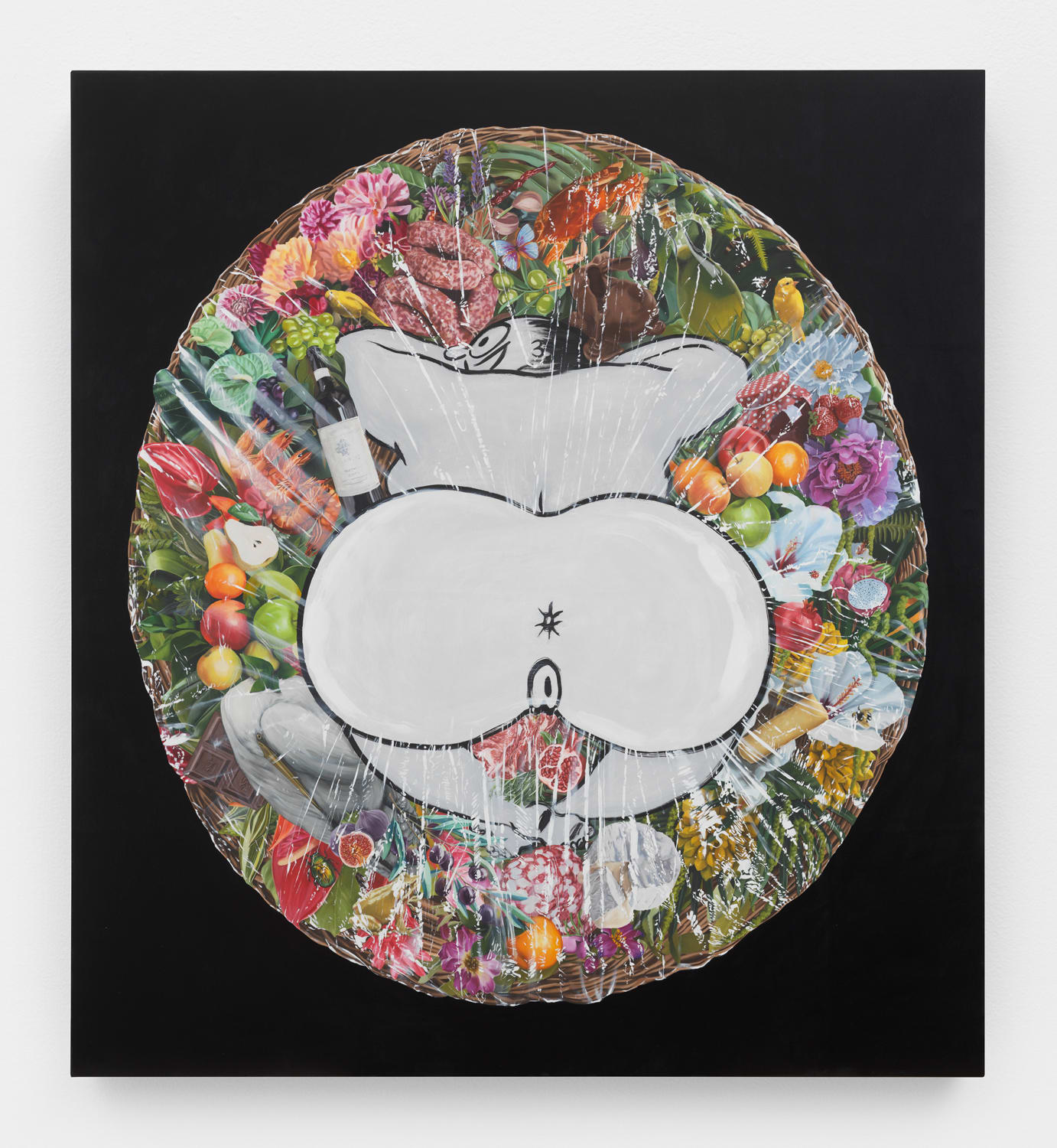
 Rudolf Stingel: ‘Kirchner Wald im Winter 1925’ at Sadie Coles, 8 Bury St
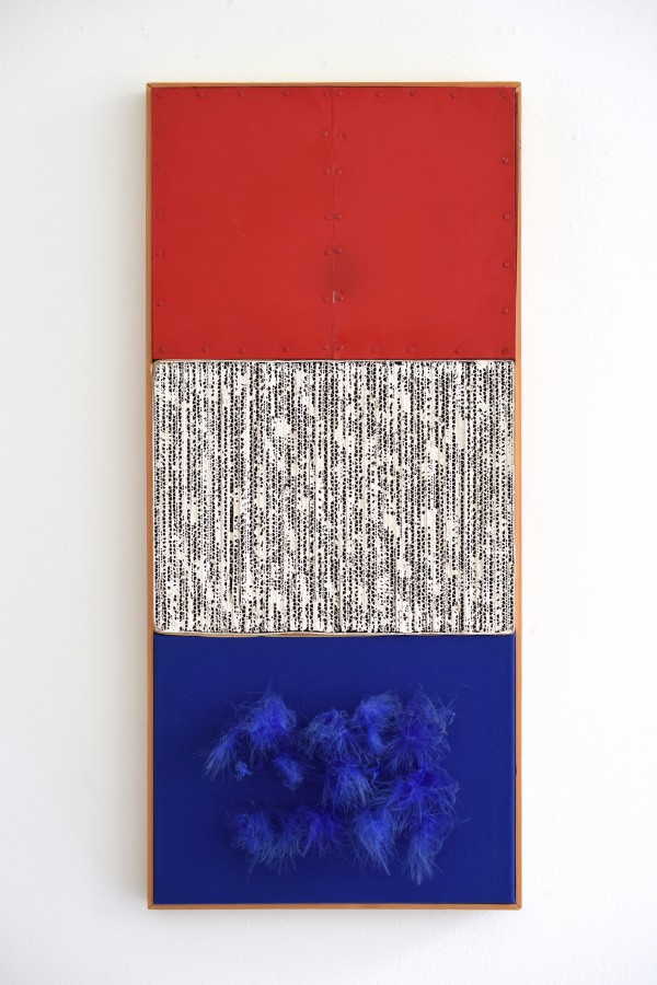
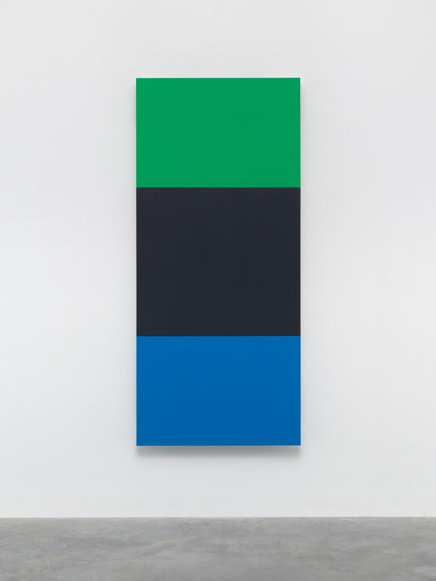
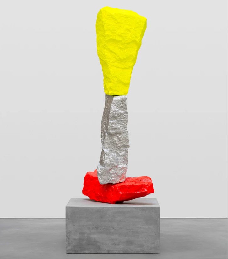
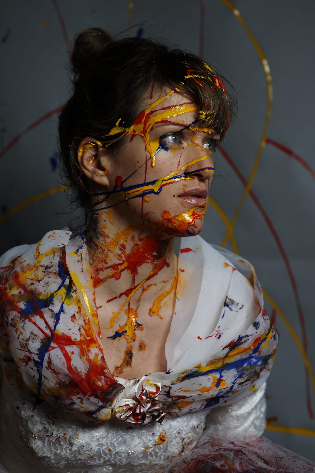
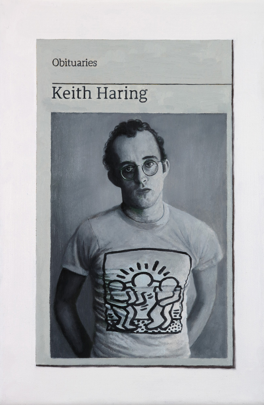
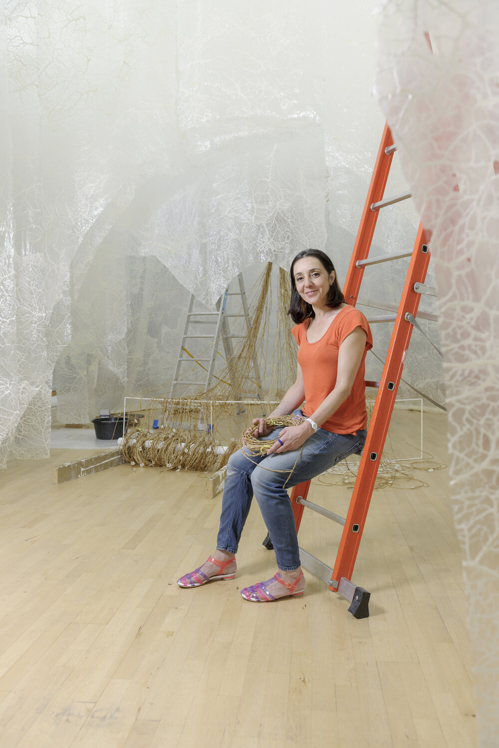
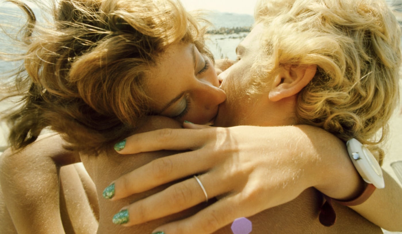
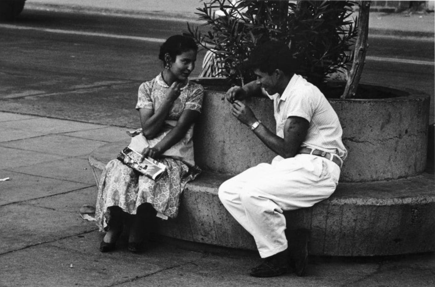
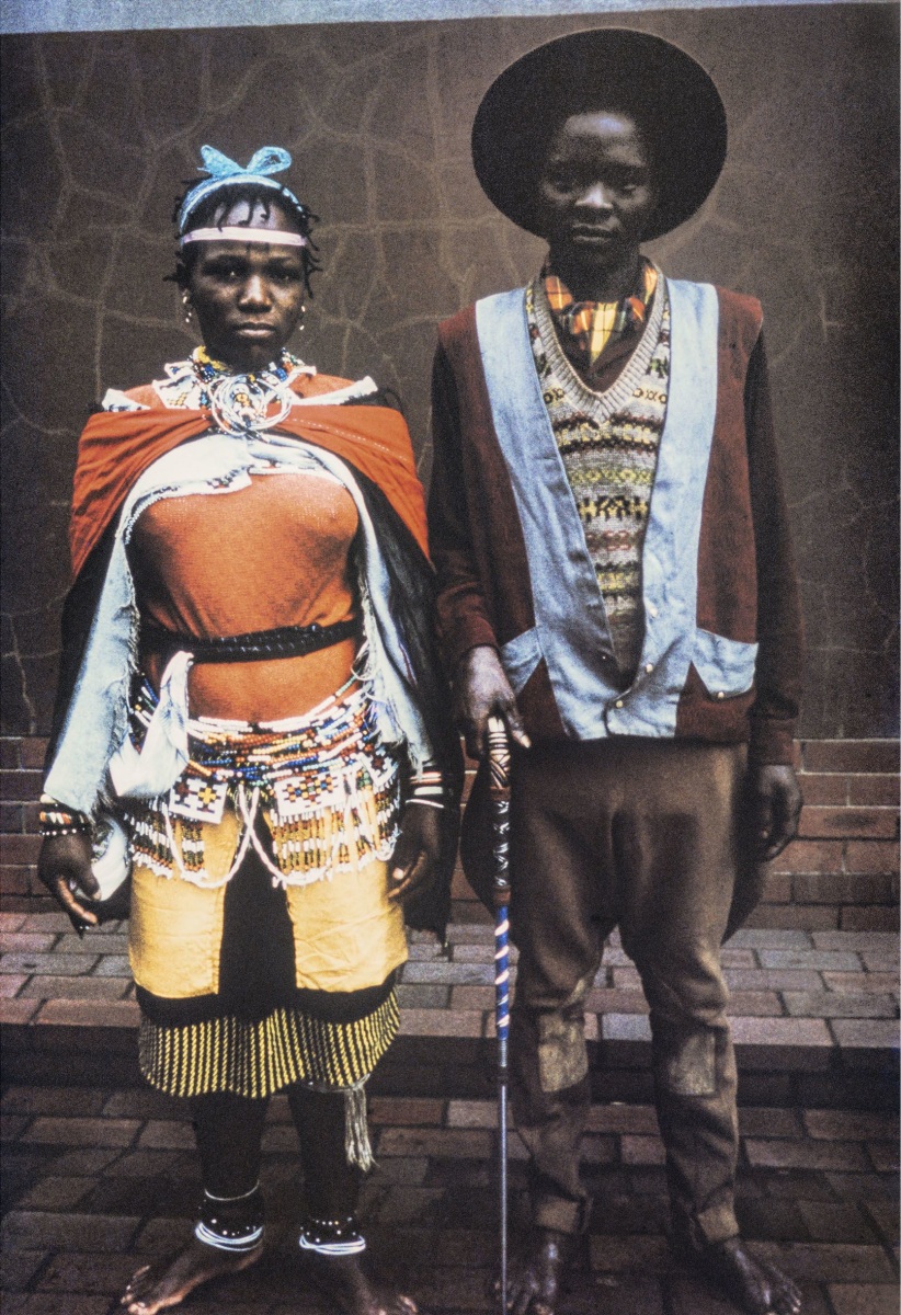
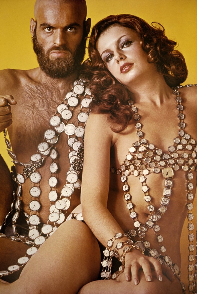

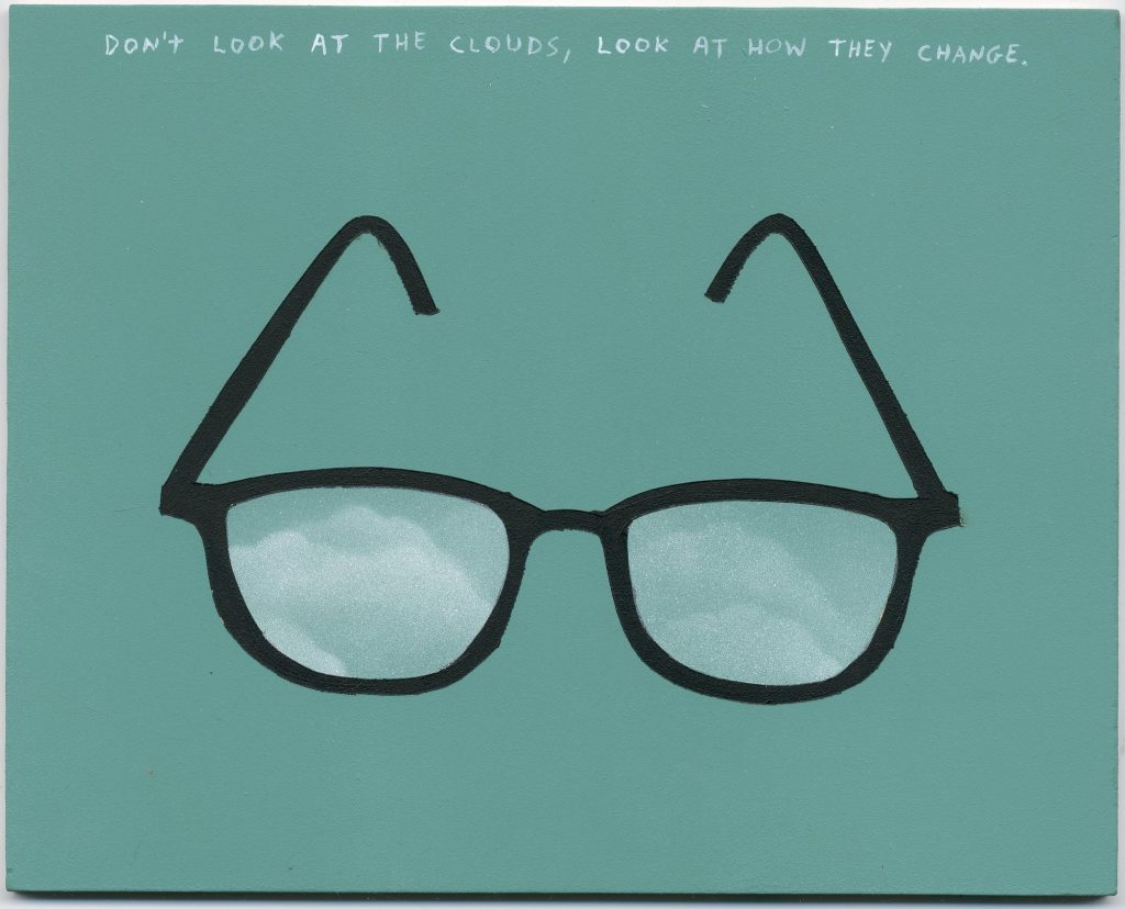

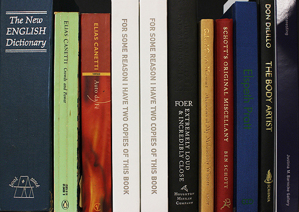

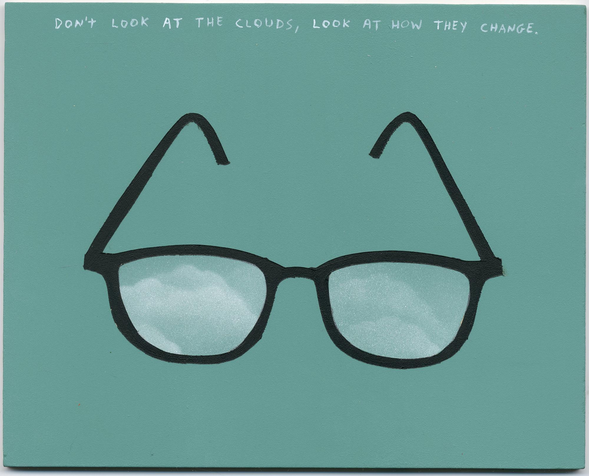
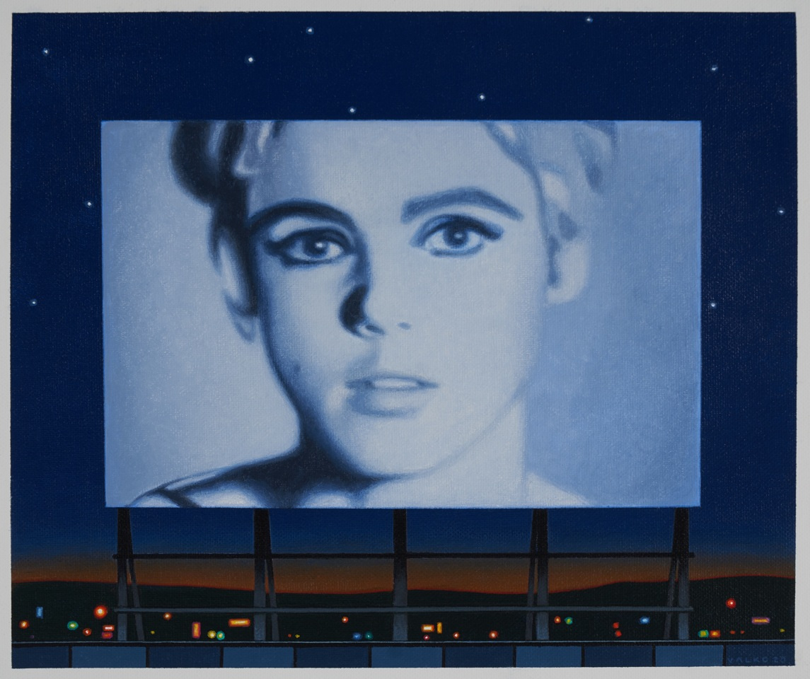
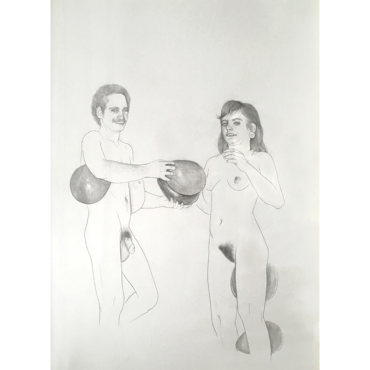
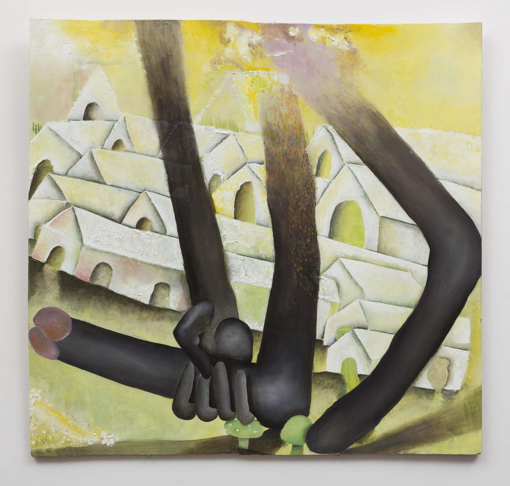
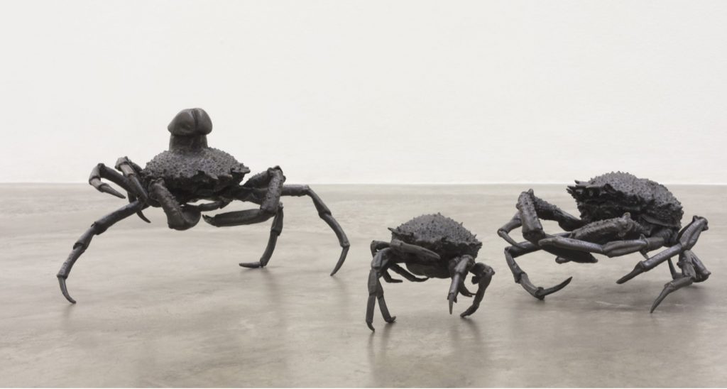
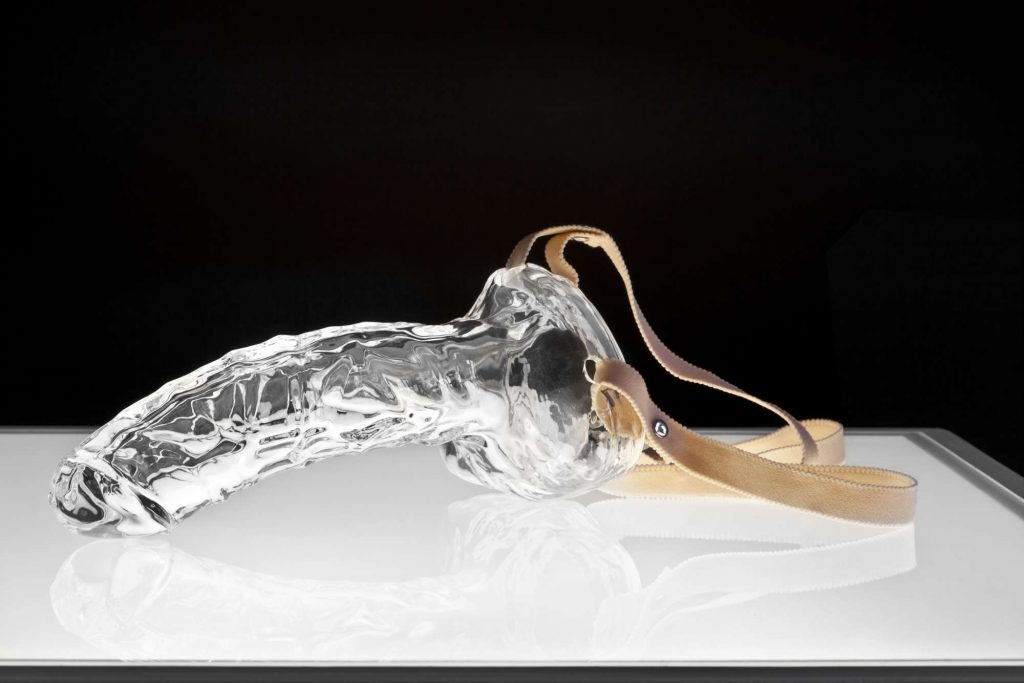
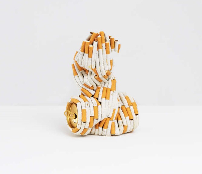

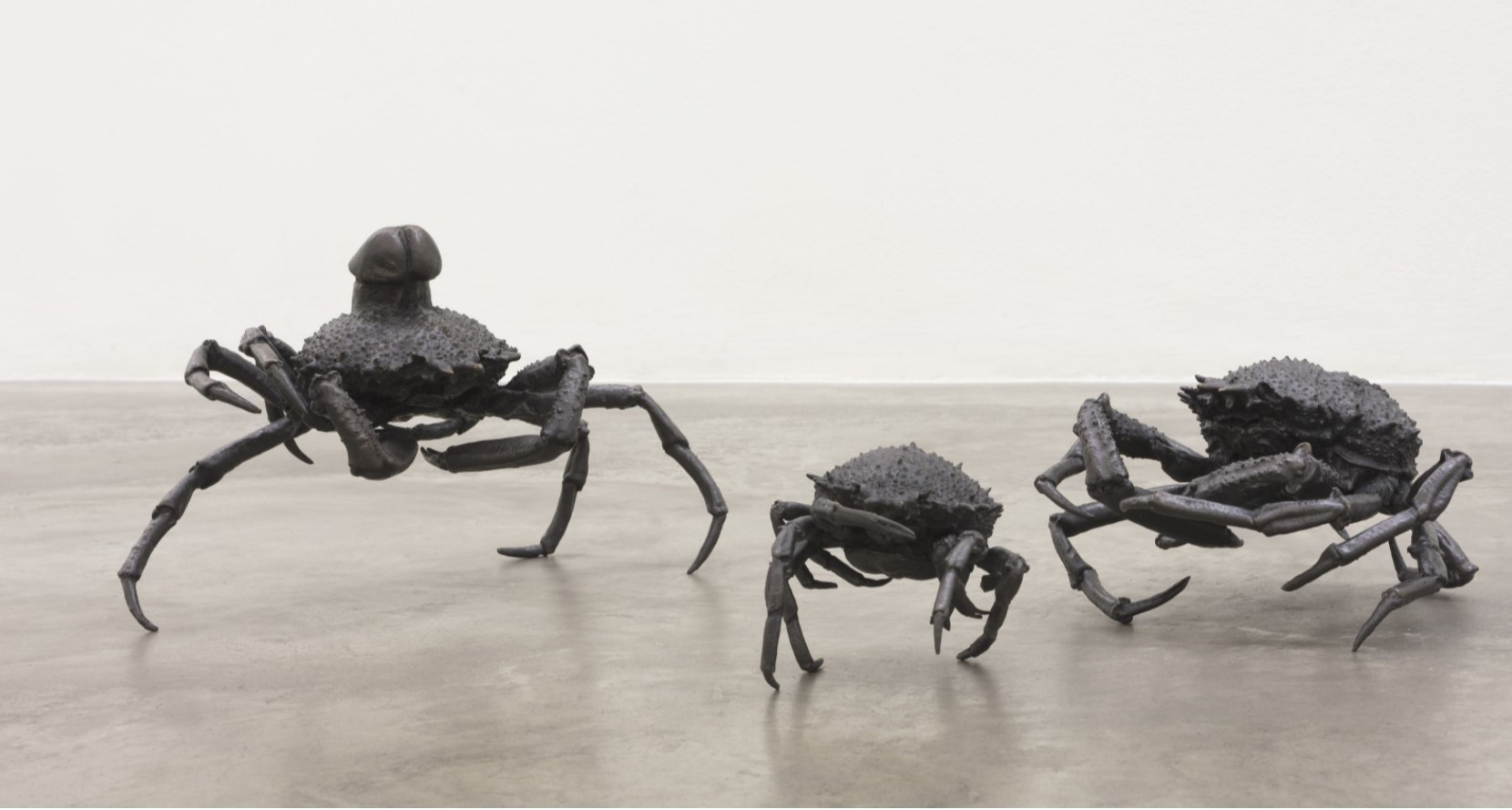


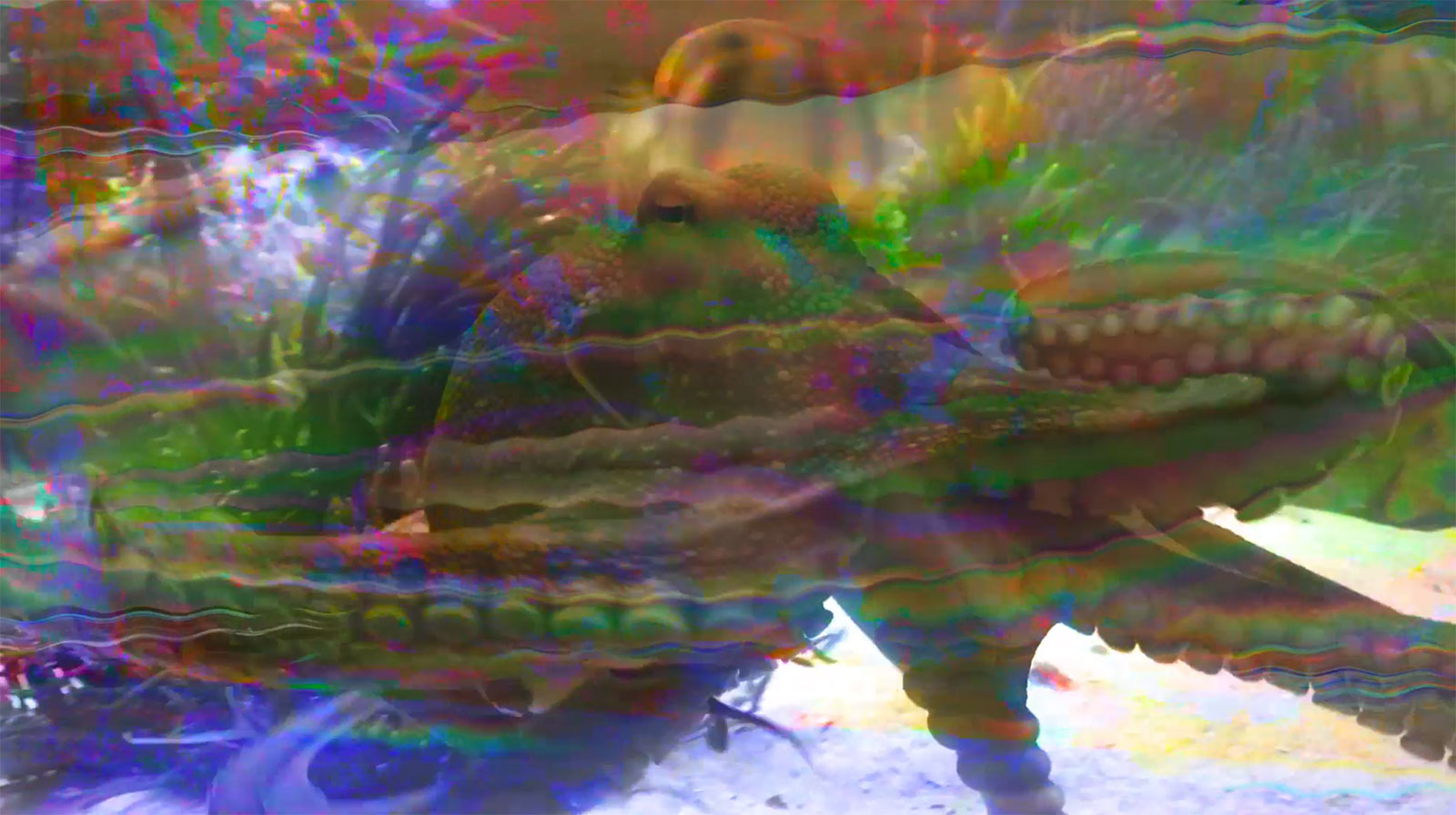

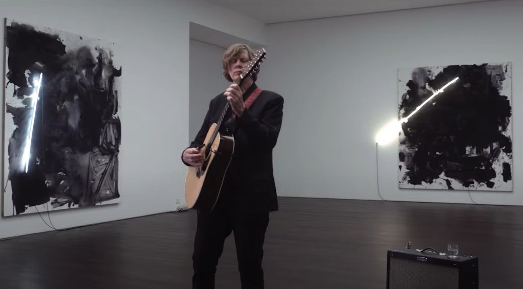
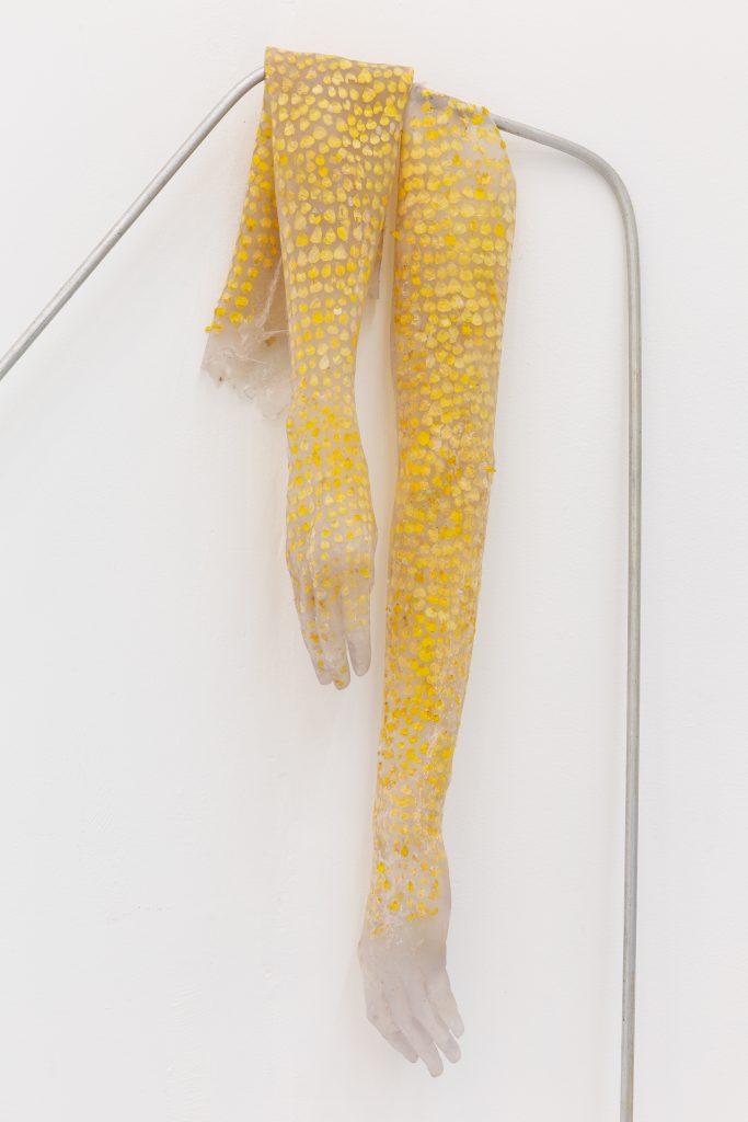 Miriam Austin: ‘Buttercup Gloves (for Alset)’, 2020
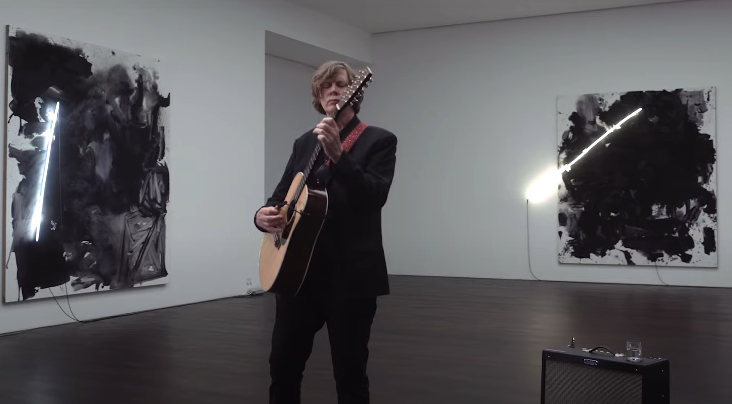

 Miriam Austin: ‘Buttercup Gloves (for Alset)’, 2020
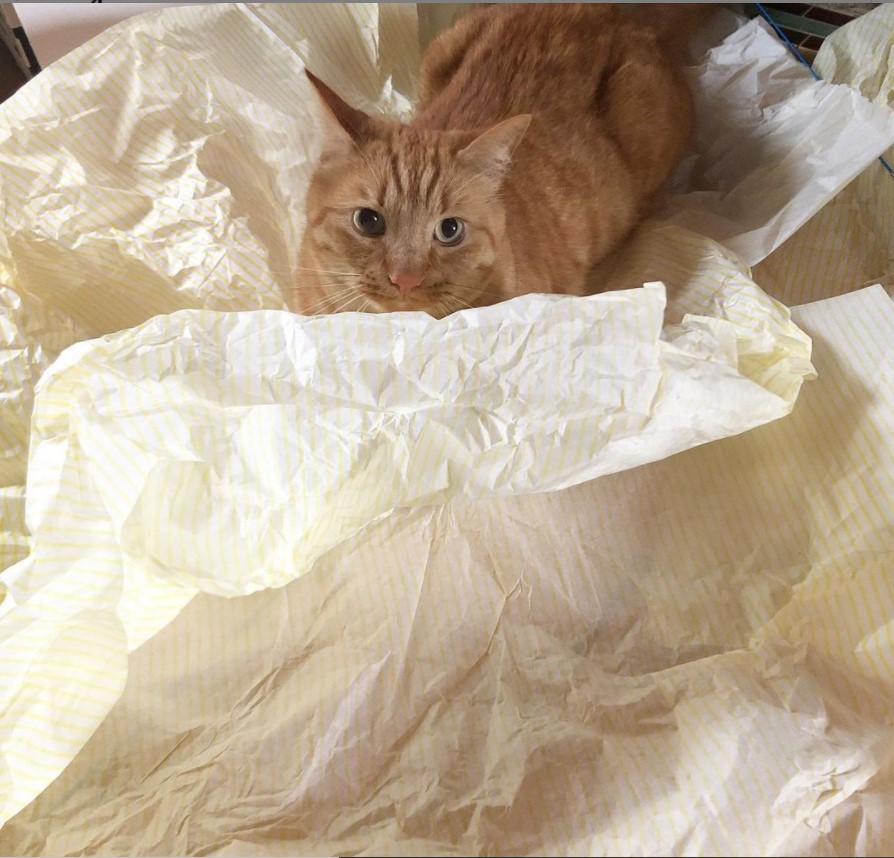
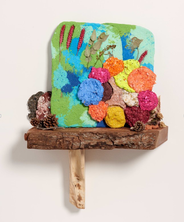
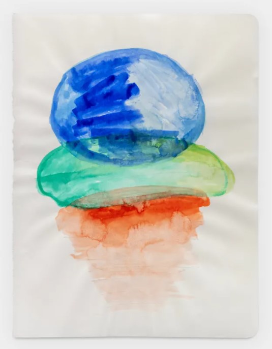
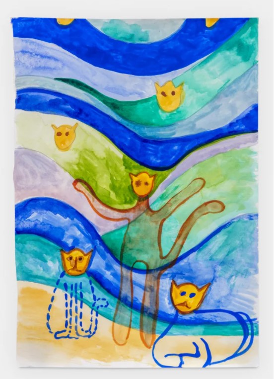
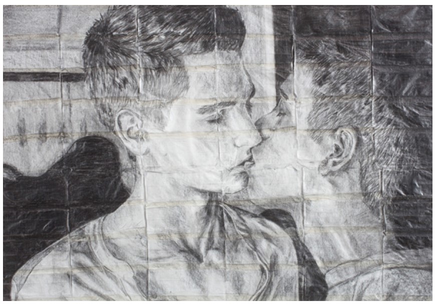
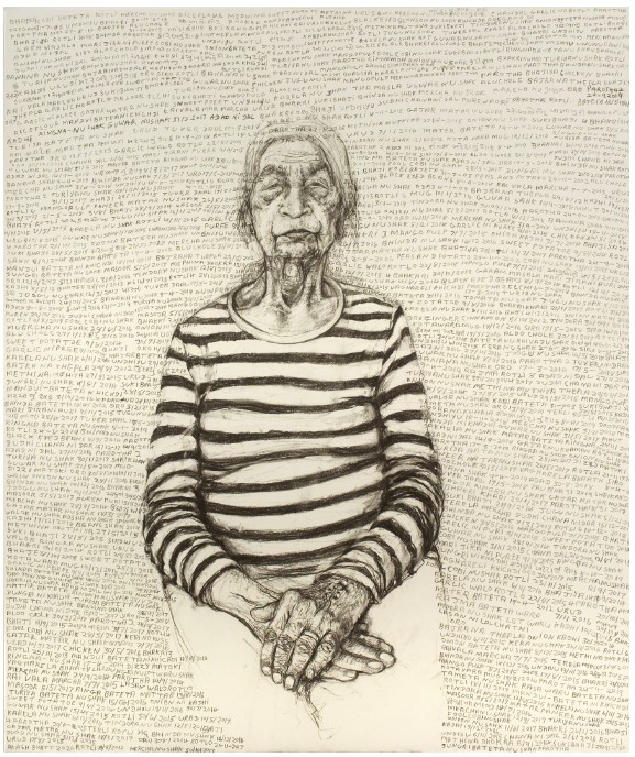
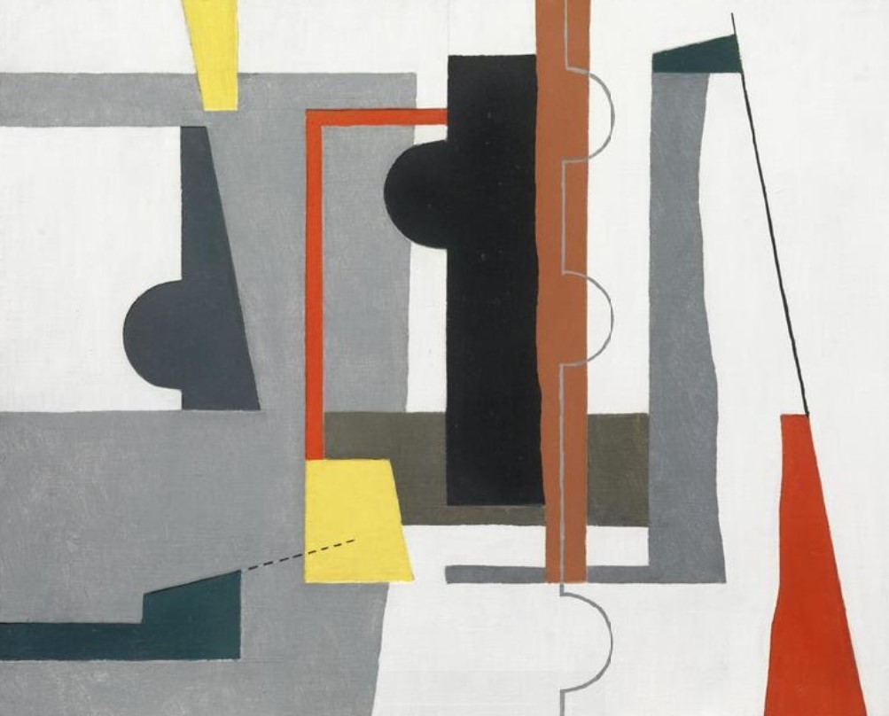
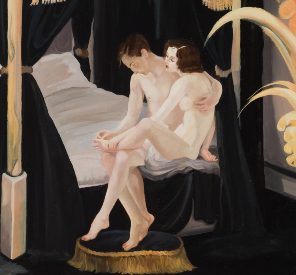
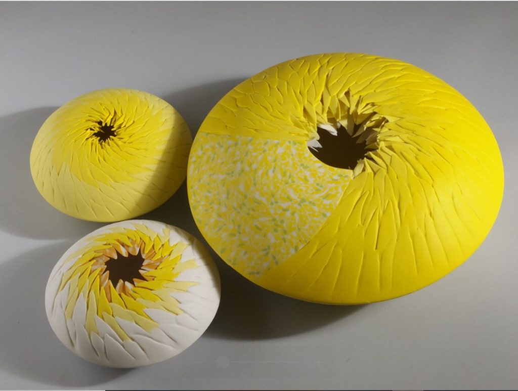


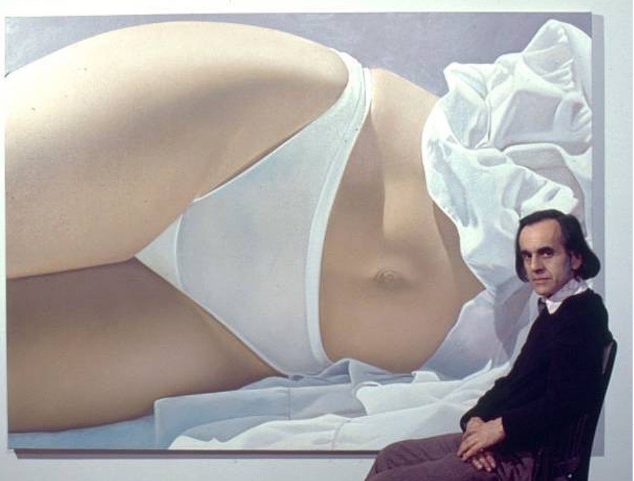
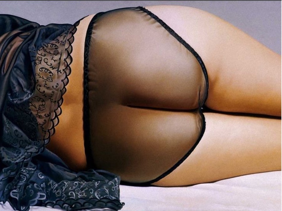
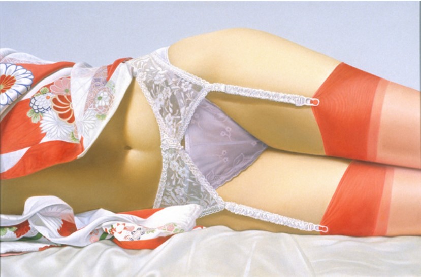
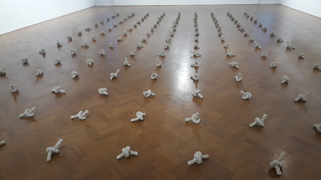
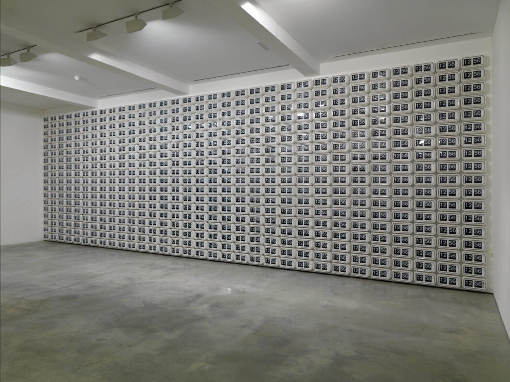
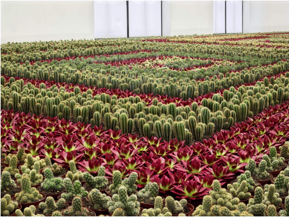
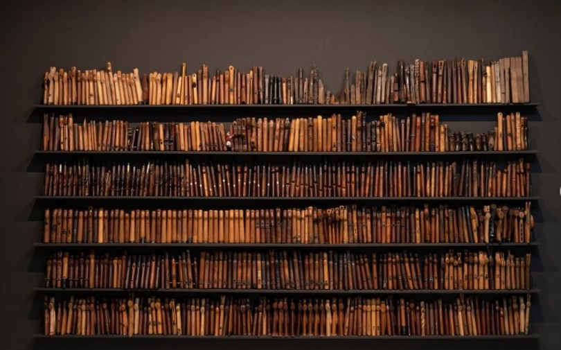


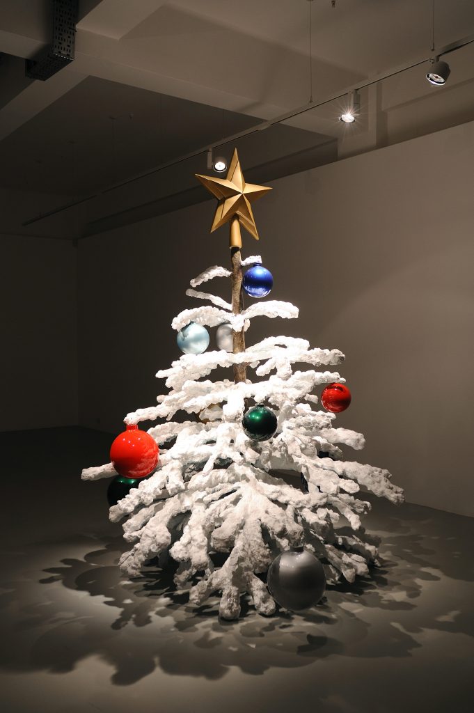
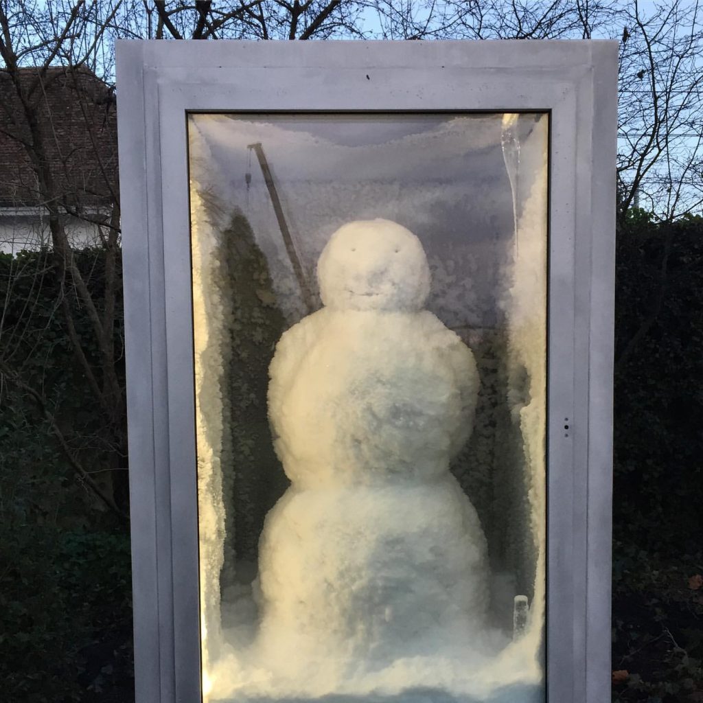
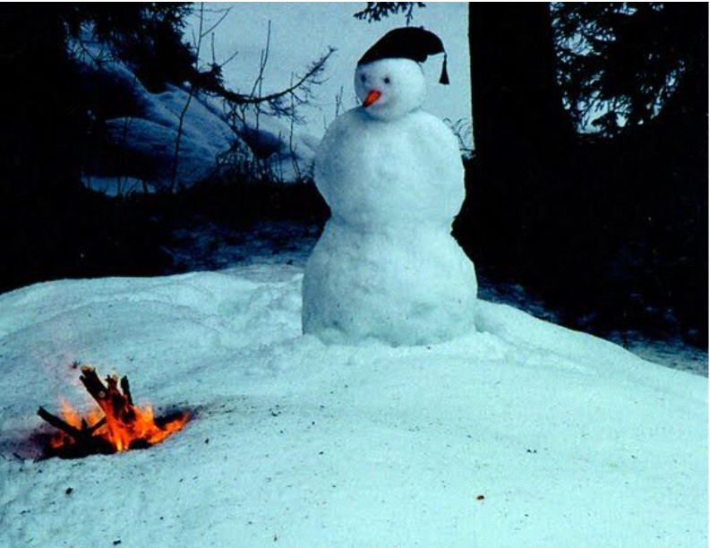


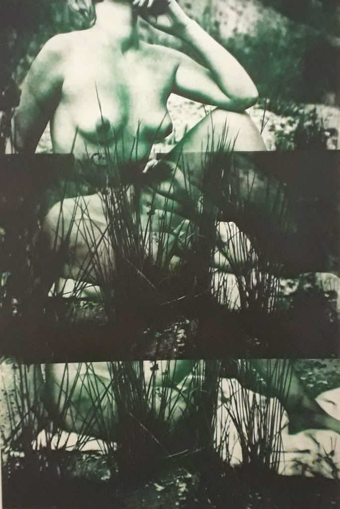
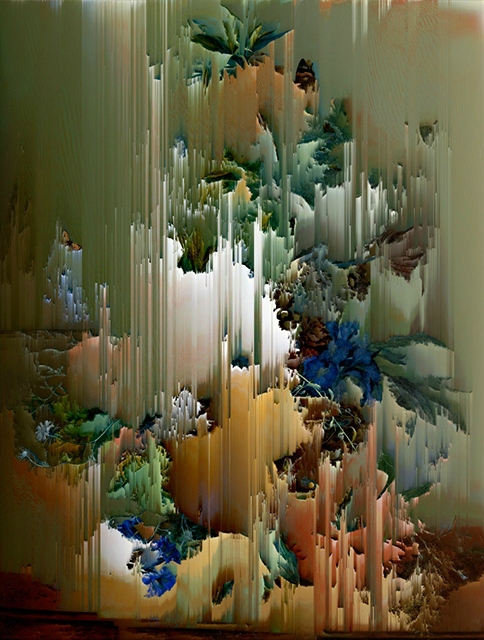
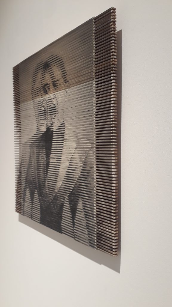
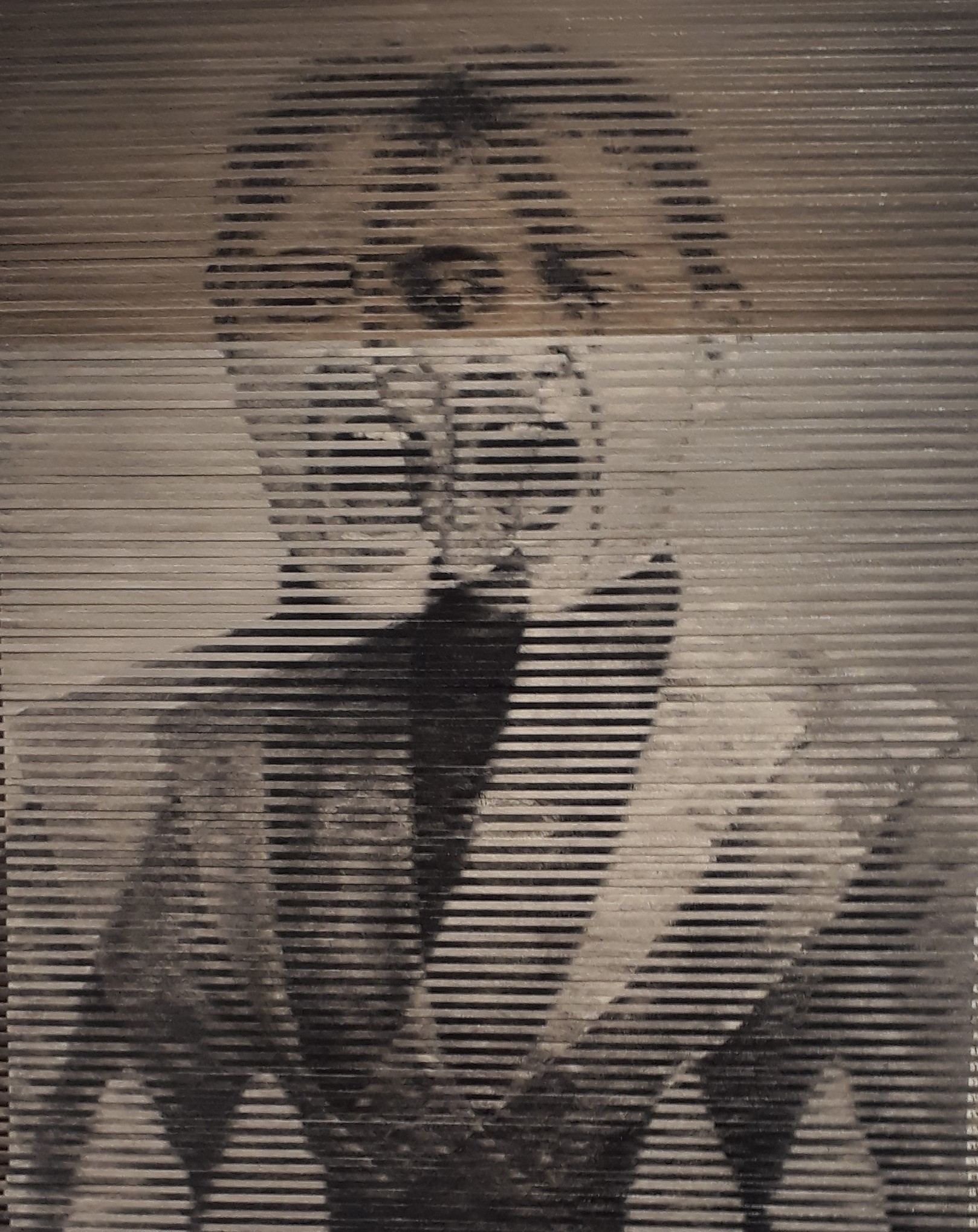

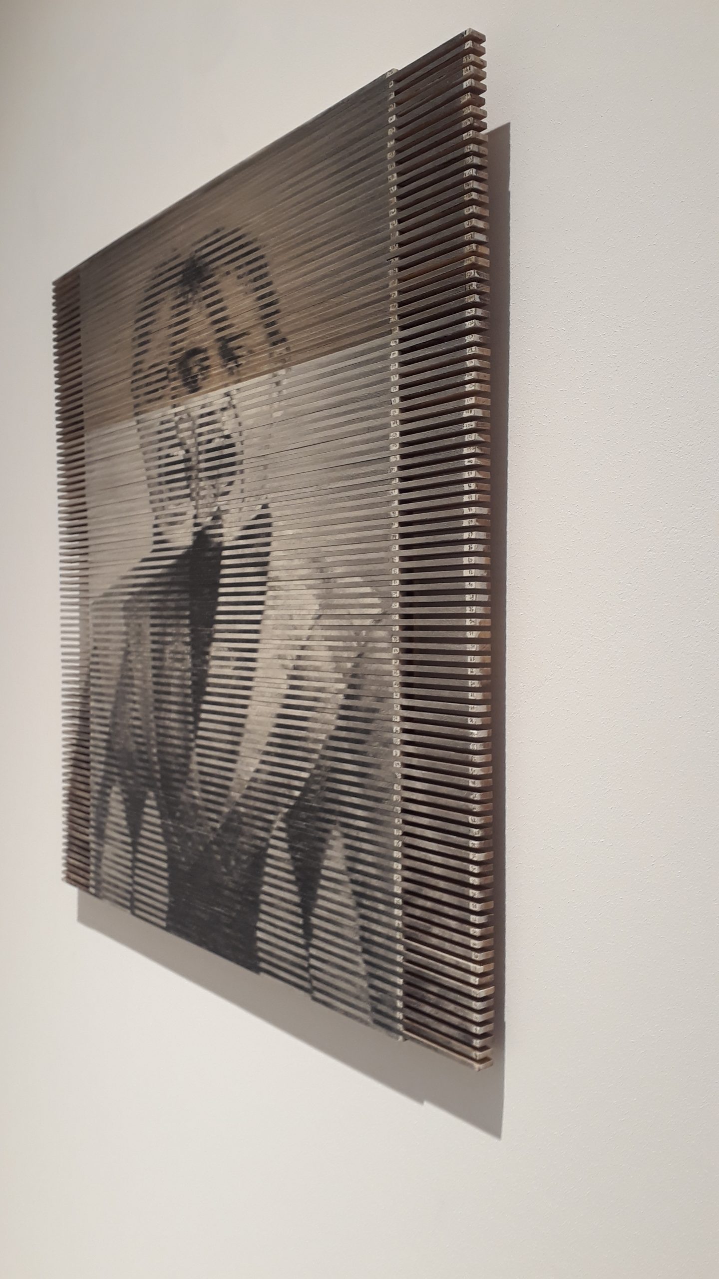
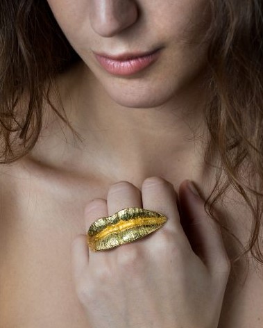
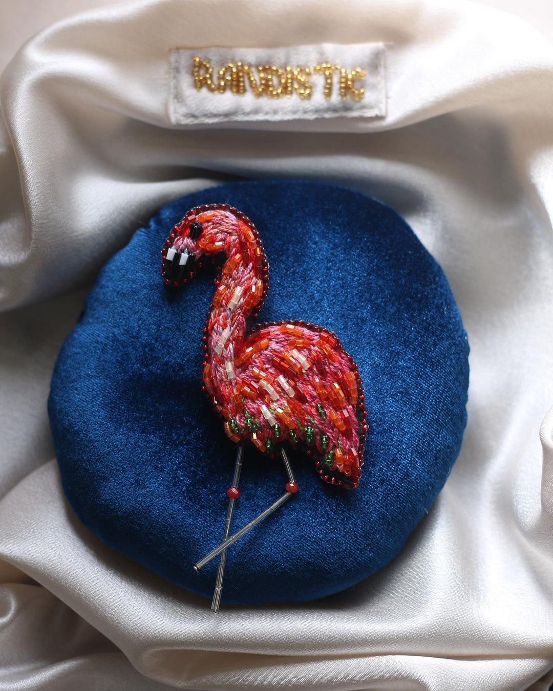
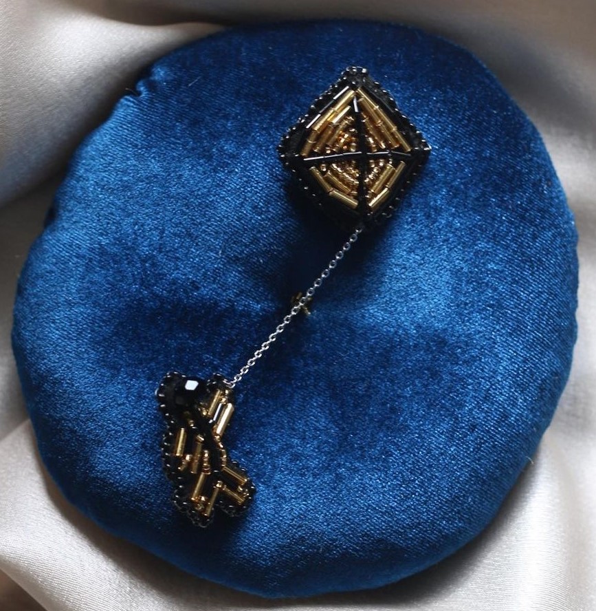
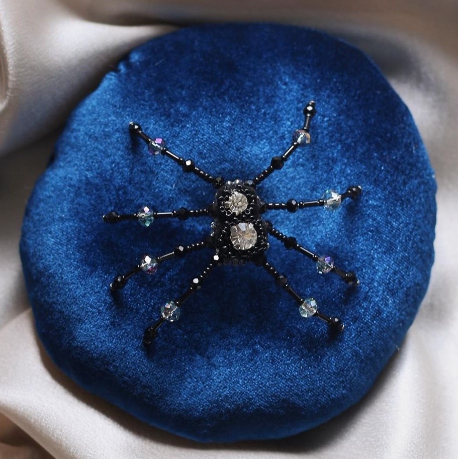
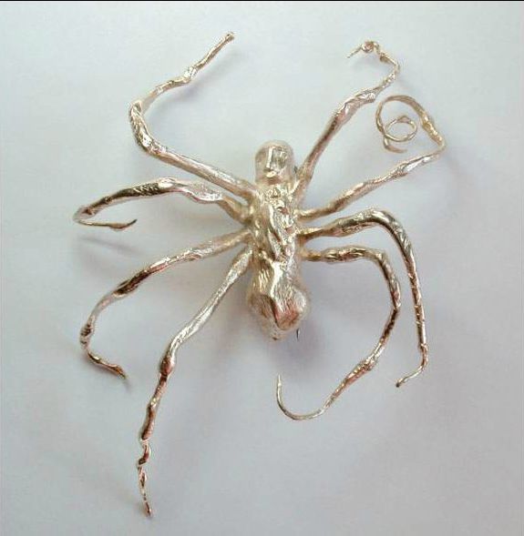
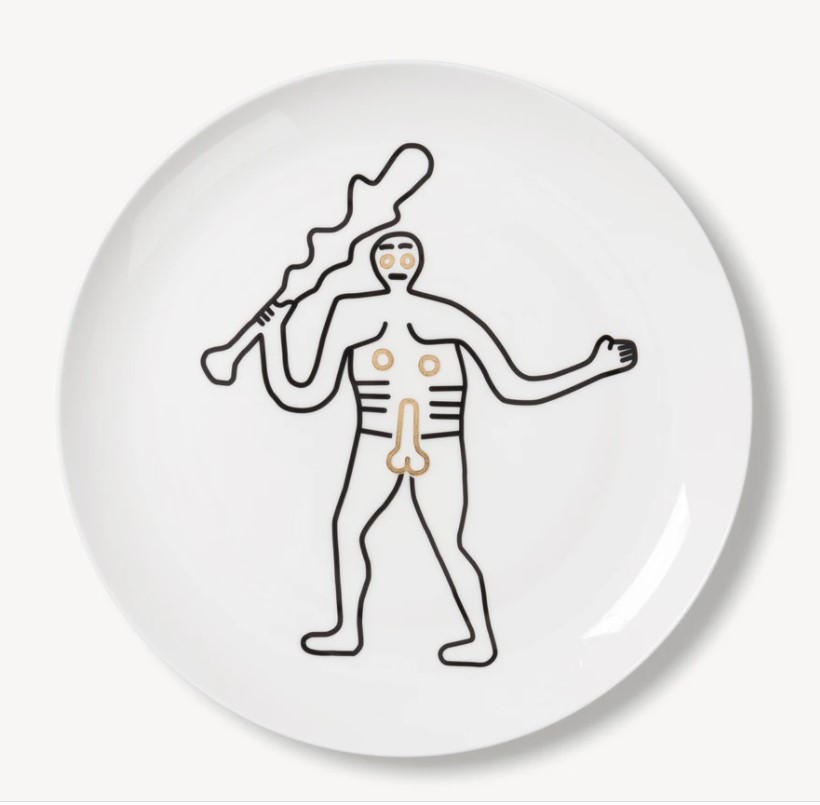
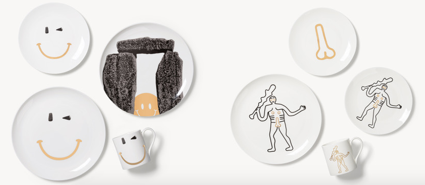
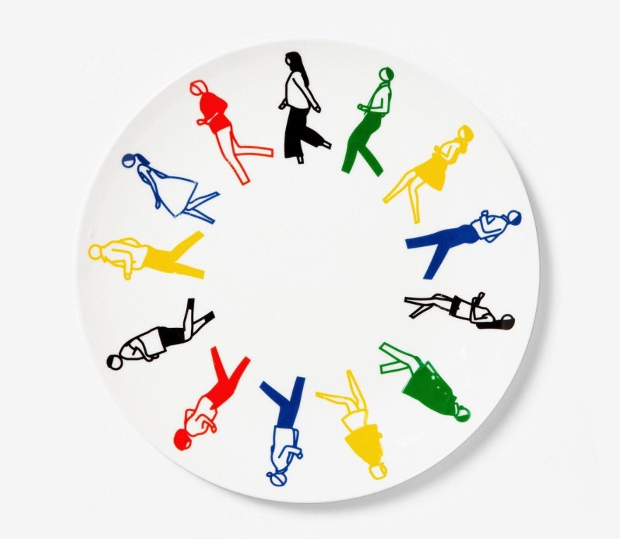

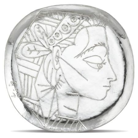
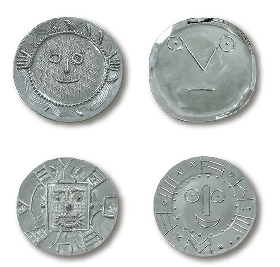
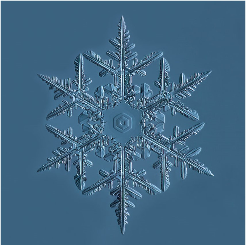
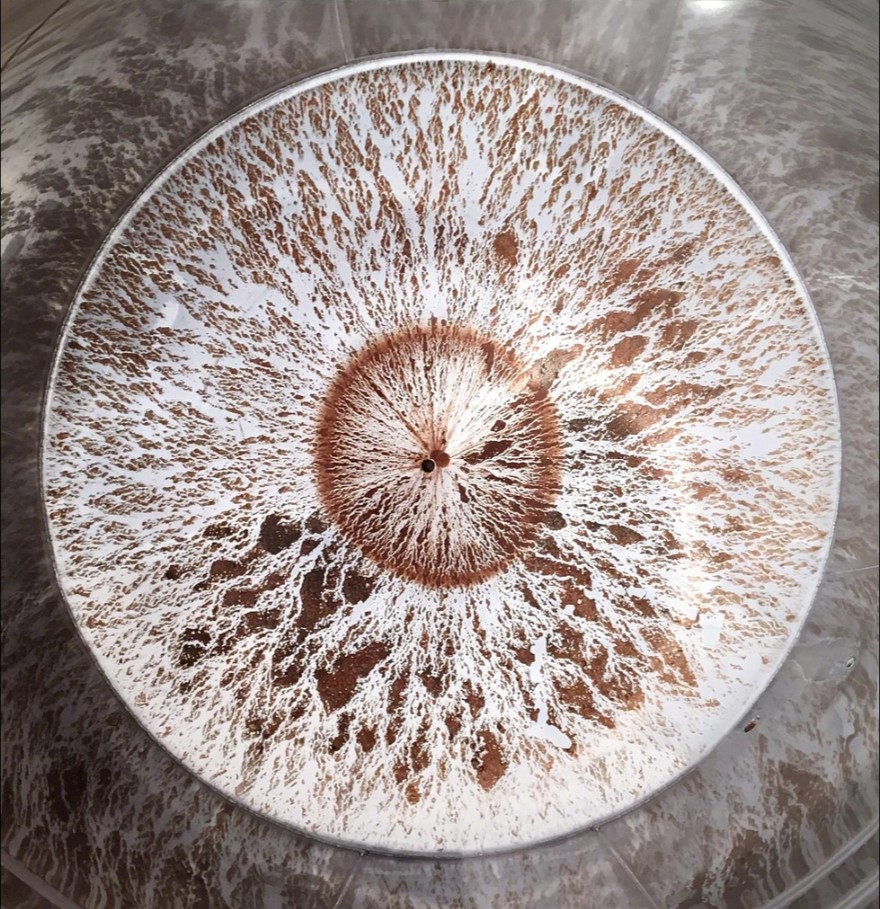
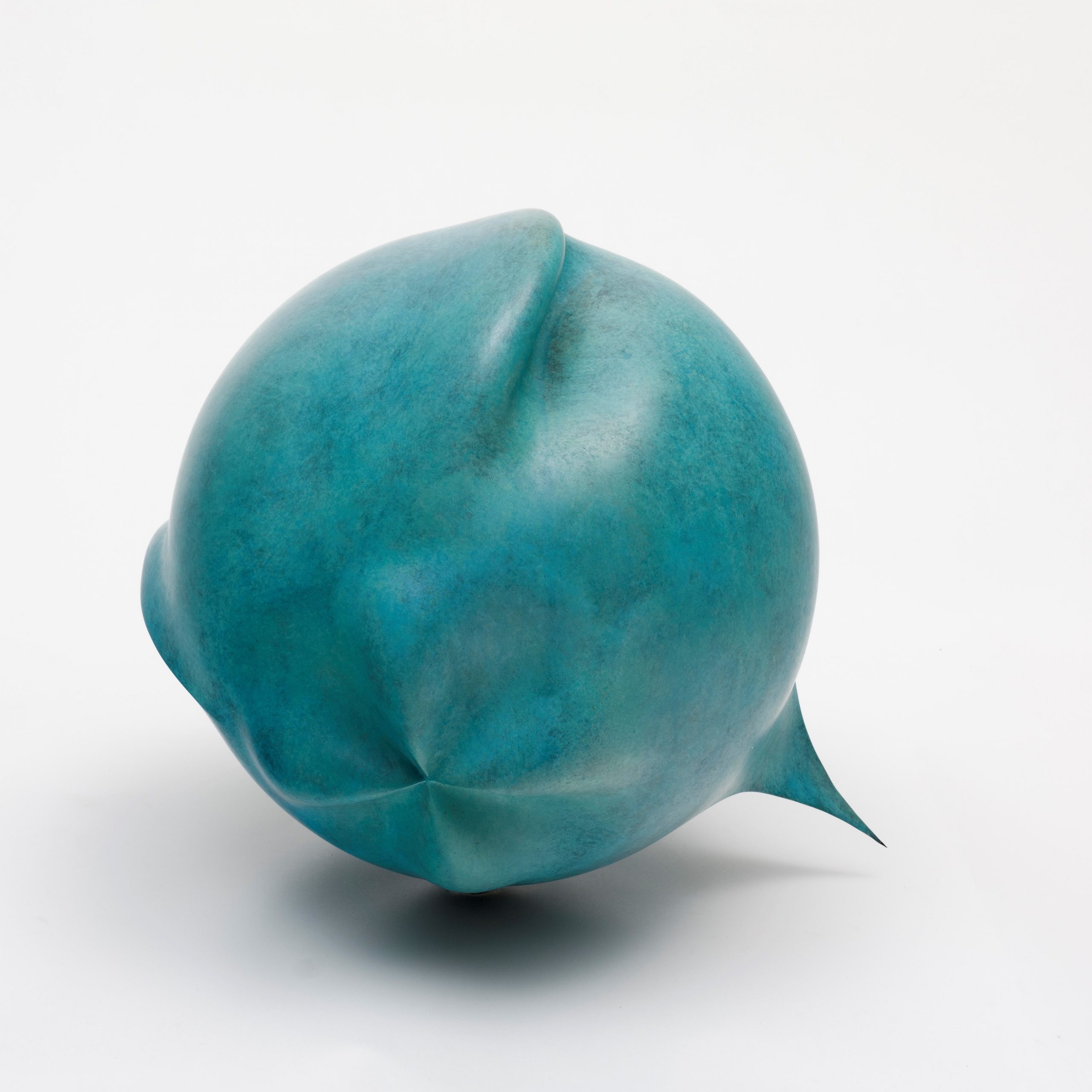
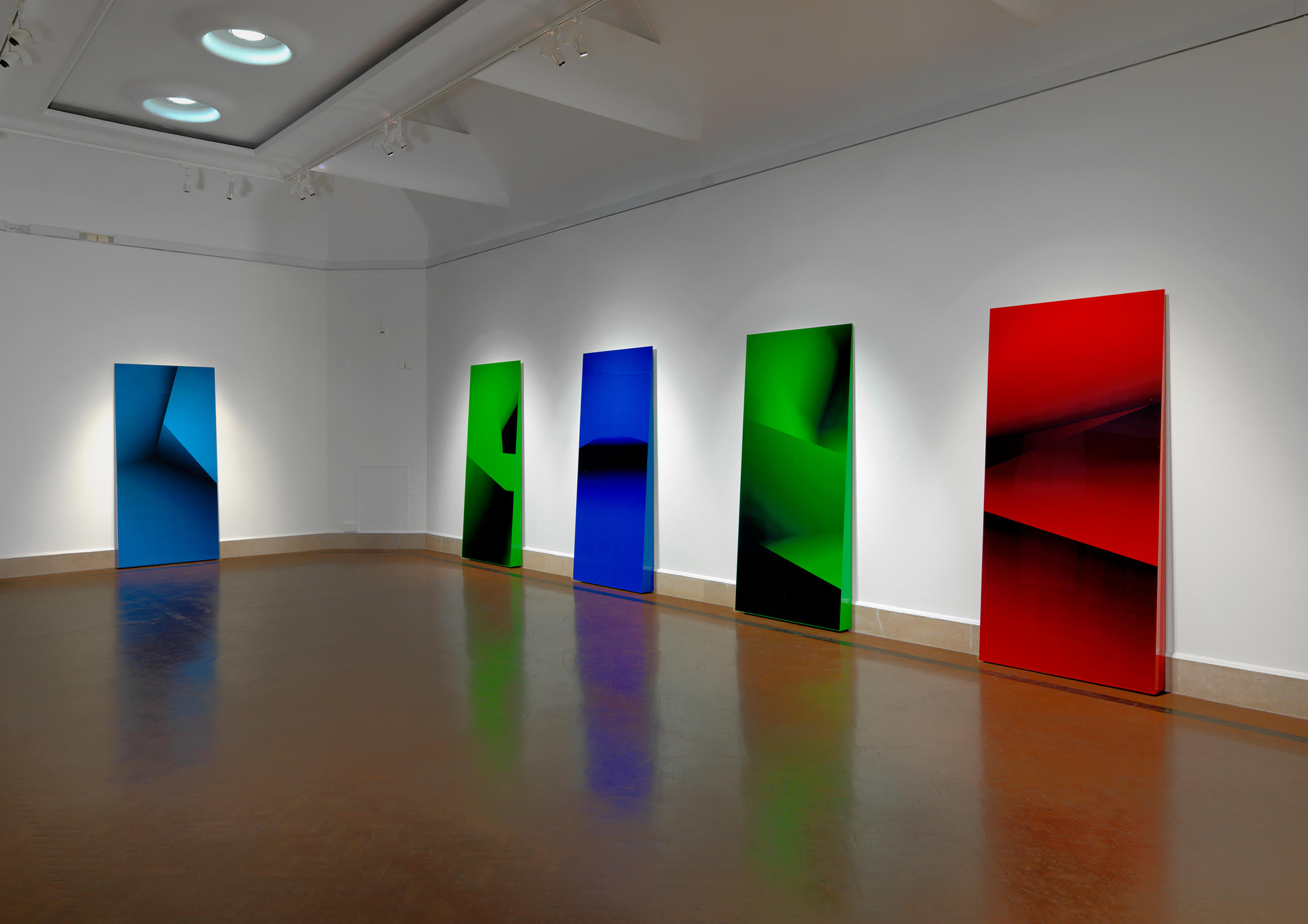

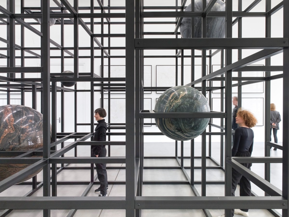
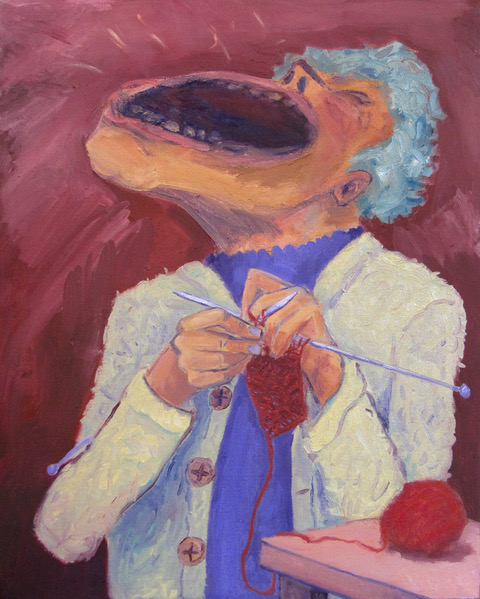
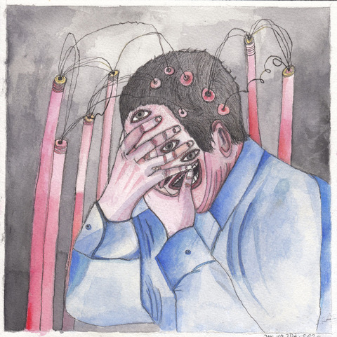
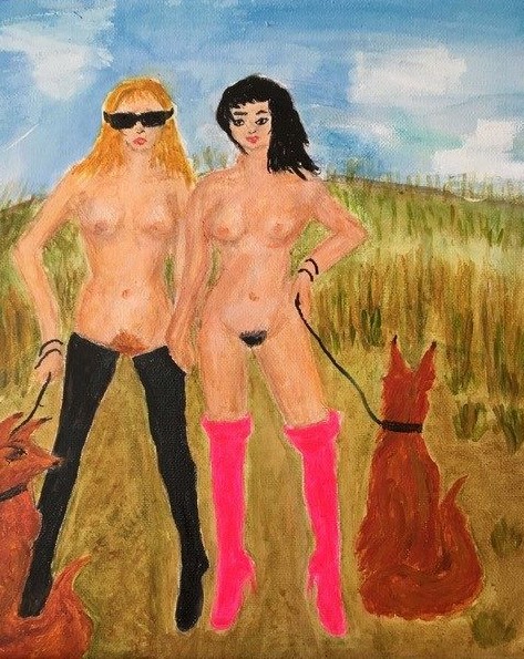

 Dale Lewis: Truffle Butter, 2019
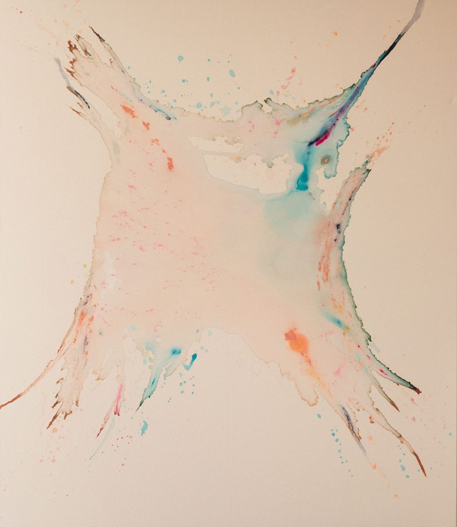
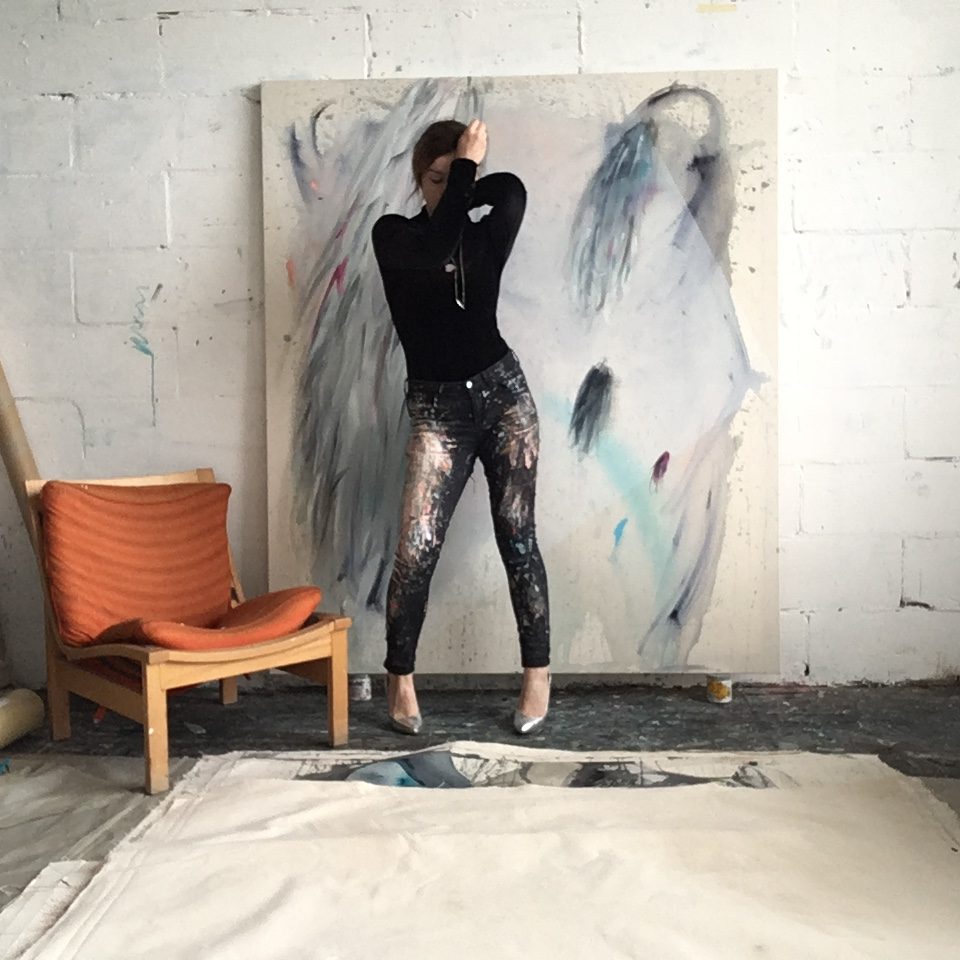
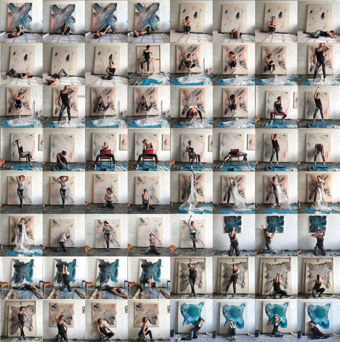
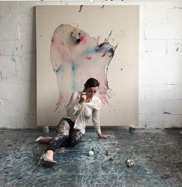
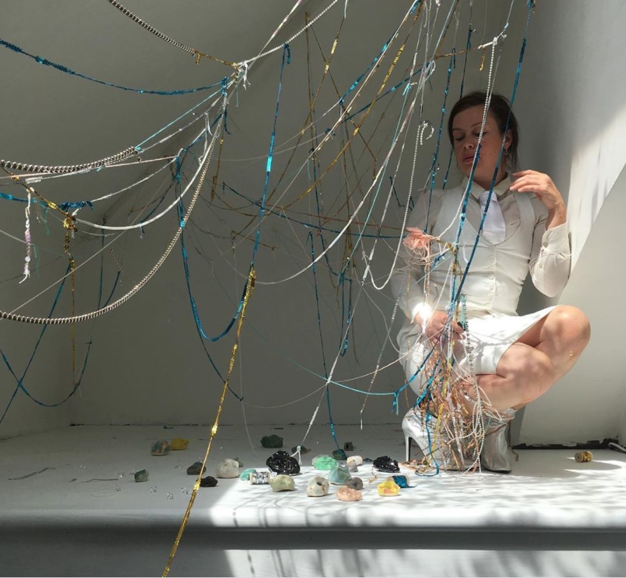
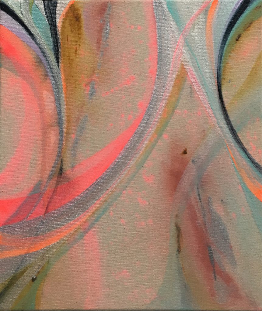
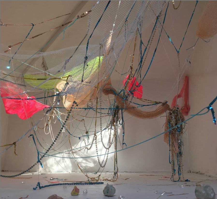
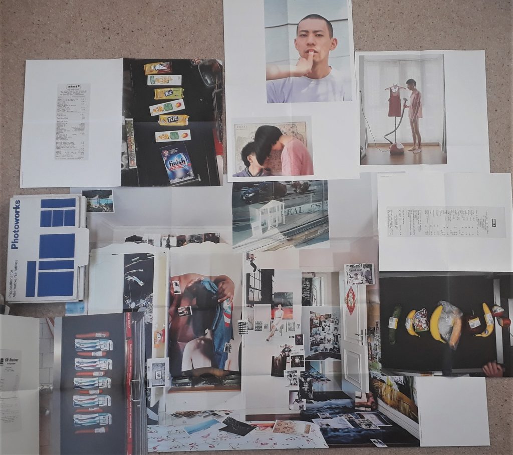


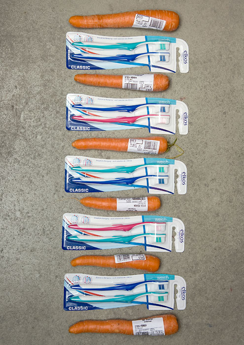

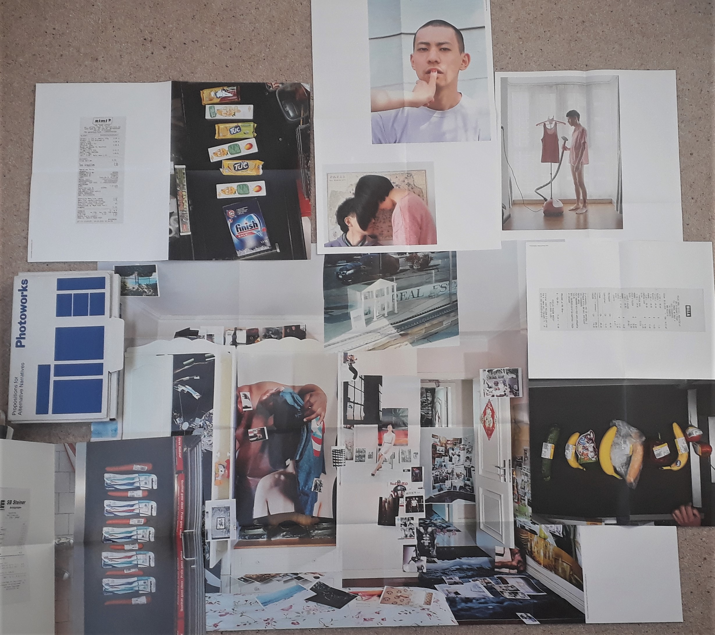
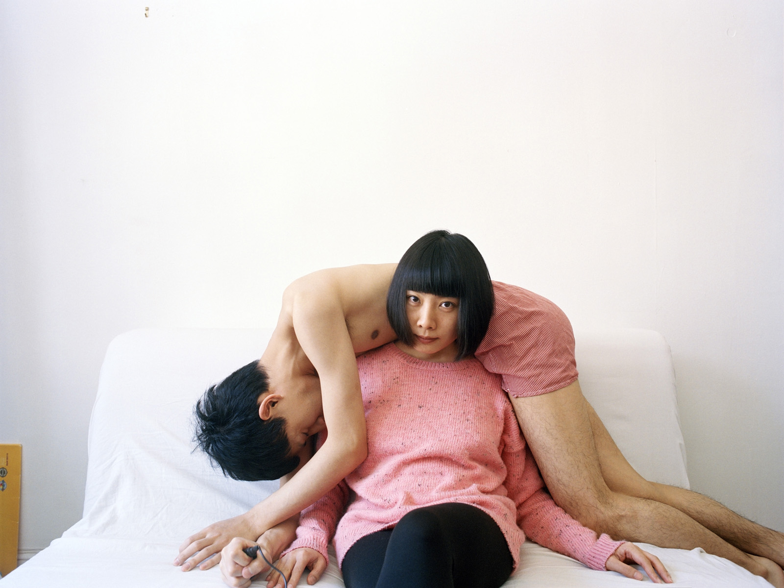
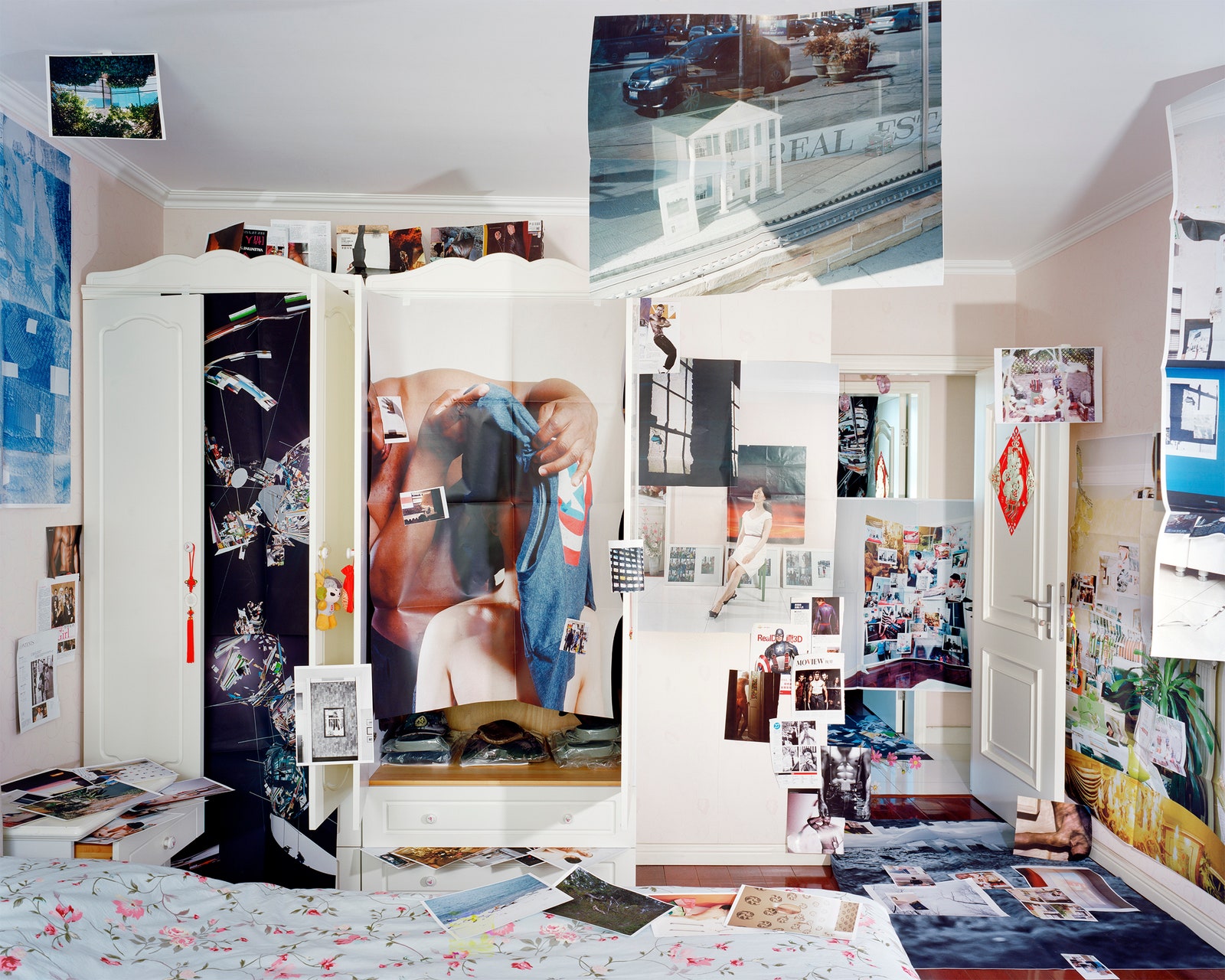
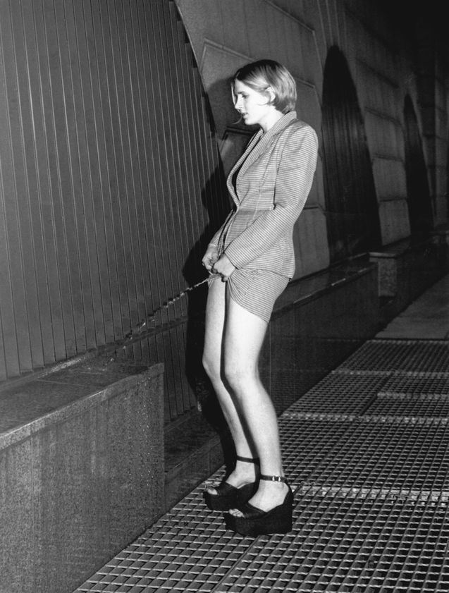
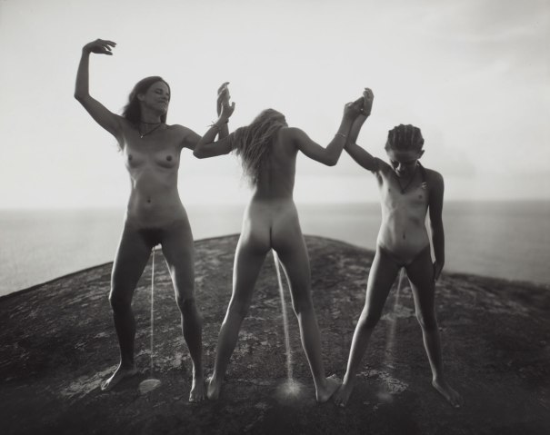
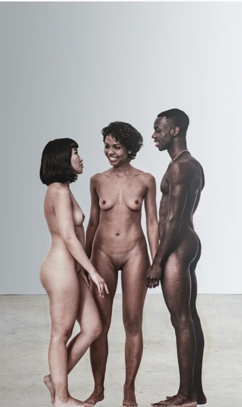
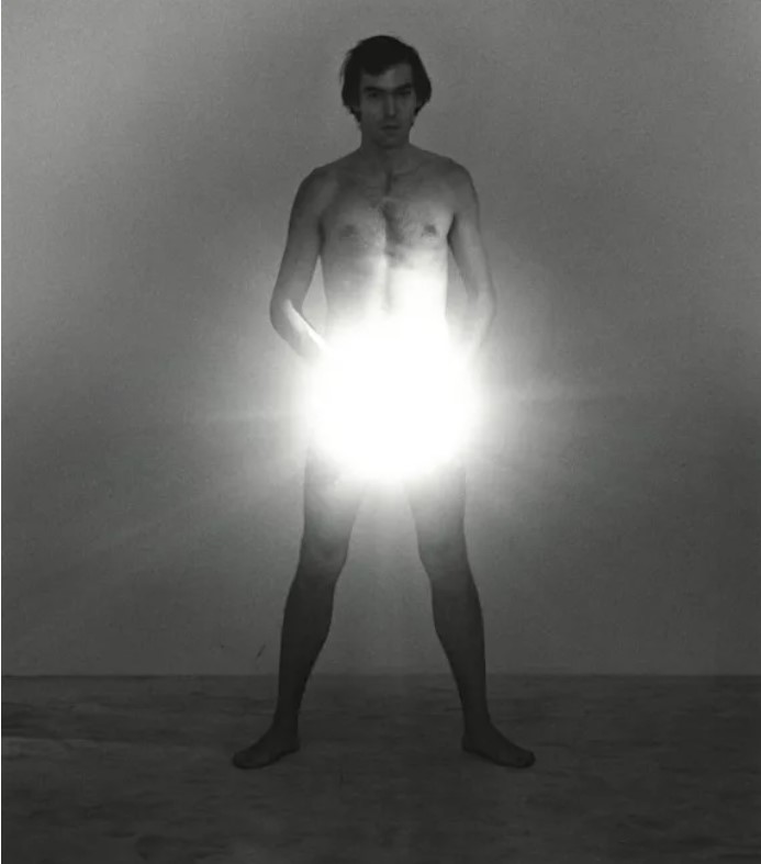
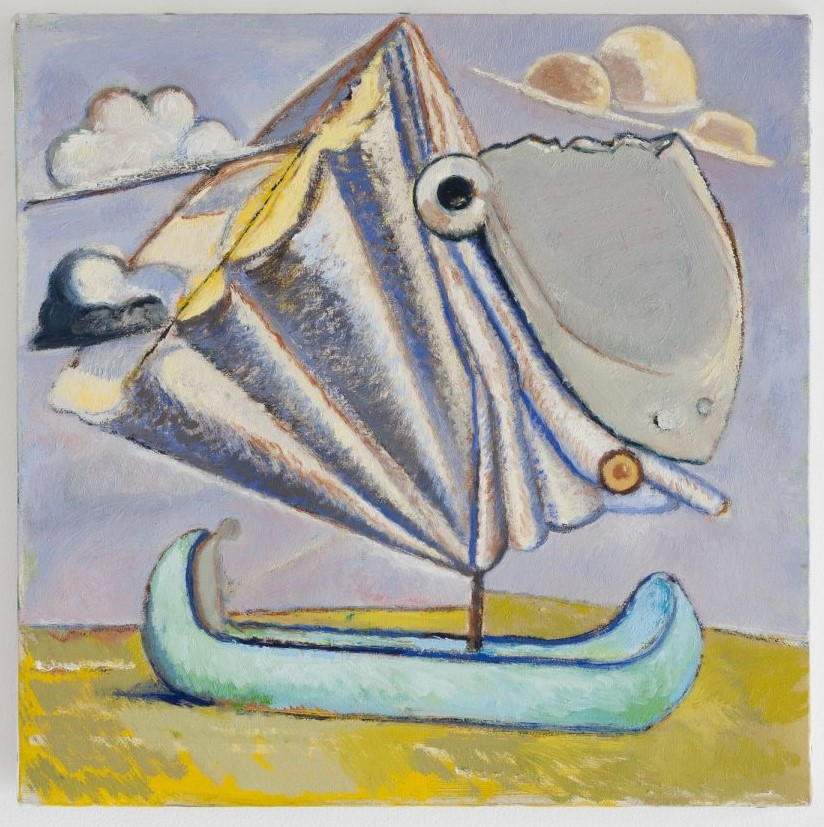
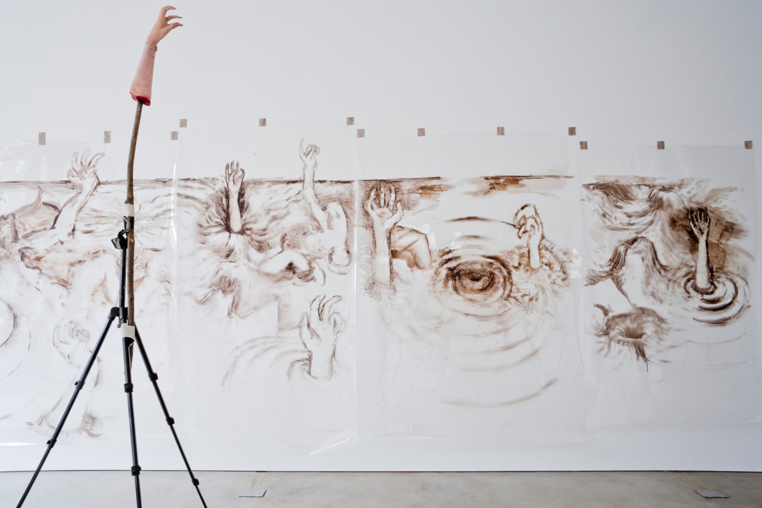


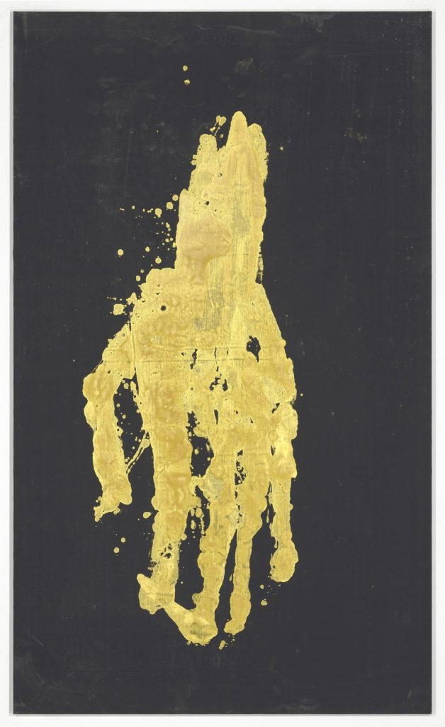
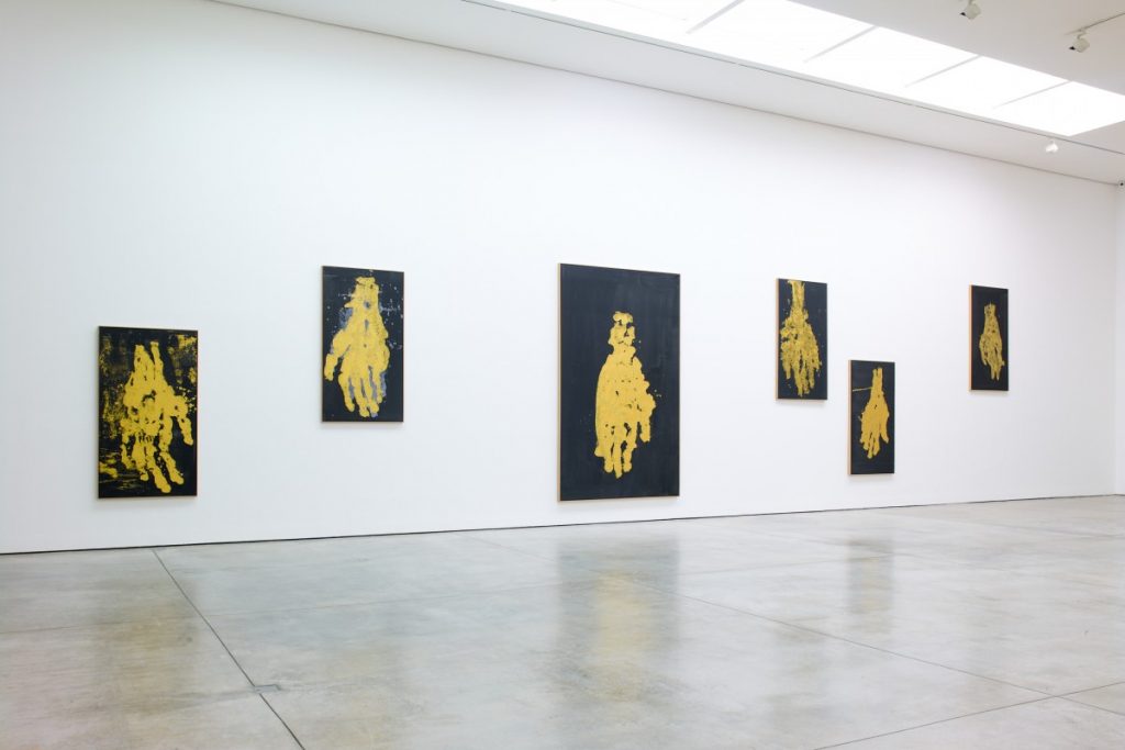
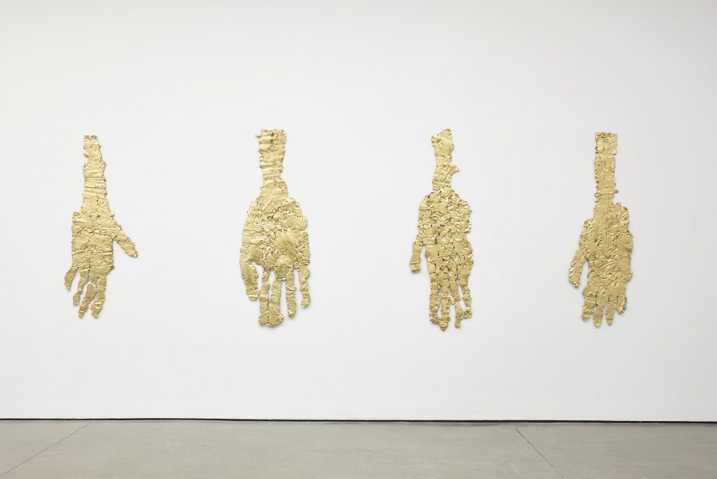
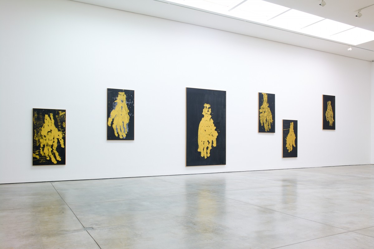
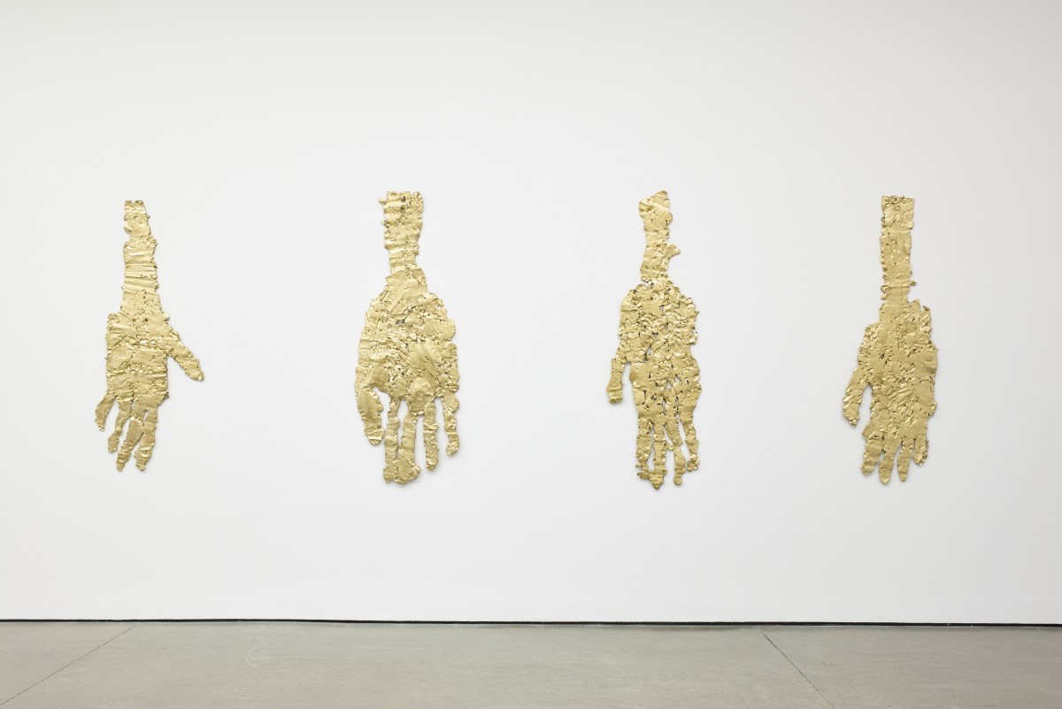
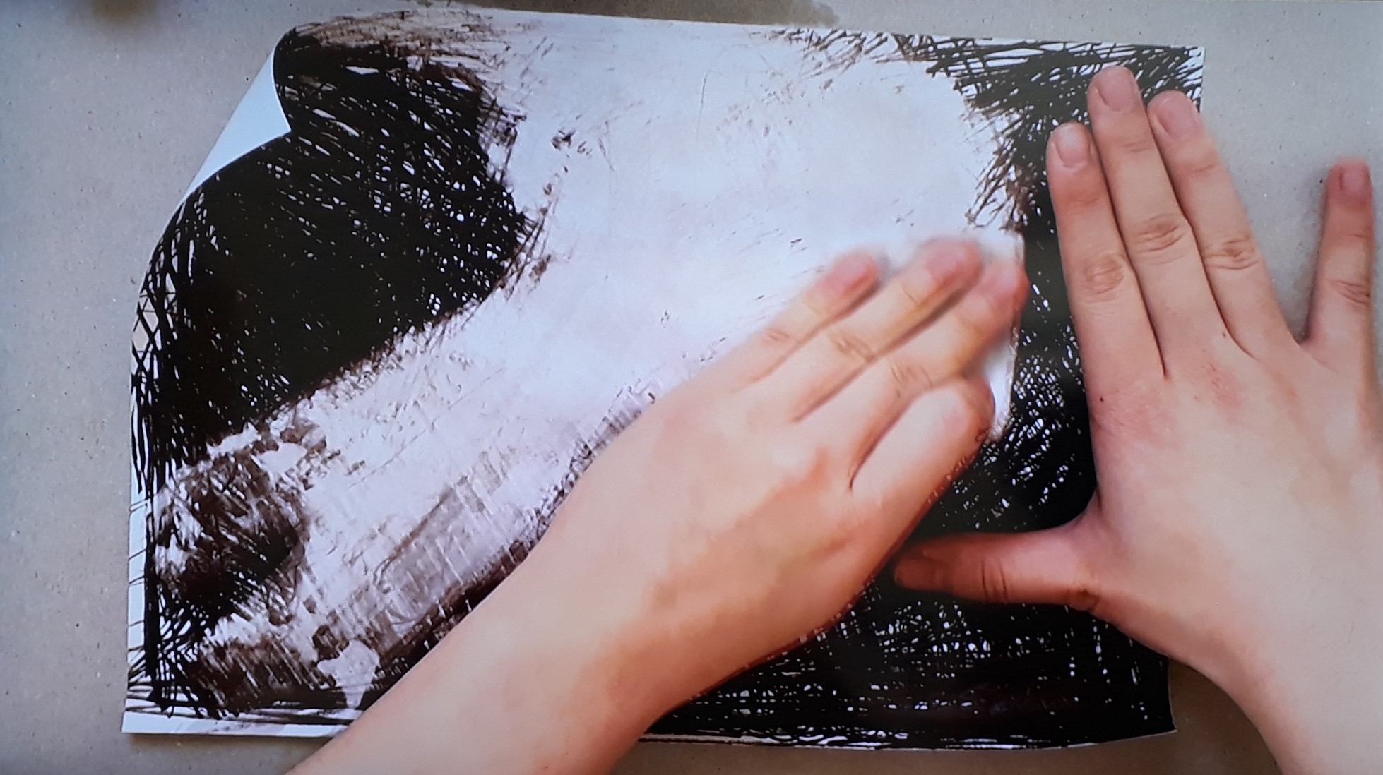
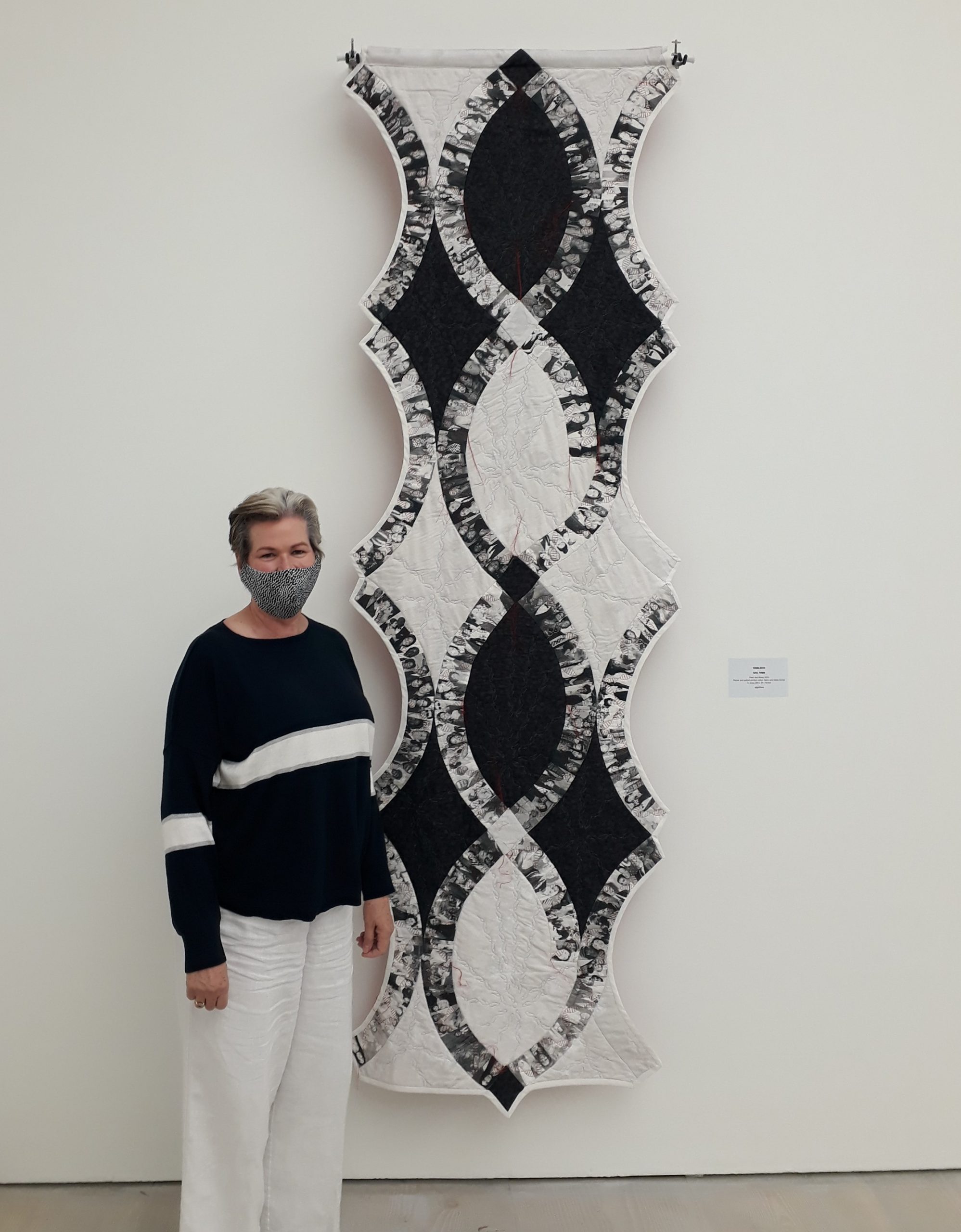
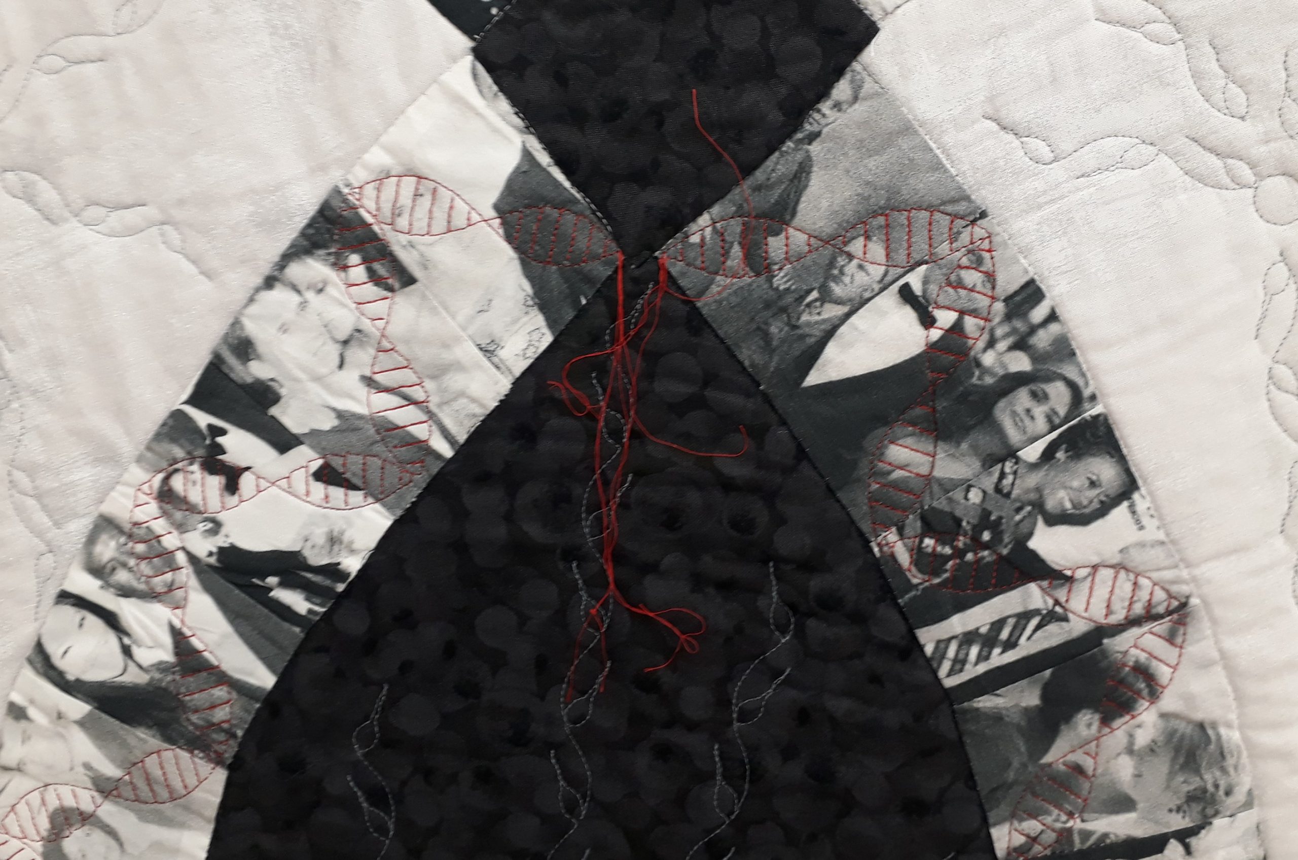
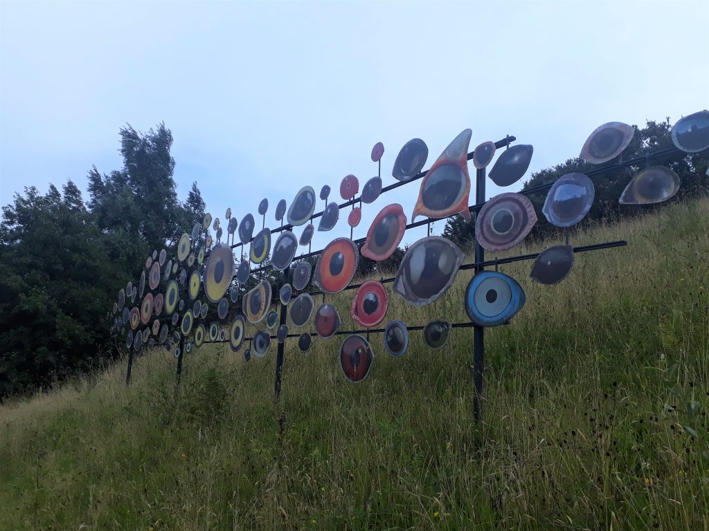
 Peter Randall-Page’s 70 tonne granite Seed, 2007, has its own atrium, in which its 1,800 nodules hum gently in their Fibonacci sequencing. That separation saves it from being improbably dwarfed by Studio Swine’s Infinity Blue, 2018, a nine metre high ceramic representation of the microscopic cyanobacteria – the basis for plants producing oxygen through photosynthesis – which emits vapour to mimic that natural role.
 Aziza Gate, 2004, El Anatsui’s characterful group of totem faces formed out of charred timbers from the nearby Falmouth Docks, deftly conjoins narratives of recycling and the history of colonialism. And Peruvian herbalist-artists Don Francisco Montes Shuna and Yolanda Panduro Baneo have made a set of twenty murals on the rock face, showing their versions of tales associated with the plants with which they work (below is ‘The Spirit Woman of Ajo Sacha’, 2001).
 Not only are these wittily charming, they are very much in tune with the need to allow nature more agency – and the paintings gain from a location which leads many to be occluded by leaves which segue into the images.
 My other three favourite works are easily missed. In the absence of any notice (labelling is generally erratic) Chris Drury’s Cloud Chamber, 2002, might be taken for a domed hut by anyone not following the art map. Which it is, but in the meditative spirit of a James Turrell skyspace.
 Jenny Bevan’s fifteen Cores, 2016, hide in plain sight at the entrance to the ‘Wild Cornwall’ section: many must have taken them for spindly tree trunks, but they are actually ceramics which impersonate the layering which might occur were they cores lifted from the ground of Eden, with plant life imprinted in the tops and colouration representing the descending geology beneath them. Finally, along the road half a mile out of the pay-to-enter zone and so likely to be only glimpsed from a moving car, is the most unusual sculpture here. Jenny Kendler describes herself as ‘an interdisciplinary artist, environmental activist, naturalist and wild forager who lives in Chicago and various forests’. Her Birds Watching, 2018-19 (top and below) is a chromatically-organised array of one hundred reflective eyes on aluminium, each representing a bird threatened by climate change. The flock is presented like a motorway barrier, making good sense of the admittedly inconvenient location at which we, as a bird watching species, become the accusatorily watched.
It would be eccentric to visit Eden if you were unmoved by nature, but given the kernel of impressive and site-resonant art, it wouldn’t be ridiculous.
Jenny Bevan’s fifteen Cores, 2016, hide in plain sight at the entrance to the ‘Wild Cornwall’ section: many must have taken them for spindly tree trunks, but they are actually ceramics which impersonate the layering which might occur were they cores lifted from the ground of Eden, with plant life imprinted in the tops and colouration representing the descending geology beneath them. Finally, along the road half a mile out of the pay-to-enter zone and so likely to be only glimpsed from a moving car, is the most unusual sculpture here. Jenny Kendler describes herself as ‘an interdisciplinary artist, environmental activist, naturalist and wild forager who lives in Chicago and various forests’. Her Birds Watching, 2018-19 (top and below) is a chromatically-organised array of one hundred reflective eyes on aluminium, each representing a bird threatened by climate change. The flock is presented like a motorway barrier, making good sense of the admittedly inconvenient location at which we, as a bird watching species, become the accusatorily watched.
It would be eccentric to visit Eden if you were unmoved by nature, but given the kernel of impressive and site-resonant art, it wouldn’t be ridiculous.
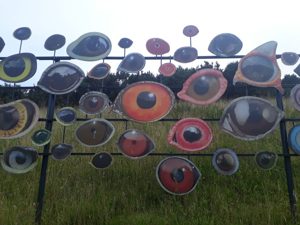
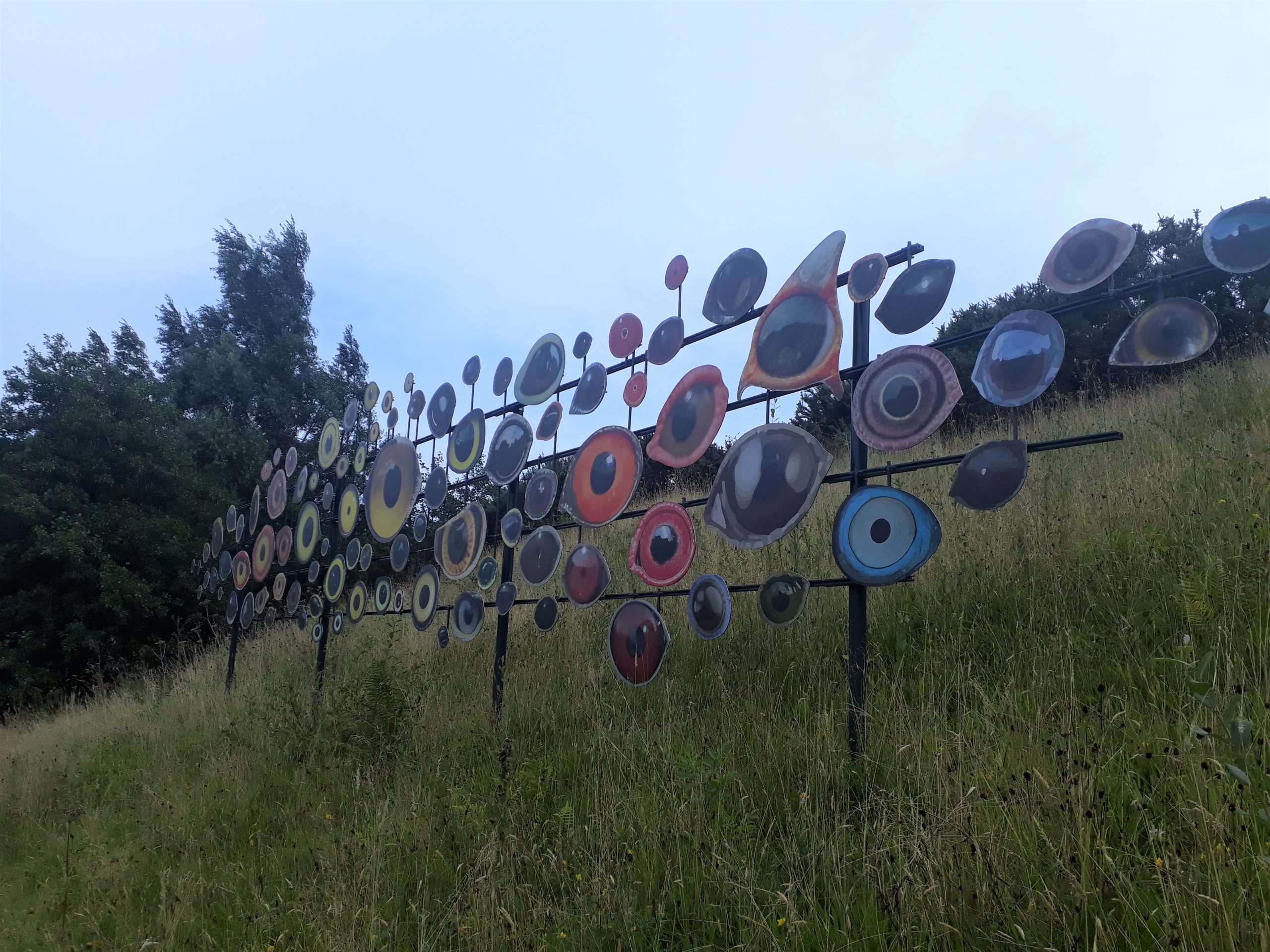


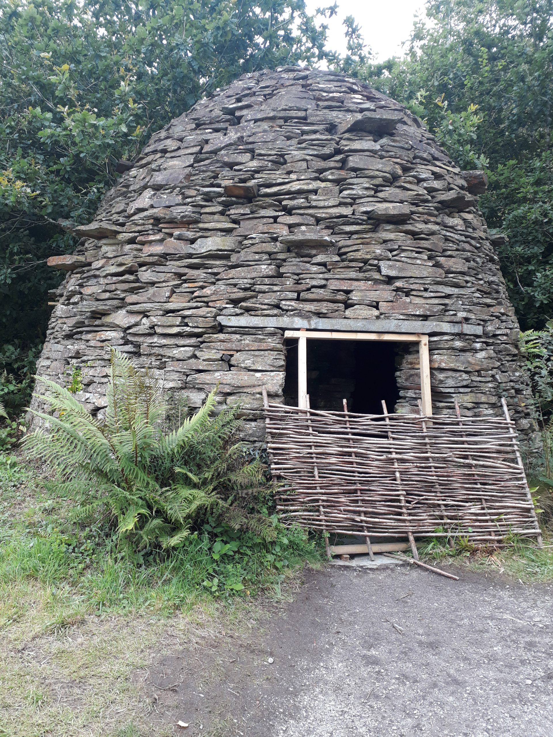
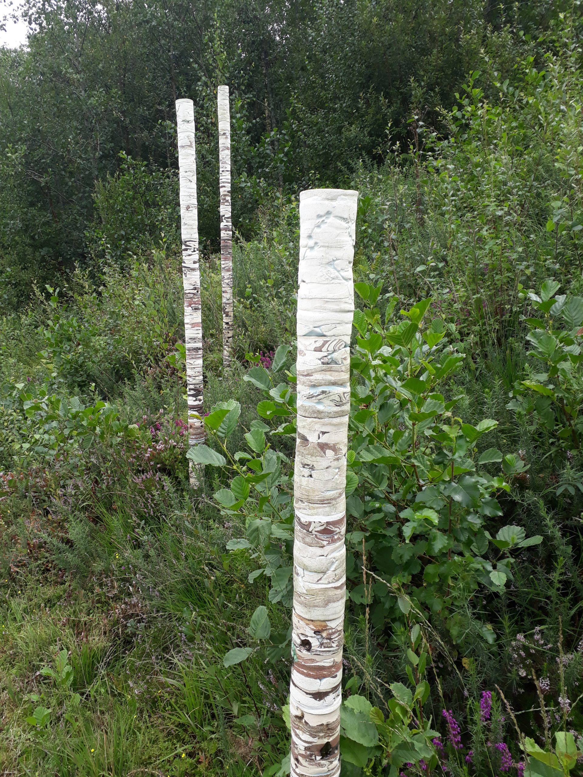

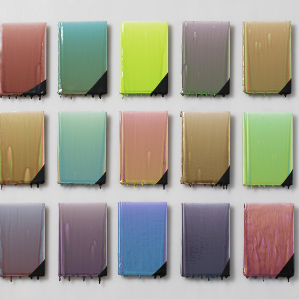
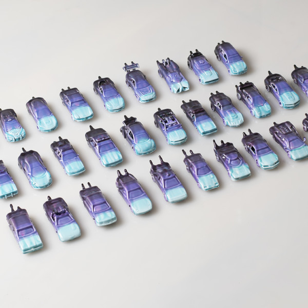
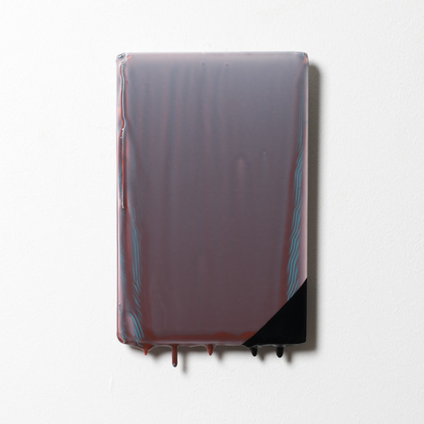
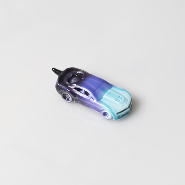
 Stephanie Temma Hier: ‘Green grass finely shorn’, 2020 (top) – oil on linen with glazed stoneware sculpture. The twist I like in the Canadian painter’s use of eccentric ceramic frames to provide bespoke contexts for her oil on canvas still lives is how the potentially heightened realism of three dimensions actually operates to undercut the veracity of the relatively traditional illusionism of the two dimensional surface. She got the idea from drinking water: ‘My experience of the water changed based on the glass which carried it to my lips, and so I wanted to similarly change the experience of painting with its own contextualizing vessel’. Shown by Brooke Bennington.
 Lindsey Mendick: ‘A fish out of water’, ‘Spilling my guts’ and ‘Hung out to dry’, 2020. One of five narrative triptychs which act as a comic strip of paintings encapsulating the messages implied by the journeys of flowers and food towards entropy. Given that ceramics are the natural material of plates and vases, and that human clay travels towards the endpoint of the Vanitas, there is logic to Mendick’s wit. Part of her show ROT at Cooke Latham Gallery
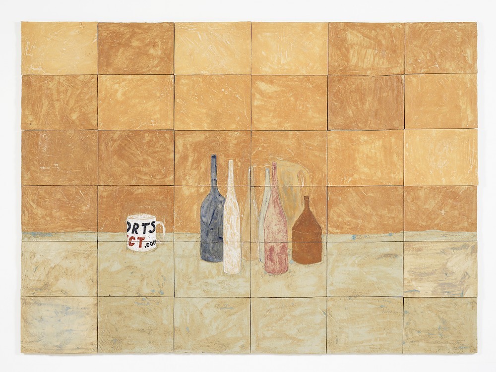 Jesse Wine: ‘Still Life’, 2015. This looks like a combination of historical precedents from its genre: Giorgio Morandi’s meditations on vases and pots – another case of clay depicting clay – join a mug such as Ben Nicholson sometimes featured. We come down to earth once we spot that the latter is actually from Sports Direct, introducing the somewhat less revered figure of Mike Ashley.
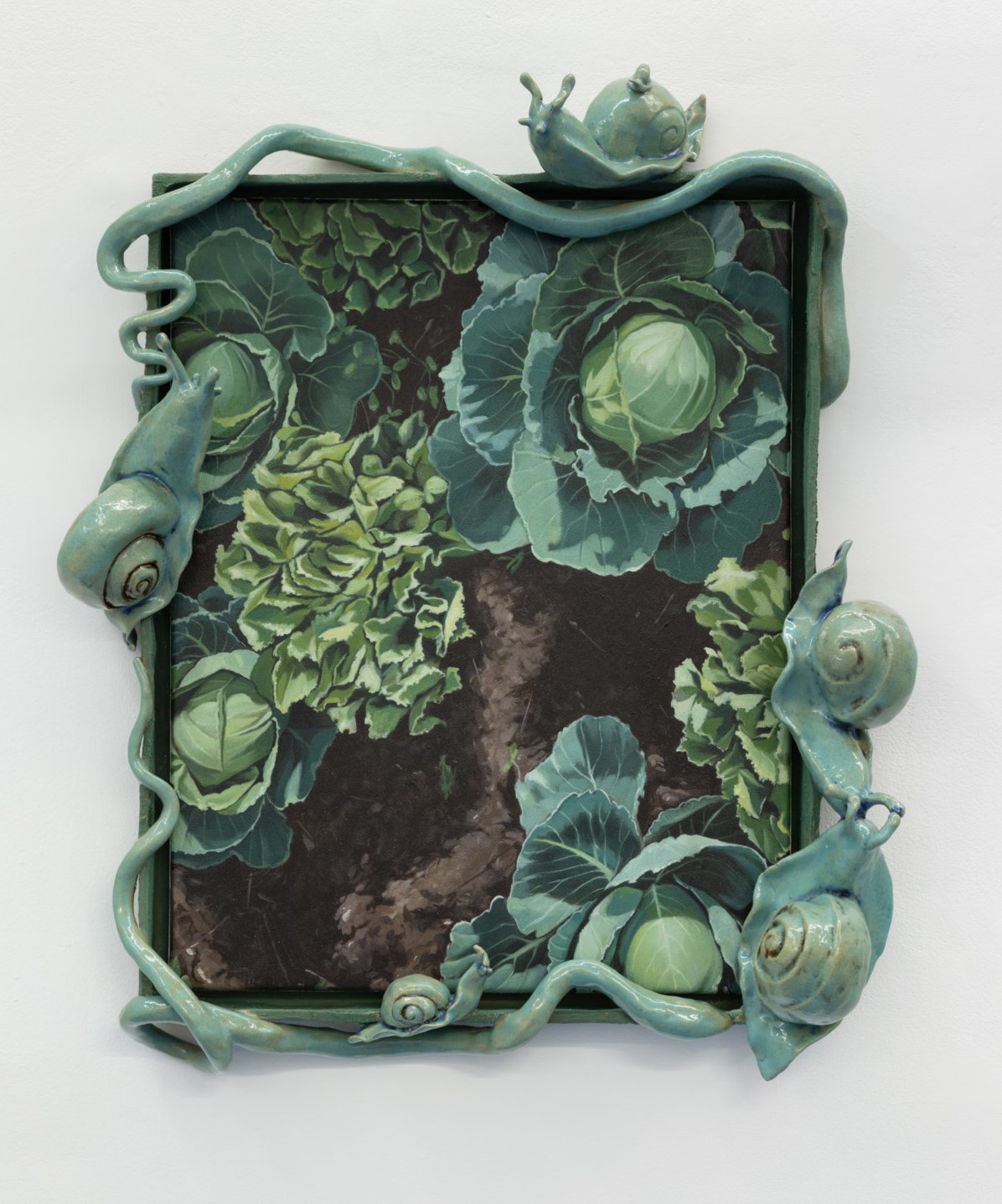
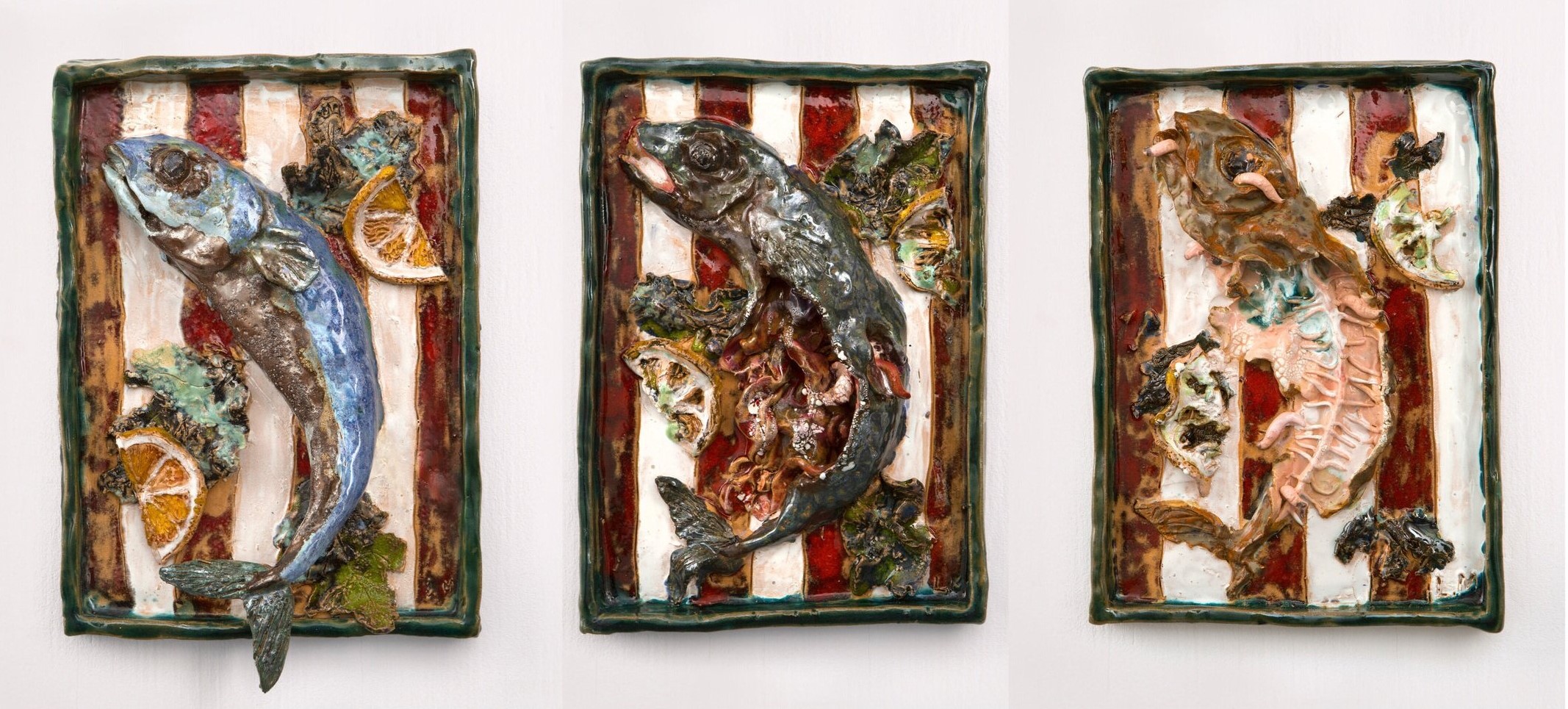
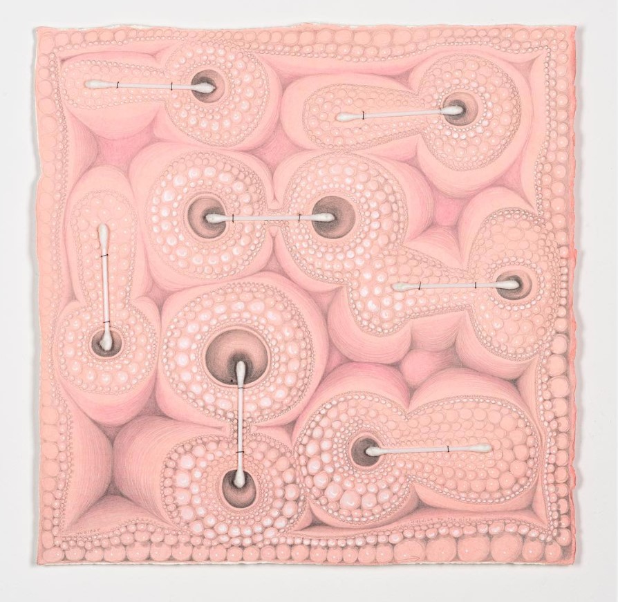


 Air
I fill the park
and nobody notices, most of the time.
Not that I crave prominence:
knowing how much I matter is enough.
Yet I wouldn’t be human were there not times
when I feel a certain pressure to show off.
(John Peter Askew – ‘Boy by River’, 2017 – top image)
Air
I fill the park
and nobody notices, most of the time.
Not that I crave prominence:
knowing how much I matter is enough.
Yet I wouldn’t be human were there not times
when I feel a certain pressure to show off.
(John Peter Askew – ‘Boy by River’, 2017 – top image)
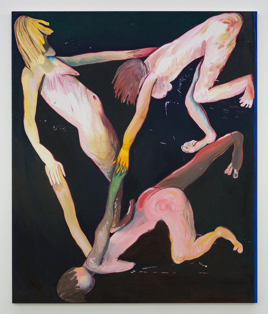

 Oddly, perhaps, the collection has fewer works (44) by Francis Bacon than by Armstrong. The Sainsbury Centre in Norwich has the largest holding by the greatest artist working in Britain in the 20th century, including ‘Head of a Woman’, 1960, which looks likely to be based on Muriel Belcher, one of three women often painted by Bacon – along with Henrietta Moraes and Isobel Rawsthorne. As for the distortions suffered by their faces, ‘If they were not my friends’ , said Bacon, ‘I could not do such violence to them.’
 Isabel Rawsthorne’s own art has been somewhat eclipsed by her profile as a subject, but she has six works in the national collection. This ‘Study of a Ballet Dancer (2)’ is at the Fry Art Gallery in Saffron Walden. Her husband from 1951-71 was the composer Alan Rawsthorne: he worked at Covent Garden, and Isobel often sketched and painted the ballerinas in the rehearsal rooms. If some suggestions of Giacometti’s style are visible, that fits in with their close artistic and on-off romantic relationship in Paris during the 30’s and 40’s.
 Paul Nash’s ‘View R’, 1940, one of 96 publicly owned works by him, is owned by Rugby Art Gallery. I doubt if the ‘R’ stands for Rawsthorne or Rugby, but its mysterious moonlit presence, seen in reverse, is fully in line with Nash’s typical way of infusing a landscape with a folklorical yet disquieting element.
 Eileen Agar‘s ‘Slow Movement’, 1970, one of 25 works by her on view, is at the National Galleries of Scotland. It was inspired by the Throne of Ludovisi, a Roman marble panel which shows Aphrodite being raised from the sea by two women: Agar (1899–1991) – who was, incidentally, Paul Nash’s lover in the 30’s – takes the chance to maximise the blue harmonies.
 There’s something human about this ‘Small Fish’, 1956, one of 49 publicly owned works by John Craxton (1922–2009). It’s in the Ingram Collection of Modern British and Contemporary Art. Living near the sea in Greece, Craxton often drew the local fishermen and their catches – he loved seafood, and would have relished this gunard for taste as well as its characterful expression.
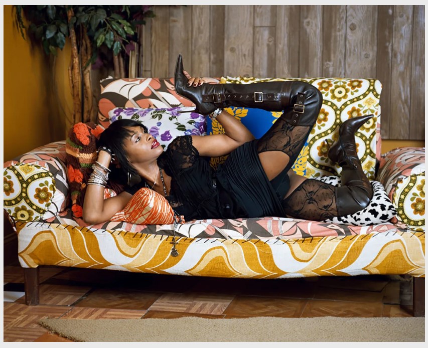
 Mark Manders makes striking work which originates in a unique way of thinking. Antwerp’s Zeno X Gallery is currently showing two typical pieces in the online version of Art Brussels.
Composition with Two Ropes, 2020 (?) has a three unusual features which are par for the Belgian artist’s course.
First, he would sooner date it 1986, for that is when (at 18) Manders started making his ‘Self-portrait as a Building’, a fictitious place filled with his work. Manders sees that as a “super-moment” extending through time, in the same way that the words of an encyclopaedia or dictionary always exist in the present, and insists that all his works over the past 30-odd years were made in that moment. ‘In the beginning’, he says, ‘I actually put the same date on all my works, but then I realized that if I continued doing that I would not be able to function in the world, because museums could not accept it’.
Mark Manders makes striking work which originates in a unique way of thinking. Antwerp’s Zeno X Gallery is currently showing two typical pieces in the online version of Art Brussels.
Composition with Two Ropes, 2020 (?) has a three unusual features which are par for the Belgian artist’s course.
First, he would sooner date it 1986, for that is when (at 18) Manders started making his ‘Self-portrait as a Building’, a fictitious place filled with his work. Manders sees that as a “super-moment” extending through time, in the same way that the words of an encyclopaedia or dictionary always exist in the present, and insists that all his works over the past 30-odd years were made in that moment. ‘In the beginning’, he says, ‘I actually put the same date on all my works, but then I realized that if I continued doing that I would not be able to function in the world, because museums could not accept it’.
 Second, though it looks like peeling dry clay, rope and wood, creating the sense that it may not last long, it is all bronze. What seems a paradoxically fragile, if unfinished, survival of a timeless archetype is actually a highly robust and fanatically precise work tied only to 1986. The illusion isn’t easily achieved: Andrew Maerkle reports that ‘it takes two weeks to paint a bronze with seven layers Manders requires: during one step the assistant actually removes paint to give the appearance that the sculpture is worn and, in another, uses a dry brush technique to gently graze the uneven surface so that pigment is only applied to the raised parts of the piece’.
 Third, there seems to be a lump of would-be-wood stuck into the classical would-be-clay form. According to Manders ‘I was thinking, if you take a few pieces of wood and put them on the table with a certain amount of clay, then how could you say as much as possible with only those materials? So I came up with the idea of a head stuck between vertical panels, and I only had to use a little bit of clay to make a sliver of face, and then it became this composition of verticals…. I have an interest in how a form can be language – how a group of verticals can be like language’.
 This acrylic and offset print on paper mounted on wood, Perspective Study, 2020, is from an ongoing series which also emerges from the logic of avoiding time other than 1986. Manders says he ‘needed to use papier-mâché for a different work, and papier-mâché requires newspapers, but I am not allowed to use real newspapers because then I would bring time into my work, and I don’t want to have dates because everything is made all in the same moment. I solved the problem by making fake newspapers’. He makes them by taking words from an English dictionary and placing them in a random order. Each word is used only once*. Then, in timeless manner again, he turns them into perspective studies, that being a technical endeavour which he feels every artist since the Renaissance should attempt.
* once is probably enough for the prominent titular word ‘Eucaryote’, a variant spelling of ‘Eukaryote’, that being an organism composed of cells characterised by a discrete membrane with a nucleus, or – to put it another way – all life forms except bacteria, given that amoebae have a membrane. I guess there’s nothing in this newspaper for the simplest single-celled community.
This acrylic and offset print on paper mounted on wood, Perspective Study, 2020, is from an ongoing series which also emerges from the logic of avoiding time other than 1986. Manders says he ‘needed to use papier-mâché for a different work, and papier-mâché requires newspapers, but I am not allowed to use real newspapers because then I would bring time into my work, and I don’t want to have dates because everything is made all in the same moment. I solved the problem by making fake newspapers’. He makes them by taking words from an English dictionary and placing them in a random order. Each word is used only once*. Then, in timeless manner again, he turns them into perspective studies, that being a technical endeavour which he feels every artist since the Renaissance should attempt.
* once is probably enough for the prominent titular word ‘Eucaryote’, a variant spelling of ‘Eukaryote’, that being an organism composed of cells characterised by a discrete membrane with a nucleus, or – to put it another way – all life forms except bacteria, given that amoebae have a membrane. I guess there’s nothing in this newspaper for the simplest single-celled community.


 Canadian painter Wanda Koop is known for her environmentally aware landscapes, but during lockdown she has developed (see top and bottom) a stream of robotic humanoid heads. She sees them as ‘portraits of uncertainty – sort of like MRIs of the human psyche – for the past, present and future’. There’s a darkness to them, but not only that, and just now they resonate with how much of our contact is mediated through technology…
 Michele Ciacciofera‘s Untitled, 13.4.2020 is from the impressive sequence of ‘Confinement notes’ which the artists of Paris/Brussels Gallery Michel Rein is posting daily. On the one hand, a delicately tentative geometric abstraction which could have been made at any time; on the other hand the materials – ‘watercolour, gouache, red wine (Saint Nicolas de Bourgueil), salt, sodium bicarbonate and pencil on paper’ – are redolent of time at home rather than in the studio.
 George Condo says of the drawings he’s made in lockdown: ‘I’m imagining figures who are distanced from each other… invented to resemble those I can’t see, and they somehow reflect my inner feelings about how it is to be left alone in the wilderness’. I guess Condo’s condo might be a fairly comfortable wilderness, but the multiple viewpoints work nicely to reflect different emotions occurring simultaneously, including fear, paranoia, claustrophobia, panic and distress. This is Parallel Lives.
 Recently announced Max Mara prizewinner Emma Talbot has started making animations in lockdown, but also continues with her wider practice, which sometimes includes pure text works in which the words are not pre-planned but emerge as she paints them. Here she finds herself ‘forced to turn inwards’ and unable to ‘compute the emptiness of days passing without feature. Episode 10 season 4’. It’s not her everyday handwriting, by the way, but a mixture of upper and lower cases and differing sizes which she has developed to enable the maximum variation of emphases.
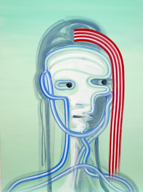

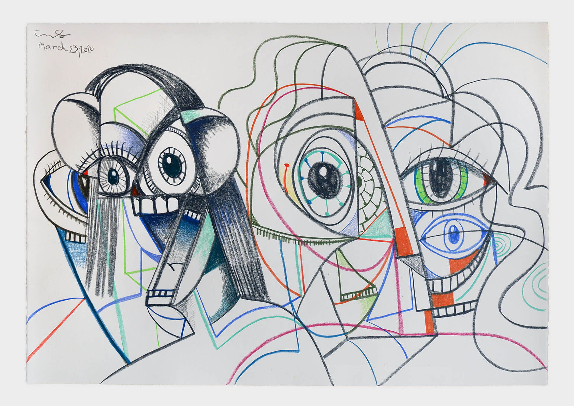
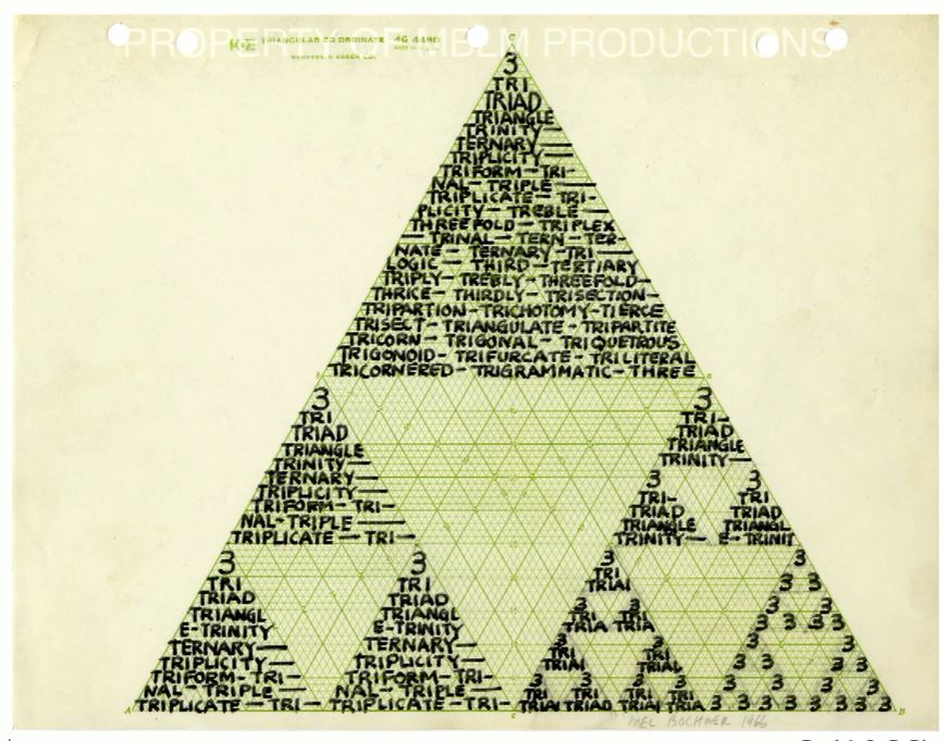
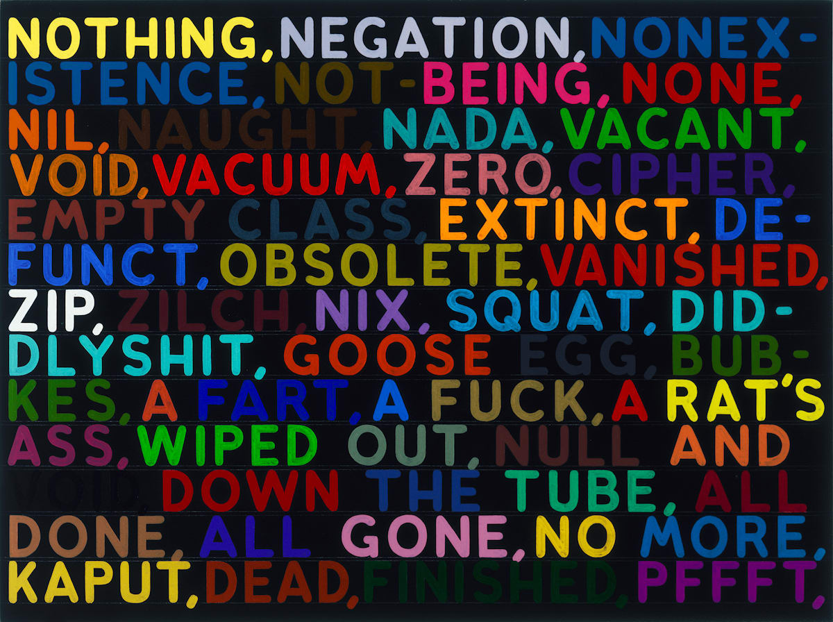
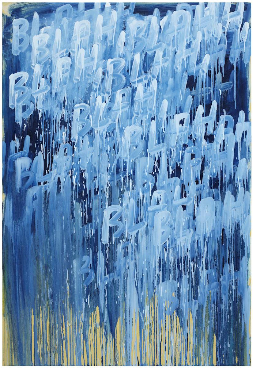
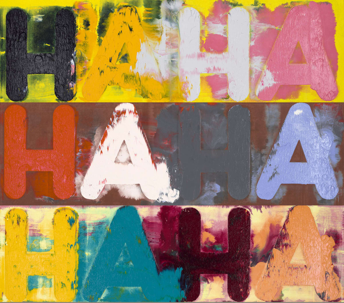
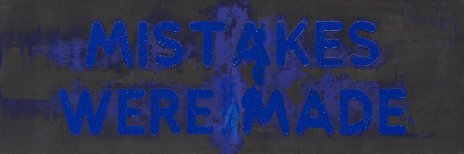
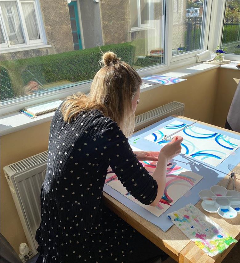 Fiona Grady at pledge work
The scheme initiated by Sussex-based painter Matthew Burrows has proved a roaring success: over 70,000 works have been posted for sale via Instagram at #artistsupportpledge, and business has been brisk. Works are offered for up to £200, and when an artist sells £1,000-worth they pledge to spend £200 supporting another artist. I gave myself a budget of that same £1,000 as a way to support artists whose works I like, and in several cases the covid-appropriate charitable causes towards which they in turn are donating some of their receipts. The set also acts a commemoration of these strange and alarming times.
Fiona Grady at pledge work
The scheme initiated by Sussex-based painter Matthew Burrows has proved a roaring success: over 70,000 works have been posted for sale via Instagram at #artistsupportpledge, and business has been brisk. Works are offered for up to £200, and when an artist sells £1,000-worth they pledge to spend £200 supporting another artist. I gave myself a budget of that same £1,000 as a way to support artists whose works I like, and in several cases the covid-appropriate charitable causes towards which they in turn are donating some of their receipts. The set also acts a commemoration of these strange and alarming times.
 Mimei Thompson: Untitled (cave), 2020.
The ultimate isolation space, perhaps, but not necessarily the healthiest: I guess it’s rather damp down there among the mosses, ferns and liverworts which seem to have tinged the space beyond the entrance area in which they normally thrive. We are all, you might say, in our mental caves just now, and maybe there’s a sickly green aspect to many of them.
Mimei Thompson: Untitled (cave), 2020.
The ultimate isolation space, perhaps, but not necessarily the healthiest: I guess it’s rather damp down there among the mosses, ferns and liverworts which seem to have tinged the space beyond the entrance area in which they normally thrive. We are all, you might say, in our mental caves just now, and maybe there’s a sickly green aspect to many of them.
 Sarah Roberts: 3 walls, 2020
Another cooped-up artist, judged by this collage with photo and watercolour, is Sarah Roberts. As is her way, she provides accompanying words: ‘She stared at the tiny blue blemishes until they became UFO’s. Blue dots in front of her eyes, swimming – as the walls closed into a crisp sheet of A4. She breathed her daily breaths through a painted lip, recognising the notable importance of keeping up appearances’. So a photo of a wall on a wall of A4 which mimics it leaves the protagonist’s inner wall just about in place…
Sarah Roberts: 3 walls, 2020
Another cooped-up artist, judged by this collage with photo and watercolour, is Sarah Roberts. As is her way, she provides accompanying words: ‘She stared at the tiny blue blemishes until they became UFO’s. Blue dots in front of her eyes, swimming – as the walls closed into a crisp sheet of A4. She breathed her daily breaths through a painted lip, recognising the notable importance of keeping up appearances’. So a photo of a wall on a wall of A4 which mimics it leaves the protagonist’s inner wall just about in place…
 Aly Helyer: Untitled gouache, 2019.
This antithesis of social distancing features, when you take a second glance, five people in a fairly small space, lit eerily green by a single bulb. What’s going on? And why is the frontal figure wearing a see-through fish scale costume? A satisfyingly puzzling example of Helyer’s way of infecting classical and mannerist inspirations with a somewhat surreal twist, open to interpretation as emotional states.
Aly Helyer: Untitled gouache, 2019.
This antithesis of social distancing features, when you take a second glance, five people in a fairly small space, lit eerily green by a single bulb. What’s going on? And why is the frontal figure wearing a see-through fish scale costume? A satisfyingly puzzling example of Helyer’s way of infecting classical and mannerist inspirations with a somewhat surreal twist, open to interpretation as emotional states.
 Gordon Cheung: Isolation (after Gaspard Dughet 1638-1640), 2020.
Gordon Cheung’s paintings on a collaged backdrop of stock listings link to an interest in the way we move between the physical world and the virtual realities of communications technology, global finance and the Internet – and on to another strand of his practice, which disrupts the data files of various image sources. Here Cheung’s algorithm reorders the photo pixels in Gaspard Dughet’s Italian Landscape, 1638-40 (original at bottom), which features figures at the currently approved two metres from each other.
Gordon Cheung: Isolation (after Gaspard Dughet 1638-1640), 2020.
Gordon Cheung’s paintings on a collaged backdrop of stock listings link to an interest in the way we move between the physical world and the virtual realities of communications technology, global finance and the Internet – and on to another strand of his practice, which disrupts the data files of various image sources. Here Cheung’s algorithm reorders the photo pixels in Gaspard Dughet’s Italian Landscape, 1638-40 (original at bottom), which features figures at the currently approved two metres from each other.
 Fiona Grady: Rainbow (yellow, orange, red) III, 2020
Fiona Grady’s work is at its most characteristic when installed on windows, where the light floods through her colourful vinyl geometries to intoxicating effect. So there’s a sense in this lockdown production (as per image at top) of the artist stuck inside. Her motif in a seductive new series of ink drawings is upbeat, it’s true, but let’s not get carried away: these are only partial rainbows, and feature only some of their usual colours.
Fiona Grady: Rainbow (yellow, orange, red) III, 2020
Fiona Grady’s work is at its most characteristic when installed on windows, where the light floods through her colourful vinyl geometries to intoxicating effect. So there’s a sense in this lockdown production (as per image at top) of the artist stuck inside. Her motif in a seductive new series of ink drawings is upbeat, it’s true, but let’s not get carried away: these are only partial rainbows, and feature only some of their usual colours.
 Guy Allott: Dark Green, 2007
This intimately-scaled oil has a paradoxically monumental presence and is rich with suggestion. A rocket form with hints of cactus, phallus and portrait head plays the sphinx role in a landscape of pyramids. Is it, perhaps, a retro-styled vision from the future beaming back a message of hope to our troubled times?
Guy Allott: Dark Green, 2007
This intimately-scaled oil has a paradoxically monumental presence and is rich with suggestion. A rocket form with hints of cactus, phallus and portrait head plays the sphinx role in a landscape of pyramids. Is it, perhaps, a retro-styled vision from the future beaming back a message of hope to our troubled times?
 Gaspard Dughet: Italian Landscape, 1638-40 – before corruption by Gordon Cheung

 Want some consolation during the lockdown? Covid-19 is far from being as lethal as the bubonic plague which, for example, killed a quarter of London’s population in 1665-6. The plague’s main vector was the flea, which transferred it to carrier rats. Yet when the business of hunting for fleas made it into 17th century art, it tended to be for Eros, rather than Thanatos. Here are two examples, both by tenebrist followers of Caravaggio who are best-known for their skill in depicting candle-lit scenes: Gerard van Honthorst (Dutch, 1592 –1656) and Georges de La Tour (French, 1593-1652). Both allude to the long-standing use of the flea as a symbol for intimacy, in the context of the prevalent view that sex led to a mingling of bloods. That provided plenty of scope for nudge-nudge, as when John Donne wrote in the 1590’s: ‘It sucked me first, and now sucks thee, / And in this flea our two bloods mingled be’.
In Honthorst’s ‘The Flea Hunt’, 1621 (top) the well-lit breasts, assumed procuress, apparent enjoyment of the hunt, and presence of two potential customers as voyeurs make the parallels pretty clear.
Want some consolation during the lockdown? Covid-19 is far from being as lethal as the bubonic plague which, for example, killed a quarter of London’s population in 1665-6. The plague’s main vector was the flea, which transferred it to carrier rats. Yet when the business of hunting for fleas made it into 17th century art, it tended to be for Eros, rather than Thanatos. Here are two examples, both by tenebrist followers of Caravaggio who are best-known for their skill in depicting candle-lit scenes: Gerard van Honthorst (Dutch, 1592 –1656) and Georges de La Tour (French, 1593-1652). Both allude to the long-standing use of the flea as a symbol for intimacy, in the context of the prevalent view that sex led to a mingling of bloods. That provided plenty of scope for nudge-nudge, as when John Donne wrote in the 1590’s: ‘It sucked me first, and now sucks thee, / And in this flea our two bloods mingled be’.
In Honthorst’s ‘The Flea Hunt’, 1621 (top) the well-lit breasts, assumed procuress, apparent enjoyment of the hunt, and presence of two potential customers as voyeurs make the parallels pretty clear.
 De La Tour’s ‘Woman Catching a Flea’, 1630’s, is more sober and ambiguous. The burned-down candle, serious expression, less sexualised breasts and swollen belly might indicate the consequences of illicit sex. Moreover, the woman seems about to crush the flea between her thumbs, perhaps standing in for some other revenge she’d like to take.
 Well, Sam Jackson’s ‘Touching from a Distance’, 2019, incorporates Ian Curtis’ words along with Joy Division song titles. It’s typical of Jackson’s way of conjoining public and private – suggesting internal thoughts through fragmented quotations, and possible appearances through corruptions of received images – so that, as Christine Coulson has put it, you ‘see souls and hear voices’.
 Edward Hopper’s paintings are often interpreted as depicting loneliness. ‘Eleven a.m.’ 1926 might be seen as going a little further than that, restricting of female sexuality by locking a nude into her domestic interior. These days, of course, everyone’s probably staring out the window, still naked, in the middle of the self-isolating morning.
 Japanese artist Tsubasa Kato’s short film ‘Listen to the Same Wall’, 2015, sees three musicians play on adjacent patios, separated by 10-foot walls which prevent the usual use of visual cues when making chamber music.
 And William Cobbing’s seven minute performance / film ‘Long Distance’, 2018, demonstrates one way to ensure you keep an appropriate gap in place… It’s a development from his well-known ‘The Kiss’, 2004, in which the clay-heads are allowed to get a little closer.