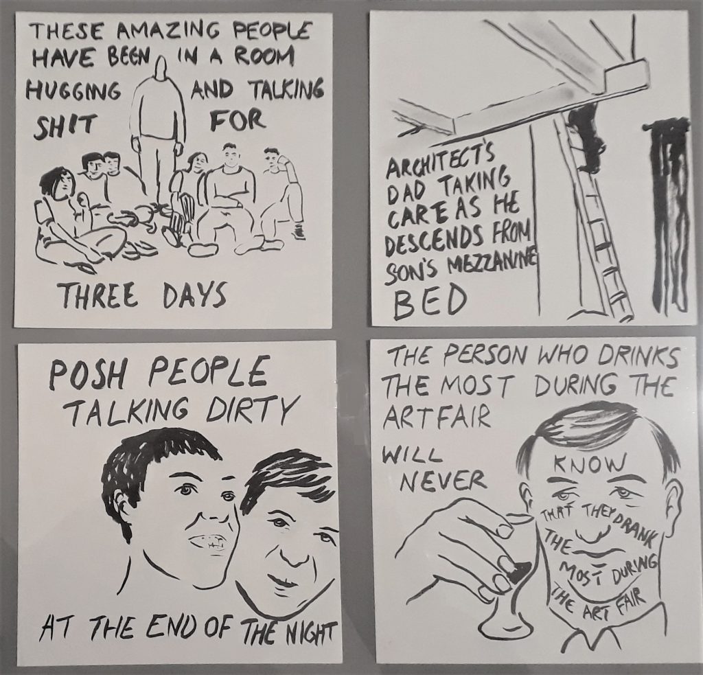
416: THE ART ON THE T-SHIRT
By Paul Carey-Kent • 1 September 2021
There’s a logic to putting art on a T-shirt: comparatively cheap, no need to find wall or floor space, avoids the business of installation (unless you count getting dressed) and allows you to show your collection out and about… I have a few examples which are fun to wear. Here are some which quite often get asked about: sometimes, I’m stopped in the street…
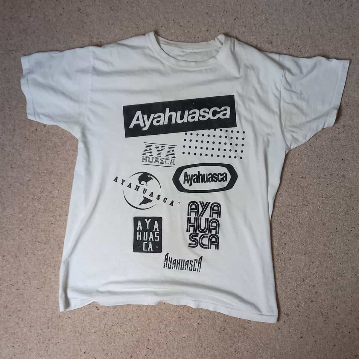
Adriano Costa
I have one of a wide range of T-shirts designed by the Brazilian artist Adrian Costa which wittily insert Ayahuasca into the typographic layout of famous consumer brands. I have to admit, though, that my experience of dimethyltryptamine, the chemical in the plants with which indigenous Amazonians make the famous psychoactive brew, is limited to the shirt.

Pedro Reyes
This, from the Lisson Gallery, has a motif which splits the generations: those for whom the telephone dial is a matter of nostalgia from those who only recall it from films or maybe even wonder what it is… The Mexican artist’s wife, Carla Fernández, is a celebrated fashion designer, so he may have picked up some tips…
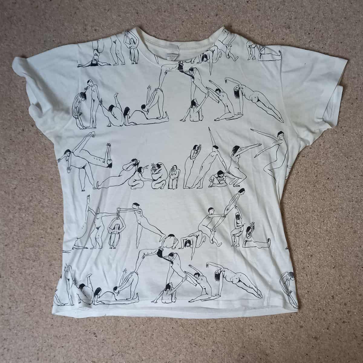
Emma Cousin
This arpeggio of interlocking figures was made for an exhibition I curated: ‘Ridiculous!’ at Elephant West in January 2020. They come from Emma Cousin’s site-specific wall pieces made in four locations as part of the ‘Survey’ show of upcoming artists the during 2018-19. Just what are the people doing, I tend to be asked, typically by those wondering whether it’s rude. I reckon we’re surveying them surveying each other…
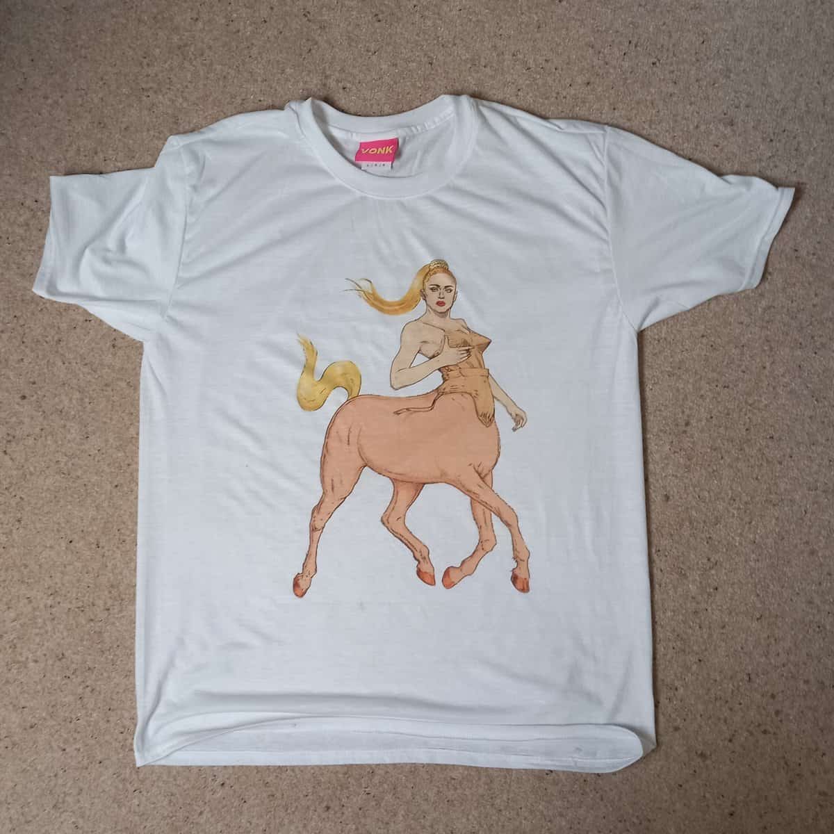
Jock Mooney
Jock Mooney does a huge range of T-shirts at www.helloVONK.com. They tend towards retro Americana in psychedelic colours and with a twist – as in ‘My Little Ciccone’, a combination of Madonna in her Gaultier kit c. 1990 with My Little Pony and the classical reference to a centaur. Or should I say a centauride – the female version of the human-horse, much less frequently encountered in Greek legend?

Raymond Pettibon
The most famous image, being the cover design for Sonic Youth’s 6th album, 1990’s ‘Goo’. Pettibon’s source was a photograph of two British mods, their cool counteracted – surely not enhanced – by a tale of parricide. Almost all artists, I’ve found, like Sonic Youth.
Art writer and curator Paul Carey-Kent sees a lot of shows: we asked him to jot down whatever came into his head
Categories
415: THE STORM BEHIND THE CALM:
JOHN NASH AT EASTBOURNE
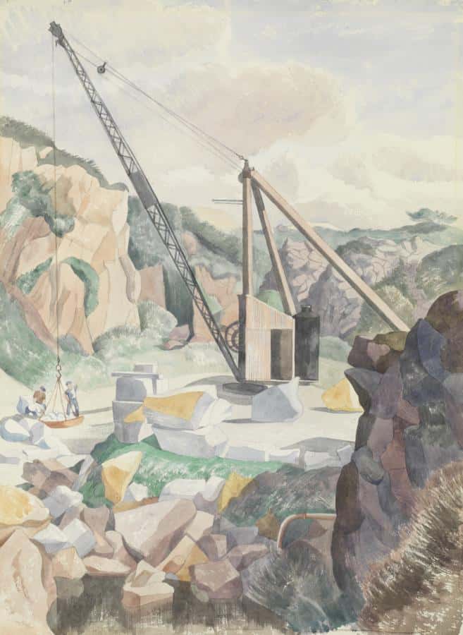
John Nash: The DeLank Quarry, Cornwall, 1963
John Nash (1893-1977) tends to be remembered as the less radical younger brother of Paul, a first rank illustrator as well as a longstanding Royal Academician adept at the subtle transfiguration of landscapes, particularly in watercolour. He was also an artist in both World Wars, albeit both less famous for that than Paul and less favoured by circumstances: for example, as a private rather than an officer in World War I, he wasn’t allowed to make any drawings while at the front. Those impressions are confirmed by the comprehensive retrospective you can now see at the Towner Art Gallery in Eastbourne (to 26 Sept). It’s an enjoyable show, with small surprises in his early cartoon work, and in just how good his botanical engravings were. One wall label, however, mentions that he and his wife were on holiday ‘with their lovers’. The exhibition says no more, but a recent biography by Andy Friend reveals that Nash’s private life was much less conservative than his art.
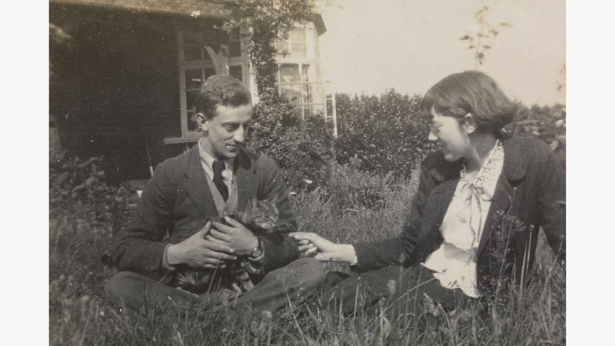
John Nash with Christine Kuhlenthal, 1918
When he and Christine Kuhlenthal (1895-1976) married in 1918, they both had interests in other women, and agreed that theirs would be an open marriage. They seemed to have maintained that principle energetically over most of the following 58 years together: Christine with lovers of both sexes, John with women who seem to split into two types – mostly the wives of other artist colleagues, whom she accepted as ‘old steadies’, but also occasional dalliances with younger ‘Dolls’, as Christine termed them. It would be nice to report that this all went swimmingly, but Friend reports that Christine suffered a good deal of pain and jealousy, particularly when a ‘Doll’ was involved, both for herself and because she felt that those affairs made John miserable. ‘An odd thing, this sexual attraction’, she’s recorded as saying of one affair: ‘The only comfort is that it passes and when it goes there won’t be much left’. We don’t hear what John thought, presumably because there are no records of that. But we do also read about the tragedy which struck the couple in 1935, when their only child William, then four, died when he fell out of the door of the car Christine was driving. Add the wars and a mother who was committed to a mental hospital for most of his childhood, and it may not be a surprise that Nash suffered from depression. All in all, then, there’s a good deal going on behind the well-ordered surfaces of Nash’s paintings.

John Nash: The Cornfield, 1918
* Andy Friend: John Nash: The Landscape of Love and Solace (Towner Gallery / Thames & Hudson, 2020 – 352 pages)
414: ART DECENTRED – BOURNEMOUTH AND SHEFFIELD
Lockdown reduced the tendency to travel to London, and it looks as if some of that decentralising shift may be permanent. That fits with an increasingly wide spread of art initiatives. The Turner Prize is in Coventry this year – following on from Hull (2018) and Margate (2019). Last week I was in Bournemouth and Sheffield for two admirably selfless initiatives which promise to become ongoing models of how to bring interesting contemporary art to non-London publics.
In Bournemouth, artist Stuart Semple not only has a huge studio and team in the upper two floors of The Avenue shopping centre, he has just taken over a floor of the former Debenhams as an exhibition space, having persuaded the new owner to give the support of free rent. The scale and location should be a winner, and GIANT has made a good start with plenty of big names and big works in the initial show. ‘Big Medicine’, curated by Semple himself, issues a somewhat tongue in cheek rallying call for art to heal cultural wounds through shared experience – with plenty of drug-related works. And the Project Space has another interesting show: Lee Cavalier’s curation of ‘Why We Shout – The Art of Protest’.
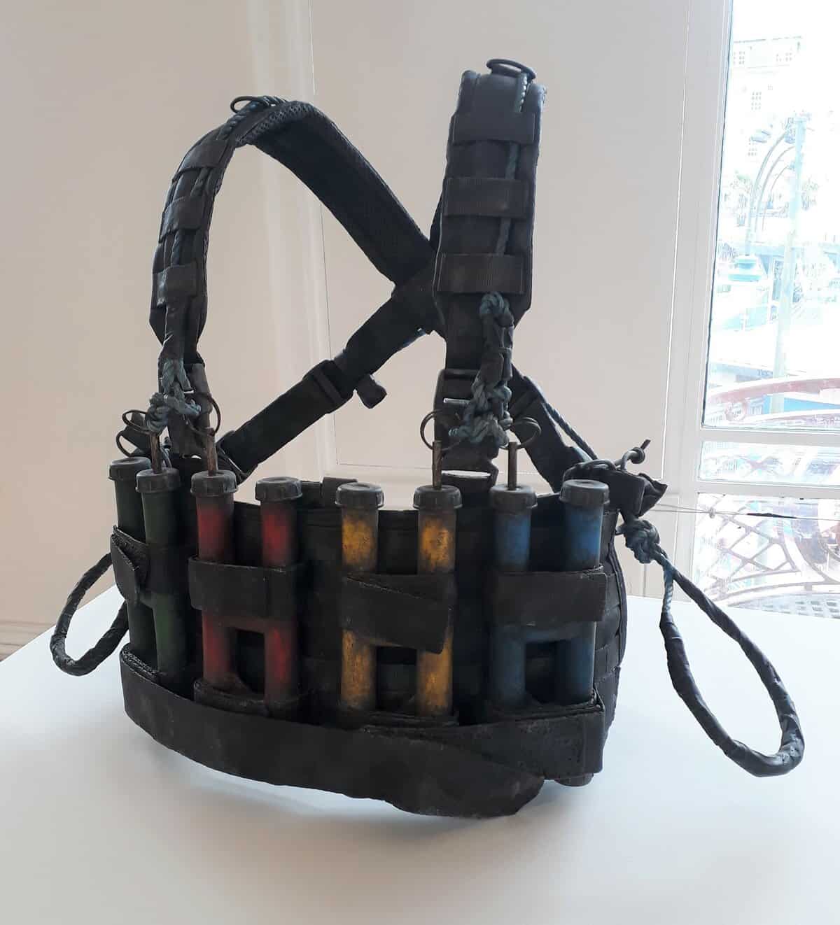
Jake and Dinos Chapman could have fitted in either show with their new series of bronze-cast suicide vests, copied from youtube clips of suicide bombers but rendered as useless as Jeff Koons’ 1985 casts of aqualungs in bronze, which the brothers cite as an inspiration. Some are art bombs, with paint and brushes where one would expect explosives. ‘The risk and danger of being an artist’, says Semple in one of his informative labels, ‘is pitched against the power of the artist’s conviction to fight for belief’. Regular new shows and performance events are planned.
Sheffield has a quite different collaboration: ‘Earthbound: Contemporary Landscape’ is a curation by the Roberts Institute of Art of selections from both the David and Indre Roberts’s and Sheffield museum collections. The former moved from a physical gallery base in London to a more fluid model, emphasising performance, in 2017, and this approach is a logical way to extend public access to the collection. A second such collaboration is already lined up for the Hunterian in Glasgow. The timing exploits the temporary closure of Sheffield’s Graves Gallery for refurbishment to incorporate some works normally shown there in the Millennium Gallery.
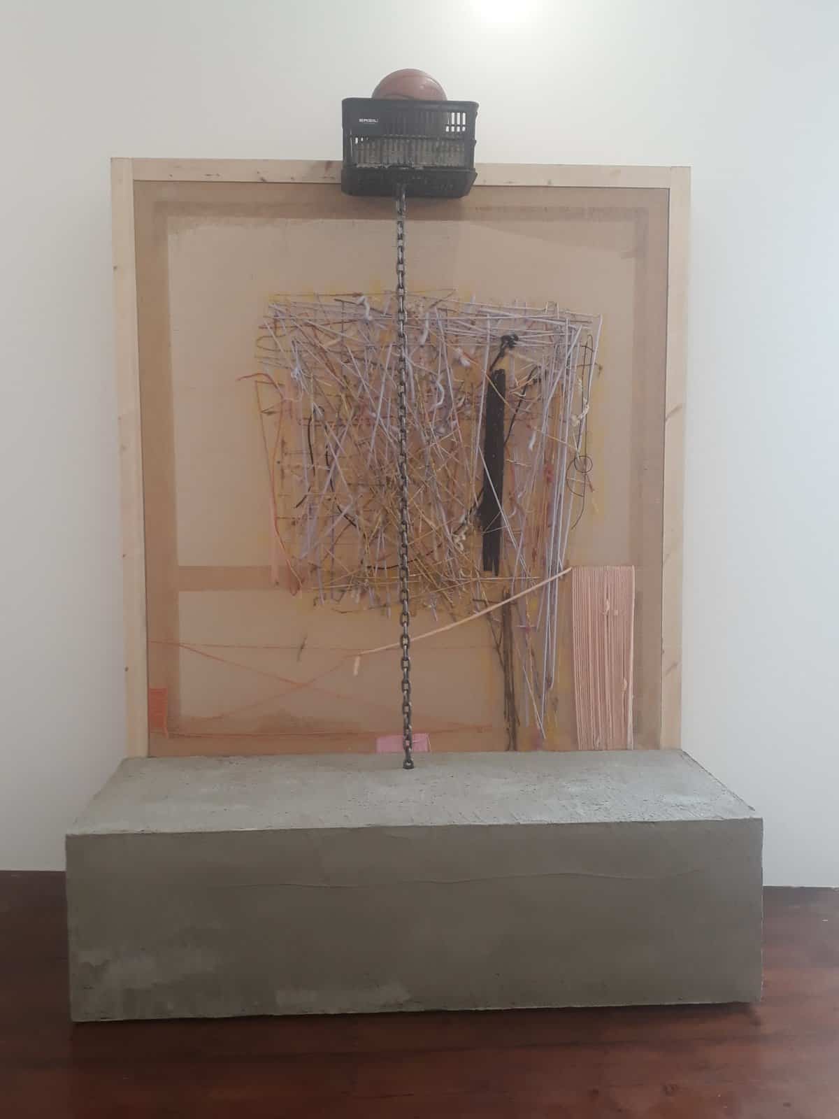
The largest and darkest work in the show is this peculiar and disturbing reproduction – scaled down to mimic Balka’s own measurements so he can just reach the top at full stretch – of a zoo built-in 1943 in the Treblinka extermination camp. Commissioned by the commander of the SS as entertainment for his family and other officers, the top part hosted a dovecote, while foxes and other animals were kept beneath. Inside it, red wine bubbles and circulates in a vat, adding catholic themes to the reflections on what humans can do.
413: ALEXANDER JAMES HAMILTON: ART INTO ACTION INTO ART
‘Untitled’, 2014 – courtesy www.DistilEnnui.com
There’s no shortage of art addressing environmental themes, and many of the artists involved are deeply engaged with the causes their work reflects on. Nonetheless, Alexander James Hamilton is exceptional in the depth of his commitment. ‘I have made it my life’s work’, he says, ‘to explore and protect global waters through artistic interventions and creating explorative bodies of work using the signature of water at the core of my practice in locations all around the world’. You can trace three decades years of that activity on his website www.DistilEnnui.com , including his compelling core practice of making underwater photographs with analogue equipment, the water operating both symbolically and as the means of generating painterly effects in his revisiting of flowers, butterflies, vanitas subjects and figures. Hamilton, as much an activist as an artist, is currently living in the Maldives, where he has a long history of working to stimulate recycling – any purchases from his site help to support that effort. As Hamilton explains, fish populations have fallen drastically as plastic pollution has entered the food chain at every level from the microscopic to the top predators, as over 90% of the aluminium and plastic from the drinks industry is either buried in landfill sites, burned or dumped in the ocean. Yet it takes less than 5% of the energy to recycle an aluminium drinks can or plastic bottle rather than make a new one. The Maldives is 1,600 km from the nearest landfall, and other than what Hamilton has initiated, there have been no facilities for recycling plastic or aluminium, or indeed creating fresh water on the local islands, with everything brought across by boat in plastic bottles. In response, Hamilton has designed and funded the building of recycling facilities– you can read the technical details here – and is also using that capacity to make art: each of the bottle sculptures in his ‘Drink Less’ series ‘is made from 1,000 aluminium coke cans brought to the Maldives and sold with no regard for responsible recycling’. Hamilton says he is ‘trying to create a satisfying ‘end of life’ for these waste materials with a meaningful message for the youth of tomorrow to consider before they make further unconsidered purchases’.
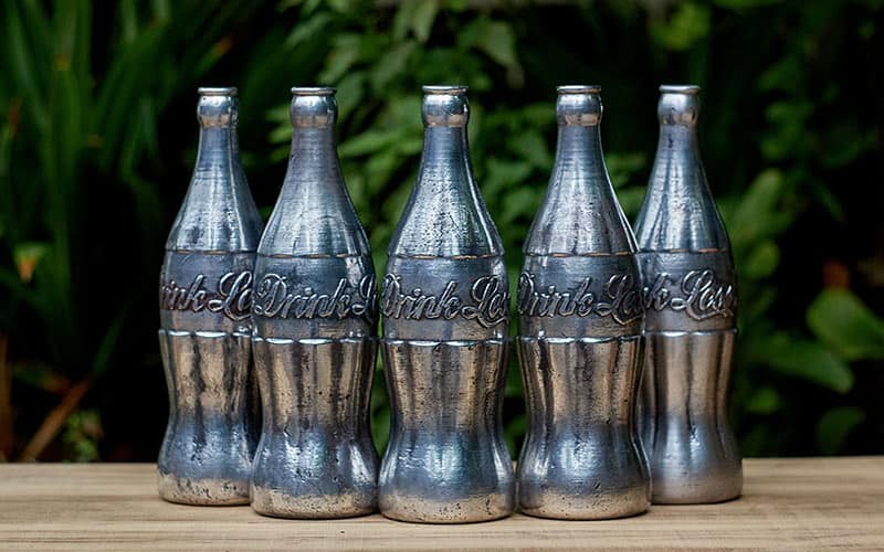
‘Drink Less’, 2021 courtesy www.DistilEnnui.com
412: ART MEETS POETRY
 Poetry was good in lockdown, being better suited to the screen than most literature or art. That makes it timely that two ambitious London shows currently combine art with poetry, even if they were necessarily in planning well before we learned the language of covid. They have prominent local partners: Shoreditch Library with PEER, The Poetry School with Southwark Park Galleries. Both PEER’s Swirl of Words / Swirl of Worlds and Southwark Park Galleries’ A Fine Day for Seeing combine an exhibition, a programme of events and workshops, and a publication. And both strike me as excellent in all three respects – though as I curated the latter with the poet Tamar Yoseloff, half of that assessment may be biased!
At Southwark Park Galleries (to 29 Aug), the focus is on partnerships between poets and artists: ten poets respond to ten artists, allowing the visitor to read or listen to each through the catalogue, online or via QR code in the gallery. The relationships vary greatly, from mother and daughter to long term collaborators to newly-mets. Perhaps the most unusual dialogue is between Basil Beattie and Maitreyabandhu. The former taught the latter at Goldsmiths Art College in the 1980s, but they hadn’t met since – the pupil is now a Buddhist, ordained into the Triratna Buddhist Order in 1990 – and has swapped painting for poetry, publishing three collections with Bloodaxe Books. He chose the huge and hugely impressive ‘Cause & Effect’ from 1980, and wrote about the time when he was an art student before he stepped across…
the threshold into the present tense: Thatcher
gives way to Grindr, Brexit and XR
as Basil, who has hardly changed, makes tea.
We prop his pictures up against the wall
and talk about the dead – Hoyland gone
and Albert Irvin “a new joke everyday”
dying at the average age, in the average way,
as if that made a difference. The paintings stand
in working studio light and measured calm
as tribute to the eye and heart and hand,
mute surfaces of know-how, marking time.
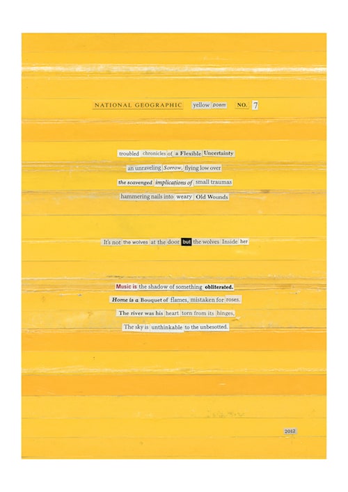
PEER’s show (to 14 Aug) considers the relationship between language and cultural identity, notably represented by publication of a free book containing 94 poems in each of 94 languages identified as being spoken in Hackney, all with English translations. The poet Stephen Watts selected these, and while you might suspect the quality of the work would be subsidiary to its concept, it turns out to be a consistently strong collection. Watts will reads his own poems at the closing event. Meanwhile the extensive exhibition brings together classic fusions of art and language (by, for example, Kurt Schwitters, Susan Hiller and John Smith) with less-known but equally fascinating works. I was taken with half a dozen of Pete Smith’s ‘National Geographic Yellow Collages’ from a series ongoing since 2009. They consist of words and phrases removed from National Geographic magazine and pasted onto a magazine-sized background of horizontal yellow or gold strips themselves cut from the publication’s iconic front-cover border. That makes them visually striking, but they also operate wonderfully as semi-found poems of surreal conjunction.

Art writer and curator Paul Carey-Kent sees a lot of shows: we asked him to jot down whatever came into his head
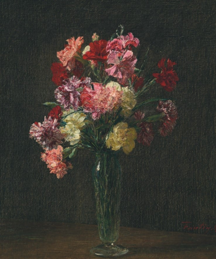
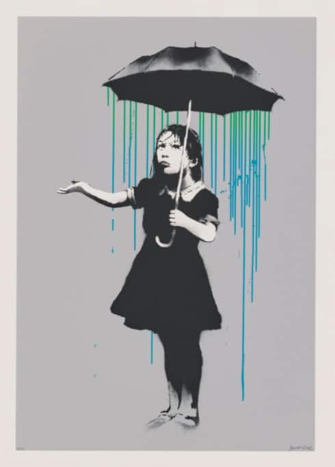
Walking round an auction house the realities of market prices never cease to amaze me. At Christies recently, for example, you could bid on various works on paper. If you like paintings of flowers, then there happened to be a highly attractive group of five unique works, expected to realise some £150,000 in total. I’d take any of those – by Alex von Jawlensky, Hannah Höch, Maurice de Vlaminck, Giorgio De Chirico and Henri Fantin-Latour – at their average £30,000 value over a screenprint by Banksy on a similar scale. Whatever its merits, the Banksy is already a secondary work, made after an original wall stencil, and comes from an edition of 416 plus an extraordinary 66 Artist’s Proofs (just how many APs can you plausibly need?). So call it effectively an edition of 500. Yet the Banksy was estimated at £200-300,000! Apparently, every pop star wants one. So I had it the wrong way around: not several Banksy huge-edition prints per Fantin-Latour painting, but several Fantin-Latour paintings per Banksy print! More of a headline lot was Banksy’s painting ‘Subject to Availability’, 2009-10, which was available subject to you having an estimated £3-5m to spend on it (it sold for £4.5m)… I’d like to say that the actual prices achieved made more sense to me, and there was a slight shift: the Banksy print made £218,750, so low end, while the Fantin-Latour was the star of the cheaper works, fetching £62,500 against its £30-50,000 estimate. Still, getting on for four Fantin-Latour originals per Banksy print.
Art writer and curator Paul Carey-Kent sees a lot of shows: we asked him to jot down whatever came into his head

![]()

The ‘Campo Boxes’ (2017) are black lacquered sculptural sound boxes which take the ‘negative shape’ defined by the irregular buildings surrounding the public squares – or campi – at the historic heart of every Venetian neighbourhood. Open the boxes, and you hear, in the gallery’s words, ‘the subtle nuances of daily Venetian life – the snippets of conversation between neighbours, calls from passing boats and gondoliers, children playing and footsteps in a pedestrian city where sound bounces off from stone to stone free of the din of traffic’ - sounds which are threatened by the depopulation of the city as well as by climate change.

In 2019 McGill organised ‘Red Regatta’, for which 52 traditional vela al terzo boats sailed in choreographed regattas, all with red sails. The colour has many Venetian associations - from its bricks and terracotta rooftops, to its flag and history of trade in red pigment, to the paintings of Titian and Tintoretto – but here stands most pertinently for danger and alarm at the city’s environmental imperilment. The red sails were made the more striking by subtle differences, hand-painted in 52 different shades from a hundred that McGill identified in her project research – she shows her colour studies alongside preparatory works, film of the regatta and photographs of the sails as reflected in the lagoon.
![]()

![]()
An accompanying book demonstrates that the regatta wasn’t just a spectacle, but also a social project: it contains interviews with each of the boat owners, building up an account of the Venetian sailing community. Some are following family tradition, others fell for the boats by happenstance. One owner recalls ‘a baptism of water’ when he first sailed in storm, another explains that not only is the name Mitieleo an acronym encoding his family, but ‘the boat’s nameplate is in the shape of our dachshund, Peggy, who completes our crew’. In a story that might stand in for the wider malaise, one of the few female captains recalls that when she started sailing ‘nine years ago’, recalls of her start in sailing, motorboats looked at her with respect ‘and slowed down as they passed’, but now ‘nobody cares, they pass at full speed without caring if their waves jolt me. Our traditional boats are every unstable and fragile because they have a flat bottom so they can navigate in shallow waters. Last year the bottom of my boat cracked and I almost sank.’
409: OUTPOSTS OF ART
I visited three places not so typically associated with art last weekend: Beckenham, Penge and Reading. But all had their points:
First to the grounds of The Bethlem Royal Hospital in Beckenham, where you can find not just the Bethlem Museum of the Mind – well worth exploring – but also The Bethlem Gallery, which aims to provide a supportive environment for artists with mental health problems. That by no means restricts it to ‘outsider art’: much of the current exhibition by former resident Sara Haq was previously shown in the 2018 Berlin Biennale. ‘Things I did that that nobody noticed (but that changed everything)’ is a set of 35 small works in oil pastel and pencil which Haq regarded as a healing practice – ‘more happenings than drawings’ at a time of time of trauma. Bright colours carry evocations of underlying disturbance in a cycle which I see as pathways through brains, but in which others have plausibly found rockpools and birds among the possibilities for apophenia.
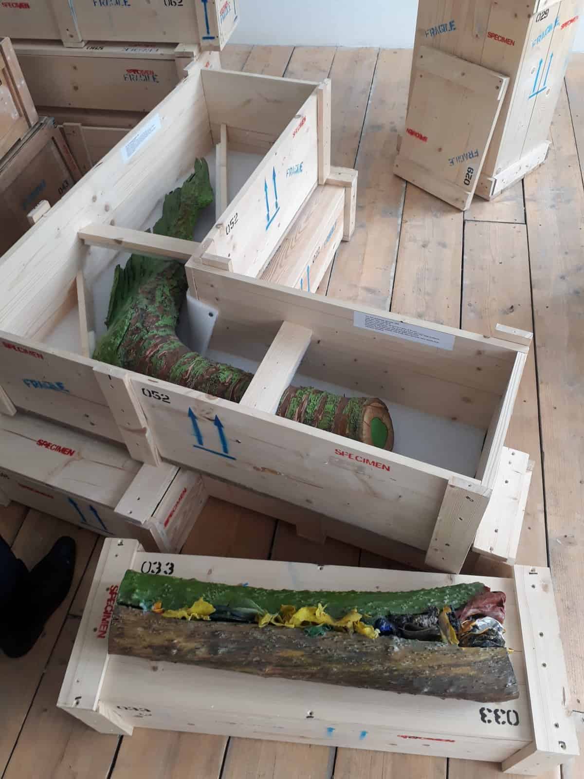
Tension Fine Arts is in Penge – easy enough to reach on the London Overground. In ‘True-Fictive Nature’, Matt Hale presents arboreal specimens. They seems to have resulting from tracking down trees which – though heavily polluted, often right to the core – are not without an aesthetic side-effect which somewhat ameliorates their message of environmental doom. He presents his full collection in Penge, even though spatial constraints force him to leave a high proportion of them boxed up on the floor in bespoke storage with impressively scientific labelling. Or maybe he faked it all: I didn’t get the chance to ask…
Caroline Streatfield: ‘Little Dreamer’, 2021
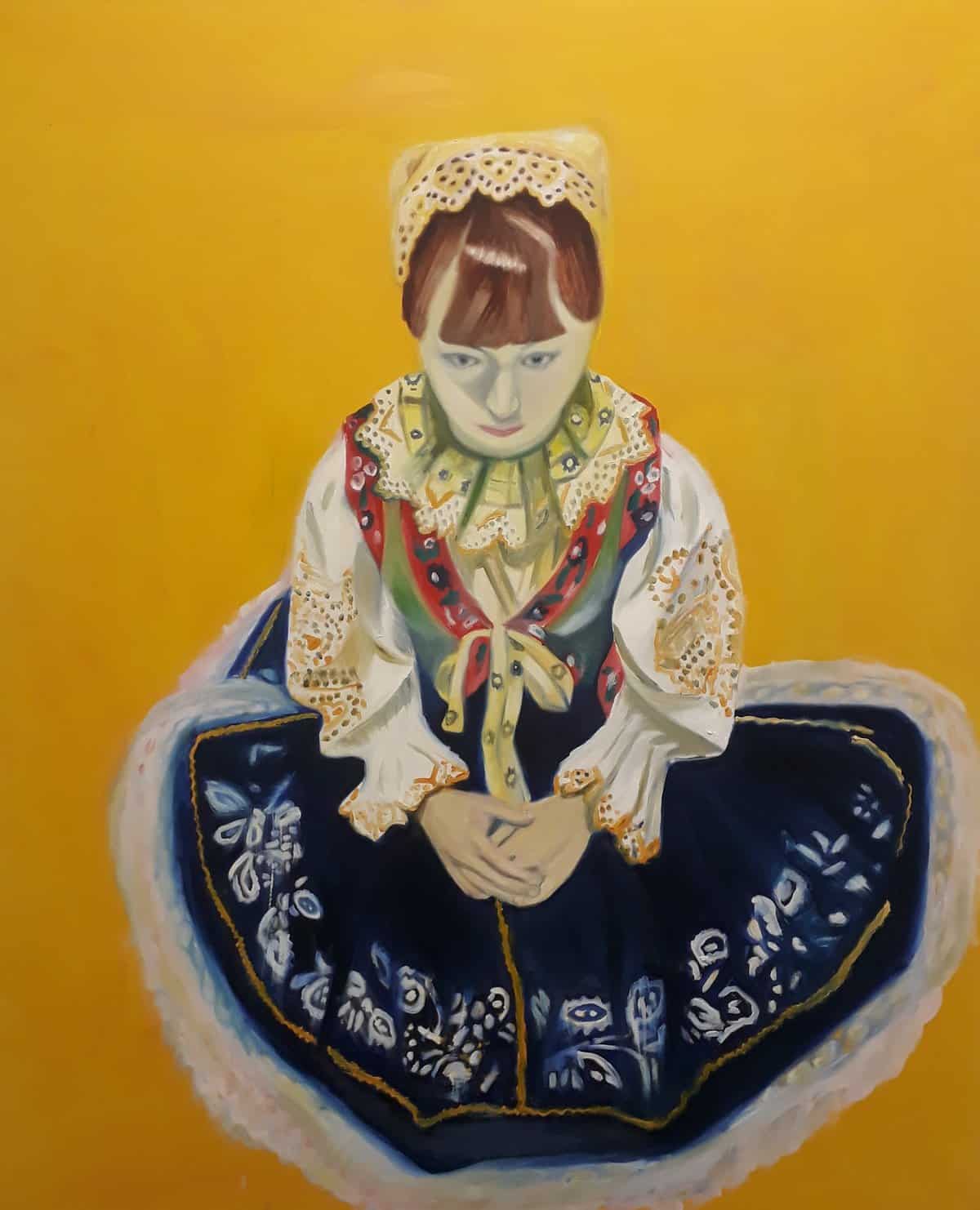
Finally to 571 Oxford Road Gallery, which lies in a studio complex at the heart of Reading’s liveliest and most diverse area. Caroline Streatfield’s ‘Hidden Ancestors’ explores her Slovak inheritance from the perspective of someone who didn’t visit her homeland until she was 21. The John Moores prize recently featured one of the series depicting her daughter in national costume, and more from that strikingly coloured set were among the 32 paintings spread across the surprisingly spacious exhibition space. Paintings of Branston Pickle provided a counterpointing reference to British identity. The building was once part of the adjoining barracks: some paintings were in a cell in which drunken squaddies were once likely to be confined until sober.
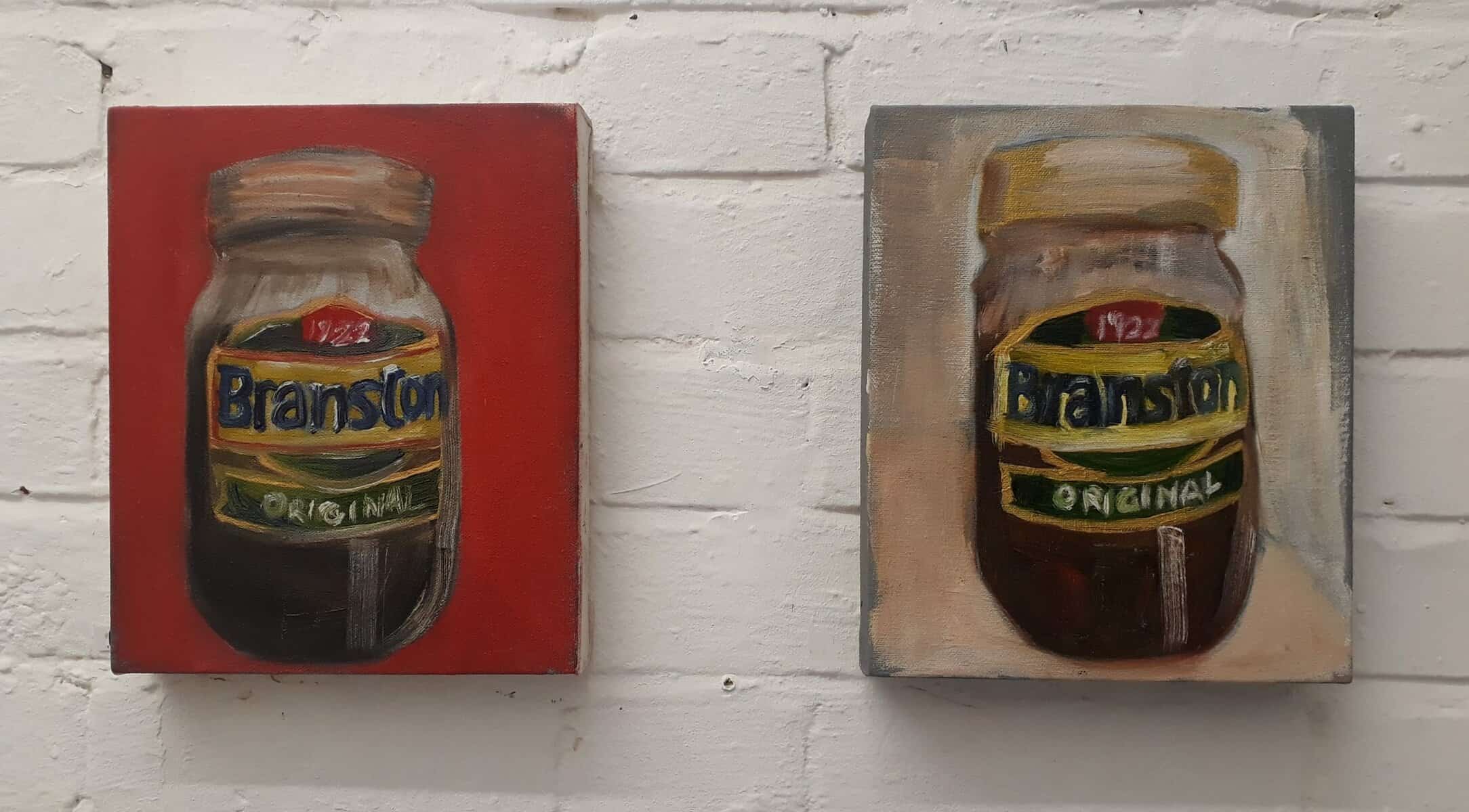
Caroline Streatfield: ‘Branston 1’ and ‘Branston 2’, 2020
Art writer and curator Paul Carey-Kent sees a lot of shows: we asked him to jot down whatever came into his head
Art writer and curator Paul Carey-Kent sees a lot of shows: we asked him to jot down whatever came into his head
408: SPOT THE DIFFERENCE
By Paul Carey-Kent • 30 June 2021
Repetition provokes us into considering what’s changed – or what hasn’t – and why that might be. Here are three examples from current London shows:
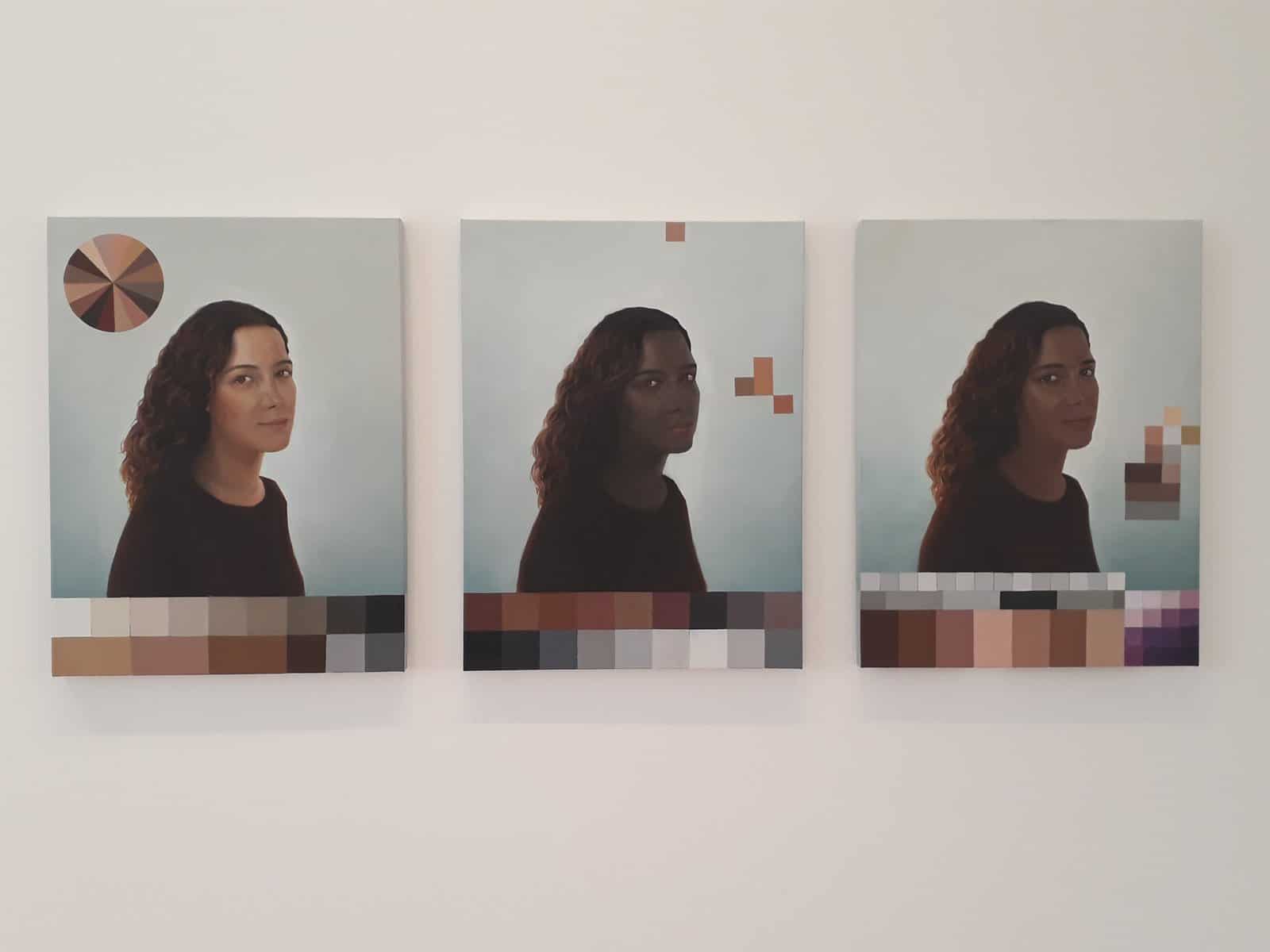
Adriana Varejão: ‘Polvo Portraits I (Seascape Series)’, 2014, at Lehmann Maupin
This tryptic is part of Varejão’s exploration of the social and historical function of race in Brazil: self-portraits with varied skin tones inspired by the idiosyncratic results of the 1976 Brazilian racial census that asked citizens to describe their skin colour. @ selected 33 of the 136 tones to paint, and these are three of the most poetic-sounding self-identifications?Sapecada (Flirting with Freckles), Burro quando Foge (Faded Fawn), and Queimada de Sol (Sun Kissed) – the shades also appear in colour bars and wheels. The academic portrait format comes from casta painting, prevalent in colonial Mexico as a documentation of the varieties of interracial mixing in the New World in an attempt to systematically classify and frame racial diversity and hybridity – with ‘pure races’ preferred.
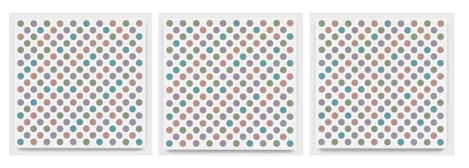
Bridget Riley: ‘Measure for Measure’ series at David Zwirner
In Riley’s ongoing series coloured discs are arranged in a diagonal grid, their palette inspired by Seurat’s pointillism, with the aim of making the colours oscillate depending on how their position on the grid places them against neighbouring hues; and you also get some popping up of white discs. The new 2020 series of these adds a fourth colour – turquoise – to the greyed off-green, off-violet and off-orange used, for example, in the National Gallery’s staircase installation. Anyway, David Zwirner has four in this particular format and colour range – No.s 45, 46, 49 and 51 in the series. Two of them use – so far as I can see – the same colour combinations. So – spot the difference…
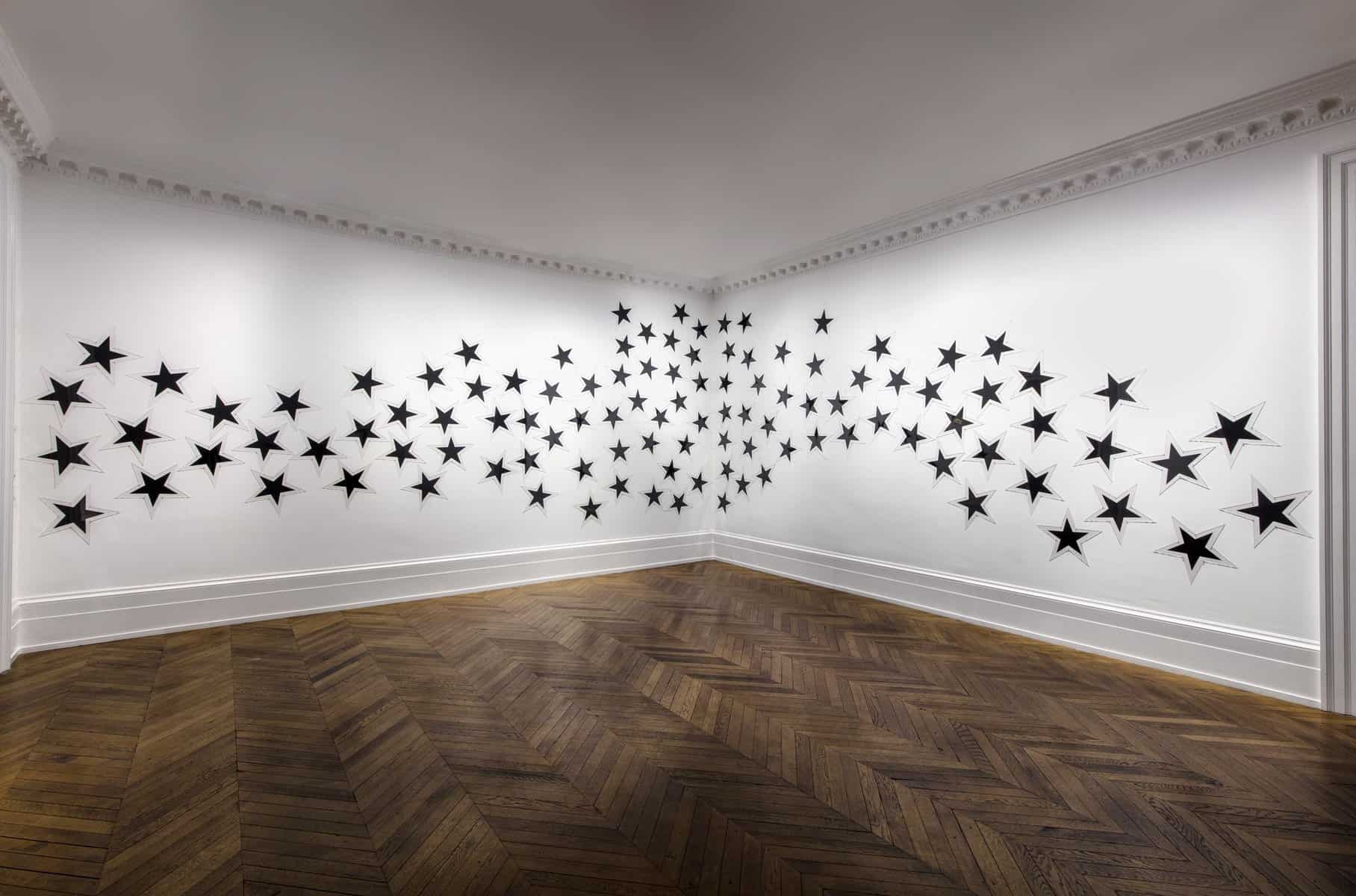
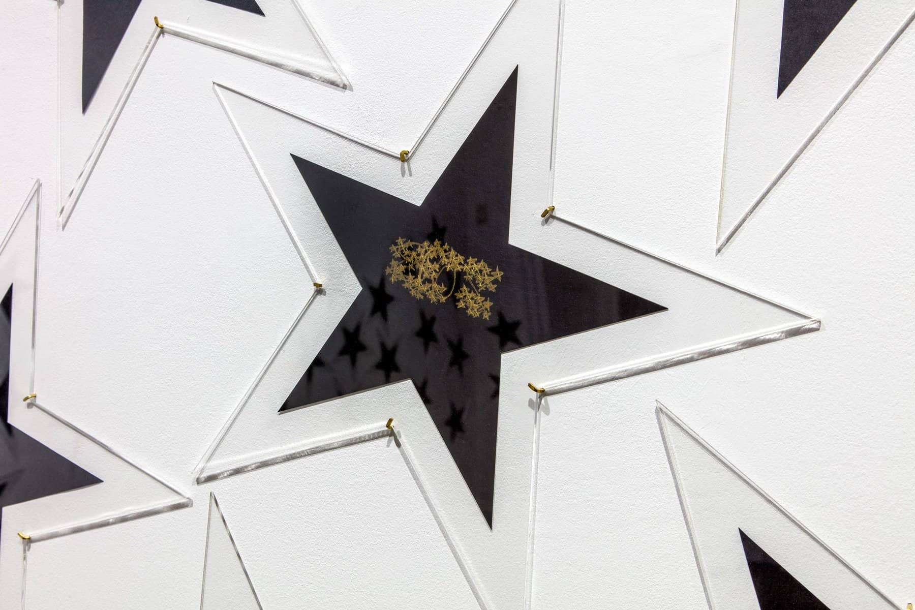
James Lee Byars: ‘The Milky Way’, 1993, at Michael Werner Gallery
James Lee Byars elegantly reduces de Vinci’s Vitruvian Man to a five-pointed star, then takes the human into the cosmos through an installation of around 100 using black paper. Just one has gold paint: ‘Eros’, inscribed in gold and hidden beneath the artist’s stylized writing, is the genesis of The Milky Way. For Byars, according to the gallery ‘Eros is a universal force to be harnessed and lead towards purity, beauty, truth and perfection’.
407: ART, LIFE AND EVERYTHING
In ‘Art, Life and Everything’, Julie Umerle chronicles her life as an artist from 1978-2010. She hasn’t had an easy ride – for example, she’s never been represented by a mainstream gallery – but has kept at it for over forty years now, clocking up enough shows and sales to keep going with the help of part-time jobs, grants and residencies. The book took her a decade to write, in line with the persistence she demonstrates throughout it, and was published in 2019. It’s a curiously even-toned account of her art education; studio time; frequent changes of studio, with all the hassle that involves, as she moves back and forth between London and New York; shows in galleries which disappeared in short order; medical traumas; meeting the inspirational Robert Ryman; her responses to world events; the odd romance and a brief marriage (page 133 ‘for some reason I agreed to marry him’… page 145: ‘not one of my better decisions ’); the impact of economic cycles; applications for funds (I wouldn’t be surprised if Umerle’s five to date is the record for successful Arts Council grant applications by an individual artist).
If you think that sounds somewhat undiscriminating, that is how it reads, but the style suits: you feel you’re getting a full account of the day to day effort it takes to keep going as a relatively unknown artist. That is, of course, what almost all artists are, and there’s a heroism to that which you rarely see set out. And it’s the legions of struggling artists from which the small minority of financially successful artists emerge: there’s an inter-dependency. Moreover, Umerle has persisted despite health issues which would have led many to give up: she required major spinal surgery in 1984 and 2004, both times hospitalising her for months and in the latter case nearly killing her: she recounts the details of conditions on the ward, morphine levels, rehabilitative regimes, learning how to use her wheelchair again – all faced with matter of fact courage. Yet nothing can get in the way of her desire to make art, and the book ends happily: ‘I continue to paint and make new work. Life is good.’
Umerle has just held a solo show – as ever, of abstract paintings – at the Bermondsey Project Space. For a flavour of her work, look at that online or her own website together with Anna McNay’s accompanying essay. Most recently, says McNay, ‘Umerle, instead of painting stable, concrete forms, splatters white acrylic paint on to optimistically spring-coloured grounds. This looser, much less controlled technique reflects the growing sense of uncertainty and anxiety felt both by Umerle herself and by the nation – and global population – at large.’
For a further perspective on Umerle’s book, see Meike Brunkhorst’s account, also on FAD.
Art writer and curator Paul Carey-Kent sees a lot of shows: we asked him to jot down whatever came into his head
406: BEYOND THE UNCANNY
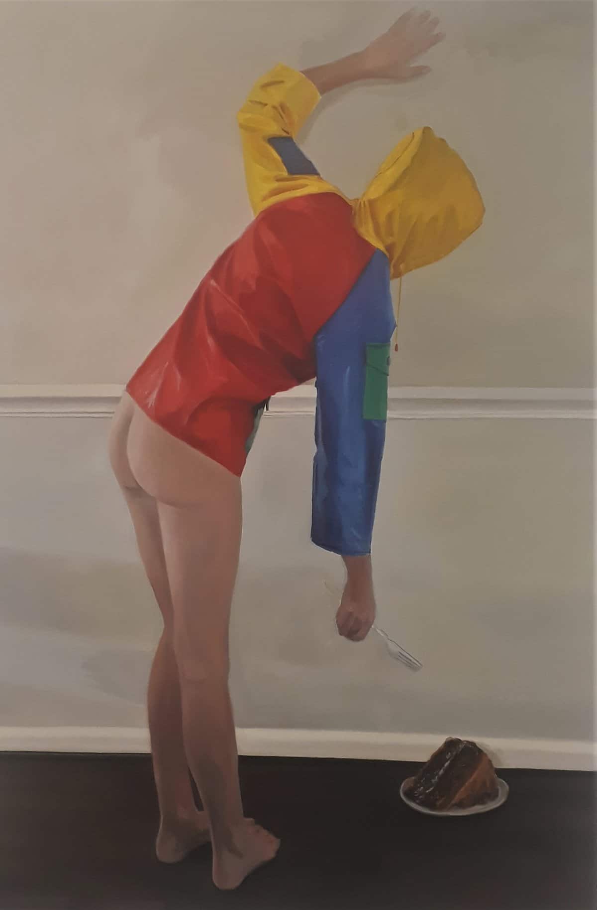
Shannon Cartier Lucy: Woman with Cake, 2021
Plenty of shows bring together paintings of figures and objects in unusual contexts or brought into unexpected conjunctions: the words ‘uncanny’ and ‘enigmatic’, ‘disturbing’ and ‘surreal’ are likely to be invoked. But, even if the paintings are good, you need a more to turn such a display into a compelling whole. Two current exhibitions demonstrate how:
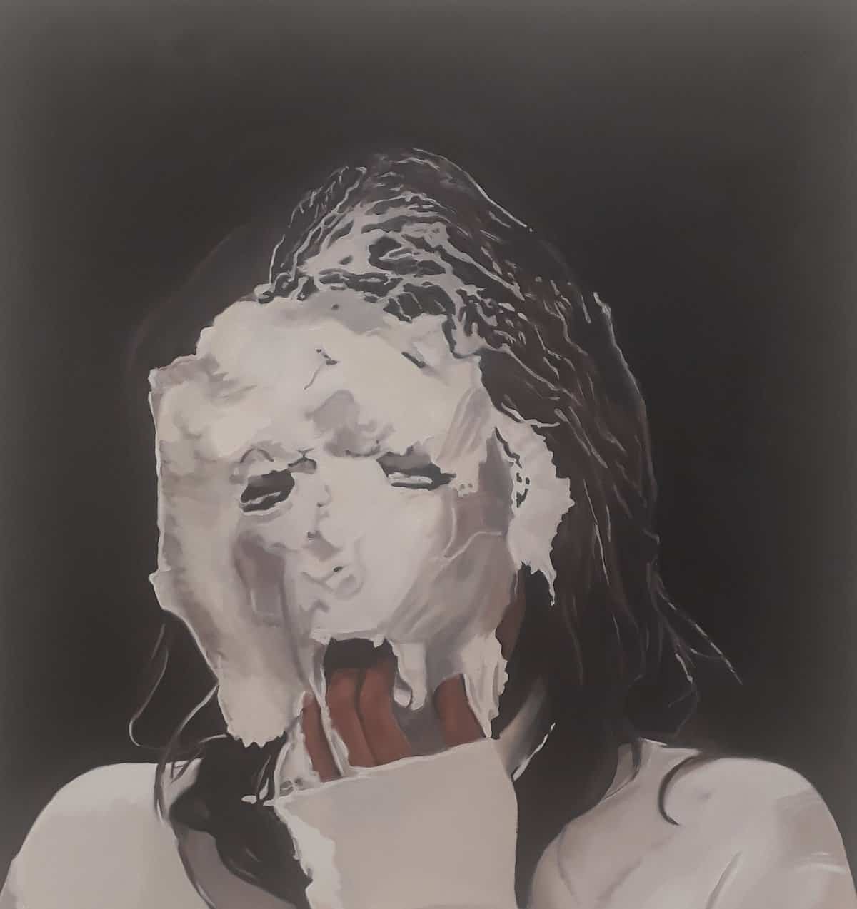
Shannon Cartier Lucy: Woman in Meringue, 2021
Nashville-based Shannon Cartier Lucy’s ‘Cake on the Floor’ at Soft Opening sets eleven paintings into a loose narrative of what looks like a perversely dysfunctional party. Some guests strike the poses of classical nudes, but dressed in multi-hued anoraks. A cake fork and scissors are brandished with apparent intent. Others interact oddly with cake and party ribbon, culminating in a woman becoming totally slathered in meringue. All of which lockdown production also feels rebellious at a time when no actual partying is allowed. The images aren’t derived from Internet searches, but the press release does mention that ‘cake on the floor’ generates 257m results on Google (that must have been written a while ago: I got 307m results and I guess you’ll get more…)
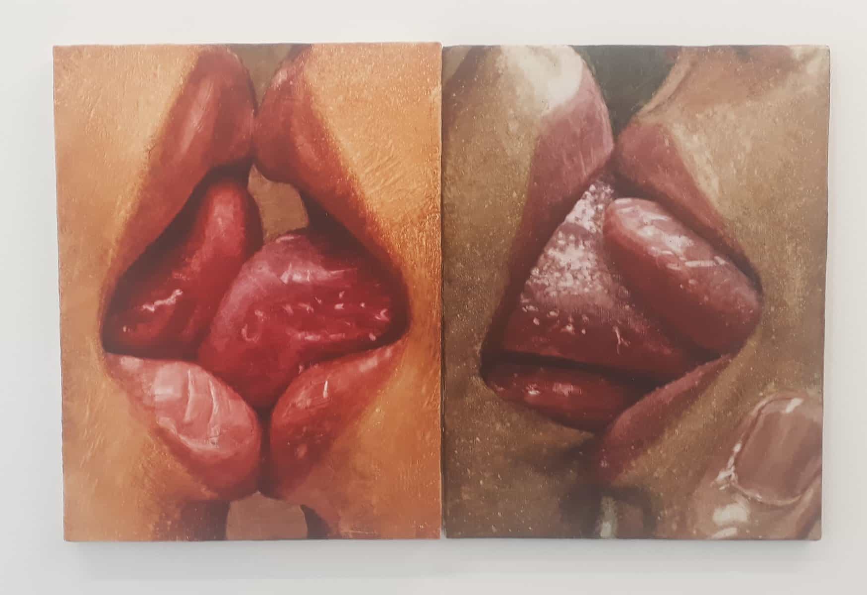
Joseph Yaeger: Conversation 1 and Conversation II, 2021
The paintings in Joseph Yaeger’s ‘Doublespeak’ at Project Native Informant are accompanied by a publication: a stream of consciousness-come-poem-come-philosophical musing by the artist. Yanger explores the limitations of language for giving access to the inner states of other people, and wonders whether it might be possible to solve the conundrum through images. The paintings feature ways in which what we see or hear might be distorted: several use refraction in glass or reflection in mirrors, others depict constraints on speech. Thus, for example, the titles of ‘Conversation 1’ and ‘Conversation II’ suggest talking, but the closeness of the tongues is such that linguistic communication must give way to non-verbal means. And the paintings have a slightly odd lushness, generated through the unusual medium of watercolour on gessoed canvas.
Joseph Yaeger: Only the dead are eloquent, 2021
405: LONDON GALLERY WEEKEND
The first London Gallery Weekend (4-6 June) felt a very positive initiative, conveniently revealing the scale of London’s commercial art scene to less regular gallery-goers, and encouraging attendance through the sense of participation in an event. 130 commercial galleries took part, probably more than half of those which could plausibly be described as showing contemporary art, in a simple model open to all if they met the geographical requirements – galleries had to be in the zones defined as ‘Central’ ‘South’ and ‘East’. There was no printed map – just online listings – and no requirement to put on a new show. Indeed, quite a few galleries took the chance to turn the weekend into a closing event. That’s a different model from the more exclusive one applied in Berlin: fifty galleries only, all opening new shows. There won’t have been many international visitors this year, but perhaps this will act as a rehearsal for next year, when that should be more feasible. Here’s something ongoing I liked from each of the regions:
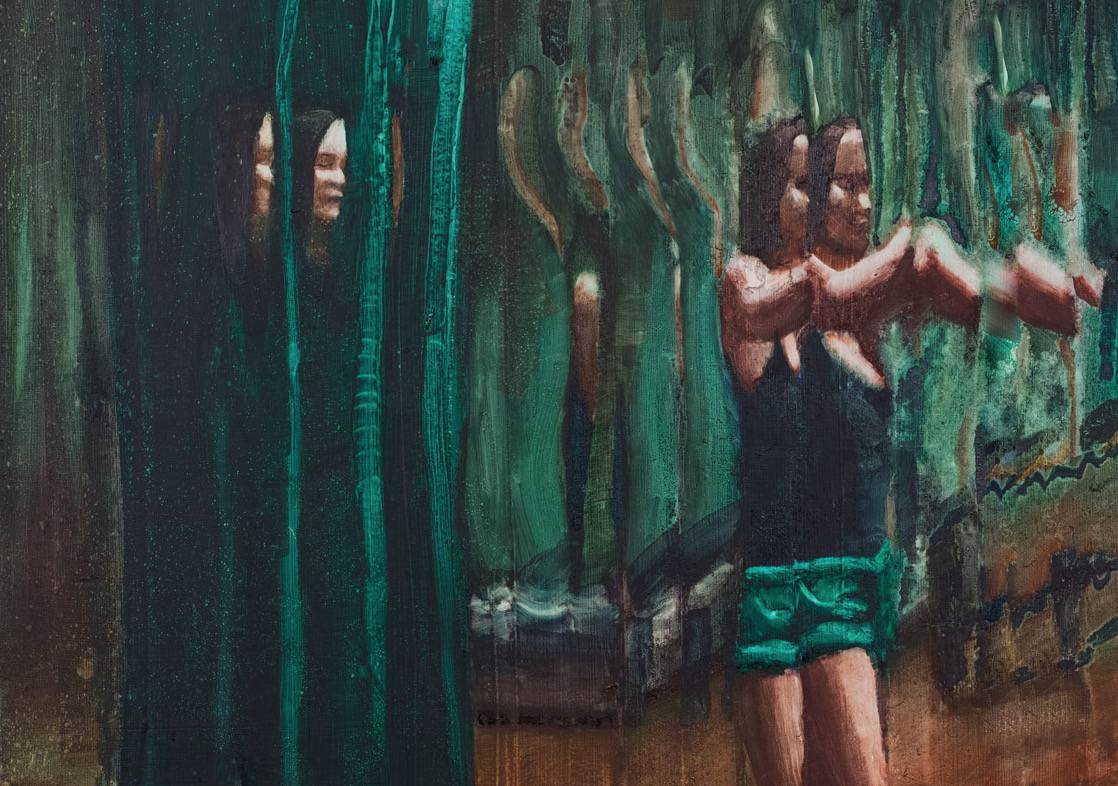
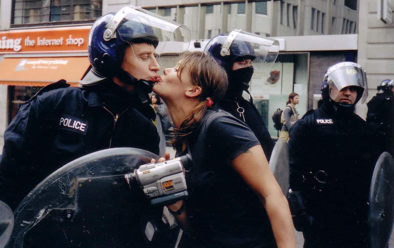
CENTRAL: Vinca Petersen at Edel Assanti (top image)
Edel Assanti played a leading role in making the Gallery Weekend happen. Their own show resurfaced Vina Petersen’s experiences from-the-inside of raves and riots from 1990-2004. They’re not all serious: as she says ‘My way of dealing with the world is to make fun, to play. So I would always dress up to go to demos, I’d pinch policeman’s bums, and have fun in those situations… So I’m trying to capture a sense of joy in these pictures. It’s about making life fun despite its hardships. It’s about subversive joy.’
EAST: Alvaro Barrington at Emalin
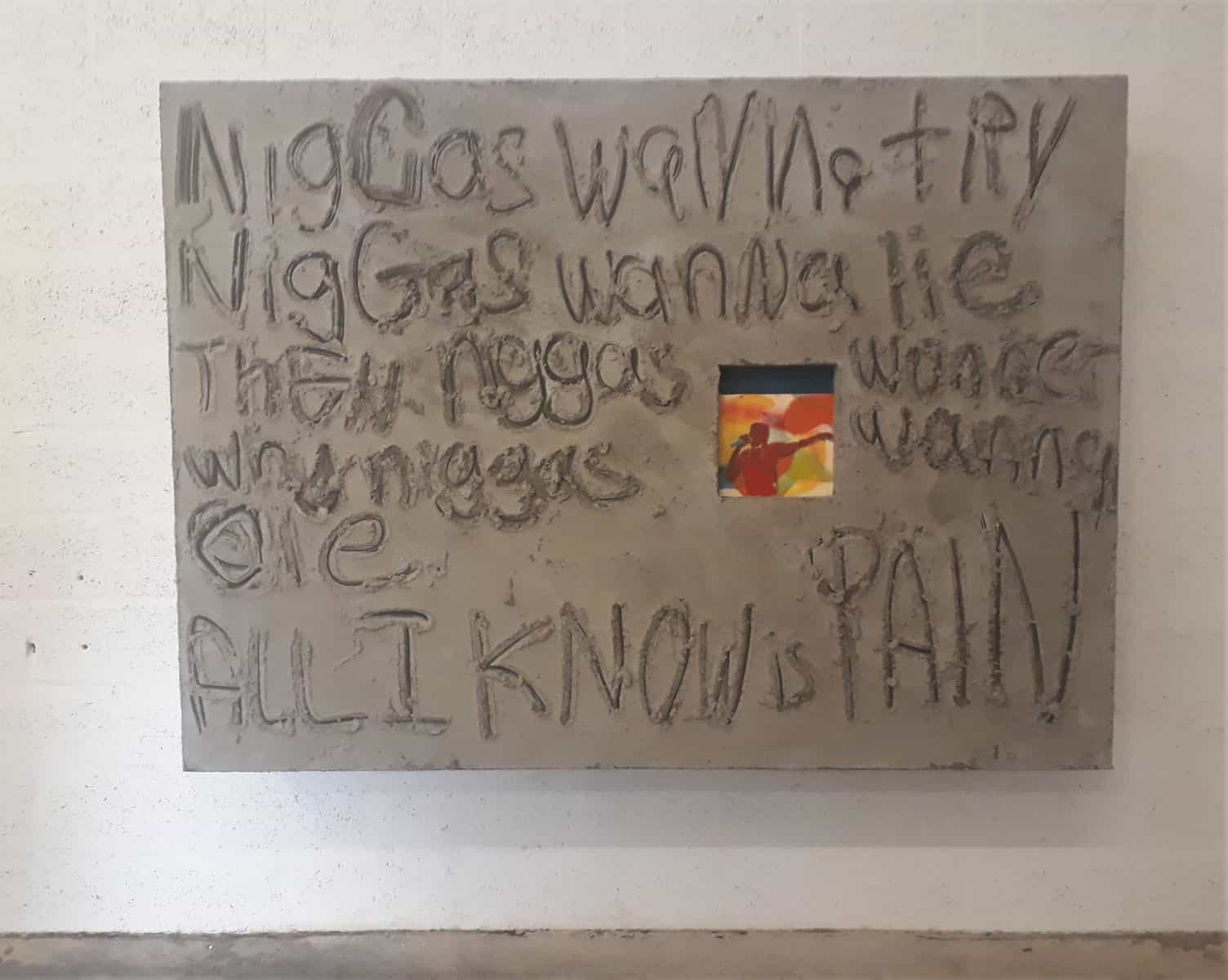
Alvaro Barrington has two shows at Emalin, one in their new building, one in their old. The first is of what might be taken as self-portraits: ‘Street dreams are made of basketball’ incorporates a milk crate as hoop and makes artful nods to Koons, Hammons and Salcedo. The other is a more direct tribute to rapper DMX, who died recently. He’s pictured surrounded by his lyrics – given weight by how they’re scratched into a grotesquely disproportionate concrete framing devices.
SOUTH: ‘The Women’s Century : Female Perspectives in Brazilian Art’ at Cecelia Brunson Projects
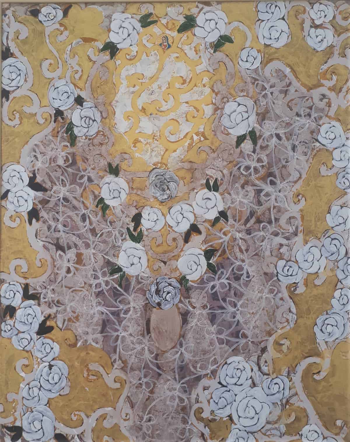
Beatrice Milhazes: Casa da Maria, 1992
Cecilia Brunson brings a concentrated and intense selection of works by Brazilian women to Bermondsey. This early Beatrice Milhazes has some of the the markers of her later style, but rather jokingly incorporates a collaged Mary – whose house seems to be set in a golden baroque more suggestive of El Dorado than of heaven.
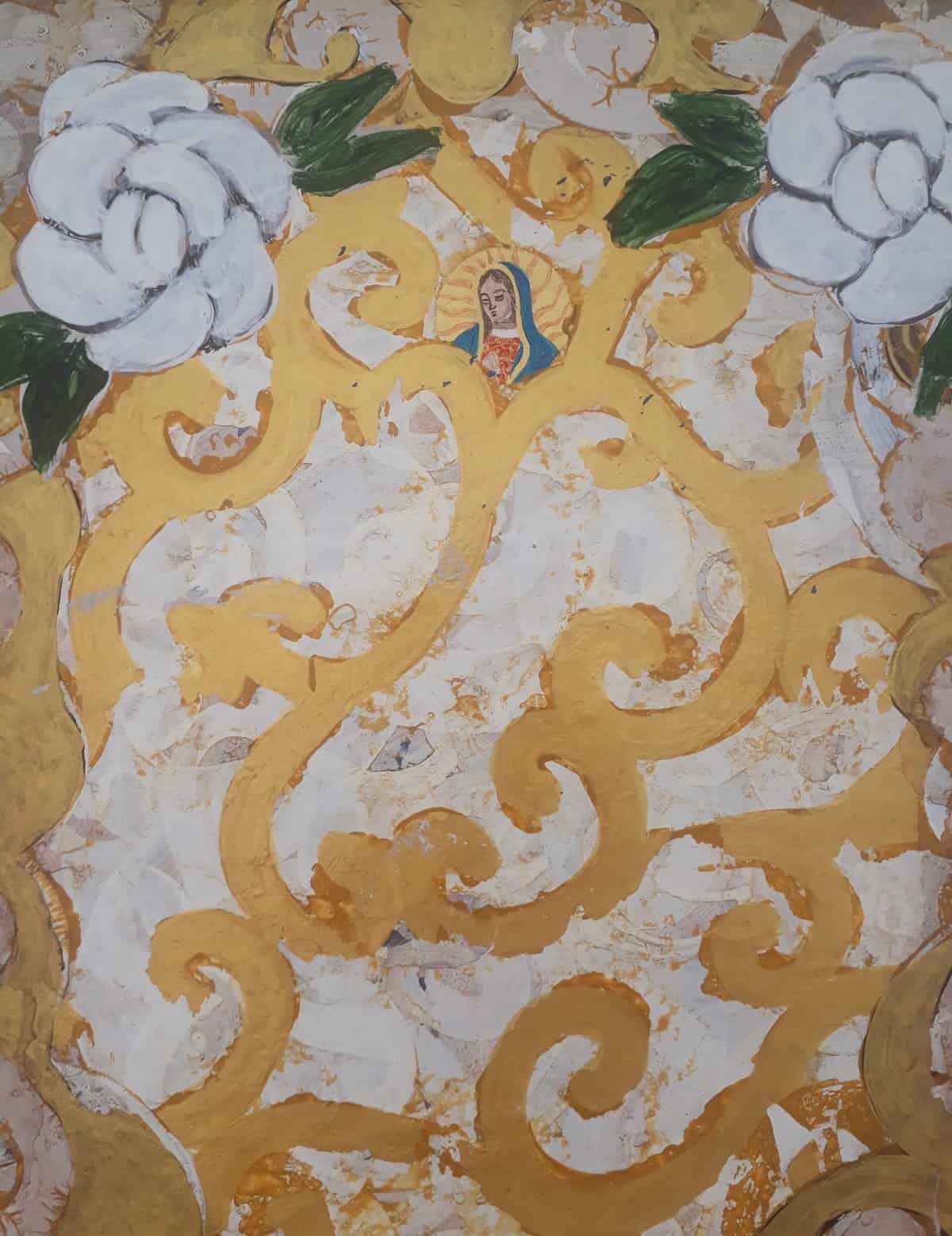
Beatrice Milhazes: Casa da Maria, 1992 (detail)
404: FROM THE MARGINS
It would be easy to assume that the major institutions, the big galleries in Mayfair and Fitzrovia, and the secondary hub of the East End would account for the best shows. Yet last Saturday I toured six galleries at the comparative margins – Leytonstone, Woolwich, north Bermondsey (as opposed to trendy Bermondsey Street), Camberwell and Kennington – and the standard was excellent. Nor did it prove hard to get around by bus and tube…
Helen Barff: ‘Mama Sunshine’, 2021Helen Barff: Many and many a day like this at The Stone Space, Leytonstone
HHelen Barff casts the memories and lightness and traces of the colour from old clothes into jesmonite to entrancing effect. She describes ‘Mama Sunshine’ as exploring 'the joyfulness, but also the burden, the weighing down - literally tugging on your skirts! - of motherhood'. It combines casts of her children's clothes with the real thing, as found in a charity shop. Hence, I suppose, the suggestion of breasts as well as legs emerging from a co-nurturing sun...
Recreational Grounds at Thames-Side Studios Gallery, Woolwich.
A stimulating 16-strong group show which carries on the spirit of the six previous 72 hour shows arranged by the artist-curator team of Fiona Grady, Anna Lytridou and Tim Ralston in a brutalist carpark in Elephant and Castle, but in the spacious gallery attached to the country’s largest grouping of artists’ studios. The show ranges from octopi to minimalism, from found hoardings to bedsheets, and taught me two new words – ‘dolos’ and ‘carabiner’, which was a bonus. And it’s always hard to resist Rosie Gibbens…
Leah Capaldi: Big Slit at Matt’s Gallery and Andrea G Artz: Ghost Weight Experience at Coleman Project Space – Bermondsey
Handily next door to each other are two shows probing the alternative realities of physical presence. Leah Capaldi presents just a glimpse of her apparent performer lying down doing nothing much, but the viewers trying to puzzle out why are also relayed live online, so maybe we’re the ones performing and the work isn’t in the gallery at all. Andrea G Artz folds antique found portrait photographs into three dimensionality, then uses those characters to populate an absorbing VR experience that draws a three-way analogy between memory, virtuality and ghostliness (image at top).
Luca Bosani: The Gargantuan Shoe at San Mei Gallery, Camberwell.
This four hour one-off durational performance scored highly on innovative features: one performer was hidden in the titular gargantuan shoe, which was big enough to enable them to play piano unseen; the other two, one with saxophone, sported ludicrously horny headwear and boots, Bosani’s own prongs being directable so that he could point out the audience member next up to receive a scrap of paper containing a tantalising fragment of the show’s narrative arc. So far, so striking, and deconstructing all sorts of expectations in the process.
Katherine Fry: Please call me home at Danielle Arnaud Gallery, Kennington.
A museum-standard installation of seven videos in a domestic environment – plus tea and cakes in the garden! – made for a satisfying conclusion. Katherine Fry’s earlier films feature hypnotic not-quite-repetitions of her actions in domestic settings with Freudian themes fully drawn out in an accompanying text by Maria Walsh: in the two screen ‘Tablemouth’, for example, the actions and number of legs on the tables vary cyclically across its 21 minutes. Even better, perhaps, is a new departure: the 39 minute film Her glass flower house, in which Fry animates a doll through stop motion to a voiceover of compellingly skewed observations.
Art writer and curator Paul Carey-Kent sees a lot of shows: we asked him to jot down whatever came into his head
403: DANDELIONS
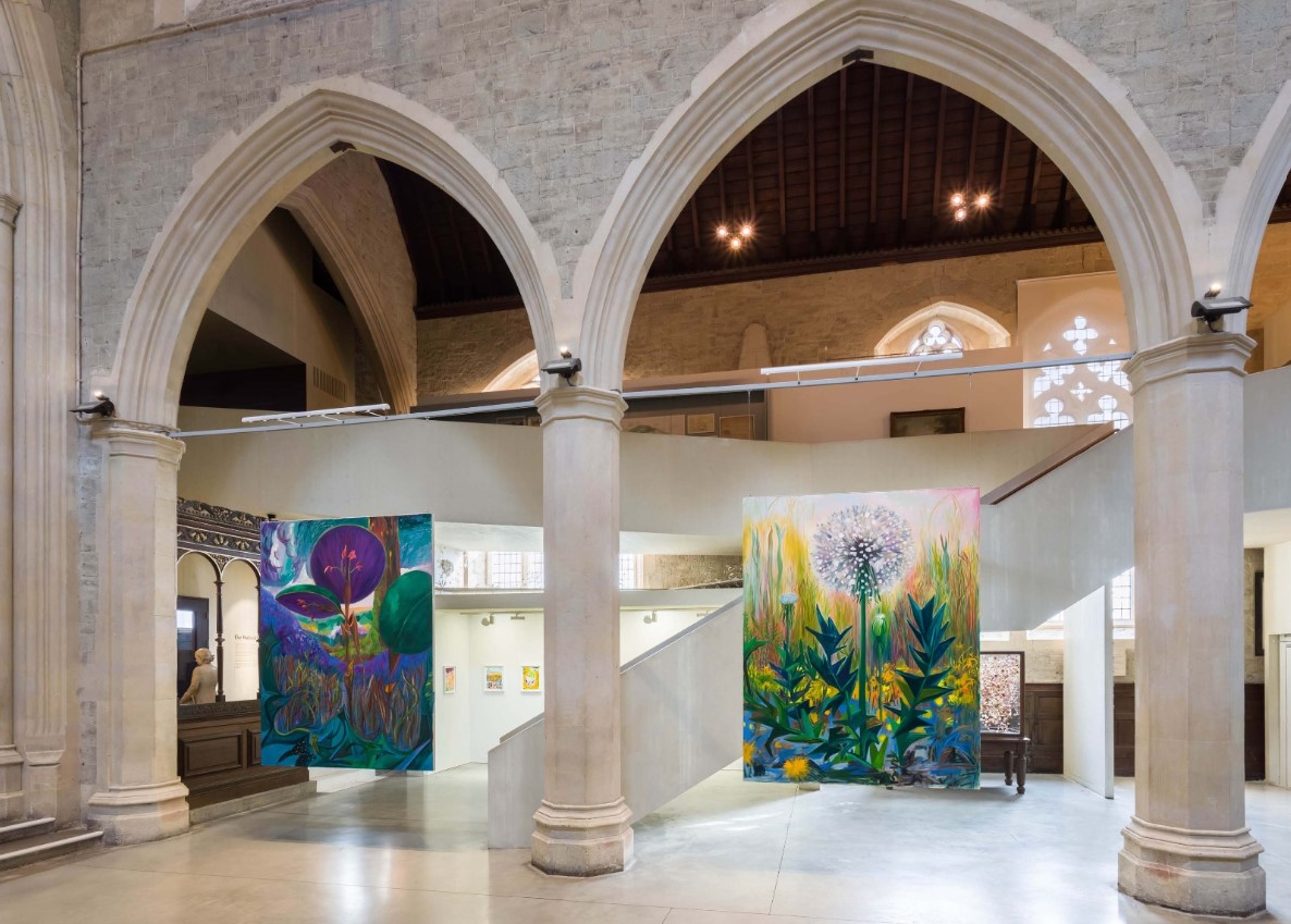
I wait years for a really good dandelion painting to come along, then – on the same day – see two artists triumph with the subject!
![]()
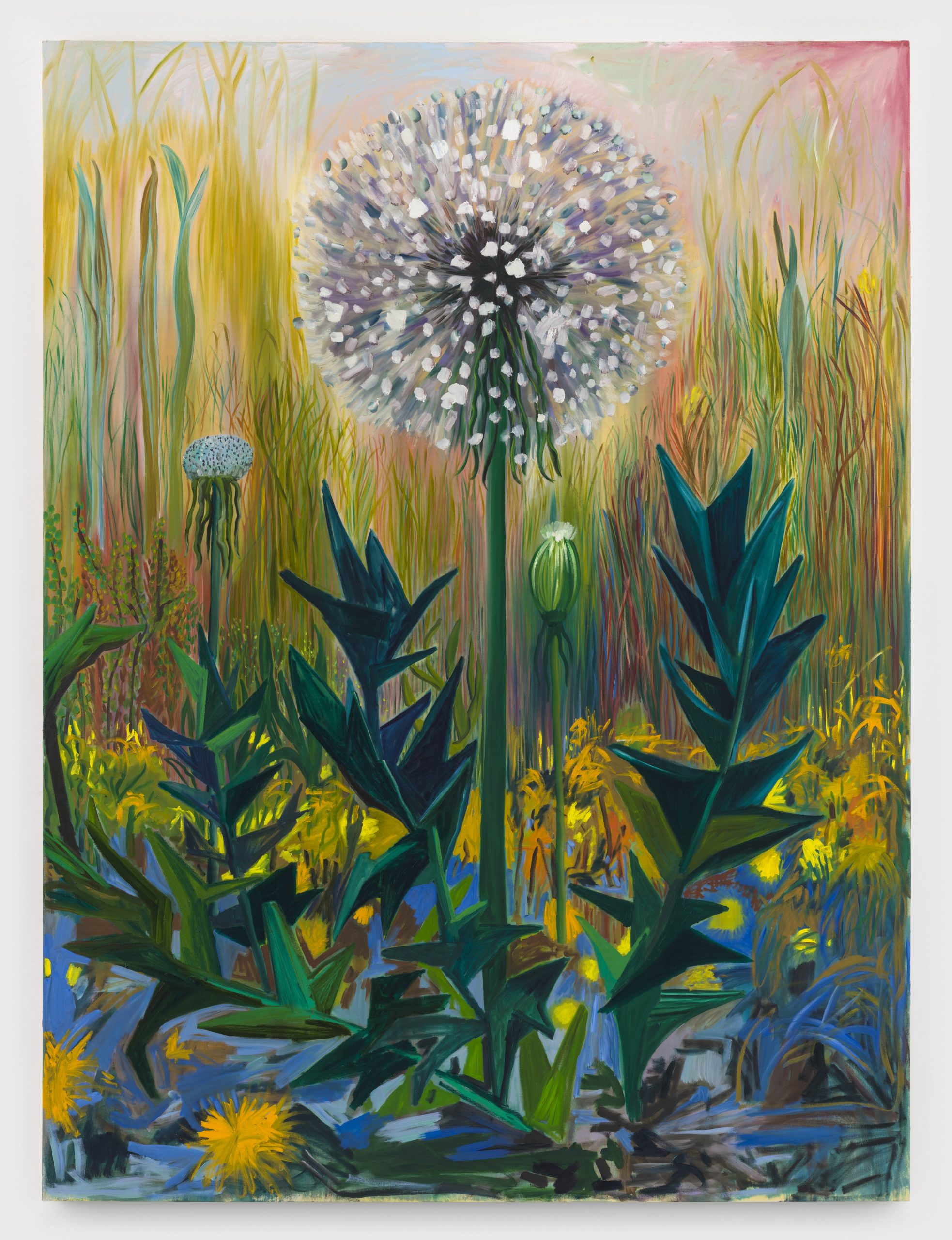
Shara Hughes: Soft and Strong, 2021 (above and top) from the Pilar Corrias installation at the Garden Museum
Entering the nave of The Garden Museum’s former church in Lambeth, you come face-to-face with four eight foot high paintings of flowers: perhaps you can get spiritual guidance from plants at such a human and iconic scale? The dandelion, says Hughes, is the closest to self-portrait. It is ‘sharp and daggered, warning us to stay away, but there are soft elements too – and it was painted at a time when parts of me were getting broken but I felt new growth was possible’.

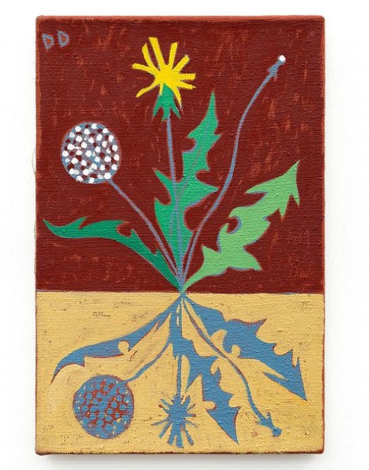
Dickon Drury: from the Dandelion Clock series, 2020-21 (above and below)
Drury’s roughly plant-sized series of ‘Dandelion Clocks’ use an ‘above-and-below’ device – of which he is fond – to intoxicating effect. That generates extra colour options and ambiguates between roots, shadow and reflection. From his solo show at Glasgow’s Kendall Koppe, which also includes examples if his wonderfully excessive still lives, and can be favourably experienced online through a five minute pan to the voice-over of a short story by Amelia Barratt.
When I said I’d been waiting for dandelion paintings, I had in mind that other contemporary examples of Taraxacum officinale art I’ve liked tend to have been in other media:
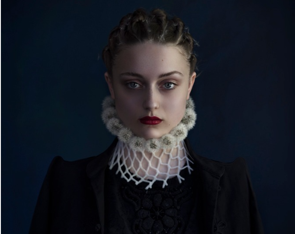
Jenny Boot: Dandelion, 2019
One of various twists through which the Dutch photographer has restaged classic Golden Age portraits as alternative fashions.
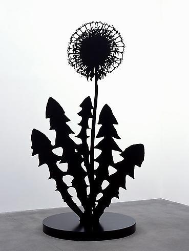
Paul Morrison: Mericarp, 2008
This powder-coated steel and aluminium form treads Morrison’s typical line between the real and the represented, between illustration and plant. At over 3m high, it’s even bigger than Hughes dandelion. Mericarp? Yes, an individual carpel of a schizocarp.
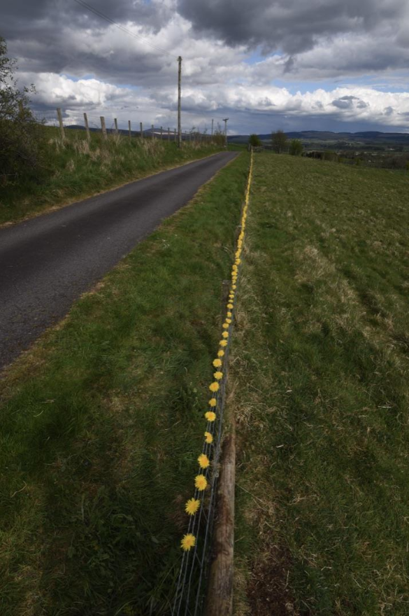
Andy Goldsworthy: Dandelion fence. Bogg Farm, 27 April, 2020
Typical of Goldsworthy’s ephemeral infusion of landscapes with delicate geometries of natural materials to make the most empathetic of human interferences – here near his studio in Dumfriesshire.
Art writer and curator Paul Carey-Kent sees a lot of shows: we asked him to jot down whatever came into his head
402: SERIOUSLY FUNNY
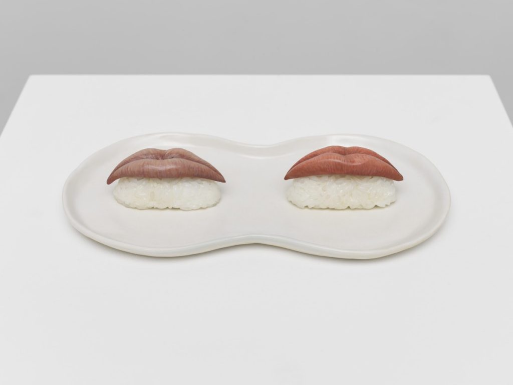
Julie Curtiss: ‘Marilyn Sushi’, 2021
It’s perfectly possible for artists to be funny, yet tackle serious issues. And who doesn’t enjoy humour? Just now, there are plenty of shows up to illustrate just that. The following, between them, tackle inequality, sexual conventions, religion, the nature of binary systems, and cultural mores.
Louise Ashcroft at Bobinska Brownlee: you sit on drain covers (as above) to watch Uplands: Utopia I.O.U. a 20 minute animation composed by sequential rearrangements of digitally collaged fragments found on an industrial estate tells of the traumas, love lives and day to day crises of a cast conjured from trash and asphalt – with enough one-liners to make it no surprise that Ashcroft is also a stand-up comedian.
Glen Pudvine at J Hammond Projects: Slugulus the White and the Penance of Saint Glen – a cycle of twelve large paintings, dramatically spot lit in a darkened, chapel-like space – provides a morality tale of sorts: an implausibly large penis consumes its owner whole. Here’s the point at which dick eats head.
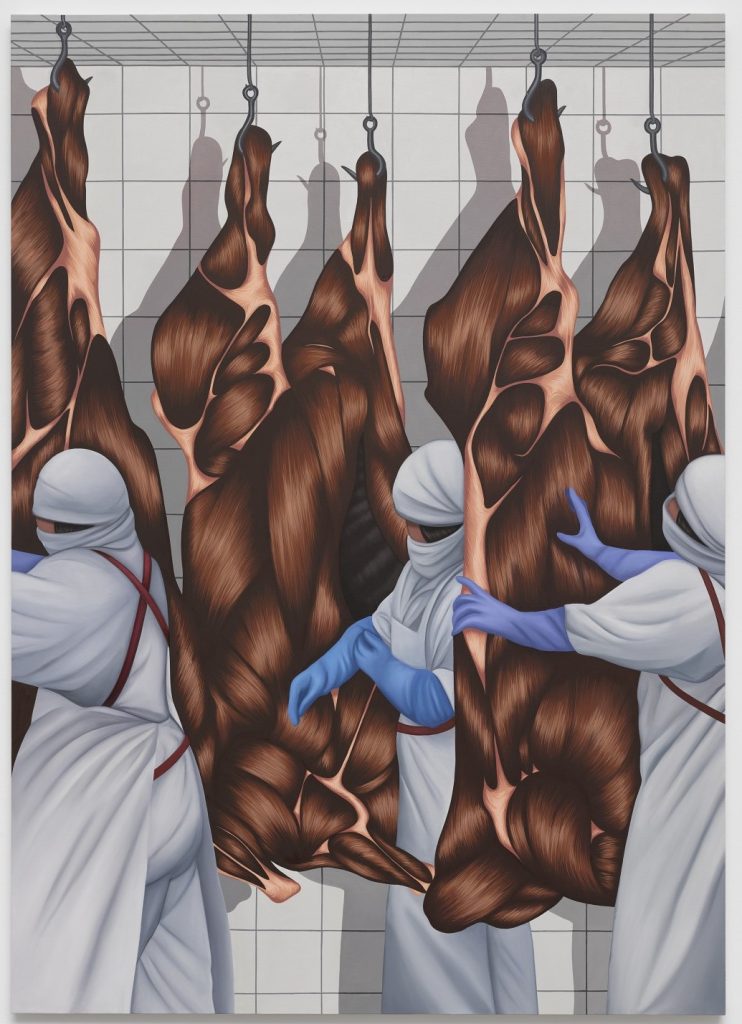
Julie Curtiss at White Cube, Mason’s Yard. Crisp renditions of the banal rendered absurdly bizarre. Curtiss’s singular paintings seem able to make pretty much anything look convincing even though it is made out of hair – as are meat and shoes in this show: above is Coldroom 1, 2020 . Recent sculptures include the concept of ‘Marilyn sushi’, as in the top image.
Bedwyr Williams at Southwark Park Galleries. A fest of witty satire, not without affection for such targets as typical art world characters (standing in for any sub-culture) and institutional architecture. Includes hundreds of Williams’ rather addictive ‘Instagram drawings’ (selection above), made daily in bed.
Art writer and curator Paul Carey-Kent sees a lot of shows: we asked him to jot down whatever came into his head
401: WHERE ARE THEY NOW?
Installation views of Penny Goring paintings at Arcadia Missa. ‘CAPS LOCK / DARKER MATTER / DEEPER LOTION/ TOXIC CIRCUS / DEATH TOLL’, to quote Goring’s own accompanying text
I had thought some of London’s galleries might close for good at the end of lockdown, but there’s no sign of any such trend. Rather, several have made good use of the last year’s hiatuses to relocate, typically to superior spaces.
For example:
Arcadia Missa: from a rather tucked-away first-floor abode in Soho to a bigger and better-lit street-level space near the Wallace Collection
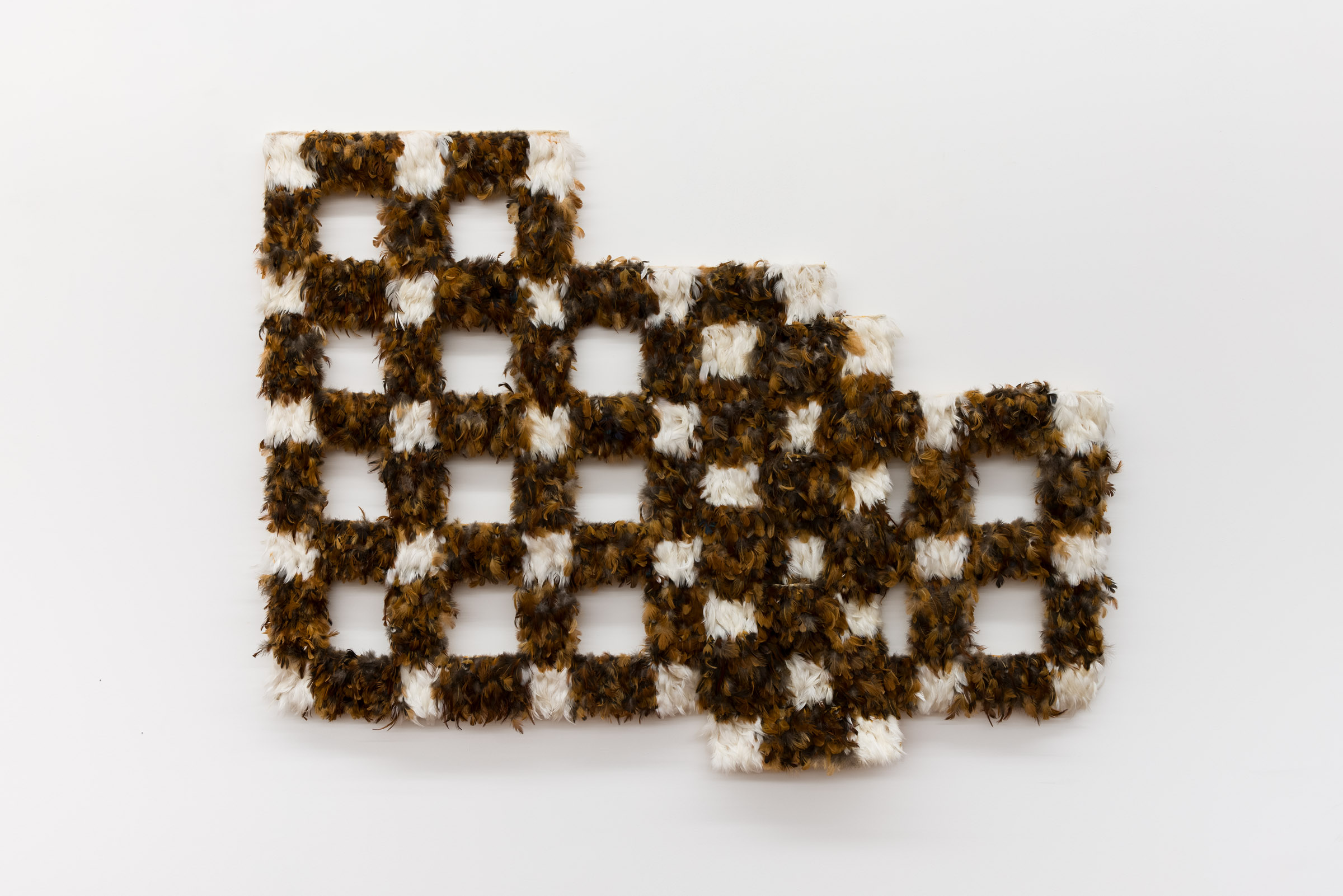
Daiga Grantina’s ‘kweie’, 2020, at Emalin: a grid at rest, softened by its realisation in – as I expect you can tell – Latvian chicken feathers.
Emalin: just a few yards from the Huntingdon Industrial Estate opposite Shoreditch Overground to a large first floor room with lots of natural light.
Mimosa House: two impressively fitted-out storeys near Holborn replace their more central but less visible premises near Oxford Circus.
Annka Kultys to a superior unit within the same Business Centre near Cambridge Heath station.
The Maas Gallery: after 60 years just off Cork Street to Duke Street, near Christies.
Two with plans afoot are Pace – will be moving out of the Royal Academy and into the former Blain | Southern premises near Oxford Circus – and Lungley who, after a residency in Seventeen’s office on Kingsland Road, will open their own space in Soho in June.
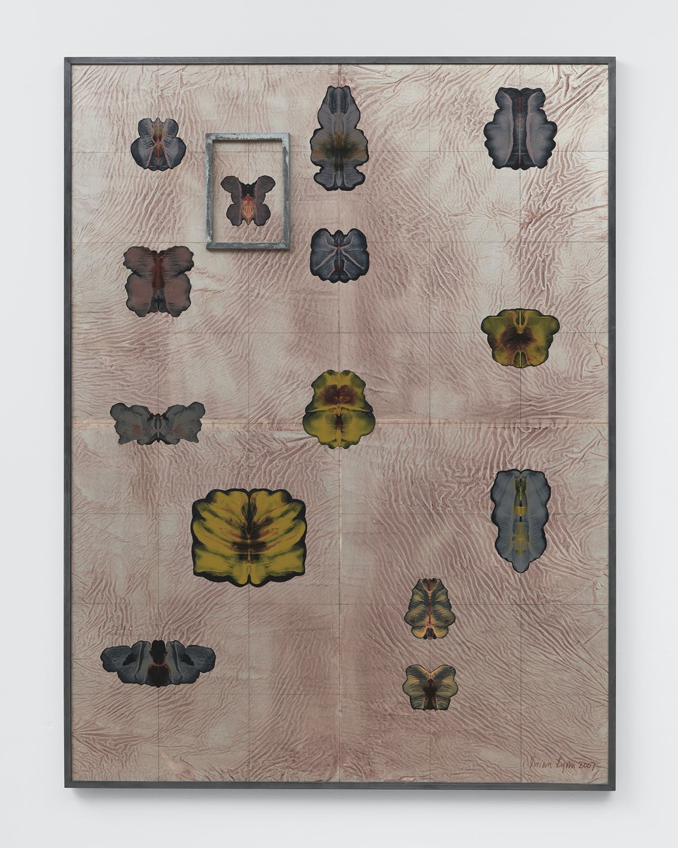
Vivian Lynn – ‘Mind field: framework to integrate things seen across different fields I’, 2007 from an impressive first UK show of the late New Zealand artist (1931-2018) at Southard Reid
Others have relocated temporarily pending a permanent move: Charlie Smith: from over the Reliance pub in Shoreditch round the corner in Charlotte Road, Southard Reid from Royalty Mews just a few Soho yards for one show in Rodeo’s former space on Charing Cross Road, Alice Black from Soho to Covent Garden, with a plan to move back into Soho.
