
INTO AND OUT OF ABSTRACTION
Colin Crumplin, Günther Herbst and Danny Rolph: curated by Paul
Carey-Kent
Private View: Friday 25 APRIL, 2014 - 6-9.30pm
Exhibition Dates: 26 April to 21 June, Thursday to Saturday, 12.30-5.30pm
Address: LUBOMIROV-EASTON, Enclave 8, 50 Resolution Way, SE8 4AL
Lubomirov-Easton
is delighted to present three painters acclaimed for their dynamic engagement
with abstraction in relation to the figurative. There’s no need for a
contemporary painter to ‘discover’ abstraction in the sense in which, for
Kandinsky or Malevich, it was the logical end point in a journey which began in
the world as observed and ended in an apparently contrasting absolute. All the
same, the relationship of abstract paintings to reality remains a key part of
their dynamic and interest. This show features three contrasting ways in which
that relationship can operate.
The route
most endorsed by past practice is from the world to abstraction. Very
often that’s linked to paring back and boiling down the teeming noumena
to a perceived purity, but Danny Rolph’s Mexico riffs on that
multiplicity as it emerges from the world in two ways. First, in the personal
history behind its conjunctions of dizzying geometries and spatial dynamics, which relate to his abiding
interest in Modernist architecture and design; second, in the variety of representations collaged
into its layering – here including wrestlers, shop signs, upended pop stars and
a starry night – which give rise to, are connected by, and interact with, the
painted abstract marks. Rolph moves from the world to abstraction – and back
again.
Günther
Herbst gives us abstraction in the world. He makes coloured geometric collages
in which, though the borrowings are indirect, such predecessors as Mondrian.
Judd and Kelly hover. He then paints those abstract forms into landscapes which
themselves collage together various styles of mark-making so that the world
appears infected by painterly technique. That stands in for social dislocation
or the imperialist pretensions of western art and, by extension, the politics
behind that. Abstraction’s in the world, aesthetically and sociologically.
The rarest route is probably Colin Crumplin’s: his two part paintings
reverse the usual process of abstracting from reality by taking a chance-driven
abstract starting point and then – perhaps years later – finding something
figurative in reality which matches it in some way. This builds the world’s
unpredictability into the process and provides a dynamic and innovative way of
staging modern painting’s typical contest between form and content. Travelling
from abstraction to the world, he arrives at riots, flowers and anatomy…
Rolph, Herbst and Crumplin, then, all combine differing languages within single works in a post-modernist manner. All manner of mark-making covers the typically busy Rolph painting, supplemented by collaged elements in the Triplewall shown here, and all jostling for the same space. Herbst uses his languages more schematically within – but not necessarily between – paintings, choosing the style which he feels best suits particular elements: here it’s mostly Realist Mountains, expressionist seas, geometric abstract vehicles and Richter-blurred reflections. Crumplin adopts a more simply contrasted format: one half abstract, one half representational… only not quite so simple, as he makes us realise how each half is also present in the other.
Moreover,
they all introduce a political dimension as they move into and out of
abstraction. As Rachel
Withers has put it, ‘Herbst self-consciously collides the antitheses of
formalism and social commitment. Their resulting failure to synthesize, and the
problems raised thereby, becomes the focus of the work’. Crumplin is
increasingly drawn to newspapers as his image source, and has matched several
‘starts’ to fires – in war in Basra, riots in Tottenham, an oil field
disaster: given the
apparently subconscious nature of his process this could be seen as indicative
of society’s underlying state. Rolph’s work might be described as ‘abstractions
of everything’, so broad is his frame of reference: politics certainly feeds in
along with, philosophy, cosmology, architecture and music
Together, Crumplin, Herbst and Rolph demonstrate how abstraction can
remain relevant today - through how it relates to, and is charged by, the
world.
COLIN CRUMPLIN
 |
| 'Parrot Tulip', 2013 acrylic and oil paint on canvas - 125 x 147cm |
What’s the basis of your work?
Typically,
as here, my paintings over the past two decades are in two parts. I have
consistently used chance in my working process for the initial 'starts' of each
painting, the non-figurative part. I make groups of these starts, large and
small, and at any time have 50 or 60 that I make photographs from and keep
together as a kind of notebook where I look for images in the chance blots and
stains. The second part of the paintings are made with a brush in oil paint on
linen – slow materials developed to paint skin and atmospheric illusions. My
concerns are our memory for images and our tendency and ability to picture.
How do
you make a ‘start’?
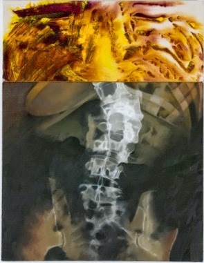 |
| 'Spine', 2010 - 97 x 75 cm |
You then use
a photographic image which matches the start in some way. How does that come
about?
That might be an image from
my collection which is collated within categories which have become evident over time – injuries, fires, floods -
or one that I need to find or take myself.
That use
of chance has literary parallels such as Raymond Roussel and the Oulipo group
of French writers. Is that relevant to you?
My interest
in the French literature of chance goes back a long way. In 1977 I published
‘Hommage a Queneau’, which takes as its starting point his ‘Exercises in Style’
(the same anecdote told in 99 different ways) and applies it to drawings of a
cup.
 |
| 'Tottenham 2011', 2012 - 147 x 125 cm |
How did
you come to choose the image of fire in Tottenham?
I’ve worked
more and more from press photographs in recent years. Aside from the political
events, which I’ve wanted to touch on, the fact that newspapers now use colour
means that we are forever presented with pictures of fires.
 |
| 'Deepwater Horizon', 2011 62x90 cm |
There is quite a lot of violence in your work?
Yes, and it’s
impossible not to think of those things as being interpreted and metaphoric.
The shark bite painting puts me in mind of late medieval paintings of flayings,
which are simultaneously horrendous and gorgeous in how they are painted.
Do any
particular artists influence you?
Early on I was influenced by
Rheinhardt and Irwin and by the artists in Cage's circle -
Rauschenberg, Johns – for their approach, and by many others who use
chance: Morrellet, early Ellsworth Kelly. And I've always liked the work of
Rothko, Louis, early Poons and early Olitski - but I can't make their
kind of working decisions.
Colin Crumplin: (born Hertfordshire, 1946) taught at Bath Spa
University, and lives in Bath. Solo shows include 'Paintings
1995 – 2005’ Six Chapel Row, Bath, 2005; ‘Paintings
1990-1997’, John Hansard Gallery, Southampton, 1997; Todd Gallery, London,
1997; Ellipse
Exhibitions / Evelyn de Beir, Brussels, Belgium, 1998.


Geoges Perec's A Void, 1969, as translated from the original French La Disparition by Gilbert Adair, is a 300-page French lipogrammatic novel, written entirely without using the letter 'e' (except for the author's e-heavy name), so applying an Oulipo constraint. Here's a paragraph:
Noon rings out. A wasp, making an ominous sound, a sound akin to a klaxon or a tocsin, flits about. Augustus, who has had a bad night, sits up blinking and purblind. Oh what was that word (is his thought) that ran through my brain all night, that idiotic word that, hard as I'd try to pun it down, was always just an inch or two out of my grasp - fowl or foul or Vow or Voyal? - a word which, by association, brought into play an incongruous mass and magma of nouns, idioms, slogans and sayings, a confusing, amorphous outpouring which I sought in vain to control or turn off but which wound around my mind a whirlwind of a cord, a whiplash of a cord, a cord that would split again and again, would knit again and again, of words without communication or any possibility of combination, words without pronunciation, signification or transcription but out of which, notwithstanding, was brought forth a flux, a continuous, compact and lucid flow: an intuition, a vacillating frisson of illumination as if caught in a flash of lightning or in a mist abruptly rising to unshroud an obvious sign - but a sign, alas, that would last an instant only to vanish for good.
Raymond Queneau's Exercises in Style (1947) is a collection of 99 retellings of the same banal story, each in a different style. The narrator gets on the bus, witnesses an altercation between a man with a long neck and funny hat and another passenger, and then sees the same person a couple of hours later in a busy square, with a friend who says his coat needs a new button... The 65th anniversary translation included this set theory version:
On the S bus, let us consider the set Ƨ of seated passengers and the
set U of upright passengers. At a particular stop is located the set P
of people that are waiting. Let C be the set of passengers that get on;
this is a subset of P and is itself the union of the set Cʹ of
passengers that remain on the platform and of the set C ̋ of those who
go and sit down. Demonstrate that the set C ̋ is empty.
H being the set of cool cats and {ɦ} the intersection of H and of Cʹ, reduced to a single element. Following the surjection of the feet of ɦonto those of y (any element of Cʹ that differs from ɦ), the yield is the set W of words pronounced by the element ɦ. Set C ̋ having become non-empty, demonstrate that it is composed of the single element ɦ.
Now let Pʹ equal the set of pedestrians to be found in front of the Gare Saint-Lazare, {ɦ, ɦʹ} the intersection of H and of Pʹ, B being the set of buttons on the overcoat belonging to ɦ, Bʹ the set of possible locations of said buttons according to ɦʹ, demonstrate that the injection of B into Bʹ is not a bijection.
H being the set of cool cats and {ɦ} the intersection of H and of Cʹ, reduced to a single element. Following the surjection of the feet of ɦonto those of y (any element of Cʹ that differs from ɦ), the yield is the set W of words pronounced by the element ɦ. Set C ̋ having become non-empty, demonstrate that it is composed of the single element ɦ.
Now let Pʹ equal the set of pedestrians to be found in front of the Gare Saint-Lazare, {ɦ, ɦʹ} the intersection of H and of Pʹ, B being the set of buttons on the overcoat belonging to ɦ, Bʹ the set of possible locations of said buttons according to ɦʹ, demonstrate that the injection of B into Bʹ is not a bijection.
GÜNTHER
HERBST
 |
Resolution, 2014 Acrylic on paper 310 x 410 mm
|
How would you describe your work?
I appropriate a language of
history and contemporary painting practices and use these as a transparent
medium in order to comment on issues relating to transience and ephemeral
structures, and it is meant as a reminder that human habitats are built upon
the wilderness and that our occupation of them is still precarious.
How did you arrive in London?
I was born in South Africa in 1963, and grew up in the suburbs of
Pretoria during the era of apartheid. I left for Berlin in 1992, when my girlfriend obtained a job there, and moved to London in 1995.
How is your name pronounced?
My mum's side of the family is from
German missionary stock and my
father came from Dutch/French settlers - we were brought up at home, speaking German. I get called
many different names, but the correct pronunciation is 'Howbst' which is the
German for 'autumn'.
You became known for paintings derived
from your photographs of homeless people’s shelters, but which incorporated
motifs from abstract painting. How did those works come about?
What attracted me was that these makeshift structures were so incongruous with the rest of the city’s architecture. Then I started seeing this modernist grid in them, which gives the work a dignity - because my works are not ironic: I'm looking for a spirituality, which the modernist era of painting carries off really well. I choose cobalt blue, white and red - colours which Mondrian would have used, but also the colours of the virgin in Renaissance painting
Do you yourself feel transient?
Definitely. Growing up in South Africa, I was aware of discrepancies in poverty and wealth, people living in really horrendous circumstances. When I started noticing the structures I may have been subconsciously influenced by how extreme poverty is so visible in South Africa. At one point I lived in a Johannesburg suburb which overlooked Alexandra Township – a vast landscape of shacks, covered in pollution.
What attracted me was that these makeshift structures were so incongruous with the rest of the city’s architecture. Then I started seeing this modernist grid in them, which gives the work a dignity - because my works are not ironic: I'm looking for a spirituality, which the modernist era of painting carries off really well. I choose cobalt blue, white and red - colours which Mondrian would have used, but also the colours of the virgin in Renaissance painting
Do you yourself feel transient?
Definitely. Growing up in South Africa, I was aware of discrepancies in poverty and wealth, people living in really horrendous circumstances. When I started noticing the structures I may have been subconsciously influenced by how extreme poverty is so visible in South Africa. At one point I lived in a Johannesburg suburb which overlooked Alexandra Township – a vast landscape of shacks, covered in pollution.
 |
Raft 3, 2014 Acrylic on paper, 220 x 300 mm (Collection of Ms Dolly Thompsett).
|
Your
recent work often involves ships and boats. That seems to have originated in a
painting of a homeless person’s barge on the Thames?
Yes, there’s a barge near Glover's Island, in Twickenham. A man had already lived in the structure for 17 years when I photographed it. Due to strong winds, the place got blown to pieces and was forever morphing into different shapes. That shelter on water led to use of ship or raft as a carrier of influence and the vehicle to which you can attach your landscape. Juan Bolivar put it like this: ‘a fragmented Piet Mondrian transported into one of his own works like an unmanned raft left by modernism's drifting legacy’.

What are the sources for your current
work?
Mostly
books: Paradise Lost, Heart of Darkness and The Fatal Impact: The Invasion of the South
Pacific, 1767-1840 by Alan Moorehead, which tells the story of Imperial
conquest of innocence; and the work of William Hodge, who travelled with Captain
Cook and made paintings termed ‘geographical profiles’, which served the modern
purpose of photographs in enabling features to be re-recognised. They provide the
archetypally-styled mountains and glaciers which appear in the background of
recent paintings. I’m also interested in catastrophism, the story of the
Fall, and by how the world was ruined after the flood – whether myth or not.
 |
The Ice Islands, 2014 Acrylic on paper 310 x 410 mm
|
Just from
what feels best: skies and seas respond to expressionist brushwork, structures
to geometric abstraction, and reflections to a blur in the manner of Richter.
It feels appropriate, when combining man with nature, to combine different
styles. That all fits with suggesting the infection of one culture by another.
 |
Raft 4,2014 Acrylic on paper 310 x 410 mm
|
Günther
Herbst: Born Pretoria, South Africa, 1963, lives in London and
is represented by Gallery AOP, Johannesburg.
Selected solo shows have been ‘The
Man Who Wasn’t There’, Gallery AOP, 2012; and at One in the Other, London, 2007 and 2009.
 |
| Cut up and reassembled images of paintings by Frank Stella, Untitled 1966, and Barnett Newman, Who’s afraid of Red, Yellow and Blue 1967, into possible ideas for rafts. |
 |
Aircraft carrier Argus, 1918: Norman Wilkinson developed a scheme by
camouflaging ships during World War one to protect them from German U boats.
The purpose he claimed was to confuse rather than conceal, making
it difficult to judge the distance and speed of the ships.
|
 |
| Small acrylic preparatory paintings on card. |
 |
Working copy as used for 'Raft 4' of View of the Islands of Otaha (Taaha) and Bola Bola (Bora Bora) with
Part of the Island of the island of Ulietea (Raiatea) from British Imperial landscapes of the
Pacific: William Hodges 1773 (National Maritime Museum / MoD Art Collection)
|
DANNY ROLPH
 |
'Mexico', 2013, mixed media on Triplewall, 140x200cm. |
What are the Twinwall and Triplewall which
you use?
It’s an almost clear polycarbonate, mainly used for conservatories. I
paint and collage on all the surfaces. The Triplewall has one layer either side
of a fluting down the centre. The reason I started using that, rather than Twinwall,
was that optically it shifts things round more and provides an extra level of
obfuscation.
What led to you using it?
I was on a scholarship at the British School in Rome in 1998, and
feeling frustrated at the lack of spatial dynamic in my paintings. Then some
drawings I was working on were blown onto the floor and landed on their flip
side. That interested me because it registered as the impression of the initial
expression. I thought about using glass or Perspex to catch that in my
paintings, but glass was too heavy and fragile and loaded with religious
history, and Perspex bent too much. Then the Director of the British School
suggested I go to a Roman hardware shop, and I knew instantly that Twinwall was
right. It has a sort of tangible emptiness, and I liked its being an everyday
industrial material.
How do your various strands of work
relate to each other?
Gradually over the years I’ve tried to bring the unusual spatial
dynamics of the Triplewalls into the work on canvas. Obviously they do
different things, as canvas absorbs the paint (though I then shine it up to
give it an echo of the Triplewall), whereas it sits on the surface of the Triplewall
with a more transgressive graffiti-like quality. But they do now bounce off and
inform each other. In the same way I’ve been keen to bring collage aspects from
my drawings into the Triplewall. So the
three strands of Triplewall, canvas and paper are in dialogue.
Mexico is very complex yet appears
controlled. Was it pre-planned?
No. It’s from instinct informed by memories, no reference to
photography. 90% is done fast, the last 10% is the tuning which creates what I
sense is the right degree of disorder and also makes it more overtly pictorial.
That 10% takes longer.
Where do you find your collage
material?
At least half is just found in the street… I like the idea of someone
discarding something and I reclaim it to re-emerge elsewhere. I also visit car
boot sales, and pick up books and photocopy elements from them.
What’s going on in ‘Mexico’?
The other
side of world comes into this world and connects through how I look at it.
There are shifts in space and scale, a sense of outer space, planet shapes, a
brochure of Monet’s garden, a 1985 printer’s catalogue, West End stars dancing;
an early photocopier which looks like a harpsichord, a classic design chair, a
drain cover, a poster of a wrestler, given to me by a friend in Mexico – I
often go to New Mexico and Texas. Paint scraped off with pins or hard brushes.
I quote the idea of a frame in the manner of a literal quotation mark. I’ve
used horizontal twin wall on front and triple wall on the back so we get the
grid. There are lots of games – representations which start and finish across
different levels – colour connections – lots of echoes.
So there’s a sense in which your work
tries to have it all?
There are a lot of competing elements, yes, and that really excites me.
My reading in astrophysics comes to mind. How do we make sense of the beginning
of time? That nanosecond before t = 0
interests me, when everything which will make up the universe is there
together. I have no hierarchies.
Do you read a lot?
I’m always reading: 19th century ghost stories, philosophy,
Marx, popular physics, phenomenology. Music also feeds in – experimental jazz,
funk, late 70’s trance disco.
Danny
Rolph: (born 1967) lives in London, and is represented by the
Barbara Davis Gallery, Houston, USA. His
most recent solo shows have been 'Paradiso',
Barbara Davis Gallery, 2014; 'atelier', ESAD, Grenoble, Valence, France; 'Duke of Burgundy', Barbara Davis Gallery; 'Kissing
balloons in the jungle', Poppy Sebire Gallery, London.


 |
| Danny Rolph in the studio: photos by Stuart Hartley |
Credits / list of works (if finalised by 15 April)


