The Tate St Ives iteration of this joint show with Turner Contemporary
achieved unanimity among reviewers: some wonderful paintings, but a
maddening non-chronological hang chopped up into sections – emphasis on
the edge of the painting, seeking unity, use of scale, tendency towards
asymmetry – of which they could make little sense. Now Patrick Heron has
arrived in Margate (to 6 January 2019), with the vivid addition of a
set of gouaches made in Heron’s last days in 1999, which occupy a
central space cut off from the schema.
Contrary to that received opinion, the mixing of paintings across
periods didn’t worry me at all. Not only did it infuse
painting-to-painting variety and facilitate cross-decade comparison, it
also made a refreshing change from the rather hackneyed linear path of
initiation, development, consolidation and late style. That would have
emphasised the then-radical but now oft-told story of the move from
figuration to abstraction, which was not Heron’s central concern: for
him it was all just painting. To quote him in 1955: ‘Merely to observe
is to subscribe to the heresy of realism; and merely to project a rhythm
is to subscribe to the opposite heresy of non-figuration. Great
painting lies between the two and performs the functions of both.’
Yet the schema applied is tendentious in two ways. First, it is
unconvincing as an account of what is essential to Heron. Second,
insofar as they apply to Heron’s work, the issues are tackled across
most of his work: little is added by the placement of particular works
within the four categories. Take the edge of the painting. I like
Heron’s thought that it is at the edges where our visual understanding
switches out of the painting and back into the dimensions of the real
world, making it ‘the springboard for all compositional reality’. But in
practice Heron seems as attentive to the edges of forms inside the
painting as of the edges which define it (see, say, early Jo Baer for a full edge focus). Perhaps that would have been a
better formulation.
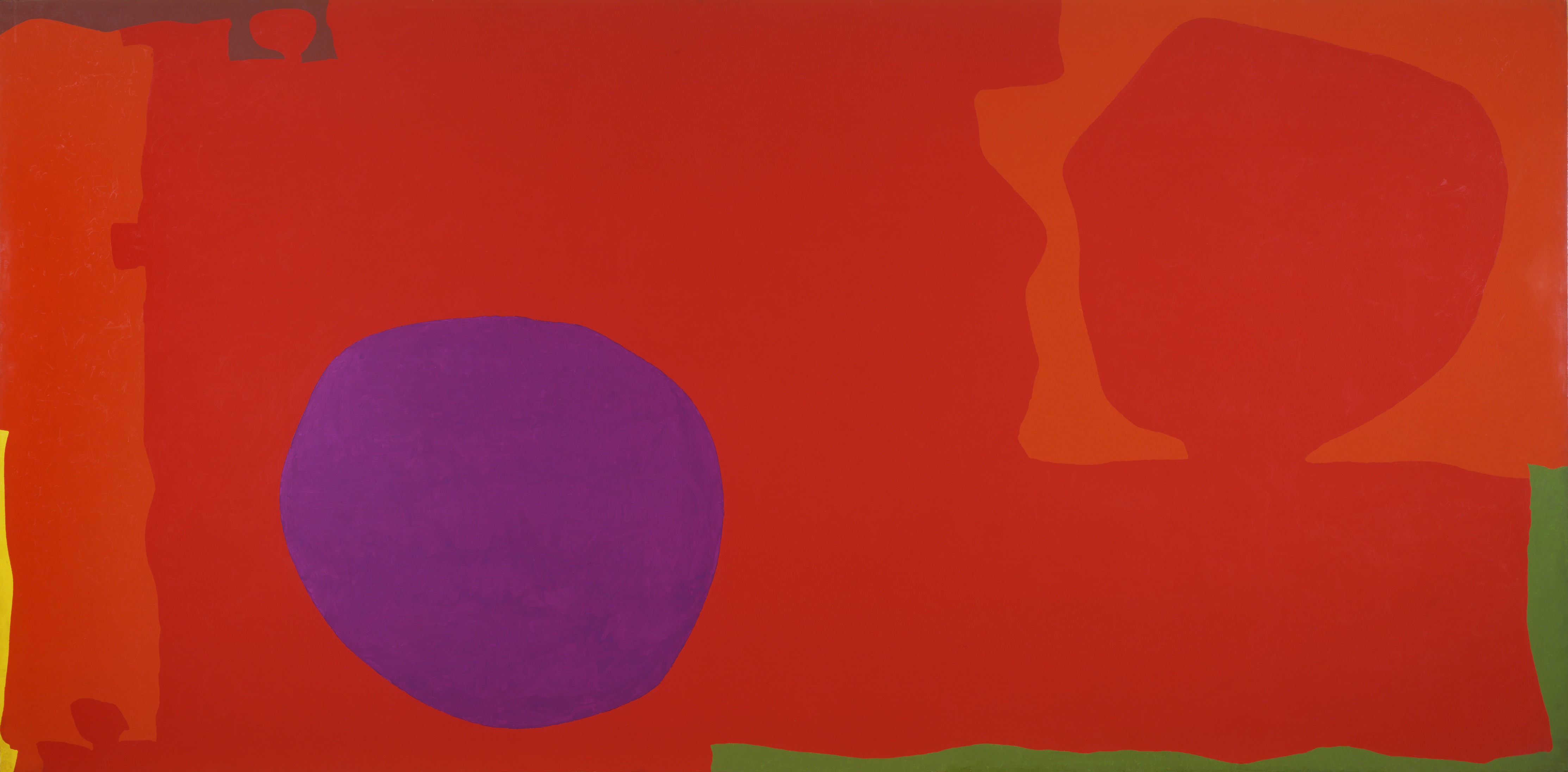
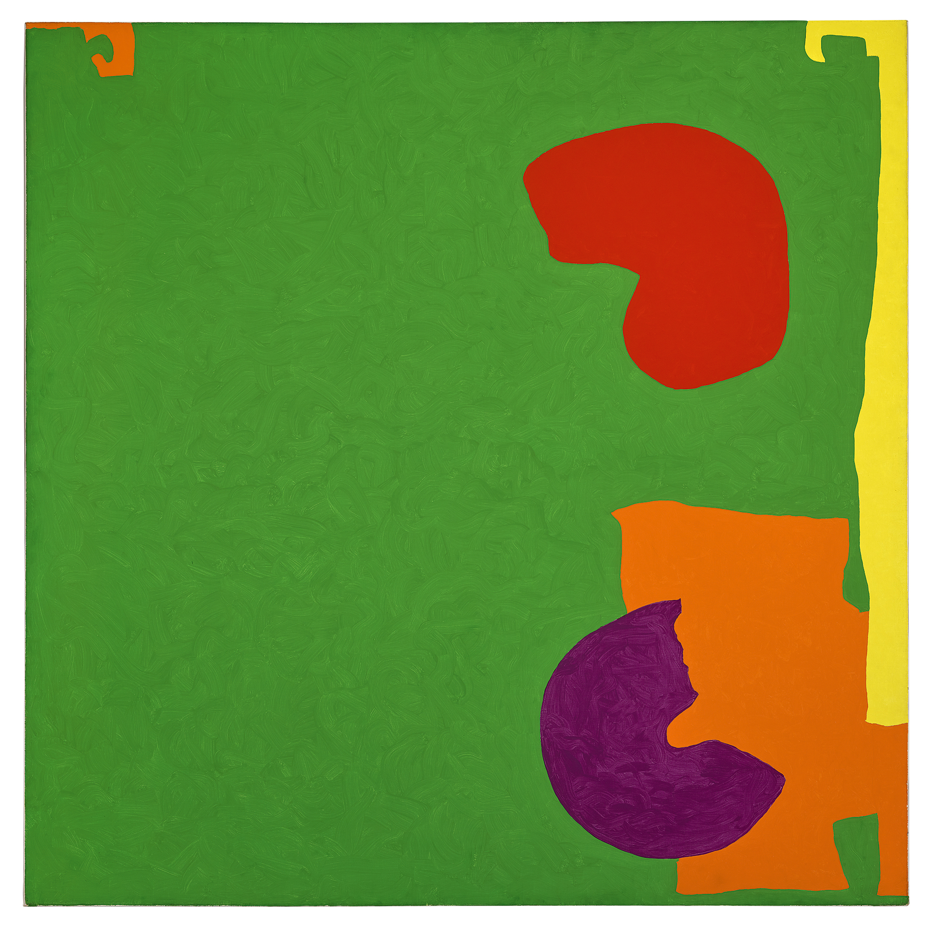
And in so far as forms do sometimes cluster at the margins, that fits
Square Green with Orange, Violet and Lemon: 1969 but surely not his
early figurative masterpiece Christmas Eve 1951. Yet the latter is in
the edge section and the former is not. Heron produced few symmetrical
paintings – you could make a case for the stripes of Green and Mauve
Horizontals: January 1958 and the all-over effect of Camellia Garden
1956 (both, oddly, deployed in the section on asymmetry) – but he did
tend towards a symmetrical balance of forces, so I wouldn’t see this as a
radical resistance to the norm. Examinations of scale and unity are on
the other hand, rather general: it is hard to think that any good
painter will not be concerned with those.
What struck me more than any of those categories were two formal
features which vary considerably across Heron’s career: the extent to
which he allows raw canvas to stand in the finished picture (which
steadily reduces through the 1950s-60s, and then increases through the
1980s-90s) and the degree of textural variation within a painting.
Heron’s most widely commended body of work is the so-called ‘wobbly hard
edge’ abstractions of the 60s and 70s, which cover the whole painting
with one layer of paint only, so that the proximity of the canvas
produces an even and intoxicating underglow. It is often pointed out
that Heron used small Japanese brushes to make these works, believing in
his words that surfaces worked in this way ‘register a different nuance
of spatial evocation and movement’. So, it is said, the viewer’s
experience is quite different from a distance than from when close
enough to see the brush marks. In fact, it is often impossible to make
out the brush marks, even from a foot away. Rather, Heron explores a
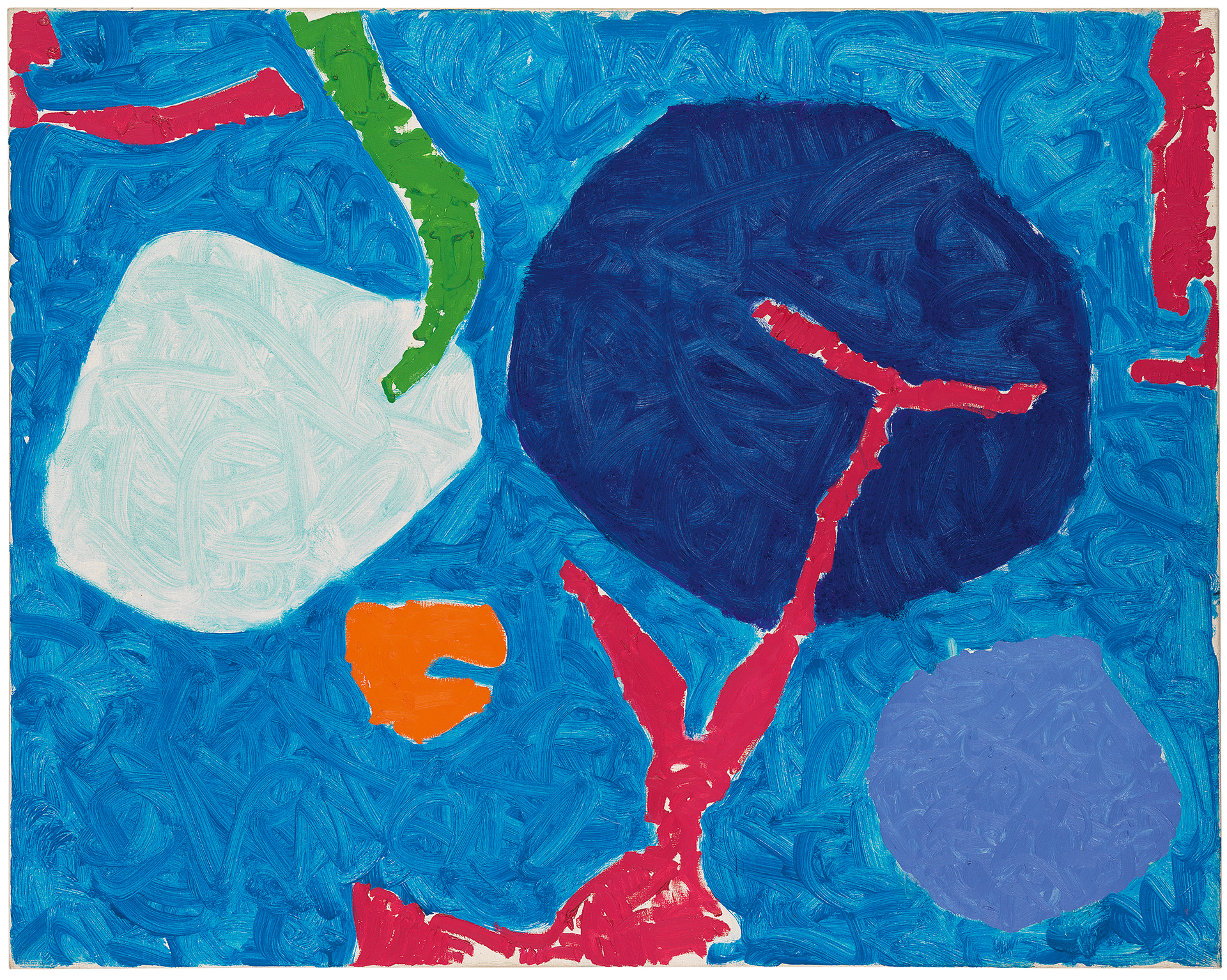
full range of textural mixes: in Cadmium with Violet, Scarlet, Emerald,
Lemon and Venetian: 1969 only the violet has prominent brushstrokes from
close up; in Square Green with Orange, Violet and Lemon: 1969 all the
positive forms show marks, but the negative form readable as background
does not; in Big Complex Diagonal with Emeralds and Reds: March 1972 –
September 1974 marks are visible across the whole surface from fairly
close, while in the transitional Four Blues with Pink: July 1983
brushstrokes are rougher so that they can be seen from some distance.
The variety which Heron generates in this way is a significant factor in
that period’s appeal.
What could have been done? Heron was unusual in his being a prominent
writer as well as painter, and there are quotations from him scattered
around the walls. For example, touching on issues of unity and scale,
Clement Greenberg opined that Heron should make his forms more central
in Violet in Dull Green: July 1959, the better to achieve ’at
once-ness’. Heron replied that initially there had been ‘only the violet
lozenge in the middle of the dull green ground. But I felt that this
denied explicit and particular scale to the picture. It made it into the
signal, a sign, which might have existed on any scale from that of a
postage stamp to that of an ocean liner’s design. It removed the
explicitly 4ft x 5ft-ness of the picture! So I let the surrounding
square discs return.’ A primarily abstract show can and become too easy
to pass across quickly at the level of sensation. Reading what Heron
thought he was about is the perfect way of adding substance and slowing
the visitor’s path down. In fact, once I concluded that the curatorial
schema were best ignored, I realised that that was pretty much the show
we have, and went on to enjoy it accordingly. I suggest you do the same.

No comments:
Post a Comment
Note: only a member of this blog may post a comment.