My 'Interview of the Month', starting June 2021 and linked to a current show by each artist, is published online at Artlyst. My aim, rather simply, is to discuss some of the work in in more depth than is achieved in the typical press release. Here they are, most recent first, uploaded the month after they appear.
March 2024: Shuvinai Ashoona
Feb 2024: Emma Cousin
Jan 2024: Roland Hicks
Dec 2023: Paulina Olowska
Nov 2023: Ghislaine Leung
Oct 2023: Shirin Neshat
Sept 2023: William Cobbing
Aug 2023: Nick Hornby
July 2023: Mark Godfrey on Alighiero Boetti
June 2023: Callum Innes
May 2023: Sabine Moritz
April 2023: Carey Young
March 2023: Haroon Mirza
Feb 2023: Jonathan Baldock
Jan 2023: Jonny Briggs
Dec 2022: Richard Schur
Nov 2022: Romuald Hazoumè
Oct 2022: No interview (would have been Bernar Venet but I was hospitalised)
Sept 2022: Wolfgang Laib
Aug 2022: Charmaine Watkiss
July 2022: Mali Morris
June 2022: Peter Buggenhout
May 2022: Martin Parr
April 2022: David Nash
March 2022: Rana Begum
Feb 2022: Allison Katz
Jan 2022: Jyll Bradley
Dec 2021: Magnus Plessen
Nov 2021: Tania Kovats
Oct 2021: Ibrahim Mahama
Sept 2021: Alexandre da Cuhna
Aug 2021: Rosie Gibbens
July 2021: Spencer Finch
June 2021: Ena Swansea
Emma Cousin: Interview of the Month February 2024 – Paul Carey-Kent
Emma Cousin’s show ‘Tunnel Vision’ is the first in Niru Ratnam’s new space in Fitzrovia. The vibrant paintings were made either side of her giving birth in late 2022, and that experience is central to the figures who populate them. Not only do they perceive the world with the intensity of focus – or tunnel vision – that motherhood and art-making can both engender, they are revealed as incorporating interior tunnels in line with the enhanced awareness that Cousin found pregnancy bringing to her own interior structure. As ever, her work is fizzing with ideas…
What is ‘tunnel vision’?
Tunnel vision is the loss of peripheral perception with retention of central sight, resulting in a constricted, circular, tunnel-like field of vision. Goggles, glasses, and binoculars as well as medical illnesses are physical causes. For me, morning sickness felt like tunnel vision, everything apart from what I was directly looking at felt sickly. Painting through this lens was focusing and challenging. Psychologically, tunnel vision is when individuals focus on cues that are consistent with their opinion and filter out cues that are inconsistent with their viewpoint. In a political context, that can be negative. But this obsessive focus, where everything else falls away, is a mindset of funnelling that is useful in the studio.
‘Tsog’, 2023 – Oil on canvas, 140 x 120 cm
All the figures seem to combine a ‘tunnel vision’ way of perceiving the world with an awareness of their inner structure of tunnels, but does ‘Tsog’ concentrate mainly on the internal aspect?
Perhaps… That’s about bringing the body back together, tunnelling inside, working out where how the tunnel would end – something comes out and you have to close the tunnel somehow. That’s the first time I’ve put figures in the background. They’re from Rembrandt’s ‘The Anatomy Lesson’, but they’re not watching the body being dissected, they’re watching how it’s put back together. It relates to my own body after birth: how to reassemble myself, how to deal with the void of the tunnel that had been filled. I imagined tunnelling to meet the baby, though of course you can’t – the baby tunnels towards you. But psychologically you do think like that, so it’s the union of inside and outside experiences. I was also thinking about tunnelling into yourself, to do with post-natal anxiety, when all the thoughts pile up like soil. Or how something was cut away, but to make something more beautiful. Beautiful and maybe gross at the same time. It’s like I’ve been inside-out for a bit! What would the flesh inside look like, and what would the flesh outside look like? It’s kind of amazing to have someone’s body inside you, and makes you aware of how much space there is inside you, and how you’re rejigged after having a baby. The way I’ve come back together is better than before in some ways – more efficient digestion!
What’s a tsog?
That’s a tool you use to cut peat. It looks like an extension of the body, fitting well within the hand. It works like a trowel, but also slices – that’s quite a brutal act but it creates these perfect bricks of geometry – an architecture of the land. That comes from remembering a holiday in the Outer Hebrides where I had watched peat cutters delve into the turf and hefting, turning, and laying out wedges of the inner soil in neat rows along the cleft they had cut into. They tunnelled into the earth and laid out its damp inner parts in tidy layers like sedimentary rock, each layer a slightly different tone of brown-black. After the birth, I saw an osteopath who described connecting me back together in slices, like a landscape that had become dislocated. So this painting is also about earth, sustenance, and pigment – thinking of how Rembrandt ground his own colours.
‘Den or Cornetto’, 2023 – Oil on Canvas, 120 X 100 cm
The tunnel as a constraint on viewing is prominent in ‘Den or Cornetto’. What’s going on there?
I was thinking about dens as in tunnels, and how they might be built. Cornetto could be some version of a cone as used in ice-creams – sharp end, open top; or the cornet instrument, that uses pistons to trap air; or the shape, like a possible puncturing tool. I was thinking about: where do you get your vision? I heard of a writer who eats as he writes so that his gut can play a role – activating an organ to feed his writing as if it were an engine. So maybe the tunnel of vision could be from the mouth, the mouth could be a portal to other realms. It’s a bit sci-fi: could you reverse the seeing process? The eyes are blinded but the mouth sees…
Is there something of a child’s playfulness in that?
As a kid I remember collecting empty toilet rolls to build things with. These redundant tubes, once heavily sellotaped and connected, could morph into limb augmentations, eye extenders and viewfinders, often becoming absurd glasses or rudimentary telescopes. Attaching them to eyes or mouth, sound could be carried further, and it seemed sight could be supplemented. I rehearsed this in the studio with two sawn-off tubular poles I had found. I felt like a horse wearing blinders in traffic, fixed and dangerous, externally oblivious.
Does your baby’s own ‘tunnel vision’ come into the show?
Yes! Early in the pregnancy, I read that the baby has tunnel vision in the womb, and reading about their sight development and understanding of object permanence in science and child psychology reference books is fascinating and very weird. After the birth I was reading ‘Diary Of A Baby: What Your Child Sees, Feels, And Experiences’ (Daniel Stern, 1990) which describes the development of a baby from the baby’s point of view.
Who’s that in the detail from ‘Dogger, Rockall and Malin’?
That’s me inside myself, painting myself with myself (my guts, thoughts, feelings etc). I put myself in a cave, embracing where I was with all these tunnels. It’s a literal depiction of the outside-inside. I did visit some caves and tunnels for real. Stalagmites and stalactites are always crazily lit, so they look toxic. And they look like gut systems…
Installation view with ‘hmeep hmeep’, 2024 Photo: Damian Griffiths (the title comes from how the film’s sound creator, Paul Julian, spelt Road Runner’s version of ‘beep beep’)
You’ve also made a mural that channels another tunnel inspiration from the violent comedy of the ‘Road Runner’ cartoons. Could you tell us about that?
The Looney Tunes cartoons feature the painted tunnel as one of Wile E. Coyote’s stunts to trick the Road Runner. In the episode ‘Fast and Furry-ous’ (1949), Coyote paints a tunnel onto a rock, instantly giving the optical illusion of an open tunnel, then lays in wait for the Runner. To Coyote’s chagrin, Road Runner ploughs on through the imaginary tunnel, confounding Coyote. He then takes a run-up to the painted tunnel and smacks hard into the rock face, bouncing off, dazed and comedically crumpled like an accordion. It’s shocking how quickly you can create an illusion like that, and there’s a slapstick pleasure to it. In March 2016, Yahoo News reported that a street artist had recreated Wile E. Coyote’s fake painted tunnel so successfully that a Fiat drove into the wall on which it was painted!
Recreating Coyote’s tunnel in the studio to better understand it, I appreciated that taking on ‘tunnel vision’ could be a way out of my stuckness, faced with an empty studio – the idea of tunnel vision could become an escape route for me, like Road Runner. The tunnel is based on a screenshot from the cartoon. I wanted the surrounding figures to be spontaneous, to be playing with where things could go, where they could tunnel, and what depth of the tunnelling metaphor I could get away with.
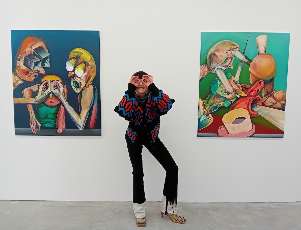
Top Photo: Emma Cousin demonstrating ‘tunnel vision’ © Courtesy of the Artist
‘Tunnel Vision’ runs 18 Jan – 24 Feb at Niru Ratnam, 71-73 Great Portland Street, London W1W 7LP. Cousin’s 2,000-word artist’s statement is available there, and I recommend it for a fuller exploration of all things tunnel vision.
Roland Hicks: Interview of the Month, January 2024 – Paul Carey-Kent
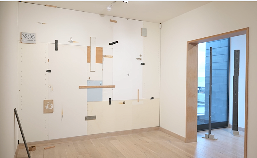
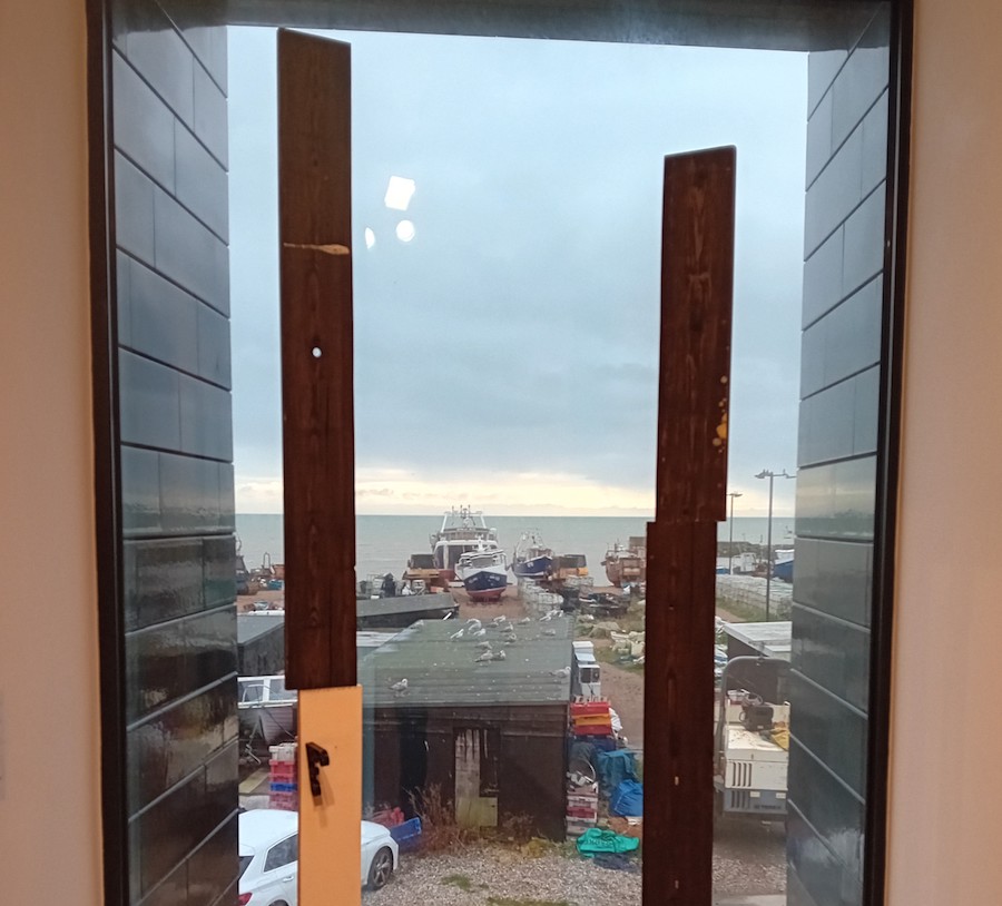
recent years Roland Hicks has used gouache, paper and coloured pencil to refashion and scrupulously reproduce the texture of plywood and Oriented Strand Board (OSB), so that first we are deceived, and then surprised by such an investment of time and effort in what look like discarded offcuts. He sees them as ‘trompe l’oeil still life paintings of fictional artworks’. It’s only at the level of finely graduated detail that we can tell what has been done. In 2021 he won the biennial Evelyn Williams Drawing Award, which sponsors the making of an exhibition at Hastings Contemporary. For that, Hicks has expanded his approach to make a site-specific installation. Two whole sea-facing walls are covered with a patchwork of apparently found materials – ‘The Fourth Wall I’ and ‘The Fourth Wall II’ – while the interstitial window with a sea view hosts two of three ‘Guardians of the Fourth Wall’, sculptures picking up on the materials used to construct the famous fishermen’s huts nearby.
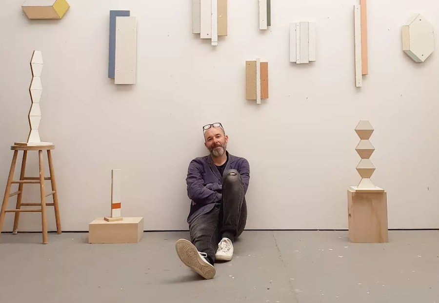
Roland Hicks in the studio with previous works, photo by Laura Wright
How long did the show take to make?
I tried it all out on a wall in my studio beforehand, using the same sort of methods, so I knew the work in theory – but there were two walls in Hastings, both bigger. So most of it had to be done on site over five weeks. I had a couple of weeks before the opening to make one wall, pretty much according to my plans. Then after the show opened, I made the second wall in public, so visitors could watch me. For that, I was happy to let things happen. People engaged very actively, and most were delighted when they found out how the illusion worked. Several came back to track my progress or bring their friends. The Fourth Wall refers both to the literal description of the number of walls in each room, as well as the theatrical tradition of breaking the illusionary fourth wall between a stage and an audience, so I was both building and breaking the fourth wall simultaneously.
Do you think ‘The Fourth Wall’ looks like art – given that you wouldn’t normally expect to find such a mixture of objects?
I’d probably say my separate smaller works tend to look more like art because they’re presented in isolation on the wall in the usual way. I’m interested in at what point something starts to look like an artwork, and what is deliberate and what is accidental in that. Because it covers the whole wall, there’s a suggestion that ‘The Fourth Wall’ might not have another wall behind it, so it weakens the fabric of the building and makes it look shoddy. I started by imagining a fictional creator who wasn’t me – the potential non-art backstory is that these were things that had been found in skips, perhaps, and brought together by a collector here for reasons open to interpretation. There’s more than a hint of folly about both the real and imaginary versions of the wall’s creation.
How have you responded to the site?
There are connotations of sea defence because of the location – the sea could come in. One of the ‘doors’ is the same as one in the gallery itself, so the work refers directly to where it is, as do the ‘Guardians’.
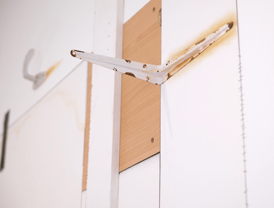
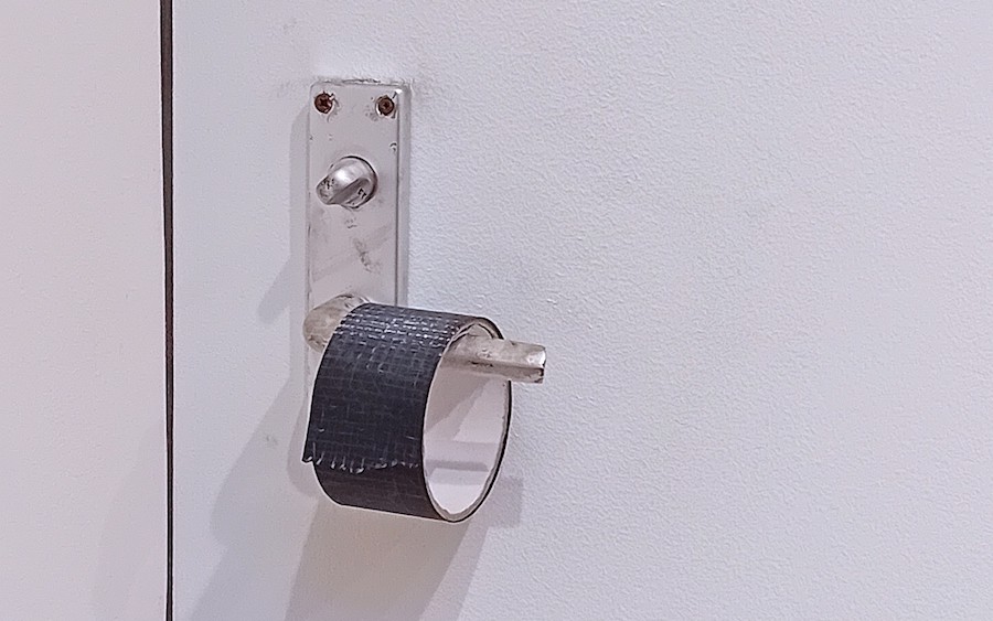
Detail from ‘The Fourth Wall’
You’ve mixed the ‘real’ and the ‘illusionary’?
Yes, it’s the first time I have allowed myself to use real items. That sets up the question of what is real and what isn’t. There are, for example, real door handles. But all the tape and rust effects are illusionary. The rust was very much informed by spending time in Hastings, where the sea air makes any metal rust, and stains the buildings. I found a way to recreate that with chalk pastel. That’s an ageing effect, though, of course, it isn’t old. And the whole arrangement isn’t meant to look as if it’s been there very long, more as if it’s been made from elements which have been thrown out from elsewhere. There’s a suggestion it isn’t finished, as where there’s an unused reel of (unreal) gaffer tape…
Is that a moth towards the top?
I did that because a real moth landed on my studio mock-up, and at first, I thought ‘Hang on, what’s that?’ Then I thought: ‘I didn’t do that, but I really should’ – and so I did!
Is your main purpose to make us wonder what is real?
All illusionistic art involves some kind of deception, and I’m interested in how these walls are effectively built from misinformation and misdirection. But the guessing game of trompe l’oeil can fizzle out once you’ve got it. So I try to find a balance by keeping other questions open.
What are those other questions?
I like to play with the degree of spontaneity, to take something that looks as if it’s been put together quite quickly, then slow it down so it takes a long time to recreate it. I’m also interested in the point at which the art happens, in confusing that moment. In a way it messes around with time, so that a fast creative thing and a slow creative thing happen at the same time. Time becomes elastic – you’re not quite sure where the moment of creativity is located. That leads to the question of how much aesthetic decision-making is intentional – what if you make the considered look accidental? Interesting things happen when you roll those two things up against each other.
‘Guardians of the Fourth Wall’ (Detail)
Might we also read the work politically?
Certainly, building walls at a border location brings in possible issues around migration or climate change. Or it could be shoring up a cultural institution against hostile opinions. The apparent poverty of materials used and precarious, the makeshift appearance of the work could be read as a metaphor for other kinds of social fragility.
Do the whole walls also operate as abstract paintings?
I aim to find a balance between an abstract painting and an accidental cobbled-together thing, without settling too clearly on either side. If it starts to become too knowing a reference to a particular type of abstraction, I’ll try to pull it back a bit. There are hints of Piet Mondrian, or Victor Pasmore – whose 2020 retrospective was the first show I saw at Hastings Contemporary. That’s hard to avoid in presenting constructive geometric elements. The other echo is of how Kurt Schwitters incorporated what look like found bits of stuff into his Merzbau. In 2017 I curated a show in the Lake District at his Elterwater Merz Barn (1947-8).
Did your curation pick up themes present in your own work?
Yes, that was titled ‘Humble as Hell’, and included some work which you might think is just an insignificant thing with no artist behind it. Is such work a humble and Zen-like contemplation of everyday ephemera, negating the artist’s ego? Or does it take a rampant ego to think it can transform bits of rubbish into creative gold? My works are probably a bit of both in some ways.
Detail from ‘The Fourth Wall’
How do you relate to the notion of truth?
I’d say I have a committed but slippery relationship with the truth. I curated a show called ‘The Tiresome Truth’ (at ASC Gallery, London in 2019). That asked whether there is more honesty in allowing materials to just be themselves than in simulating them faithfully – does the deception in that rule out the truth? Picasso said that ‘art is a lie that makes us realise truth’.
But ‘truth versus fiction/realism versus deception’ is just one of several points of balance in your works.
Yes, you can also ask if they’re painting or sculpture, still life or abstraction, accidental or deliberate, fast or slow, playful or serious, ugly or beautiful, old or new…
Roland Hicks: ‘The Fourth Wall’ runs to 3 March at Hastings Contemporary. Hicks will be in conversation at the gallery with Graham Crowley, winner of the 2023 John Moores Painting Prize, on 2 Feb.
Paulina Olowska: Interview of the Month December 2023 – Paul Carey-Kent
Multi-media artist Paulina Olowska has said that what fascinates her the most is ‘the non-linear history hidden beneath the surface’ and that growing up in the 1980’s ‘amid two opposing visions and mentalities in socialist Poland and the United States’ significantly shaped her artistic outlook. That has led her to engage with the political and social histories of Eastern Europe and America – most often in the context of female perspectives and narratives – and to investigate how they feel in the present by revisiting them through her work. Her new show ‘Squelchy Garden Mules and Mamunas’ recasts her interests in the context of natural landscapes and Slavic myths. It incorporates work developed for her major solo show ‘Her Hauntology’ at Kistefos Museum in Norway, and fills the whole of Pace’s extensive London gallery until January 6.
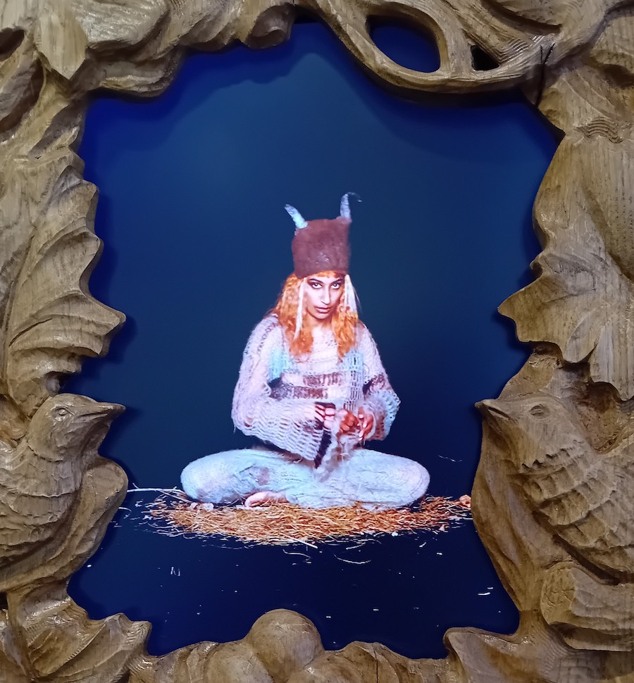
You show five videos of ‘Mamunas’ and ‘Garden Mules’? What are they?
A mamuna, literally translated from Polish as strangewife, is a female swamp demon closely associated with rivers, streams, and thickets. They appear in various forms in folk stories across the Slavic region, and contrast interestingly with the mythologies of Christianity which we all know. The ‘Garden Mule’ is the white little boy with horns: that name came out of my discussions with curator Kate Smith when we were filming in Norway. After telling her what mamunas are, I said: ‘let’s make up some other names of deities from the forest’, and she suggested ‘garden mules’ – it sounded good and I like it that the mule lives between animals, being half-horse, half-donkey, so it’s a metaphorical title.
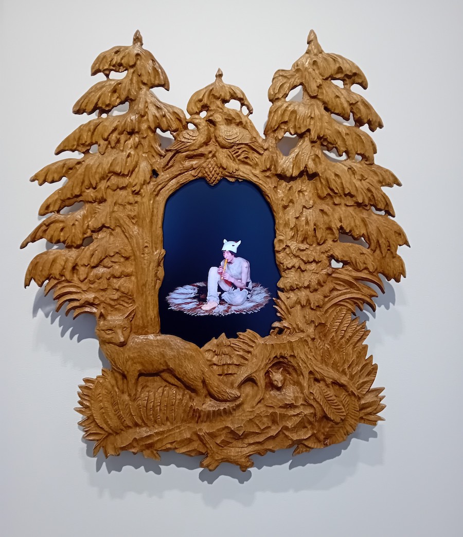
Paulina Olowska: detail from ‘Squelchy Garden Mules and Mamunas’, 2023 – five channel framed video installation, dimensions variable
So we have four mamunas and the garden mule. How have you presented them?
Making a show in the middle of the woods in Norway, was as inspiring as running a foundation (Artist House Kadenówka Foundation) in the middle of the countryside in Poland. Both are surprising and unexpected locations to present contemporary art. To amplify the spirit of the Museum in Norway, in what is called ‘The Twist’ – a twisted building over a river – I decided to add more fake trees inside and place the Mamunas videos in the hollows of them. At Pace they are on screens set in carved frames like woodland hollows. I love making amplifications of spaces, as in the performance The Mother in Tate Modern in 2015, where I created set of a Huculian hut with paintings by Pablo Picasso , Meredith Frampton and Henri Matisse.
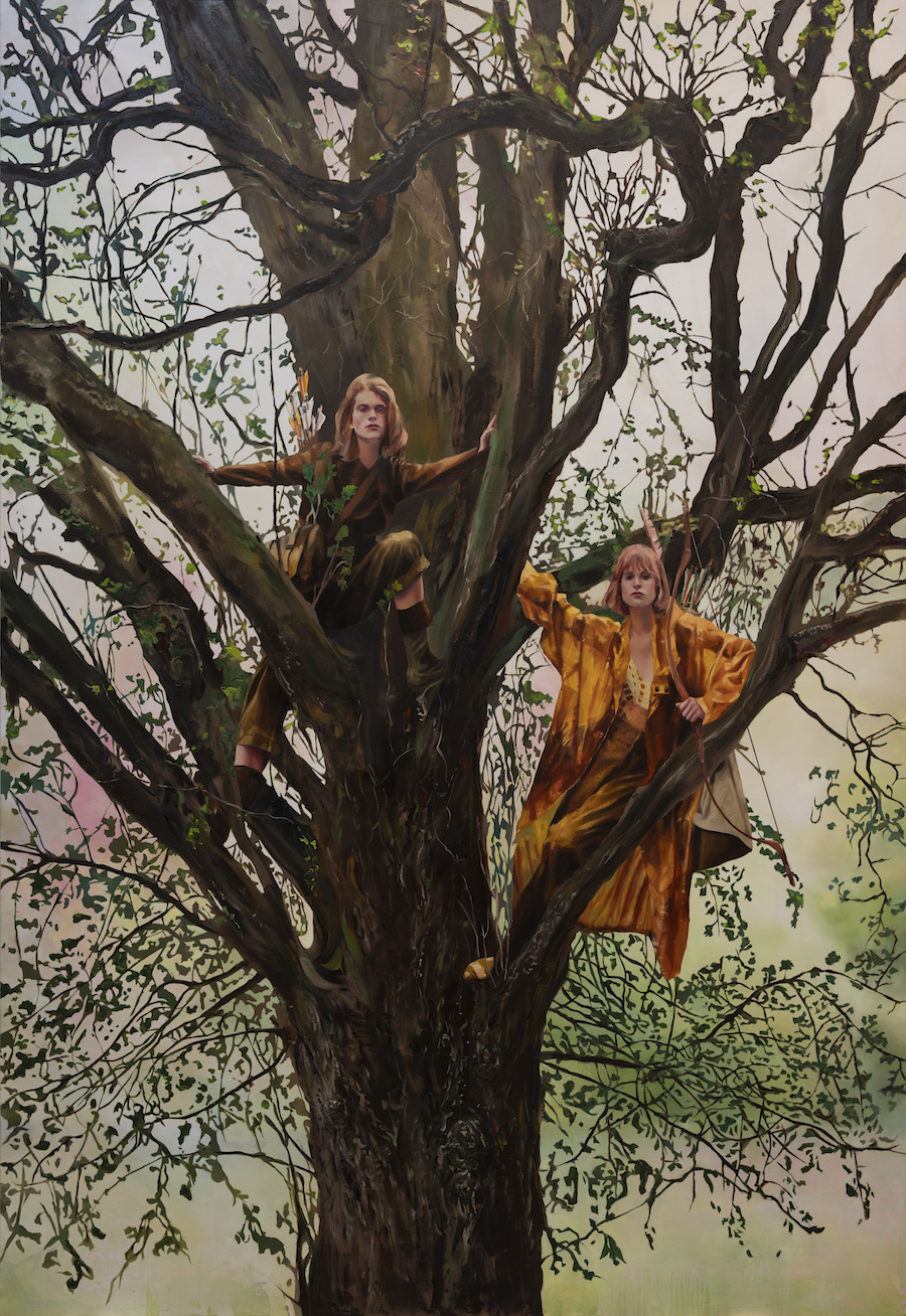
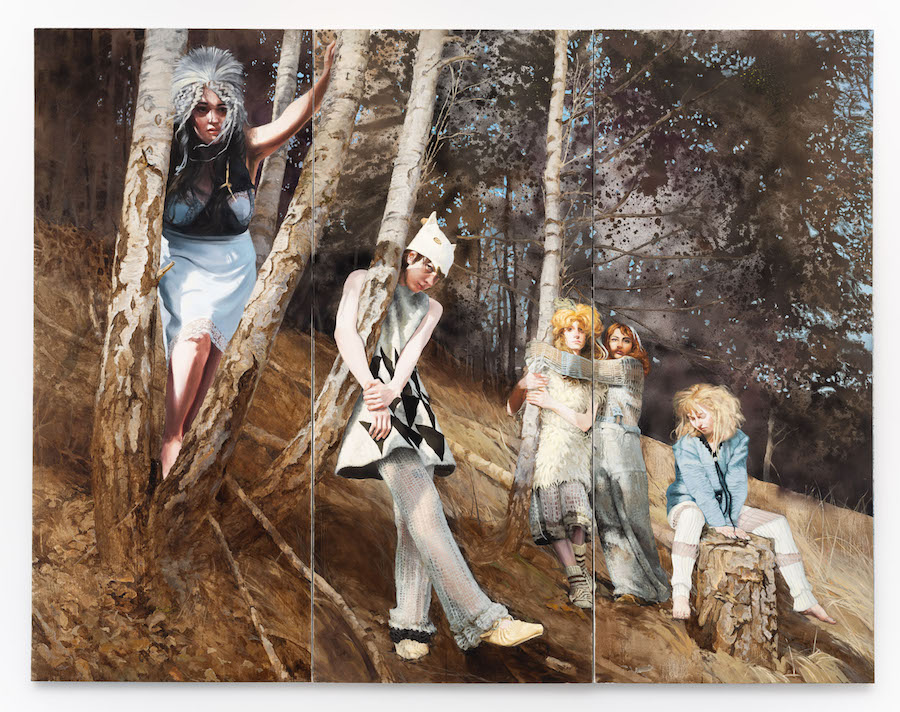
Paulina Olowska: ‘Dziewannas (After Branislav Šimončík)’, 2023 – oil on canvas, 310 x 209 cm
Several large paintings feature the same cast, but others – such as ‘Dziewannas (After Branislav Šimončík)’ don’t. Why is that?
Most of the works come from my photoshoot and films made in Norway, but I wanted to take this show beyond just those ideas. So others, like Cepelia, Dziewannas or Glisne are paintings based on found photography that I reappropriated with a more personal narratives. For example I found these amazing portraits of a young androgynist couple on an oak tree in recent Vogue Czech shoot by Bransilav Simoncik. I present them as Dziewannas, the wood demons, as archers guarding the forest – the arrows are my addition.
You show your studies for the costumes in which the mamunas performed, and also puppets wearing the costumes. I guess that fits in with your long-standing interest in fashion?
Yes, I love to connect art with fashion, and for two years I worked as artistic director of Polish Art Vogue: I did photoshoots, met models, saw the industry. A lot of my work comes with the belief that fashion is a metaphor for personal and social revolution. Pose and hair style become symbolic. And the parallels and differences from art were fascinating for me. Fashion deals with theatricality through colour, form, space, people… I started to look at fashion photographer’s portfolios and find the images which resonate with me. I often create outfits for my models, as in the downstairs space of Pace, where I include the outfits from the photo session in Norway.
Paulina Olowska: detail from ‘Squelchy Garden Mules and Mamunas’, 2023 – five channel framed video installation, dimensions variable
Who are the mamunas?
Mine are mystic creative professionals (laughs)… While at Vogue I met a lot of incredible people working in fashion. One of them was Lou, from ‘Let it go’ agency in Amsterdam. Lou was managing talents such as Amy Morgan, Rick Geene, Sayuri Chetty, Kamil Sznajder and Yasmin El Yassini…. They are my muses – my mamunas and mules. They’re all in their twenties, they do part time studying while modelling or being actors or musicians. Filming them was great fun.
They seem more mischievous than demonic?
One thing about demons is that we’re scared of them, and their power, so if they’re too friendly it’s not good! But what is true about Slavic goddesses – as well as Hindu goddesses – is that they have their yin / yang virtues, their either / or, the friendly side covering the more evil side.
Paulina Olowska: ‘Strzygla with Mamunas’, 2023 – oil on canvas, 260 x 333 cm
How were the paintings of the five characters – such as ‘Strzygla with Mamunas’ – made?
The idea was we met to make films in the tree hollows, but I grabbed Kacper Kasprzyk, the photographer, and Monika Kucel, who helped me make the outfits, and we had a photoshoot day outside. We did plein air photos, middle of the winter with Mamunas exploring the rivers and forests of Jevneker village in Norway. It was spontaneous – and I’ve found that spontaneity works well for me. I was looking at them throughout the year, left them on my studio wall, I thought ‘they are excellent, I want to make paintings from them’. Then I took the time to explore in my painterly head how to work with paint gesture and weave in the painting the expression of nature. And I liked the connection with how back in the day painters had an entourage – models, assistants, students – always this aspect of the artist being present with others – now I feel painters are more solo in the studio, so the idea of recreating images from my tableaus was special. And the mamunas have come to the openings…
Why not show the photographs?
Perhaps I will get there, I am interested in exploring the language of photography, but at the moment when I reflect on the photographs, I feel a desire to transform them into a deeper visual language, echoing the moment. Photography is a split second while painting is a duration, a constant re-entrance into the scene, a mind game, a kind of head projection combined with the alchemy of the process. A painting emerges from months of being with the image in the studio – I really like painting as a method of mediation. My aim is to achieve what Bernard Frize, one of my teachers, called the ‘economy of painting’ – how to represent an image with the most persuasion in the gesture. In this show, inspired by Norway and seeing the divine nature painting in its new National Museum, there is a new direction for me in the representation of nature. I like to have question in mind when I make a show, and here it was not so much Slavic folk art as ‘how do we represent the landscape as a painter?’ And so with every image I moved between different approaches and techniques.
Your previous work has often reinterpreted historic female muses for modern times, and you’ve spoken about how the past haunts the present. Could you say something about that and how it applies in this show?
Here I’m looking to research the missing links to modernity not through historic muses, but through folk art. That’s an alternative setting for the theory which dear Mark Fisher developed to apply to music, in which elements from the past persist in the manner of a ghost. His approach made sense of my take on feminism – can you make a new future for feminism through figures from history coming back to you, by re-envisaging them for what they can give us now? That’s why my book of the Norwegian show is called ‘Her Hauntology’ – as it’s my take on it.
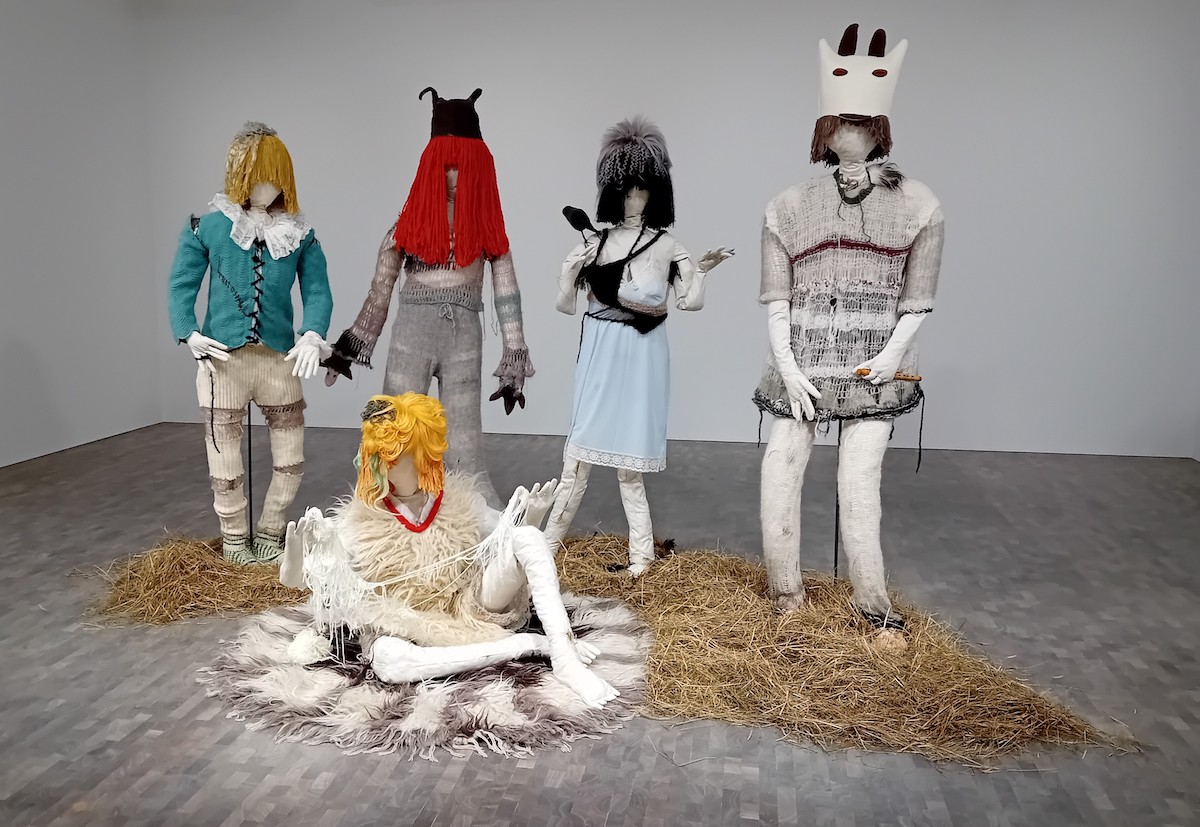
Top Photo: Paulina Olowska: ‘Squelchy Garden Mules and Mamunas’ Costumes’, 2023 – costumes, wigs and mannequins – dimensions variable
Paulina Olowska: ‘Squelchy Garden Mules and Mamunas’ runs Nov 22, 2023 – Jan 6, 2024 at Pace Gallery, 5 Hanover Square, London
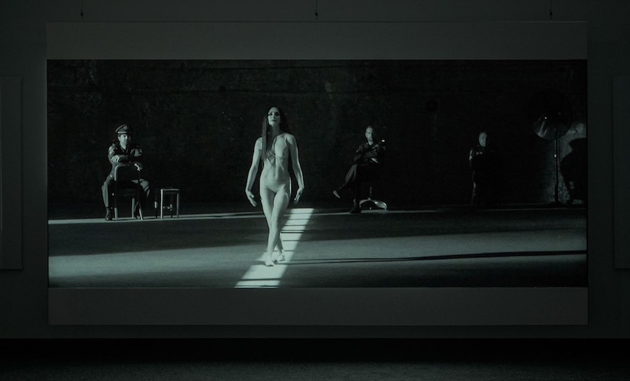
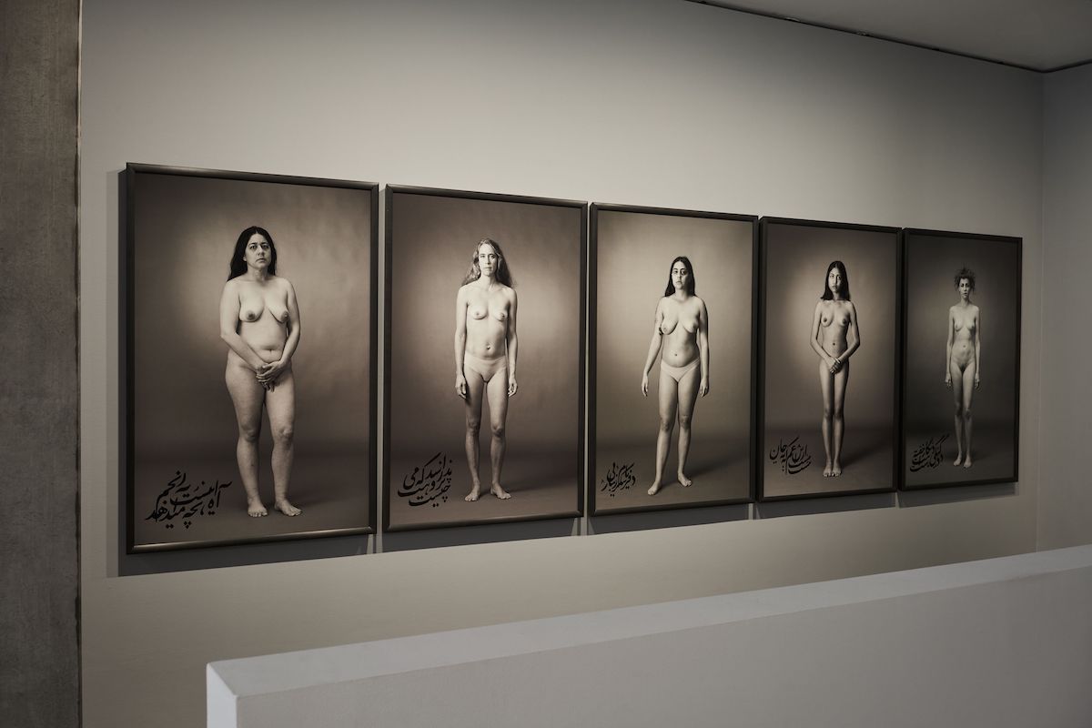
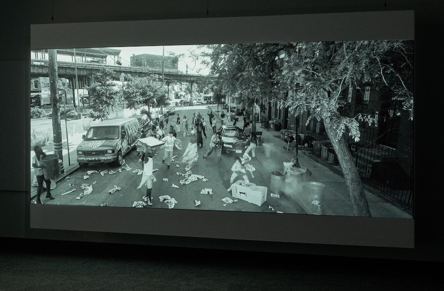
Shirin Neshat: Interview of the Month, Oct 2023 – Paul Carey-Kent
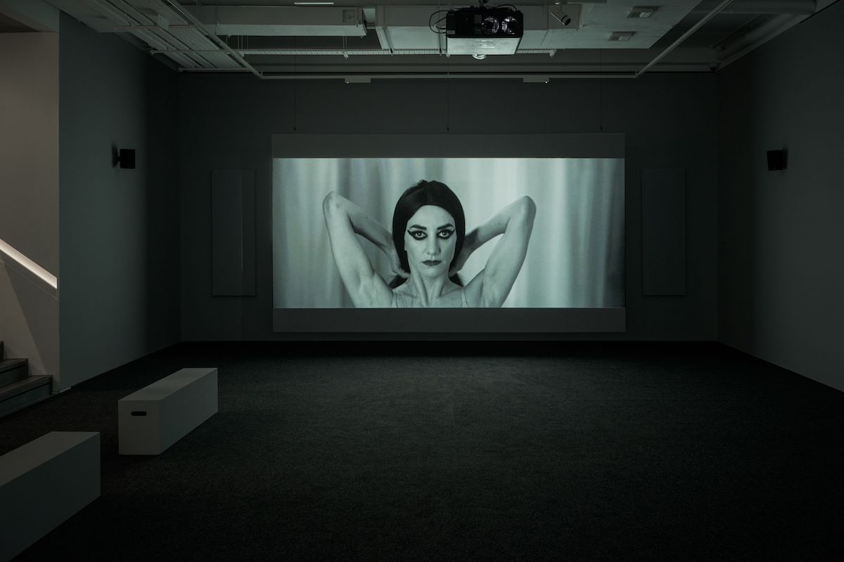
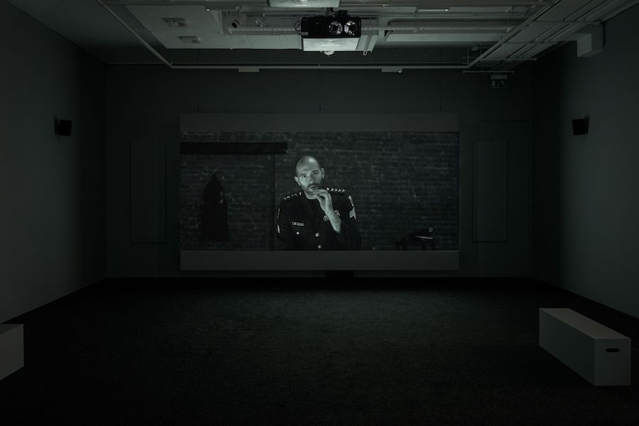
I talked to New York based Iranian artist Shirin Neshat in her current show at Goodman Gallery, which presents an immersive video installation and a series of nude portraits considering the female body both as an object of desire and as an object of violence and shame. In the chilling 15-minute double-screen film work ‘The Fury’, Neshat’s protagonist dances seductively for a room of impassive soldiers. Then we see bruises on her body, indicating the abuse she has suffered, followed by her emergence onto the streets of Brooklyn. Physically displaced and mentally disturbed, she walks the streets reliving the horrors of her past. From the street’s vantage point, she is one among many in her cocoon, alienated and atomised. Yet, at the film’s conclusion, she sparks a mini-revolution as women throw trash into the air and dance wildly.
How did ‘The Fury’ come about?
For some reason, I got drawn into following the trial of the notorious prosecutor Hamid Nouri, who was captured by luck in Sweden by the international court. He was among those responsible for the massacre of nearly 3,000 young political prisoners in Iran. The victims’ families, who are now living outside, came to give testimonies. What struck me the most was how the regime would rape the young women before execution because, according to Islamic laws, virgins cannot be executed. I couldn’t stop thinking about these incredibly horrifying reports. I’ve also known several Iranian women who have spent time in prison and heard their stories about women who are sexually assaulted in prison and how they could never recover. They would often sit in a corner, wouldn’t speak, and many would commit suicide after they were freed. So, the concept of “The Fury” developed during 2021-2022, and I shot the video in June of 2022 before the Woman Life Freedom movement in Iran. In this highly fictionalised and stylised narrative, the female protagonist cannot disconnect from her haunted past and her psychological trauma, even in the state of freedom in a new country. I wanted to make a work which draws this boundary between the interior of her mind, the exterior of her mind, the interior of her apartment, the public space – and how everything was disconnected – like she wasn’t present till the end until she was most vulnerable and asked for help. So everything was created around the notions of sanity/insanity, illusion/reality, interior/exterior, Iran/USA.
And the setting is personal to you?
This video was shot where I live, in Bushwick, Brooklyn, a working-class, primarily Hispanic community. Most of the neighbourhood barely speaks English, yet these are the people I am closest to and see more than anyone else. They are my community in New York, even if we all come from different cultures and religions and speak other languages. I feel safe and at home here.
Is the woman based on an actual person?
No, she’s a fictionalised character I created and is not merely meant to represent a female political prisoner in Iran but to capture some of the trauma and dichotomies experienced universally under such conditions.
You use a double-channel video. What is the advantage of that?
This video wasn’t designed initially in two channels; I decided on that later. Everything became about creating two different points of view and putting the audience in an uncomfortable position. So, in a way, the audience becomes the editor, deciding where to look and how to put the story together. I wanted the audience to distinguish between the way she viewed the world and the way the street bystanders and the uniformed men viewed her.
She begins in a seductive manner. Why is that?
There is a development in this short narrative. First, the female protagonist appears as an object of desire through her erotic dance, and then slowly, we reveal the brutality of what has happened to her. She’s at first seductive because that’s often the story of women: we have the power to seduce and create temptation, yet due to the same reason, we can fall victim to violence. This subject is not exclusive to Iranian women, of course – I am a firm believer that most women around the globe have experienced some form of sexual assault or molestation at some point in their lives, but they don’t talk about it. We tend to internalise such experiences and even become ashamed of ourselves and our bodies.
And that’s picked up in the poems on the photographs in the show?
Yes, the poems I transcribed on the surface of the photographs are from ‘Another Birth’ by Forugh Farrokhzad, who died in 1967 at the age of 33. I have often used her poetry in my photographs. She was one of the most radical among Iranian women poets in how she expressed the problematics of the female body in relation to traditional and religious values – taboos. Her poems have often been considered blasphemous, and at some point, her books were banned in Iran. I remember one of her poems. I believe it was called ‘Face to Face with God’; she poses the question to God: if you are the creator, why am I supposed to feel so much shame about a body that you’ve given me?
Unusually for your work, both the film and the photographs feature women naked or near-naked. Why is that?
I couldn’t imagine the depiction of sexual exploitation without showing the naked flesh of a woman in “The Fury.” In the video, it was necessary for me to show both the seductive and yet brutalised body of a captured woman. In the photographs, I tried to take a similar approach. Some images resonated with notions of power, pride, dignity and beauty regardless of the women’s size and age – and in other images, we are faced with women in pain whose bodies have obviously been brutalised.
What led to how do you show the men?
The men’s gazes expressed everything: the sense of hate and violence. I didn’t need to show them doing anything to her; their bodies and uniforms represented their power and control over her. The interesting thing is that their blank expressions never changed from the time she dances seductively to when she finally fell to the floor bruised. They remained emotionless, which is so typical of men who are incapable of humanity-only atrocities. I hate to say it, but some people enjoy other people’s suffering. I’m an optimist and would like to think there is a good side to every person, but you just have to look at the last few days in the Middle East to see how hatred, violence and evil are so deeply ingrained in people. When she’s on the floor struggling, you see the men looking at her as if they enjoy it. Lastly, I was careful to make the uniforms generic and not specific to any culture.
Why is the whole show in black and white?
Initially, we shot the video in colour, but later, I changed my mind. I think there is a severity in black and white that felt right to my narrative. Also, we occasionally used Infrared with the camera, which turns everything into negative, and that was used each time we went to her point of view on the streets. Overall, I felt that the black-and-white look also helped with the melancholic mood of the story. I slowed down music – a Persian song with lyrics rewritten in Arabic – to make it more melancholic but also beautiful. That goes back to the mysticism in Iran – things are terribly sad and emotional but highly beautiful and affecting.
You made the film before Masa Amini was killed, yet there are echoes?
It’s almost uncanny how the story of “The Fury” is similar to what transpired in Iran a few months later. Here, we have a woman who becomes a victim. Her victimisation unleashes other people’s rage, which culminates in a protest, and that is exactly what happened in Iran: a revolution unravelled immediately after the murder of an innocent woman, Mahsa Amini, who became the victim of the Iranian government.
Dance is important in the film?
Yes, dance is central to the film, both as the female protagonist danced for the uniformed men and how, in the street, bystanders turned their protest into a strange ritual of dance and destruction. Oddly enough, during the Woman, Life, Freedom revolution in Iran, dance, which is forbidden in public, became an expression of protest as well.
Top Photo Shirin Neshat: The Fury – installation view, courtesy Goodman Gallery
Shirin Neshat’s ‘The Fury’ runs to 4 November at Goodman Gallery, 26 Cork Street, London W1S 3ND
Ghislaine Leung: Interview of the Month November 2023 – Paul Carey-Kent
Ghislaine Leung is one of the four artists nominated for this year’s Turner Prize, the winner of which will be announced on 5 December.
Her show in Eastbourne consists of ‘score-based’ works: they repurpose found objects, but Leung’s parameters for how to show them leave plenty of scope for the hosting Towner Gallery to influence the outcome. That relinquishing of control allow the socio-political and spatial conditions of art production, its presentation and re-presentation, to come to the fore. That may sound worthy but potentially dry – yet Leung goes about things with an appealing wit, and the results are compelling in themselves.
As explained in detail in your recent book ‘Bosses’, your starting point is how to make work rather than what work to make?
Yes, I aim to work with what I have, rather than what I don’t have – it’s untenable trying to work with what you don’t have, which is the position faced by many artists who can’t access the resources they need – which, of course, also exacerbates existing class, gender and racial hierarchies in our industry. I was interested in finding a mode of production that made space for a different kind of work. And this came from something I probably initially conceived of as a problem, I always thought you can make an artwork and you can perfect it in some way yourself. And then the work goes into a context that you can’t control and it has a different read or it changes or it shifts, and this was something I wanted to control. It was the wish to control that seemed like a clear problem to me. I wondered how to embrace the contingency of works instead, to embrace their vulnerability. Rather than thinking ‘how can I fix and control this? How can I maintain its integrity in the way that I have conceived it?’ I shifted to thinking that the resilience of the work could come from its vulnerability, its total contingency, its complete dependency, my trust in a situation.
Is that in line with Sol LeWitt’s approach as set out in ‘Sentences on Conceptual Art’, 1969, such as ‘Once the idea of the piece is established in the artist’s mind and the final form is decided, the process is carried out blindly’?
I’d see my work as more of a dialectical flip on LeWitt’s methodology. He starts with concepts which lead to the material form. For me, materials, inclusive of the sets of conditions and limitations I’m working with, are generative towards concepts. I don’t know the final form, and – given the highly contingent nature of the scores – I can’t and, in fact, don’t want to. This is why the works are scores rather than instructions, just as a musical performance isn’t quite the composer’s or the performer’s. In that sense, I am theoretically the composer, and the institution is the performer, and the work, in each iteration, comes from both. I like to be surprised by my work when I come into a show!
Ghislaine Leung: ‘Violets 2’, as installed at Simian, Copenhagen – GRAYSC Images, courtesy the artist & Simian
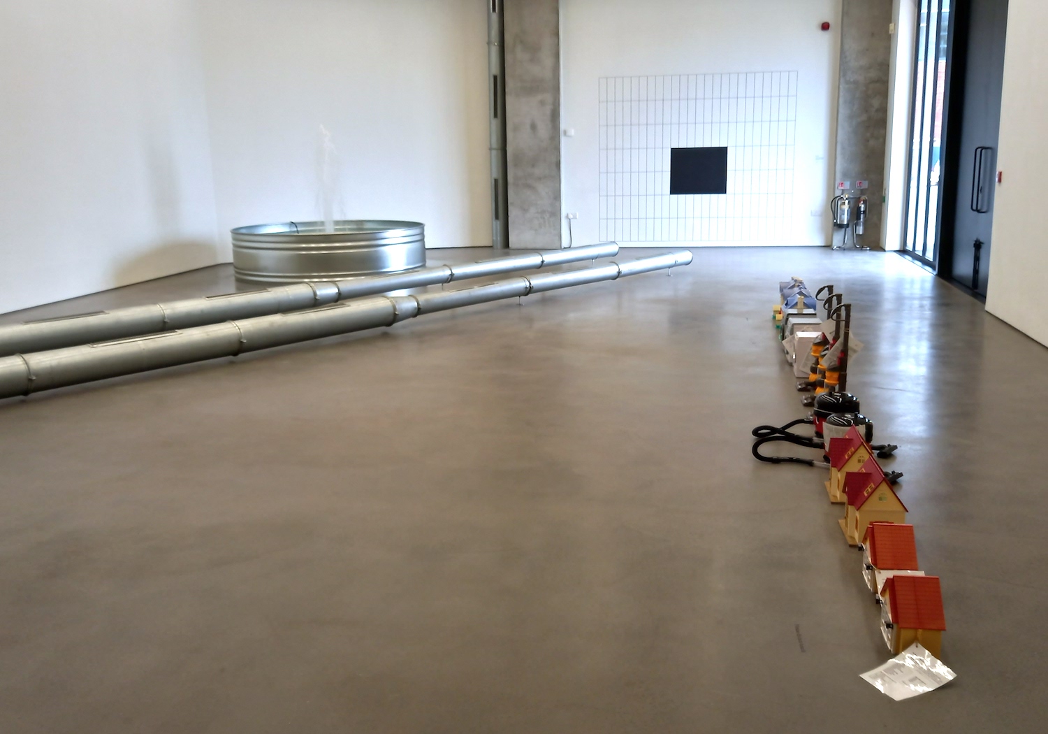
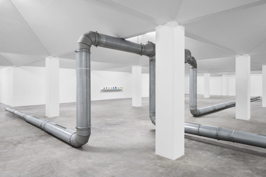
Can you say something about the largest work in your Turner Prize display?
The score for ‘Violets 2’ reads: ‘All parts of a ventilation system removed from Netwerk Aalst Bar during its 2017 refurbishment are reinstalled within the space of the exhibition and fixed on the floor. Using as much of the material as possible while keeping it all interconnecting. Spare pieces that do not fit this configuration are bracketed together in smaller formations. A welcome sign is installed.’
I was working there in Belgium from 2017-19, and we were thinking about who the institution was speaking to – about how often ‘the public’ is referred to like a separate and somewhat mysterious entity to be spoken to or placated. I was aiming to bridge this externality by thinking about the internality – the politics of the institution and my position in that – an immanent form of critique looking at the structures of power inside, rather than outside, the place. What about the people already in this room, the politics that are already here? So how the institution was organised in both social and physical structures. So many of the circuits of power, the things that allow for the functionality of the building, are rendered invisible. At the time, the institution was undergoing a renovation and discussing what was going to be removed and what was going to be inserted. The ventilation system that makes up ‘Violets 2’ was going to be removed as smoking was no longer allowed in the building, which made it surplus. And I was interested in what these forms of institutional waste were, who and what was considered valid or useful within these public-facing spaces. I took the ventilation system which had been on the ceiling of the bar, and mounted it on the floor of the gallery space above that bar, which had the same spatial footprint. And installed a welcome sign alongside it. I’m always interested in this institutional welcome, on who is being welcomed and why, especially in how ex-industrial spaces become art industrial spaces. Violets 2 has been on almost permanent tour since 2018, it flexes to fit into different spaces, and it shows something different about these spaces each time, as its parameters are shaped by these limits.
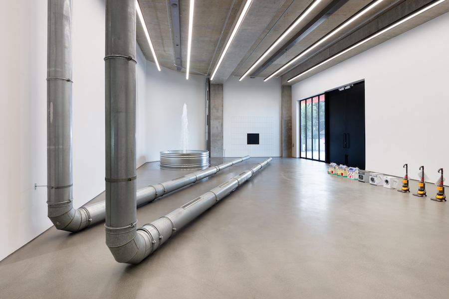
Ghislaine Leung: ‘Violets 2’, Towner Gallery, Eastbourne – Angus Mill Photography
You’re asking one institution to do something with another institution’s structures?
The way an institution performs a score says a lot about them, e.g. their Health and safety rules, what they want to achieve – that was my aim at that time, to acknowledge the systems of the institutions.
The sculpture we see reminded me somewhat of the 1960s ‘Square Tubes’ of Charlotte Poseneske – another artist who emphasised the cooperative aspects of her work.
Yes, and I think this is exactly what I mean about how materials can be generative. This becomes especially interesting in relation to historical artworks that refer or even enact forms of industrial production like Poseneske’s. What happens if you use existing industrial objects rather than fabricating them? What shifts what doesn’t? In a way, I’m trying to take something back into the use of art and to understand that as already an industrialised social structure, one that is often unacknowledged but shapes so much of what constitutes not only the art object but who can and can continue to, make art.
Why does the title refer to violets?
I had been thinking about how systemic prejudices are so often perpetuated by our own internalised ‘micro-violences’ that we do to each other and also ourselves. Ones that are fabricated into the internal structures of our institutions. And was struck by how close the pretty and flowery word ‘violets’ is to the loaded term ‘violence’.
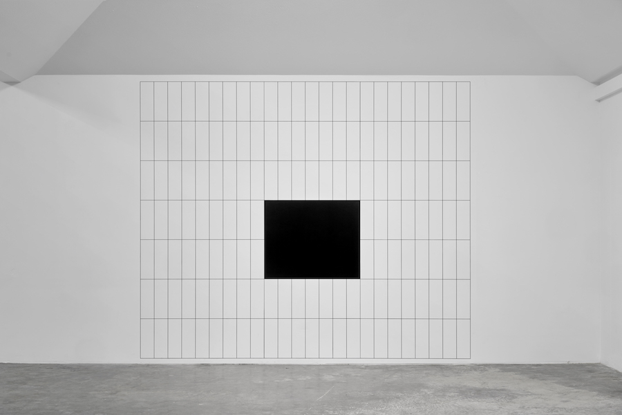
Ghislaine Leung: ‘Hours’, 2022 – photo Paul Carey-Kent
‘Monitors’ broadcasts a baby monitor from one room to another, and ‘Hours’ divides the week between your studio hours, indicated by a Malevich-like black square, and the rest. I note you spend only 8% of your time in the studio – presumably, you’re constrained by factors such as being a mother?
Yes, being a mother, and working, and in multiple jobs. I think the earlier works like ‘Violets 2’ and ‘Public Sculpture’ were very much about institutional systems, and how they constitute the work, what their labour conditions are, how they work. In the past few years, especially since having a child, I’ve become more and more interested in how I work, how I have internalised various expectations and ideas about labour and value; questions that are about how I institute, and taking a position of critique into a more reflexive and lived form of actionism. As such the more recent scores have become less about the interrelation between two institutions, and more about my form of instituting, how my labour, life, limits, collide, are in conflict or grow… about that intra-institutional aspect of bringing myself in. For many years I felt I couldn’t do that, felt that how I lived didn’t have enough value to speak about, but more and more I feel that speaking about that situation is a necessity. And if you’re trying to make work inclusive, then life is really important within the work.
Ghislaine Leung: ‘Public Sculpture’, 2018 – Photo: Paul Carey-Kent
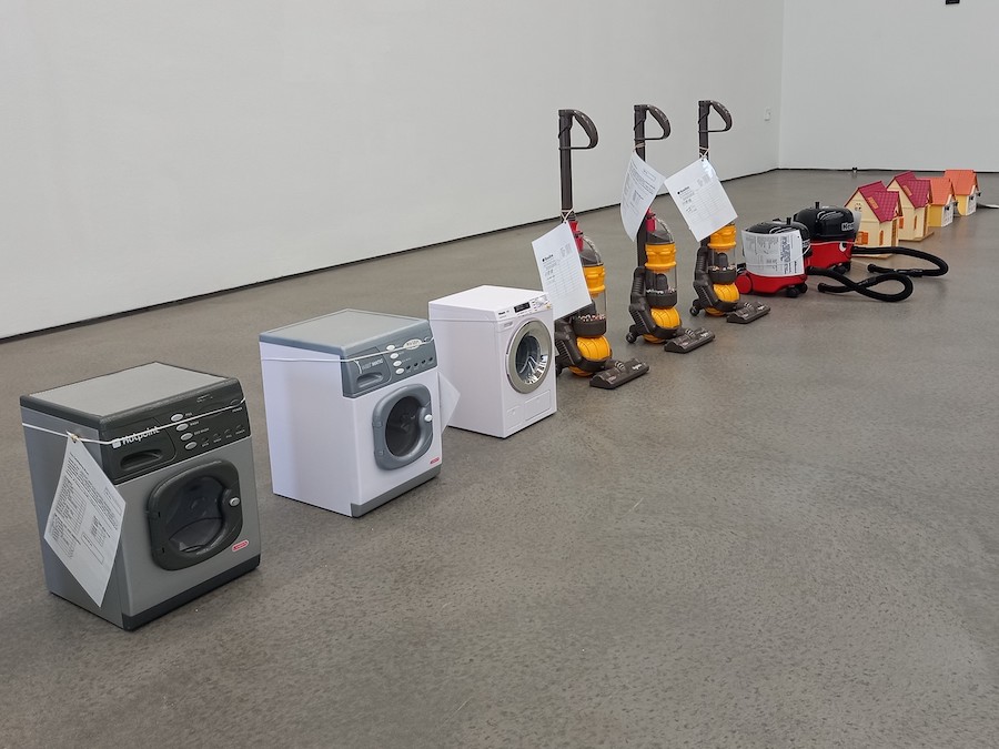
‘Public Sculpture’ presents a group of toys from the collection of the public library in Reading. They struck me as unusual toys?
They are fascinating, yes. Toy libraries often have a lot of these kind of role play toys, leading to questions about what roles we play, or the roles played in the construction of such roles. And there are two companies – Theo Klein in Germany and Casdon in the UK – who specialise in miniatures of branded goods, so you’ll get a Theo Klein Miele washing machine or a Casdon Henry Hoover etc.… I was interested in that double identity – in that one object has two brands attached. And the toys have another double identity: as individual objects they are toys in the library; as a set of objects, they are a loanable artwork by me. Both exist in the library system, and you have to join the library to access them, either way. So I’m interested in how the work circulates as well as how it is actioned through the score. And this doubling – or troubling – of identity is important to me, as a mother and an artist, as someone with a father from Hong Kong and a mother from London. I’m asking what identity is if you think of it as not so much as the objectifying question of ‘what you are’, but ‘how you are’.
Work by the four artists shortlisted for the Turner Prize 2023 (Jesse Darling, Ghislaine Leung, Rory Pilgrim and Barbara Walker) is on show at the Towner Gallery, Eastbourne to 14 April 2024. The winner will be announced on 5 December. Ghislaine Leung was nominated for her solo exhibition ‘Fountains’ at Simian, Copenhagen.
Top Photo: © Artlyst 2023
William Cobbing: Interview of the Month, September 2023 – Paul Carey-Kent
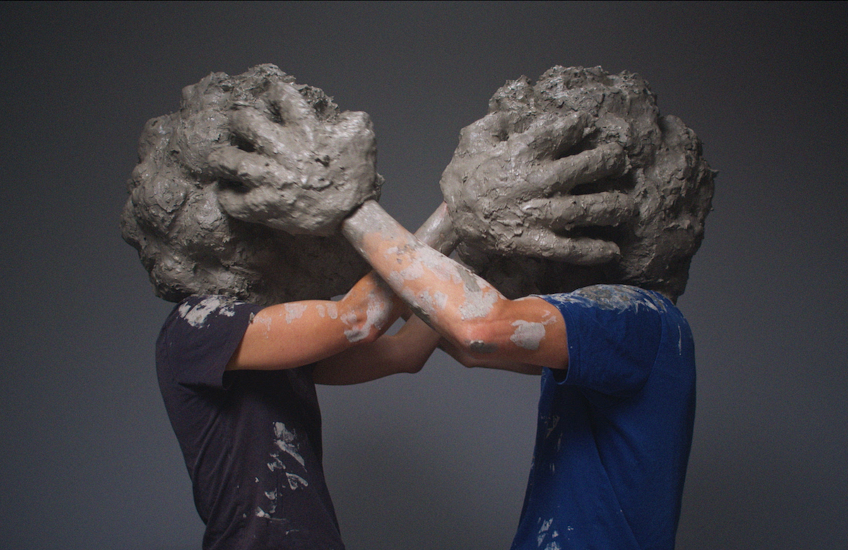
William Cobbing has three shows opening in September: he’s in the group shows ‘After the Performance’ (with the film ‘screensaver’ at Tension Fine Art, Penge 7-30 Sept) and ‘Full House’ (ceramics including ‘Float’, presented by Canopy Collections at Cromwell Place, South Kensington 14 Sept – 1 Oct) and has a solo show at Airspace Gallery as part of the British Ceramics Biennial in Stoke (23 Sept – 5 Nov), with a series of new videos, sculpture, and performance, exploring a playful and ambiguous interaction between people immersed in mounds of formless clay. ‘These earth-clad people, says the press release, ‘are caught in an ouroboros loop of transforming themselves’ and ‘individual identity is effaced, with the protagonists becoming hybrid forms somewhere between themselves and the material’. It seemed a good time to talk…
‘Will.ni.naiz’, 2022 – video stills
PCK: You might say that clay is foregrounded in your work performatively, in a more radical way than just using it to make ceramics. What’s the appeal?
WC: It’s the clayiness, the clagginess, the tactility, the squelchyness of clay I like to work with before it turns into beautifully honed pots. I’ve been reading Petra Lange-Berndt’s catalogue essay for the exhibition I was in: ‘Further Thoughts on Earthy Materials’ at Kunsthaus Hamburg. She examines creation myths, as in the bible, in which clay is a passive material that gets shaped and always with a gendered contract that man has autonomy over the material. She looks at the feminist critique of this, in terms of ‘material’ signifying ‘mother’, subverting Western ideas that material is passive and needs to be conquered, with clay having its own innate qualities, its own personality. That also made Lange-Berndt think of Kazuo Shiraga’s, ‘Challenging Mud’ (1955), in which he wrestled mud with the lovely takeaway line ‘and the earth won’. I’m also interested in the Jewish myth of the Golem, in which once the Golem is formed, a ‘shem’ is put under the tongue, and that gives life to the clay. It’s a mutable myth, but there’s a 1915 film ‘Der Golem’ in which the Golem, created from clay, rampages through the streets, out of control – the myth of decisive agency over material is countered.
Still from ‘screensaver’, 2022
Do you also associate your work with the environmental agenda? ‘screensaver’ might be seen that way?
Yes, ‘screensaver’ shows an expansive clay ground of which we are a part, as opposed to being separate from it. There are no digital interventions: it features four performers, directed by me with no special effects – what you see is what you get. And it suggests that the world can cope without us, in contrast to the humancentric idea that the world in some sense can’t exist beyond us. It can, which is humbling. I also think of how Georges Bataille, in ‘The Big Toe’ (1929) explains that ‘the function of the human foot consists in giving a firm foundation to the erection of which man is so proud (the big toe, ceasing to grasp branches, is applied to the ground on the same plane as the other toes).’ Yet even though the big toe is central to the human as vertical and separate from the earth and looking towards the heavens – we have our feet in the mud…
You could look at ‘screensaver’ as a dark work, as if for example an earthquake has just occurred. But the hands do also seem to be enjoying the clay. How do you see it?
I’m hoping there is ambiguity in all my videos. They elicit a variety of responses from attraction to repulsion – some people find them abject, revolting, nihilistic. Others find them funny. Here I do also see elements of sensuality with the material, and a reference to the process of making – but without the result. That’s a kind of artistic limbo, so ‘screensaver’ deals with the state of limbo.
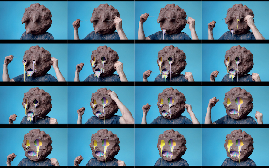
The single head video works, made with the constraints of lockdown, have been widely viewed online. They strike me as quite painterly, as the colour bleeds out of, for example, ‘Will.ni.naiz’ (as above)
I did start out painting at school, but switched to sculpture soon after starting art college. I don’t paint now, but I loved Auerbach, Bacon and Guston– who use paint in a visceral way. That slicing away of layers isn’t quite destructive – people saw it as ‘peeling back into the self’.
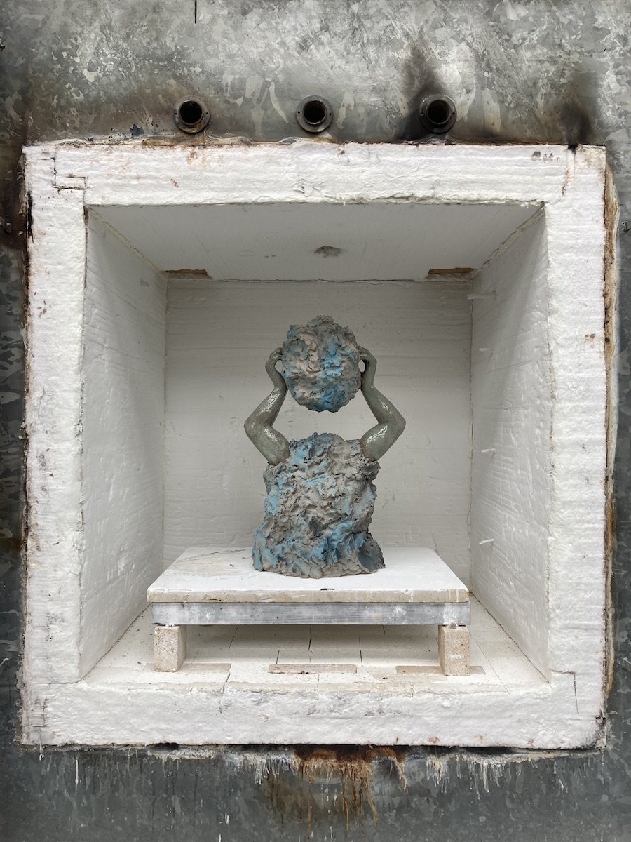
‘Float XL’, 2023
The ceramic ‘Float XL’ relates to the solo videos?
Yes, it came out of modelling clay on my head, but has a kind of impossibility. I sometimes try to maximise the qualities of each medium, and you can’t separate head and body on film! It’s wanting to draw attention to this poor guy with a clay mass ball for a head. Materiality in sculpture is often about heaviness and gravity, and this is evading the normal physical constraints. The videos are referenced, playing jokily between the rough and smooth clay, by the more realistically sculpted arms. I made this on a residency at the European Ceramics Centre (EKWC) in Oisterwijk, The Netherlands, where I had the chance to work with top technicians. That enabled me to experiment with different effects on clay – the arms use a Chinese celadon glaze, a semi-translucent pale green; the rougher parts are sprayed with an underglaze.
‘Float XL’ might also suggest carrying a rock?
That fits with a view I have of the video heads as a whole as picking up on a possible interpretation of Camus’s ‘The Myth of Sisyphus’ (1942). Sisyphus, in ancient Greek myth, was condemned to repeat forever the same meaningless task of pushing a boulder up a mountain, only to see it roll down again. Yet Camus concludes: ‘the struggle itself towards the heights is enough to fill a man’s heart. One must imagine Sisyphus happy.’ A daily repeated routine can give a sense of meaning, as opposed to seeing that only in the achievement of a final objective. Being engaged in a process can be engrossing.
Top Photo: Still from work-in-progress (2023)
You will be showing eight new films in an immersive installation in the appropriate location of Stoke, the historic home of the ceramics industry. Like ‘screensaver’, they feature more than one performer, as indicated by the exhibition title ‘Social Substance’. What are they about?
They return to my pre-lockdown consideration of inter-relationships, and what happen when communication – or miscommunication – occurs. I’m not one for dramatic renderings in my own performances or when directing others: I try to keep actions very rudimentary, almost underperformed, deadpan – with the idea of pulling back, allowing the clay to have more of a say. And almost like an animal movement, here perhaps a bear with big paws.
The performers’ senses are restricted. How does that play out?
I want to think of actions that put obstacles in the way, slow down the movements, and make us think about the restriction of senses, especially on sight. And there’s a difference between viewing the films and experiencing them as a performer. The performances are short enough not to be too claustrophobic, and it becomes quite meditative when you can’t see. The attention given to sight, which tends to be seen as primary, reduces and you then get an increased awareness of touch and hearing – the pecking order of the senses is changed. I’m happy that some people will think it looks horrendous and suffocating while others see it as meditative and sensuous as well as abject. And it’s physical, slapstick humour. People have a particular taste for humour, so not everyone will find them funny, but I see humour as a lubricant to help process more difficult emotions.
You can follow William Cobbing’s work via his Instagram @william.cobbing. His three shows are at Tension Fine Art, Canopy Collections at Cromwell Place , and Airspace Gallery.
Nick Hornby: Interview of the Month, August 2023 – Paul Carey-Kent
You will soon be able to follow a London trail of three major public sculptures made by Nick Hornby. As he explains, ‘they have the guise of tradition but are, in fact, far from traditional: they unravel tropes of the monument, but in a way which is accessible and, I hope, not too didactic. I want the viewer to be in conversation with these forms, to feel they are in on the question.’ It seemed a good time to talk to Hornby in his London studio.
You’ll shortly have three permanent public sculptures in London as well as one in Harlow. How did that come about?
In the 2010’s I was shortlisted for several commissions, but lost out to more established artists. In 2019 I won my first public commission. My somewhat cheeky pitch was to say: you’ve just had proposals typical of the main options for a public sculpture – a man on a chair and a shiny blob. The first, a memorial, may be accessible to the public but is deeply problematic, stumbling on critical questions about who is being represented and by whom. The second, an abstraction, avoids those pitfalls, but at the cost of being ‘just another of those’ kinds of nonspecific abstract sculpture. So I suggested we present that dilemma as a question – by taking Michelangelo’s ‘David’, the apotheosis of human perfectibility, and intersecting that with an abstract line from Kandinsky, one of the first artists to set out “theory” behind abstraction. That intersection became ‘Twofold’, in Harlow, Essex. Completing that sculpture made a huge difference: once I had shown that I could be trusted to deliver a massive and structurally complicated public sculpture, I was quickly shortlisted for three other commissions – and won them all.
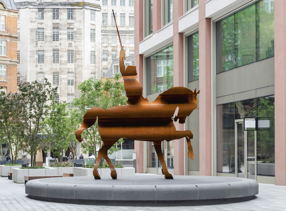
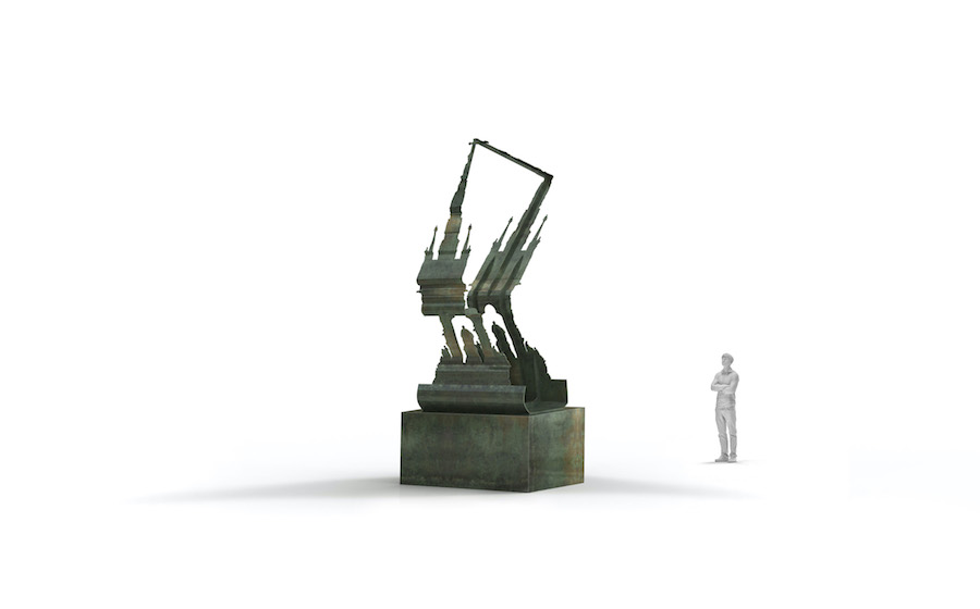
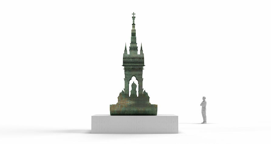
We can already see ‘Power over others is Weakness disguised as Strength’ opposite St James’s Park tube station and ‘Here and there’ close to the Albert Memorial. ‘Do It All’ will be unveiled in Kensington Gardens on 27 September. What do they address?
The first critiques the trope of the equestrian statue, the second deals with the monumental figure in the urban landscape, and the third combines the silhouette of the Albert Memorial with the profile of Nefertiti, perhaps the most powerful woman in ancient history. Collectively they pose the question: what does a monument mean in the 21st century? Each sculpture asks that question from a very particular site, and embodies my enduring interest in form, material and objectness.
How do they emerge from your long-running sculptural concerns?
From 2010 onwards, I devised a system for intersecting components from multiple trajectories. The method creates new, synthetic forms, but from certain vantage points you can still see the original elements. There is a strangeness to this relationship between the new object and the quotations.
How does ‘Power over others is weakness disguised as strength’ operate?
The artwork responds to its surroundings —Westminster, a national seat of power, where sculptures of men on horseback are numerous. But if those statues celebrate power, this sculpture challenges it through two visual quotations. The first references a statue located outside the Palace of Westminster. On that site there’s a nineteenth-century celebratory depiction of Richard I, unveiled during a period of Industrialisation and Imperialism. The second is a reference from Laurence Sterne’s experimental novel ‘Tristram Shandy’. In the book, a curling line suddenly interrupts the printed text. It describes a conversational gesture, where the speaker waves his stick in the air to describe the experience of freedom. The line escapes the confines of words and embodies the freedom it describes. The presence of that line in this sculpture invites us to think about storytelling, history and the fictions that support the figures we turn into statues. If this sculpture repeats the image of Richard I, it is to suggest the fragility of power and its monuments. After all, he is only visible from certain angles. From others, the image collapses: the figure of power is toppled within his own statue.
Nick Hornby: Power over others is Weakness disguised as Strength, 2023, © Nick Hornby Studios
And the title – a quote from Eckhart Tolle – points towards that meaning?
Yes—in the public realm, I really wanted to avoid misinterpretation: this is a critique of the equestrian statue format, rather than a celebration of Richard I. To shine a light on this subject, I had to incorporate an image of the very thing I’m trying to critique. This is a conundrum and I was sensitive to the fact that you do clearly see his image at a certain point – so I wanted to make it abundantly clear that I’m trying to propose an alternative, and not celebrating military men on horses.
So there is a collage of timelines?
My relationship to time is very flattening – things like love, betrayal and sex are timeless, and you can access just as much truth in something from 500 years ago as today. So here I combine several times into a sort of flat object: a 12th century king, a depiction of him from 1850, a line from Tristram Shandy (published in 1759), and a title from 1997, all in a 21st century sculpture.
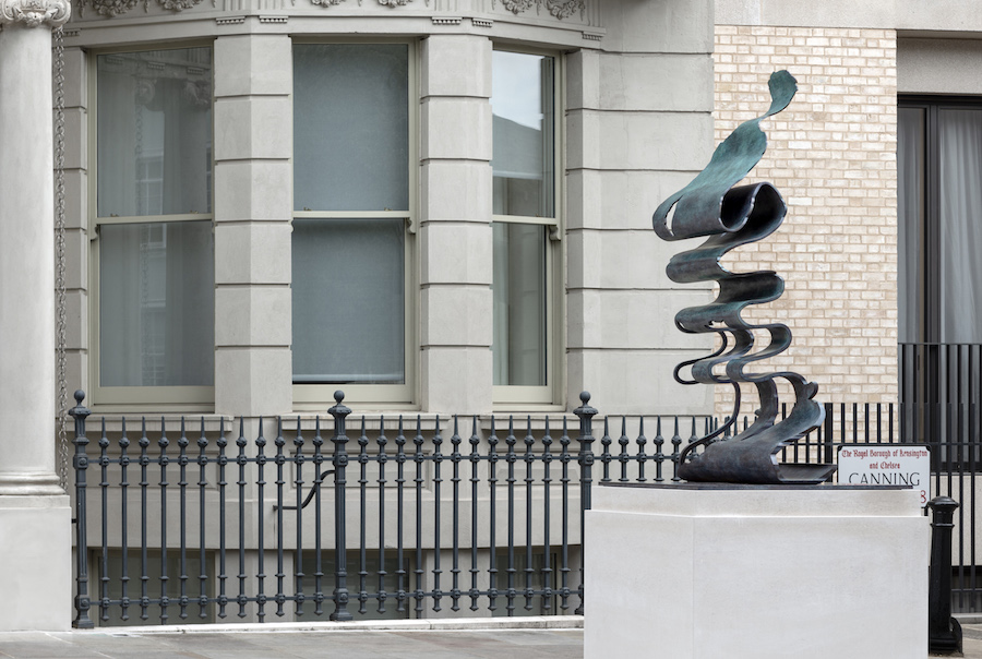
Nick Hornby: Here and There, 2023, © Nick Hornby Studios
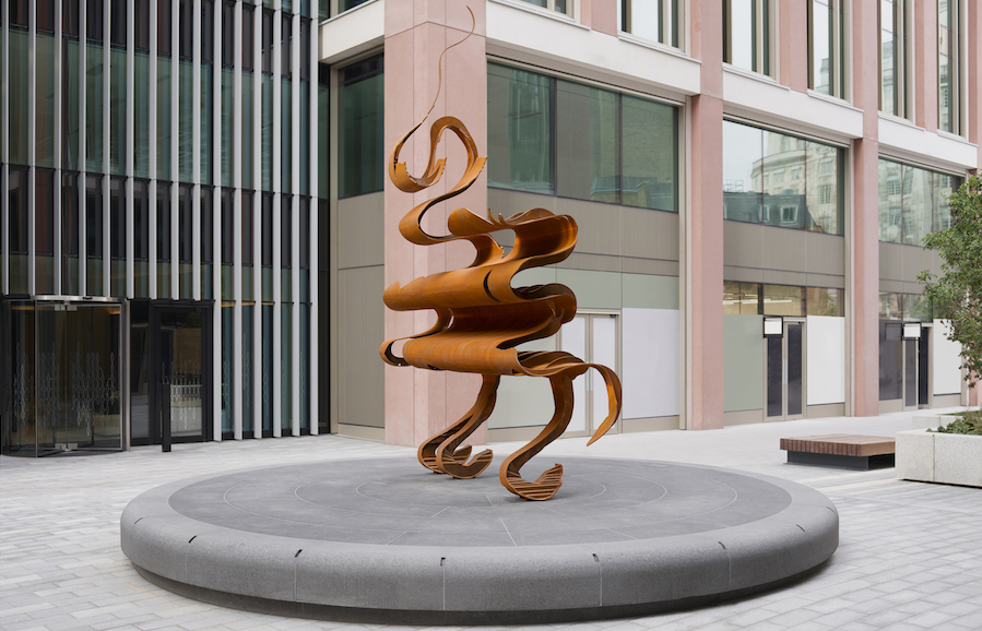
What comes together in ‘Here and There’?
The same line from Sterne – a thread between the sculptures – is combined with the 1818 figure of the Wanderer from Caspar David Friedrich’s famous painting. The sculpture is very close to the Albert Memorial, which in turn connects it to ‘Do It All’. You see ‘Here and There’ first from far down the road, when it looks like a classic monument of man on a plinth, but as you get closer it unravels into Sterne’s line. The Wanderer in the painting is looking out from the top of a mountain, evoking that mixture of beauty, and wonder and fear of the unknown. The painting has become attached to the philosophical idea of the sublime. It’s also strange because we only see back of the man. It’s about presence and distance, and I want to reorient viewer to include the park. There’s also a personal connection: my father has late stage Alzheimer’s, and I am increasingly dwelling on memories. I have exquisitely precious childhood memories of sailing model boats on Hyde Park Pond, when model boats seemed huge and the pond oceanic, so I think that’s where the Lilliputian play with scale comes from.
Nick Hornby: Here and There, 2023, © Nick Hornby Studios
‘Tristram Shandy’ is clearly important to you?
I can trace my practice back to structuralists and the epiphany of reading Saussure, Barthes and Derrida at art school. Tristram Shandy fits with that: it’s non-linear, full of distractions and anecdotes, the first book to make the visual layout of words on the page a component – really the start of modernism. And I love that line for being neither text nor image – not a word, and yet not a drawing.
Nick Hornby: render for Do It All, to be unveiled Sept 2023, © Nick Hornby Studios
Does ‘Do It All’ refer to DIY?
Yes: in 1988 the post-modern architect Ian Pollard designed the extraordinary Egyptian revival Homebase on Warwick Road. It was perfect example of postmodernism – a basic rectangular warehouse with a theatrical cladding. I grew up close by and as a child would regularly buy timber and electronics there. Like tea-drinking, I feel DIY is a classic British institution. Sadly, the building was knocked down but is now the site for a new development and my sculpture. The brief for this commission asked the artists to refer to one of the ten historical figures the new buildings were named after. I was rather shocked to see they were all Victorian men. By chance, Howard Carter, who discovered King Tutankhamun, was one of them, which brought me right back to the mock-Egyptian Homebase that I loved so much. In opposition to Prince Albert, I juxtaposed the incredible and iconic head of Nefertiti. The sculpture’s other component is the Albert Memorial: as a neo-Gothic Victorian monument it has a post-modern quality to it in as much as one period is imitating another. And it is problematic too, with inappropriate depictions from the corners of the Commonwealth around the outside. My goal is to shine a light on contrasting architectural styles and what lies behind them.
Nick Hornby: render for Do It All, to be unveiled Sept 2023, © Nick Hornby Studios
Finally, how are these works made?
The process is incredibly exacting and intrinsically linked to conceptual backbone of the series. Where these sculptures are pitting two contrary images against one another, the mode of fabrication has two distinct steps. The objects are designed parametrically (scripted in code and text), and the resulting 3D object is then digitally flattened into distorted 2D pieces. These pieces are laser-cut from sheet metal (corten or bronze) and then, under huge mechanical force, manipulated from their distortions back into their correct forms, where they are wielded together by hand. The laser cutting is rapid, with pin-point accuracy whereas the manipulation is a slow exertion of huge force. The sculptures are collaborative effort between myself, my engineers (The Structure Workshop) and the fabricator (Benson Sedgewick).
….And the materials?
All three are metallic – two are bronze and one is corten. Bronze is the traditional material for historic monuments and is loaded with history and associations. The equestrian work is in corten – ostensibly a “rusty steel”—which sets up a clearer material distance from the monument being referenced. Corten protects itself by developing a rust-surface, which becomes a protective barrier, like a scab – which is stronger than the original material. What appears to be self destructive in fact creates resilience – perhaps like a self-toppling statue – the fragility is the strength of this sculpture.
Top Photo: Power over others is Weakness disguised as Strength, 2023 – Corten Steel, 5 x 3.5 x 1.3m. Commissioned for Northacre Curated by @nativeartsadvisory. Designed in collaboration with @structure.workshop and fabricated by @bensonsedgwick.@nickhornbyartist.
Here and there, 2023 – Bronze 3.3 x 1.2 x 1.2m. Commissioned by Royal Borough of Kensington and Chelsea Council and the Victoria Road Area Residents’ Association with public art funding from One Kensington Road W8@nickhornbyartist. Designed in collaboration with @structure.workshop and cast by @bronzeagelondon. Curated and commissioned by Ann Elliott
Go to Nick Hornby’s website for more about his public sculptures and his work as a whole.
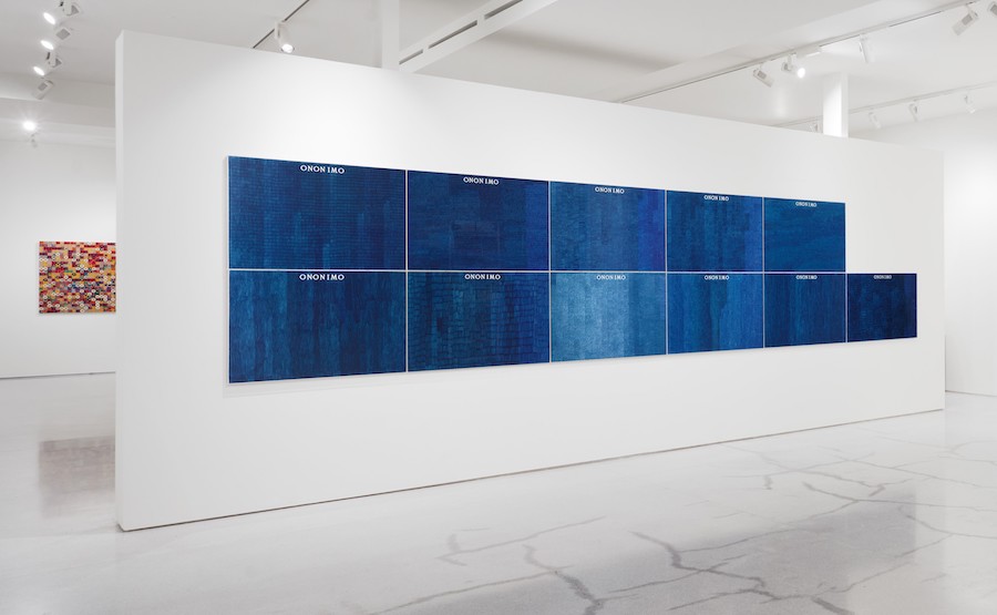
Mark Godfrey on Alighiero Boetti: Interview of the Month, July 2023 – Paul Carey-Kent
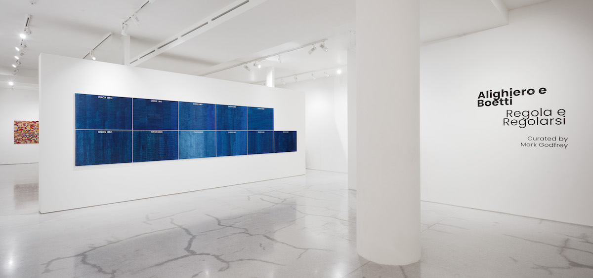
Anyone wanting to understand the innovative art of the Italian conceptualist Alighiero Boetti (1940-94) should head to Ben Brown Fine Arts / Claridge’s ArtSpace, where ‘Regola e Regolarsi’ gives them all they need. There are some 90 career-spanning works, informatively presented to demonstrate Boetti’s explorations of serial schemes and systems; his innovative approach to self-portraiture; his use of language; and his way of producing work with the assistance of unknown third parties. I spoke to Mark Godfrey, who curated the Tate’s seminal 2012 survey ‘Alighiero Boetti: Game Plan’ as well as this, the largest subsequent presentation of Boetti in London.
How have you put the show together?
The first room roughly coincides with the world Regola (‘Rules’), and considers the key concepts that Boetti worked with in the first eight years of his practice. It looks quite dry and conceptual, even though it contains a lot of his personal interests. The second part of the show has an explosion of colour and textures, so even though the rules still exist, there is an adjustment to them – Regolarsi means ‘adjustments’. The third space, viewable on request, contains a selection of drawings from his studio. Boetti is celebrated mostly for works operating through some sort of fabrication process. He was, though, the kind of artist who could never stop doing things with his own hands – but he felt that work was very much secret. He would make drawings by experimenting with such techniques as blowing ink, using stamps, or dipping elastic bands in paint and dropping them on sheets of paper. And had his own cosmology of animals which he drew – he liked animals with a great sense of energy and movement.
Alighiero Boetti: Regola e Regolarsi (Order and Disorder), 1978 – Embroidery, 23 x 24 cm
How does the word square ‘Regola e Regolarsi ’ illustrate Boetti’s approach?
When it came to embroidery he would write the phrases out and send the canvases off to the embroiderers, initially in Afghanistan, then in Peshawar, leaving the individual colour choices to the embroiderers. They were women commissioned by men, so there was an intermediary between Boetti and the embroiderers. That contrasts with most artists in the sixties: they would either have work fabricated by people that they visited a lot, or might have assistants in their studios – but Boetti set up a system of production whereby people unknown to him completed the work. He liked the idea that the final appearance of the work was as much down to their input as his. The union of order and disorder – Regola e Regolarsi – is something Boetti was obsessed by as a good way of making art. In the word square the order is in that it’s a 16 letter phrase that fits perfectly into a square, and in the fact that every letter gets the same amount of space. The disorder is in the way that the three words are run together, and also in the choice and combination of colours not being controlled by him.
There are several biro works. How do they operate?
Boetti’s biro drawings would be made by students – he worked with a woman in Rome who would commission someone to fill in the biro sheets, so they are anonymous. But they are also eponymous, because they give a sense of the individual draughtsperson’s sensibility. He made up the word ‘ononimo’ – combining the Italian for ‘anonymous’ and ‘eponymous’ – to capture this idea that something was both anonymous and individual. Boetti didn’t know – and didn’t want to know – the people who finished the work for him, and therefore something is left to chance. The show includes an eleven panel biro work using the word ‘ononimo’, which is very lush in its blue. It was made by eleven different people who each took their own approach to the task of filling out the paper. In some drawings, the vertical lines are compact, the horizontal bands are tidy and even and there is little overlap, so there is a consistency of colour. In other drawings, the lines are more dispersed and the bands wavy, or there is more overlap – and consequent darkening. Boetti was able to achieve a real beauty with blue biro which is quite remarkable, given it’s an office tool, really.
Was the number 11 important to Boetti?
Yes, very important: he was interested in pairs and twins – he actually photographed himself as a twin – and 11 was like a twin but with internal difference, as one of the ones has a value of one, and the other has a value of ten. That’s why there’s an eleven-part Ononimo work.
The biro works often feature commas. What role do they play?
What would be handed to the people making the biros was a blank sheet with stencilled letters and commas in Boetti’s specified font – their job was to fill in the paper but not go over those parts. He liked commas because they suggested movement rather than the stasis of a full stop, a place of pause but where something continues. They indicate the letters to be read from the alphabet above. You go back and forth between the alphabet and the commas, and that spells it out. It’s pretty simple, but the commas seem to float in space, so it’s more difficult than one would think to figure out the phrase. In ‘Mettere al Mondo il Mondo’ they spell out another rule of his that I like to translate as ‘putting the world into the world’ – that the artist takes things that are already in the world, and puts them back into the world. Where Yves Klein invented a particular kind of blue, Boetti just takes the available four colours of biros – he often uses readymade colours. Or he takes phrases, number sequences or office calendars and puts them back in the world.
Alighiero Boetti: La Metà e il Doppio, (Half and Double) 1974 – Ballpoint pen on paper in two parts, 70×200 cm
Here he took the number 1974 and divided it in half, so one side reads 987 in Italian. On the other side he doubled it, so that reads 3948. The numbers look random but in the middle of them is the date of the work, so it’s a way of taking something that exists at that point – the year it was made – and putting it back in the world.
Alighiero Boetti: Alternando da Uno a Cento e Vice versa (Alternating from One to a Hundred and Vice Versa), 1993 – Woven fabric 300 x 290 cm.
What’s the logic of these black and white patterns?
There’s an embroidery and a rug which come out of a kind of number game he invented, which is called ‘alternating from one to a hundred and vice versa’. It sounds dry but is actually very playful. He created a grid of 100 squares, with each square itself divided into 100 squares. In the top square you have one black and 99 white squares. In the next square that alternates to two white and 98 black, then three black and 97 white and so on… Once he’d invented this schema, he got other people to plot out the squares, and would make embroideries or rugs from their designs. Of all his schemas, this is probably the most expansive, as there are billions of ways to do it – as for example there are 100 options for where to put the first black square – and so the realisation becomes incredibly open. The chromatic and numeric schema provides an order, and the disorder lies in not knowing how it will be fulfilled.
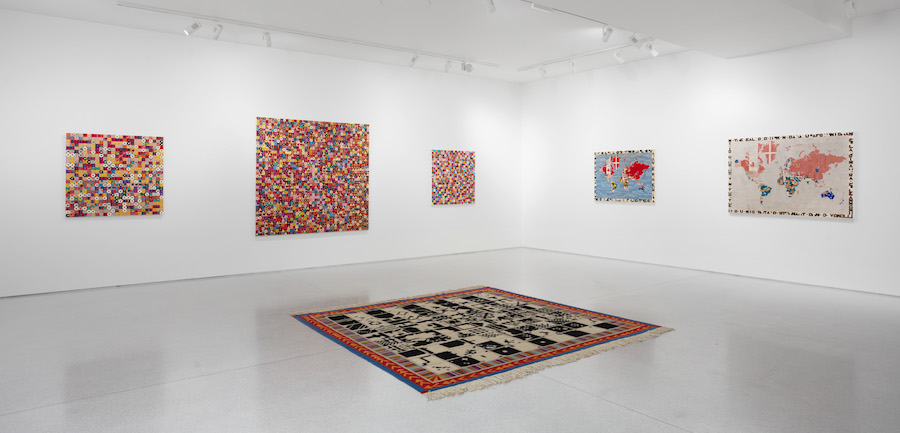
Alighiero Boetti: installation view. Including two Mappa
The Mappa might well be Boetti’s most famous works…
The idea of the world maps was to fill in the border of each country with the design of its flag. The difficulty was what to do when there was a civil war, and so a dispute about what the flag should be. In those instances – a beautiful idea – he kept the map as a blank, showing that there is a dispute, but undecided. Boetti saw the maps as particularly good examples of his principle of non-intervention. As he put it in 1974: ‘For me the embroidered Map couldn’t be more beautiful. I did nothing for this work, chose nothing myself, in the sense that: the world is shaped as it is, I did not draw it; the flags are what they are, I did not design them. In short, I created absolutely nothing.’
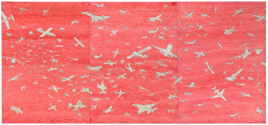
Alighiero Boetti Aerei (Planes), c. 1987 – Ballpoint pen on paper laid down on canvas 3 parts, 139 x 100 cm each
Why was he interested in planes?
Boetti had collected images of aeroplanes whenever they appeared in newspapers and magazines, and had made transfer drawings of them. In 1977 he teamed up with an illustrator called Guido Fuga, who made the composition – a triptych of the sky filled with aeroplanes, all flying in different directions and of various sizes. A lot were to do with the Cold War – they’re mostly American and Russian planes – so you could see it as a romantic image of concord instead of violence. Working with Fuga he made this arrangement – an example of order and disorder because the planes are in complete disorder, but there’s an order in that there are no crashes. Boetti liked Fuga’s drawing so much he photographed it and printed it at different scales, allowing him to make many aeroplane works from small to very large, some with watercolour, some with biro.
Alighiero e Boetti: Regola e Regolarsi is at Ben Brown Fine Arts, 12 & 52 Brook’s Mews London W1K 4DG, and Claridge’s ArtSpace, Brook’s Mews – to 31 August. Images courtesy of Ben Brown Fine Arts.
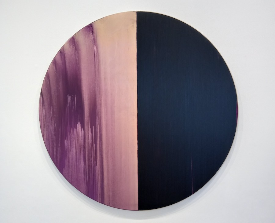
Callum Innes: Interview of the Month June 2023 – Paul Carey-Kent
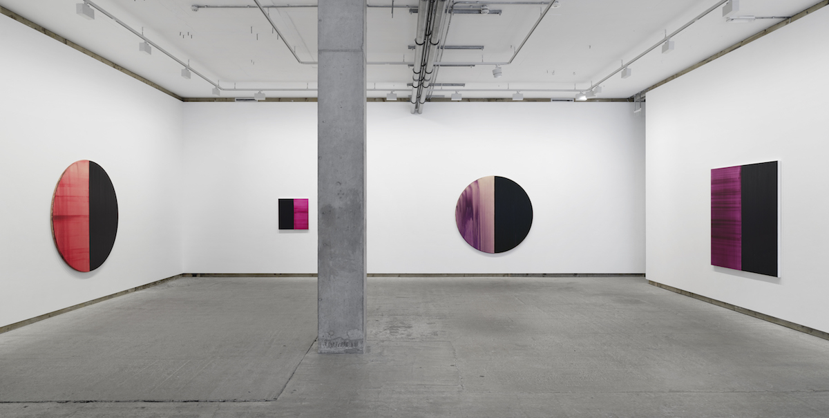
Over the past four decades, Callum Innes has worked in series, creating luminous abstractions which expose the fundamentals of painting: pigment, surface and space. His tenth show at Frith Street Gallery is the first to include new circular paintings alongside rectangular canvases. The two streams of work are made in the two studios between which Innes divides his time: Tondos on birch ply in his home city of Edinburgh, rectangular canvases in Oslo.
You’re known for the play between addition and removal in your work, in particular for using turpentine to ‘unpaint’ the canvas, leaving only vestigial traces of colour. How does that operate in, for example, ‘Exposed Painting Delft Blue / Violet Red Oxide’, 2019?
I’m reducing and adding repeatedly. What people don’t see is that there been a blue put down first, then a violet, then a red, then a green, then a blue again, and a black over it all, and it’s been gone into several times. The history of all that is there. For example, the black line you see running across horizontally halfway up on one side actually runs all the way across. This is the biggest size I’ve ever worked on – I can still just about go across in one stroke on a platform. If I couldn’t do that, it would be too big. And this work achieves a ‘watercolour effect’, which I’d always found difficult on canvas before. This is also the oldest painting in the show, and one I didn’t see for two years as it was in Edinburgh while I was in Oslo when Covid shut the borders.
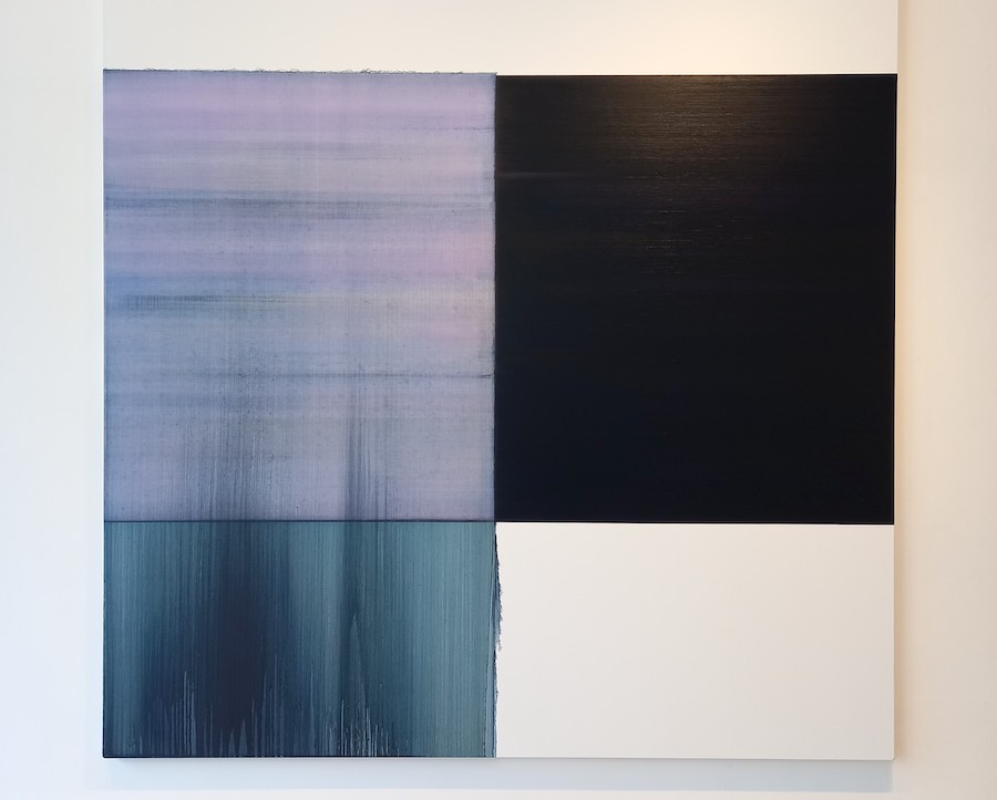
‘Exposed Painting Delft Blue / Violet Red Oxide’, 2019 – oil on canvas, 250 x 242 cm Photo: Paul Carey-Kent
You have consistently used black?
Yes, but in the early exposed paintings I would mix all the colours into the black and then reveal the colour. With these recent works I’ve been into the painting maybe five or six times, putting different colours on, exposing that side, drying off, evaporating. There’s much more addition than there used to be.
And the white of the canvas is equally important?
It is. When I have studio guests who are seeing my work for the first time, and they ask ‘how do you paint the white bit at the bottom there?’, then I know it’s working, that there’s spatial ambiguity. I like when the painting spirals from something very simple to something very complex. You don’t know what’s behind what, where’s the foreground. I like that idea of ‘where is space in the painting?’, and how you physically react to it.
‘Untitled Lamp Black / Deep Purple Dioxazine’, 2023 – Oil on Birch Ply, 180 cm. Photo: Paul Carey-Kent
What led you to the circular format?
The round form originally emerged when painting the end of a whiskey barrel for charity. I really enjoyed working on the hard surface of oak, later birch, and the fact it was wood, so I could see the grain and leave it coming through. After that I thought it would be quite nice to extend it, and to push the work forward through the Tondo.
Why do you make the Tondos in Edinburgh?
Because they’re quite heavy – about 70 kilos each, they’re backed with aluminium to prevent warping – and I have assistants there. I’ve been working on them for about two years, on and off, as I travel back and forward to and from Oslo. There I have a smaller studio and no one really to help me lift things around – so I carry on with the rectangular format on canvas. For me it works really well having two studios. I’ve discovered that it’s very helpful to make something in Edinburgh, not see it for three or four weeks, then come back and see it afresh. My paintings are all about landscape and light, and the studios have very different light: Edinburgh has a very beautiful north top light, Oslo has a hard sidelight – sometimes I have to cover the window to kill the light.
What difference is made by the change of surface?
It changes the physicality of my painting. It’s tough on wood. I knackered my wrist the first few weeks. And it has a very different grip. Canvas sits very comfortably, the birch ply has more physical presence. And they’re heavier metaphorically, as well as physically. I keep the bevel facing out, which expands the painting, so – depending on where you stand – one side can look larger than the other. I found it surprising, the first time I showed one, how physical they are.
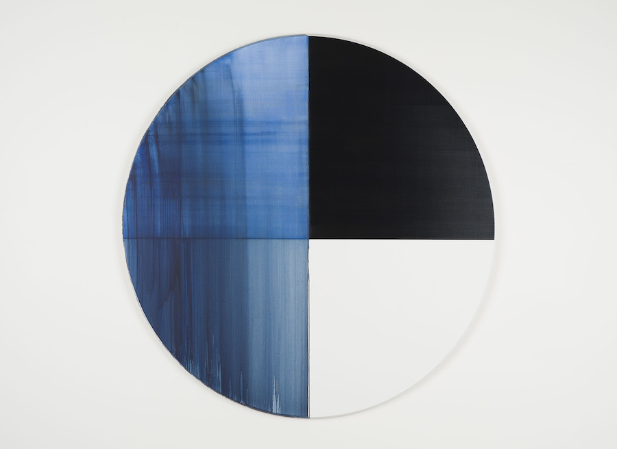
‘Exposed Painting Imperial Blue’, 2023 – Oil on Birch Ply, 180 cm. Courtesy the artist and Frith Street Gallery, London.
Do you hope to generate a spiritual dimension?
That’s for someone else to say. They are about light and landscape, how you look up and see that sky. The research for my practice is actually being outside and walking down the coast or through the countryside. But I won’t title them like that because that shuts it down a wee bit. They’re moments in time.
Do you draw on your walks?
If I’m out I’ll sit down and sketch the landscape, but I haven’t shown them. It something that’s always there. I think by sketching I am absorbing. I’m happiest walking – that’s my pleasure – and the colours are all there in the landscape. Also, every day in Oslo I take these beautiful fold-out books and try to make ten or more abstract drawings before I start, like a musician playing scales, and that’s really helped me. I have over 300 books now, but I’m not sure what I’ll do with them.
Do you have a skill you enjoy other than painting?
I’m an OK cook. I enjoy it, and it’s the same process as mixing paints: a bit of this, a bit of that, you don’t know what you’ll end up with.
Top Photo: Installation view, Callum Innes, Frith Street Gallery,Golden Square. Photo: Ben Westoby, Courtesy the artist and Frith Street Gallery, London
Callum Innes is at Frith Street Gallery, 17-18 Golden Square, London to 1 July. You can also see him on the gallery website, talking in his Edinburgh studio.
Sabine Moritz: Interview of the Month May 2023 – Paul Carey-Kent
Sabine Moritz was born in East Germany in 1969: her family managed to move west in 1985, but her early work often took its subjects from recollections of the Soviet era, and she remains engaged in exploring memory and its interpretations. Now she is presenting a series of new paintings across both Pilar Corrias’ London spaces. The gallery state that ‘Under the Skin’ (at Savile Row) and ‘Heart of Drought’ (at Eastcastle Street) focuses on ‘the juxtaposition of the external and internal world, setting the works within a larger continuum of an ever-immediate present… Moritz confronts the viewer with uncertainty, questioning whether memory can ever be an unmediated representation of the past’.
How did you arrive at your abstract style?
It begun in 2015 with a painting called ‘Heaven’. At the time I was working with photographs – in that case of Ukraine in 1947 – but I always made changes or erased parts of them. One painting imagined a child lying in the grass, looking up to heaven. The idea of what the child could have seen became abstract. Later I thought this could be the beginning of something. For a long time I couldn’t make the idea work, but after many attempts the abstract paintings started to look after themselves.
What is your process?
I start without a plan. As the painting develops it becomes its own law, then I have to respond to what is there. All my marks are made with brushes, but in a wide range of sizes, mostly wet-in-wet, but sometimes on dry colours so that there is variation across different areas. I may mix colours in advance, on the brush, or on the canvas – I’m not dogmatic about that. I work on several paintings at once, often in series, across many sessions. I’ll hang them, look at them, turn them around… I’ll think ‘It’s 30% ready’, ‘It’s 70 % ready’, ‘It’s 90% ready’… The last 5% often becomes tricky.
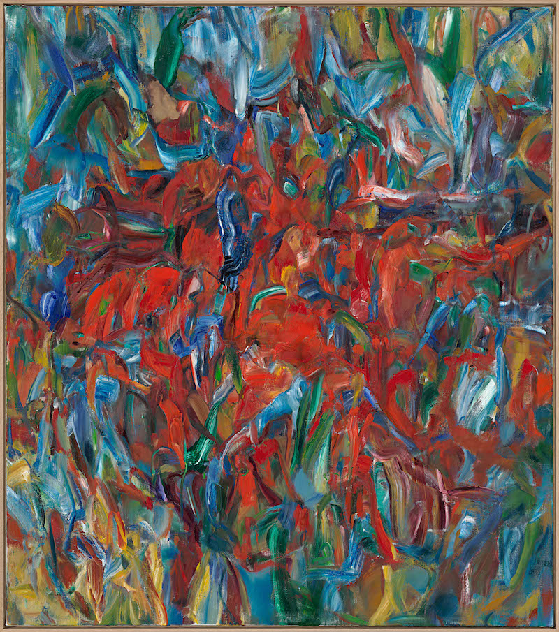
What makes the two halves of the show different? For example, if we look at ‘For the lovers V’ (from Savile Row, the ‘inside’ half) and ‘Heart of Drought II’ (from Eastcastle Street, the ‘outside’ half)?
I see what sort of answer you are seeking. But my abstracts are always abstract. There is nothing figurative hidden in them. While painting I have different things in my mind, so the paintings express sub-conscious feelings and thoughts. This feeds into the titles, which refer to the worlds outside and inside. Probably for the viewer the difference is apparent mainly in the narrative of titles. My memories and emotions are involved, and in the broadest sense I associate some paintings with the inner world and some with the outer world.
Were the paintings named to match the concept?
No, the idea of the division came quite late, when I already had the paintings and the titles and saw how they could fit together.
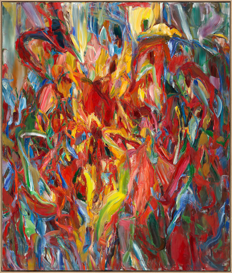
You also cite some specific inspirations for this body of work?
To give a few examples, alongside a multitude of unconscious influences: the Titian exhibition “Love, Desire, Death” at the National Gallery in 2020-21; a documentary about the explorer Magellan; my strolls; looking out the window; and, regrettably, also the daily news.
Is ‘Meeting’ the only figurative work in the two shows?
Yes, I used to paint mostly figuratively until a few years ago, but now I have made just one other still life and two landscapes. It requires a different mind-set to make figurative paintings. I did wonder at one point about the possibility of having a figurative-abstract split across the two galleries, but in the end included just this one, from the Vanitas tradition, but with a humorous title. I thought it fitted.
It’s as if the skulls are talking to each other, but they can’t?
Yes, but also we are not alone, we all have the same fortune ahead of us.
Is the ‘Heart of Drought’ the negative half of the show?
No, there is positive and negative in everything. Negatives are part of our lives, we can’t work without our shadow. I try to give you more, so you can link negatives to positives, such as in the painting Rain III (2022) downstairs at Eastcastle Street.
Is there a suggestion of flowers or people in your abstract language?
No. People often see flowers, but I have painted and drawn a lot of flowers, so that’s how I can say strictly: no, never flowers. Maybe you can sometimes sense the energy of writhing figures, for example in Artemis and Actaeon, which was inspired by Titian’s rendition of the same subject in which the goddess Artemis turns Actaeon into a deer upon him seeing her naked, only for him to then be devoured by his hounds. Once a person said to me ‘I see a duck’. Well, that was his choice! I prefer them not to see a duck, of course, but I like people to be free to make their own associations, to let them drift into their own ideas about life…
But if you yourself saw a duck, you would change it?
Oh yes!
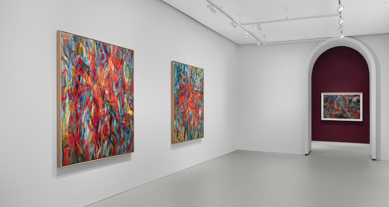
It looks as if you have thought carefully about the background colours, with both spaces split between a greenish grey and darker reds?
I like to experiment with the wall colours. My idea was to have a light grey that no one should notice, then dark walls to change the character of the space and make it more atmospheric. And at Savile Row I felt the wooden and the stone floor gave too much information, so I asked for that to be covered, making the two spaces more similar.
Sabine Moritz: ‘Under the Skin’ is on view at Pilar Corrias, Savile Row: 27 April—17 June 2023. ‘Heart of Drought’ is on view at Pilar Corrias, Eastcastle Street: 27 April—3 June 2023.
Carey Young: Interview of the Month, April 2023 – Paul Carey-Kent
Carey Young explores systems of power and gender equality in her solo show at Modern Art Oxford. ‘Palais de Justice’, 2017, is a surreptitiously-filmed view of the operation of courts in Brussels, edited to give the impression that the legal system is run by women. ‘The Vision Machine’, 2020, applies a parallel thought experiment by concentrating on the female workers only in a Japanese lens-manufacturing factory. And ‘Appearance’, 2023, is a silent ‘filmic portrait’ featuring 15 female judges. All three films, says Young, try to reverse ‘the male gaze’ by playing with some idea of a female gaze. And all three act as ‘thought experiments’: speculative fictions which turn documentary footage into the imagined future of a female world.
Carey Young: still from Appearance, 2023. © Carey Young. Courtesy of the artist and Paula Cooper Gallery, New York
What themes are you tackling in the show?
There are two main themes. The first is around my engagement – for over twenty years now – with law. The show includes many new pieces and traces a line through my law-based work … I’m interested in law as artistic medium and as a form of power in society. What is law? What are its aesthetics? Who gets to administer it? What are law’s performances, rituals, languages, materiality and what is its effect on us? These are questions which fascinate me, and I keep going back to them.
The other theme, equally pressing to me but more recently as a particular interest, is in women, and especially women’s relationship to cameras and to the regimes of cinema and photography, including in the social media era. I’m thinking about power in that sense, too.
Those themes relate to each other in different ways throughout the show. I wanted to create a triangular relationship between the overlapping themes of ‘Palais de Justice’, ‘The Vision Machine’, and ‘Appearance’. Then I added photographic and text works in the central space, which push the themes in other related directions. I wanted those works to have a sense of realism. They relate to contracts, prisons, land, Brexit – things we can recognise as being about law and the body, borders, transitions, something being at stake.
What proportion of court judges in Britain are women?
I only have figures for England and Wales, as that is one jurisdiction, and Scotland is another. At the moment, 35% are female, which is 10% more than a decade ago. In proportional terms, most women judges work in the lower courts, and only one on the highest court, the UK Supreme Court, so that is another imbalance. There also needs to be much more done to recruit more ethnically diverse judges, who account for 4% of court judges (and 9% if we also count male judges), as of 2022 figures, but are 18% of the UK population. And only 1% of judges are from black backgrounds – a figure that has not changed since 2014 (although some of the UK’s most senior non-white judges feature in Appearance). Efforts are being made to diversify the judiciary further but it is a slow process.
Appearance features judges who are diverse in age, seniority and ethnicity. I wanted to defy the stereotype – which is backed up by ongoing statistics – that judges are older white men. Here, the judges are a wide mix of women, from the youngest ever female judge (even six years on, she is only 37), to judges of various non-white ethnicities, to the UK’s only trans female judge, or the only female judge on the UK’s Supreme Court. Many went to state school. They are all trailblazers in one way or another, showing a future of the judiciary that better represents the UK population.
Carey Young: still from Appearance, 2023. © Carey Young. Courtesy the artist and Paula Cooper Gallery, New York
What guidance did you give the judges in ‘Appearance’?
They appear as they wish: all are wearing their real robes and their choice of shoes and jewellery; they could choose their make-up and how their hair was done. They could act as they wanted to on camera, although I did ask them to sit in a judge’s chair placed in the centre of the film studio, and if they were going to look at the camera, they should make eye contact with it. It wasn’t at all like acting – they could have any expression on their face, as they wished – they were conveying their own feelings. This resulted in a wide variety of expressions, from cool toughness to warmth, benevolence or self-consciousness. They remain enigmatic, though because they don’t speak. Most said the experience reminded them of being in court because they were surrounded by crew all facing them with rapt attention, which led to several of them replaying trials in their heads, which is visually very interesting on camera because the judges change expression throughout their takes. One of them – a very senior judge – decided to bow to the camera as she entered and exited the shot because she would bow to the court. It’s very surprising because she wears a gold-encrusted robe and is clearly very powerful, but those bows reverse that power, just for a moment.
But you did ask them not to wear wigs?
I wanted the work to be international, and judges outside the UK and Commonwealth don’t wear wigs. Also, I think the wigs look anachronistic. The judges defend them as a disguise: because they are vulnerable to possible retribution when they leave court, they cherish the anonymity provided by wig and robe. The piece hovers between this idea of the official identity of the judge and their personal aspects of self-expression – their subjectivity – which you see through close-ups: shoes, eyes, hair, earrings, glasses, even bat-shaped cufflinks. This conveys their individuality and humanity, as well as differences between them. The judges were happy with the idea that Appearance is about them as people as well as in their roles. I hope viewers will have the strange experience of feeling, as I did, slightly guilty watching the footage, as if they are facing each judge in court. That’s why I made it a single-screen work. By giving such a direct, frontal encounter with the judiciary, the work effectively puts the viewer ‘in the dock’. Along with Velasquez’ Pope Innocent X, Warhol’s ‘Screen Tests’ were an initial inspiration. It was an added extra – though I only found out later – that Warhol was originally inspired by the ‘Most Wanted’ ads of the New York Police Dept.
Carey Young: still from Appearance, 2023. © Carey Young. Courtesy of the artist and Paula Cooper Gallery, New York
The title suggests that appearance matters?
Judges rely on their robes to help them seem an anonymous and objective manifestation of ‘the law’. The title also relates to the idea – which persists, in which we’re indoctrinated – of judging women on their appearance. And it also refers to appearing – being formally summoned in person – at court. The appearance of law fascinates me for what it says about what law is. How a courtroom looks, sounds or even smells is very evocative. Such sensory experiences are often what we’ll remember most about a place. The aesthetics of law go far beyond black type on white paper. The more we examine this, the more we can understand the aesthetic vocabulary of how the state manifests its power.
How does the law need to improve?
The law claims to be neutral, but it really isn’t, especially in how it’s applied and in terms of who has power in it currently. In terms of the tenets the law holds dear, the scales of justice are balanced, justice is blind, and we’re all supposedly equal under the law – but we know that isn’t the case. Most people can’t afford legal representation; women are not believed by police or when they testify in court; racial bias abounds in policing and the legal system; and most judges are privileged older white men who don’t understand many societal issues. So, the quality of judging will be open to question until this is fully addressed. And legal language is so abstruse people can’t understand it without a lawyer, who of course, is unaffordable… So, part of my interest in law is a political one, of helping people to engage with and understand it as a system and a phenomenon and to emphasise that it belongs to us. We could change it. And we need to understand its power – it remains one of the few options to rein in corporate power.
What do the judges make of ‘Appearance’?
They trusted me and were happy not to see the footage before the work was exhibited. Some came to the exhibition opening. So far, they’ve been thrilled by all the sections that aren’t about them – and steel themselves for seeing themselves on screen, like most of us would. I’m looking forward to more discussions with them, such as at the public symposium at Modern Art Oxford on May 19th, at which a panel of participating judges will discuss the work with me.
Carey Young: still from The Vision Machine, 2020. © Carey Young. Courtesy of the artist and Paula Cooper Gallery, New York
Your speculative fiction in ‘The Vision Machine’ is that women are running the factory. How close is that to the true position?
There were a lot of male workers at the factory. I don’t think women have power positions in Japanese factories. SIGMA is a global corporation, but in essence, it is a family firm run by a man who inherited it from his father. But I don’t think that matters: I’m using the factory as a metaphor to talk about visual culture. What if women made tools that propagated an idea of female-centric visuality? What might that be?
So what the women are making is critical?
Yes… they are making lenses for photographic or cinema cameras, and I shot the piece with lenses made by those workers, so it’s a self-reflexive work about the act of making films. We also see the women testing lenses, so it’s about the means of production – in a Marxist sense – to make tools for vision. It’s also about paying respect to women as artists and as artisans: beyond the fact that women artists have long been sidelined or written out of art histories, the artistry and technical skill of women is another thing that’s completely side-lined. And that extends to how cameras and lenses are sold – the number of times I’ve been in a camera shop and the sales assistants have assumed that I must be an amateur because I’m a woman! That did help me when I was making ‘Palais de Justice’, though: I wasn’t authorised to shoot the footage, but I tended to get away with it because nobody thought I was a serious filmmaker – or even a filmmaker at all. They took me to be an assistant for someone else – presumably a male director. Being female was a kind of disguise.
Is there anything about you that people tend to find surprising?
I’m from that original house music generation and never stopped being into it, especially deep house and mellow techno. I don’t actually listen to anything else, and buy a lot of tracks online. In another life, I would have been a DJ.
Top Photo: Carey Young: still from Palais de Justice, 2017. © Carey Young. Courtesy of the artist and Paula Cooper Gallery, New York
Carey Young’s show ‘Appearance’ is at Modern Art Oxford to 2 July.
Rea
Haroon
Mirza: Interview of the Month, February 2023 – Paul Carey-Kent
Haroon
Mirza’s exhibition of new work consists of installations that play ingeniously
between sound, light and electric current in the manner that has gained him
international acclaim. Here, a constellation of works is thematically connected
around the so-called ‘Holy’ or ‘Divine’ frequency of 111Hz, which provides a
sonic bathing experience that permeates the gallery spaces. They include
explorations of drug-induced shamanic practices; a series of Solar
Cell Circuit Compositions that act as scripts to the film; and
glass chambers housing an ant colony
and a fungal bed of organic matter, powered by halogen lamps that provide heat
and light - not only to ensure the ecosystem’s survival but also to illuminate
solar panels that activate sounds created by the ants’ movements. This rich
content provided plenty for me to ask about…

The show is called ‘|||’, which could be Roman numerals or an
indication of phasing – I like that ambiguity - but refers primarily to 111Hertz
(Hz), an audio frequency I have been fascinated by for some years. Studies have
shown that exposing people to light and sound in the range 110-112Hz can bring
about strange neurological effects, most specifically reversing the functions
between the left and right sides of the brain. I commissioned a bespoke Shruti
box, tuned to 111Hz, and chose a Tibetan singing bowl, also at 111Hz, that
together create a quasi-therapeutic sound that reverberates throughout the
exhibition.
So people
could be altered by the resonance as well as by the art?
Yes, though curiously it is quite a normal frequency. Standard
western musical notation centres on 440Hz as middle A, meaning that 110Hz is
two octaves down the scale and therefore only slightly different and within the
human voice range, although it’s typically harder for a woman’s voice to extend
that low.

Haroon Mirza: Exhibition
view of ‘The Ancients call it Ataraxia’, 2023 -
Photovoltaic panels, aluminium profile, bespoke media device,
electronics, DMX dimmer pack, wire, fixings, bespoke loudspeakers, bongo drums,
hand crafted drum, Yew tree branch, floodlights, solenoid device - dimensions variable,
© Haroon Mirza, Courtesy Lisson Gallery
In the main room you present ‘The Ancients call it Ataraxia’. That includes a dual
video work in collaboration with filmmaker Helga Dóróthea Fannon in which
mushrooms are collected and a tea ceremony is conducted. What are we seeing and
hearing?
The installation has two films running simultaneously, each 15
minutes long, acting as both a meditation and a trip. You can switch between
them, although I like the idea of people watching one screen at a time while
maintaining the presence of the other. Solar panels – which also feature in the
films - are triggered periodically by the soundtrack, and that in turn sets off
an automated shamanic drum. ‘Ataraxia’ is a kind of un-word; it means ‘calming
of the mind’ – rather like meditation – but is something we don’t experience
much anymore, at least not in normal western life. ‘The Ancients call it’
brings in the history of shamans summoning spirits. The films are based on true
life stories, including the murder of a shaman in the Amazonian basin, whose
character is combined with another type of shaman in Siberia. There they work
with amanita
muscaria mushrooms, the equivalent to the better-known
Amazonian tradition of using ayahuasca.
It’s not the classic psychedelic magic mushroom psylocibin - linked to
hallucinations - but the deliriant
strain also known as Fly Agaric, which is associated with toxicity, dizziness,
loss of coordination and the stimulation of dreams. I recently tried
micro-dosing it and it induced vivid dreams. The Siberians often drink it
boiled as tea, as seen in the tea ceremony captured in the film. The more extreme
method is via reindeer, who eat the mushrooms as part of their diet – the
mushroom has two components: muscimol and ibotenic acid
– the muscimol is the active ingredient and the acid is toxic. But when it
passes through the animal’s body it is purified, so drinking reindeer urine is
also a known practice. But I haven’t tried that!
Do you take a
lot of drugs, rainbow urine aside?
People often assume that I do, but no – I’m mostly just hanging
out with my kids!

Haroon Mirza ‘Light Work xlviii’, 2023 - COB LED tape, wire,
aluminium, copper tape, PWM device - dimensions Variable, © Haroon Mirza,
Courtesy Lisson Gallery
The second
downstairs space contains two works inspired by your trip to the Arctic. Why is
‘Light Work xlviii’ on the floor?
I showed similar works on the wall until recently, but the latest
in LED lighting works just as well on the floor, and I like the way light is
then cast onto the ceiling. The colours are set up to create white light: combining
six parts red, two parts green, one part blue. You can see this on the ceiling,
especially in the evening when it gets dark. The LEDs also oscillate at a frequency
of 111Hz. The technology for LED lights is to scintillate light, and one
frequency is as good as another for that – 111Hz is quite a slow frequency, a
designer would probably use a higher one. There is also a nod to the
minimalists here – LeWitt, Judd and in particular Fred Sandback; in my first
show here at Lisson I recreated a Sandback piece in light. So the work is about
light and formalism, and how in the Arctic Circle light plays such an important
role in the culture, whether it’s 24 hour light in the summer or the different
types of Aurora in the winter.

Haroon Mirza: ‘After the Arctic Circle’, 2023 - Glacial erratic
stone, polyurethane resin, silicone, CPB LED tape, twisted electrical cables,
photovoltaic panel, pigment, copper tape, aluminium tape - dimensions variable,
© Haroon Mirza, Courtesy Lisson Gallery
What about
the big rock tethered to a solar panel in ‘After the Arctic Circle’?
This is more about nature and the landscape. It’s a glacial
erratic rock that travelled to Wales at some stage, so it’s a found object, which
has moss on and an ammonite fossil visible. My intervention is to carve into
the stone and put a light in there. What looks like string on the solar panel
is actually electric cable. The panel provides the energy for the light on the
rock, so if you stand in front of it, the light dims. The surface of the panel
acts as an abstract painting, but references the Aurora lights. There are also
parallels to be drawn with the Sisyphus myth.

Haroon Mirza: ‘Illuminated Amanita Harvest (Solar Cell
Circuit Composition 22)’, 2023 - Solar cells, Polyurethane resin, copper tape,
electrical wire, magnet wire, LED tape, miniature painting by Brishna Amin
Khan, cables on glass, anodised aluminium - 147 x 147 x 8 cm, © Haroon Mirza, Courtesy Lisson Gallery
You’re showing
two miniature paintings. How do they fit in?
They are – very elaborate - story boards for the film: I
commission paintings from Brishna Amin Khan, a miniaturist based in Lahore, by
giving her the description of the scene to paint in her style. Then I
illuminate them, not with the traditional gold leaf, but by using copper tape and
solar cells in a circle to make a sort of halo. The energy is picked up from
the lighting in the room. The solar cells are placed on the glass using resin,
which seeps out and creates an aesthetic of its own.

Installation detail from ‘For(a)micarium’, 2023, © Haroon
Mirza, Courtesy Lisson Gallery
‘For(a)micarium’
centres on leafcutter ants. What are they doing?
They’re tending a fungus garden – the ants don’t actually eat the
leaves: they take them back to the garden to feed the fungus, which they do
eat. They are the only non-human farmers. I also supply sugar syrup, which is
like crack to them. Ants are very interesting creatures: researchers talk about
how an ant colony is a super-organism rather than being made up of individuals.
So there’s always this tension between the whole and the individual, which you
can read across to human societies, too. Ants are very simple, with a tiny
amount of neurons, but they do incredibly complex things. When people talk
about the signs of consciousness emerging, they refer to the emergence of
agriculture and the beliefs associated to burying the dead. The ants have a separate
place to which they carry their dead, and they’ve been farming for longer than
us…
There’s sound
and light, too. How does the set up operate?
As the ants pass a sensor – which they must cross to reach their
food - they activate sounds in the musical composition. The lights come on and
then go off as required to regulate the heat: they act like an artificial sun.
The fungus needs a humid 20-27 degrees to flourish. And the sound is influenced
by how much light is needed to heat the fungus. Also incorporated is my
personal collection of psychedelic cacti – San Pedro and Peyote.
Haroon
Mirza’s ‘|||’ runs 24 February – 8 April 2023 at the Lisson Gallery.
An associated NFT called ‘Solstice Star’ is available at solsticestar.xyz
Jonathan Baldock: Interview of the Month, February 2023 – Paul Carey-Kent

Jonathan Baldock works across sculpture, installation and performance. He has a way with unexpected faces – as in his long-running series of ceramic masks – and it’s plants that take them on in his solo show ‘we are flowers of one garden’. The installation is humorous, theatrical and camp but also macabre, simultaneously considering change, ageing, grief and loss in the context of his personal history and the history of working-class culture.
What’s with the pinstripe coat?
I thought I’d fit in with the business style of Mayfair without going so far as wearing a suit…
We enter a garden of sorts?
Yes, the front space is set up like a garden, with vase pieces like figures, flowers like faces, hands like flowers…
What’s the show about?
My Mum and her garden. I was sitting in my Mum’s garden, and though I’ve always told people I don’t come from an artistic background, I suddenly thought, ‘I do!’ – seeing the garden as an outpouring of creativity. My Mum’s a really keen gardener, and that her outlet – there’s pride, yes, but also something deeply personal and spiritual about it. And I thought I wanted to make an exhibition about this. We moved house a lot, but every time Mum made the most of the garden. The garden she has now isn’t big – maybe 10m x 10m – but she really packs the plants in, so the borders have taken over the centre.
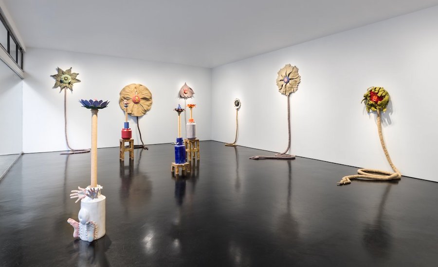
Is it a rather personal show?
It’s more personal than any show I’ve done, so I can’t separate myself from it in the way I usually can. My Mum is directly present – this is the first time I’ve cast a body other than my own. There is something about me moving away from the countryside to London, how I look to nature for comfort now. And flowers are a metaphor for life – they need nurturing and looking after – so the mirroring with the relationship of gardener to a parent seemed really beautiful. And the year making the show allowed me to spend time with my Mum. I hope I’m not candy-coating it, but it absolutely comes from a place of love – Mum’s my number one. And I hope that’s reflected in the work. Any relationship has its ups and downs, but I do think my Mum did her best for me and I adore her for that. And as you get older, you start seeing your parents in yourself.
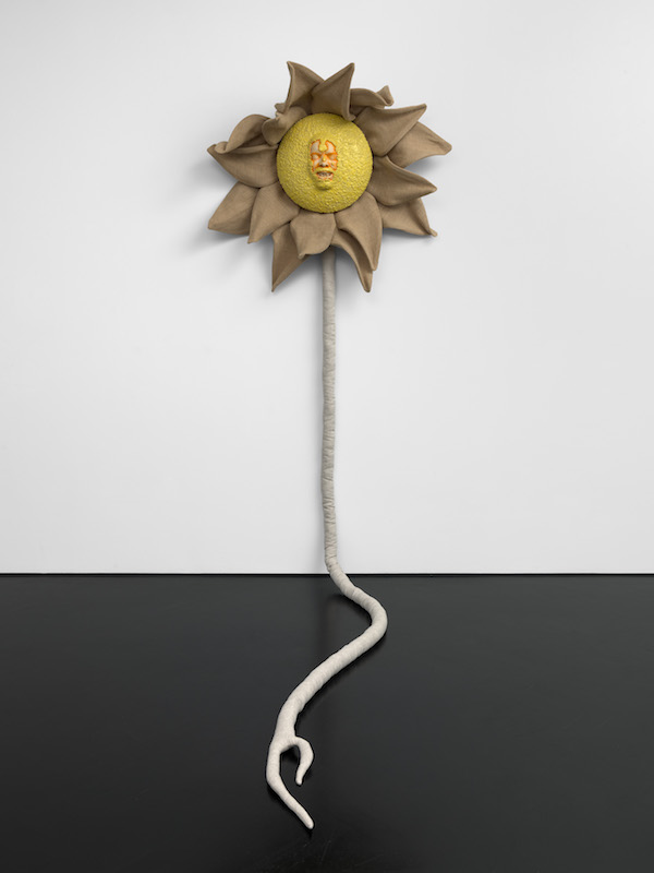
Do the flowers represent you and your mother?
No, I look at them as their own beings, even though the Mother Flower is the only work which doesn’t have any casts from either my body or my mother. That represents the interconnectedness of nature. The roots are about connectedness and the mother tree philosophy. It’s about how we understand the natural world, how we used to think we were above it but now we realise we’re all just a part of it. ‘Mother Flower’ is covered with European folk emblems. There’s a Hungarian flower motif with a razor blade look. The nose is from Germany, the eyebrows are Polish, and the eyes are from a Dutch shape. I love folk motifs as they tell of people who worked closely with nature, and they probably go back further than we know, as history isn’t written by the poor. And they seem to have a common aesthetic, so they work well together.
Why do some flowers have roots and some not?
The sculptures have roots, though not all are displayed with them. Buy a flower and you get a root free! I wanted to vary it so that some have that rat’s tail look, but others are more floating and solar. I see the roots as mandrakes – as having a limb-like quality.
What materials have you used?
Everything you see is either from plants or else is clay – the earth they grow in. So you have hessian, linen, and felt. I also wanted some scent, so there are dried flowers in the mouths: rose, lavender, hibiscus, and chamomile. I’ve used applique – I love that because it’s an embroidery technique rooted in the history of working people as a way to put scraps of fabric together to make clothes and decorations. And the trace of the hand in the stitch is important to me, like handwriting or a trace of the body.
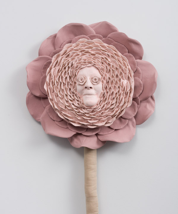
Some of the colours are more bodily than floral?
Totally. I wanted to present them as fleshy, and I’ve reversed the colours so that the petals are always drained of colour and the centre is bright.
What’s the soundtrack?
My mother’s family were hop pickers. That’s a way of life that doesn’t really exist anymore. And hops also have flowers. You can hear samples from my granddad – who worked in the hop fields – playing the accordion and my mother and I singing the Dolly Parton song ‘Wildflowers’, the lyrics of which provide the titles for all the works. Dolly is an artist I love, and apart from being a beautiful song about flowers, ‘Wildflowers’ is essentially a song about being free to be yourself. From a queer perspective, that was always going to resonate.
‘Just a wild mountain rose’ is cast from your mother’s face?
Yes. Casting faces relates to death masks – but this is about keeping her forever. It also makes her a little psychedelic, blissed out. And the use of linen adds a theatrical element, as in stage backdrops.
‘Wildflowers don’t care where they grow’, is you?
Me with chamomiles in my mouth.
Are the flowers particular species?
No, I looked at lots of flowers, but these are all imaginary hybrids of their features. Some have a folk motif; some are more real.
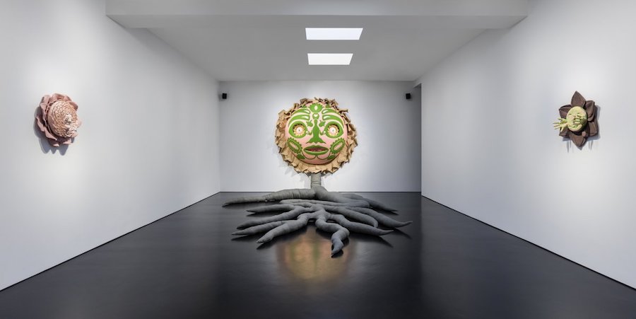
Installation view (back room): Courtesy of the artist and Stephen Friedman Gallery, London. Photo by Mark Blower.
They strike me as more active than most flowers in art?
Yes, I like the idea that the flowers are powerful beings in their own right. They could do something, could carry emotions, and are a little bit… scary! Perhaps they could eat you…
And extrovert – like you?
People think I’m a gregarious and outgoing extrovert, but that’s not really true; it’s performative. And that’s in the work – it’s like a mask – there’s performativity. I’m an introverted extrovert, constantly trying to communicate what it is to be human.
The works look as if they were fun to make?
Totally. A lot of this is channelling joy, and as a maker, I love making; that’s my favourite part of being an artist.
What did your mother make of the show?
I am very happy and relieved to report that she loved it!
Top Photo: Jonathan Baldock with ‘Mother Flower’ 2022, photo © Paul Carey-Kent Artlyst 2023
Jonathan Baldock’s ‘we are flowers of one garden’ runs at Stephen Friedman Gallery until 25 February 2023.
Jonny Briggs: Interview of the Month, January 2023

Jonny Briggs combines photography, performance, and sculpture to explore issues around childhood and identity. Archival family portraits trigger his entry into a complex and painful past, breaking apart rigid structures and conventions to create space for new perspectives. I talked to him about some of the twenty works in his current show at Kristin Hjellegjerde’s London Bridge space, which features many ingenious means of suggesting psychological states through the forms of presentation.
How would you describe your work as a whole?
I look at the constructed reality of the family through the constructed reality of photography. I’ve felt personal resistance to the medium of photography, and restricted within the requirements of the family photograph, of having to perform in it in a particular way. I’ve found that dishonest, and rebelled against it in the work. I’ve noticed that the more works I make, the more they start to feel like clues.
Clues to what?
To the back story, or the past, or the patterns which recur in the work as a whole once I look back across it. I’ve found one recurring theme is confinement and restriction. That used to take place within the image, but now I’ve found the presentation and framing can achieve it.
Is that your ear at the exhibition entrance?
Yes! I made this on a residency at a glass lab in Stroud. It took hundreds of attempts – there were fleets of failed ears. It’s frosted glass, sand-blasted to create blur. I cast my ear in alginate, made a plaster positive, made a silicon mould, cast that in wax, corrected that and filled in holes, then made it out of plaster, then cast it in glass from there. I nearly gave up! I call it ‘Window’ as it’s surveilling the space. I like the precarity of it resting on just two nails, and think of the fragility of glass clashing with the hammer used to put it up.
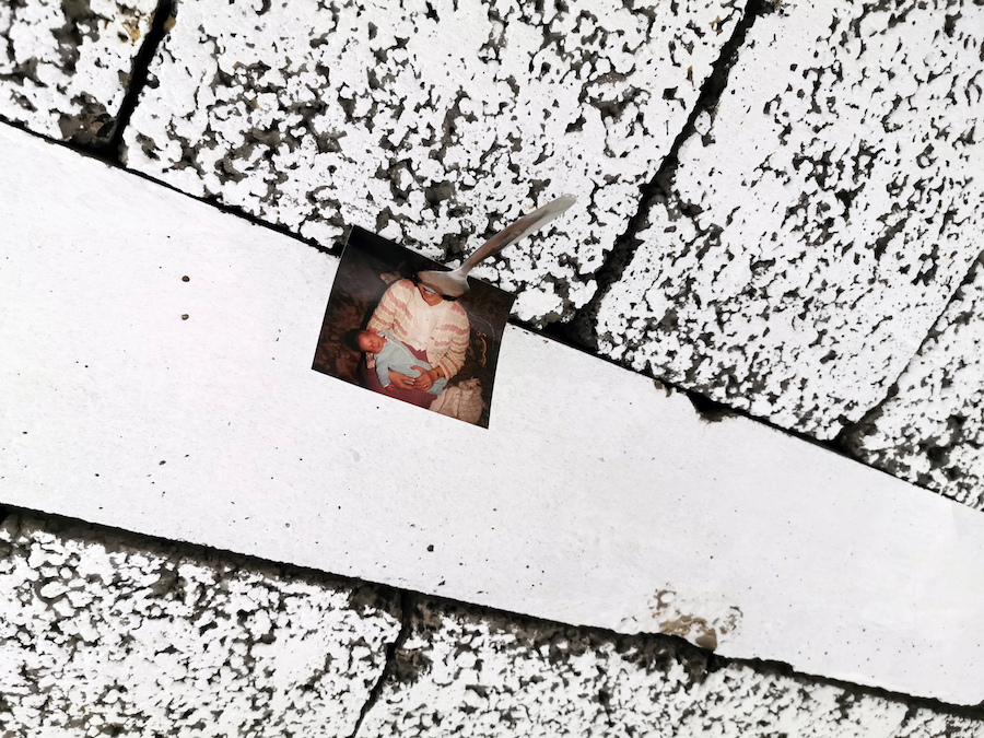
Smile (Spoon Holding Photograph of Artist’s Mother to Ceiling), 2022 – Mixed Media, Photograph, 8 X 10 cm – Photo Courtesy Jonny Briggs / Kristin Hjellegjerde Gallery
And what’s that up there?
That’s ‘Smile’: a teaspoon holds a photograph of my mother – holding me as a baby – to the ceiling. I like the thought that most people won’t spot it! The spoon follows the curve of my mother’s smile. It’s an object that helps us to provide for someone or be provided for, and I think of this connection between mother and baby through the mouth, and of the mouth as a site for both speaking and eating – but the spoon gags. The breeze blocks are rather delicious looking. There’s no glue: I found a spot with a gap that would hold the spoon, and there was only this one place.
Photo-Labyrinth 2 (Artist Holding Photograph of their Grandmother to their Own Eye), 2022 – Photo Courtesy Jonny Briggs / Kristin Hjellegjerde Gallery
The ‘framing’, widely defined, seems to take up 90% of the work in the ‘Labyrinths’ and the oddly-shaped photographic image 10%. What’s going on there?
Reading from the outside you see a black frame, a white window mount, the black backing board, the white border around the photo (which is mounted on aluminium), all around the colour photograph of me holding up (and almost hidden by) a black and white photograph of my paternal grandmother – with the eyes cut out, through which you can see my eye. Almost like an attempt to see through her eyes, or maybe there’s an aspect of considering my place within the family or even my place in the world. And all those hypnotic corners generate a sensory-questioning Op Art experience.
I can see why you reference a labyrinth! What are you aiming to express?
My resistance to the frame comes from a childhood feeling of confinement in terms of gender, trying to find my place within the family and to live up to my father’s expectations. There’s something restrictive and formal about the aesthetics of the frames, something strict and rigid about their designs, with frames within frames within dead ends and mazes. I also think of the pinstripes of a formal suit, of restrictions I felt when I was younger, of social systems I felt confined within, and within the family the expectations of what a boy should be or do. The discovery of my sexuality had an aspect of learning to hide to survive – when it’s safe to show yourself, when on the other hand you should camouflage yourself. So hiding and the gaze runs through the work. In some works I cut into the frames to liberate the content, to disrupt the formality. And sometimes it’s as if the family photograph is being role-reversed.
Held (Photo Of Artist’s Paternal Grandmother Held To Wall By Frame), 2022 – Mixed Media – Photo Paul Carey-Kent
What’s happening in ‘Held’?
This is my paternal grandma, it’s a frame large enough to hold the image that holds the image to the wall.
So the frame is doing its job, but by an unusual means. Presumably it doesn’t actually penetrate the wall?
That’s for the viewer to decide. I love not knowing how something is done. And I love how often that’s a question in photography – what’s real, what’s not? That takes me back to how I felt as a child, not knowing what’s real and what’s not, like a magician’s trick. It’s as if it’s just been thrown. And I like how the glass reflects the other side of the head from some angles. Maybe there’s also an aspect of Pinocchio. And the mouth, again, is gagged.
Retrospect (Folded Photograph of Artist’s Paternal Grandfather), 2022 Photo Courtesy Jonny Briggs / Kristin Hjellegjerde Gallery
‘Retrospect’ is equally surprising…
I hope it looks casual, but then you see how fully it’s engineered. It’s important to me that it’s very precise and considered and sort of restricted. I wanted to encourage peeping up and around to see the image of my paternal grandad. The frame almost dipping its head feels anthropomorphised, as if it’s encountering shame, and I think of those expectations that my dad and granddad tried to fulfil, and that I couldn’t. So maybe this is asking where trauma comes from – have I inherited a susceptibility?
There is a certain violence in the show. Does that suggest the trauma, too?
I don’t feel like a violent person, but it is in the work, yes – a lot of cutting, pinning and restricting. I’ve been thinking of the monstrous, of the departure of the human form. Sometimes I identify with the monster as an outcast not accepted in the social group. I feel embraced in the art world and can express myself safely as a liberated monster, but what I’m making now still derives heavily from the challenges of my younger years – an attempt to work through my suffering, surrounding my relationship with my father, and silenced queer past. Now is the purge. I was terribly well behaved at school, but now I have the opportunity to rebel!
Top Photo: Jonny Briggs with ‘Window (ear in glass)’, 2022 – Photo Paul Carey-Kent
Richard Schur: Interview of the Month, December 2022
For two decades the Munich-based painter Richard Schur made rectangular compositions taking the grid to new levels of looseness and complexity. Those paintings generate emotions, suggest place, construct architectural effects, seduce and play with us – but only insofar as those qualities emerge from his central concern: the primacy of colour and what colour evokes. Lately he has moved towards shaped paintings incorporating curves, but they remain intuitively driven by colour. I spoke to him at his new solo show in Kristin Hjellegjerde‘s London Bridge space.
What led you to change your underlying language?
I was building up the virtual worlds of my compositions as an ‘architect of colour’, based on squares. That provided both gravity and the horizon, but at some point I developed the intention of adding one other elementary form. I’m 50 now, and I don’t want to be just repeating the things I know how to do. The circle was obvious from the sun and the moon, so I thought I could use that to go further. That led me to the concept of a shaped canvas. Once I’ve developed a shaped form, I can experiment with different decisions and colours, and look at how they respond to the outer form. That shaped form became the stage for a classical interaction of colour.
But complete circles do not appear?
For me a painted circle is a bit of a cliché. And there are many reasons to use rectangles – just look at your phone – but not a circle. And the partial circles create more of a back and forth with the rectangular elements. They introduce an extra complexity: the implied full shapes and the partial shapes. They are also like silhouettes of sculptures.
Richard Schur: Sunset Story, 2022 – Acrylic on Masonite Photo Courtesy Richard Schur/Kristin Hjellegjerde Gallery
Why does the title of ‘Sunset Story’ encourage us to see a landscape?
Mondrian – who is my hero – said that colour and line should be consciously composed as other than in nature, that non-objective art should not have references. In that context it’s playful – ‘serious play’ – that a composition that starts from zero can arrive at the possibilities, as here, of mountains and the sea. So when I call a consciously non-narrative work ‘Sunset Story’, I am teasing Mondrian a little.
Could it also be a speech bubble?
Not yet, but I like that.
Richard Schur: Only Us 2022 – Acrylic on Masonite Photo Courtesy Richard Schur/Kristin Hjellegjerde Gallery
What about the sides? There’s an ambiguity between apparent and real shadows. Is that why they’re black?
The open sides look best with the dark colours. They’re not black but a very dark brown, slightly warmer than black, softer. The painting is consciously flat, but you see the side and it changes with your viewing angle: that kinetic aspect sometimes supports, sometimes changes the perception of the composition. The Masonite boards I mount together consist of wood fibres – it doesn’t warp and you can do what you like with it. As it comes out of the router you can see what it is made of: up close it looks like a fabric, like dark velvet, and I like that.
Richard Schur: Red Sun, 2022 – Acrylic on Masonite, Photo Courtesy Richard Schur/Kristin Hjellegjerde Gallery
‘Red Sun’ has a different sort of space, doesn’t it?
Yes, it suggests a cut-out or zoom-in, or looking through a lens or periscope, a frame – you see through to beyond. And you look through somewhere that’s square, contradicting the colour’s evocation of a sun. I do make sketches for these works – I called this one ‘Sunset for Me’, it felt very personal – but I paint very much alla prima, mixing directly on the board. It took three layers to get the right vibration between the colours.
How many separate pieces are involved?
Two, cut with a router and saws. If you split it up they are made from circles and squares, subtraction and addition. I order circles, then cut them back myself. There is something very industrious and serious about it. And I like the ambiguity between the cut divisions and the painted divisions. Sometimes I do fuse two pieces together to read as one, but here I intuitively liked the gap where red meets yellow. And I am also attracted to the possibility of bigger gaps – I have experimented with 5mm – I still have the thrill of newness so I’m exploring the possibilities.
The colour in ‘We’ operates rather differently?
Yes, most works have the classical warm and cold contrasts, but this all warm. I worked a long time on the yellow, which was very tricky to make not too yellow, not too warm, not too cold. I mixed it on the board directly until I found the right level – you have to keep spraying to stop it drying. I called it ‘We’ because all the reds are together, but there are two shapes separate – what unites and separates those things made me think it might be about how society works. It’s a formalist work, of course, but Mondrian and Malevich were always asking: why are we doing this? It has to do with life and we are human beings…
So there’s a transcendental aspect?
Yes, there is something behind, but it should be a mystery. You see a clear form, a clear setting – the hard edge doesn’t lie – but at the other end there is this hovering moment of transience, hard to grasp but visually happening. It’s like when music evokes emotions – it was seeing how painting could operate that way that first touched me and drew me in to art as a teenager. Perhaps, to simplify, it has to do with ‘ideals’, maybe in some utopic way. Also, of course, creating beauty. I guess that sounds old fashioned…
Richard Schur: Inter, 2022 Photo Courtesy Richard Schur/Kristin Hjellegjerde Gallery
What’s happening with that dark, narrow vertical shape in ‘Inter’, almost like a line between the wider dark sections?
My old art teacher said to figurative painters: avoid the outline, when two colours meet that’s also a line. I avoid conscious lines, but this was about how the different tones meet. I didn’t want them to meet directly. It’s as if the interactions of colour represent universal relationships. Two similar colours meet, but not fully. They can’t get together as there’s something in between.
Your American paintings have previously felt different from your European paintings. Where were these made?
Normally I am influenced by where I am, and its light, but these were born in the reset mode of the lockdown, so I was withdrawn in my studio in Munich. It could be they reflect a desire to imagine places elsewhere. And with lots of looking through something, they feel like gazing out to a far horizon.
Is that a tightly organized studio in which you were locked down?
No, it’s messy! I’m very informal, chaotic rather than organized, more ‘play it by ear’ than scheduled. My wife says people looking at my art would not expect me to be like that!
Interview: Paul Carey-Kent with Richard Schur Top Photo: Richard Schur with We, 2022 – Acrylic on Masonite All Photos: Richard Schur Courtesy Kristin Hjellegjerde Gallery
Richard Schur: ‘Edge of Abstraction’ is at Kristin Hjellegjerde Gallery, 2 Melior Place, London SE1 3SZ from 9 December 2022 – 21 January 2023. You can see a full range of Schur’s past works on his own website.
Romuald Hazoumè: Interview of the Month, November 2022
Beninese artist Romuald Hazoumè has been making his well-known masks for many years, but ‘Carnaval’, his show at the October Gallery, is unusual in bringing together a large number in conversation with each other. The masks, combining Yoruba traditions with salvaged contemporary materials, always consist of three elements: a jerry can, one other item, and an activating title. It might be tempting to see them simply as wittily unexpected conjunctions – in, perhaps, a surrealist manner – but that would be to overlook two things. First, the fact that they are always portraits, either of individuals or ‘types’; and second, the particular local significance of the jerry cans. Since gas is far more expensive in Benin than in neighbouring oil-producing Nigeria, organised gangs use the cans to transport contraband gas by moped – so the containers represent a profitable but dangerous activity, as well as connecting more broadly with the highly charged topic of the oil industry. Hazoumè spoke to me from his studio in Porto Novo.
When and how did you make your first mask with a jerry can?
My first mask was made in the 80s. But even before this period, I made masks with everything that came to hand for a children’s game called KALETA (mask). This led to making further pieces that came to the attention of the art world.
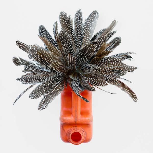
Romuald Hazoumè Pintade, 2022 – Found objects, 45 x 43 x 35 cm
What has kept you going with the masks for so long?
I continue to make ‘Masks’ for my community. It’s my duty because there is a quality and a strength that a mask exudes. But that doesn’t mean I can do it all the time; it has become increasingly difficult for me to create masks unless I’m in my workshop. And the work takes a lot of time for the result that you finally see.
How do you see the particular significance of the jerry can as the consistent basis for the mask?
The jerry can is a metaphor for an individual left on the ground. It’s not that the individual is important to me, but rather their story, which can be read through the traces left on the plastic container.
October gallery summarises this particular installation of masks as ‘a whimsical form of contemporary African portraiture’ which ‘in typically ironic fashion…addresses the material exploitation of the African continent throughout colonial history whilst at the same time paying homage to the breadth, originality and independence of Africa’s cultural traditions and values.’ Can you expand on that?
We Africans are still not conscious of exactly what it means to be African. There’s so much ignorance and misunderstanding, and we have no idea about what we could be or even what we should be. What we most need to talk about today is how did we get into this state? More importantly, how do we get out of this state? What retrograde forces prevent progress, and who are the obstacles? That’s what all these masks are discussing between themselves, giving voice to these necessary questions. Certain masks represent the smooth-talking heads of state and politicians, those who give long speeches and have ready-made answers for every problem. Some masks represent the other side of the coin, the people who have no say at all but whose opinions are equally valid. This plurality of peoples and diversity of opinions is the masquerade: a multitude of different voices talking about youth, age, pain or greed; speaking of unimaginable wealth and grinding poverty, of unconscionable excess and unfathomable sorrow. From this torrent of sound emerges the sonorous voice of the ancestors; out of the confused hubbub comes the voice of the people, resonating with the ring of truth. This is Africa; and this is our carnival!
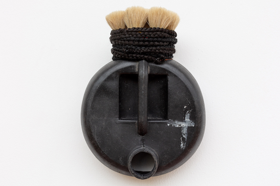
Romuald Hazoumè Blaireau, 2022 – Found objects, 34.5 x 26.5 x 10 cm
Can you say something about some of the specific masks? What lies behind ‘Blaireau’?
It’s a symbol of a type of president that exists in Africa and all over the world. When you call someone ‘Blaireau!’ it’s deeply insulting because you’re implying he’s a blithering idiot. The word has also come to mean a ‘shaving brush’, formerly made using badger hair. So, this is my portrait of one leader, an African badger whose hairstyle I’ve represented using shaving brushes. His type have no idea what they’re supposed to do to lead their countries forward. But badgers can be very long-lived animals. They survive by keeping in lockstep with the ‘great powers’—America, Russia, China and Europe. Not only does he create mayhem all around him, his standard response is to call on God, thinking that’s going to save him. That’s why I selected this particular container, which already had a white cross on the black ground. He’s just ridiculous, a real joke!
What about ‘Pintade’?
Politicians have nicknames given by the people they govern. ‘Pintade’ is a ‘guinea hen’, one of Africa’s oldest birds. They have the same political personality, but you have to search for them. But there is one thing they cannot hide – their true face, which they end up revealing.
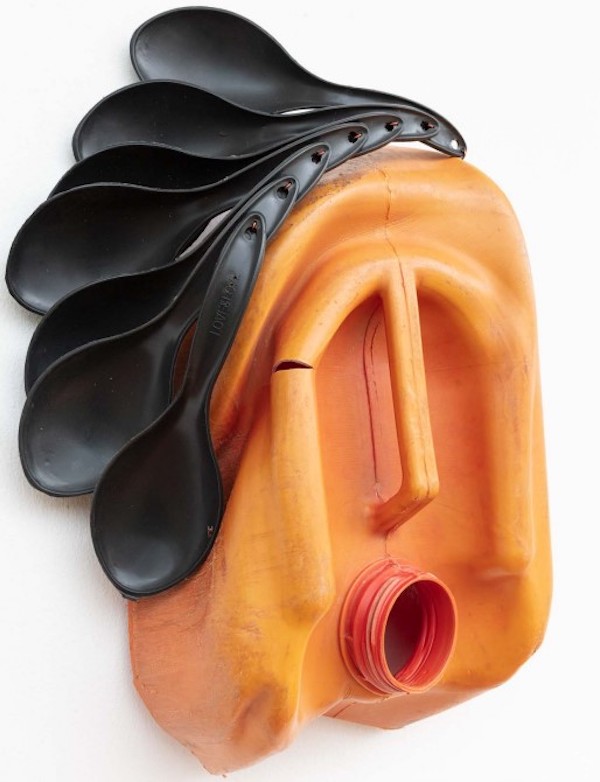
Romuald Hazoumè Le Sapeur, 2022 – Found objects, 42 x 31 x 14 cm.
And ‘Le Sapeur’?
Today, everyone knows how the urban subculture of people dressing as dandies (‘sapeurs’) flourishes despite the unrelenting poverty. Poor people scrape together complete outfits that take years to assemble and parade in the streets wearing their regalia, striking elegant poses and performing dramatic routines. It’s pure masquerade! If you visit their homes, the reality is they have nothing to eat. These countries, blessed with immense oil and mineral wealth, should be amongst the leading economies on the continent, but they’re controlled by incompetents, so they are instead plagued by poverty, disease and violently divisive conflicts. When you look at their leader’s fine clothes—the Yves St. Laurent suit, the expensive Rolex, the Italian leather shoes—you see the illusion of sophisticated refinement. However, these are not men of vision or political acumen, they are merely clothes horses for deluxe western brands, who believe wearing such finery implies superiority. This Sapeur guzzles his way through enormous riches simply to flaunt his baubles, never realising they’re only of value because he imagines they are. The large spoons decorating this mask focus attention on the ‘special accessories’ others don’t have. In Africa, when we say someone eats with a large spoon, we imply they’ve plenty of food to fill their bellies and live comfortably. These fools scoff all their countries’ riches, which, if properly distributed, could easily feed all the people.
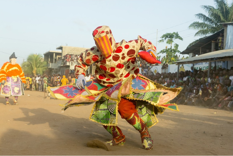
Romuald Hazoumè ‘Kpadjè, 2016
The exhibition also includes some striking photographs. What do they show?
They capture the dance of ‘The Egun-gun’, or ‘those who return from the dead’, venerated by a very large community in West Africa, where all religions intersect among the followers. The photos depict ceremonies created in honour of the ancestors.
Why do you wear a kepi, a military hat covered with badges?
This is my own visual recognition sign. When I arrive in a country, those who come to welcome me can easily recognise me by my hat.
I have heard that there are many different languages in Benin. How many do you speak?
Yes! There are exactly 55 different languages and I speak six. I believe that the multitude of languages implies many different cultures, however, there is a common language: and that is the visual language of Art.
Photos Courtesy October Gallery London and the Artist
Romuald Hazoumè solo exhibition ‘Carnaval’ runs to 26 November 2022 at October Gallery, London. Images of works Copyright R. Hazoumè, Courtesy the Artist and October Gallery, London.
Wolfgang Laib: Interview of the Month, September 2022
Wolfgang Laib is an unusual artist: infused with the natural world and Eastern philosophies, he has made consistent and relatively unchanging use of his favoured materials for fifty years, resisting the conventional view of how an artist should develop. He is perhaps best known for his ‘Milkstones’, pure rectangles of white marble made complete with a surface of milk, and for his installations of the pollen which he harvests by hand close to his home in a village near Biberach in southern Germany. Laib’s current London show at Thaddaeus Ropac presents sculptures of three other long-favoured materials – beeswax, brass and rice – together with a room of works on paper.
You didn’t have formal art training. Is that important for your art?
Very much… if I hadn’t studied medicine for six years, I never would have done what I have in art. I like to say I didn’t change my profession, I set out with the ideals to study and help humanity. So I feel I do with my artwork what I wanted to do as a doctor. Yet medicine is about the physical body, and though it can do incredible things, I felt that art could go further to include everything.
You’ve said that ancient Chinese philosophy, especially that of Laozi, is a significant influence. Does his thinking, such as the preference for ‘non-action’, for collaborating with the natural order, feed into your work?
Yes, that’s how I see things… Laozi says the less you do, the more – as everything is already done. It’s a very simple but very serious approach, the opposite of our society’s way of striving for achievement.
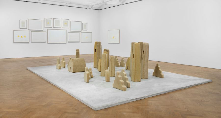
Installation Wolfgang Laib: ‘City of Silence’ Thaddaeus Ropac London
You also have a close relationship to India?
I have a long connection with India, my father became very interested in Tantric art: he said the abstract drawings looked like Mondrian, but 400 years earlier – so he wanted to travel to where they were from. My thesis at University was on the purity of drinking water in India. And for sixteen years now I’ve had a studio outside a small village in the south of India. I am, I think, the only western artist with such a studio, because the bureaucracy makes it very difficult to arrange.
I know you spend a lot of time harvesting pollen. Do you also keep hives to obtain the beeswax you use?
One beekeeper would probably have 5-7 kg of wax left over in a year, but here I have around 200-300 kg. For one of the walk-in chambers I might use 2,000-3,000 kg – and I’ve just made a 40 metre long corridor installation for Anselm Kiefer which uses six tonnes of beeswax. I work with a candle factory close by in Germany, or else it would be impossible to obtain so much. You can buy commercial beeswax, which is purified and lacks the qualities I like … when it contains still a lot of pollen. I had to learn how to use it, which isn’t easy, and has rarely been done – if you think of previous examples, such as Medardo Rosso’s wax sculptures, you find they are made of plaster covered with just a thin layer of beeswax. My works are only beeswax, there’s nothing underneath it, and that is not so easy technically.
What do you like about beeswax?
I like the aroma. And the golden colour. In natural light it loses most of that colour and becomes a little transparent, but I realised that if you show it in artificial light, the colour stays. Most of all I like that beeswax, like pollen or rice, is a material far beyond me and beyond European culture. It’s like the difference between a blue painting and the sky: the sky is much more than a blue painting, and my pollen squares are much more than yellow paintings.
You are presenting ‘City of Silence’ – beeswax houses, towers and ziggurats. How did that come about?
They come from a dream in which I saw a medieval tower in Italy, surrounded by an abandoned village, and I was so in love with this tower I am still dreaming of making it as an artwork 20 metres high. I have made smaller towers: I call them ‘Towers of Silence’ – after the structures built by Zoroastrians in Iran.
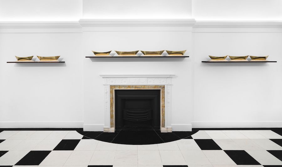
Installation Wolfgang Laib: ‘City of Silence’ Thaddaeus Ropac London
You are also showing boats in a sea of rice. How are they made?
Originally I made boats out of beeswax, sometimes very large, installed in rows on a wooden scaffolding, up to 20 m long. More recently I’ve made small boats from brass, which I cut myself and fold like paper. I’ve shown them on the floor, or on shelves as here. I always put them in a row of rice, else they would fall over. I have used rice over many years as a symbol of nutrition, and not only for the physical body. As long ago as 1983 I made the pieces ‘the sixty-three rice meals for a stone’ and ‘the rice meal for the nine planets’ – rice is universal, it is not only for me to eat.
Do you worry about repeating yourself by making similar work over a long period?
I feel uncomfortable with the art world’s desire for new work – new work – new work. I’m very content if I can make today a milkstone which I made forty years ago. If Mondrian had made a painting every day, we wouldn’t look at them at all anymore. In the exhibition I have one room of drawings made over many years, some of which I hadn’t seen for a long time: I was pleased to discover one drawing twenty years old with an image of a beeswax tower I’ve made this summer. Art is not a fashion show.
Are you religious?
I think it is a serious life, and I am searching for a content beyond the material world. I have studied Sanskrit. Gandhi is important to me. I have been very interested in Jainism, which is much more radical than Buddhism – in its emphasis on non-violence. Jain monks walk with a brush to clear the space in front of them to avoid treading on insects; they eat before dark lest they don’t see any insects on their food; they put a cloth below taps to filter out any insects in the water. And I like Jain art… the figures are always the same, there is no individual expression. But I am not a Buddhist and I never became a Jain. My religion is art.
Wolfgang Laib: ‘City of Silence’ at Thaddaeus Ropac London. 8 September – 3 October 2022. Photos: Eva Herzog. © Wolfgang Laib. Courtesy Thaddaeus Ropac gallery, London · Paris · Salzburg · Seoul Top Photo: Wolfgang Laib portrait, 2015 Photo: Ulrich Ghezzi © Wolfgang Laib Courtesy Thaddaeus Ropac gallery, London · Paris · Salzburg · Seoul
Charmaine Watkiss: Interview of the Month August 2022
Charmaine Watkiss is the daughter of Jamaicans who came to post-war Britain in the 1960s when immigration from former colonies was encouraged to help with the significant labour shortage. That experience is central to the life-sized drawings she makes – of herself, but as characters constructed to explore ideas around diaspora, ritual, tradition, ancestry and cosmology. I caught up with her at her first institutional solo show, The Wisdom Tree, at Leeds Art Gallery, where five of those large drawings are complemented by smaller works.
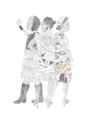
They Didn’t Come to Stay, 2017- Pencil, graphite powder, silver wax, acrylic and ink on Fabriano paper, 175 x 135 cm.
‘They Didn’t Come to Stay’ is the oldest drawing here. What does it show?
It’s a homage to the Caribbeans who came to Britain in the 1940s–70’s [i]. The figures can be seen as three separate women from different times or one woman at different stages of her life. On the right, a young maiden is about to set out on her journey. The central figure embodies the fight for equality in the 1970s. The woman on the left represents the Windrush generation today.
Why do they overlap?
Whenever I draw inter-generational figures, I overlap them.
What is the golden flower on the young woman’s dress?
When I was making this work – a year before the Windrush scandal broke – I googled ‘Windrush’ and this floral motif popped up prominently, as it wouldn’t now. So I wove some of this William Morris design (from 1881-3) into the clothing, and it’s become a trope: whenever I speak about the Windrush generation, I use this motif. The myth was of being invited to a country where the streets are paved with gold. But we know that wasn’t the reality, so I used acrylic paint – Fool’s Gold, not 24-carat gilding on the floral motif to drive this message home.
The central figure looks assertive…
I remember going to Brixton Market with my Mum, and that way of standing with hands on hips is typical, lots of people recognise it. You’re not going to mess with that woman! The dress has a collage[ii] recording a march in the 1950s – referring to the struggles that generation had trying to settle into the country.
Is she owning the issue by wearing it?
Yes, though I’m also thinking of the way we can have images or concepts projected onto us, but with the clothing, you can remove that. All three are in their Sunday best, with the gloves. My Mum was a dressmaker, and for people from the colonies, the way you present yourself was very important. That links to the expectation of politeness and decency, which is a source of pride but with an element of repression, of not being true to yourself. I was very aware of the difference between the Caribbean Patois-speaking culture inside the home and the outside world where you had to be English.
And the older woman?
I gave this character armour because lots of my parent’s generation were saying: ‘This is our country now, we belong’, but I just felt that wasn’t quite so… By the time of the protests in the 1970s, we’d been told we were not welcome, despite being invited, so there was a need for protection. I used silver gilder’s wax to reference Leonardo’s silverpoint drawing[iii] of a man with a lion on his armour.
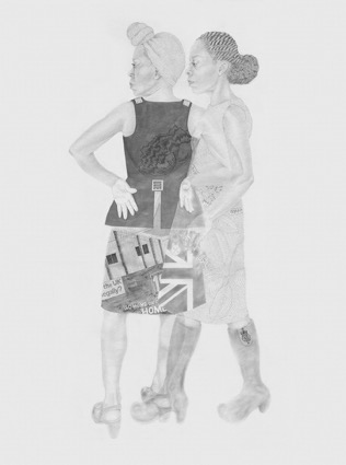
Facing the Wind, 2021 – Pencil, graphite and silver wax on Fabriano paper, 175 x 130 cm
In 2018 it emerged that hundreds of the Windrush generation had been wrongly detained, deported and denied legal rights. How does ‘Facing the Wind’ respond to that?
Some Windrush claimants had died before receiving compensation[iv], so there are two figures instead of the three, because that generation is aging and dying. I incorporate the Justice and Chariot archetypes from Tarot cards – the former representing fairness, the latter determination to overcome challenges. Justice has the scales in her hand, and keys – but the lock can’t be opened. The Home Office’s symbol is on her boot as a play on the designer logos you find on clothes. The other figure has the Yarl’s Wood detention centre[v] on her skirt, and is wearing a charioteer’s armour. She’s taken charge and is ready for the battle.
The Matriarch I, 2021 – Graphite, pencil, coloured pencil, watercolour, gum, ink and Reckitts Blue on paper, 175 x 130 cm
‘The Matriarch I’ combines history with botany. How did you arrive at that?
My Mum was raised in the Blue Mountains of Jamaica, where they lived off the land. When I was growing up, she treated me and my brother with herbs. The scene is about the different ways in which women have used agency, each have their own story to tell about liberation.
What are the plants?
The standing figure has the pride of Barbados flower on her back, designed to look like a beautiful blouse but telling the story of how the seeds of this flower were used as an abortifacient by enslaved women. In her hand she holds a fertility doll. The seated figure, the matriarch inspired by the African ‘Queen Mother’ archetype, wears sage around her neck, used when dried for clearing a space – so not just for ingestion, but in ritual. At the front is a cutting from the highly toxic manchineel tree. You can’t eat the apples, and if you just stood under a tree during rain you would get burned. The sap was used as a poison by the enslaved, and so represents resistance.
These full-colour drawings are a new development, well suited to flowers. But you don’t colour the flesh?
I want to retain the integrity of drawing, which is why I use just graphite for the figure itself. If I coloured the faces too, it would become more like a watercolour. I love the intimacy of drawing: it feels private, it allows for attentive mindfulness. Also, colour would raise the question of skin tone, which is not the focus of my work – and so could detract from the story itself….
Threshold Guardian of Light and Truth, 2021- Graphite, pencil, watercolour and ink on paper, 76 x 56 cm
Two of your six medium format’ Plant Warriors’ are also on display in Leeds. In what sense are they ‘warriors’?
I picked six plants which my parents’ generation used as healing balms, strengthening their bodies in preparation for leaving the home space and needing to be warriors in the world. I wondered what it would be like to embody the plants in human form. So the warriors wear neckpieces of the flowers of the plants, the kingdoms of which rule over them.
Is your work about the Caribbean specifically, or is it wider than that?
The Caribbean comes with historic and cultural connections to Africa, and I’ve done my ancestry DNA: mostly Nigeria, partly Benin. So in looking at women of the diaspora, I’m interested in what got from Africa to the Caribbean, as well as what came from the Caribbean to Britain. It’s also worldwide, as leaving your homeland and having to adjust is a common experience now – many people find elements of their own stories in my work.
Finally, you’re a slight 5ft 1″. What do people make of that?
They always seem surprised that I am a foodie – love food, love eating, love cooking, love talking about food… I guess being a small person people are not expecting that of me.
Charmaine Watkiss continues at Leeds Art Gallery to 30 October. You can also see her work in ‘Drawing attention – emerging British artists at the British Museum to 28 August. Images courtesy the artist.
[i] The generation often named after the Empire Windrush, the ship that brought one of the first groups of West Indian migrants to the UK in 1948.
[ii] The dress has a drawing referencing the demonstration against the Commonwealth Immigration Act, led by Claudia Jones, 1962. She founded the West India Gazette, Britain’s first black newspaper, and set up the Notting Hill Carnival
[iii] ‘I made a few study drawings of Leonardo da Vinci’s Profile of a Warrior in Helmet (1742) at the prints and drawings study room at the British Museum, and was then inspired to incorporate the warrior’s armour on the older woman in my drawing.’
[iv] At the time I started this drawing in November 2020, I had read that 9 people had died whilst waiting for compensation. Now that figure is considerably more – 23 to date)
[v] Many who were accused of being illegal were held at the Yarl’s Wood Immigration Removal Centre in Bedford, even though they had lived in Britain most of their lives
Mali Morris: Interview of the Month, July 2022
Mali Morris is a popular and notably active member of the Royal Academy of Arts, making her an appropriate choice for the annual commission to make flags over Bond Street. She also has new paintings in the RA Summer Show, and a retrospective of her prints. In Sam Cornish’s words, her abstract paintings feature ‘opacities and translucencies overlaid and juxtaposed to create an image in which space moves through colour and colour through space’. I caught up with her just as the flags were being hung.
What was your response to the invitation to make flags for Bond Street?
At first I wasn’t sure if it was the right project for me. On the one hand, I liked the idea of making a celebratory work to invite interest in the Summer Exhibition, just around the corner. I was part of the team that selected and hung last year’s show, so I know how much hard work goes in to making it such a popular and enjoyable tradition, and felt it would be an honour to be involved again. On the other hand, my paintings develop out of a complex process, they’re definitely not ‘designed’. And I didn’t really want to just photographically reproduce a painting. But a few hours later it seemed more like an interesting challenge, and I decided I should have a go.
Mali Morris RA’s flags on Bond Street for Art in Mayfair Photo: © courtesy Mali Morris
How did you tackle it?
I tried various formats, realising they needed to work visually on three flags across, moving down the street in 11 bands. I eventually revisited a structure I’d used in a series of paintings called ‘Ashbery’. They have a loose, dark lattice brushed directly over a patchwork of bright colour; two or three circular forms are then cleared when the dark paint is still wet, revealing random accents of yellows, reds, and blues. The print show at the RA includes two related prints, ‘Staith’ and ‘Bridge’. I hoped the lattice would read across the three flags as a graphic visual link and the bright circles would bounce around down the street, with a randomly varied order across the three flags keeping things lively.
Were you seeking effects similar to those in your paintings?
As it turned out, yes. I’m always preoccupied in painting with how colour relationships can create luminosity, which in turn creates pictorial space – not illusionist space, but an alive and moving space. I enjoy getting lost in paintings, of any style and period, as the eye meanders around and in and out – not unlike moving through the world, but as an experience, not an illustration. I made designs at 1/10 scale because that is familiar to me, and got excited when Matt Hunt (the designer at the Royal Academy) showed me the computer mock-up he’d made of how they might look in situ. That’s when I realised that the flags might operate as active images in real space, in the ever changing light of day – that the properties I look for in my paintings might explode outwards, as it were.
How do you go about titling works?
The titles come after the works have been made. They aren’t to do with the meaning of the paintings, but they have to have a ring to them which suits the painting.
Presumably the ‘Ashbery’ series is named for the American poet John Ashbery (1927-2017)?
Ashbery, 2013 – Acrylic on wood, 24 x 28cm (Private Collection) Photo: courtesy Mali Morris
Yes, I love his work; I was reading Ben Lerner’s 2011 novel Leaving the Atocha Station, in which he describes Ashbery as ‘compelling us to attend to our attention, making us conscious of our reading as we read’. That seemed completely in tune with how you find out more about a painting as you go.
Impeller, 2021 – acrylic on canvas, 168 x 192 cm Photo: courtesy Mali Morris
You also have new paintings in the RA summer show, the biggest being ‘Impeller’. How do you make this type of work?
I start out with what I call a checkerboard, on which I put down colours that advance and recede, and apply the paint in a variety of ways – using different size brushes, for example. When that is totally dry, a circle goes on. The degree of transparency in that colour is absolutely crucial as I need the checkerboard colours to come through enough, but not too much. And that circle has to be done in one shot because the colour is in the medium, which shows the brush marks. So that has to be a very fast process following on from the slow process of making the checkerboard patchwork. Once the circle is dry, I put the rectangles on: they need to relate to both the checkerboard and the transparent circle. All that juggling across chromatic and tonal and spatial shifts is done by eye, intuitively, without a system.
Where does that all take place?
I work on the large paintings on the floor, and it can be a difficult stretch to reach the centre. It’s quite an athletic activity – I sometimes have to rig up a makeshift plank to walk along!
‘Impeller’ is quite close to the language of the flags, as are some of the prints at the RA, but how did you arrive at the rather different-looking ‘Tipitina’?
A rectangle of white was printed onto the ivory coloured paper, before anything else went down. It’s barely noticeable at first, but vital to the way the image works. Toussaint I – IV and Mardi Gras are similar, the most graphic prints I’ve come up with so far. The key was to find ways for the dots/circles to animate the white space, to make it swing and twist, so that I was constructing pictorial space rather than a flat design. I made very many works in paint on paper to explore this, before I found what I wanted to see. As for the title, ‘Tipitina’ seemed to fit the sensation of ‘tipping/touching’ along a horizontal spread – it’s a song written by the legendary Professor Longhair (who also composed ‘Mardi Gras in New Orleans’). I made this series, and others, with Master Printer Kip Gresham, and Alan Grabham, in Cambridge. We all liked the song when we played Allen Toussaint’s version on our phones when the work was done.
Talking of songs, I hear you are a Dylan fan?
Yes – and I heard him go electric on 21 May 1966 when I was a 21 year old student in Newcastle – the night after ‘Judas’ was infamously called out in Manchester!
Top Photo: British artist Mali Morris RA during the unveiling her new specially designed flag installation on London’s Bond Street, as part of Art in Mayfair, an annual six-week celebration of art and culture that runs alongside the Royal Academy of Art’s Summer Exhibition 2022. Picture date: Monday June 20, 2022. PA Photo: Doug Peters/PA Wire courtesy Mali Morris RA
Mali Morris’s flags can be seen on Bond Street to 31 July 2022. The Royal Academy Summer Exhibition 2022 runs to 21 August. Mali Morris’ prints are in The Sir Hugh Casson Room, Royal Academy (open to all to look) to 15 August 2022.
Peter Buggenhout: Interview of the Month, June 2022
Belgian sculptor Peter Buggenhout makes slippery, near-formless sculptures that typically repulse with their abject materials, yet draw you in to an uncanny unknowability. Now you can see his work, in a rare London outing, at Holtermann Fine Art. Formally, they operate rather like abstract paintings – and Buggenhout trained as a painter – and they actually carry very definite meanings. I asked him to tell me more…
PCK: Your sculptures may be abstract, but they do have a rather consistent subject, don’t they?
PB: Yes, I’m so much intrigued by complexity, and by how this world around us is completely incomprehensible, unpredictable, is a world we cannot grasp with our limited minds.
I Am The Tablet #7, 2022 – Marble, plastic, wood, epoxy, iron, wood, silver tape, aluminium, cardboard, epoxy, synthetic plaster, 197 x 212 x 47 cm
PCK: How did that way of thinking start?
PB: When I was 17 I had ten hours of maths lessons a week, the ultimate counterpoint to what I’m doing now. But I realised I didn’t want to continue studying maths. It was like putting grids on top of the world and trying to make the world fit the grid. People said ‘You’re good at maths and languages, you should do something worthwhile, like engineering’, but I said: ‘No, I’m going to art school.’
PCK: So how do you make a work, and does that process enact your thinking?
PB: Imagine you buy a house. You have two children so you change the house to provide bedrooms for them. Then you sell and it becomes a gallery. It’s sold again, and each time that leads to changes so that eventually it becomes difficult to see where you started from. I see that sort of complexity in the state of the world, and that way of thinking is also my working practice. I start with something that attracts me, and then I say ‘that’s nice, but I’d like it larger’, then maybe I cut it back, then ‘I’d like something blue’, but I actually find something yellow… So yes, the work is a metaphor for this approach. There are no rules.
PCK: But you depict nothing?
PB: I try not to. When you walk around a sculpture you have different gestalt moments: that’s the way the brain works, we need to classify the world. So you will see one thing, perhaps a face, then something else, as you circle it. I consider a work finished when you can’t put those moments together coherently, when you have no clue any more: I aim to exclude the possibility of recognising one thing as dominant.
PCK: Is there a pessimism in this view that the world is too complex for us?
PB: Over the years I’ve became rather accepting of the situation. What is the answer to complexity? Simplification. But in simplifying, we are not respectful of the world – every different type of chair, for example, deserves a proper name – but that would make it impossible to communicate. It would show the complexity of things yet be self-defeating. So I came to accept things the way they are – a definition of hope, in a way. It’s not that we’ll get to the happier world that the western approach to science promised, but that as every day proves it’s not the solution, you should accept the complexity just the way it is – then a lot of stress falls away.
The Blind Leading The Blind #21, 2007. Household dust, hair, wood, polyurethane, foam, aluminium, polyester, polystyrene
PCK: You work in long-running series, and ‘The Blind Leading the Blind’, of works covered in dust as if happened upon after decades of abandonment, is probably the series best known to British audiences…
PB: I still make the dust pieces – everything is continuous, circling round the same ideas but from different angles – but I realised it didn’t make much sense to talk about the complexity of the world when you have only one way to come at it! And if I wanted to grasp the complexity fully, I had to use other colours and other materials – not just hide it under dust.
PCK: Three other series appear in the show. The ‘Mont Ventoux’ works all use a cow’s intestine as a starting point. What’s behind them?
PB: The title doesn’t say anything about what you see, but about the spiritual approach, the philosophy behind the work. Every series has its state of mind leading to the title. ‘Mont Ventoux’ refers to Petrarch sitting on top of the mountain in France, looking down. He invented the Renaissance, in a way, by saying we can master this world by dividing it, by cutting it up into pieces, by trying to understand it. But he forgot he was standing at a distance. From up there it looks possible, but it’s an illusion to think you can master things. I like to use abject materials – that have been removed from their original context, that have lost their use and shape and meaning. They repulse us at first, but then their indefinability attracts us. Some materials are abject in their essential being – intestines, blood, dust… Other materials can become more abject as they become less recognisable or traceable.
On Hold #21, 2022 – Plaster, synthetic plaster, iron, inflatable, textile, wood
PCK: The biggest work in the show is from the ‘On Hold’ series
PB: I think I’ve done 35 of those. They all start with an inflatable object. This one is mainly made with part of a bouncy castle – the idea was to squeeze it between different shapes, then I pumped it, and filled it with polyurethane so it did the same thing as air in a bouncy castle. And it’s important that it’s somewhat unstable: it’s a frozen moment.
PCK: Then there’s ‘I Am The Tablet # 7’?
PB: That series is mainly about human culture rather than the whole world. The marble refers to the Tablets of Moses and the Ten Commandments – the ultimate simplification of society: ten rules, keep to them and you’ll go to heaven. Then I add other materials, just as in the Talmud there are comments on the commandments, and comments on the comments… Soon, we cannot read the history in the stone any more, we cannot read the thing as a whole – that’s my comment on the ultimate simplification of society.
PCK: Your wife of over 30 years, Berlinde de Bruyckere, is also a sculptor – and with a comparable sensibility. What difference does that make?
PB: We are different, as Belinde always remains more symbolic and narrative, whereas I try to push that away. But you might say we are really making art for each other, fighting to please, impress and push each other, trying to convince each other of our values. Sometimes her work comes to me, or I go to her, then it goes away…
Photos: Courtesy Paul Carey-Kent, Holtermann Fine Art and the artist
Peter Buggenhout: ‘On Hold’ continues to 23 July at Holtermann Fine Art, 30 Cork Street.
Martin Parr: Interview of the Month May 2022
Martin Parr is famous worldwide for over 50 years of intensely colourful and wittily affectionate photographic observations of people. Indeed, he’s so popular and has so many shows that told me he does three or four interviews every week! There wasn’t much chance, then, of asking him new questions, but he was still happy to discuss his exhibition ‘Life’s a Beach’. Appropriately located in the archetypal resort of Bournemouth, it brings together two of his most enduring themes: the British and the beach.
Martin Parr Margate, England, 1986
PCK: What particularly attracts you to people at leisure?
MP: I have documented many other things, including work, but if I have one overall project, it is depicting leisure. I like it when people are free to act as they wish.
PCK: The beach is one of your favourite locations. Why?
MP: Beaches are open-ended spaces where people can relax and be themselves, and they’re just lying there, you know, ready to be photographed. My parents were bird watchers, so the seaside I was taken to as a child was mainly marshes and cliffs, where we were looking for warblers and waders. There wasn’t a slot machine or a fellow beachgoer in sight. That was OK, and as my parents were leading the bird-watchers, I would of course be watching the bird-watchers. But there is a degree of catching up on what I missed out on.
PCK: You have photographed beaches all around the world and all around Britain. Are they different in different places?
MP: They can be. On Indian beaches, the women are largely covered up, on Brazilian beaches they wear as little as possible. And the activity varies. Sunbathing is constant, but in India or Mexico, there are lots of people selling things on the beach, which doesn’t happen in Britain. And I’m drawn to the fact that it’s slightly shabby in this country, it’s slightly falling apart. I’m a photographer, not a sociologist, but northern beaches tend to be working class, whereas the middle-class beach has developed more in the south. Bournemouth, I guess, is a mixture, though I’ve photographed more often in Weymouth, which is included in the show.
PCK: I think you like to use flash outdoors?
Yes, if you combine colour negative with flash you get very intense colours. But I don’t use it as regularly as I used to do – perhaps my palette has calmed down a bit. And recently I’ve been using a telephoto lens when no such heightening is possible.
Martin Parr New Brighton. From ‘The Last Resort’. 1983-85.
The litter in the New Brighton photograph from ‘The Last Resort’ series is particularly striking
It is what it is. I’m taking a picture of reality and exaggerating it. There were photos without litter, but I chose one in which it was particularly prominent. Photography is used as a propaganda tool, which serves to sell products and ideas. I use the same approach to show aspects of reality, a mixture of documentary observation and staged comment.
Do you ask people whether you can photograph them? That very characterful woman in Margate, for example?
Sometimes I ask permission, often I don’t. She just walked across my field of vision, I didn’t speak to her. Even then, she looked like a dated character – and I like Margate, Broadstairs and Ramsgate for their old-fashioned air. Sometimes people object: that’s an occupational hazard. I accept that all photography is voyeuristic and exploitative, and obviously, I live with my own guilt and conscience. It’s part of the test and I don’t have a problem with it. Some people even accuse me of acting illegally, but in fact, there is no law against photographing in a public space the way I do. And I can use the results as I like, except as advertising.
Do you see the deckchair as operating rather as if she’s carrying an abstract painting?
I don’t know, that’s something for you to ask yourself. It works in the picture and I can’t explain why.
Martin Parr Eastbourne, East Sussex, England 1995-99
How come the Eastbourne photograph is dominated by plants and ice cream?
A surreal touch results from using something big in the foreground, that’s come out of experiments over the years. It’s the only photograph of mine to be featured on a British stamp!
It isn’t real ice cream, but reminds us that you were an early photographer of food before it became an Instagram convention?
I was ahead of the crowd, yes. Phone cameras make it easy to take such photos, with older cameras you’d have to be further away to get a good shot. I like to photograph food because what we eat is part of who we are. And not many people were taking natural shots of food thirty years ago, especially not of junk food. There was magazine and advertising food photography, but that wasn’t about junk food, which is much more interesting.
Martin Parr St Ives, Cornwall, England, 2017
The St Ives image is from your ‘Beach Therapy’ project. Why did you choose a telephoto lens for that?
Within art and documentary photography, it’s a lens that isn’t used at all frequently. It’s quite an expensive bit of kit, but the sharpness is mind-blowing. In fact, at that end of the lens, you see things you can’t see with the human eye. The compression is also interesting – it’s almost artificial. But again, it’s part of photography and part of what I want to explore and incorporate into the pictures. What’s good is the excitement you generate when you explore and new things start to happen.
What led you to that particular photo?
It was a windy day, the surf was good. I took half a dozen photographs and chose the best.
Is that usual?
Yes, I take lots of photos, and I gather momentum as I explore a subject. Many are ‘alright’, but that isn’t much good to me. I want spectacular images. When I look through them it’s obvious to me which is the best. I’m happy if one image from a day is spectacular.
Martin Parr: Life’s a Beach is at GIANT Gallery, Bournemouth, to 26 June 2022
You can also see his football photography in a solo show at the Oof Gallery, London until May 8
Words: Paul Carey-Kent © Artlyst 2022 Images © Martin Parr / Magnum Photos Top Photo: Gabriel Bush
Martin Parr ‘Life’s a Beach’ at GIANT Gallery, 2022
David Nash: Interview of the Month April 2022
Forty years ago, David Nash was the first artist to make work on-site for Yorkshire Sculpture Park –invited by the founding director Peter Murray, who has only just retired. Nash has worked frequently with YSP since, so it makes sense that his current presence there is dubbed ‘Full Circle’. What’s more, to explore the park is to experience a very full circle of Nash’s work: he has five permanent works spread around the grounds; a display of films, archival photographs and works on paper in the Bothy Gallery, charting the creation of his work for YSP over the years; a retrospective of four decades of drawings in the Weston Gallery, concentrating on trees; and a display of editions in the Upper Space of the visitor centre.
PCK: I thought you’d be bigger!
David Nash: I am 5 feet 8 – but yes, people sometimes expect me to be six feet plus with a beard and an axe through my belt! I have hauled plenty of wood around, though, and got a bad back as a result!
PCK: How has your engagement with trees come about?
David Nash: My early interest was putting colour into space. I liked demolition wood because it carried a history of human engagement, and I found wood a good material to bear the colour. But I didn’t want to just paint it on, I wanted to integrate the colour into the wood itself. That led me to staining the wood and then to using the wood itself in the natural state. By then, I was in Wales, where demolition wood was hard to find. There was a road-widening scheme locally and trees were being cut down, so I started using unseasoned wood. In art college, I was told that wood must be seasoned otherwise, it will crack and warp, but I liked the fact that it did that and decided to work with it. That’s become my general way of working: rather than starting with a fixed idea, so that any change from that is a potential problem, I like to go with what happens, seeing that as a positive.
PCK: So are trees just a material to you?
David Nash: No: as I came to understand their root systems and the workings of photosynthesis, I tuned in to their aliveness. Trees aren’t made of wood, wood is their body. Rudolf Steiner indicated that there’s a soul in Oak collectively; there’s a soul for each species – the individual tree is part of a much wider phenomenon. That’s consistent with the connection between fungi and trees, which is symbiotic: trees can’t absorb nutrients from the soil without the intervention of fungi, and in return, fungi get the sugars from photosynthesis.
PCK: Do you think of trees differently now from forty years ago?
David Nash: As I have grown older, my feeling for wood has grown deeper. I came to Wales when the environmental movement was kicking off, and I could see then that we weren’t operating in symbiosis with nature but raping it. I wanted to work with nature in a way that gives things back. I empathise with the Taoist view that we should seek to collaborate, not dominate. The way farmers grow hedges is a good example: they tend and shape and cut them, and that stimulates growth and creates a great habitat. Trees just take enough to thrive, and they give back more, and we need to learn from that.
David Nash Installation view of documentary photographs of the making of Black Mound, 2013
PCK: The Bothy Gallery shows the processes behind your permanent works at YSP. The images of the fire to make Black Mound are striking. How controlled was that?
Seventy-one Steps, 2010
DN: I have been charring wood since 1972. In 1986, I was asked to work in the Forest of Dean. There was lots of charcoal made there in the 19th century, and I saw the sites where the burning had taken place. I made a burned dome form with 900 pieces of larch, but people walked over it, which wasn’t safe. The answer was to fill the gaps with crushed coal. At YSP, I was keen to use coal again, as it is present close under the landscaped grounds and is what the original wealth of the house was built on. This time I used larger stumps spaced so that people could walk through the sculpture, and the Coal Board donated the coal. The process was actually closely controlled, and something of an ‘event’, with lots of people there. We set the stumps out in a big round hole, added kindling, and lit the fire. The kindling wasn’t as dry as I’d hoped, so my assistant and I strapped leaf blowers on our backs for the four hours of burning! Then we put it out with a hose and added the coal the next day.
PCK: Seventy-one Steps also uses wood and coal, but as it takes the form of functional steps down a hillside, I suspect people might not realise it is an artwork?
DN: That’s fine by me. I like low visibility art outside. I don’t like big things dominating the site. The steps were already there, but they were badly spaced and decaying. So I proposed to replace them with charcoal steps and to tamp them into coal.
Installation view with May 2020, July 2020 and Oaks Leaves Through May 2021.
PCK: Some recent drawings appear abstract at first – what has led you to that?
DN: The subject of Oak Leaves Through May is the transition of colour so that any figurative element would be a distraction. I had noticed, walking regularly past some oak trees, that when the leaves first appear, they are small and golden, then they turn a more ochre yellow as they get bigger. Only later do they move towards green as the chlorophyll comes through – first light, then darker. This process happens over two weeks. I apply the colour using pigment rubbed onto pads of fleece, and it took me ages to find the right colours to match what I’d seen. The soft dots came out of a birthday card I made for my wife: she’s a great colourist. I made dots onto the card to record the colours in the garden.
Oak, Beech, Ash, 2017 – Pigment on paper stencil print, 76 x 57 cm, Edition of 19
PCK: You also have a gallery of stencil editions. How does Oak, Beech, and Ash characterise the different trees?
DN: The way the branches attach is different in each of those species: ash has the sharpest angles, beech the long smooth curves, and Oak is in between. Here the colours pick up and exaggerate the differences in their natural hues – that’s one thing I like about a drawing rather than a photograph: you can show just what you are interested in, whereas, with a photo, you get everything.
Words/Top Photo: Black Mound, 2013 Paul Carey-Kent © Artlyst 2022
David Nash: Full Circle is at the Yorkshire Sculpture Park until 5 June 2022
Rana Begum: Interview of the Month March 2022
Rana Begum brings her viewers into an interactive world of colour, light and form. Initially, her geometric language could be traced back to cityscapes meeting the patterns of Islamic architecture from her early childhood in Bangladesh. In recent years she has increasingly added more organic elements, as can be seen in her major show ‘Dappled Light’, running in related but different site-responsive versions at the Mead Gallery near Coventry (13 January – 13 March) and Pitzhanger Manor in London (25 March-August). I caught up with Rana in her spectacular studio residence in Stoke Newington, building which has been a decade-long project, to discuss some of the work in the shows.
PCK: What’s your overall aim in these shows?
Rana Begum: They explore how light, form and colour come together – in different ways, depending on the material and the idea… As with all my shows, it’s important that the work embodies change through how its appearance changes due to light or as the viewer moves around or through it.
PCK: You are orchestrating works, some very large, that respond to the two sites and to each other. Are you aiming for a particular mood?
Rana Begum: I guess it is a positive, uplifting experience of colour and movement, reflective of what we’re all craving for coming out of a pandemic. But I was thinking more about how to deal with the scale and how to curate a narrative in the space, such as by placing the hard-edged reflector works opposite the softness of the big painting. That shows some of what I’m juggling in the studio.
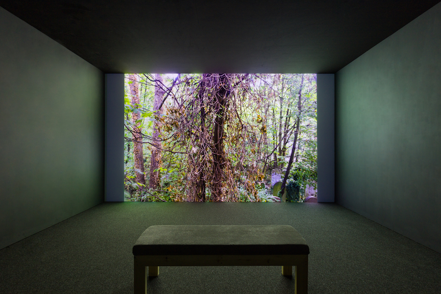
Rana Begum Installation shot of No. 1080 Forest, 2021
PCK: You’re showing your first film. What led to that?
Rana Begum: It came out of lockdown watercolours I made of views out of the window of my flat, which overlooks Abney Park Cemetery in Stoke Newington. I then started photographing moments in the day, as recorded in my alternative Instagram account @ranabegum_lightstudies. You are encased in a kind of forest, and you see this incredible change and movement of light – daily, and then monthly and yearly. It’s made up of stills taken every hour of the year with daylight, stretched across a 37-minute film. It is projected in a separate room at full height, so it replicates the experience of standing before the large window so that the viewer experiences the full effect of the change.
PCK: It looks as if it’s breathing?
RB: Yes, there is a life to it. Sometimes the light is left on in the hallway, and that’s reflected in the window: I like how the general activity in the space comes through.
PCK: Did you have to discipline yourself to take a photograph hourly, as Tehching Hsieh did for his One Year Performance1980-1981 when he punched a timeclock and took a self-portrait on the hour, day and night for a whole year?
RB: No, luckily, I had a timer!
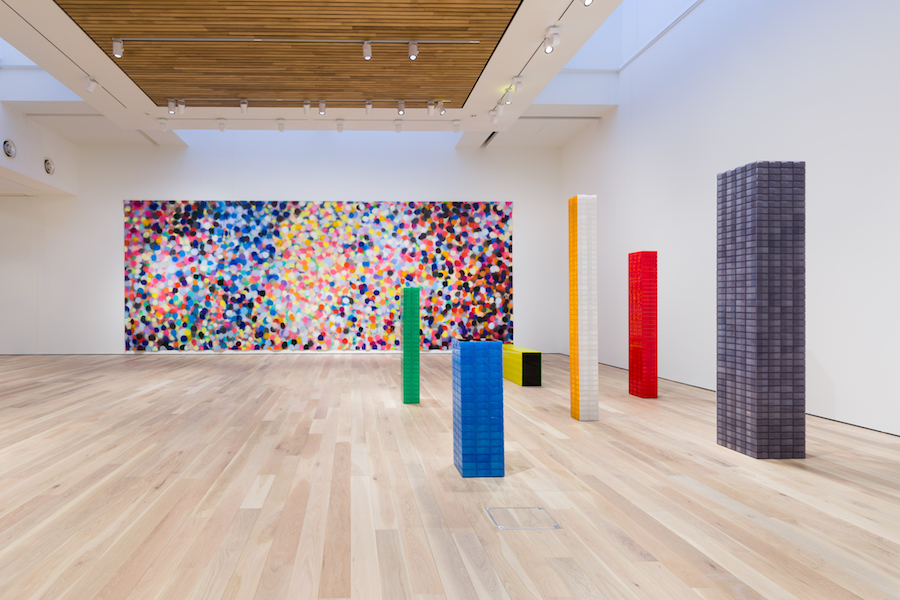
Rana Begum No. 1079 Painting Large (MG), 2021 – acrylic and spray paint on canvas, H370 x W1000 x D5 cm, with reflector works – installation at the Mead Gallery
PCK: No. 1079 Painting Large really is large, encompassing a whole internal wall of colourful splotches. How did that language develop?
RB: Each time we start a body of work, we have to check the spray cans of paint we use, so that forms a mark on a piece of paper. That accidental by-product fed into a more deliberate imitation of the process on canvas, in which your entire perspective is taken up as you stand in front of it, and the repetition allows an idea of the infinite. That came from a dialogue between me and my team: I have an idea of the colour palette, and that’s the main direction for them to ‘spray without thinking’. It’s one huge piece of canvas fitted to the structure of the room. Even if you stand still, the way the colours are applied does lead to a sense of movement. It’s part of a gradual shift that’s creeping in towards work that’s more organic, with more flow and movement to it – sort of less controlling than the geometry. At the Mead Gallery, there’s natural light above through a skylight. Pitzhanger Manor will have a similar painting but responding to a space without natural light.
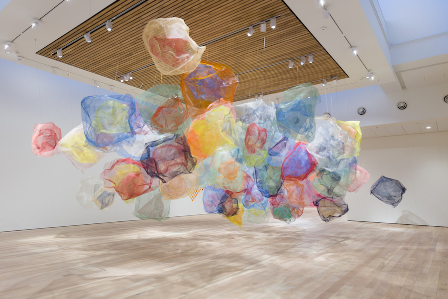
Rana Begum No.1081 Mesh (MG), 2021 – powder-coated galvanised mild steel
PCK: Does that relate to the cloud of mesh that also makes the most of the scale available in the Mead Gallery?
RB: It does: I wanted to bring that to life in three dimensions, so there is form, structure, movement, and also transparency. I wanted to see how it could shift as the viewer walks around and through the work. There’s a static element to it, but it’s activated by people moving and by how it connects to the space.
PCK: Can we read your Bangladeshi background into the work?
RB: I came to the UK from Bangladesh when I was eight. I feel very fortunate to have grown up having exposure to two cultures which contrast so completely. Despite my efforts to keep my work free from cultural comment and reference, I think that is naturally made manifest. I find myself turning to the intricate forms of Islamic art and architecture, with its bright colours and repetition. Having a strict Muslim upbringing, the rhythm and repetition of praying five times a day and reading the Quran was instilled from a young age. This rhythm has worked its way into my working process. However, I think it’s important to remember that my work isn’t about religion, culture, gender or politics. Rather it is a visual universal language that everyone can relate to and understand. This is one of the reasons that the works are titled by number – I don’t wish to dictate how the viewer should interpret the work. I prefer that they find their own meaning, their own kind of connection with it.
Words: Paul Carey Kent in conversation with Rana Begum Top Photo: mesh cloud No.1048, 2020 (all images: Angus Mill photography)
‘Dappled Light’ is at the Mead Gallery near Coventry (13 January – 13 March) and Pitzhanger Manor in London (25 March-30 September 2022)
Interview of the Month February 2022:
ALLISON KATZ
What
is painting? The definitive means through which an artist gives us access to
their unique vision? Or a fascinating - but always provisional – dance around
the subjectivity and limitations of both artist and medium? London-based
Canadian Allison Katz relishes the second of those options at Camden Art Centre
through a recurring range of eccentric subjects - such as cockerels, cabbages,
the interiors of lifts, views from open mouths, other art, jokes, anecdotes,
and plays on her own name. I asked her about some of the 30 works that make up
the installation ‘Artery’ – a title that feeds the internally captured word
‘art’ into the heart’s connection to all our organs, the circulation of ideas
within the body of the show, and the gallery’s place within the systems and
communities of the locality.

Allison Katz: Installation with ‘The Other Side’, 2021 – oil and
rice on canvas, Photo Rob Harris. Courtesy the artist
‘The Other Side’ seems to
depict a cockerel crossing not a road, but a gap in the gallery’s display wall. What interests you in that?
‘Why did the chicken cross
the road?’ has the structure of a joke, but it is actually an anti-joke because
there’s no punchline. So it’s about deflation: you set up the expectation that he must have some
intention, somewhere to go, but he just wants to get to the other side. Somehow
that disappointment is funny, and I thought: that’s exactly what painting
is, a big build-up and then a deflation, but one that leads to something more
interesting – the unknown. The joke can
also be interpreted as being about death and anxiety, so what you remembered as
a child turns out to have these other meanings. That’s what’s great about painting:
the idea evaporates as you chase it, and it ends up being about so many other
things. After twenty years of painting I still have no idea what I’m doing until I get to the
other side, it renews itself in constantly surprising ways.
There are several cocks in the show. Why do you paint
the same thing repeatedly?
As with all the things
that end up being motifs, I don’t set out for it to be like that. They start out as one-off engagements,
but then for one reason or another it interests me to return to the subject. So
they’re all ongoing – I don’t want to put a limit on anything, and I’m against the idea of a
finite ‘series’ - as who knows when another idea will come that fits? Or when I’ll want to return to a
work - the magnetic pull of a painting is that it’s never really finished:
the surface remains open in a way that it doesn’t in sculpture or film.
You can be tortured by that or made curious by it, and I like to stay on the
curious side.

‘Cabbage (and
Philip), No. 22’, 2020 – oil on linen, 35 x 35 cm
There are five painting of cabbages. Why so?
There are actually thirty,
from which I chose five for Camden. They began in 2013 when I wanted to paint a
portrait of my husband, and he didn’t want to pose. I spied a cabbage and felt it was functioning in a very
similar way: veiny with a heart and a brain. It seemed to be a suitable
surrogate in that moment, and as portraiture is bound to be a failed enterprise
- I wasn’t going to capture him ‘for real’ anyway - it was easier to imagine his presence in a kind of shadowy way.
I’m not interested in the cabbage on its own per se but for the dynamic it
creates in relation to this idea of deferral and failure, still-life and
portrait, so in every cabbage painting his profile is at the side. The shadow
is important as this stand-in for a lack, or a need. And the shadow activates
the edge of the painting when we normally want to look at the centre: it’s a way to show how you
can’t really paint your true desire, you have to go around it. It’s also a
complete pleasure to paint from observation, which I don’t do often, and that
sort of concentration often leads to a refreshment of other techniques and
ideas.

Allison
Katz: Elevator III (Camden Art Centre), 2021 – acrylic, iridescent and
metal pigments on linen Photo Eva Herzog. Courtesy the artist.
You’ve hung a trompe-l'œil elevator interior on the wall at the point behind which
the actual service lift runs. Do you like elevator jokes?
I do, because they operate
on many levels! Ha. My interest in painting elevators began with an extremely
vivid, almost lucid dream I had… it rattled me, but still it is extremely rare
for me to paint the subject of a dream. The situation that activated it was a
site visit to Nottingham Contemporary, where the first iteration of ‘Artery’
took place. To my surprise their service lift actually opened up in Gallery 1,
where I was going to show. Because of this coincidence I knew I had to
investigate it further in paint. I had already done tons of research in regards
to my dream’s possible meaning online – that’s the thing about the
Internet, there are forums for elevator dreamers! They had interpretations for
every aspect of the elevator: the material it was made of, the building it was
in, the others inside it with you or not, the floor number you went up or down
to… It just reconfirms that sense of how deeply complex and symbolic the
unconscious is. And painting is exceptionally good at taking a surface and
allowing it to operate on, yes, any number of levels… both visual and psychological.

There are several paintings where we seem to be looking out of a mouth. How do they work?
They use a mouth, measured
to my own height, as a framing device to suggest the point of view of both
language and the gut – the gut so that consumption and taste are built in, a
way to play on and challenge the idea that painting is just a matter of taste.
And we always look with our eyes, but what happens if other body parts do the
looking? You can’t outrun your own frame, so I like to build it in so that you can see and
question it rather than taking it for granted.

Installation view at Camden, Photo Rob Harris. Courtesy the artist
‘Artery’
runs 14 Jan – 25 March at Camden Art Centre, with an associated off-site presentation of Katz’s announcement
posters at the Canadian High Commission on Trafalgar Square.
Interview of the Month January 2022:
JYLL BRADLEY
Pardes, the new commission by Jyll Bradley for the Fruitmarket Gallery in Edinburgh, is not just a sculptural installation, but the creation of an inclusive space for public interaction and events. As such, it follows on from her public commissions Green/Light (for M.R.), for The Folkestone Triennial (2014) and Dutch/Light for Turner Contemporary (2017), which used the generative structures of hop gardens and glasshouses to express the practical, spiritual and emotional work involved in growing a sense of self, place or community. For the most part, Pardes will host others, but one of those events will be the screening of Bradley’s new film M.R., 2021, which links the communal spirit of Green/Light (for M.R.) to her own life story.

Jyll Bradley in Pardes. Photo:
Neil Hanna.
In your new film, M.R., we see your sculpture Green/Light (for
M.R.). That work adopts structures from the hop industry, recalled from your
childhood in rural Kent. We hear a personal narrative about your adoption. How
do sound and vision connect?
The visuals are juxtaposed with the narrative,
effectively using the sculpture as a giant camera – both into the past and
reflecting the world around it. The sculpture is dedicated to my birth mother,
(M.R.) so it becomes a means of looking at my
own history through something I’ve made. I love how sculpture can become a
social phenomenon – you make the work and then you learn how it operates in the
world – and I spent a lot of time hanging about the sculpture and watching how
other people reacted to it. My film is autobiographical, but it is
also the portrait of an artwork. I wanted to show that Green/Light (for
M.R.) isn’t the static thing you might expect, but open and
reflexive: it reacts with light; the natural world evolves in and
around it. It has a private life; like us it has good days and bad days.

Green/Light (for
M.R.) 2014. Photo: Thierry
Bal
The film follows your younger self
searching for an identity both as a person and as an artist. That use of the
sculpture as a seeing device resonates with the revelation that you developed a
sight problem while studying at the Slade. What happened?
I woke up one morning at 24, and my left eye was
full of ‘floaters’. It seems that, while I was in the womb, my mum ate
something raw with the parasite toxiplasmosis in it, a creature that dies but
leaves dead cells floating around. For some reason it erupted then, rather than
in childhood as is usual. There’s no cure, and you can go blind. I’m always
aware of it, though I have learned to live with it. So it’s
something I have got from my birth mother that I relate to sight and insight of
all types. The ‘eruption’ was the catalyst for looking for her.
That triggered you to write diary
entries exploring the experience of adoption, and you quote from those. There
are some striking statements about adoptees, for example ‘we were not chosen,
we were available’ and ‘we walk with an invisible twin – the life we didn’t
lead’…
You never get over the combination of how you are
always told you were chosen, but on the other hand you feel you were abandoned.
I’ve seen it explored in literature – Jackie Kay’s The Adoption Papers is
wonderful – but not in art. I grew up in the 60’s-70’s under a particular
system – closed adoption – in which the record of the biological parents is
kept sealed until adulthood. In the narrative of the film I access that
information for the first time. The story concludes with me writing to my biological
mother.
If one part of your identity is ‘who
you are’, another part is ‘what you do’. How does that connect?
As a child I was always told how good I was at
drawing… and as an adoptee you have extreme desire to please – so I wondered:
did I want to become an artist just to please people? And is artistic ability
something you can inherit, or is it a matter of conditioning?
M.R. is the first part of a planned
trilogy. Will we learn what happened after you wrote the letter?
You’ll have to wait and see! The other films are
only in my head at the moment. But they will also use my sculpture as a way
into autobiographical themes via my writing – I’ve always written alongside and
as part of my practice, including plays, dramatisations and documentaries for
BBC Radio 4.

Pardes, 2021. Photo: Tom Nolan
‘Pardes’, appropriately for a space
that was once a fruit warehouse, brings an apple green light to a structure
derived from the leaning design of historic glasshouses in Scotland. What were
you thinking about?
I wanted to make a hybridisation of the different
growing structures I’d found, and I also see it as an abstracted version of an
orchard turned on its side. I am interested in the connection between harvest
and structure - that universal connection between growth and shelter. Pardes can
read as a roof, upward growth and beams of sunlight as well as echoing the
beams of the warehouse. And it’s not so much occupying the building as
intersecting with it. As with my other sculptures the work acts like an eye you
can look through, picking up reflections and refractions from its environment.
The work sees the building - and us. In many ways it is one of my most abstract
works, I pared it back over lockdown. It reflects my questions during that time:
‘what is essential? What is not?’
‘Pardes’ uses fluorescent Edge-Lit
Plexiglas, which has become a signature material for you?
Yes,
rather as fruit takes in light and makes something of it, the Plexiglas sucks
in light and pushes it out at the edges, so they glow with a green light that
will sustain us through winter. This is the first time I’ve made such a
structure inside: I was going to flood the work with artificial light, but
instead I have embraced the dark light of the space, so the plexi just picks up
any light available to it. It is a gloaming work, evocative of landscape and
perhaps the times we are going through.
Is that a
stuffed owl up there?
Yes, that’s a detail you might not notice at first. Perhaps it will catch the mice in the warehouse…In seriousness, the owl connects to a wonderful woman I met during the course of researching this work. You can only access the full story behind its presence by asking one of the gallery hosts.

Still from M.R.
Pardes runs to 18 April at
Fruitmarket, Edinburgh. M.R. will be screened there in March, and will also be on view
in at the Hayward Gallery this summer. Dates and times to be confirmed.
Jyll Bradley is also in the group show ‘Trees Die Stand: Plants and Humans’ at
Pi Arts, London, to 15 January.
Interview of the Month, December 2021
MAGNUS PLESSEN

The German painter Magnus Plessen tends to paint in thematic groups: in 2016 he showed his ‘1914-1918’ series in London, looking at bodies armoured for, and repaired after, combat in World War I. His new show ‘Hope Love Helium’ (White Cube Mason’s Yard to 8 January) refers, says the gallery, to both ‘the ineffable dynamics of affection’ and the ‘not unrelated’ process of nuclear fusion, the transformation of hydrogen into helium that powers the sun.

You described your last show at White
Cube as providing a ‘mechanistic’ view of the world. What is the angle here?
I’ve moved on to an understanding of reality which is more about processes that we don’t see. I love to think of realities which exist beyond what we can perceive, to imagine that the matter we are composed of is attached to another level of reality, to events that we don’t fully understand and can’t control. Events which continuously take place and even began long before we were human. The book ‘Journey of the Universe’ (Brian Thomas Swimme and Mary Evelyn Tucker, 2011) talks about the stars being our ancestors, meaning that the material that we are made of was actually prefabricated 14 billion years ago when the Big Bang happened. They say, far more beautifully than I ever could: 'Star birth occurs when gravity squeezes a cloud of atoms together so tightly that nuclear fusion ignites in the centre. In this process hydrogen fuses into helium. This nuclear energy expands outwards and opposes gravity. Stars represent an amazingly creative balance between gravitational collapse and nuclear explosion. And as a star expands it creates all the elements (phosphorus, oxygen, carbon, gold, etc.) it’s by this stupendous process that we can say the stars are our ancestors. The carbon atoms of our body passed through an intense explosion of a star.'
What struck you in that?
The
thought that my existence starts long before conception, the history of my
family and more generally the history of mankind. I think about the idea that on
a subatomic level we as humans consist of the same particles as everything else
in the universe. That feels like a huge relief. I suddenly feel less isolated from
and helpless towards the world around me if I begin to understand that matter
some billions of years ago formed a constellation which reached a higher
complexity from which life came forth. Did this have us in mind, or is it just a
creative process that took place regardless of us? Scientist talk about how matter
self-organises. This feels incredibly creative yet independent of us and
indifferent to our desire to comprehend reality from a human perspective. What
used to be the domain of religion or esoteric speculation seems to have become the
domain of science.

Untitled (Fig. 19),
2021 - Oil and charcoal on canvas, 200 × 250 cm
How is that reflected in the paintings? Take ‘Untitled (Fig 19)’, for example…
One
of the great things about being a painter is that I can follow different
representational systems simultaneously, be they micro or macro. I don’t have to be true to life-size. In the
context of a painting I can blow up electrons to the size of a pumpkin. The
micro and the macro are in parallel in my paintings. With this in mind I could start
to invent a world and show it to myself in the process of painting it. I become
the first person to see this world. My new paintings are less rooted in
experience or memory. They take me to an unknown place. I wish I could one day consider
the human figure from a quantum-mechanical perspective.
The idea of an image from the waiting
room of the universe came to me some years back before I had read about quantum
states of electrons. At that point I thought about images as
pre-recordings: a pre-record
of my subject before it has been differentiated or materialized into our time-space continuum. I imagine them coming from the
ante-room of the world - the waiting room of the universe - on the doorstep of Doctor Newton’s office. He
would be the kind of character who won’t hesitate to tell you what is wrong with you if you remain out there!
My
new endeavour to imagine something physically impossible in the context of a painting
reminds me of my urge to see the underside of the brush mark when I started to
paint: as though I could step into the painted space, turn around and see the
underside of a painted mark. Today, however, it is not good enough to be on two
sides of an object. I try to think of myself in transit from a sub-atomic state
to a classical state of being. The old dualities - front and behind, imagined versus
palpable reality, abstract versus figurative – are beginning to shift. This time
it seems more about potential: what scientists call the superposition of
particles. Translated into a painting, that would mean for me possibly female or
male or up and down or undecided. This list goes on.
This is a decidedly yellow and blue show?
Absolutely,
the thinly painted yellow round shapes glow with energy and come towards me. The
indigo blue areas move away from me and create a deeper space in which I can
hide information as if underwater. The thickly painted yellow passages which
are painted using a brush are more about time. In these areas I feel like I gain
time because the colour dries so slowly.
These
yellow passages, like the brown, fence-like structures, feel more closely
attached to the surface of the canvas. This could be because I exert pressure
on the canvas when I paint them. I literally push the paint into the surface.
If
my canvas where to vibrate, these areas would only vibrate as much as the
canvas itself does, whereas the round yellow shapes and the blue passages would
freely swing and bounce up and down like a wave. Their flatness and volume,
stillness and movement resonates with my own situation of being caught between two
concepts of reality.
What
I read fundamentally challenges my intellectual and practical tools. If I could
somehow integrate my eyes in my hands, I imagine I would feel more grounded in
the real world because I could apprehend and touch reality immediately. The
very concept of reality which I so urgently wanted to hold on to suddenly seems
secondary.

I see that in ‘Untitled (Fig, 23)’, the
stretcher bar behind the canvas is picked up in the painting, both horizontally
and diagonally?
Yes,
the horizontal and diagonal brush marks are an impression of the stretcher bar.
I am used to attaching the image to something undisputedly real. When painting
my wife while she was pregnant with our first son, I measured her belly using tape,
much like a tailor takes measurements. I then stuck the tape directly onto the
canvas. I had found a way around subjective interpretation by touching reality directly
with my brush.
The female form looks rather ethereal…
She’s
more like a ghost, whereas the male is more solid and composed, often partially
of wood- a blockhead! They are depicted in different material states and yet
they freely connect. They form spontaneous impermanent constellations. I think
that the tenderness between female and male in my paintings comes without scripted
expectations of what should happen next.

Installation view at White Cube
Do you still turn the canvas around as
you paint?
Sometimes
images from the history of art emerge on my canvas as I work on it. By turning the
canvas, I can free it from interfering memories. What’s more, if I do that
several times, there comes a moment when an unexpected image comes towards me,
rather than me bringing an image to the canvas.
What are people surprised to
hear about you?
That my wife and I
have four sons.
I think that makes you one man in 300, as only
5% of men have four children, and the chances of them all being boys is 1 in
16… Does that large family influence
your work?
I don’t separate my artistic life from
my family: that’s a decision you take as an artist – do you treat them as one
thing, or as separate spheres? My studio is at our home, so there is a constant
exchange. I don’t paint portraits, but when I think of the female it is always
my wife. If you compared the shape of her eyes with women in the paintings, you
would recognise it. And the energy of the boys certainly feeds in as well! I
never really know what will happen next…
Interview of the Month November 2021
TANIA KOVATS
One can distinguish no fewer than seven diverse yet
thematically linked streams of work in Tania Kovats’ show ‘Oceanic’ (at Parafin to 20
November). We discuss three of them below, but you will also find a library installation
made up of various copies of ‘The Sea Around Us’, an inspirational text for the
artist; her ‘Books from the Flooded Library’, stained by water; several meditative
‘Sea Mark’ watercolours of the surface of the sea; and a sculptural
installation evoking the death of coral. Kovats lives in Devon and teaches at
Dundee University.

‘The Divers’, 2019 – installation
view of Oceanic at Parafin Gallery, photography by Peter Mallet
Where does your name
come from?
I am half Transylvanian, but I was born in my Nan’s council
house, where my parents were living at the time, in Whitehawk, Brighton.
‘Brighton Rock’ comes
to mind…
I remember being shocked when I read it as a teenager, a
book set in Brighton’s underbelly by a writer who does sex, guilt, and Catholicism
so well.
Walking into the show,
everyone will be struck by the ‘Divers’. How did you arrive at the idea of
casting in concrete from wet suits?
It was more an impulse than an idea – I trust my
impulses, but post-rationalising a bit - wetsuits are the skin we wear to be in
water, we wrestle in and out of wetsuits, and we are slightly different
creatures when we’ve got them on. And I’ve always loved the Selkie myth of the
seal woman who slips off her skin to come on shore to dance. This is like that
in reverse: you slip on a skin to get into another element, the water. The
sculptures are figurative but boneless, they are about the flesh not the
skeleton. Their headlessness anonymises them and emphasises the euphoria of the
body. I wanted to give the impression
they are passing through the solidity of the architecture, joyfully moving
between worlds like when you enter water.
Do you dive?
I love being in the water, but no, I’m not a diver. I get
‘vertigo’ in deep water, even though I know I can’t fall. I am fascinated by free
divers – for their discipline, and the incredible breathing exercises – that
enable them to do what they do, the depths they can reach on a single breath. I
see parallels with how I work across drawing and meditation, practising them
both in tandem, including through the ‘Drawing Breath’ workshops I run to
combining these two things.
How do you make them?
I suspend wet suits in a small scaffold tower, block them at
the end, and fill them up – even small wet suits can hold a huge bulk of
concrete, though some can take more than others. Then I bind them, so I can
then tension them against the vertical and make them bulge and fall in ways that
interest me. I wait three days, then
spend a day unpeeling them, which is another wrestle. I leave the zips in – I
see them as the navel, that show where these bodies have come from. I like how
the wet suits print details, such as seams, into the concrete. I finish them with cleans cuts at varying
points to reference both classical sculpture and the cleanly cut cuff.

‘Freediver’, 2020 – installation
view of Oceanic at Parafin Gallery, photography by Peter Mallet
That admiration of freediving
must feed into the title of the ‘Freediver’ works. How did they come about?
I have my yoga mat in my drawing studio – they are both daily
practices. One morning I decided to combine them by making a body print. So I
covered my skin in linseed oil and Payne’s Grey oil paint, and carried out a
series of sun salutations, printing through repetition, more or less hitting
the same places as I repeated the poses. The feet slip, as I’m covered in oil. I called them ‘Freedivers’ because they feel
as if they are mobile, moving through space. ‘Freediver’ also suggests the state
of mind I hope to achieve in yoga and drawing.
I suppose Yves Klein’s
Anthropométrie works are one
predecessor?
Yes, I recently found some fascinating interviews with Klein’s
wife and models, describing how much they loved the process – they said that
they never felt naked, due to the paint on them, and felt they were printing
their souls rather than their bodies. That made me think again about the feminist
reading of those works that I had previously signed up to, that problematise
this work. The ‘Freediver’ works are me printing myself, though – I am brush
and artist at the same time. It’s a very primal impulse to print with the body:
you can go from handprints I’ve seen in caves in Patagonia right through to
David Hammons, Agnes Dene and Helen Chadwick using a photocopier to print her
body. I made ‘Freediver’ during lockdown at a time when touch was becoming
associated with contamination and danger. Touch is so important, and it has a unique
reciprocity: when we touch something it touches us back, and that’s not true of
our other senses like looking or listening. So I wanted to visualise a positive
language of touch.
’’’Orgasm Drawings’,
2021 - installation view of Oceanic at Parafin Gallery,
photography by Peter Mallet

The ‘Orgasm Drawings’
are another lockdown project, and again touch is evoked. Are they difficult to
make?
It did take some work to establish how to make these and an
entry into a particular state of mind. My right hand is bringing me orgasm, while
my left hand holds a pencil and mirrors or copies the movement. It’s the most
extreme manifestation I could think of where I could make a drawing about touch.
The drawings I end up with are abstract expressionist scrawls that describe, I
think, a vagina. And I like the bizarre idea that you could say: ‘look, there’s
an orgasm!’ which is a little disruptive in a show that could seem polite. But they’re
also oceanic moments: the moment of orgasm is one in which you are less
separate from the world, you expand and are part of everything.
How can I tell
whether, in line with general male insecurities about the female orgasm, you’ve
faked them?
The question of truth and trust hangs over any artwork you
see. I suppose it would be possible to make a set of ‘fake’ orgasm drawings but
that doesn’t interest me. What I like more is the idea that it might be
possible to trace and hold an orgasm on a piece of paper.

Interview of the Month, October 2021
IBRAHIM MAHAMA

Ibrahim Mahama came to
international attention for his monumental installation of jute sacks at the
Venice Biennale in 2013, a powerful way to reference how only £2bn of the £15bn
market value of Ghana’s cocoa production, largely transported in such sacks,
flows into the country. But that
represents just one strand of his hugely ambitious, socially engaged practice,
for which he acquires all manner of objects – and even buildings - in order to
tap into their histories. I caught up with him at the opening of his show
‘Lazarus’ (15 September – 7 November 2021 at White Cube Bermondsey).
Is that the biblical Lazarus who rose from the dead?
Yes, the ‘Lazarus Effect’
is collecting remnants from the past to reinterpret them, to make them live
again.
That includes Nkrumah Voli-ni, an uncompleted grain silo in the northern city of Tamale,
where you live and work. How come?
I’ve been researching
the post-independence infrastructure in Ghana, buildings which were abandoned
in 1966 when our first president, Kwame Nkrumah, was overthrown in a military coup
d’état. They were part of a socialist programme to make Ghana self-sufficient,
but the subsequent regimes have wanted nothing to do with his legacy, so the
buildings were never finished - even though that would have made economic sense.
It was said that the silos, being built by Soviet architects, weren’t suited to
the climate, and even that Nkrumah Voli-ni was going to be
a prison. It had been abandoned for sixty years, but I asked myself the question: if you can’t use it to
store cocoa or maize, why can’t you make another use of it?
How will you use the silo?
I’m trying to bring
the building back to life – not to be as it was, as in the 60’s we didn’t have
the same environmental concerns that we have today, but using it an ecological
way – as a greenhouse. When I bought it, the occupants were bats, and I wanted
the bats to be co-inhabitants. The pandemic was starting, and bats were being
blamed for starting the virus – but, if anything, these species have not
endangered mankind, mankind have endangered every other species on the planet. So
I’m interested in the whole ecological system around the bats and what they
symbolise.

Appropriately, then, bats appear in the hanging sculptural
installation ‘Lazarus’ (2021). What is that made from?
I am working with
armatures from old buildings, and pulling them together to create this gesture
of the bats by combining them with tarpaulins of the sort traditionally used to
cover goods which are being transported internationally. They’re dark, and
oil-drenched from contact with engines, so it almost looks as if oil has
spilled into the ocean and killed whales. The show also has collages, which
combine photos of the bats in the building with documents like receipts from Ghanaian
companies.

The most striking – and noisiest – work is ‘Capital
Corpses’ (2019-21), which consists of
100 sewing machines on school desks, operating in syncopated bursts, and
blackboards still showing the last lessons taught with them. What is that
about?
I like the simple idea
of combining the classroom with these machines, typically used by young women
who, lacking a formal education, get a sewing machine as their means to keep a
family. I’m interested in the contradiction between what the machines and the
desks signify.
How do you acquire so much old stuff?
I often negotiate to
replace old for new, added to which there are many scavengers in Ghana, so if I
need anything I just commission them to go around. The desks are a colonial
design by British, and I like it that kids always write on them. I was less
interested in the sewing machines as formal objects than in the sound connected
to them – but they didn’t work. Often in Ghana people will buy second hand
clothing without worrying if it will fit or not, because we always have a
tailor available. So I worked with tailors, switching them from using the
machines to repairing them. When they came back on, it was another return of
the dead.
You’re just finishing your PhD. What is your subject?
It is based on the
project to resurrect buildings around the country – old swimming pools and
cemeteries as well as silos. I look into the political forms behind the spaces
– Marxist theories of capital, and the contradictions posed - and aim to
translate them into another kind of system that allows for hope to be bred
within a new generation.
What do people make of you back home?
They are surprised
that I consider myself an artist, given the sorts of thing I do, but I think
that is an important part of leading them into new perspectives.
You come from a large polygamous family. Can you tell me about
that?
My father has four
wives and they have ten children, but there are many adopted children, too –
more than I can count, you always came across different people in the
house. Relations with my mother and the
other wives are very similar: the only reason you can marry more than one wife
is because you are deemed to be very responsible. Everything is equally shared,
and sometimes wives will give children to each other to raise. I don’t know if
my practice would have developed in the same way if I didn’t have that background
– even though my work doesn’t deal with my family, the spirit of it makes a
difference.
Interview of the Month, September 2021
ALEXANDRE DA CUNHA

The
Brazilian artist Alexandre da Cunha has a major show at Brighton’s CCA. ‘Duplex’ (to 25 Sept) articulates ‘his
engagement with cultures of consumption, reuse, materiality and art history’
through found – but altered - objects. I talked to him about four works linked by their association
with labour and leisure - mops and concrete mixers on the labour side; beach
towels and part of a boat for leisure.
Hi Alexandre, you’re bang on
time!
Yes… knowing I’m both
Brazilian and an artist people expect me to be an easy-going, laid back, untidy
kind of guy who goes with the flow - but I’m actually very punctual and
organised!
You’ve worked between London and
Sao Paulo for 20 years. I guess that’s been difficult recently?
I still have a place in
both, and normally I’m back and forth – typically a few times a year. I always
seem to have a good excuse to go back there when it gets cold! But I was stuck
here this last year, and so I experienced my first complete London winter. It
was horrendous – though there was something disruptive about continually
switching seasons.
Are your works readymades?
I’ve never fully
embraced that term. There is always some alteration and usually a lot of work
behind them - not just a displacement of the object. So, for example, the mop
heads which make up ‘KENTUCKY (Napoli)’, 2020 are individually dyed by dipping them
in paint, then there’s a lot of work in knotting them together, like making a
tapestry.
That’s a curious title: ‘KENTUCKY
(Napoli)’…
Most of my titles come
from brands of products or labels which I find. ‘Kentucky mop’ is actually the
name for that type of mop, and I liked how it also irresponsibly appropriates a
place and a culture. This Kentucky was made in Naples for the Thomas Dane show
there, and uses colours I saw in the city.
Tell me about the mops
They’re a long-running
series. After a while I started dying them, but I’ve only just started with partial
dying – that suggests tie-dye, and makes them more painterly. I like to
establish a dialogue with the space – here the mops touch the floor, and that reminds
you to recognise their function – they could have been used for the labour of
cleaning the floor.
The Urn Series are cement
mixers. How did you come to use them?
That began from me
collecting images of mixers I saw both here and in Brazil. There are differences:
in Sao Paulo people will often use a mixer themselves, whereas in Hackney I’d
see them on commercial sites with several workers involved. But I realised what
I was mainly interested in was the shape, so I started collecting abandoned
ones, then bought them off EBay and so on. I remove the blades inside, and just
use the drum as a readymade that has a lot of life – I’m not appropriating the
object alone, but all the work that was done with it – all the history
indicated by dents and marks. I don’t
change that shape, just the surface. Some I do little to, some I polish until
they become shiny, returning them to the metal. That makes them look newer, but
actual new ones would be too boring, too regular.
I notice some of the five drums
are titled simply ‘Urn IV’ etc, but others are titled ‘Full Catastrophe’. Why
is that?
They were in a show
which used a quote from Michael Cacoyannis’s
1964 film Zorba the Greek – picking up on
the struggle to build a home in the context of asking what defines masculinity:
‘Yes, I’m a man’, says Zorba, ‘…wife,
children, house, everything - the full catastrophe’. That fits with how the staging
on paving slabs in Brighton suggests a domestic patio. I’ve previously shown
the drums both on plinths - which emphasise their association with archaeological
relics and the museum display of treasures – and on paving, reminding us of how
the cement might be used.

What’s the appeal of the beach
towels showing a woman, as used in ‘Amazons’?
What first attracted me
was the underlying and somewhat disturbing weirdness of having an image of a
body painted on a towel, so you are lying on someone else. Then I discovered
the potential to use the leisure / tourism aspect to talk about other things,
e.g. dreaming, escapism, even time travel.
It acts as a figurative
painting, doesn’t it?
It does: I always refer
to categories of representation through my work. I like it that the first
encounter with the viewer has an entry point – being seen as ‘a picture’, ‘a
pot’ etc. In this case tapestry, photography and sculpture are all in play, and
as I dye the towels with shades of one colour, that introduces the processes of
pop painting or printing – the repetition might suggest Warhol in particular.
And I enjoy how you still recognise the object within the work – the towel is
unashamedly there, no tricks or hiding.

‘Duplex’ is more like a drawing
or relief?
Yes, it’s very spatial combination
of objects from two very different places in a forced marriage: the carpet from
a home or office, the railing from a boat, made strange by its vertical
placement. Indoors and outdoors come
together. You might hope to escape on the boat, but you’re going nowhere on a
carpet.
Is it relevant that all of the
works we’ve talked about relate to the body?
Yes, it’s becoming clear
to me that if there’s one thing to say my work is about, it is about the body.
Both labour and leisure operate through the body, through tactile, physical
relationships with objects: handling the mop, shovelling the cement, using a
towel, holding a railing…

Interview of the Month, August 2021
ROSIE GIBBENS
The entertaining and thought-provoking solo exhibition, ‘Soft Girls’, by Rosie Gibbens, is at the Zabludowicz Collection, London to 15 August. Gibbens has cobbled together a dozen moveable semi-humanoid sculptures out of domestic appliances, exercise equipment, sex toys, fabric and stuffing. She activates them in an accompanying video and live performance to generate raise questions about power and agency.

Rosie Gibbens in the ‘Soft Girls’
installation
I
first saw you three years ago, in a film that Art Monthly described as making
‘a convincingly earnest comic turn out of performing sex acts on an office
chair’. How do you see that now?
I made ‘Professional Body’ for my degree show in 2018. My
manipulation of an office chair developed out of mucking around while sitting
on one: something clicked and I imagined this bored office worker in a very
corporate space trying to entertain herself. The dynamic is unclear – perhaps
the chair (or whoever it stands in for) has power over her or perhaps she is in
control of the situation. I remember some teenagers watching: they didn’t
realise they were sitting on the same chair until I told them – they thought
that was gross and got off fast!
The
installation at the Zabludowicz Collection has some of the same spirit but is
more like a gym. Do you go to the gym?
No, performance is my work out! Though it may not be very
effective, as I like incorporating objects which probably don’t work. For example I’m pretty sure the ‘vibrating
plate exerciser’ doesn’t really make you lose weight – but it was good for a
game at Christmas, when you had to sit on it and make a life drawing while
vibrating. And there’s a penis pump which I’m not sure works at all – I tested
it with my finger – I doubt it would
make anything bigger! I’m interested in niche products that are
advertised as ways to streamline and improve our lives but actually make things
more confusing and frustrating!
Are
they sculptures or props?
I don’t worry about that, or about whether the performance
documentation is an art work, which people often ask. You can get tangled up in
definitions, but at the end of the day it’s all part of the same project. I do
want the props to stand up materially and formally, though, to work in their
own right when I’m not there.

‘Gym Master’, 2020 – vibrating plate, hospital chair,
nipple tassels, rubber gloves, fabric and stuffing
I
notice you always perform in the same high heels?
Yes, they’ve become part of my character of myself. They
change how I move, and my posture and can reference different realms to me -
they have a slightly fetish aspect but also wouldn’t be out of place in a
wedding or boardroom. That fits with how my materials are a mix of medical and
sex shop supplies and things you’d have at home. I like to cross over these different worlds
– gym / office / hospital / porno / domestic – so it’s not clear what type of
space you’re in.
Tell
me about the printed fabric ‘Tongue’ which can be pulled out some 13 feet
That comes from Looney Tunes: when a character sees
something they like – often a cartoon woman – their eyes bounce out of their
head and their tongue unrolls. So my tongue is responding to the other
sculptures and performances in the same way. You pull on a butt plug to pop out
the eyes – I saw some children who thought it was hilarious until their parents
stepped in on seeing what it was!

Rosie Gibbens in performance
There’s
a film of you using your inventions. Can the audience join in?
I’d encourage it in principle, but I’m not sure how long
the sculptures would last so only some can be played with in this show. I’d
like to build more robust sculptures in the future designed for other people to
activate. There’s a real joy in being able to try them out, and that would
change the dynamic.
What
were you thinking about when you made the work?
I was mixing together different references to how female
bodies are consumed, and trying to give new life to stereotypical images by
looking at them through my own lens. I was particularly interested by the
Anatomical Venus models of eighteenth-century Italy, languid women with
detailed reproductions of their innards exploding out of them for the purpose
of medical training. I love their mix of glamour and the grotesque. I combined
these with references to horror movie characters, sex dolls and nudes from art
history. Hopefully my sculptures and performance give different perspectives on
and agency to these.
How
do you use these figures?
Though my work has humorous elements, I think it marries
dark and light. I was imagining the Venuses coming to life through the horror
genre to seek revenge for the way they were originally portrayed in passive, sometimes
violated positions. I give them a new cartoonised way of living. I think of
them having their own personalities and as versions of me. And there’s the
‘Soft Girl’ internet aesthetic, a hyper-feminised cute look taken so far that
it appears ironic. These girls are playing with their identity around that
stereotype and being irreverent towards it. That’s my approach, too.
Interview of the Month: July 2021
SPENCER FINCH
In
his current exhibition at Lisson Gallery (‘Only the hand that erases writes the
true thing’, to 31 July), Spencer Finch presents new works which continue his
long-running investigation of the subtle beauty and mystery of nature and our
perception if it. The show contains fascinating considerations of snow, light
and a mountain walk, as well as the clouds, fog and mistakes he discussed from
his New York studio.

Cloud
(cumulus fractus under stratus, Connecticut),
2021, is a drawing of layered clouds. When you get close, you can see it’s made
with Scotch Tape. How did you arrive at that medium?
It
was an accident of experimentation. I was trying to make pictures of clouds
using translucent vellum, and they looked OK, but you could always see the spot
where I’d applied the adhesive. At one point I was using Scotch Tape to hold
the vellum to the paper, and I realised I could use the tape as both the
adhesive and the material that adhered. After that epiphany I found a way to
build it up to create light and shadow. That pares the work down to the
essence, and I’ve always liked work where there’s nothing superfluous.
Incidentally, the manufacturers won’t say that Scotch Tape is archival, but in
tests I’ve found it lasts much better than any ‘archival tape’!

The ‘Usuyuki’ series summon ‘fog’ and
‘snow upon snow’ simply by layering rectangles of white fabrics on the gallery
walls. What is ‘Usuyuki’?
That’s
a Japanese term for ‘light snow’. I have explored making images of fog out of
different materials for more than ten years, because it is a subject that is
both material and immaterial, which conceals but also reveals in unexpected
ways. I worked with a Japanese fabric specialist and New York fashion shops to
accumulate the correct weights of tulle and chiffon, which I layered to create
suggestions of landscapes veiled by fog, mist or ice. They change in real time
as the light in the space changes, so it’s great to have them up at a time of
year when there’s so much daylight in London.
What do you hope people will see in
them?
The
construction of these works is intentionally simple and matter-of-fact: I didn’t want any tricks – like theatrical
lighting or frame built up around it – I want it to be very clear what’s going
on. But the optics are quite complex.
Not only do the various layers of fabric vibrate back and forth in the
picture plane, but the shadows created by the edges of different layers add an
additional degree of visual complexity. What I enjoy most is the ever-changing
dialogue between the material and the light in the space - but that happens
very gradually, the changes are very subtle.
I remember as a student spending lunch hours with Ad Reinhardt paintings
that changed with the viewing conditions, and that’s the sort of meditative art
viewing experience I was striving for. It’s really about the edge of seeing,
where you question your own vision and perception – for a moment it can look
like fog or snow piled up, and then it all falls apart, becoming just this fabric on the wall. That
back and forth is really interesting to me: it’s about seeing ourselves seeing,
experiencing our own perception.
Do you ever worry that there’s ‘not
enough there’?
I
do, but often if I put more in it looks bad and I take it out. As Wittgenstein
says in Culture and Value ‘in art it is hard to say anything as good as saying
nothing.’ Perhaps that comes from my being trained by minimalists. Like them, I
don’t want to tell people what to think: rather than revealing truths, I create
situations to reveal the world in a subtle and complex way.

The ‘Mistakes’ series of 25 pastels on
coloured paper record moments when you mistook one thing for another, such as
‘wet leaf mistaken for dog poop’ and ‘fleck of parsley on laptop screen
mistaken for malware icon’. What led to
these works?
For
years I have kept a record of perceptual errors that I encounter. I usually
laugh when I have one of these moments. For me, these mistakes point to the
slipperiness of perception and the beauty of subjectivity, but also to the
deeply psychological biases of perception. Sometimes I see what I want to see
or am afraid of seeing, rather than what is actually there. Deciding to
transform my notes into drawings, I included more detail at first, then
realised that they had to be more like a smear: when you make a mistake, you’re
obviously not seeing clearly. The coloured paper, I hope, gives a sense of
childlike wonder at the ridiculousness of the world and how we experience it.
I found it hard to guess what was
shown, so I was drawn in close read the captions.
You
need the captions, yes, but then the images are intended to be looked at out of
the corner of your eye so they can appear to be both things at once,
re-creating the ambiguity that I originally experienced.

How wide is the appeal of your way of
looking?
I
know my work isn’t for everyone – I’ve seen enough people walk in and out
quickly! This is work made for people who share the spirit in which it is made.
That’s one of the great things about being a visual artist: you don’t have to
have mass appeal. I don’t want to be restricted to an elite, but I don’t mind
if not everyone finds it interesting, so long as all kinds of people do: not
just people previously engaged with visual art, but people walking in off the
street.
Interview of the Month: June 2021
ENA SWANSEA

There’s an
aura of mystery to Ena Swansea’s big, impressive paintings at Ben Brown Fine Arts (‘green
light’ to 30 July), and I wanted to know more. Just how are they made, and why
do they show what they do? So I arranged a Zoom with the artist in her New York
studio…
How does
your use of graphite in paintings operate?
I discovered
that graphite had this curious quality that it both sucks the light out of the
image and also reflects and so brings light back into the image as you move around
it. I’ve made many paintings on graphite grounds, but they only really thrive
in perfect lighting – they can die otherwise. So I evolved into using what you
might call graphite and its cousins… there’s oil, acrylic, mica, pulverised
marble, ink, graphite and pastel in these paintings, including luminous and
metallic pigments.
What effect
does that intend?
I hope my
paintings feel as if they could be turned on and off. As if you have just a
nanosecond ago pulled the plug on an old TV. The images look unstable, as if
part is missing or out of focus. That echoes how, when I was a kid,
US TVs only had 525 lines. Now, of course, we live by these glowing screens:
it’s as if we have a doppelgänger which has another life, who
lives in the screen and thinks everything is real in there…

pollarded trees, 2021 - 152 x 122 cm
You have a
background in film, but I think it’s your photographs which provide your
starting points?
Yes, looking
back over the last few hundred paintings (see enaswansea.com) they feel like frames
from a film which cannot be made. I’m revisiting things which I haven’t quite
figured out. But I don’t shoot much moving stuff – rather, I have a library of
165,000 photos organised by ideas, sometimes literary, sometimes particular
subjects like ‘pollarded trees’. They look weird to an American, we don’t
control our trees like Europeans. To me, they become anthropomorphic.
What places are we seeing?
Many
different locations, for example the North Carolina woods where I grew up, and
the ocean near LA, as well as New York. People have said, though, that they are
all infused with an urban feeling, even when they are
landscapes. I’m not sure how that happens, but you could say that
Frank O’Hara’s great poem ‘Meditations in an Emergency’, 1957, catches the
mood: ‘One need never leave the confines of New York to get all the greenery
one wishes—I can’t even enjoy a blade of grass unless I know there’s a subway
handy’.
These works
were made while you were locked down in New York. How did that influence them?
I think they
benefitted from the isolation. In New York life just collapsed, there was
nowhere to go and time crawled by… The studio was – technically
speaking – the same, but it felt very different…. And that affected what I was
doing, and for me it made the paintings talk about time.
Are there
also political aspects to that difference?
I think so,
yes. Lockdown made us realise together – collectively, wordlessly, like bees
communicating in a hive – that we are vulnerable. I think that made it clear
that a lot of work is needed to make things more balanced in society. I’m a
Southern woman who was indoctrinated in Victorian values that resist being too
explicit about such matters, but in a strange way I think that’s in the show.

area code 2019,
2019 274 x 208 cm
I was particularly
struck by ‘area code 2019′. What’s happening there?
You could
say that dropping a phone booth into this location makes no sense, but I’m
drawn to phone booths as a plot device – miniature stages, places where
superheroes go to get transformed… I started to take photos of them, but they’re
vanishing – apparently only four working phone booths remain in Manhattan. I
got the idea of small child – not really old enough to make a call – trying to
use a phone booth at night in the woods, leaving you to wonder what the problem
might be. It’s a mysterious painting of something you’ve never seen – yet feels
familiar.

Finally, how
did you get your unusual name?
My mother
was immersed in poetry and got the idea of naming me after Dylan Thomas – but I
turned out to be a girl. She somehow got the phone number of Thomas’s widow,
Caitlin, rang her up out of the blue and asked her to name her daughter. She,
unsurprisingly grouchy, asked what I looked like. ‘The ugliest baby you’ve ever
seen’, replied my mother, ‘Crossed eyes, a lumpy head, a big strawberry
birthmark and a tuft of red hair’. Caitlin said ‘she sounds like an Ena. That
means Ocean on Fire’. You wouldn’t choose to be a paradox, but I like the name
now…
Paul Carey-Kent writes widely, including for Art Monthly, Frieze, World of Interiors and Border Crossings, and has a weekly column online at FAD Magazine. He is visual arts editor of the science-meets-the-arts magazine Seisma. Paul’s next curation is ‘A Fine Day for Seeing’ at Southwark Park Galleries (28 July - 29 August). You can find him on Instagram @paulcareykent and read a wider range of writing, including photo-poems, at Paul’s Art World.

No comments:
Post a Comment
Note: only a member of this blog may post a comment.