Wednesday 18 January 2017

THE UNOFFICIAL LONDON ART FAIR AWARDS


London Art Fair seemed a little more even - and so a little duller - than usual this year: less dire stuff, less outstanding material. Here are a few things I feel moved to make awards to in reasonably pointless categories... More officially, Hannah Farrell (at PAPER, a good stand - see below as well) won the £2,500 De’Longhi Art Projects award for best artist in the Projects section.


YOUTH:
       
Troy Makaza: Tender Trap at First Floor Gallery, Harare

The Zimbabwean artist has found a personal voice at just 22, using his own recipe for silicone infused paint to weave / sculpt / paint semi-disintegrating lattices.  They look like tasty abstractions where you might expect political engagement given Zimbabwe's problems - but Makaza says his foundational shape is the animal hide, and its easy enough to read the works as disrupted maps, damaged viscera or post-traumatic remnants.


HISTORIC WORK:


Dod Procter: The Golden Girl, 1930 at The Lightbox, Woking
Woking’s Lightbox, ten years on from its opening, is the special institutional guest. The stand's impressive range of Modern British work from the Ingram Collection, included this from the underrated Dod Procter (1890-1972), who studied in Paris before settling in Newlyn in the 1920's. Solidity and light come together atmospherically in her figures, the best known being Morning (1927), which is often on show at the Tate.


CONJUNCTION:
  
 Helen Sear: View Finder, 2016 and Andreas Rüthi : Field I-IX, 2016 at GBS Fine Art, Somerset

The best sightline in the fair pairs Welsh-based Swiss Andreas  Rüthi’s nine colourful fungi-scapes with Helen Sear's Becher-tweaking set of twelve images of circular hay bales rendered strange by both the digital removal of shadows and their substitution for the camera’s lens in presenting landscapes. Nor is it just the works which get on together: the artists are a couple.

PHOTOGRAPH:
  

Sandra Kantanen: Distortions 8, 2016 at Purdy Hicks, London
Finnish photographer Sandra Kantanen achieves painterly effects by distorting her images of the natural world. Her latest floral series essays a dragged effect in the tradition of Polke's photocopy works or Gordon Cheung's more recent computer glitching of Dutch Golden Age still life paintings. The result looks decidedly watery, as if the flowers' colours have been spread into hue-intensified reflections  - and infect a dreamy beauty with a slightly alien undertow.

KNOWLEDGE GAIN:  


Bethan Hamilton: from the sequence Splosh! (Yoghurt) , 2016 at PAPER, Manchester
The artist-led Manchester gallery featured Bethan Hamilton's sequence of herself being 'sploshed' by increasing amounts of yoghurt: technically assured drawings in which the pour was the simple negative of blank paper. I learned that sploshing - also known as the 'Wet and Messy Fetish' (WAM), is for people who are aroused by the copious application of such substances. Hamilton's practice has often dealt with eating, so this fits at a slant to that, but can also act as a take on the painted self-portrait. 

ABSTRACTION ON THE SIDE:
John Hooper: To August Macke, 2004 at Beardsmore

John Hooper's highly textured chequerboard abstractions emerge from a mixture of rules and intuition: the primary underlying pattern of colour application in the knight's move from chess, but with exceptions, and the colours derive from his responses to the art he looks at (here August Macke is prominent) and the music he listens to (Benjamin Britten gets a mention), all of which is annotated by date down the side of the painting as he works on it. Beardsmore, incidentally, has joined London's rent-driven trend towards galleries giving up their permanent space but continuing to operate (see also eg Art First,  Jane England, INIVA).


NON-EUROPEAN:


Sea Hyun Lee - Between Red 016MAY02, 2016 at Atelier Aki, Seoul

For some years now, Seahyun Lee has been painting red-on-white landscapes which collide the natural world with the sociopolitical complications of Korea, the monochrome originating in surveillance photography, the redness in the political and personal . This recent square format example (horizontal  panoramas are more typical) poignantly  juxtaposes blossom with the Sewol ferry disaster of April 2014, in which 304 people died.


VIDEO / FILM:


Melanie Manchot: ’11/18′, 2015 in Photo50
Film is rare at LAF.  Chrstine Monarchi's theme (in the generally reliable 'Photo50' curation) is adolescence, and the outstanding work is Melanie Manchot’s  nine-channel  installation, fading in and out the variously aged footage of her daughter, as filmed for one minute per month from 11-18. Given the constraint, its surprising how strongly the construction of selfhood comes across.


Tuesday 10 January 2017

PAUL'S ART STUFF ON A TRAIN 191-200


‘Coherence’: Paul’s ART STUFF ON A TRAIN #200


DJ Roberts chose Philippe Halsman’s unusual 1952 image of Marilyn Monroe to allude to Larkin’s interests in certain areas of glamour and pornography

Art and poetry don’t always cohere, but two events this week have shown how to bring them together. On Tuesday artist DJ Roberts opened an installation paying tribute to Philip Larkin (Larkinworld, at the Poetry Library in the Royal Festival Hall to 16 April), an eclectic and appropriately modest mixture of chances to hear poems with evocations of the poet’s character and concerns, from vinyl posters of his little-known jazz lyrics to the books he read, records he listened to and photographs of people he admired. Roberts himself contributes small drawings of Hull and the noen ‘Like an enormous yes’, highlighting his thesis that Larkin should be taken more optimistically than is the norm, hence his concentration on Larkin’s humour and enthusiasms rather than the curmudgeonly poses he loved to strike. On Wednesday, Heather Phillipson gave an illustrated talk about her own work (as part of the Zabludowicz Collection’s admirable ‘master class’ series). She didn’t read any of her award-winning poetry, but it lay behind at every point in her dazzlingly erudite account of the way she has expanded their concerns into a stream of major art installations all over the world. Where Roberts is self-effacing, Phillipson is ambitious, colliding academic theory, poetic language, fear, fantasy, politics and a deep concern for human-animal relations as issue and metaphor. If any coherence is hard to grasp, that’s the messiness of the world. ‘Why live simply’, she asked teasingly, ‘when it’s so easy to make things complicated?’.


                  Heather Phillipson: THE END, shortlisted proposal for the Fourth Plinth,


Heather Phillipson: THE END, shortlisted proposal for the Fourth Plinth, Trafalgar Square, on view at the National Gallery, London, 19th January – 27 March 2017 / image credit: James O Jenkins


‘Homage to the Homages’ : Paul’s ART STUFF ON A TRAIN #199


Josef Albers: ‘Study for Homage to the Square [Autumn Scent]’, 1966 – Oil on Masonite, 41.3 x 41.3 cm)
It’s easy to be blasé about Albers’ Homage to a Square series, which occupied him pretty much exclusively from 1950-76. Yes, they’re canonical, but we know what to expect: three or four nested squares in multiple colour variations within a narrow band of visible white ground. In isolation – as they’re often seen – they can look like just ‘another one of those’ to walk past. But you’re forced to look more closely by a show of forty predominantly yellow works and studies (Josef Albers: ‘Sunny Side Up’ at David Zwirner to 10 March, all sourced from the Josef and Anni Albers Foundation). Different palettes create different climates, according to Albers, and Zwirner-goers in New York get the bleaker weather of his grey and black works, whereas in London ‘all is sweet / on the sunny side of the street’. That although Albers’ basic method is rather clinical and cold: unmixed colours (he was a fanatical purchaser of paint) squeezed straight from the tube onto Masonite. Yet the variations in scale are impactful – the four foot square example here is the biggest I’ve seen – as is the demonstration of how different dynamics can come out of a relatively narrow colour range. That includes shifts in the dominant spatial perception: do we read the squares as flat, or as a tunnel ahead, or as the aerial view of a stack? It’s often said that one test of art’s impact is whether you see the world differently afterwards: it’s a rather trivial example, but within twenty yards of leaving the show, the pavement didn’t look as it did before…

The pavement on Grafton Street near David Zwirner
Most days art Critic Paul Carey-Kent spends hours on the train, traveling between his home in Southampton and his day job in London. Could he, we asked, jot down whatever came into his head?

‘The Case for Swindon’: Paul’s ART STUFF ON A TRAIN #198


John Hoyland: ‘Trickster’, 8.12.77. Acrylic on canvas. 90 x 84 inches
Whenever my wife and I drive to the west country, Swindon provides a convenient halfway break for coffee – except that it’s a standing joke between us that she always wants to stop somewhere else. Perhaps it’s not the most alluring place , though the old town is nice enough, but a good reason to stop off has recently come to my attention: the local Museum and Gallery’s excellent and cunningly acquired collection of modern British art. Moreover (to 11 Feb), you don’t have to go to Swindon to see a good sample from it, as Osbourne Samuel are showing highlights including Alfred Wallis, Ben Nicholson, Lucien Freud, Richard Hamilton, William Turnbull and Gillian Ayres. To pick one, ‘Trickster’, 1977 must be as fine a painting as John Hoyland ever produced. Nor is the collection static: the London showing is designed to publicise its fund-raising case for expanding into a new building; and in September it is the venue for a solo show which was part of Cathy Lomax’s prize for winning the British Contemporary Painting Prize in 2016. So, worth a visit – and that also provides a chance to mention that Lomax, who is one of the directors of the artist-run Transition Gallery in Hackney, will also feature in ‘Ears For The Eyes’, my own rather eccentric show at Transition Gallery (10 Feb – 5 March). If you’re not stuck in Swindon at the time, I recommend it.
Cathy Lomax: ‘Audrey’s Ear’, 2016


‘Padding Up’: Paul’s ART STUFF ON A TRAIN #197


Francis Bacon: ‘Study for the Human Body’, 1982


Dan Rees: ‘French Cricket’, 2010 – installation view at Tanya Leighton Gallery, Berlin
Were there an Olympics for sports and games in art, I could imagine table tennis, chess and football as medallists. Cricket is a rarer presence, partly I suppose due to its limited geographical scope, so the yet narrower history of cricket pads in art, rather than mere genre paintings or celebratory statues of cricketers wearing them, is less than extensive. Francis Bacon employed them in several 80’s paintings as a means of further alienating the distorted body even as they might pretend to protect it. ‘French Cricket’, Welsh artist Dan Rees’ 2010 show in Berlin, included graffiti-sprayed pads in a gentlemen-meet-the-street moment. Perhaps, rather than conjuring up the trivial, stumpless version of the game as typically played on the beach, Res’ version operates like French bread or French kisses, which are surely better than plain bread or kisses. And just recently pads formed an ideal foil for considerations of colonialism and protection in Oxford-based South African painter Carla Basuttil’s show at Josh Lilley (Nov – Dec 2016). For ‘The Super-Suburb Defence Authority’ she invented her own private security company (in Johannesburg, it’s a bigger business than policing). A mock film advert for the firm featured men wearing painted masks, some of them in the form of cricket pads. And those pads were also shown sculpturally under a title with both cricket and non-cricket meanings: ‘Nightwatchmen’.


Carla Basuttil: Nightwatchman 3, 2016


Carla Basuttil: still from ‘Defending Your Territory’, 2016


‘Mind the Gap!’: Paul’s ART STUFF ON A TRAIN #196


Installation view of Les Lalannes at Ben Brown Fine Art, London
Ah no, not the gap between train and platform, or between supposed rail service and practical reality over Chistmas. The gap between art and design can be hard to pin down. Two current shows pose the question by combining the two Ben Brown (to 26 Jan) has a spectacular installation of Claude and François-Xavier Lalanne’s animal-based furniture and less functional objects, complete with pool and set against photographic backdrops. The show includes a fireplace in the form of a baboon, a flock of sheep of doubtful functionality (with just a couple cut back to definite seathood), vine-encircled mirrors and aluminium crocodile skins you can sit on – plus their famous cabbage with chicken legs. Les Laannes worked together from 1956 until François died in 2008, but Claude is still producing at 93. The rather younger London-based Nigerian Mimi Shodeinde trained as an architect, which may be the right background for combining painting and furniture design. Her leather and plexiglass chairs are curvaceously modernist, while the paintings take more direct inspiration from the female form. They are from a series entitled ‘Iwa’ – ‘character’ in Yoruba- but are as visage-free as the chairs, as Shodeinde considers the face too distracting. Their gold and black scheme is textured with tissue paper, sand and salt to stop them getting too smooth and kitsch: richness and roughness are juxtaposed. Again, the total environment is effective (at the Gallery of African Art to 21 Jan), especially against dark grey – however much is design and how much art.


   Mimi Shodeinde in the Gallery of African Art, 45 Albemarle Street, London
Most days art Critic Paul Carey-Kent spends hours on the train, traveling between his home in Southampton and his day job in London. Could he, we asked, jot down whatever came into his head?

‘Art for Health?’ Paul’s ART STUFF ON A TRAIN #195


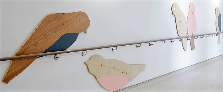
cornelia_baltes_4

Cornelia Baltes ‘Hanging Out Again’, 2014 – Wood, Pine veneer, Cherry Wood veneer, American Walnut veneer, paint – Royal London Hospital Maternity Unit


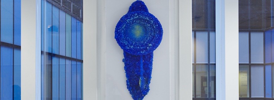
My two worlds – art and health finance – rarely cross, so it was doubly interesting to be shown around some of the art commissioned by www.vitalarts.org.uk in the hospitals of the Barts Health NHS Trust – England’s biggest. The Trust doesn't pay for the art, but Director Catsou Roberts has done an impressive job seeking external funds to enable  artists to make work for clinical settings. The highlights of a 2,000-strong collection include Cornelia Baltes’ wooden birds, Roger Hiorns’ copper sulphate stoppages of discarded office clocks from The Old Royal London Hospital, and striking work by Peter Liversidge, Hurvin Anderson, Richard Slee and Kim Rugg. Roberts gets plenty of positive feedback, but can art be proven good Value for Money in the cash-strapped NHS? Perhaps, in that a collection valued at £2m has been leveraged out of a budget of £100,000 per year for the art team which also runs music, dance and craft workshops across five hospitals. That represents just 4p per head of the 2.5m population served and a mere pinprick against Barts’ total annual budget of £1.4bn. The art could help towards creating a positive environment, which increases wellbeing and can speed recovery times. That's a good thing in itself, of course - and when a hospital bed costs upwards of £300 per day, it takes only a tiny impact on length of stay across Barts’ 2,000-odd beds to give a positive financial return. That sounds feasible, quite apart from supporting the arts, which I naturally favour with my other hat on. 


roger_hiorns_1a

Roger Hiorns: ‘Untitled’, 2012 – found plastic and metal office clocks from the old Royal London Hospital and Copper sulphate


Most days art Critic Paul Carey-Kent spends hours on the train, traveling between his home in Southampton and his day job in London. Could he, we asked, jot down whatever came into his head?


‘One Evening in London’: Paul’s ART STUFF ON A TRAIN # 194

Euan Uglow: ‘Daisy’, 1976

Most evenings the London art scene can yield plenty of variety, but a recent Thursday provided a particularly enjoyable set of contrasts, so much so that I ran late… I started at Piano Nobile, who have the knack of unearthing just the right works for their 20th century surveys – here a welcome opportunity (to 14 Jan) to compare how William Coldstream and his pupil, Euan Uglow, interrogate reality through measurement. ‘Daisies and Nudes’ aligns not just some of their finest figure studies, but also flowers – for which Uglow is known but Coldstream is not. On to the Freud Museum, where Martin Wilner, a practicing psychiatrist as well an artist, is a natural fit (to 19 Feb). He talked about the elaborate system which feeds into his double-sided day-by-day psychological portraits and his more diaristic scrolls from the subway, in which people seen are integrated with words overheard to compulsive effect. Third was Mat Chivers’ solo show (to 28 Feb) in the large underground garage space of PM/AM. ‘Harmonic Distortion’ has worldwide environmental scope: marble clouds intricately patterned by wave formations; cyanotypes making apparent abstraction out of fifteen years of data showing that our cloud cover is reducing; a performance in which one woman is bound by another, Kinbakushi style, in state of the art fibre optic cable even as she tries to draw circles using the oldest of means – ochre pigment… So whether you wanted academic analysis, obsessive drawing burrowing into the psyche or the wide sweep of science and its consequent politics, you had them.


wilner-subway

Martin Wilner: detail from subway drawing


install-chivers


Post-performance installation view of Mat Chivers: ‘Harmonic Distortion’

Most days art Critic Paul Carey-Kent spends hours on the train, traveling between his home in Southampton and his day job in London. Could he, we asked, jot down whatever came into his head?


‘All You Want for Christmas’: Paul’s ART STUFF ON A TRAIN #193


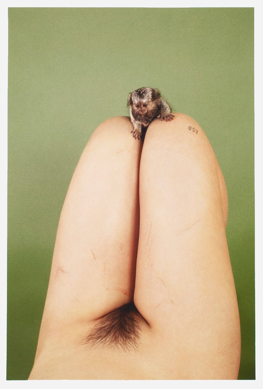
127_ryan_mcginley_marmoset_lsd_2012__c-print_64_8_x_44_cm__edition_of_50__courtesy_of_the_artist_and_studio_voltaire_london_2048x2048-ryan


Ryan_McGinley:’Marmoset LSD’, 2012

linder-dinner-set

Linder’s dinner set

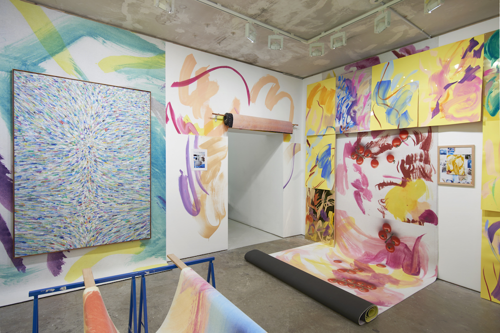
Studio Voltaire’s annual seasonal sale to benefit its work takes place (to 18 Dec) in the considerable central space of a knocked-through version of Alan Cristea’s former space on Cork Street. A visit is much more fun than the typical Christmas shopping experience, whether you buy or not. Christmas a la Voltaire seems to be more than usually oriented towards sex: Linda’s dinner set of porno-plates, a large green breast by Edward Kay, Ryan McGinley’s cheeky monkey and Cary Kwok’s drawing of a somewhat extravagant ejaculation are all prominent – but there’s plenty of other fun, too. Perhaps galleries in general are starting to take Christmas more seriously: Blain|Southern, for example, has a one day pop-up store and sale on 10 December. But if you’re given art, what will it look like at home? Arcade has a lively show which gives you an answer for Peggy Franck’s exuberantly colourful swirl paintings and tapestries, as not only is are they installed somewhat as if the gallery is a house, but ‘With no hands. Like a sea.’ (to 17 Dec) also incorporates photographs of the work in other spaces, so splicing documentation and art. Franck, it seems, hopes to pretty much take over your house, making her work a brave if adventurous gift! I guess you might opt for something more easily placed yet worthwhile – House of Voltaire have various towels and blankets, for example…

peggy-franke-install

Peggy Franck install view at Arcade

_867x650_peggy-franck_lucebert_43_pf

Peggy Franck when you get the work home

Most days art Critic Paul Carey-Kent spends hours on the train, traveling between his home in Southampton and his day job in London. Could he, we asked, jot down whatever came into his head?

‘Not What But Whose’: Paul’s ART STUFF ON A TRAIN #192


liquorice-allsorts-patrick-hughes


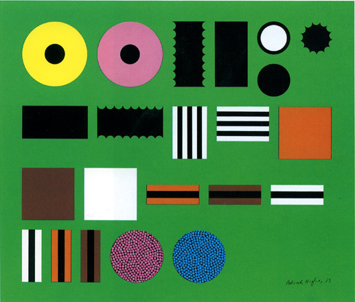
Patrick Hughes: ‘Liquorice Allsorts’, 1960 – Estimate in Bowie sale £10—15,000, sold at £81,250

Whilst provenance is an important factor in establishing the genuineness of work for valuation purposes, it isn’t normally a big factor in exhibitions. Just recently, though, three quite different exhibitions have had that focus. Sotheby’s, leading up to their 10 Nov auction, showed David Bowie’s art and design collection. It was packed, and catalogue sales were brisk – something which was hard to attribute to the public taste for such as Bryan Wynter, Bernard Leach and Ettore Sottsass – and the auction yielded prices which were typically double estimate. The Tate’s big new photography show (‘The Radical Eye’ to 7 May) is also part celebrity snooping, as while the quality of Sir Elton John’s 10,000 work photography collection is not to be doubted, it is presented in ways designed to let us see what John’s massive Atlanta house looks like, smothered as it is in his collection mounted in floridly assertive frames. In a contrast of sorts, Annely Juda is showing the bulk of a modest yet thoughtfully compiled collection of 56 works by former art critic Jos Knaepen (1933 – 2014) – it’s quietly good yet has of course got no attention. The Knaepen Collection – A Passion for Art (to 23 December) does, though, have its own focus on provenance, as a large proportion of the work was bought from Annely Juda…


elton_john_tate_modern

Installation view of Sir Elton John’s frames

knaepen_show_2016_006__full-size

Installation view of The Knaepen Collection, with Alan Green, Joseph Albers, Edwina Leapman


‘Shore Thing‘: Paul’s ART STUFF ON A TRAIN #190


rimg2211
Michael Dean: installation view

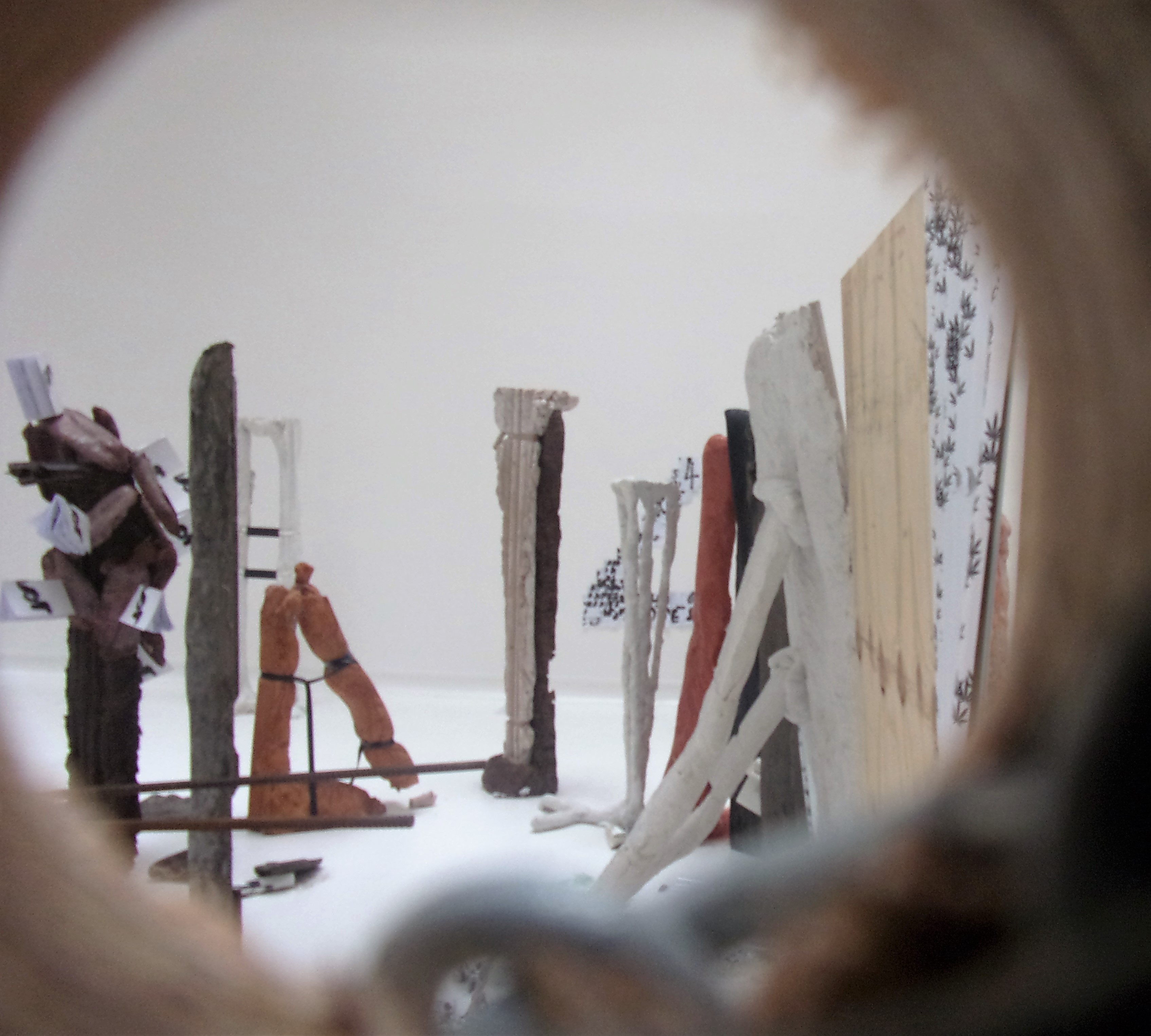
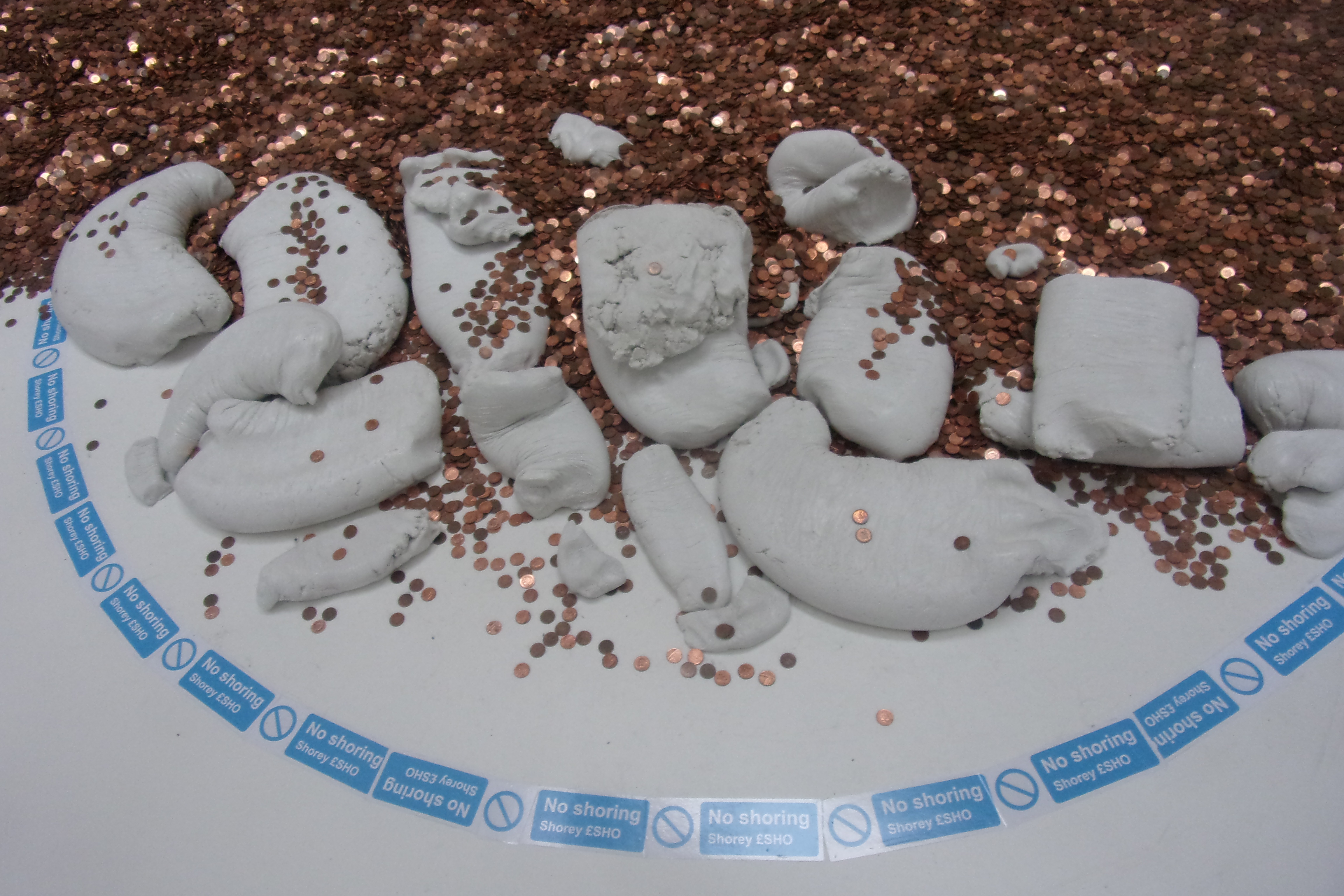
The Turner Prize judges have a tough task this year (announcement 5 Dec). Should they recognise the originality of a sculptor who collapses language into body into cityscape with a formal zip which belies his primary material of utilitarian concrete? One, moreover, who was nominated for shows which a British-based art follower might well have seen (as I did, in Amsterdam and South London)? Or should they select one of the other comparatively ersatz artists – Anthea Hamilton, Helen Marten and Josephine Pryde – present on account of shows in America? Aren’t there, I wonder in passing, enough good shows in Britain? I’d be tempted to make the Turner a prize for the best show in Britain by an artist based here, in which case the shortlist would have seen Dean joined by, say, Jenett Thomas, Sara Barker and Magali Reus). Anyway, Michael Dean – for it is he who should win under actual or hypothetical rules – describes his aim as giving a hard core form to his writing, which he translates into into a typeface of his design, from which he then generates moulds and casts. Hence we can see abstract alphabets, crumpled pages and his self-published books (used as plinths, and from which he often invites the viewer to rip a page) as well as tongues and clenched fists. The prize, incidentally, is £25,000, only £4,564 more than Dean has included in ‘All shores describe touching’ in the form of a beach of 2,043,600 penny coins – which fits the sculptural mise–en–scène and speaks to what he calls ‘the industry of poverty’ – as the amount the Government states is needed to support a family of four.

rimg2218
Michael Dean: installation view

Most days art Critic Paul Carey-Kent spends hours on the train, traveling between his home in Southampton and his day job in London. Could he, we asked, jot down whatever came into his head

About Me

My photo
Southampton, Hampshire, United Kingdom
I was in my leisure time Editor at Large of Art World magazine (which ran 2007-09) and now write freelance for such as Art Monthly, Frieze, Photomonitor, Elephant and Border Crossings. I have curated 20 shows during 2013-17 with more on the way. Going back a bit my main writing background is poetry. My day job is public sector financial management.

Followers