Writer and curator Paul Carey-Kent collects various writings here, including his weekly column for FAD art news, monthly interviews for Artlyst and texts from the shows he has curated. He currently writes freelance including for Art Monthly, Seisma, STATE, Border Crossings and World of Interiors. See Instagram for his daily choice from current shows. Some non-art content, such as photo-poems, is also included.
'Uneven' is a generous way to describe The Other Art Fair (14-17 March in Brick Lane): there's plenty of bad
and stale art. But the concept of meeting artists in front of
their work is a good one, and it gives a showcase to some of the many without gallery representation. My guess is that most people would find a few
artists from the 140 who appeal. Any rate, I found ten who interested or entertained me: here are five of themin front of their work, and me in the midst of another piece.
Jo makes collages which use playful systems, such as joining
up to edges, to arrive at a language which generates a satsifyingly painterly
aesthetic. When I asked her for a picture, she
propounded the interesting theory that the explosion of online images and
Instagram in particular has put visual art in a position parallel to that of
music when radio arrived.
Alice plays art, textile and fashion backgrounds into
politically-driven machine knitting. Here a confusion of black and white (that
would be ‘no deal’ and ‘remain’ I suppose) leads to a dizzying confusion into which
the word ‘Brexit’ has been smuggled; while her partner Josh poses before a view
of himself as a revolutionary.
Joshua has photographed 350 of London’s extant 450
launderettes – all as they are with no interventions – in the face of the
ongoing reduction in these characterful and social spaces. Some surprisingly colourful
examples caught the eye...
An artist has to eat: I found Nicolette snacking in
front of her series of starved-looking dolls got up in bobbly constructions. On the
one hand Barbie is imprisoned, as if by body image – on the other hand, you get the
feeling she’s enjoying herself in these vibrant balls of hand-rolled
textile…
Neat, you may say, the fragility of butterflies made out of
razor blades, suggesting sharp conclusions to the brevity of life – but isn’t
that simply combining two of Damien Hirst’s best-known streams of work? Of
course: but Lene’s usages precede Damien’s by some time… And she's designed her own themed dress: we await Damien's.
The fair's special attractions included this literally immersive installation in a greenhouse. The massed results of holes punched in unrecyclable papers - hence the preponderance of shiny stuff - reflect on waste, but also struck me as a rite for the passing of any need to ready paper for filing in our digitalised lives. Mainly, though, this was confetti-style fun.
I also liked Walter van Rijn (66), Etienne Clément (132), Delphine Lebourgeois (27) and Nayla Tabet (147). That makes ten entertaining diversions, even if my hit rate was modest...
Phoebe Boswell: detail from ‘She Summons an Army’ 2018
My very first weekly column – this is the 300th – considered the matter of blind art and the absence of a powerful congenitally blind artist. That hasn’t changed, but – a little disquietingly, perhaps – two recent shows related to the theme turned out to be within a golf shot, if a little further than a stone’s throw, of Moorfields Eye Hospital. Sargy Mann (Royal Drawing Trust to 10 March) had problems with sight from 1973 onwards, which he viewed positively at one level as chances to see the world differently and paint accordingly, for example using an oracular telescope with eightfold magnification. That changed from 2005, when he went totally blind, but he carried on painting with considerable success – either from memory or – as above – by using his wife Frances as a ‘tactile model’ rather than a visual model, and basing his marks on ‘seeing through touch’ to tenderly featureless effect.
The medical diagnosis is better for Kenyan-British artist Phoebe Boswell (at Autograph to 30 March), but she had the sight of only one eye while making the 34 drawings of ‘She Summons an Army’ as she sat in waiting rooms within Moorfields as she contemplated the sudden blindness of her right eye following a traumatic incident in 2017. The figures of her imagining all have heads turned surreally monocular. They’re part of a wide-ranging show which explores various traumas, and includes some beautifully disturbing footage of her eye operation. It all goes to reinforce the point that our perception is a joint function of what’s in the world and how we are equipped to receive it.
Sargy Mann: Frances at the Top of the Stairs, 2010
299: A Visit to Elephant West
Anna Liber Lewis: ‘History Lesson’ 2018
The launch of Elephant West, a big new space in a former garage next to White City tube, and linked to Elephant Magazine, is one of the most welcome recent developments in London’s art scene. There’s an emphasis on events and exploratory projects, rather than conventional exhibitions. Currently you can see recent paintings by Anna Liber Lewis.
Anna Liber Lewis: ‘Sirius Paralysis’, 2018
Looking at them reminded me that painting is a simple business: the only decisions of any consequence are what to paint, and how to paint it. But ‘simple’, of course, doesn’t mean ‘easy’. Those decisions, for example, often require a lot of bravery. Liber Lewis has plenty of that: she applied to the RCA after a thirteen year gap post-BA for museum and community work, teacher training and a child, graduating in 2015. She took on subjects likely to cause a fuss, painting bodily matters – and cocks in particular – from a feminist perspective, and she compared the physical engagement of painting with sex. Her talent was clear enough, and she won the Griffin Prize in 2017, as a result of she was invited to choose a collaborator and funded to spend a year in the studio without distractions. The display emerging from that is extensive: 17 paintings, many 2m high, and a dozen smaller works on paper. Collectively, they demonstrate a desire to move from being attended to primarily for what she paints, to seeking recognition for the way she uses paint. It’s a courageous move, though also one influenced by her chosen collaborator, Four Tet musician Kieran Hebden, whom Liber Lewis has known most of her life. She’s been listening to his music while she paints, and sending her images to him to trigger new music: you can listen to that while you look at the paintings. That’s a pleasant enough way of slowing down your looking to advantage, though I didn’t find that the rhythms of the two forms felt particularly close: Four Tet’s electronica is chirpy but laid back, Liber Lewis’s mark-making is vigorously assertive. That’s not a problem: many artists use music as inspiration, the results of which are unlikely to relate directly. Yet it did incline me to look at the paintings just for themselves.
Anna Liber Lewis: ‘Phonic Lips’, 2018
What we find is a shift away from clear shapes given their own space towards a layered approach which ambiguates what we see – an effect enhanced by a move towards more abstracted forms, less clearly delineated colour fields, and more mixed colours. They don’t come across as wholly abstract: many feature eyes as a motif, for example, and many – they’re all in portrait format – read naturally enough as faces. Yet they do foreground their abstract means.
Anna Liber Lewis: ‘Grand Ecart’ 2018
So Liber Lewis has maintained her bravery. The results are patchy, but why shouldn’t they be? The residency is designed to encourage experimentation: it’s a project, not an exhibition. History Lesson retains the most from her former mode, as the title may hint, and suggests a mask hanging against a chromatically divided background, triggering thoughts of social divisions and how hard it is to counter them once they’re entrenched. Phonic Lips employs whale forms, evoking another sound world, against a swelling background which does indeed have an aural quality. Sirius Paralysis foregrounds a green mamba which could equally be a sculpture, floating free of an architectural backdrop: the nature of civilisation seem in play here. Those culturally mediated examples are the strongest paintings here, but the overall title ‘Muscle Memory’ points to painting as an act of learned instinct. I’m not so sure Liber Lewis is in that place yet, and maybe she doesn’t need to be. I could get less out of, say, Cadence, Grand Ecart and Shape Shift, which seem to rely less on determinable form, more fully on muscle memory. To make that succeed, you need a very distinctive painterly language – like, to pluck three radically different abstract examples, Joan Mitchell, Jane Harris and Bernard Frize. Liber Lewis isn’t there yet – her abstract mode is somewhat generic – but she’s evidently brave, and has time. The same, I trust, can be said of Elephant West.
298: Art or Design at Collect…
Kaori Tatebayashi: ‘The Night Garden, Delft’, 2018
What’s the difference between art and design? Is it just a matter of whether the product is functional or not? Or whether the exploration of ideas is a prime purpose of making work? Whatever the case, such boundaries are always porous – indeed, ceramics and tapestry are increasingly popular media in mainstream contemporary art . The Collect fair run by the Crafts Council at the Saatchi Gallery in London (28 Feb – 3 March) gives chance to look at the potential crossover through over 300 artist/designers. It would be easy to focus on five whose work I have already written about: Carolein Smit, Tim Rawlinson, David Clarke & Tracey Rowledge, Claire Partington and Livia Marin. So here are five others whose work also appealed:
Irina Razumovskaya: Staircase, 2018 at Officine Saffi, Milan
The young Russian’s wall mounted porcelain is coloured by the traditional Chinese jade green celadon glaze. Razumovskaya has studied in St Petersburg, Jerusalem and London, but this was inspired by a residency in Jingdezhen. What might have been minimalist regularity gives way to either top to bottom story of deterioration or the sequence of a breaking wave.
Sara Peymanpour: Hejab in one of 15 artist-led solo stands branded the ‘collect open’
This hejab is made from gold and jewels in a pattern resembling the mosaics on mosque doors in Peymanpour’s native Iran. She told me she’d have liked to wear nothing but this golden cage in order to maximise its taboo-challenging impact, but had feared that might not be allowed… Still, a better bet than wearing it in Iran, where a prison term would follow.
James Rigler: Herm 1, 2019 at Craft Scotland
The New Zealand born Glasgow-based artist has a distinctive ceramic style which often looks to upend hierarchies of objects. Here what looks like an inedibly architectural wall of ham proves to be a punny update on an ancient Greek tradition. Herms are stone figures of head, torso and genitals, linked with the cult of Hermes, god of fertility. Hence, it turns out, the dangling balls.
Lada Semecká: Flow V, 2016 at Galerie Kuzebauch, Prague
The Czech Gallery showed four interesting artists in the most coherently curated stand, grouped as ‘Glass Rituals’. ‘Flow V’ is made from fused glass, for which glass crystals are sprinkled onto sheet of molten glass, Semecká then shifts the base around in order to obtain rippling effects which – in a nice paradox – suggest the ultimate dry of desert sands as much as ultimate wet of the ocean.
Kaori Tatebayashi: The Night Garden, Delft, 2018 at Joanna Bird Contemporary Collections, London (top image)
The Japanese ceramicist creates sculptural tableaux from stoneware. This is from a series placed against gold leaf in Dutch-style wooden frames, appropriately inspired by still lives from the Netherlands’ golden age. In a neat touch, Tatebayashi delegated titling this series to poet friend Gregory Warren Wilson – indeed, when I spoke to her she wasn’t entirely sure what he’d called what. Nice snail…
Art writer and curator Paul Carey-Kent sees a lot of shows: we asked him to jot down whatever came into his head
297: What's It Worth at Auction?
William Copley: ‘Jardinage’, 1961
Both Sotheby’s (S) and Christies (C) have major London auctions this week, head to head in impressionist, modern and surrealist categories. Compared with gallery viewing, the big difference strolling around them – apart from the arbitrary nature of what’s there – is the visibility of values, and I’m often surprised by what is and isn’t expected to be worth a lot. So, using mid-price estimates, I gave myself an imaginary budget of £6m and wondered how I would and wouldn’t spend it. I derived that budget from the likely cost of a small Lucian Freud: ‘Head of a Boy’, 1956 (C) – which at 7 x 7 inches equates, rather absurdly, to over £100,000 per square inch (actual proved to be £5.8m). Another unattractive way of spending it would be on Jenny Saville’s ‘Juncture’, 1994 (S), though I grant that’s very large (actual £5.4m). Will she, as that implies, be canonical in 100 years’ time? I doubt it. I feel similarly about Adrian Ghenie, so £2.5m for ‘The Collector 4’ (C) and £3m for ‘Duchamp’s Funeral’ (S - actual £4.3m) – both 2009 – would also feel an ill-advised use of the budget.
On the other hand, how about this collection of ‘ten for the price of one’ if estimates prove right, instead of that small Freud (which is roughly to scale with the Matisse which follows)?
Henri Matisse: ‘Nu demi couché’ Not quite the classic colourful Matisse odalisque, but a substantial painting at 29 x 37 inches, making it a ‘mere’ £2,300 per square inch at £2.25m (C - but was withdrawn from sale) Actual
Pablo Picasso: ‘Flowers in a Vase’, 1901 Might be fun to have a Picasso some might not recognise as such, painted when he was 19…. £2m (S)
Francis Picabia: ‘Iris’, 1929 63 x 38 inches so just £300 per square inch for a pretty characteristic masterpiece at £650,000 (C - actual £671k)
Marcel Duchamp: ‘Hommage à Caïssa’, 1966 – a found object and related to Duchamp’s passion for chess for itself and as a metaphor for artistic activity… £220,000 (S - actual £225k)
Glenn Brown: ‘Life is Empty and Meaningless’, 2005 I like his sculptures pretending to be paintings, but they fetch much less than his paintings pretending not be flat. £200,000 (S - actual £137,500)
Oskar Schlemmer: ‘Light Grey Group’, 1936 – pretty much what you want in a Schlemmer, in oil on paper rather than canvas, perhaps reducing cost… £175,000 (S- actual £375k)
Pablo Picasso: ‘L’étreinte’, 1969 Let’s add in a high quality late Picasso ink drawing which everyone will recognise as his… £175,000 (S - actual £175k)
Maurice Denis: ‘Jardin du Couvent’, 1892 – an attractive painting by one of Les Nabis… better value than Bonnard is likely to yield… £90,000 (C - actual £119k)
Paul Klee: ‘Bauhaus Lanterns Festival’, 1922 : ‘only’ a hand-coloured postcard-size lithograph, but then ‘only’ £12,000 (C - actual £23,750)
William Copley: ‘Jardinage’, 1961. Typically witty, and isn’t he on the rise, critically? £7,000 (C - actual £42,500, seems the market agreed) – see top image.
At least the Freud would fit in my house rather easily, but I wouldn’t mind moving to a bigger house to accommodate that group.
Art writer and curator Paul Carey-Kent sees a lot of shows: we asked him to jot down whatever came into his head
296: Andy Holden's Laws of Motion
Still from Andy Holden: Laws of Motion in a Cartoon Landscape
It’s always nice to see a significant project unfold from the beginning. Back in 2011, Andy Holden was in residence at the Stanley Picker Gallery in Kingston, and I caught his brilliant illustrated lecture on ‘Laws of Motion in a Cartoon Landscape’, setting out the typical tropes of the cartoon as a starting point for analysing art and the world. The artist’s lecture was having something of a moment them, as I recall Ryan Gander and Doug Fishbone also excelling. The problem is that such events are hard to repeat – but Holden found a very logical solution. Continuing to develop his ideas over 2011-17, he has inserted a cartoon avatar of himself into a film version. Now that film comes to London for the first time in the highly appropriate setting of the Cinema Museum, Kennington (21 Feb – 10 March). You can see why it took a while: Holden has sourced over 400 illustrative clips, the range of references – from cave painting to Futurism to Slavoj Žižek to quantum mechanics – is dizzying, and the analogies he draws out of the material are persuasive and witty. Untrammelled by his erudition, Holden provides a most entertaining hour. By way of a flavour. Law I states that ‘any body suspended in space will remain in space until made aware of its situation’. That leads Holden to observe that ‘capitalism as a whole operates with nothing below it’ – and, as the 2009 collapse of banking system showed, it was ‘oblivious till it looked down’. I also love Walt Disney’s explanation of how there should be an underlying logic to cartoon impossibilities: the spine which runs the length of a cow ‘explains’ why pulling its tail rings the bell on its neck. And the comparisons Holden draws between the unmooring of cartoons from the factual world with post-modernism in the arts and ‘post-truth’ in politics are spot-on. There are ten laws of motion. No. 11 could be: go see this…
Click here to see the trailer for ‘Laws of Motion in a Cartoon Landscape’.
Holden’s 2011 installation in Kingston included the list of laws
Art writer and curator Paul Carey-Kent sees a lot of shows: we asked him to jot down whatever came into his head.
295:The Pleasures of Tracey's Traumas
Tracey Emin: ‘Insomnia 8.27’ – titled from the time of the photo, and blown up to 2 metres high in the installation of 50 selfies
You might describe Tracey Emin’s huge and superbly orchestrated show ‘A Fortnight of Tears’ at White Cube as a pleasurable maximisation of pain. It pivots on a larger-than-life bronze of her mother cradling an absence where one might expect a child. That carries through into Emin mourning her mother’s recent death (in ‘The Ashes Room’ with paintings, film and vitrines of personal notes). When your mother dies, she says, ‘the place you came from no longer exists’. That thought links to her own childlessness, and so to the works which revisit the traumas of rape and abortion which have driven much of Emin’s earlier art – no wonder she took umbrage at the press conference at the suggestion she might be jumping on the #metoo bandwagon. Her 1996 film ‘How It Feels’ – a 20 minute account in interview format of the abortion experience – is being screened as context. If anything it seems less raw than the new neon, sculptures and many paintings – some of which look almost abstract before you see such brutal titles as ‘They Held me down while he Fucked me 1976’. That’s in line with Emin’s own view that – contrary, perhaps, to popular belief – she ‘used to be embarrassed’ by her cathartic responses, but now ‘just wants to get this stuff out’. Both those intense areas of experience and suffering feed into the third main strand of the show: the whole room ‘Insomnia installation’ of 50 self-portrait photos blown up to a scale monumental enough to feel tongue in cheek even as they chronicle what Emin describes as ‘like an early death from within’. For the past four years she has taken selfies when she can’t sleep and is unable to function awake, showing an impressive range of bed wear and a lack of vanity which extends to showing puffy eyes and a fat lip. This, a fresh new reason for tears, might be seen as an update on the famous bed. Emin would like to be seen as essentially as a painter, but her unique ability is rather in how she presents her inner self. ‘A Fortnight of Tears’ confirms that power.
Emin in the Insomnia Room takes a selfie of herself with selfies
Tracey Emin: ‘They Held me down while he Fucked me 1976’, 2018
Tracey Emin: 'The Mother', 2017
Art writer and curator Paul Carey-Kent sees a lot of shows: we asked him to jot down whatever came into his head
I was surprised to find recently just how much there is at Tate Modern which might entertain the typical two year old. My grandson, Rowan, acted as the test case. The biggest hit was Tania Bruguera’s installation, which incorporates a super-shiny floor on which no shoes are allowed. Whatever you think of the latest Turbine Commission as political art, this area is as popular with sliding children as were Superflex’s swings which preceded it. After charging around for 20 minutes, Rowan had to be dragged away.
Other popular artists were Haegue Yang, for giving the chance to look up at a structure made from hundreds of Venetian blinds; David Batchelor, for providing a tower of simultaneous colours for identification (‘Spectrum of Brick Lane 2’ , 2007); and Rulolf Stingel for his orange wall carpet, which visitors are invited to mould and sculpt (‘Stingel challenges artistic conventions by exchanging paint on canvas for carpet mounted directly onto the wall and allowing the viewer to make their own marks on the surface’ – label). Also of some interest were Susan Phillipsz’s dark room full of voices and Olafur Eliasson’s super bright rooms.Nor was critical engagement lacking, through the Bloomberg interactive artists timeline, an interpretative wall which summons pictures when you press on it. Add chances to look down from on high and the sweet items in the café, and Tate Modern has plenty going for it if you are young – as Tate itself points out here. The question, I suppose, is to what extent this indicates that art has been problematically infantalised. But if you have a toddler, just be grateful.
Inside installation view, Krzysztof Gil, Welcome to the Country where the
Gypsy Has Been Hunted, 2018. Photo: Andy Keate,Courtesyof l’étrangère
Polish Roma artist Krzysztof Gil’s ‘Welcome to the Country where
the Gypsy Has Been Hunted’* was an interesting and unusual exhibition emerging
from his parallel art practice and PhD research into how discrimination against
the Roma took place much longer ago than we might suppose. Gil presented
drawings in the manner of the Dutch golden age inside a Roma-style shelter with
barely enough light to make out that they showed the so-called ‘gypsy
hunts’ of the C17th in the Netherlands, when the law enabled such persecution
to be treated as a public sport. The audience had to hunt in their turn for
what was both disturbing and uncanny. In conversation with the artist Ken
Gemes, Professor of Philosophy at Birkbeck College, explained
that the move towards ‘othering’ people on a biological basis occurred in the
C19th, feeding the notorious atrocities of the C20th. Prior to that, said Gemes,
discrimination tended to stem from differences in beliefs, so there was at
least the possibility of change. Now it was on the unalterable basis of the
body. Consequently, discrimination wasn’t to be tackled positively, by educating
others, but negatively - by excluding or eradicating them as having ‘bad
blood’. Gemes also proposed an interesting account of why political art
mattered: according to him it can give metaphorical heft to both the material
developed by academics and the experiences of activists, enabling simpler
messages to counter, for example, Trump’s prejudiced sound bites. He
cited the 1950’s influence of Turgenev’s ‘Notes of a Hunter’ on the abolition
of serfdom in Russia and Harriet Beecher Stowe’s ‘Uncle Tom’s Cabin’ on attitudes
towards African Americans, as examples of artists having more practical impact
than academics. Let’s hope the show had a little of the same effect.
* l’étrangère gallery, 44a Charlotte St, Shoreditch 16 Nov 2018 –
5 Jan 2019
Outside installation view, Krzysztof Gil, Welcome to the Country where the
Gypsy Has Been Hunted, 2018. Photo: Andy Keate,Courtesyof l’étrangère
Art
writer and curator Paul Carey-Kent sees a lot of shows: we asked him to jot
down whatever came into his head
292: Reserved for London Art Fair (see separate post)
291: Islam Expanded: Idris Khan at the British Museum
One of Idris Khan’s ’21 Stones’
The dominant contemporary feature of the British Museum’s well received new Islamic Gallery* is a site-specific work by Idris Khan. Though still, perhaps, best known for overlaying multiple photographic images, Khan has moved on in various directions over the past decade, including monumental public commissions and an ongoing practice of making drawings-come-paintings-come-prints by turning a small passage of writing into rubber stamps, which become the means of creating apparently abstract compositions.
The library of stamps in Idris Khan’s studio
Khan’s studio contains a library of sorts: his shelves hold the many stamps made to create such works. I like how ‘21 Stones’, 2018, adds an overall narrative to installation made from 21 different texts stamped in blue oil paint on paper, then scattered across a full wall. The visual impact is given added resonance by the presence of the texts – written by Khan about his own life. It’s not that you can read them – Khan does not intend that to be possible, and even from up close, the legibility is limited – but they draw you in to an intimate, if mysterious, encounter. The more explicit backstory is that of the ‘Stoning of the Devil’ ritual, when pilgrims throw stones at a wall of the Jamarat during the annual Islamic Hajj pilgrimage to the holy city of Mecca: the wall represents the devil, though the pilgrims are encouraged to turn their attention inward, through contemplation and meditation, to rid their spirit of impure thoughts, which ultimately brings them closer to the divine. The British Museum’s wall stands in, so that each drawing represents a stone thrown, suggesting in turn how the words hit the paper to create the artwork. As Khan says: ‘I have always imagined when a pilgrim releases a stone, and it hits the wall, the words and prayers that the stone represents explode into a physical language’.
Idris Khan with ’21 Stones’ in the Islamic Gallery
* featuring 1,600 objects across the 7,000 sq. ft. of Rooms 42 and 43
Art writer and curator Paul Carey-Kent sees a lot of shows: we asked him to jot down whatever came into his head
290: Edward Burne-Jones: Feat Piano, Sleep and Feet
Sir Edward Burne-Jones’ serious intent can seem laughable, so here are some somewhat less serious points from Tate Britain’s comprehensive presentation of his work:
*He was baptised Edward Coley Burne Jones: ‘Coley’ from his mother, who died a week after his birth in Birmingham in 1833, and ‘Burne’ from his aunt. He grew up as Edward Jones, adopting the ‘Burne’ as an artist but adding the hyphen only in 1885
Edward Burne-Jones: The Garden Court, 1890 from ‘The Legend of Briar Rose’
*He is known as a painter of beautiful, lean women with an expressionless demeanour into which melancholy undercurrents can be read – very much in tune with the subsequent development of the catwalk model. Seeing the work in bulk, he clearly loved a well-turned foot in particular. ‘The Golden Stairs’ is traduced by Jonathan Jones in The Guardian as a ‘fey concoction’ which exemplifies how Burne-Jones gives us ‘art that shows how boring beauty can be’ as it ‘disdains life’ in favour of ‘art for art’s sake’. Be that as it may, the maidens on the stairs yield the chance to paint twenty naked feet, and many more are sprinkled throughout the show. Shoes were not Burne-Jones’ thing.
Edward Burne-Jones: The Graham Piano (1879–80)
* He expanded not only into stained glass and tapestry (often working with William Morris) but also into decorating a piano to spectacular effect. Inside the lid, for example, we see Mother Earth struggling to control a hoard of naughty cherubs, which reminded me of reluctantly taken lessons.
Edward Burne-Jones: Briar Rose cycle – installation view at Tate Britain*The Briar Rose series, given a separate room, is his masterpiece, though Jonathan Jones considers it his most stupid work. The stasis which can seem problematic comes into its own in an unusual installation of four large paintings, ten pendants, and wall texts. They’re based on the Grimm Brothers’ version of ‘Sleeping Beauty’, and show first the ‘winning prince’ then the prone figures of failed rivals, the dormant king and courtiers and his daughter’s dormant personal attendants (with bare feet, of course), before reaching the princess we know is about to wake. That makes 24 sleeping figures bookended by the two who are not stilled in time, all united by the thicket of briar rose. Sleep, in a way outside of life, turns out to be Burne-Jones’ perfect subject.
289: Edward Woodman’s Superior Records
Richard
Wilson: ‘She Came in Through the Bathroom Window’, photographed by
Edward Woodman in 1989. ‘The window was actually drawn out of the space
where it is normally located, and brought into the room so that the
outside world expands but the interior architectural space shrinks’,
says Wilson
The John Hansard Gallery in Southampton has (to 2 Feb) an unusual
exhibition: ‘Space, Light and Time’ is a retrospective not – at least
not directly – of seminal British art of the 1980’s and 90’s, but of
Edward Woodman’s photographs of the work and the artists involved. It is
of interest for four reasons.
First, the images give an excellent account of a wide range of work –
mainly sculptural or performative, and almost always photographed in
black and white, which maximises the undistracted concentration on form.
Second, the photographs actually stand in for much of the work, which
was temporary. The Tate, for example, bought Richard Wilson’s ‘She Came
in through the Bathroom Window’ from Matt’s Gallery, but they won’t be
able to show it in the original building – in which the windows were
relocated to the centre of the room. Woodman’s notably precise view –
apparently the only shot he took, after considerable preparation – is
the closest we’ll get to what it was like.
Third, we meet the artists in action, as in particularly evocative images of Helen Chadwick (1953 -96).
Helen
Chadwick with Ego Geometria Sum (1982-4), photographed by Edward
Woodman at Riverside Studio, 1985: a set of sculptures that reflect the
mass of the artist’s body at a succession of ages from premature birth
to maturity at 30, take for appropriate to the age (eg the pram) and are
printed with pictures of the object in question and of Chadwick’s form
as shaped to the object, that conforms to the sculptures shape. Thus
did she represent the attempt to free the ego from traumas past.
And fourth, there is a chance – alongside the expected Damien Hirst,
Cornelia Parker, Mona Hartoum etc – to (re)discover artists who have
fallen from the public eye. I was drawn to Woodman’s Wood, ie the
little-known work of Julia Wood. Unfortunately that Woodman was so
severely injured in a bike accident in 2000 that his primary practice
was cut off. But he has fought through that to make other work and to
re-engage recently with his documentation of art, so the show concludes
positively – as well as being positively worth seeing.
Julia Wood’s work photographed by Edward Woodman in 1981
288: Clare Price: painting, performance and the self
Clare Price: ‘Needs’, 2018
The actions of Clare Price
are visible in her series of rapidly-made paintings ‘Fragility spills’.
The works are scaled to the artists body, and we can see, in her words,
‘colours smear push soak float leaving fingered edges and thin wet
absent middles like pelts’. Price goes further, however, through two
sets of photographic projections at the ASC Gallery
(to 20 Dec). In the first, taken remotely, she strikes dance-like poses
in front of the works, wearing studio clothes which themselves bear the
accidental results of her actions. That suggests an autobiographical
angle, confirmed by the photographs’ original publication on a private
Instagram account alongside hashtags indicating emotional vulnerability: 'needs', for example, 'fragile' and 'refuge' .
Clare Price as photographed by Benjamin Whitley, 2018
The second set of photographs is a collaboration with Benjamin
Whitley: he’s two decades younger than Price, enabling
differences in generation and gender to generate an alternate
and intimate gaze. Price sees the photographic additions as
‘un-containing’ the self from the constraints of the stretcher, so
enabling a ‘spilling forth of affect’ from the paintings. As Stephanie
Moran puts it in an attractive accompanying booklet*, Price’s practice
proposes that ‘painting has a structure that contains experience’. That
suggests, says Cairo Clarke in the booklet’s other text, that Price’s
combination of paintings and photographs forms ‘a dance between
containment and release’ which emphasises ‘the importance of being an
active, conscious body’ when making art. The overall result is a novel
presentation – and potential remaking – of the self through the action
of painting. That resonates with the growing belief that differences
between the sexes, between man and nature, between human and
technological, are less fixed than used to be assumed.
Clare Price at the ASC Gallery, Thurlow Street, London – installation shot
* ‘Fragility Spills’, published by Marcelle Joseph’s GIRLPOWER Collection
Art writer and curator Paul Carey-Kent sees a lot of shows: we asked him to jot down whatever came into his head
287: David Ostrowski’s Show of the Book
Exhibition view: David Ostrowski – The Thin Red Line
By way of an interesting reversal of the usual hierarchy, David
Ostrowski’s ‘The Thin Red Line’ (to Jan 19) delivers more ‘the show of
the book’ than ‘the book of the show’. The German painter is known for
canvases which foreground his apparent nonchalance, with just the
occasional sprayed gesture on near-empty grounds suggesting a lazy
graffitist. The casual yet considered approach extends to the hang at Sprüth Magers,
with some paintings obscured by others, and tapestry carpets rolled up: it's more an environment than a set of works. Ostrowski adopts a restricted
palette, and here the focus is on red – so much so that an accompanying
book with five essays on the colour is an integral part of the show. The
writers consider red from various angles. Can it drive you crazy? The
mantis shrimp, says Tenzing Barshee, ‘is believed to have the eyes with
the widest range of colour reception in the animal kingdom. To me it
doesn’t come as a surprise that this animal is extremely aggressive. It
speeds towards its prey and punches it so fast that the impact creates
underwater light and sound’. Colour psychologist Vanessa Buchner reports
that red has the most prominent associative effect: it makes a pleasant
person seem more so, but also a disagreeable person even more
unappealing. ‘Wearing a red shirt to your next first date’, she judges,
assuming her readers are nice, ‘would not be a terrible idea’. It also
seems that people playing with red poker chips bet more than those using
blue or white chips, perhaps because they seem like the chips of
winners; and the Chinese don’t allow red at funerals since it’s the
colour of happiness. All of which and plenty more gives substance to a
show in which there is artfully little to look at…
Exhibition view: David Ostrowski – The Thin Red Line
Art writer and curator Paul Carey-Kent sees a lot of shows: we asked him to jot down whatever came into his head
286: Munnings Beyond the Horse
Alfred Munnings: ‘Moving the Truck to Another Yard’, 1918 (Beaverbrook Collection of War Art 19710261-0475)
Here is an unexpected exhibition in an unexpected location: the impressively refurbished National Army Museum,
which reopened last year, is showing some 50 Alfred Munnings
paintings*. They were commissioned by Lord Beaverbrook in 1918 as a
means of recording the Canadian contribution to the First World War, and
have emerged from storage at the Canadian War Museum in Ottawa in
pristine condition for a first viewing since 1919! Munnings’ reputation
is as a brilliant – if rather old-fashioned – painter of horses; and a
stick in the mud president of the Royal Academy, famous for railing
drunkenly against modernism. His work remains popular and fetches good
prices, but isn’t really part of the mainstream story of art. The work
here is varied, though horses are central, this being the last war for
which they were a significant presence: the British Army alone deployed
over a million, though they proved less suited to the new trench warfare
than to subsidiary operations, such as reconnaissance, transport and
the logging for the war effort – led by Canadian lumberjacks and
extensively recorded by Munnings. Most of the paintings are relatively
bucolic at first glance, and certainly there is no death to be seen. Yet
we are kept aware of the martial backdrop, and I was reminded of how
Edward Thomas’s great poem ‘As the Team’s Head Brass’
sets the timelessness of ploughing against the trauma of conflict. I
was also entertained to find that Munnings actually stated that a cow
‘though not perhaps so beautiful or romantic an animal as a horse, is a
better subject for the artist’ – and went so far as to buy one to act as
his model. All of which makes for an interesting show – though not one
likely to change Munnings’ critical standing.
* ‘Alfred Munnings: War Artist, 1918′ to 3 March 2019
Alfred Munnings: ‘A June Evening in the Jura’, 1918. (Beaverbrook Collection of War Art 19710261-0480)
Art writer and curator Paul Carey-Kent sees a lot of shows: we asked him to jot down whatever came into his head
285: Anyone for Ashtrays and Fans?
Uta Kogelsberger: ‘Bad Eggs’, 2018 – paint on ceramic
Ceramics and textiles are increasingly accepted as mainstream art
materials. Ashtrays and fans, though, are less likely to come to mind
than sculptures and wall hangings. But you can see plenty of both
currently. The Belmacz Gallery – an unusual space in that it shows
another edge-of-art category, jewellery, alongside paintings and
installations – is displaying 91 artists’ ashtrays and related smoking
artifacts* – either made by them or chosen from their personal
collections. It’s great fun, as in the awkward ‘where to stub it out’
conundrum posed by Nigel and Boris above, and in these three uses of
unconventional materials:
Finoa Banner aka The Vanity Press: ‘Untitled’ 2018 – Cohiba cigar wrapper and tampon
Stefan Reiterer: ‘Ashtray’ 2018 – five matchboxes handpainted with lacquer and glue
Simon Popper: ‘At a Certain Point, Everything is an Ashtray’ 2018 – yes, they really are mushrooms.
The Barbican is currently showing perhaps the best-known modern art
fans: three of the six which Oskar Kokoschka gave to his lover Alma
Mahler (1879-1964), the composer’s widow, which depict aspects of their
lives together **.
Oskar
Kokoschka’s Third Fan for Alma Mahler, 1913 is a memento of the
couple’s trip to Italy, including at centre their embrace at the foot of
Mount Vesuvius.
But the fan and its potential for art is essentially an eastern
tradition, so it is appropriate that the Japanese-run White Conduit
Project Space *** is showing 50 fans commissioned from contemporary
artists.
Sally
Kindberg: ‘Fan-fare’ 2018 – starts from the history of the fan for
signalling device to apply the parallel silent communication system of
the lighthouse.
Ryan
Gander: ‘Prepared for slowness’, 2018 An ongoing series of fans used to
bluster the artist’s fireplace of his family home, Woodbridge, UK
(edition of 100)
Karen David: ‘Aubrey (Season 2, Episode 12)’ 2018 – of The X-Files, I presume: I guess Karen is a fan
* The Ashtray Show West at Belmacz Ltd, 45 Davies Street to 12 Jan
*** Pacific Breeze at White Conduit Projects, 1 White Conduit Street, Islington: 2 Dec – 13 Jan
284: Peter Funch and the Construction of the Self
Peter Funch from ’42nd and Vanderbilt’
Paris Photo takes the photo book very seriously. All the top photographers were there recently, signing their latest. I returned with ‘42nd and Vanderbilt’ by Peter Funch (TBW Books 2017).
Its premise is simple: from 2007-16 Funch took photographs at the
eponymous, and decidedly anonymous, street corner in New York between
8:30 and 9:30 a.m. He then sorted through them to detect recurring
characters – in other words, commuters (and there’s too little art
consideration of such a big chunk of many people’s lives). Funch’s
effort over such a period is astonishing. Already something routine –
boring, even – is made interesting, like Roman Opalka painting numbers.
And you always get a nice frisson from the ‘compare and contrast’ of
similar pictures. Will their clothes change? Not always. Will their
gestures recur? Often. Funch previously combined many different people
at different times doing the same thing – yawning, for example – at the
same place. Now people are just ‘being themselves’ at in the same place
at different times (though also, in a way, at the same time). We don’t
just fit in with society, we fit in with ourselves. Douglas Coupland, in
the book’s essay, suggests that a critique of capitalism is implied –
of ‘the way we package and sell ourselves and how we make our peace with
our lots in life’ (largely by disappearing into our own worlds as we
make the routine journey). Yet I wonder: the construction of a self is
vital to happiness, but we can trace back to David Hume the worry that
it’s hard to pin down that self. Perhaps it’s just such repetitions and
consistencies which provide the grounding for the self to do the
interesting stuff. That’s true at home, too: we follow the same
routines, but capitalism doesn’t drive that. Seeing an action and
expression I think not ‘what a deadening routine’ but ‘ah, that’s him’.
Peter Funch from ’42nd and Vanderbilt’
283: Frida the Modern
Frida Kahlo: ‘Self-Portrait’, 1948
How does a painter currently making her way respond to the life and
work of Frida Kahlo? I attended the V&A’s ‘Making Herself Up’ with
Emma Cousin, whose paintings recently made a splash at Edel Assanti
gallery. We agreed that my question suggests a false division: life and
work are integrated in Kahlo’s case. The show combines her paintings
with clothes, photographs and intimate possessions which her on-off
husband Diego Riviera had sealed for 50 years at the La Casa Azul in
Mexico City, after Frida died in 1954. All contributed to Kahlo’s
construction and performance of a self through which she generated a
charge which carries through into her paintings. Her approach finds a
ready parallel in modern women such as Madonna and Tracy Emin. Is it a
problem that Frida traded on her beauty? Cousin thought not, as Kahlo
had not adopted existing standards, but created her own, embracing her
facial hair and mixing and matching European and Mexican influences. Nor
did she submit to her physical disabilities, the social constraints on
women, or the career disability of being seen as a mere adjunct to the
great Diego. Frida composed herself as she would a picture, and turned
her photographic self presentation into a daily theatre of beauty and
pain. And the paintings stand up well: Emma was drawn to the way Kahlo
builds up the substance of flesh, and how she feeds the conventions of ex voto
painting into her construction of space. Posthumously, as the sell-out
show testifies, Frida Kahlo has succeeded fully in her refusal to go
unnoticed.
Frida Kahlo in blue satin blouse, 1939, photograph by Nickolas Muray
Art writer and curator Paul Carey-Kent sees a lot of shows: we asked him to jot down whatever came into his head
282: Significant Others: Ana Mendieta and More
Ana Mendieta: ‘Self Portrait with Blood’, 1973
Ana Mendieta would have been 70 this month (18 November 1948 – Sept
10 1985) had she not fallen 34 floors to her death at just 36. The
turning points of her life are well known: arriving in America as a
child refugee from Cuba in 1961; the relationship with her teacher Hans
Breder at the University of Iowa; his documentation of her early
performances; the prescient integration of her work with the natural
world through the mid 70’s; the move to New York in 1978. After an on-off relationship – they were said to be prone to heavy
drinking and arguments – she married Carl Andre in January 1985. He was
tried for her murder but acquitted in 1988 on the grounds that there was
insufficient evidence to prove that he had pushed her out of the
window. The verdict continues to split the art world, but there is more
consensus on the comparative merits of their work. When she died,
Mendieta’s profile was low but Andre’s was towering. Several
significant posthumous shows (including one now up in Paris) have
revealed the full scope and importance of her work, such that theirs is
now seen very much as a marriage of artistic equals. She’s part, I’d
say, of a trend: the reputations of Frida Kahlo*, Helen Frankenhaler and
Kim Lim all look likely to eclipse long-term those of the husbands –
Diego Rivera, Robert Motherwell, William Turnbull – who were more lauded
in their lifetimes. And while you couldn’t quite say that of Anni
Albers, Lee Krasner or Dorothea Tanning*, their reputations as artists
independent of Josef Albers, Jackson Pollock and Max Ernst have soared
in recent years.
* the only two of the seven women listed to feature among the 44 in
the Barbican’s new show ‘Modern Couples: Art, Intimacy and the
Avant-garde’
Ana Mendieta: ‘Untitled (Blood and Feathers)’, 1974
Art writer and curator Paul Carey-Kent sees a lot of shows: we asked him to jot down whatever came into his head
281: IS IT FINISHED?
Picasso: ‘Harlequin’, 1923
One of the questions most commonly asked of artists is: how do you
know when the work is finished? Evasion or denial characterise most
answers, such as ‘when they take it away’ (de Kooning) or ‘What
nonsense! To finish it means to be through with it, to kill it, to rid
it of its soul’ (Picasso). Collectors have sometimes needed to be on
their guard against artists – Degas was notorious – who wish to finish a
work after they have sold it…
So it was interesting to come across a comprehensive article by Christophe Van Gerrewey (Forthcoming at http://deappel.nl/en/publications) proposing setting out ‘seven types of unfinishedness:
*Consistent with the foregoing, because the artist’s individual conclusion that it is finished cannot be rationalised
*All works of art are unfinished because they are open to completion
in different ways by the viewer: it is only with the audience that they
find their true purpose
*Because it is but part of a greater, unfinished – possibly
unfinishable project – at one extreme Van Gerrewey cites Jürgen
Habermas’ speech ‘Modernity: An Unfinished Project’
*Viewing the artwork as process / concept / method means that the
work goes on. Sol LeWitt does not make a wall drawing himself, he
provides the instructions to make it so anyone can execute the work
anywhere.
*Preferring an aesthetic of unfinishedness – a modern trend valuing
the sketch above the worked up version in many cases (though that raises
the question: what is the ideal endpoint for a work to be held up
against when judging it incomplete?
*‘Unfinished’ as finished: as if an artist releases a work from the
studio, then it must by definition be finished, however it may look
*On the basis that the work will always retain latent potential.
Never count someone happy until he dies, Sophocles is reported to
have said. And so, until our time comes, we have the imperfect happiness
of seven types of unfinishedness. That said, articles on FAD can be
altered after publication: I may have further thoughts…
Willem de Kooning: ‘Abstraction’ 1949 – 1950
Art writer and curator Paul Carey-Kent sees a lot of shows: we asked him to jot down whatever came into his head
280: Martin Eder’s toxic beauty
Martin Eder: ‘Possession’, 2011/18
‘Parasites’ is the tenth exhibition at Damien Hirst’s Newport Street
Gallery, which opened in 2015. The German painter Martin Eder, shows 53
works – many of them huge and all, his staff assured me, owned by Hirst.
As before, excellent presentation makes the most of the material, but
the content won’t be to everyone’s taste. Eder sees himself as an artist
of our dystopia for whom ‘beauty is toxic’. His world is one of excess
in Koons mode, with plenty of naked bodies, puppies and kittens, all
executed with the bravura and moral intent of 19th century history
painting. In Eder’s words ‘I set out to choose the stupidest subjects…
Things that everybody knows’ so that ‘you can really get started with
the scenery, the dramaturgy’: the result, he says correctly, is
‘iconography right on the border of car bonnet painting and the
Renaissance’. The Guardian’s Jonathan Jones believes it shows Hirst is
‘unable to tell the difference between dangerous art and masturbation’,
but I’m surprised he sees much scope for sexual arousal, it is so
overwhelmingly concerned with colour relationships and painterly
effects. Is that enough to offset the danger that the crass / juvenile /
kitsch images will reinforce rather than undermine the critique of
consumer society as infantile and perverse? I’m not sure, but for
example the shaggy transitions of dog to rug and pink phasing of roses
to tent to cushion to stuffed flamingos draw the eye winningly in
‘Possession’ 2011/18, and I’m glad Damien has given us the chance to
ponder Eder’s merits.
Martin Eder: ‘The Reaper’, 2103/18
Martin Eder with ‘Your God is High on Misery’, 2018
Art writer and curator Paul Carey-Kent sees a lot of shows: we asked him to jot down whatever came into his head
279: CLOUDS AT THE V&A
Thomas Ruff: ‘Tripe_01 (Amerapoona, Mohdee Kyoung)’, 2018
The Victoria & Albert Museum’s re-presentation of its photography
collection in a newly opened ‘Photography Centre’ strikes a nice
balance between image and information, method and content, historic
development and contemporary relevance. Highlights include the 3D
illusion of being present at the Great Exhibition in 1851 and
acquisitions from shows I have admired by current photographers who
should be better known, such as Peter Funch, Jan Kempanaers and Marco
Breuer. One small cloud I noticed on the sunny horizon was the label
categorisation of Nan Goldin as ‘one of the world’s most influential
female photographers’ – I didn’t see any parallel labels commending a
‘leading male’. There are also positive clouds aplenty. Thomas Ruff, who
often works by altering pre-existing images, has discovered a kindred
spirit in the collection for his opening commission: the wonderfully
named Linnaeus Tripe (1822-1902) often retouched the negatives of his
views if India and Burma, especially by painted on clouds. Ruff blows
the images up big and adds his own emphasis to the interventions.
Penelope Umbrico: still from ‘171 clouds from the V&A Online Collection, 1630-1885’, 2018
Penelope Umbrico has sourced images of clouds from the V&A’s
online collection, and merged them into an hour’s passing weather
featuring 60-odd paintings on a monumental ‘Light Wall’. And at the more
dramatic end of atmospheric conditions, Hiroshi Sugimoto’s ‘Lightning
Field 225’ is a recent acquisition: one of a series using a 400,000 volt
Van de Graaff generator to apply electrical current to a sheet of
negative film on a table top. The result image is a lightning-like bolt
of electrical current.
Hiroshi Sugimoto: ‘Lightning Field 225’, 2009
Art writer and curator Paul Carey-Kent sees a lot of shows: we asked him to jot down whatever came into his head
278: Popular at Frieze
We’ve just had the first Frieze during which I was on Instagram (follow me at www.instagram.com/paulcareykent ). I posted 20-odd works as of interest, and these were the most popular three…
There’s a nice logic to Nicole Wermers’ ‘Untitled ashtray (shells)’
(2018) as above: grandness gets smaller as the layers ascend till the
crushed shell form of sand is reached, only for the sequence to be
summarily stubbed out… unless the implied smoke is the next reduction.
Rana Begum’s newest stream of work at Kate MacGarry is so recent it –
the ‘crumples’, perhaps – hasn’t yet picked a generic name. These are
jesmonite versions of sheets of A4 paper screwed up, flattened to a
degree, then spray painted from various angles – so linking them to
Begum’s well-known ‘bars’ (as on Third Line’s stand) in which the colour
seen varies with the viewer’s position.
Tatiana Trouvé’s ‘The Shaman’ (2018) at Kamel Mennour is the most
spectacular work , turning a massive bronze tree root into a working
fountain as a way of proposing the potential for the artist to operate
as a shaman of sorts: able travel from one world to another – as trees
cross from below to above ground – and to achieve transformation.
277: Anomie with Rodgers and Ketter
Terry Rodgers: ‘It’s Complicated’, 2017
It may look an improbable pairing, but two shows opening last
Thursday felt as if they had a common core. Terry Rodgers has his first
London solo at Jerome Zodo: ten of his characteristically large, lush
paintings of beautiful people. They’re in party mode, but hardly having
fun: of the 40 figures whose faces are visible, none smile, and nor do
they make any connection with each other: expressions which made sense
individually loses coherence as separately posed models are brought
not-so-together. It’s easy to assume that these are a routine
production, but the painting is passionately engaged and Rodgers’
compositions can be daring, as in the radical prominence of a fur in
‘It’s Complicated’, 2017. There are no figures in Clay Ketter’s
photographically-based works at Bartha Contemporary, where he has an
impressive mini-retrospective. However, his most recent series,
emphasises social isolation in a complementary way. Tract (2010-ongoing)
– taken from satellite images stitched together with CGI technology –
depicts the architecture which part-causes, part-consolidates the
distancing which Rodgers depicts; and the formal interest is largely in
the baroque interplay of pattern, just as it is in Rodgers. Are we
setting up a world – offline and on – in which interaction has been
impoverished to such an extent that the individual, never mind
community, well-being is under threat? That’s what I take Ketter and
Rodgers to fear.
Clay Ketter: ‘Spider Woods’ 2012 / 18
276: To Deptford
Part of Laura Yuile’s installation for Deptford X
The annual Deptford X (21-30 Sept) may be a relatively small event in organisational and funding terms, but makes for a packed visit. Six commissioned projects form the core, and this year they’re all within five minutes of the festival’s hub on Deptford High Street. For example Laura Yuile has covered domestic items with pebble-dash in a striking estranging move, and had shop mannequins talk to each other as a stand-in for the restricted interactions of social media. I also enjoyed Louise Ashcroft’s subversion of the Festival’s own operational process: she attended a board meeting and persuaded its members to press various body parts into clay, which she has used to make a tea service for use at their next meeting with a title – ‘Fleshing Board’ – drawn from a report she found in the archives. The breadth of special projects is shown by the inclusion of a volume of playfully post-modern stories by David Steans – it starts with the author looking for the book in the library before he’s written it… The bulk of the Festival action is in 61 fringe events, ranging from well-known artists in established spaces to pop-ups in shops. My lucky dip suggested that the standard is good: Gossamer Fog (on the rare topic of technomancy), Castor Projects, Peter von Kant and APT all have interesting shows – the last being the biggest, with 41 artists from the Art in Perpetuity Trust studios each showing alongside an invited artist, throwing up many compelling conjunctions. Nor is it far to the new Goldsmiths CCA gallery, which has a seven room presentation of Mika Rottenberg’s compellingly grosteque work. So the area is well worth a visit…
Nicholas William Johnson: ‘Antennae’, 2018 at Peter von Kant, a trippy depiction of the halluciogenic Angel’s Trumpet.
Art writer and curator Paul Carey-Kent sees a lot of shows: we asked him to jot down whatever came into his head
275: Abstract Expressionist Women on the Rise
Grace Hartigan: ‘White’, 1951
Around 65 years after its productive highpoint, it’s interesting to
speculate how the history of abstract expressionism will look in another
65 years. By the time pop and minimalist tendencies came to be seen as
the newer vanguard, the received story concentrated almost entirely on
white men: Pollock, Rothko, de Kooning, Newman, Kline, Motherwell…).
More recently, black painters have gained increasing attention (say Jack
Whitten, Frank Bowling and Sam Gilliam); and among women, Helen
Frankenthaler and Joan Mitchell have seen their prices and reputations
escalate. Yet the correction may have some way to go, given that plenty
of women worked alongside their male peers in developing and exploring
what Elaine de Kooning pithily summarised as painting which was ‘an
event first and only secondarily an image’. The exhibition ‘The Women
of Abstract Expressionism’ suggested a shift when it toured the United
States in 2017, reintroducing Grace Hartigan, Judith Godwin, Ethel
Schwabacher and others to considerable acclaim. Now ‘Hidden in Plain
Site’ (at the Amar Gallery to Dec 13) provides a stimulating chance to
see eleven such artists’ work in London. Its curator, John Paul Rollert,
has a theory of what happened. The men ‘were happy to divide the spoils
of artistic appreciation when there were essentially none to speak of
(de Kooning, Fine, Frankenthaler, Thomas, and Hartigan all presented in
the 9th Street Show, a legendary 1951 exhibition featuring nearly 60 New
York artists in which not a single artwork sold)’. But the minute there
was recognition, and money to be made, ‘the women were sidelined’ and
‘newly christened as second-class citizens who were steadily pushed out
of the spotlight’. So: how will the cannon look in 2080?
Amaranth Ehrenhalt: ‘Carmona’ 1957
Art writer and curator Paul Carey-Kent sees a lot of shows: we asked him to jot down whatever came into his head
274: The Joys of a Small Biennale
Eca Eps: ‘Pure Water’ – fills a boat of sorts such as refugees might not survive in with water as packaged for those who do.
I’ve just returned from the third Biennale
to be held in the small (pop 43,000) German town of Halberstadt, 100
miles west of Berlin. It’s quiet, historic and slightly eccentric*, a
good setting for 14 projects spread across six sites throughout
September on the theme ‘Climates of Change’. The budget was a modest €
50,000, and while it was no surprise to learn that volunteer effort
underpins such an event, the effort needed became evident as I toured
with the event’s chairwoman, local artist Ilka Leukefeld. For the
ambition is international, with an independent curator (London-based
Pippa Koszerek) given free rein to initiate several performances and
such technically challenging installations as a machine for reproducing a
tornado at small scale (Alistair McClymont), an interactive worldwide
public broadcasting jukebox (Sara Lehn) and a three screen video
programme with randomly alternating use of a single soundtrack
(installed in an atmospheric cellar under the town hall, still filled
with World War II bomb rubble, by the best-known artist to feature – the
German film maker Alexander Kluge). A notable organisational triumph
was the agreement of free travel for all visitors on the town’s handy
tram network, but I wasn’t surprised to hear of teething problems in
setting work up, operational difficulties, late funding decisions and
sudden withdrawal of planned venues – all confirming the selfless
dedication required to work through such issues. Back at the art, the
Italian collective Museo Aero Solar were overseeing the participatory
production of a huge balloon made of recycled plastic bags; the Nigerian
Eca Eps wove performance, film and installation together impressively
to consider the paradoxes of water as life saver and life threatener;
and the Slovene Jasmina Cibic’s film ‘Fruits of Our Land’, which
bitingly yet entertainingly recreates a 1957 Jugoslav debate about what
art works should be commissioned to represent the nation, was well
placed in a Town Hall committee room**. Attendance will be modest, but a
day at the MKH Biennale does tick the boxes required for a worthwhile
biennale: interesting and fresh work presented in the context of a
coherent and topical agenda in unusual locations which add to the
experience.
* A former monastery in Halberstadt is the site, for example, of a
performance of John Cage’s organ work ‘As Slowly as Possible’ which is
due to last 639 years, the next change of note being set for September
2020!
** Recent words from President Erdogan chime exactly with Cibic’s
implicit critique: he complains that Turkey’s arts have become ‘more
Western than the West, at odds with the nation’s values, and unaware of
the rich heritage left behind by our ancestors’.
Balloon making workshop with Museo Aero Solar
Art writer and curator Paul Carey-Kent sees a lot of shows: we asked him to jot down whatever came into his head
272:Art, Duchamp and Retinal Chess
Tom Hackney X Purling London Art Chess – ‘Retinal Chess’, 2018
Art and chess have often been linked, most famously via Marcel
Duchamp, who was addicted to the game to the extent that not only did he
switch his focus from Athena to Caïssa, but it contributed to the
failure of his marriage in 1927. According to Man Ray, Duchamp spent so
much of the honeymoon studying chess problems that his bride got up when
he was asleep and glued the chess pieces to the board. They divorced
after three months. Duchamp designed and carved a chess set of his own,
and Purling London’s
is the latest of several projects over the years which have asked
artists to design sets. Much the most interesting is by Tom Hackney, who
has since 2009 played on Duchamp’s refusal of art in favour of chess
making an ongoing series of apparently abstract paintings which actually
represent the moves from games played by him. Duchamp famously saw his
readymades as an antidote to purely ‘retinal art’, emphasising the
thinking behind what is seen. As Hackney explains, both art and chess
can be considered in terms of their retinal and non-retinal
characteristics, as the physical placement of the pieces represents the
thought-space shared between opponents. ‘The set I have designed’, says
Hackney, ‘aims to accentuate this retinal aspect of chess, with the
pieces defined by the two primary types of photo-receptor cells found in
the eye – cones and rods. As the game progresses the pieces are
scattered into disordered configurations and combinations, before being
reset into spectral sequence and tonal rank’. The result is the most
interestingly coloured pieces since Yoko Ono’s ‘White Chess Set’,1966.
The
set in action: the position is from a game between Turner and Duchamp,
played in New York, c1948 – photo by Austin Fuller, World Chess Hall of
Fame
Tom
Hackney: ‘Chess Painting No. 118 (Duchamp vs. Le Lionnais, Paris,
1932)’, 2018 – 48 x 48 cm | gesso & primers on linen, oak frame
Art writer and curator Paul Carey-Kent sees a lot of shows: we asked him to jot down whatever came into his head
271: Completely Coconuts at the British Museum
It’s not easy to get a grip on the boggling scale of the British
Museum: it has around 8,000,000 items. There’s room to show only some
8,000 at any given time, i.e. 0.1% – but half of them are included in
the surprisingly extensive online catalogue. Take masks: a catalogue
search on the term yields 9,631 items.
One which appeals to me achieves character in the simplest possible
way, by exploiting a coconut shell. It is a late 19th century example
from the Idahan Murat – that is, Indonesian hill people, blackened by
fire with eyes and mouth cut through. That made me wonder if, narrowing
matters down considerably, there were more of these. Indeed there are,
although few of the 1,590 objects which depict or use coconut materials
are masks…
This three-horned 1980’s mask from the Mexican state of Guanajuato
was made for use on the Day of the Dead (now Nov 2 but differently timed
during 3,000 years of pre-Colombian observance).
The jauntiest drupe is this recent mask from Dhaka, the capital of
Bangladesh, which wittily retains some shaggy mesocarp as a beard.
Even hairier, though not strictly a mask, is this fabric face made
with knotted coconut fibre over a wooden core. It’s a god image made
for ritual purposes by Society Islanders in French Polynesia.
Art writer and curator Paul Carey-Kent sees a lot of shows: we asked him to jot down whatever came into his head
270: Art in Tunbridge Wells?
Tracey Rowledge & David Clarke: ‘Zoo’, 2018
Royal*Tunbridge Wells is an attractive town to visit, yet I was
surprised by the merits of Tunbridge Wells Museum & Art Gallery
(even before the major facelift for which it has obtained lottery
funding). The permanent collection covers such matters as biscuit
manufacture and how to make a cricket ball, and holds the last known
wildcat in the south-east (stuffed in 1888). What could be a dull
display of a local family tree showcases top notch portraits by
Reynolds, Lawrence and Gainsborough. There is, as one would hope, a
definitive history and display of Tunbridge Ware – intricate marquetry
items mass-manufactured by gluing together long strips of various woods
to make the required pattern, then delicately sawing off horizontal
slices to decorate the surface of objects. Added to which there are
currently two excellent temporary exhibitions. Tracey Rowledge and David
Clarke‘s ‘Shelved’ (to 20 Aug) re-presents local items such as worn
shoe soles, wooden gazelles from charity shops, and the bases from
trophies. Nine such groupings are secreted around several buildings,
adding to the adventure. Steffi Klenz’s ‘Staffages’ (to 8 Sept)
redeploys the museum’s own objects into constructed photographic
scenarios and also allows visitors to make their own arrangements.
Steffi Klenz: from ‘Staffage’, 2018
Typical Tunbridge ware
* Can you name the nine places in the UK officially holding that
honorific? They show a southern bias as well as a recent increase:
Kingston upon Thames (from the 10th century), Windsor (12th
century), Sutton Coldfield (1528), Leamington Spa (1838), Kensington
(1901), Tunbridge Wells (1909), Caernarvon (1963), Wootton Bassett
(2011) and Greenwich (2012). Perhaps Irvine in Ayrshire, Nicola
Sturgeon’s suitably historic birthplace, should be added to the list,
righting the balance somewhat and complicating any Caledonian
secession…
269: Lorenzetti, Mantegna, Bellini: Fragment or Part?
Ambrogio Lorenzetti: ‘Group of Four Poor Clares’, c 1320-25
The aesthetic appeal of the fragment is well known, and though it
tends to arise accidentally in older work it’s not so rare to wonder
whether the whole would really have been much better. I was reminded of
this when coming across Ambrogio Lorenzetti’s ‘Group of Four Poor
Clares’, c 1320-25, at the National Gallery. Not only are they removed
from context, two of them are only partial glimpses, making it doubly
fragmented. The Poor Clares are members of a contemplative Order of
Catholic nuns (officially the Ordo sanctae Clarae), founded by
Saints Clare of Assisi and Francis of Assisi in 1212. But the lack of
narrative explanation frees things up from what may well have been a
more more male-driven narrative, and teasingly suggests that that the
same unfortunate Clare may be repeated quarce here. That set me
wondering whether nearby paintings might also provide good fragments,
should it come to that. Andrea Mantegna’s ‘The Virgin and Child with Saints’, c 1490-1505, is
a good candidate on account of the details of drapery and flowers.
Moreover, Mantegna will soon share a show with his brother-in-law,
Giovanni Bellini, at the gallery (1 October – 27 January). So here’s a
snip from the ‘Madonna of the Meadow’ c 1500-05. Both excerpted works
are masterpieces, but whether bits and pieces or the whole thing, the
double exhibition ought to be good…
Detail from: Andrea Mantegna: ‘The Virgin and Child with Saints’, 1490-1505
Detail from Giovanni Bellini: ‘Madonna of the Meadow’ c 1500-05
268: Similarly Different: Isa Genzken and Caroline McCarthy
Isa Genzken: ‘Untitled’, 2017 – adhesive tape and foil on aluminium panel
It’s fairly common to find that two artists arrive, by different
means, at a somewhat similar looking endpoint. That’s the time to
remember that the motivating force is part of the work. A different case
arises, though, when the effect obtained is the reverse of the other
artist’s. Isa Genzken’s wall pieces from 2017 look, from a distance,
like bright and dynamically balanced polychromatic abstract paintings
with colour and glimpses of metallic ground in play. But the German is
known for applying the collage aesthetic to found objects across the
wide range of her work, and up close it does indeed turn out that she
has applied horizontal and diagonal shop-bought tapes and foils onto
plates of brushed steel. Mondrian’s use of tape to plan his paintings
interacts with Duchamp’s invention of the ready-made. But if Genzken is
pretending to be a painter, London-based Irish artist Caroline McCarthy
in the similar-looking, if more ordered, ‘Crosstown’ is pretending not
to be. Like Genzken, McCarthy typically brings everyday items into
conversation with art – I like her still lives sculpted from wet
coloured toilet paper and paintings reproducing matchboxes. And her tape
works look rather like Genzken’s – even when you get close. But
‘Crosstown’ is a painting: McCarthy, I’d say, is undermining the
readymade aesthetic by returning to the illusions of retinal painting it
was meant to replace – the reverse of Genzken’s manoeuvre. In doing so,
she joins quite a roster of contemporary artists to use ‘the tape
illusion’ in different ways: other favourites are Kees Goudzwaard, David
Musgrave, Alastair Gordon and Kaz Oshiro.
Caroline McCarty: ‘Crosstown’, 2016 – acrylic on canvas
267: The RA’s Types of Thing
Anne Griffiths: ‘The Taxonomy of the Cornflake’
Who doesn’t like a good typology? Certainly the Royal Academy hanging
committee do, judged by the number in its Summer Exhibition, from which
I’ve chosen four. The ideal art typology, I think, looks initially
rather too repetitive: it’s only the artist’s attention to detailed
individuation which persuades the viewer that there are discriminations
to be made. On those grounds, the cornflakes and peach stones are my
favourites here…
Mark Beesley: ‘Mock Tudor’
Mark Beesley won the Hugh Casson drawing prize for his pen and crayon
on tracing paper depiction of 20 Mock Tudor frontages, which call to
mind the typologies of the Bechers even as they channel a
quintessentially English form of – bad? – taste.
Peter Randall-Page RA: ‘Peach Stones’
It isn’t immediately obvious that peach stones are markedly different
one from another, yet Randall-Page, better known as a sculptor,
contrives to make them seem worth looking at in his lino-cut, not to
mention setting them up as sly genital substitutes. Talking of which…Cathie Pilkington RA: ‘The Joys of Six’
From objects to actions: Cathie Pilkington’s hand-coloured lithograph
is pretty small scale, given that 64 positions are described in the
Kama Sutra, but she covers the basics in typically jaunty style. That
said, her formally similar set of glass animal images has sold twice as
many as this sextet, which may be trickier to hang.
Anne Griffiths: ‘The Taxonomy of the Cornflake’ (detail)
The previously unknown Anne Griffiths has got plenty of press for her
arrangement of 84 cornflakes, rather as if they were butterflies, with
an elaborate key alongside to give each of them a reference code based
on eight factors such as brand, size, colour, and degree of contortion.
The alluring T7.922110, for example, is a fairly large single Tesco
flake, marked, frilly-edged, teardrop-shaped, bubble-textured and
somewhat curled.
266: Liverpool Biennial 2018: 14 July – 28 October
The 18th Liverpool Biennial,
with 40 artists from 22 countries, steers clear of the standard
offerings: there is no central hub; no big ‘wow factor’ work to provide a
talking point; and far less use than in previous editions of unusual
locations, preference being given to exploiting the existing
infrastructure of public arts buildings – so no ‘wow locations’ either.Perhaps the idea is to call attention to Liverpool’s improved
infrastructure, which is also sufficient to swallow such major parallel
events as the John Moores Painting Prize, Bloomberg Contemporaries and a
celebration of current art from Shanghai. That thinking extends to
foregrounding existing collections, such as the World Museum’s
impressive papier–mâché flowers. And the theme – Beautiful world, where are you?
– is pretty loose, allowing for regret for what’s gone and optimism for
the future. The result is a quietly democratic and thoughtful Biennial
experience, with many of the best work too old to have been influenced
by the event: three artists to whom I warmed were in that category…
Banu Cennetolu: The List on Great George Street, Liverpool
Banu Cennetolu
The Turkish artist, who is also showing at the Chisenhale currently, doesn’t necessarily see The List
as art: her purpose is to draw attention to the fate of over 34,000
asylum seekers who have died since 1993 in trying to enter Europe, or
within the system for detaining them. She re-presents internet-sourced
data to maximise its visibility, here by showing what’s known of date,
name, origin and cause of death on a massive advertising hoarding (you
can also read the distressing litany of drownings, security force
shootings and suicides in detention here). It led to something of a fly posting war, as prior users of the site pulled down sheets, which then had to be replaced.
Alys in Veracrus, Mexico at age 30
Francis Alÿs
One modest room in the Victoria Museum is ringed with postcard-sized paintings which the Mexico City-based Belgian has made plein air
in the course of travelling to conflict zones to make his renowned film
works. And the hauntingly light touch of the paintings in Age Piece
is presented as a means of self-discovery by the wall labelling, which
sequences them according to how old Alÿs was – from 22 to 59 – at the
time of their production.
The 1954 photographic origin of Varda’s ‘Ulysse’
Agnès Varda
The veteran French new wave film director has shown regularly in
galleries this century. At FACT she combines a monumentally-sized new
photograph with a three-screen installation of extracts from previous
films, and the beautifully nuanced 1982 short Ulysses, in which
she tracks down the subjects in her own photograph from 1954 to inform
voice-over reflections on the nature of images and the effects of
memory. In a subsequent Q&A, she majored on her passion for
heart-shaped potatoes, beaches and cats – which she admires for how
people love them but – unlike dogs – cannot tell whether they love them
back.
265: The Downside of Germany’s World Cup Failure
Aleksandr Deineka: ‘Football’,1924
I can’t claim that the combination of art and football in a magazine excited me when the new magazine OOF
was announced, but the first two issues have been excellent. The first
included articles on Leo Fitzmaurice’s soccer strips made out of
cigarette packs; Chris Ofili’s obsession with Mario Balotelli; Hans
Ulrich Obrist interviewing Rose Wylie about her football paintings; and
how Marcin Dudek’s youthful stint as a KS Cracovia hooligan has fed into
his art. The second, out for the World Cup, includes a thorough
discussion with Eddie Peake of exactly what his naked five aside matches
might mean; an assessment of crowd behaviour as demonstrated by Julie
Henry and Debbie Bragg’s riveting film of reactions to a goal; and how
Aleksandr Deineka’s still-fresh ‘Football’ (1924) fed into the more
formulaic development of ‘socialist realism’ in the USSR. In sum, OOF
has unearthed interesting art which just happens to feature football,
and has proved commendably international, female and analytical.
Moreover, Justin Hammond, who launched the magazine with Time Out’s Eddy
Frankel, has converted his J Hammond Projects
gallery into a pub of sorts for the duration of the World Cup. There
are drinking and match viewing opportunities alongside the art, and a
chance to hear how Mark E Smith read the results in 2005. Jurgen Teller,
who also features in Issue 2, probably won’t be attending: the
photographer, a passionate Germany fan, set up a project in Russia to
record himself watching every game his team plays. Alas – perhaps –
Germany failed to progress for the first time since 1938, leaving him
with blank screens. Oof!
Art writer and curator Paul Carey-Kent sees a lot of shows: we asked him to jot down whatever came into his head
264: SATURDAY NIGHT IS ART NIGHT
Still from Yuan Goang-Ming: ‘Dwelling’, 2014
London’s Art Night shifts zone each year, encouraging exploration
beyond Mayfair (2016) to the East End (2017), the South Bank (this year)
and on to Waltham Forest (2019) and Brent (2020). Judged by last year,
the free fare on offer on 7-8 July from will be very lively and crowded.
With 70-odd projects (12 curated by the Hayward Gallery on the theme of
‘home’), and the South Bank – Vauxhall – Nine Elms areas not easy to
traverse, some careful preplanning is advised using the official guide. Here’s what I’m looking forward to most in a geographically feasible order moving west:
* young Dutch artist Puck Verkade presents a video installation at the Oxo Tower
which draws pointed parallels between sexual violence and environmental
threats, yet does so with whimsical wit (purple number 56 on the
official map).
* The Hayward Gallery itself gives you the chance to
catch the excellent retrospective of Lee Bul in the main gallery and
Yuan Goang-Ming’s three films in the project space before looking at his
fourth, projected onto the building. It’s a vision of normality – only
underwater and exploding (green 12).
* Jane Bustin has an attractive way of building narrative – including
ballet – into abstract painting. Now she branches into a music and
dance performance at Marriot County Hall (purple 37)
* The Morley Gallery is showing a brand new two
screen film ‘txt??rz’ by 2012 Turner Prize winner Elizabeth Price: her
striking subject is a contagion of muteness (purple 34). You could warm
up for that earlier in the day, incidentally, with a whole Mute show at
Amanda Wilkinson’s gallery in Soho. Let’s hear it for the mute!
* Turkish artist Halil Altindere is occupying the British Interplanetary Society
(yes, really!) with an extensive installation with film and virtual
reality which pretends to take seriously the sarcastic proposal that
migrants should be settled on Mars (green 8)
* The Sunday Painter, which started in Peckham but
moved to Vauxhall last year, combines the sharp group exhibition ‘The
Shape Left By The Body’ with performative readings of – you guessed it –
an erotic fiction about liquid PVC (purple 32).
* Tamara Henderson will fill the New Covent Garden Market
– it moved to Vauxhall in 1974 and Saturday bring its weekly
inoperative night, with a choreographed procession of dressed in
costumes made from material found at the market (green 4).
* Another Turner Prize winner, 2004’s Jeremy Deller, brings the Melodians Steel Orchestra UK to Prince of Wales Drive the Nine Elms area, playing a spectacular 53 instruments made from 45 gallon oil drums (green 3).
* DRAF’s film choices at Battersea Power Station’s village hall
look interesting: a one hour loop from six artists including David
Shrigley, Cyprien Gaillard and Lars Laumann. That also provides a chance
to see how the redevelopment of the massive site is going (purple 8).
And it’s followed (11pm-4am) by a club night with the Lisson Gallery,
with live sets from Haroon Mirza and Hans Berg.
Art Night runs 6pm on Saturday 7 July to 6am on 8 July, but some projects (see the guide) run on through Sunday and a few beyond that.
The community on Mars as imagined by Halil Altindere
Art writer and curator Paul Carey-Kent sees a lot of shows: we asked him to jot down whatever came into his head
263: Darkness, Tea and Art
Roughly what I didn’t see
Only after I had attended a tea ceremony at Yamamoto Keiko Rochaix
(19 Goulston Street to 3 August*) did I receive a beautifully written
formal invitation. I replied immediately with my apologies, for such are
the paradoxes put in play by Yoi Kawakubo’s solo exhibition
‘I/body/ghost’. Kawakubo explores the nature of phenomena which are hard
to pin down with a physical presence, for example by sanding the
gallery walls to form charts of share price movements. And he presents
the Japanese tea ceremony in a room rendered totally dark. Biscuits and
tea are served, as the evidence of taste indicates, and the sounds of
what I – new to the ceremony – imagine are its preparation can be heard.
There are two things going on here. First, the darkness, which alters
the impact of our other senses and made me wonder whether what was said
to be there was actually present: I was asked to admire the floral
arrangement and calligraphic art which are integral to the setting.
Second, there is the ceremony, which has an ancient tradition –
originating in peace-making discussions between warlords – and has many
precisely defined variants are possible. Both darkness and ceremony are
interesting in themselves, but the particular characteristic here was
their combination. I was asked to imagine something I had never seen,
whereas Japanese participants would have found familiar visuals replaced
by a novel foregrounding of sound. Either way, routine perceptions are
challenged – which is, after all, just what art is meant to do.
* slots available, £10, between 4pm and 6pm on Saturdays 7, 14, 21 July – contact news@yamamotokeiko.com to arrange
Roughly what I did see
Art writer and curator Paul Carey-Kent sees a lot of shows: we asked him to jot down whatever came into his head
262: Bricks in Basel
View of Per Kirkeby works at Michael Werner
Brick
sculptures were one characteristic stream of work by Per Kirkeby, who
died in May at 79. Michael Werner showed one of his last at Art Basel. The
Danish artist, who grew up in the shadow of a brick church, invokes
mystical and monumental as well as the everyday and minimal by making
buildings without a purpose – there are no entry points. As it happens,
Basel had several other interesting works featuring bricks, as if
extending the tribute.
Asta Gröting: ‘Naturkundemuseum’, 2016 at carlier gebauer
Carlier
Gebauer showed one of Asta Gröting ‘Berlin Facades’, which – before
such scenes disappear as the city redevelops – hauntingly capture the
physical impact of war damage on Berlin’s buildings through an exacting
silicon casting process for which the artist has set up her own factory.
Elisabetta Benassi: ‘Equivalenti’, 2014 at Magazzino
Two artists used real but distorted bricks interestingly: Elisabetta
Benassi arranged misfired examples in the number and formation of a
classic sculpture by Carl Andre, undermining its minimlist perfection.
Kate Newby: ‘I want to hear everything’, 2018 at The Sunday Painter
Kate
Newby – both at The Sunday Painter’s stand at Liste and now in the
London gallery – herself vandalises the bricks in her platforms, which
serve as the base for many subtle interventions. Ugo Rondinone and
Michael Wilkinson transfer the look of brick into the language of
painting.
Ugo Rondinone: ‘erstermärzzweitausendundsechzehn’, 2016 at Esther Schipper
The
former has them painted, somewhat expressively in oil on burlap – yet
deadpan and titled just by date – as a way of importing their studied
neutrality into the more historically and emotionally charged matter of
applying paint.
Detail of Michael Wilkinson ‘Untitled’ lego work at The Modern Institute
The latter uses lego bricks to set up a minimalist barrier partly inspired by Pink Floyd’s The Wall . Both depart as suits them from traditional brick colours, something Kirkeby never did.
Art writer and curator Paul Carey-Kent sees a lot of shows: we asked him to jot down whatever came into his head
261: Subversion at the Royal Academy
Tal R: House 44, 2015 – Pigment and rabbit glue on canvas, 254 x 254 cm
I’m not sure one could claim that the Royal Academy Summer Exhibition (12 June – 19 Aug) is now cool. But in its 250th
anniversary year it is no longer so uncool that it is simply ignored.
Instead, it is ripe for being subverted. To some extent, lead organiser
Grayson Perry does that himself with the riotous and provocative
tastelessness of his hang (‘the biggest, brightest and most colourful Summer Exhibition
yet’ says the PR). Some contributing artists play along. Perhaps it’s
no coincidence that Michael Landy’s large drawing, teeming with figures
making a sort of salon hang of warning signs, is called ‘Not Fit for
Purpose’. Mike Nelson could be playing on both the social standing of
the average visitor and the inevitability that many of the 1350 works in
the show will be overlooked by placing a homeless person on the grand
stairs leading up to the exhibition – or, rather, a suggestion of such
made from the telling material of building detritus. My observations
confirmed that most people didn’t notice the piece, but those who did
were strongly drawn in. The colourfully abstracted architecture of Tal
R’s ‘Haus 44’ 2015 looks much more innocuous. I imagine few of those
filing past will twig that it introduces a brothel into the polite
environs of the Summer Exhibition: it’s one of a series looking at
frontages from the sex industry – which Tal likes for how, like much
art, ‘you only know if you enter’.
A
visitor who did spot Mike Nelson’s ‘Untitled (Public Sculpture for a
Redundant Space)’, 2018 – sleeping bag, concrete and rubble
Detail from Michael Landy: ‘Not Fit for Purpose’, oil stick on paper
Art writer and curator Paul Carey-Kent sees a lot of shows: we asked him to jot down whatever came into his head
I was in my leisure time Editor at Large of Art World magazine (which ran 2007-09) and now write freelance for such as Art Monthly, Frieze, Photomonitor, Elephant and Border Crossings. I have curated 20 shows during 2013-17 with more on the way. Going back a bit my main writing background is poetry. My day job is public sector financial management.


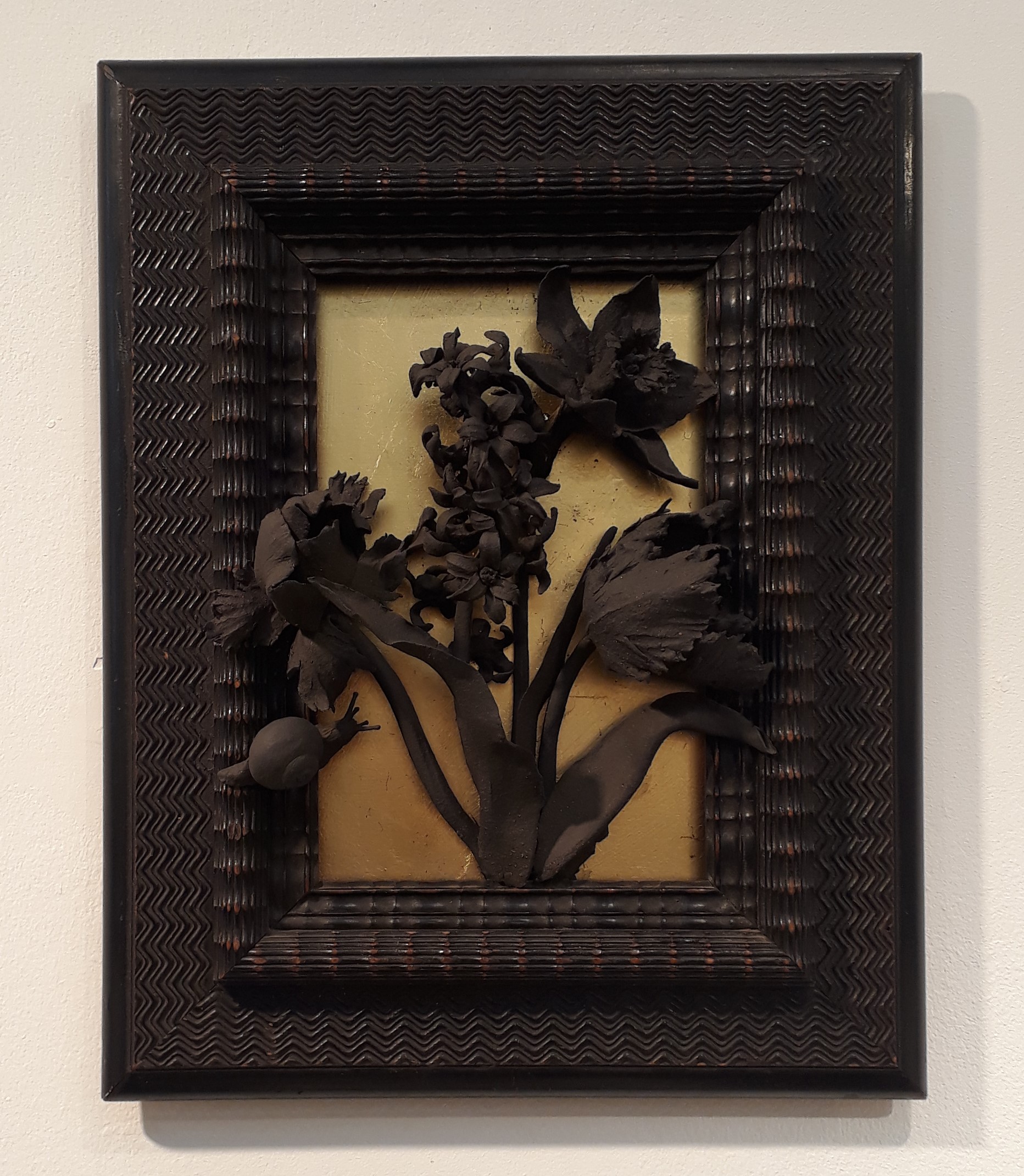
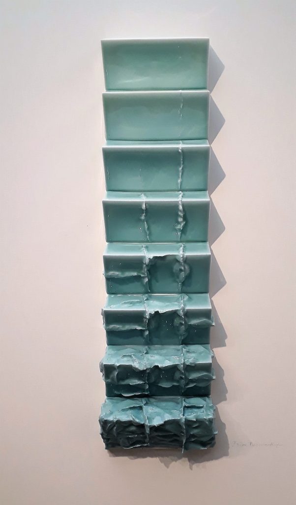
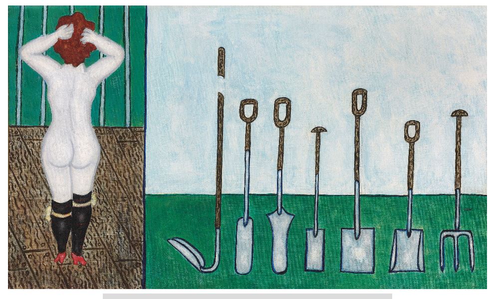
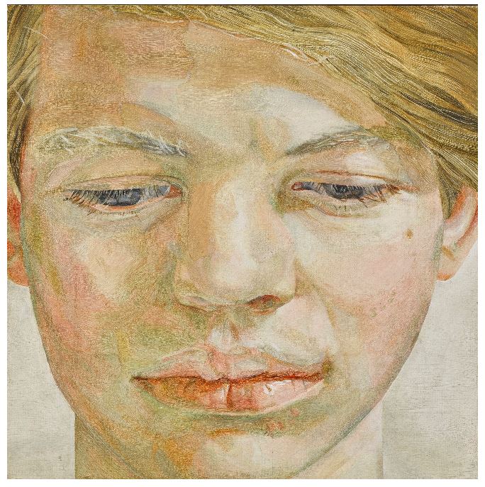
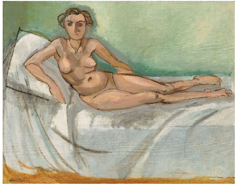
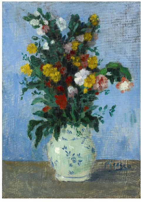
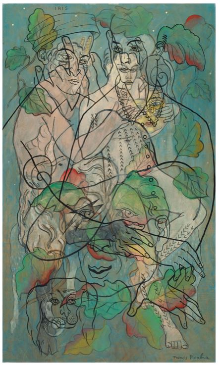
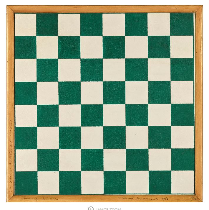
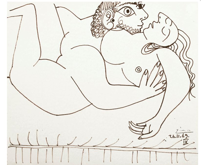
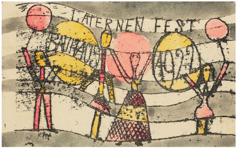
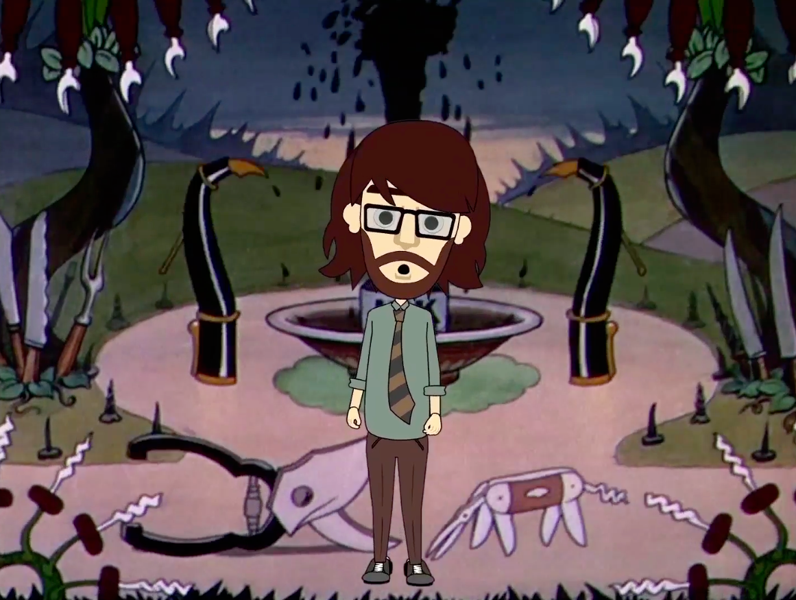
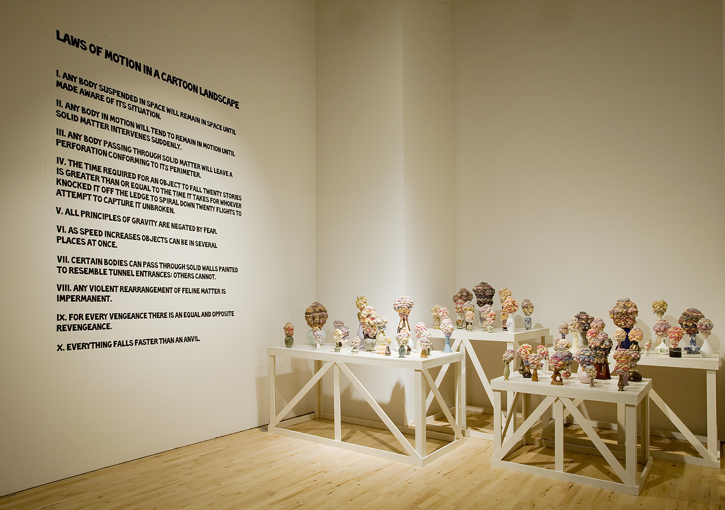
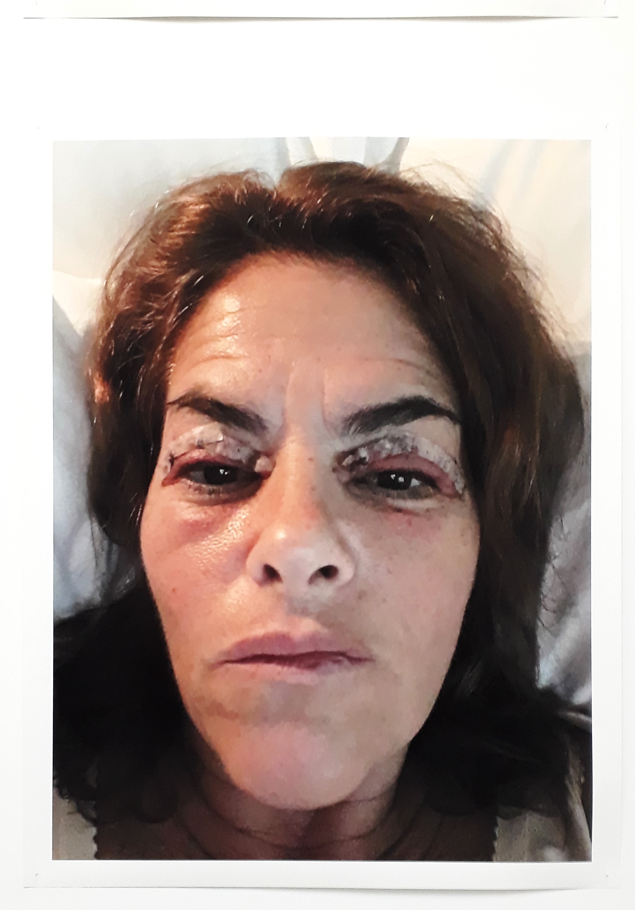


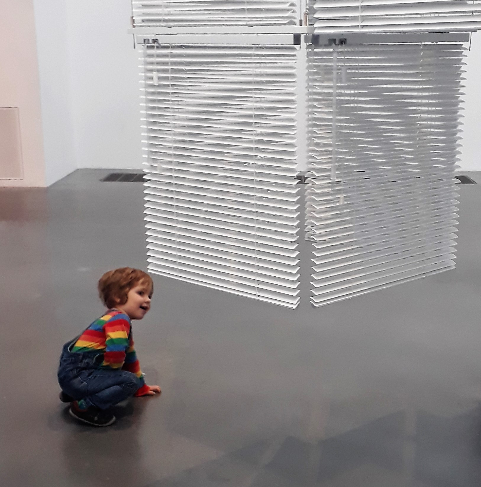
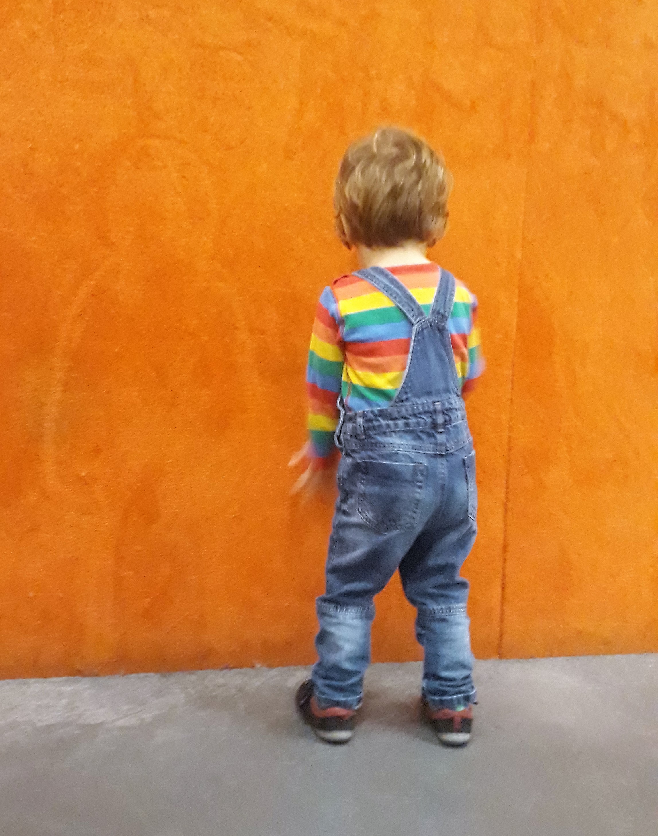


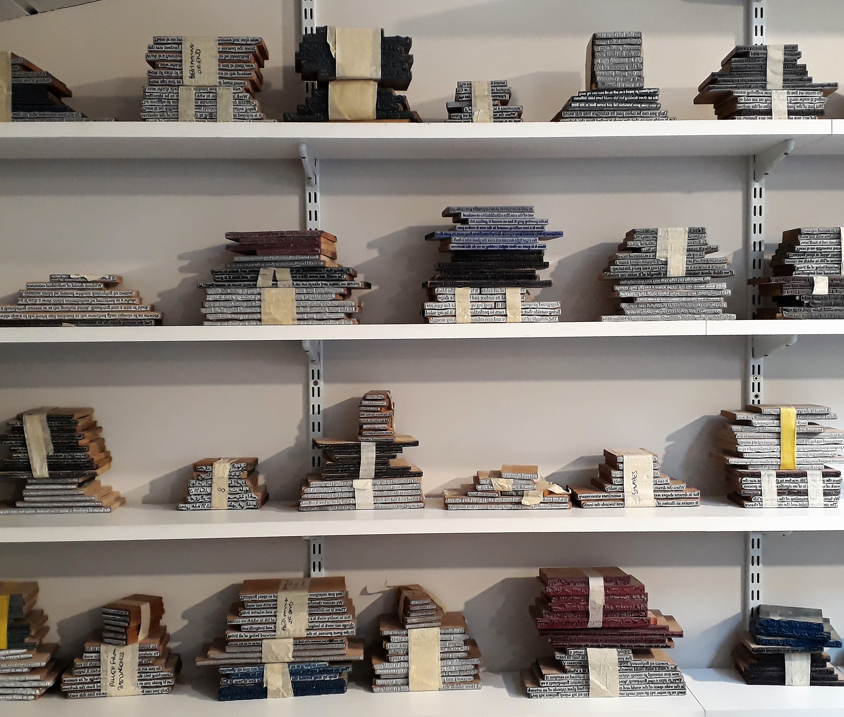
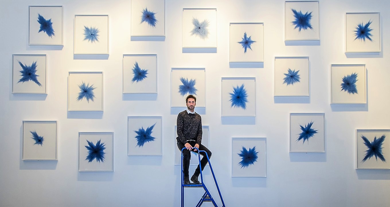
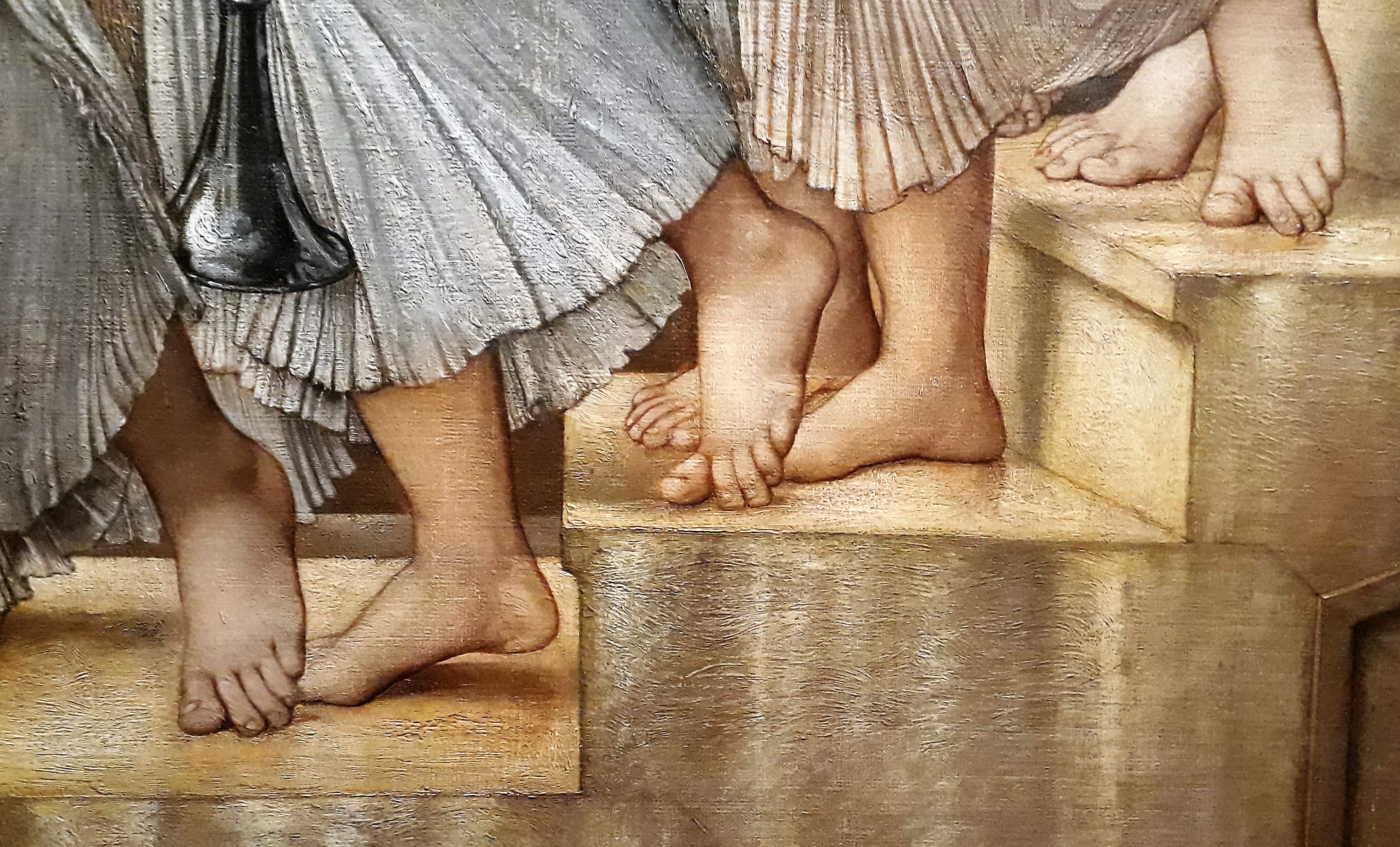
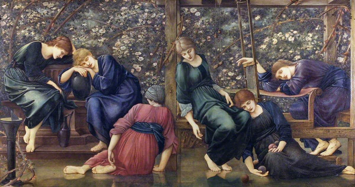
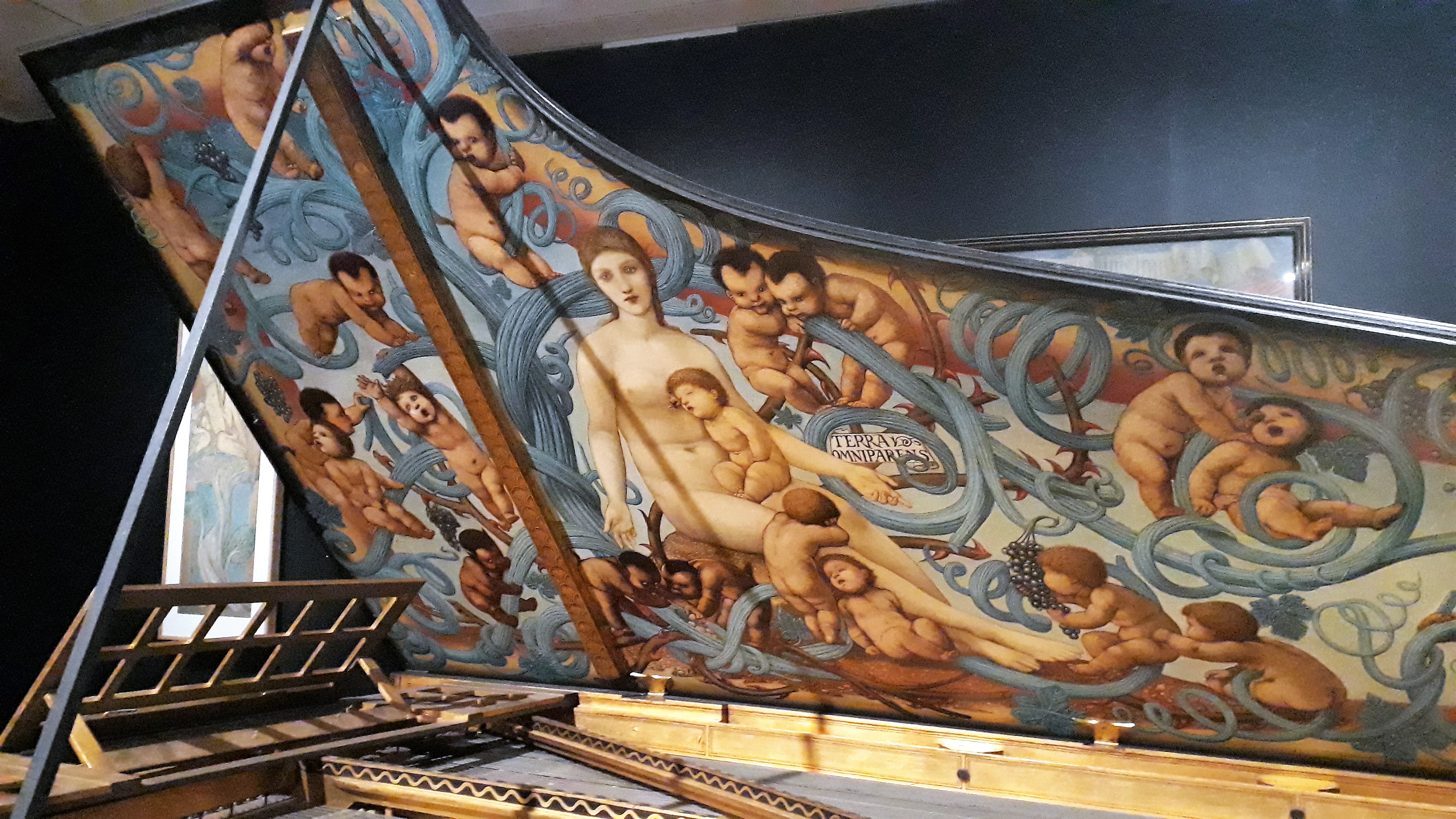

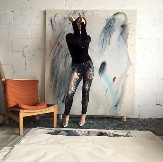
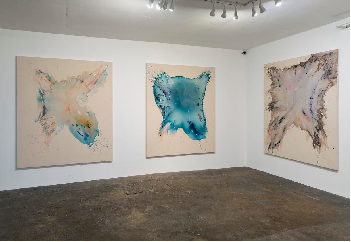
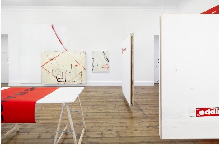
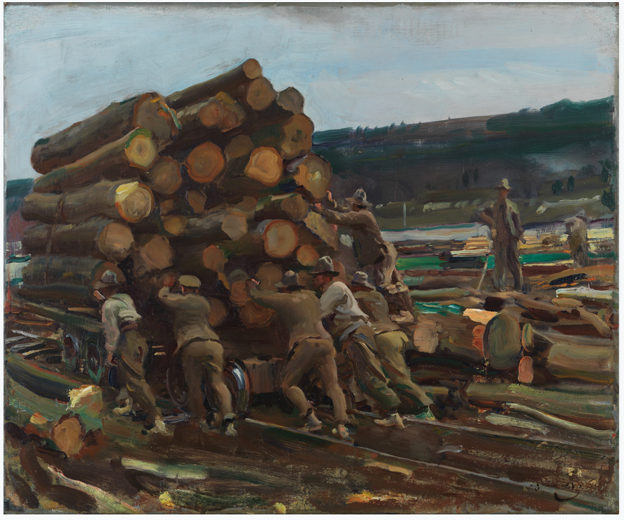
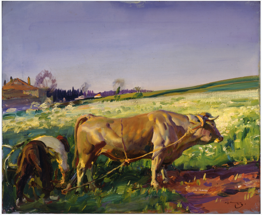
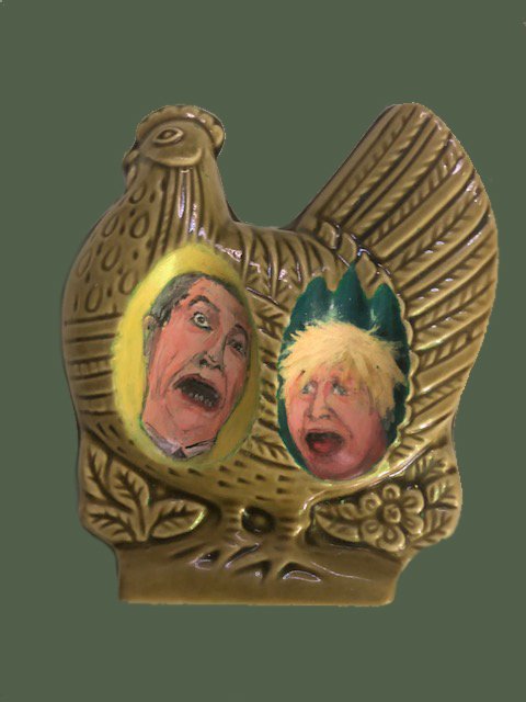
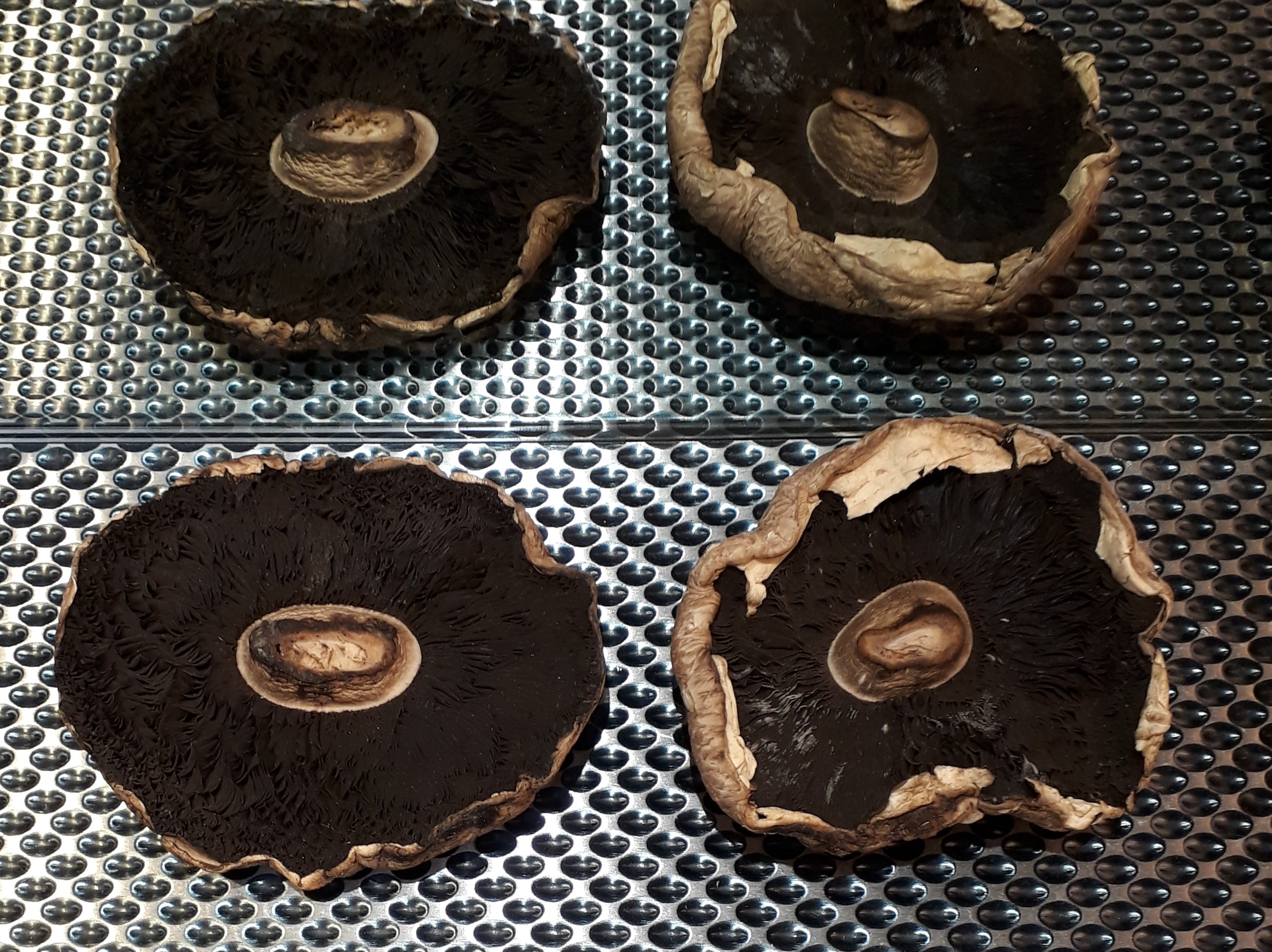
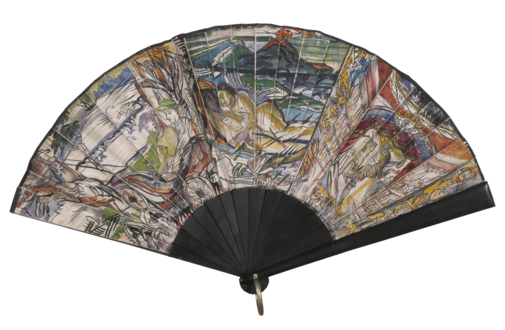

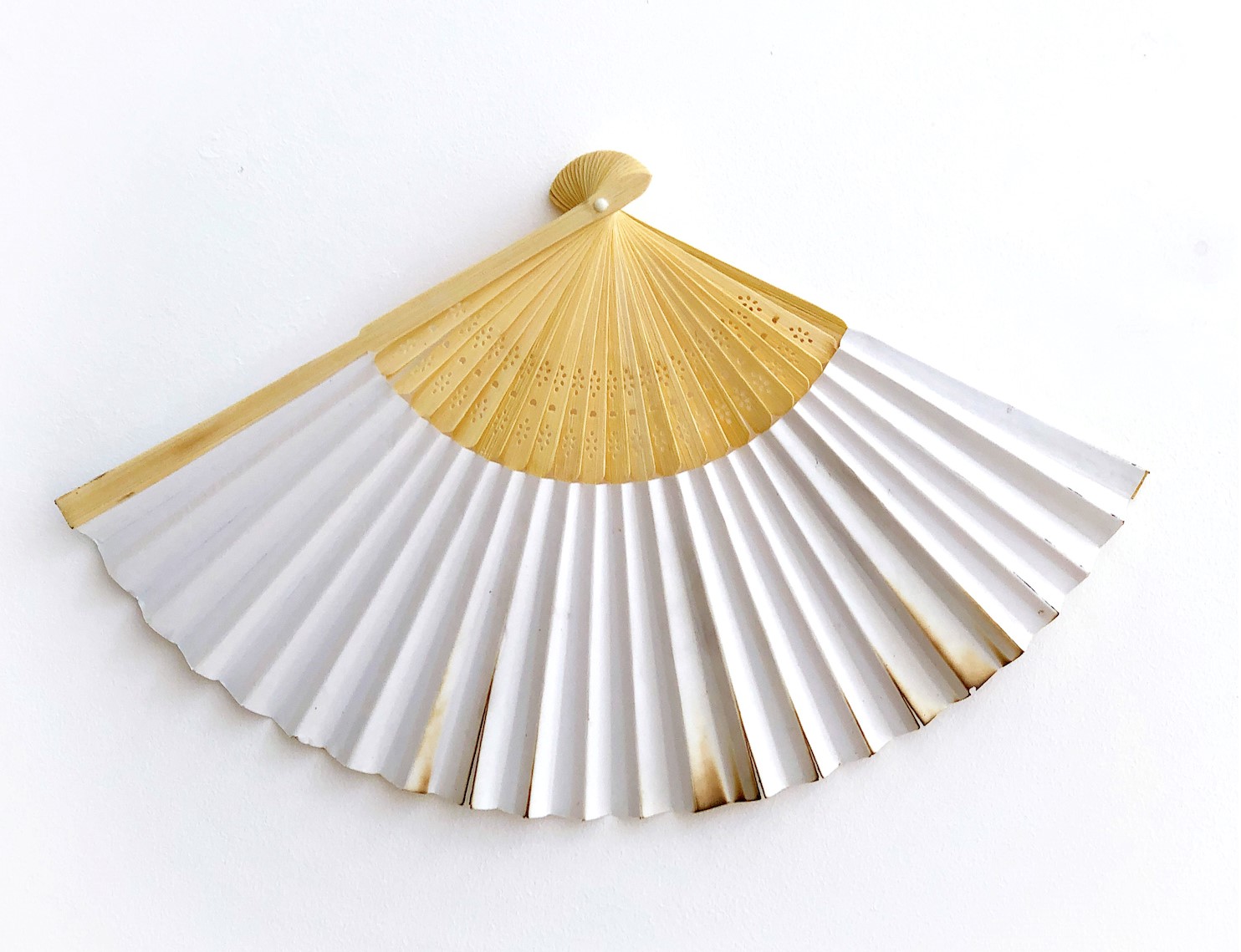
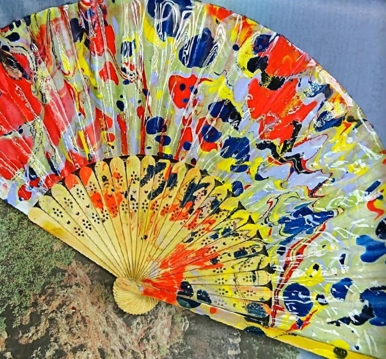
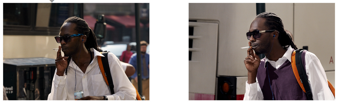
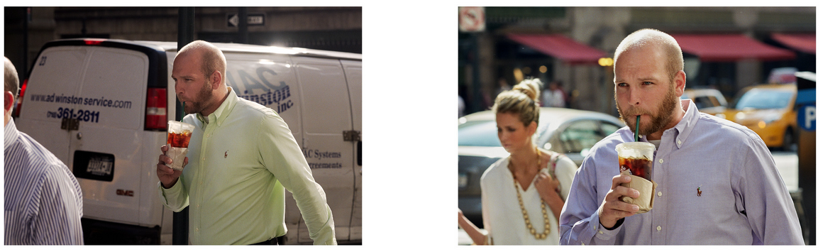
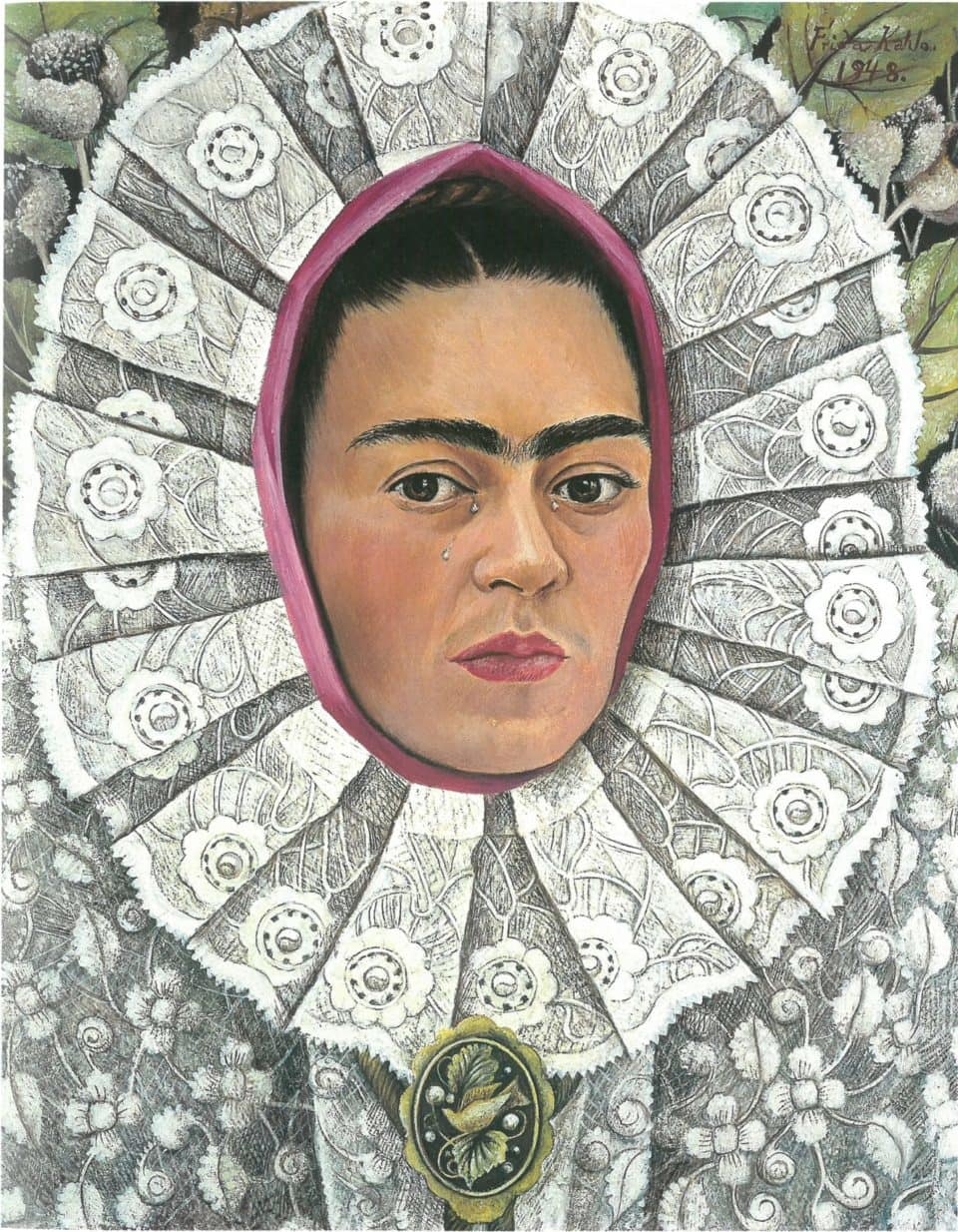
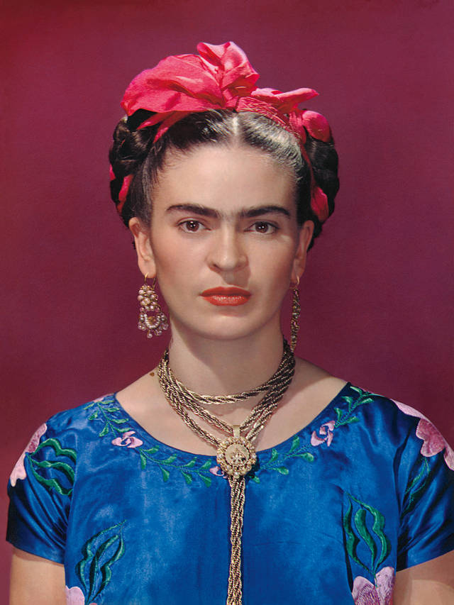
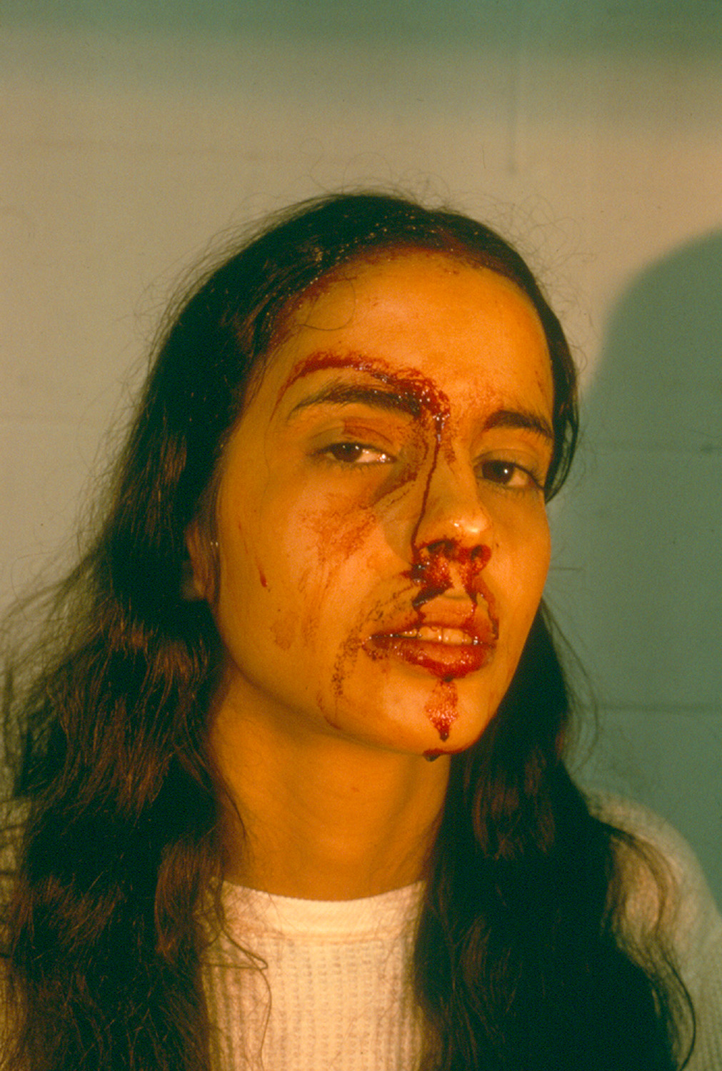
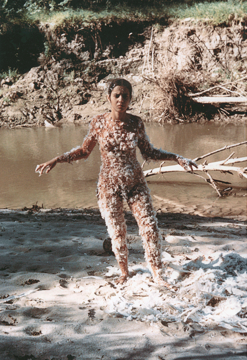
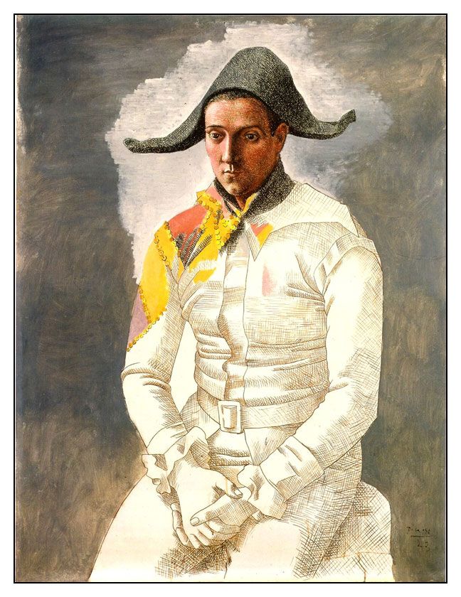
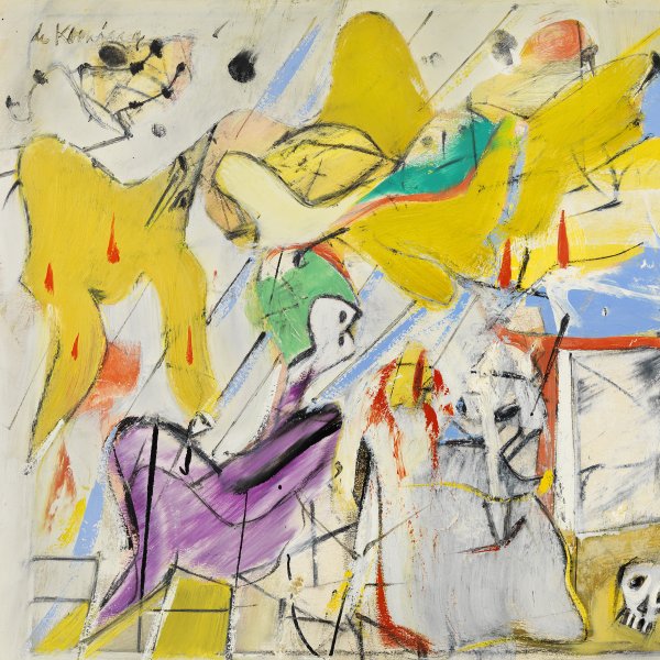
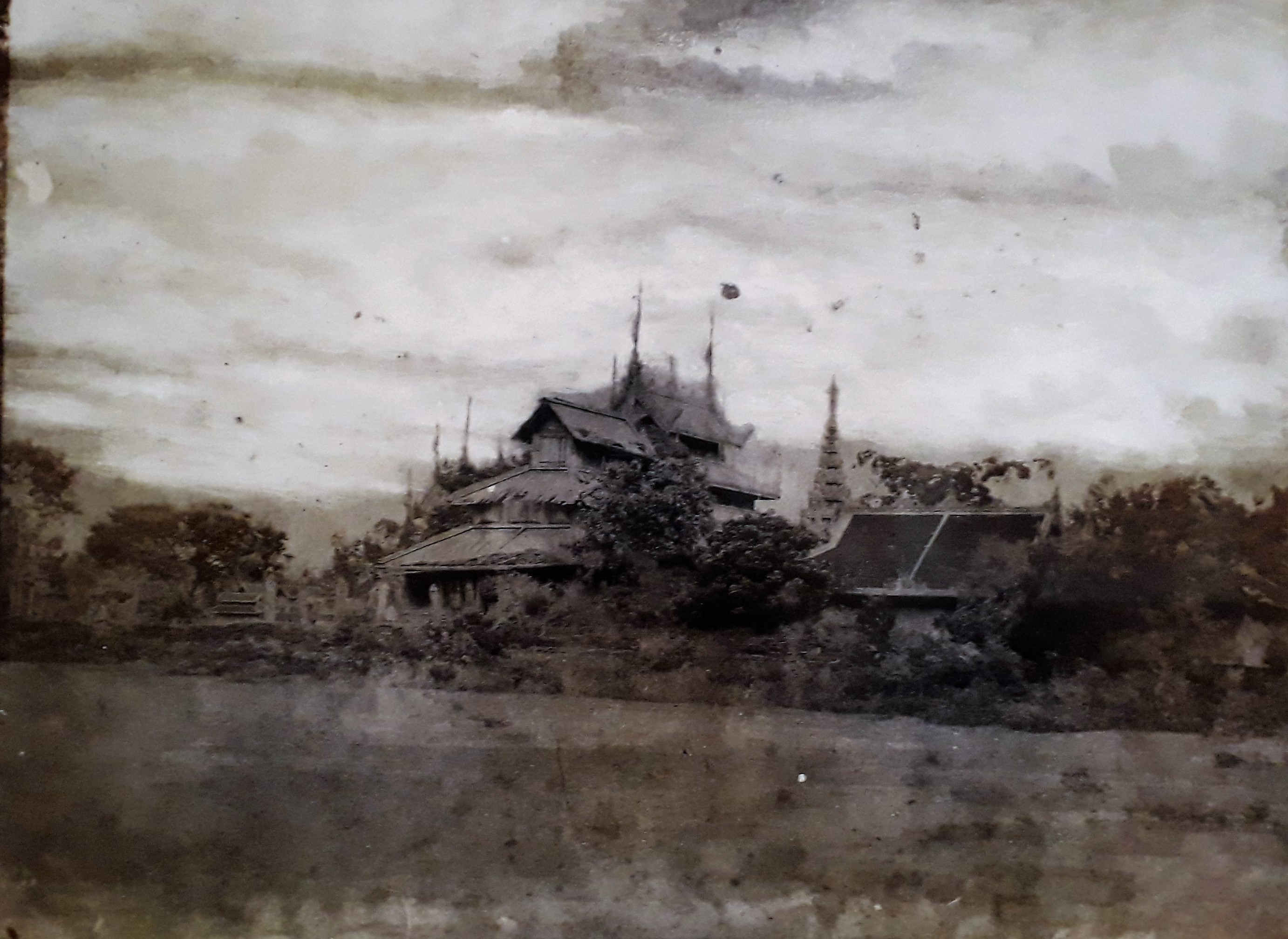
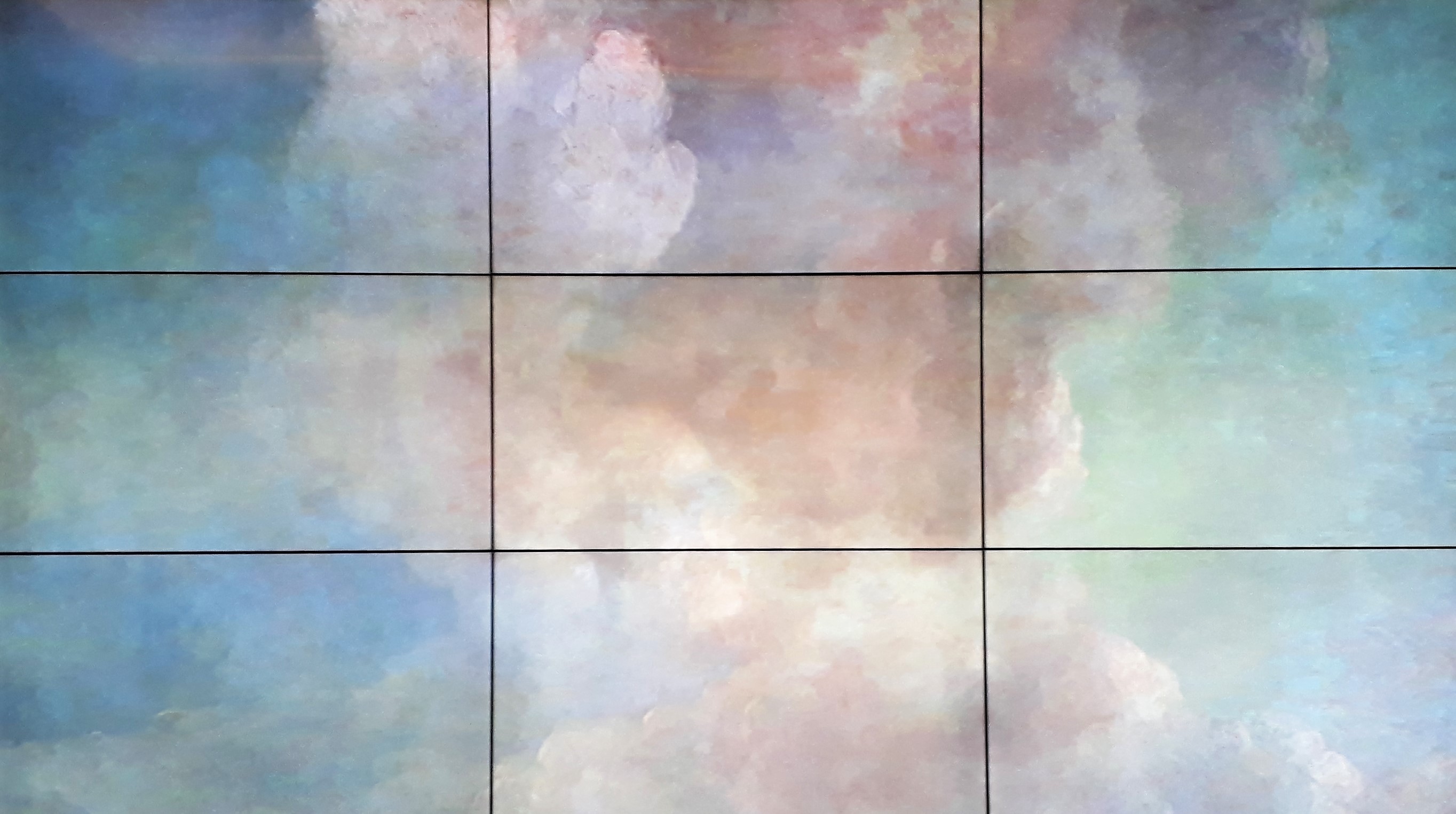

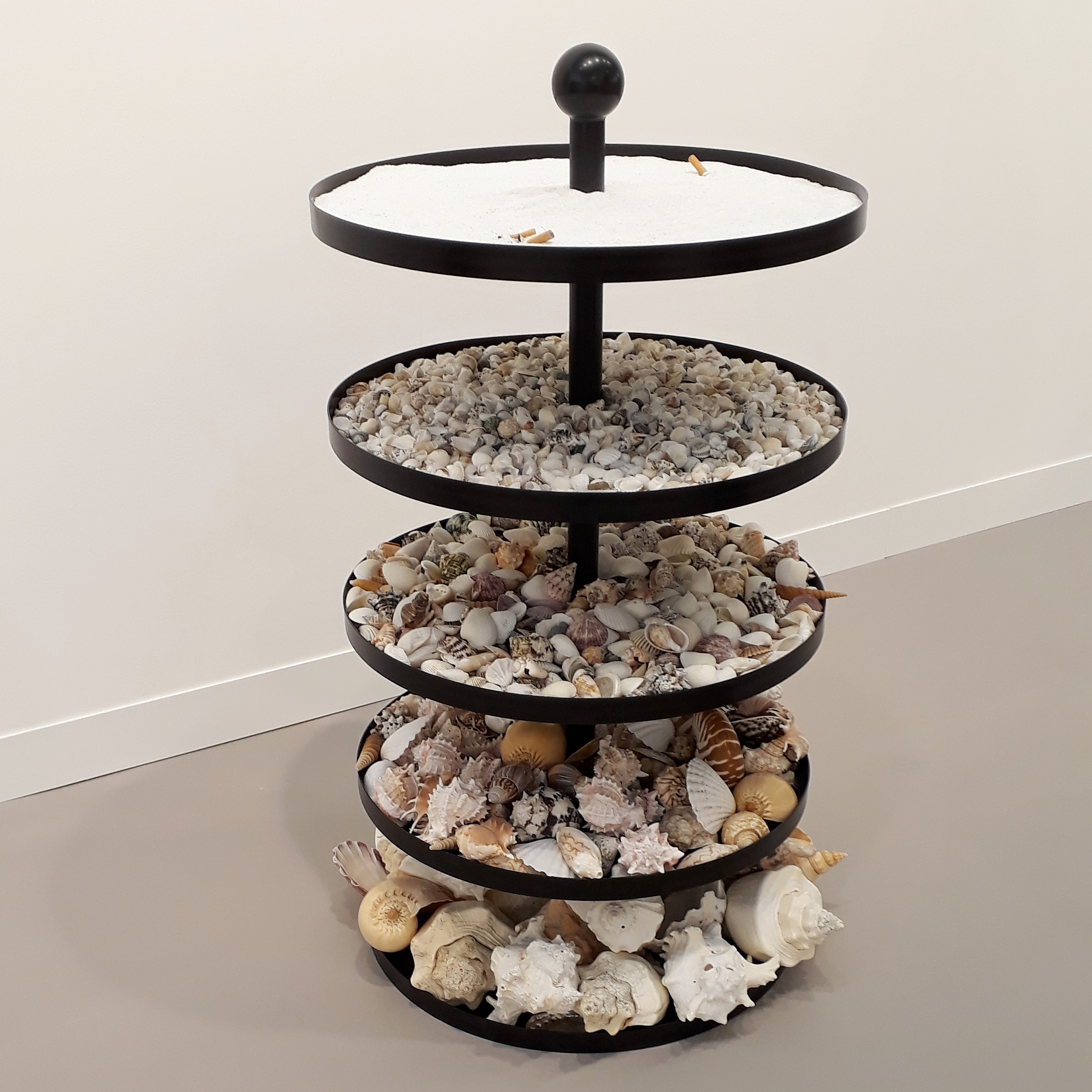
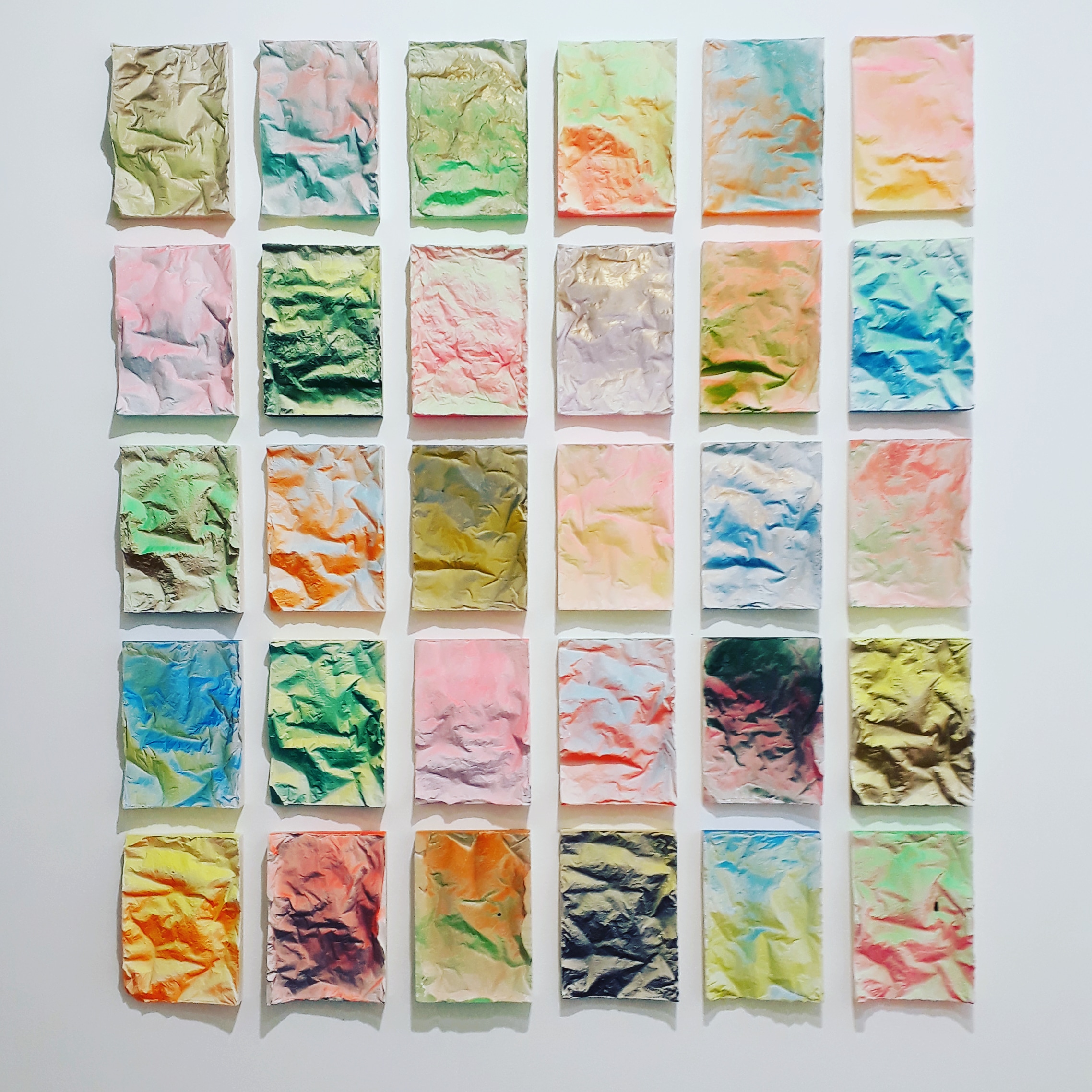
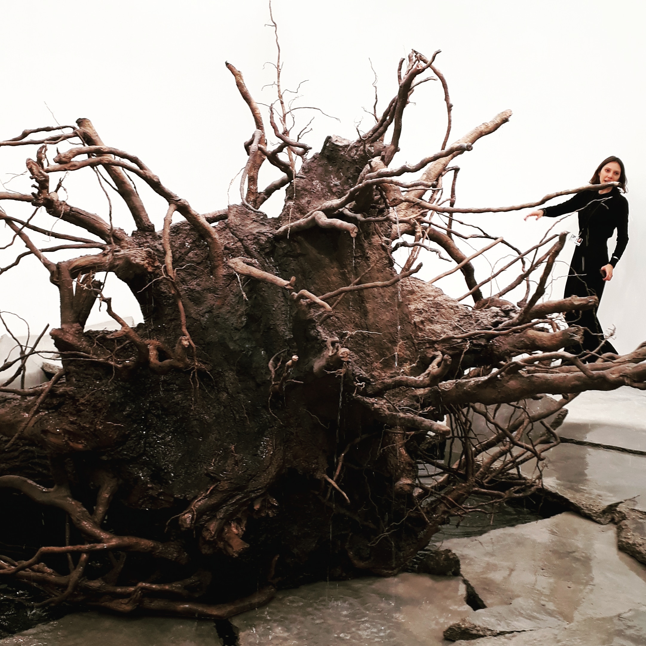


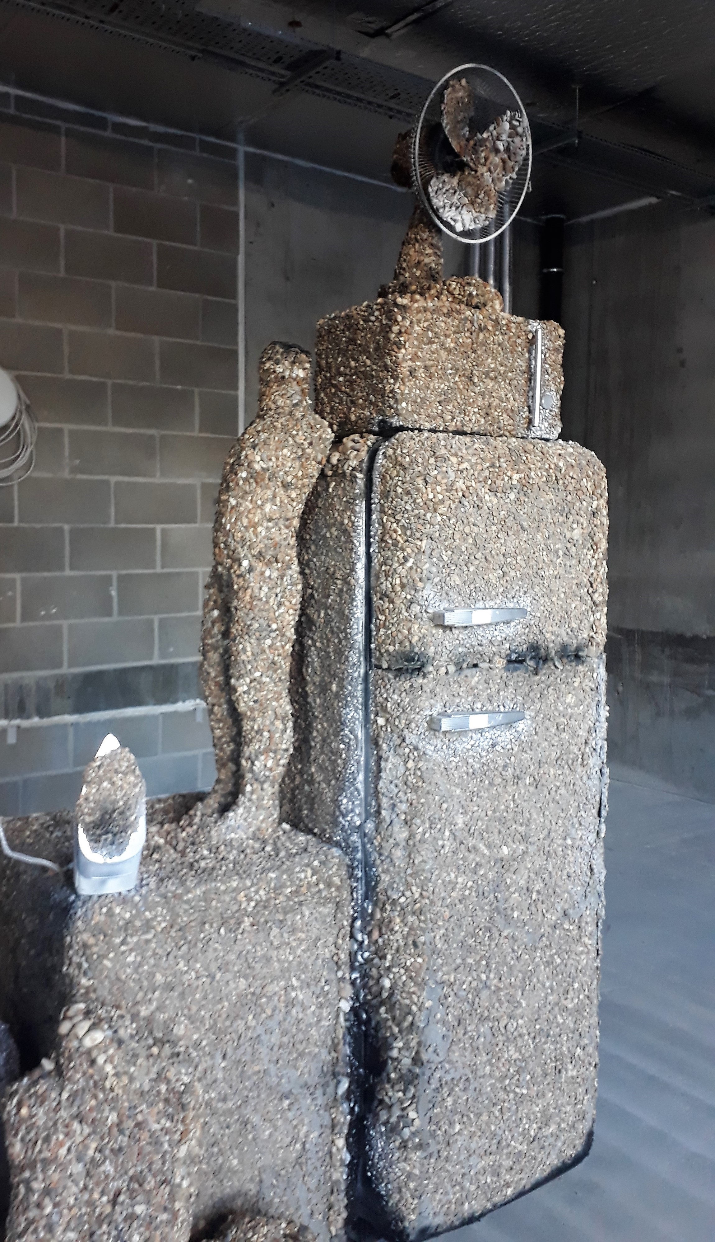
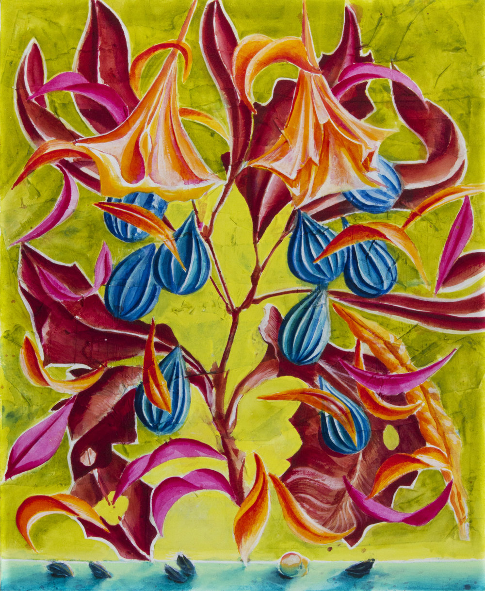
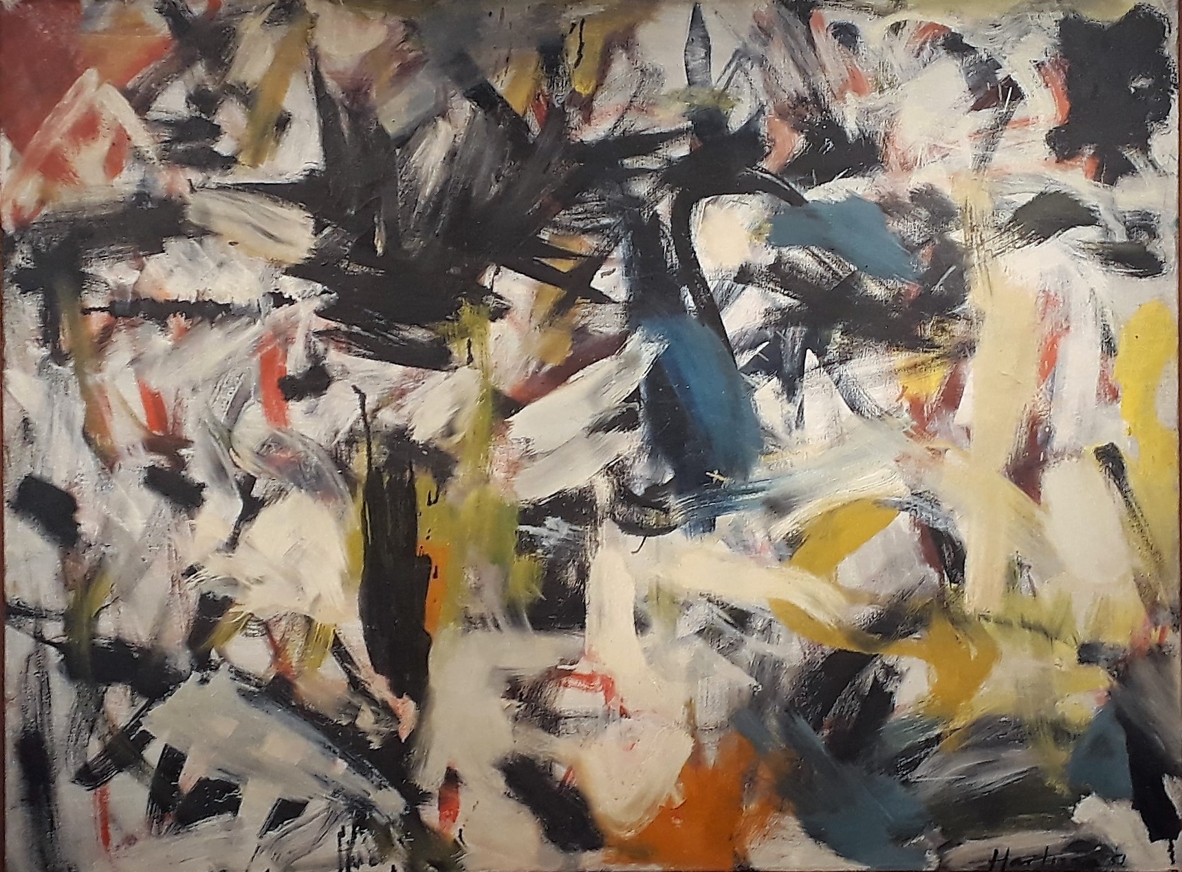
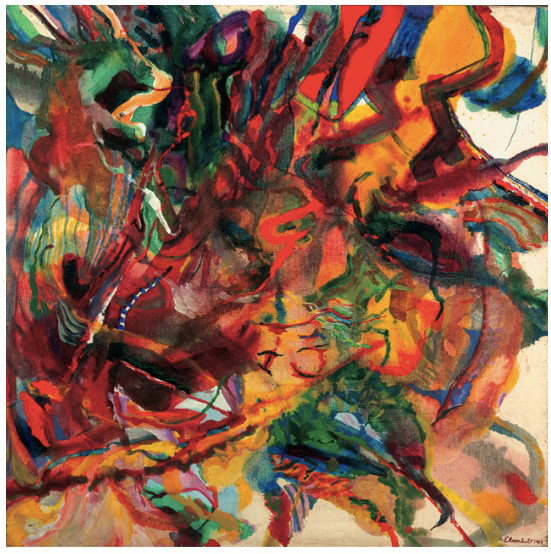
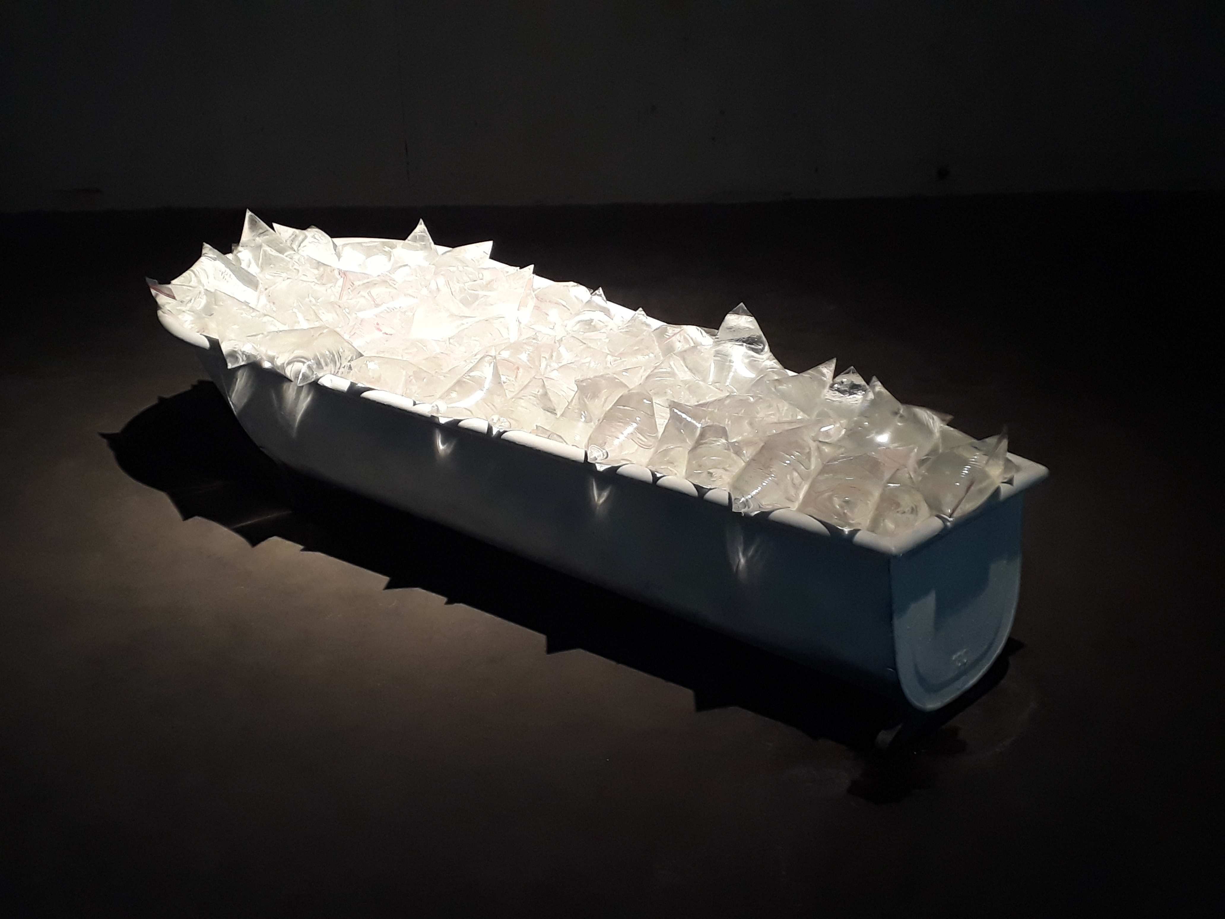
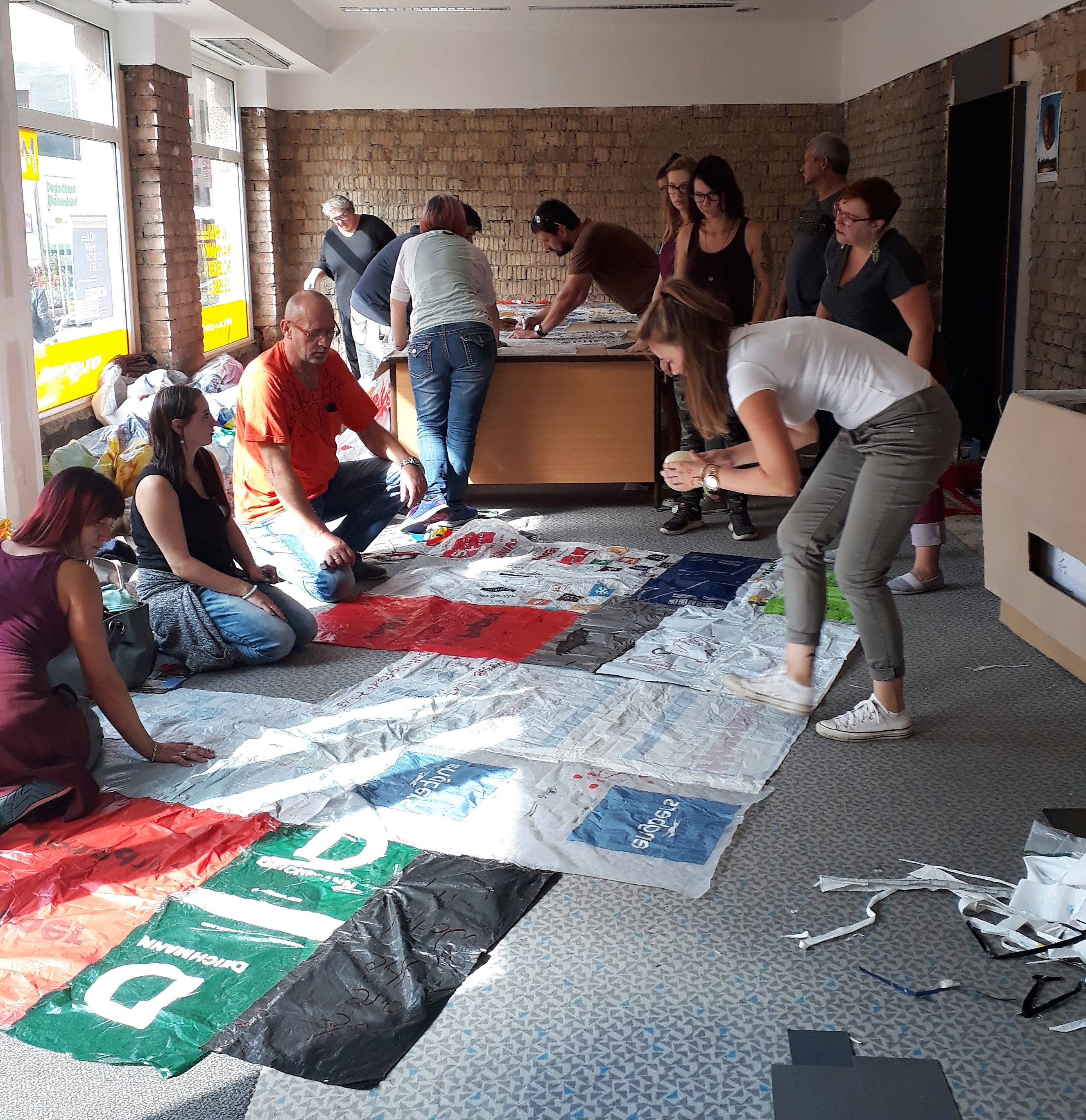
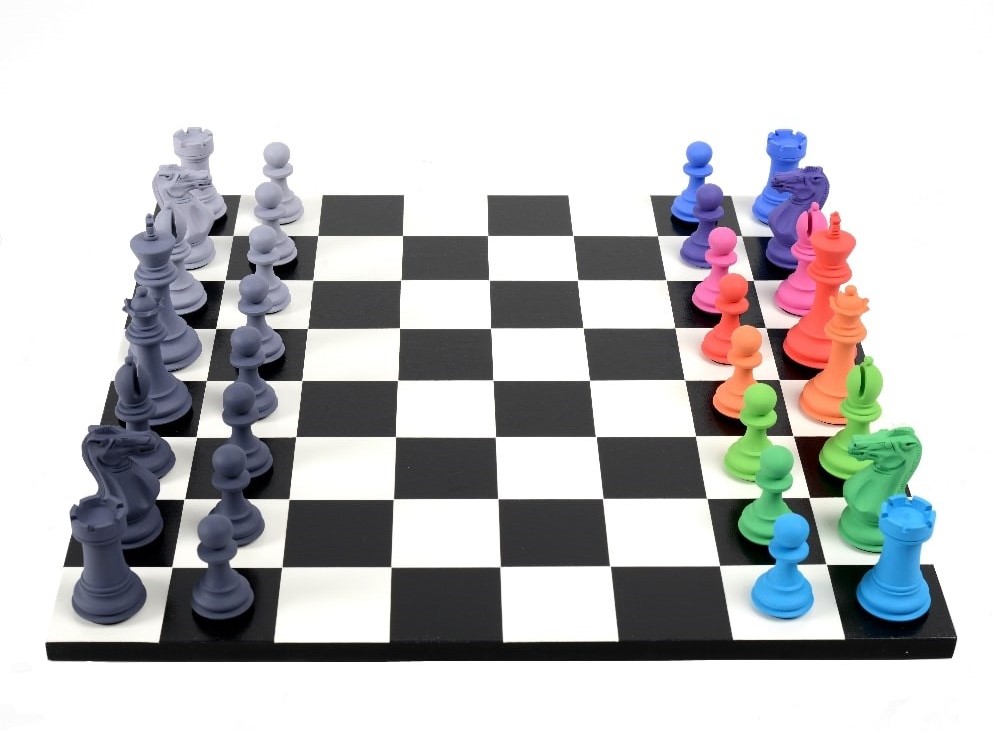


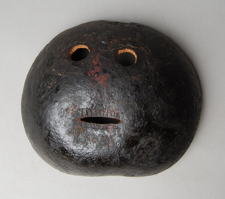
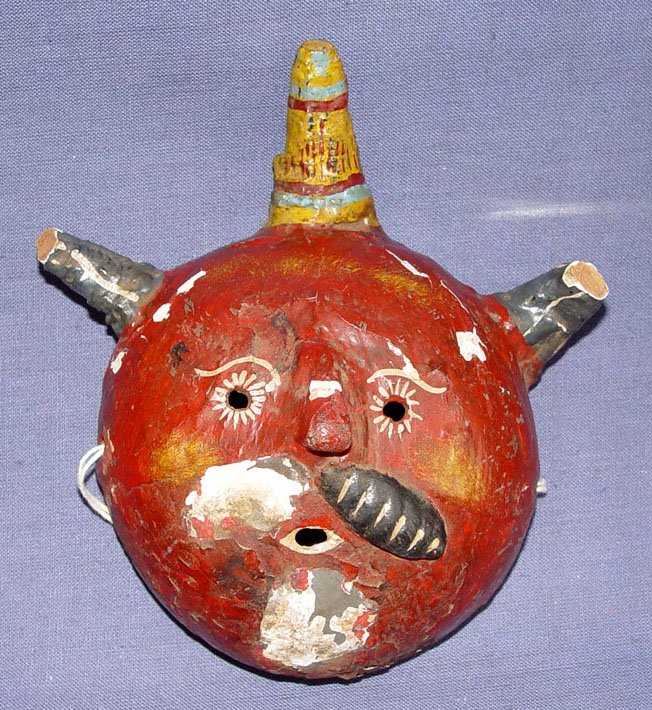
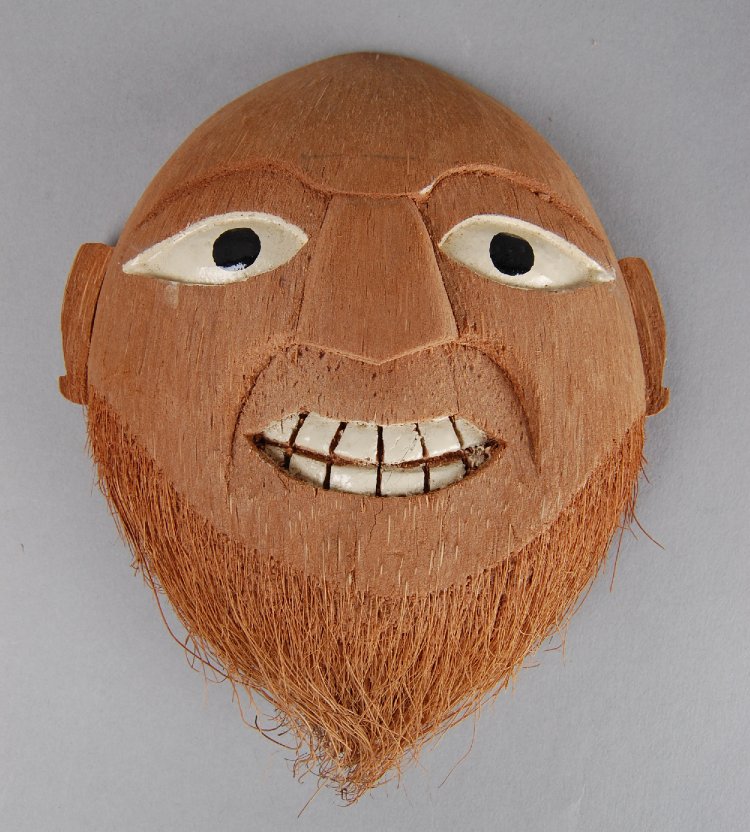

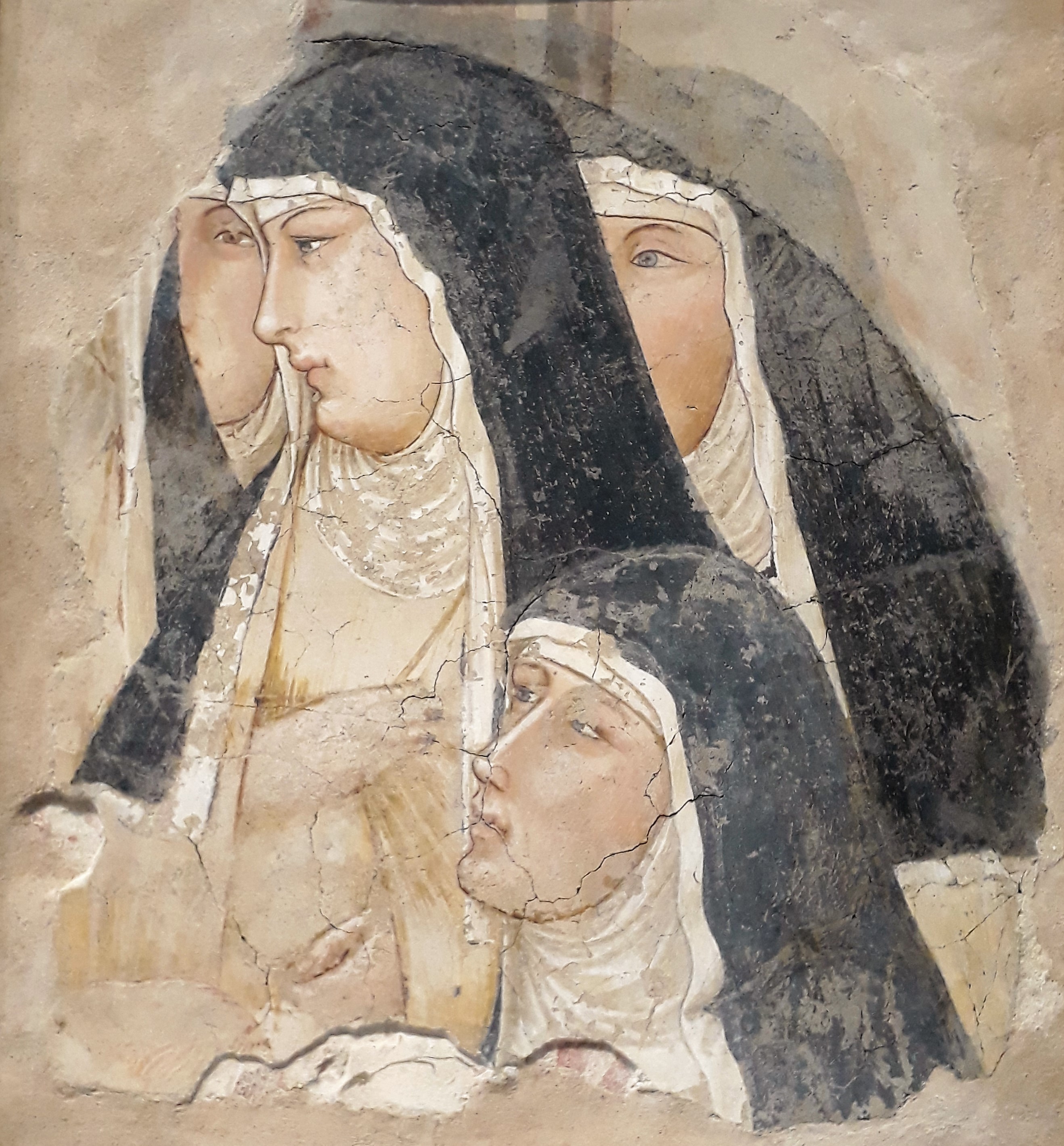
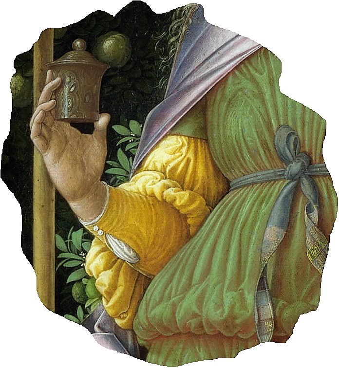

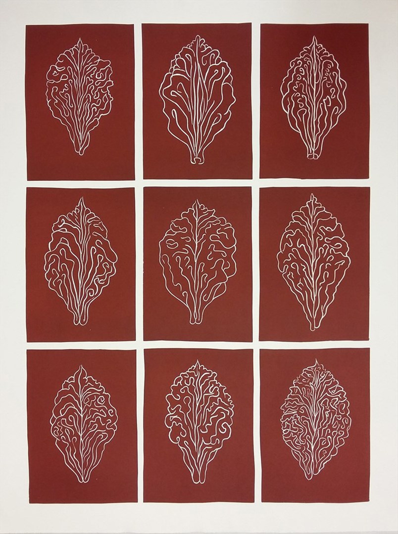
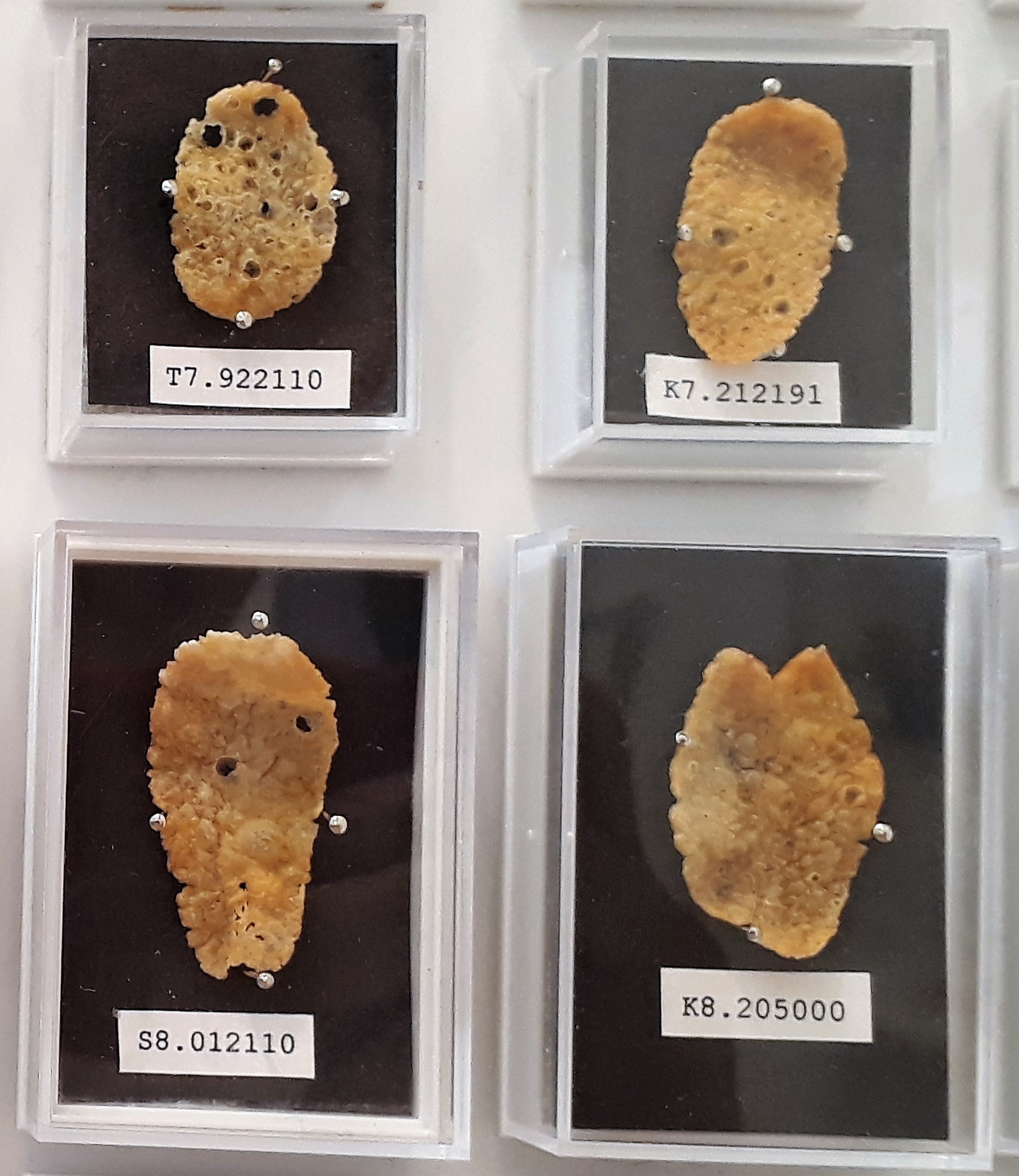
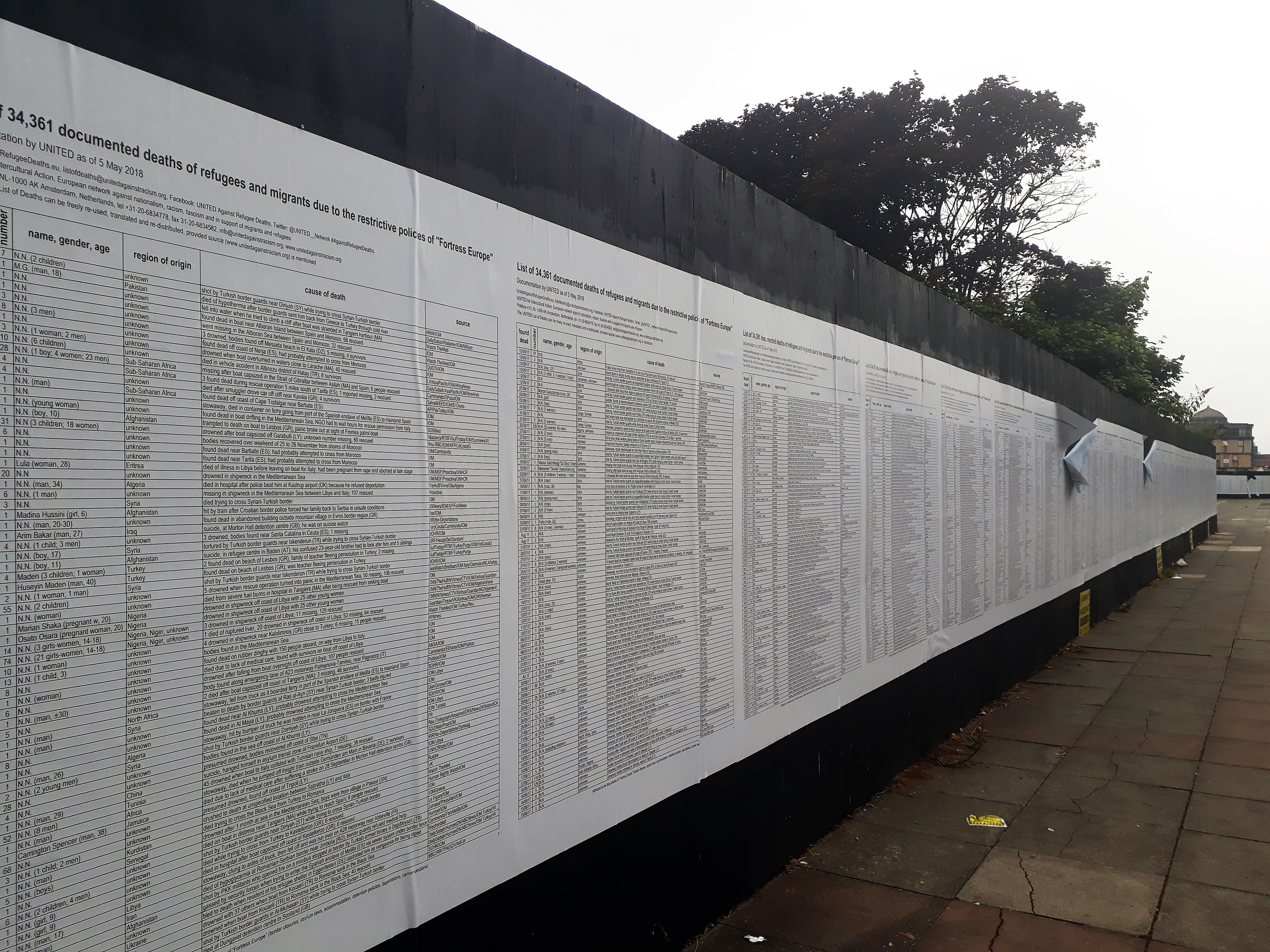
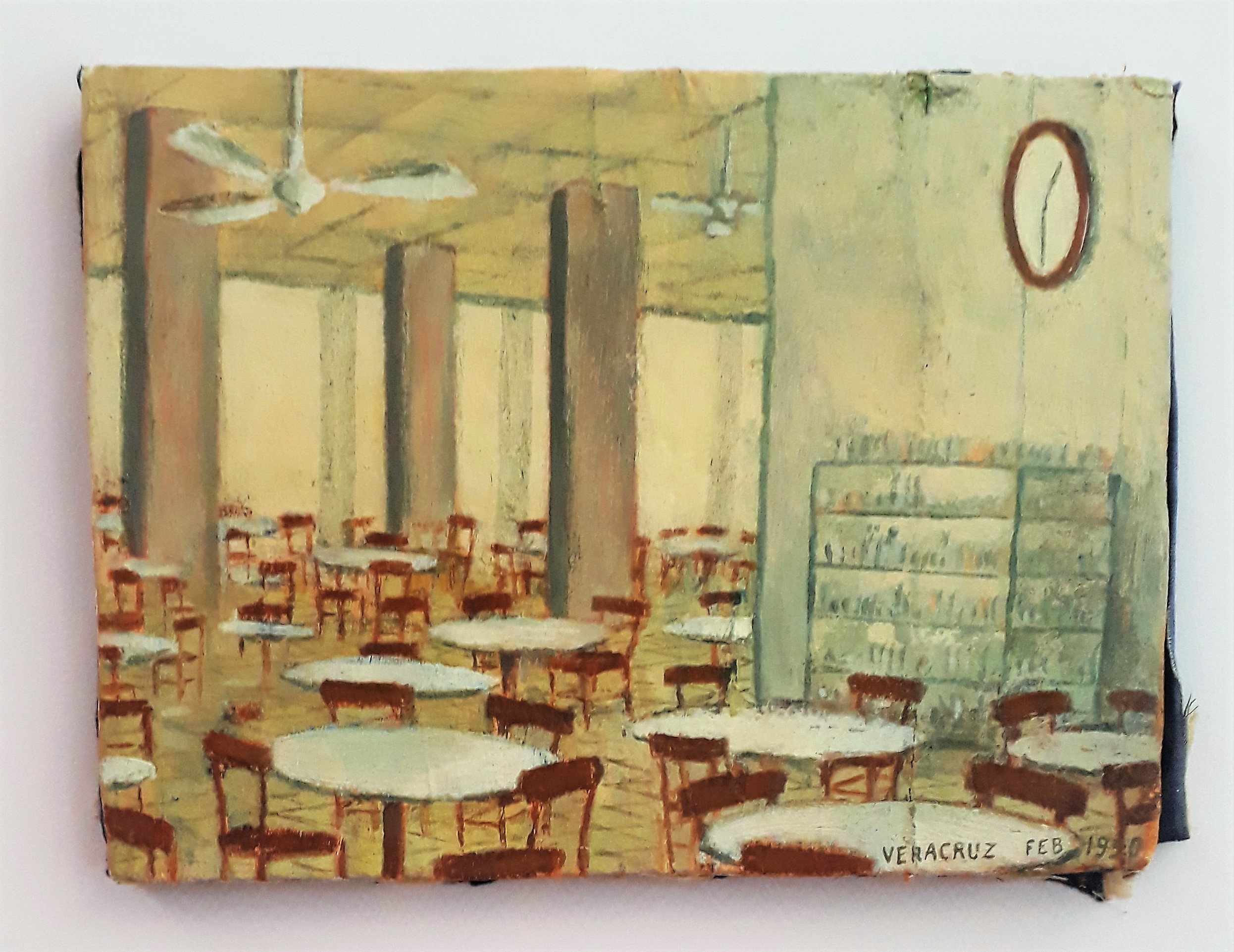


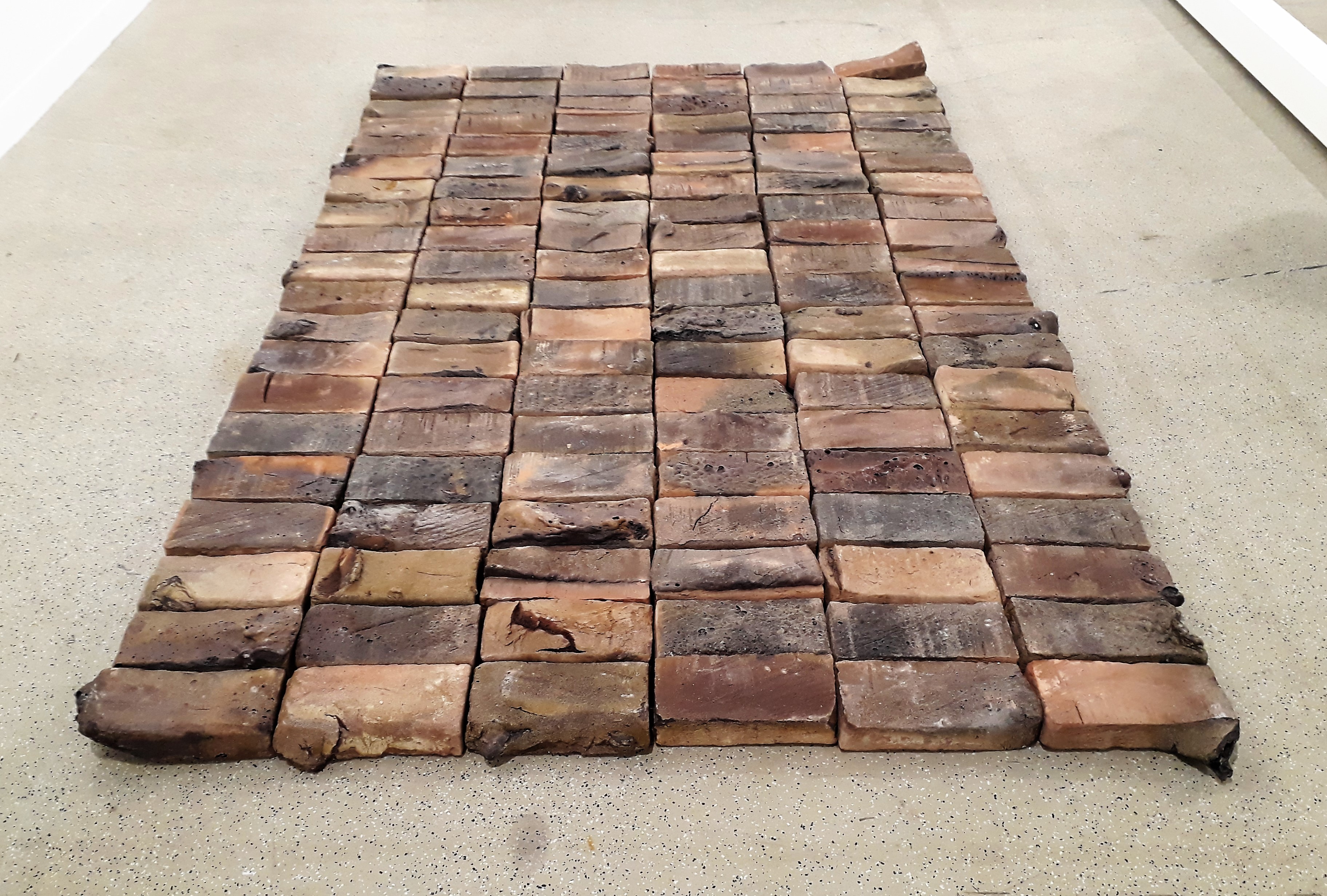
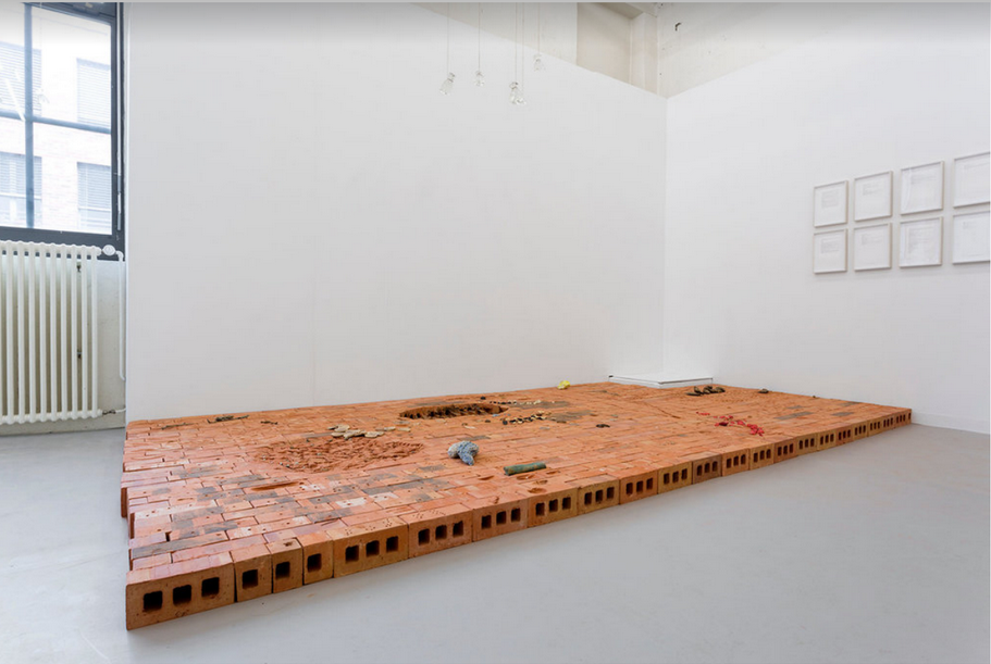
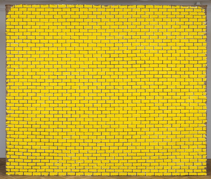
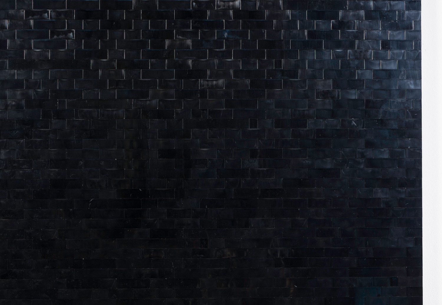

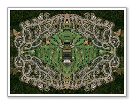