Writer and curator Paul Carey-Kent collects various writings here, including his weekly column for FAD art news, monthly interviews for Artlyst and texts from the shows he has curated. He currently writes freelance including for Art Monthly, Seisma, STATE, Border Crossings and World of Interiors. See Instagram for his daily choice from current shows. Some non-art content, such as photo-poems, is also included.
Lluís Lleó, Suki Jobson,
Phillip Hunt, Simon
Allison
Suki Jobson's photo from walking with sheep in the Alps
Among the many dictionary definitions of ‘drift’ is ‘the flow of a current’. But you can also drift a flock of sheep, for a drift is ‘something driven or drawn together’. Just so, this show emerged from curator Nico Kos Earle’s curatorial drift
between continents, which led her to Lluís Lleó, from Manhattan and
Barcelona; Suki Jobson, who works between Sligo, London and Marseilles;
Phillip Hunt in Cape Cod via New York and Johannesburg; and Simon
Allison in Oxfordshire and Auckland. Their voices seemed in compliment,
and here their commonalities are corralled into three main holding
points: movement between places; transition between one way of being and
another; and an openness to the use of found and contingent materials.
Suki Jobson studio shot
Movement Between Places
To drift
is to deviate off course, and all four artists have moved away from
places, but also returned. Fifth in line to generations of painters,
Lluís grew up in Catalunya but moved to Manhattan in 1989. This summer
he reclaimed his father’s old studio near Barcelona. Last year Simon
went back to New Zealand and bought a studio where he worked alone for
three months to produce his solo show, Shift. He, like Suki,
likes to walk out of his studio, to see what he might find. (Suki walks
in Sligo with her dog, Finch, and with shepherds and their flocks in the
Alps Maritimes). Phillip finds the wild coast of Cape Cod a ballast to
his work. ‘This is emotional space’, he says, ‘especially in winter. In
painting I like the idea of disappearing into an image or emotion’. Each
winter’s sole painting is lonely and majestic.
Lluís Lleó on Park Avenue
Untethering and Transition
All
four artists share an untethering from the familiar or transitioning
into the unknown. Suki is a geographer who studied law. She worked in
geopolitics for 15 years, but words came to seem restrictive and
inadequate to her. Now she is searching to unearth a lost more universal
language - a pre-language…. Her lines and threads meander from one work
to the next, between inside and outside, conscious and unconscious, as
she seeks our connections - relationship - to the land. Lluís grew up
immersed in the tradition of the fresco, left for another continent, and
developed work shaped by fresco’s hallmarks. Simon visits the
wilderness often, and records or brings back traces of humanity. Through
the fiery process of lost wax casting, these secret gestures are
transported into a future perfect. Phillip’s painting is his medium of
self-discovery. He let go of commercial film making, but continued to
paint because he needed to - whether to process his thoughts, or simply
to disappear in the making. Since 2009 he has produced just one
monumental work each year. Time is key here, not just in the making but
in the sense of time spent with the work.
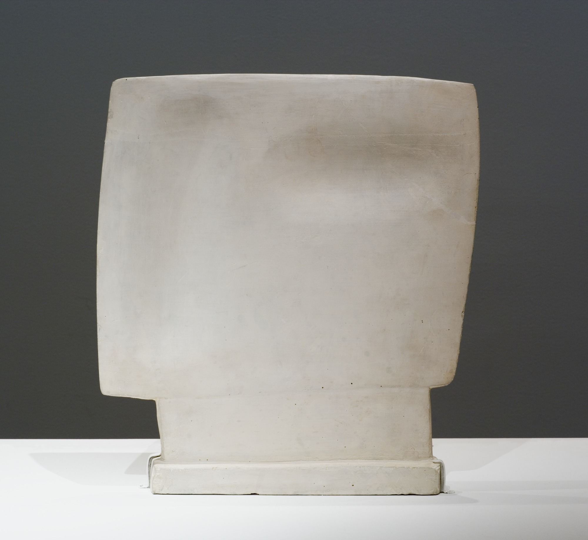
Simon Allison: Ghost
The Drift of Materials
Materials
can act as a catalyst: Lluís shipped five 6,000lb sandstone slabs from
Catalonia to Park Avenue, applied shapes in ultramarine and cadmium, and
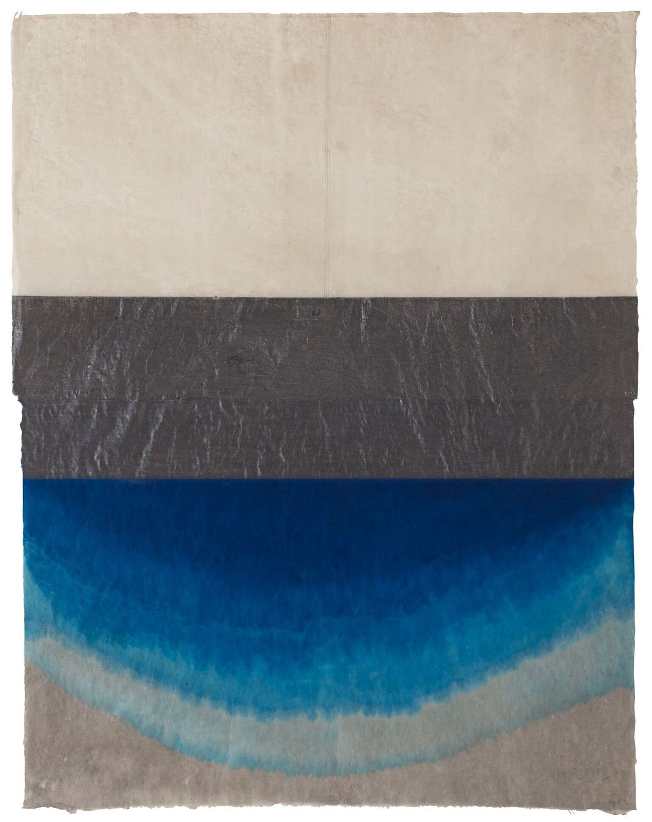
planted them like erratics in the flowerbeds. Suki found torn and
stained ancestral linen under the stairs of her father’s studio in
Ireland, choosing shapes intuitively, she then reassembled the pieces
into a triptych. For Ova she sewed found ovals, once cloth for
trays, like giant eggs. This circles back to the imprint of place on our
psyche, and how primordial shapes drift in and
out of our consciousness. Materials can form the substrate from which
ideas emerge, as with Lluís’ discovery of hand pressed Nepal Mitsumata
paper. Simon uses the ancient method of lost wax casting – for
corrugated iron, fruit, bark, even tissue paper. He tends to let things
fall apart, then put them back together, stronger. ‘Spin Cycle’ makes a
time piece out of a young fallen trunk. Driftwood. Phillip’s ‘Paper
Jets’ are more about drifting across time. He came across a suite of old
works on a trip home to South Africa after his father’s death. Perhaps
he found a part of himself he had forgotten. He brought the pieces back
to Cape Cod and completed them with small biomorphic overlays.
Phillip Hunt: Paper Jet
It may not be in the nature of the drift
to reach an end point, but Webster’s seventh definition is ‘an assumed
trend toward a general change’. Just as these works defy any single
reading, they also creates a space for us to let go of what we think we
know and just drift into how we might be different.
Catherine Story: ‘Shadow‘ (to 3 Feb) – a particularly ingenious folding of individual works into overall concept
The gallery experience is work + space + installation, and while that
is a sensible order of importance, the presentation can certainly make a
big difference. Consider how the wrong airflow affects Alexander
Calder’s mobiles, or the lighting. Sophia Contemporary trains
floor-lights on Iranian-American Afruz Amighi’s evocative wall-sculpture
combinations of female archetypes and symbolic objects, yielding
‘up-shadows’ to distinctive and somewhat uncanny effect . And Peer is
leaving the lights on all night during the run of Catherine Story’s
‘Shadow’, making the most of a cinematically themed combination of
painting and sculpture which cleverly turns the notably street-facing
gallery into a cinematic backdrop for the action of Shoreditch locals.
There are various ways of getting video wrong, such as failure to think
about sound bleed or not stating the length of the film. On the plus
side, I noticed and used the button ‘press to restart’ on the monitor
for one of John Smith’s ‘Hotel Diary’ films at the Imperial War Museum .
An excellent idea! All three twists, by the way, come from the
artists, but full credit to the galleries for effective implementation.
Afruz Amighi: ‘Echo’s Chamber’ (to 19 Jan)
John Smith: ‘Hotel Dairy 3’ in ‘Age of Terror: Art since 9/11’ (to
28 May). Here interesting content is, incidentally, undermined by an
ill-judged layout (another factor in large shows – see Jasper Johns at
the Royal Academy for a rather good layout).
'New Actions in Painting': Paul’s ART STUFF ON A TRAIN 239
Clare Price: ‘# painter # painting 1’, 2017
Say what you like about its ill health, I reckon about half
the gallery exhibitions in London are largely or entirely of paintings. That
means I must have visited 5,000 painting-based shows this century. Yet there
are approaches in the gesturally-themed group show ‘Control to Collapse’ which
I can’t recall seeing in any of them (Blyth Gallery, Level 5 Sherfield Building,
Imperial College, Kensington to 3 Jan – not a space you’d come across in
passing, but handily close to the Serpentine Gallery). Clare Price shows one of
her body-actioned full-reach-scaled abstractions ‘s.b.l.f.’ along with a
photograph of herself – ‘# painter # painting 1’ - in front of it in the studio
(and just the photos of her posed with two more paintings). And Liz Elton shows
both 'Seilebost 1’, a photograph of a ragged sail-like oil composition on
compostable material horizontally posed in the landscape, and ‘Exposure 1,
Seilebost’ – the material in question hung in portrait format. That’s two fresh
ways of enacting the dialogue between painting and its documentation, preparation and finished work, art and action. Come to that, Rebecca Byrne (painting on canvas set on
painted wallpaper to which it relates) and Alex Roberts (backlit painting on
silk) also adopt rare techniques. Not that I object to more orthodox means, in
which mode Tamsin Relly has the most works in this lively show…
Liz Elton: 'Seilebost 1’ (front) and ‘Exposure 1,
Seilebost'
Clare Price: ‘s.b.l.f.’, 2017
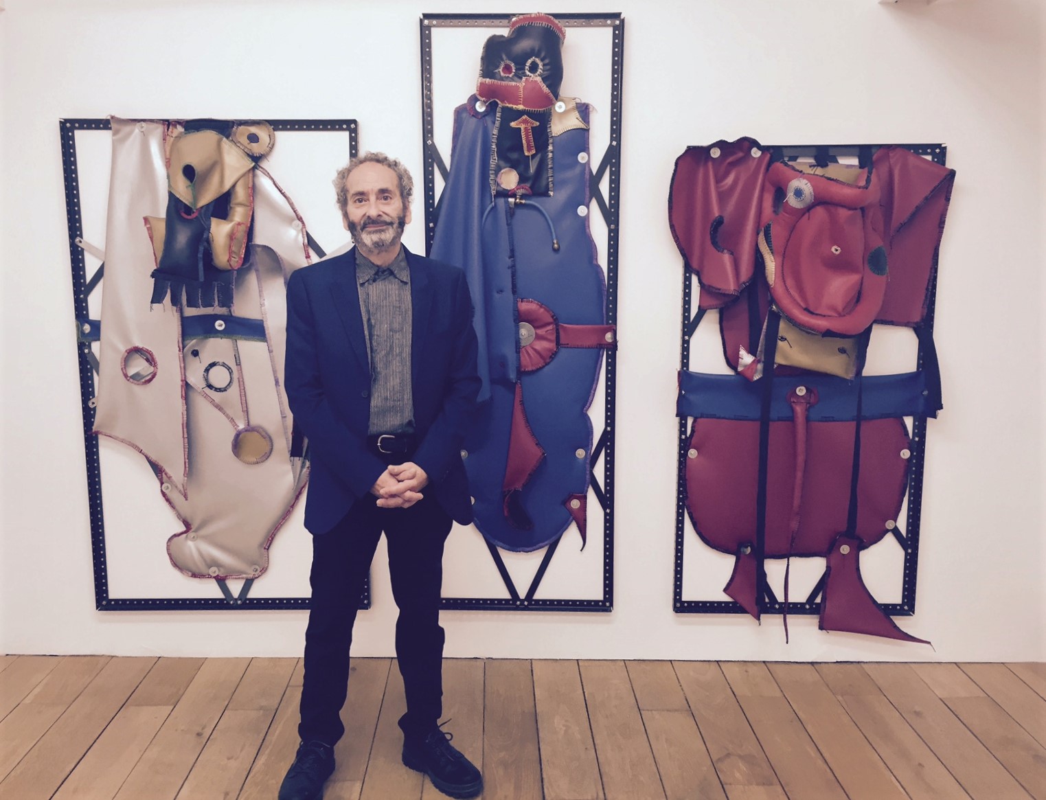
'Methods of Evasion': RM Fischer and Clive Hodgson: Paul’s ART STUFF ON A TRAIN 238
Installation view, R.M. Fischer: SCULPTURE, Southard Reid, London,
UK, 16 November – 20 December 2017. Courtesy The Artist and Southard
Reid. Photo credit: Mark Blower
Clive Hodgson - installation shot
Two excellent current shows include contrasting approaches
to the artist identifying self with work. At Southard Reid (to 20 Dec)
R.M. Fischer has adopted an art name in a bid to distance his artist
self from his personal self: he says the initials don’t stand for
anything. RM is known for his 1980’s sculpture which makes lamps from
kitchen appliances, referencing industrial and design tropes in a way
which has translated well into public sculpture. His more private recent
work creates an appropriately democratic cast of characters who emerge
out of apparently abstract conjunctions of bits and pieces of hardware
he’s had around for decades, with the soft additions of vinyl and fabric
sewn together with a characterfully crude stitch. Each has just an RMF
number as title, leaving us to decide which are playful, which troubled.
At Arcade (to Dec 16) Clive Hodgson is up front: his abstract
paintings foreground his name and the year of composition, slyly
declaring the ongoing existence of the artist, On Kawara style, and
providing the most prominent recurrent motif in his work. He says he
can be ‘more modest’ – as in one example in which spray paint almost
covers the ‘C.Hodgson’. Clive uses a lot of spray, which he attributes
not to a misspent youth but to a reluctance to touch the picture –
neatly undermining the very involvement of the artist’s hand which the
signature is traditionally meant to assert. So maybe both artists are
evading the personality cult in the process of developing a distinctive
personal language.
Clive Hodgson: ‘Untitled’, 2017
RM Fischer at his opening
'Visiting the Bethlem Gallery': Paul’s ART STUFF ON A TRAIN 237
Mr X’s vehicle in front of the gallery To Beckenham, in London’s near-Kentish outskirts, to visit the
Bethlem Gallery. It’s in a sparkling newly-adapted art deco building,
along with the Bethlem Museum of the Mind, on the psychiatric hospital’s
270 acre site (it was founded in the City in 1247, and the Imperial War
Museum now occupies its 1816-1930 incarnation). The gallery shows,
primarily, work by artists who have had contact with its services:
Richard Dadd (1817-86) is historically the most famous artist of those.
That, as Director Beth Elliott explains, is a different matter from
‘outsider art’ or art therapy. Rather, the gallery and associated
studios are a non-pathological resource for residents and the visiting
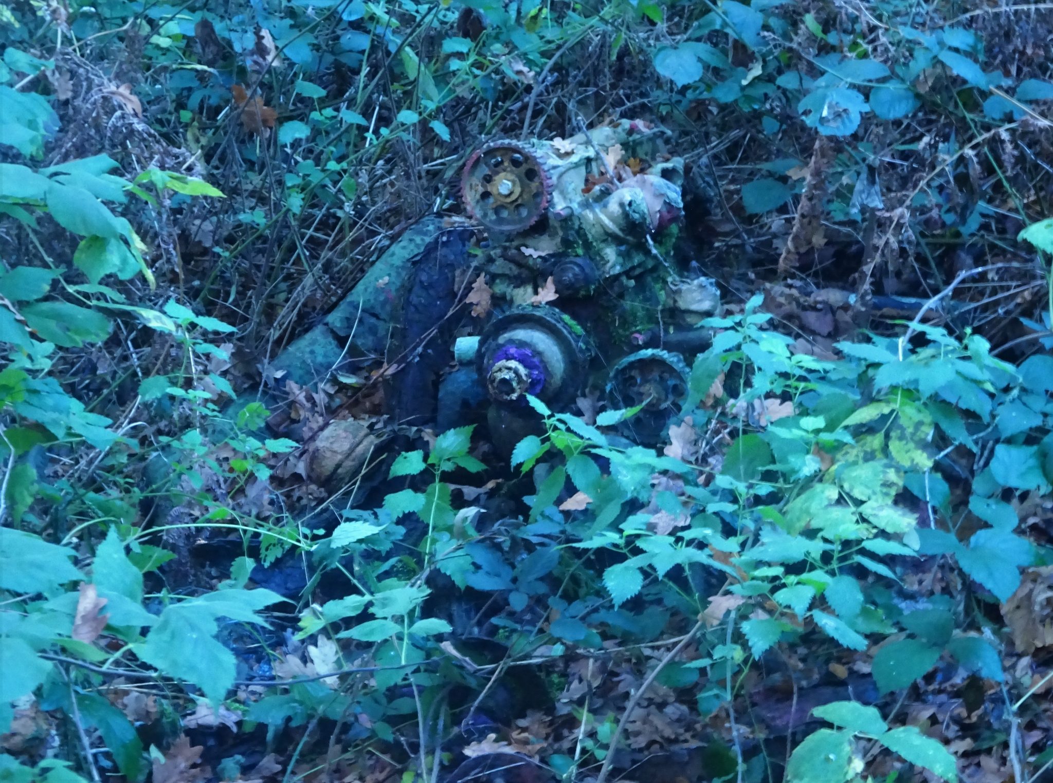
public. Among those featured in the exhibition I saw – ‘It’s How Well
You Bounce’, on the theme of resilience – were Matthew, who has an
alluring scavenging and abstract painting practice and also gave me a
highly informative tour of the grounds; Mr X, who drove up in one of
several mobility vehicles which he has customised to spectacular and
distinctive effect; and ‘The vacuum cleaner’, whose compelling
performative text ‘Comfort the Disturbed and Disturb the Comfortable’
asks angry questions following Trump’s election. Other artists include
the widely shown Sara Haq and Liz Atkin. All five would be interesting
in any gallery, so Bethlem makes a worthwhile visit on historical,
landscape, medical and artistic grounds. Next up is the Bethlem Art
Fair, which runs 25 Nov – 22 Dec.
Painted engine by Matthew in the grounds
Most days art Critic Paul Carey-Kent spends hours on the train,
traveling between his home in Southampton and his day job in London.
Could he, we asked, jot down whatever came into his head?
'Critical Categories Under Glass': Paul’s ART STUFF ON A TRAIN 236
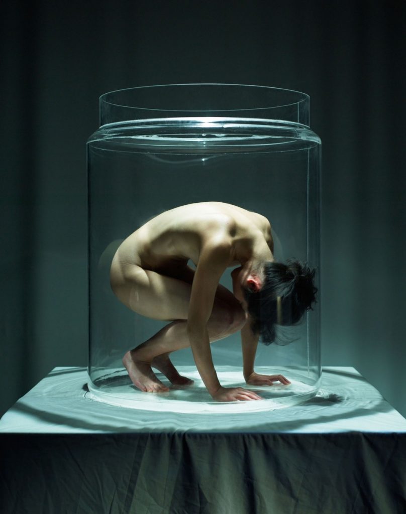
Clod Ensemble performance of ‘Under Glass’, photo Manuel Vason
What are the boundaries between art forms? The question came up at
the Hackney Showroom, where I caught the fascinating Clod Ensemble
production ‘Under Glass’. The staging has the audience moving around in
darkness to look at characters (it could be theatre) move (or, more
probably dance) inside glass containers (rather like a museum display,
but also suggesting scientific specimens) to a composed soundtrack (a
concert of sorts) with intermittent readings from Alice Oswald’s
intensely conceived ‘Village’ (poetry). Any of the above then, plus the
whole effect might be classified as an art performance or physical
theatre. So, when galleries – Tate Tanks for example – increasingly
programme what could have been shown in a theatre, does it matter what
it’s called? For marketing purposes, perhaps, as it can be tricky for
venues to know how best to categorise such genre-busting works to best
develop their audiences. I also suspect that classification can affect
critical appraisal. What may seem new as, for example, performance art
may be old hat in the world of dance, and – given that no-one (apart,
of course, from Hans Ulrich Obrist) can keep up fully with every art
form, critical assessments are bound to be partial and influenced by
which genre of critic is involved. From my own blinkered point of view –
knowing art and poetry more than theatre and dance – ‘Under Glass’
tackles issues of environmental concern and social isolation in an
innovative way which is both serious and entertaining. But I guess I’d
need Hans Ulrich to report to get a fully balanced view…
Clod Ensemble performance of ‘Under Glass’, photo Manuel Vason
Most days art Critic Paul Carey-Kent spends hours on the train,
traveling between his home in Southampton and his day job in London.
Could he, we asked, jot down whatever came into his head?
'The Studios Visit': Paul’s ART STUFF ON A TRAIN 235
Jeremy Hutchison with Chisenhale cleaner Maria Joyce and the creations she made together with fellow cleaner Grace
Blocks of artists’ studios increasingly hold open days, which make
for entertaining and varied visits quite different from the single
artist version. Some such events are well organised: the artists in the
Chisenhale Gallery’s building have the advantage of an adjoining
exhibition – Hannah Black’s mysterious but fascinating ‘Some Context’,
which includes 20,000 copies of a book describing ‘The Situation’ – and
added refreshments, a group show, performances, talks, special sales in
aid of building works and more… Among the highlights: Matt Calderwood
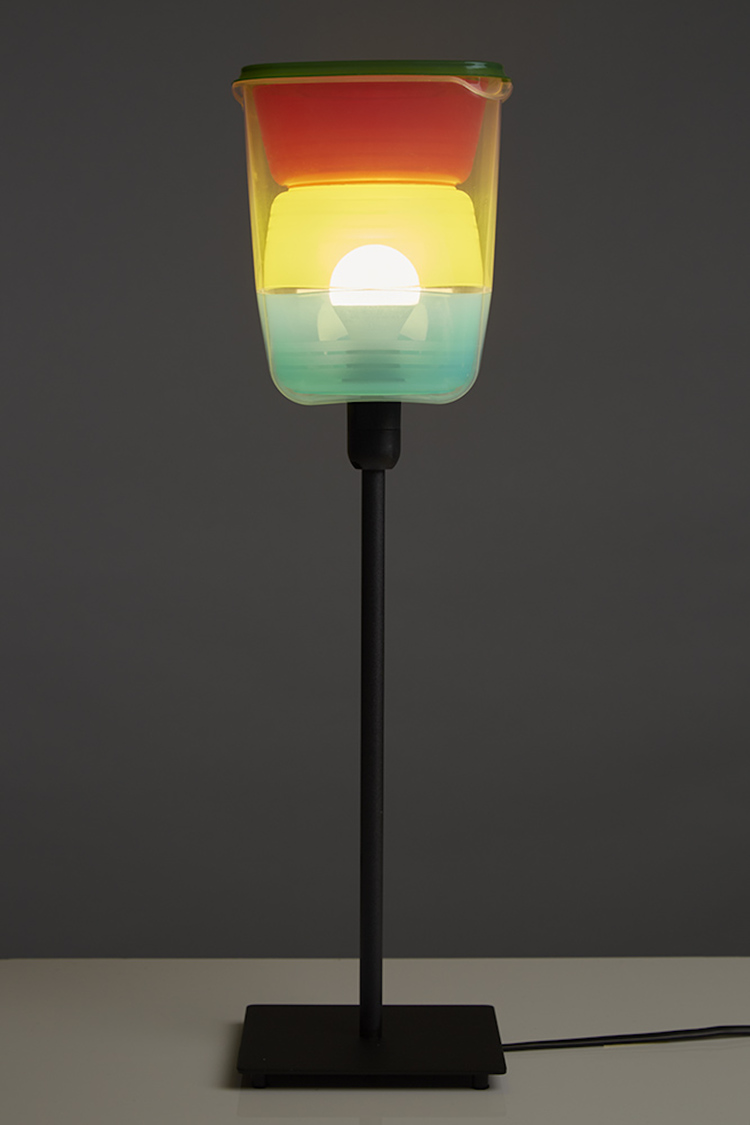
displayed the lamps he makes by hacking together IKEA products which
happen to fit with each other without any fixings needed – here, food
containers; the ever-imaginative Amikam Toren showed a new line of
drawing-sculptures made simply by varnishing actively-positioned banana
skins; Shakti Orion made an engaging striped equine in full make-up for
her ‘Zebra Cross’ performance; painters Diana Taylor, Lee Maelzer and Mark Fairnington (who had several of his vast flower paintings on view) showed strongly; and Jeremy Hutchison collaborated with the
cleaners. They were more active than usual in preparation for the open
studio days, encouraging Hutchison to question the comparative value of
their marks and his by exhibiting the results of them hoovering on
graphite. I’ve been to similar events in Bow, Hackney, Hackney Wick,
Stoke Newington, Bermondsey, Deptford, Streatham, Wimbledon, Brockley
and Camberwell, but they are threatened by the squeeze on studio space
in the city as redevelopment continues to push artists out.
Matt Calderwood: ‘Article 16.10.20.BYPG’
'The Ghosts of Saatchi and Fold': Paul’s ART STUFF ON A TRAIN 234
Mali Morris: ‘Third Ghost’, 2016 – acrylic on canvas, 168 x 192 cm
It would be hard to conjure a bigger contrast than that between the
Saatchi Gallery’s majestic four levels and FOLD’s modest basement space.
Actually its director, Kim Savage, used to work for Saatchi, and there
turn out to be echoes. Saatchi has lots on now, of wildly varying
quality, but its ‘Salon’ (organised with Omer Tiroche, to 8 Dec) is one
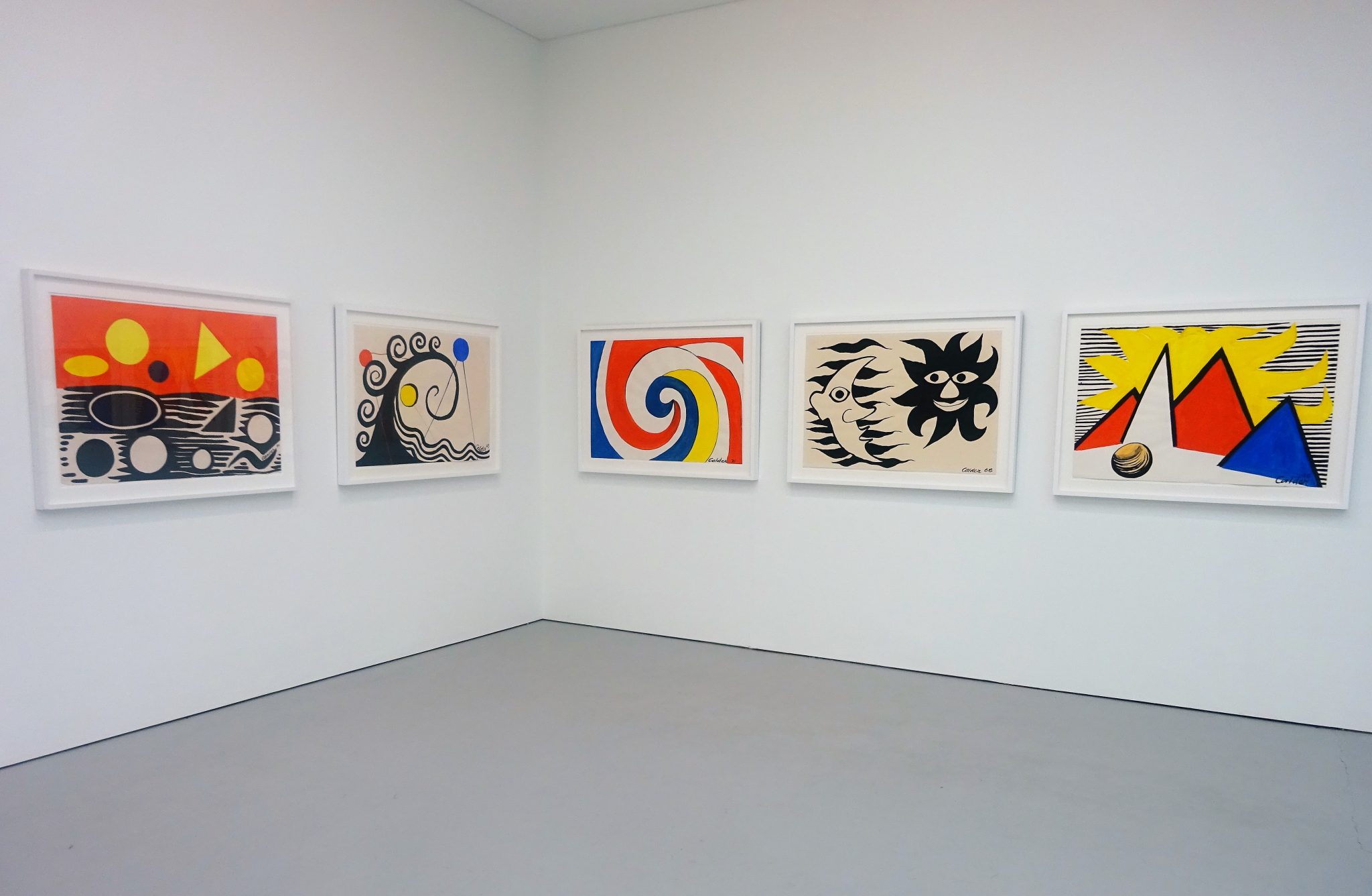
below ground space lit up by Alexander Calder’s vibrant gouaches. FOLD’s one and only room currently has a comparably radiant show by Mali Morris
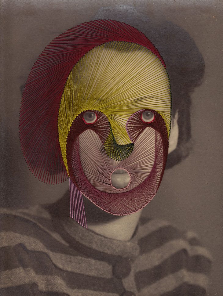
(to 25 Nov). Another Saatchi space holds Maurizio Anzeri’s drawings in
thread on found photographs*, revealing a further affinity: both Anzeri
and Morris derive much of their effect from the ‘ghosting’ through of
what is largely buried. Morris’s big new paintings arise from an
elaborate sequence of quartering the canvas into four colours,
overlaying an oval of another colour, then adding a top layer of smaller
rectangles. That’s done with plenty of masking tape to ensure sharp
divisions, but also with very big brushes loaded with gel-thickened
paint, so that directional strokes are a prominent feature. That enables
Morris, some way from simple geometric abstraction, to effect a sort of
double syncopation: a call and response between different colours is
itself played off against the visible rhythms of the paint’s
application. The oval is left as a ghost, not unlike the ovals of the
faces under Anzeri’s embroidery.
* part of Saatchi’s ‘Iconoclasts: Art Out of the Mainstream’
(to 7 Jan). No more iconoclastic nor any less mainstream than most of
his shows, it’s weirdly uneven: aside from Anzeri six rooms, mostly of
bad painting, precede one room of good painting (Dale Lewis) and a final
room with three rather wonderful large sculptures (by Kate MccGwire,
Douglas White and Alexi Williams Wynn).
Installation shot: Alexander Calder
Maurizio Anzeri: ‘Rita’, 2011 – Embroidery on photograph, 23.5 x 17.5 cm
'What Colour is the Sky?' : Paul’s ART STUFF ON A TRAIN 234
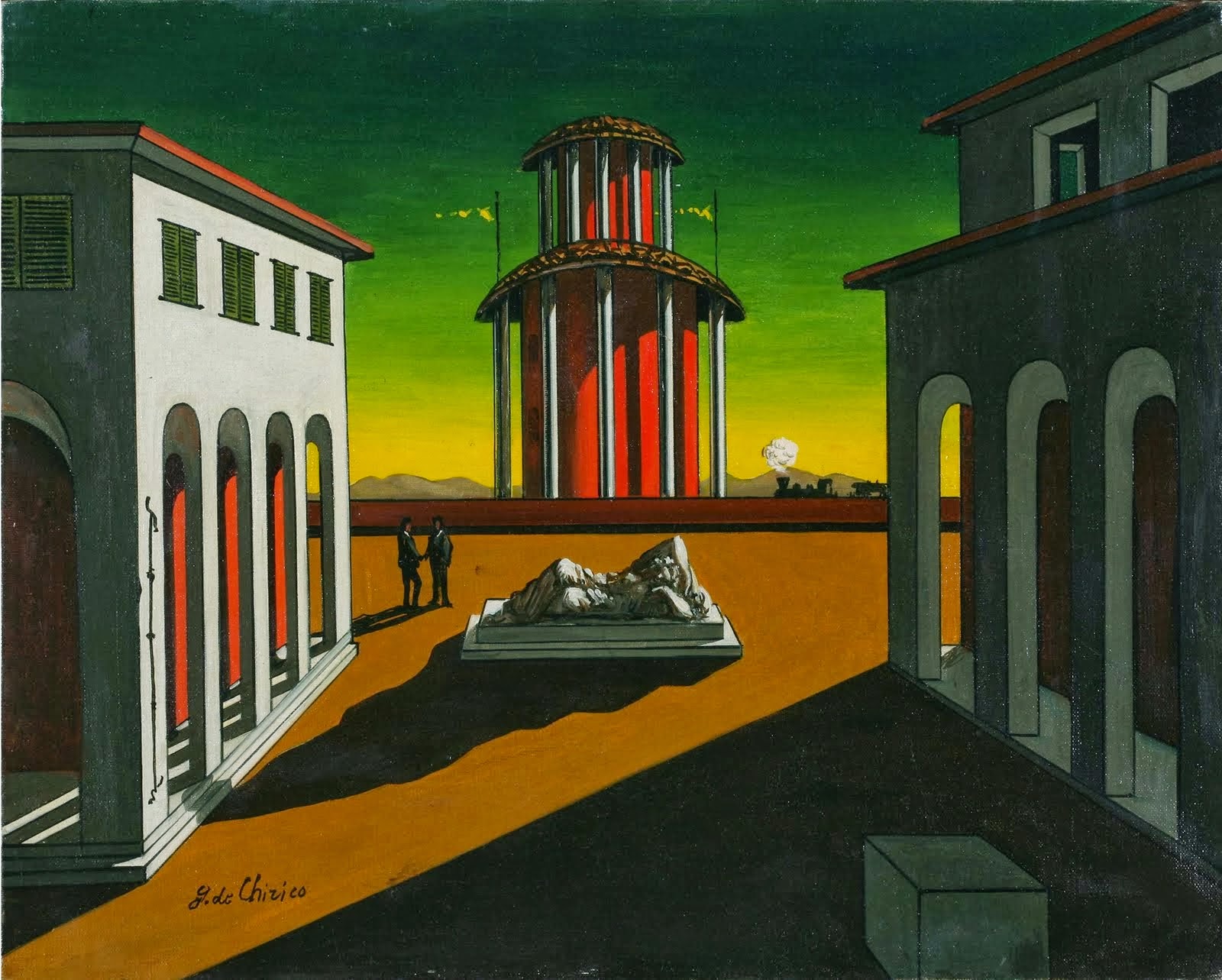
Giorgio de Chirico: ‘Piazza d’Italia’, 1915
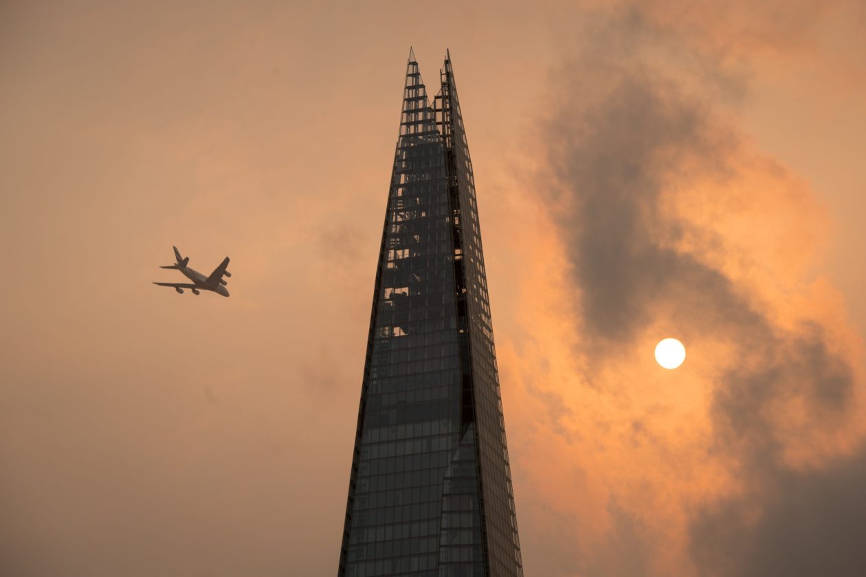
The amber sky which distracted London last week made me wonder:
what’s the most unnatural sky colour among painters? Sunset and sunrise
allows plenty of scope for yellow-orange-red, with no need to wait for
Saharan sand. But painters have a free rein, which leads me towards
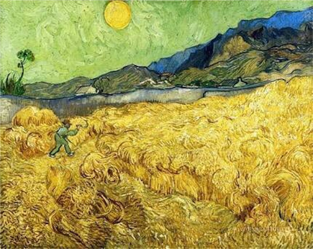
green. Van Gogh’s ‘Wheat Field with a Reaper’ (1889) is typically
vibrant, though as he saw it as ‘an image of death, in the sense that
the wheat being reaped represents mankind’. The Fauves set out to use
colour arbitrarily, so the green sky in Derain’s ‘Boats in the Harbour,
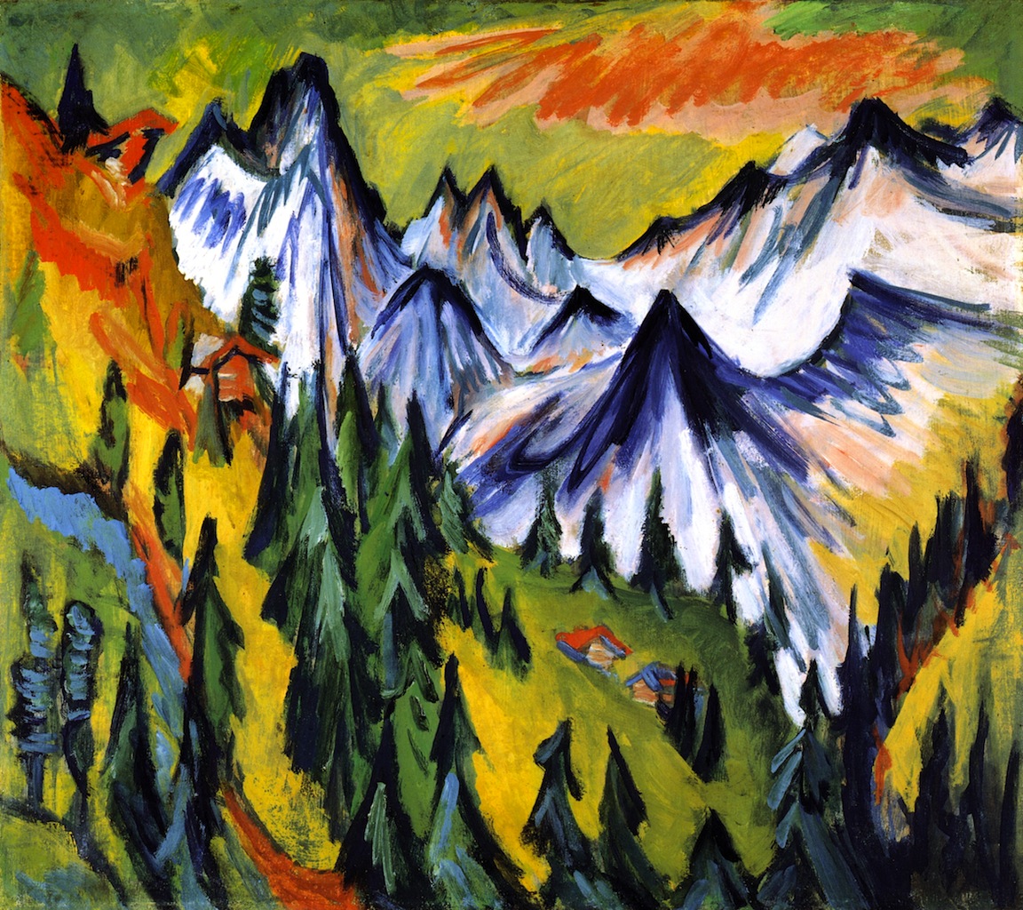
Collioure’ should not surprise. Expressionism took from that, as shown
in my choices my Kirchner and Nolde (the latter may be the painter
laureate of the hyper-coloured sky). It’s more surprising in Giorgio de
Chirico, but his frequently green skies are part of his elusive
creation of atmosphere. Neo Rauch might be seen as de Chirico’s
successor in terms of conjuring atmosphere through a historical and
surrealist mix: he rarely resorts to the green sky, but I don’t say
never…
Vincent van Gogh: ‘Wheat Field with a Reaper’, 1889
Andre Derain: ‘Boats in the Harbour, Collioure’, 1905
Ernst Ludwig Kirchner: ‘Berggipfel’, 1918
Emile Nolde: ‘Veiled Sun’, 1950
Neo Rauch: ‘Das Horn’, 2014
The sun in London, 16 October 2017 (photo Dominic Lipinski/PA Wire)
'Marden, Lalic, Terre Verte': Paul’s ART STUFF ON A TRAIN 233
Brice Marden: from the Terre Verte series, 2017
Maria Lalic: ‘History Painting 17, Italian. Naples Yellow – Raw
Sienna – Burnt Sienna – Terre Verte – Raw Umber – Burnt Umber –
Ultramarine’, 1995
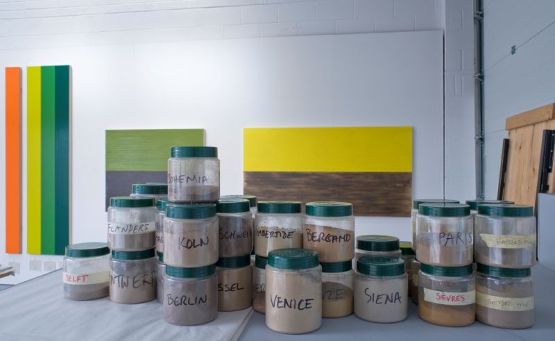
The Grosvenor Hill Gagosian has (to 15 Dec)
a rigorous suite of paintings by Brice Marden, highly regarded in the
US for 50 years but hardly seen in the UK this century. Marden made his
name with lyrical monochromes in the 1960’s, to which he has returned
using terre verte (green earth), an iron silicate/clay pigment
widely adopted as a base for flesh tones during the Renaissance. Ten
eight by six foot paintings employ ten different brands of terre verte
oil paint, revealing the considerable variation stemming from different
earth sources, and suggesting a mossy forest floor in changing degrees
of shade. A ‘run-down’ area at the bottom hints at each painting’s
enactment. The idea of making the paint used the subject as well as
object of a painting is itsef becoming a small tradition. Indeed, Tate
Modern is currently displaying six of the 53 ‘history paintings’ which
Maria Lalic made from 1995-2004. She used smooth horizontal brushstrokes
to apply thin glazes of all the colours in a Winsor & Newton
catalogue which grouped paints into the eras in which they were
available. ‘Naples Yellow’ is from the ‘Italian’ period covering the
16-17th centuries, of which it constitutes a chronology of pigments, terre verte
included. Lalic has said she is ‘excited by recognising a time and
place through colour’, Marden speaks of ‘harnessing and communicating
some of the powers of the earth’. I imagine they’d be happy to own each
other’s quotes.
Brice Marden: installation view
Maria Lalic: installation view
Brice Marden: studio view
Maria Lalic: studio view (with her ‘History Paintings’)
'Saws, Buns and Feathers': Paul’s ART STUFF ON A TRAIN 233
There’s always plenty of interesting stuff at Frieze London and
Frieze Masters, whether or not you like it as art. Here are four unusual
works which I did also rate highly as art.
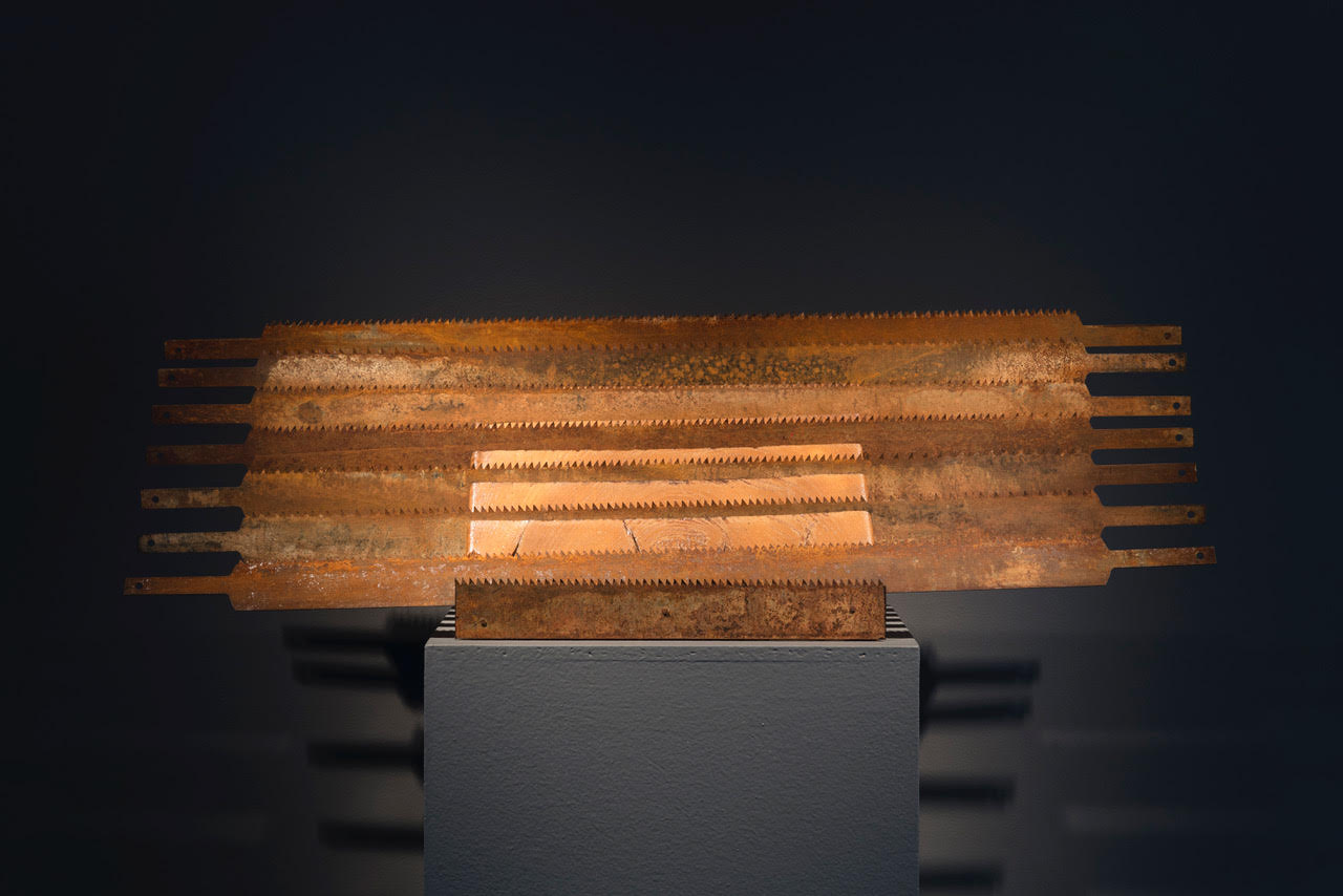
Heinz Mack: 'Lamellar Sculpture with Eight Saw Blades', 1954 at Olivier Malingue (London) in Frieze Masters
This early Heinz Mack
has a neatly circular logic, as it incorporates the saw blades that cut
its wood. Moreover, Mack – who grew up 500 miles from the coast in the
centre of Germany – made it after seeing the sea for the first time, at
the age of 22. So you can interpret it as waves, as well as the
overlapping plates of body armour implied by the title.
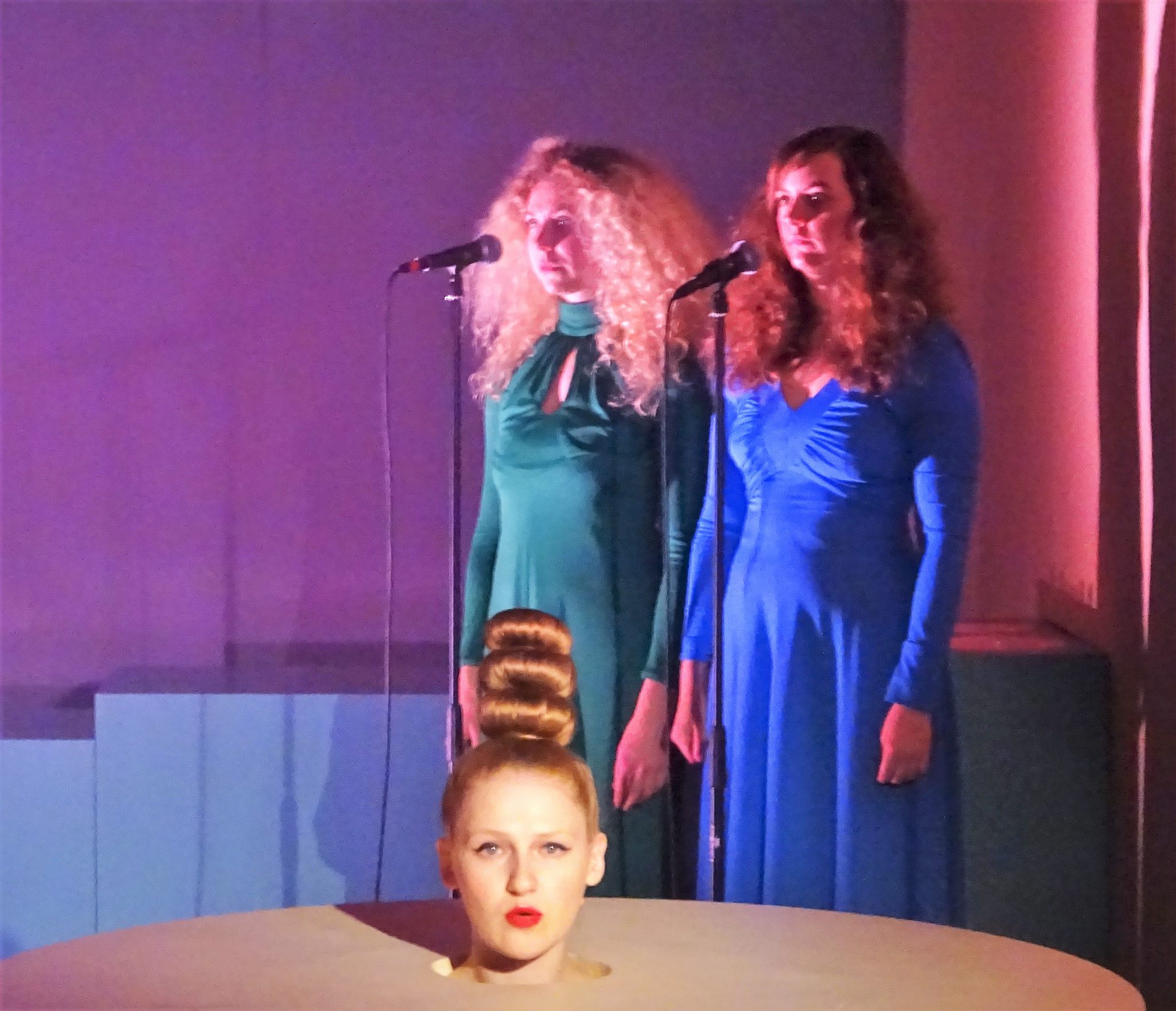
View of ‘Androgynous Egg’ from the Projects programme at Frieze London
Buns were the go-to hairstyle at Frieze London. The outstanding
performance, Georgina Starr’s ‘Androgynous Egg’ – twenty minutes of
sculpture, advanced singing, hyper-flexible choreography and witty
ovum-themed text – also starred a triple-bunned soprano disembodied
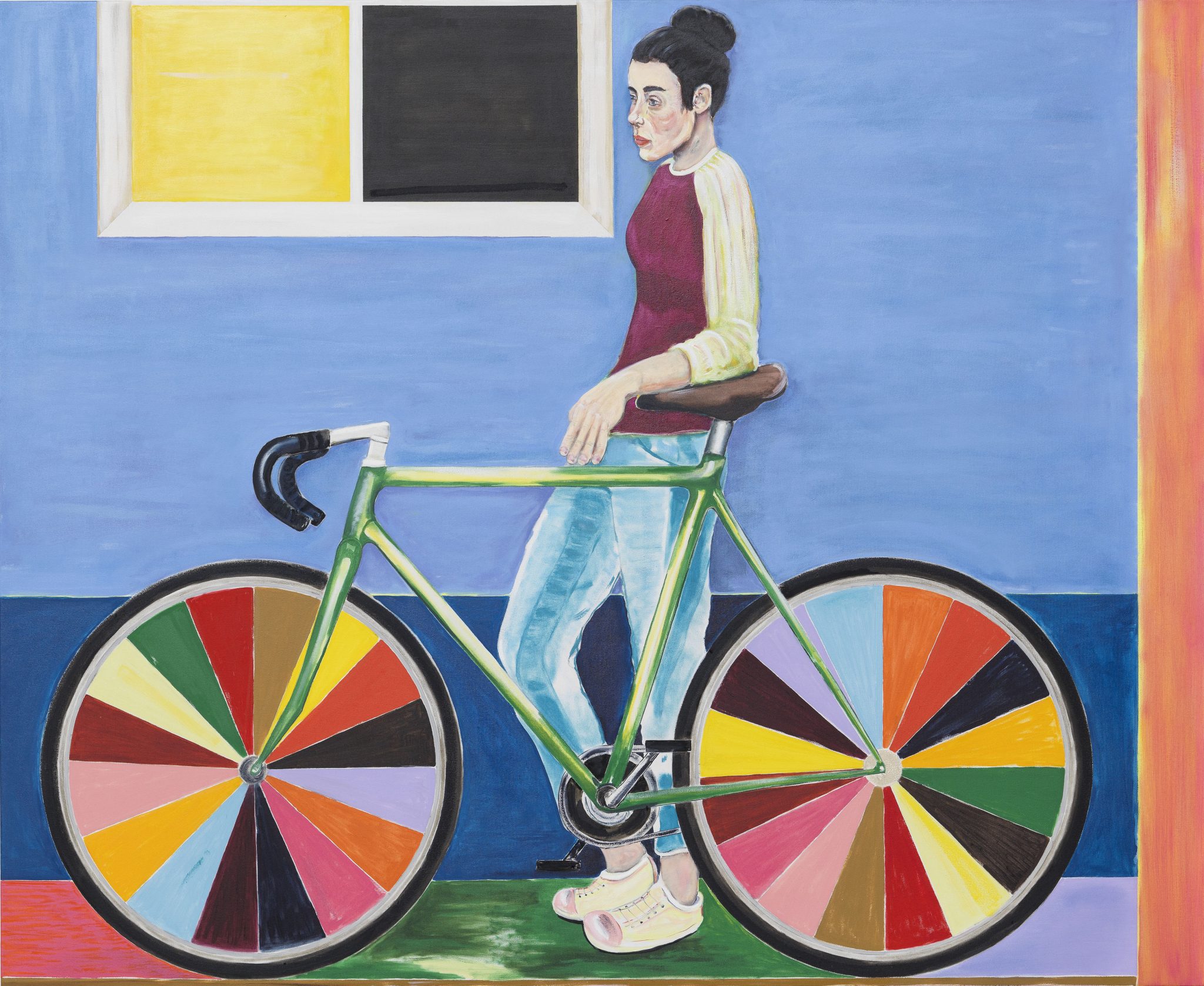
from the head down. And Ryan Mosley, a painter of comparable spirit
known for his glorious treatment of beards, showed signs of developing
the bun as the female beard… This is a modest example,
but the bicycle more than makes up for that!
Ryan Mosley: 'Weekend Break' , 2017 at Eigen + Art (Berlin) in Frieze London
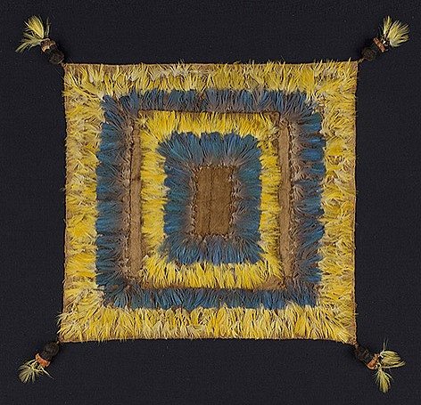
One of the Frieze ‘collections’ was of Aztec feather works which were
not only aesthetically striking, but seemed to have retained their
original colour for well over a thousand years. Was there a scientific
secret to that? The gallery didn’t know of one, but it seems from net
research that feathers get their colour from a unusual combination pigment groups and the tough keratin protein of which feathers are made, and that the angles through which their internal structures
reflect light are particularly efficient, both factors which seem likely to help... .
Feather Textile from the Huari Culture, Southern Andes, c. 800AD at Paul Hughes Fine Art (London) in Frieze Masters
'The Frieze Masters Effect': Paul’s ART STUFF ON A TRAIN 232
Jean Dubuffet: ‘Les commentaires’, May 24, 1978 – acrylic on glued paper mounted on canvas (30 sections), 140 cm x 204 cm
In line with a longer term trend, a number of excellent
London-originated galleries have closed in the past year few months:
goodbye to Wilkinson, Breese Little, Laura Bartlett, Limoncello and
Vilma Gold. They might be termed ‘middle market’. The shift has been
towards the upper market, with galleries founded abroad playing a bigger
role in London. That’s not so good for London-based artists, I suspect,
but it does make for some spectacular shows, especially to coincide
with Frieze. Or rather, perhaps, with Frieze Masters, for it is ‘classic
contemporary’ work from the late 20th century on which dealers
increasingly seem to focus: Lévy Gorvy, for example, need all their
space, including the director’s office, to show the complete set of 23
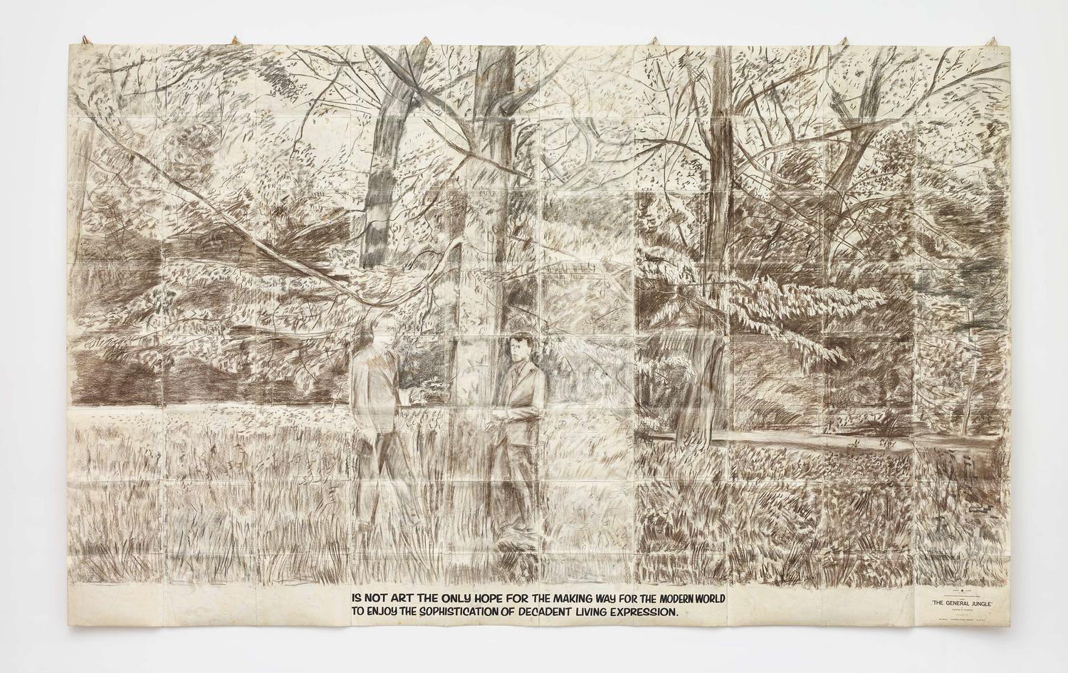
wall-height works in Gilbert and George’s sequence ‘The General Jungle
or Carry on Sculpting’ from 1971. They look like beautiful drawings,
attractively pre-aged by the application of potash, but the catalogue*
states that ‘it is crucial to their existence and meaning that these
sculptures are emphatically not drawings, nor are they intended to have
any aesthetic qualities’. Rather, ‘their fabrication as multi-sheet
‘descriptive works’ is dictated solely by the artists’ intention to
communicate as forcefully and efficiently as possible… the emotional
residue of events and feelings, left on places and objects by time…’.
Pace’s presentation of the ‘Theatres of Memory’ which Dubuffet begun in
his mid-seventies are equally impressive: vast collages made by
combining many of his own paintings. Almine Rech and Gagosian have
complementary Tom Wesselmann shows. Hauser & Wirth go with Marcel
Broodthaers and Jack Whitten. Rewarding viewing, then, but limiting the
opportunities for artists to show what they’re doing now…
* Based on the artists’ conversations with Michael Bracewell Gilbert & George from ‘The General Jungle’ – IS NOT ART THE ONLY
HOPE FOR THE MAKING WAY FOR THE MODERN WORLD TO ENJOY THE
SOPHISTICATION OF DECADENT LIVING EXPRESSION
Most days art Critic Paul Carey-Kent spends hours on the train,
traveling between his home in Southampton and his day job in London.
Could he, we asked, jot down whatever came into his head?
'Comprehensive Whiteread': Paul’s ART STUFF ON A TRAIN 232
The doll’s house version of a house casting ‘Ghost, Ghost II’, 2009 – Polyurethane (fourteen parts)
What makes a top show? Most obviously, quality and presentation. Matthew Collings is good on the former; and knocking down walls to put all the work in one opened-up space works wonderfully. The curators explain this as enabling the connections between works to be seen, but I can’t think of an artist who needs that less. Rather, I like that presentational gambit because it enables the whole exhibition to act as a deconstructed dwelling, with windows, doors, cabinets etc circling round a central staircase. I thought of Damián Ortega’s disassembled and spaced out Volkswagen, ‘Cosmic Thing’, 2002. But anyway, where Rachel Whiteread at Tate scores the fullest marks is in a third factor: its comprehensiveness. All the extant sculptures you can think of are here, from Whiteread’s debut to new work straight from the studio, and in numbers – eg there are ten cast of inner water bottles as torsos. Plus there are drawings; vitrines of objects from the studio; photographic documentation of site specific works; a new external commission in the garden; and Whiteread’s own choice of her favourites from the Tate’s collection, which occupy the Duveen Galleries along with her own most luminously colourful work ‘Untitled (One Hundred Spaces)’, 1995. With most such surveys you can ask: ‘why haven’t they got that?’ or ‘why haven’t have done that?’ Here, I couldn’t really imagine anything extra.
Rachel Whiteread: 'Wall (Door)', 2017 - Papier-mâché, 217 x 228 x 9 cm
Most days art Critic Paul Carey-Kent spends hours on the train, traveling between his home in Southampton and his day job in London. Could he, we asked, jot down whatever came into his head?
‘Anti-Heteronormativity in Berkshire’: Paul’s ART STUFF ON A TRAIN 231
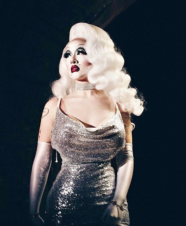
Victoria Sin
Curator, collector and writer Marcelle Joseph’s ‘You see me like a UFO’ (9 Sept – 7 Oct*) is well
worth a trip to her home in leafy Ascot. It showcases 85 works by 70 playfully categorised artists. The opening
featured a performance by the hyper-made-up female drag artist Victoria
Sin, who along with Jesse Darling is one of two artists in the show who
go by the pronoun ‘they’. As such, both are allowed to be on open
display with their female, LGBTQI or non-Caucasian peers, whereas the
minority of 14 heterosexual white male artists get corralled into spaces
behind specially commissioned curtains by Marie Jacotey and Evan
Ifekova. Despite my minority status, I was allowed full access – and by
and large I liked the uncurtained zones more, partly I admit for
including four artists who’ve been in my own shows (Alice Anderson, Jane
Hayes Greenwood, Liane Lang and Suzanne Moxhay); but also for Samara
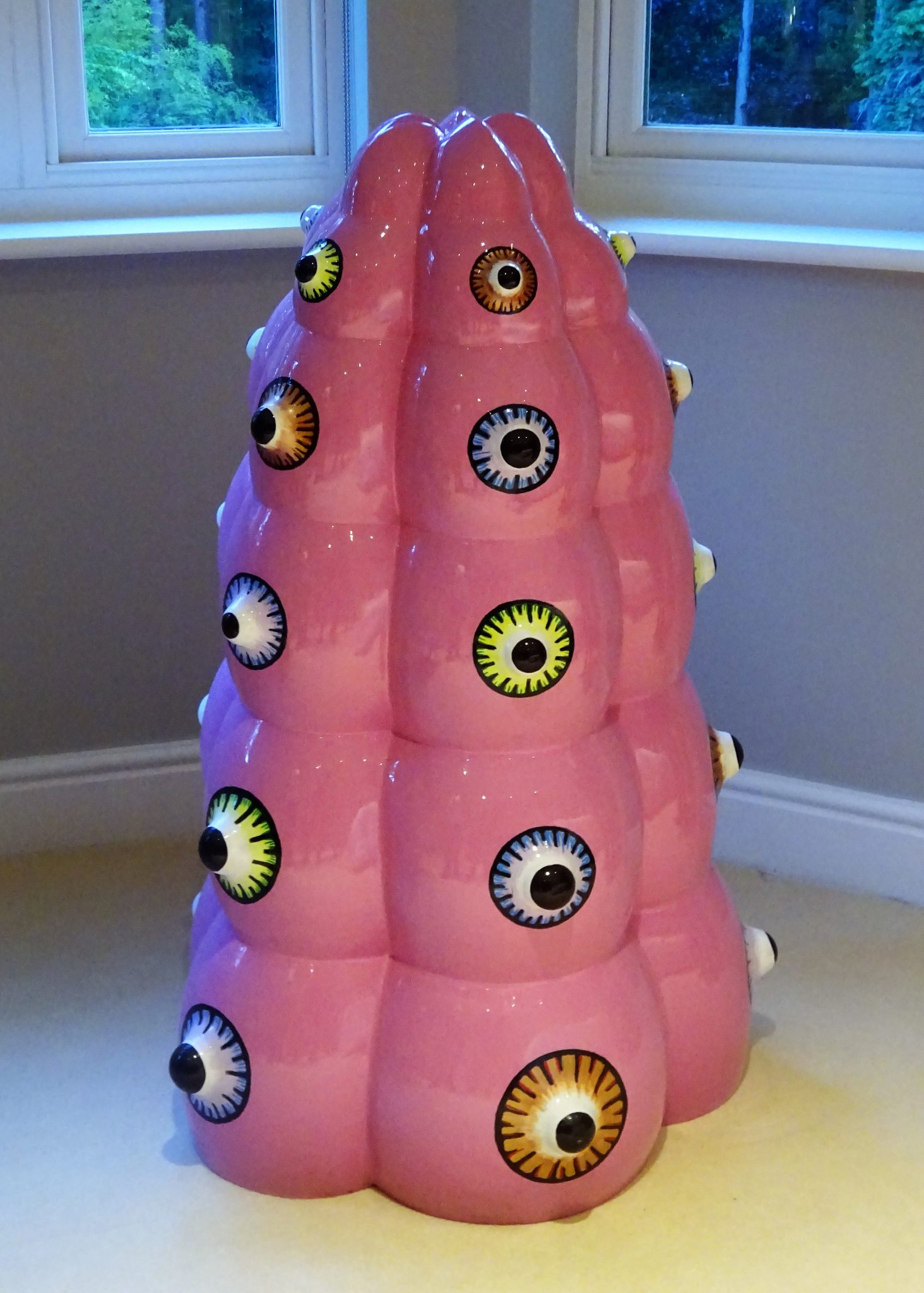
Scott, Tereza Vickova, Florence Peake and Noemie Goudal in particular; and for two artists new to me… Hyojin Park provides fun in the guest
bedroom with a bright pink stainless steel sculpture, described by
Marcelle as a phallus of boobs, which could equally be a multi-eyed
creature from unsurveyed sea depths; while Argentine Ad Minoliti’s
‘Queer Deco’ series is true to the jocular spirit of the show’s
classifications, subverting the South American tradition of geometric
abstraction as she lays into the heteronormativity of the typical
American home.
Hyojin Park: ‘My Eyes Behold the Glory’, 2012 – stainless steel and oil spray paint, 120 x 45 x 45cm
Ad Minoliti: ‘Geo Queer Deco (Green)’, 2014 – acrylic on canvas, 65 x 55cm
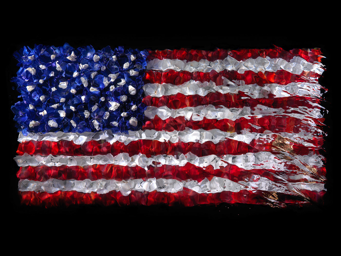
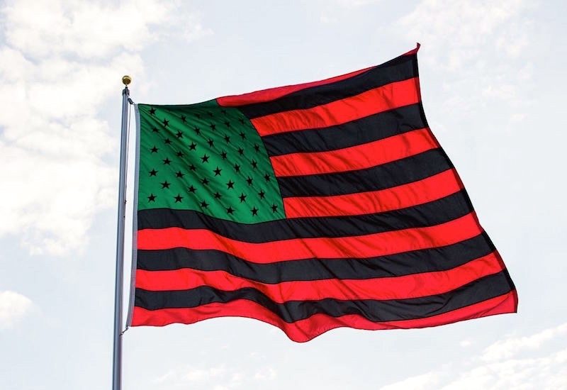
'Flagging Alexander James': Paul's ART STUFF ON A TRAIN 230
Alexander James: ‘Death of the Dream of Democracy’, 2017
It’s not easy to make an original work which uses the stars and
stripes successfully, there being so much to compete with, most
obviously Jasper Johns (whose major show is due at the Royal Academy Set
23 – Dec 10), though Childe Hassam, Cady Noland, Robert Longo and David Hammons would
also feature in the list of successful users. Now Alexander James joins
the tradition with his photographs of flags formed by flowers shot
underwater (for Dellasposa Fine Art, in residence at Alice Herrick’s
gallery at 93 Piccadilly to 17 Sept). They derive from the vanitas
tradition: so death is on the way. There’s an admixture of gold – for
greed, I suspect, not for inherent value. One flag is disrespectfully
upside-down. We pick up a view on Trump even without the title ‘Death
of the Dream of Democracy’. They’re very like paintings, an effect
emphasised by the way they are varnished – so that the surface crazes
into the craquelure of an old painting. That suggests both fragility and
inflexibility. That’s upstairs: below is an atmospheric presentation of
James’ underwater butterflies, including the superposition of parent
and offspring – who, such are butterfly families – can meet in no other
way…
David Hammons: ‘African-American Flag’, 1990
'Art of the Postcard': Paul's ART STUFF ON A TRAIN 230
Lada and Saso Sedlacek: the back of this card reads: ‘Hi, Am at the store, pl txt me list of things to buy’
Jeremy Cooper, closely involved with the emergence of the YBAs back in the day, is better known now for his collection of postcards made by artists, which features in his 2011 book ‘Artists' Postcards: A Compendium’ and has been accepted by the British Museum. ‘Art of the Postcard’ (Handel Street Projects to 8 Oct) combines his new choices of this affordable art form with other original artworks designed to be posted, as selected by home gallerist Fedja Klikovac. His choices tend towards the conceptual and the East European. The unusual result is 111 fascinatingly varied small-scale exhibits. Among the best are a miniature painting by Lothar Götz, over-paintings by David Batchelor, David Ward and Amelia Critchlow, an intricate collage by Nicolas Feldmeyer and a pseudo-narrative postcard book by Susan Hiller. Materials include aluminium, wood and slate. Martin Creed contributes an impressive turd and Tracey Emin a typical nude. Donald Trump makes two appearances, sort of: Peter Kennard and Cat Phillips give him nuclear submarine headwear, while Ruth Ewan displays a blank card which turns out to be an erased image of the President - £500 to achieve that seems a bargain. Of course, postcards have a whiff of the past, wittily exploited by Slovenians Lada and Saso Sedlacek, whose series of 16 shows them in the act of posting text messages to each other over the several days it takes to clarify what shopping is required.
Lothar Götz: ‘Composition with Silver’, 2017 – postcard
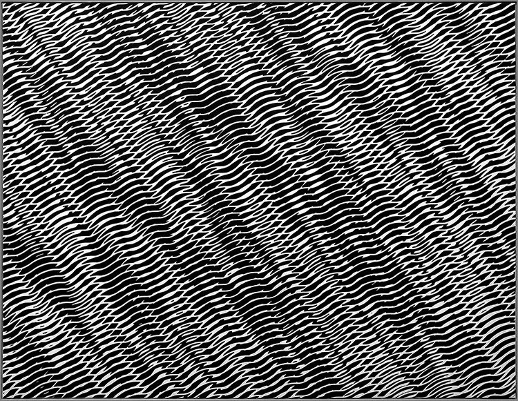
'Famously Unkown': Paul's ART STUFF ON A TRAIN 229
Grignani’s mark for pure wool
Franco Grignani: Combinatoria di Strutture Ondulate Interferenti, 1956
Prior to recent shows at M & L Fine Art (June-July) and now at
the Estorick Collection (to 10 Sept), Franco Grignani probably belonged
in the category of artists you’ve never heard of yet whose work you turn
out to have seen. The Italian (1908-99) explored the optical effect of
structured black and white repetitions in the late fifties in a manner
which can be related to Bridget Riley’s subsequent work. When you see
his paintings alongside the famous Woolmark introduced in 1964, it is no
surprise that Grignani was responsible for that – having made an
awkward ethical decision, as a judge for the competition. Concluding
that the entries were not up to standard, he entered himself under a
pseudonym! In fact, Grignani worked consistently across art and design,
and his book cover for late sixties sci-fi books from Penguin are also
striking – and a rare indulgence in colour, which he considered for the
most part too subjective for art, though I found that the perspectival
effect of some black and white works can introduce an illusion of
chromatic gradation . And if it’s a test of art that other things remind
you of it, then at nearby Highbury & Islington underground station
on the way back from the Estorick, the setting of one of Mark
Wallinger’s 270 mazes from his Labyrinth project (2013) seemed set to
echo Grignani…
A typical Grignani cover
Wallinger placed a la Grignani?
Most days art Critic Paul Carey-Kent spends hours on the train,
traveling between his home in Southampton and his day job in London.
Could he, we asked, jot down whatever came into his head?
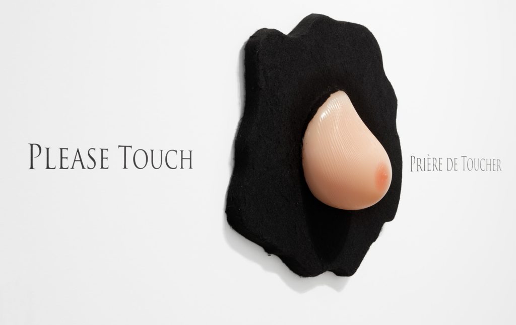
Omer Tiroche (to 1 Sept) do their bit with an over the top
installation-come-work by the gallery’s own staff. It supplements works
by such as Calder, Ernst and Matta in tribute to Prière de Toucher, the
first post-war surrealist show, with a sculptural homage to Duchamp’s
famous rubber breast cover it. To put it more directly, there’s a giant
silicon boob on the gallery wall, which viewers are invited to fondle.
It’s risible, yes, but not so alien to the spirit of surrealism.
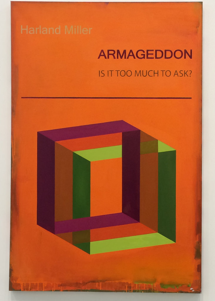
Harland Miller: ‘Armageddon is it Too Much to Ask?’ 2017, Oil on canvas 284 × 195 cm
Speaking of which, White Cube’s glorious show of female surrealists
in Bermondsey has 170 works. There seems to be room for everything, yet
the White Cube Mason’s Yard show by Harland Miller (to 9 Sept) doesn’t
even contain the painting about which its press release waxes most
lyrically: the typical book-cover-meets-abstraction ‘Armageddon – Is It
Too Much To Ask?’. Yet that, too, may have a humorous logic: yes, it is too much to ask. But I’m giving you a digital chance…
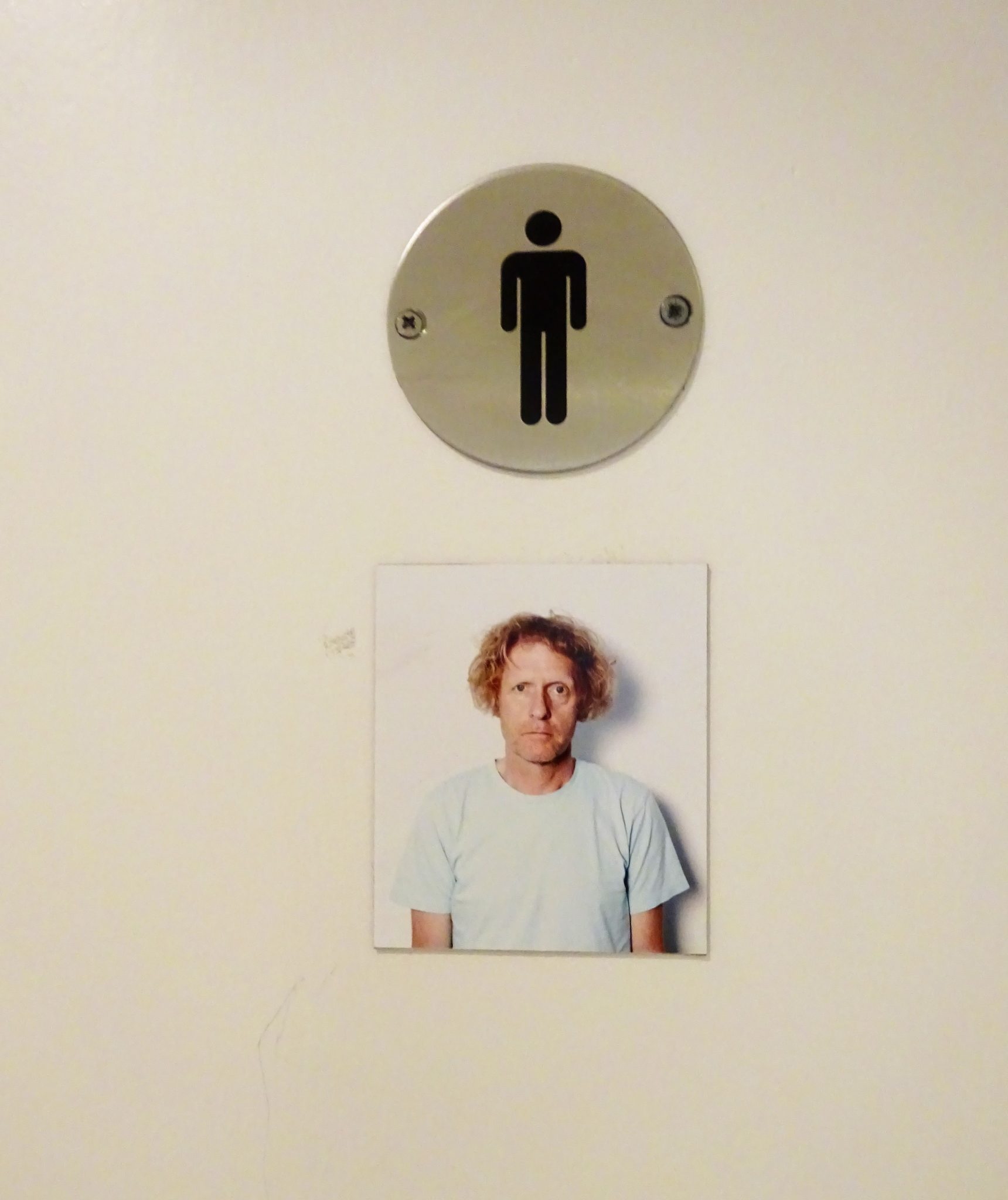
Perry on the bike, which is on show at the Serpentine
Yet silliness central is at the Serpentine Gallery, where Grayson
Perry holds sway. Of course, that is deliberate, as flagged by its
titling as ‘The Most Popular Art Exhibition Ever!’. All the same, it’s
hard to be even unseriously enamoured of a motorbike customised for
Perry’s teddy bear; or a skateboard with an image of Kate Moss on it
simply in order to call it a ‘Kateboard’. But the loos are fun: the
gents now has Grayson’s photo on the door, the ladies has him dressed as
Clare.
The Other Giacomettis:
Paul's ART STUFF ON A TRAIN 227
Tate Modern’s Giacometti retrospective (to Sept 10) is the best
chance to see the sculptor as more than an existentialist. Yes, there
are plenty of etiolated figures and murkily tentative portraits in his
mature post-war style, all great in their way. Giacometti’s lively and
also-famous surrealist phase – from 1931 to his ior to his excusion rom
the group in 1935 – is well-represented, too, But you might in addition
consider:
Giacometti the Fauve: actually Tate misses a trick by
including none of Alberto’s very early landscapes, clearly inspired by
the similar work of his father Giovanni, an established painter in that
style.This scene from Borgonvolo is from 1920.
Giacometti the Cubist: among various works with a cubist
influence, filtered through a life-long reverence for Cezanne, is his
paradoxically twelve-sided ‘Cube’, which may refer to throwing two
dice.
Giacometti the Obsessive: ‘Disagreeable Object’ has
primitivist, surrealist and fetishistic qualities – and has been seen as
a metaphor for frustrated desire, given Giacometti’s somewhat troubled
sexuality: he’s said to have been pretty much impotent other than with
prostitutes. Man Ray’s photograph shows Lili complicating that narrative
by holding the sculpture as if it were a baby.
Giacometti the Egyptologist: Giacometti considered Egyptian art an
unequalled pinnacle, and one highlight is his copy of the book ‘History
of the Ancient Egyptian Civilisation’, on which he copied across various
illustrations in exploratory-come-tribute mode.
Giacometti the Minimalist: There are five ‘gazing heads’ at
the Tate, flattened forms in which indentations suggest that features
have been removed, giving them a hauntingly elegant presence.
Alma-Tadema’s Death by Petals:
Paul's ART STUFF ON A TRAIN 226
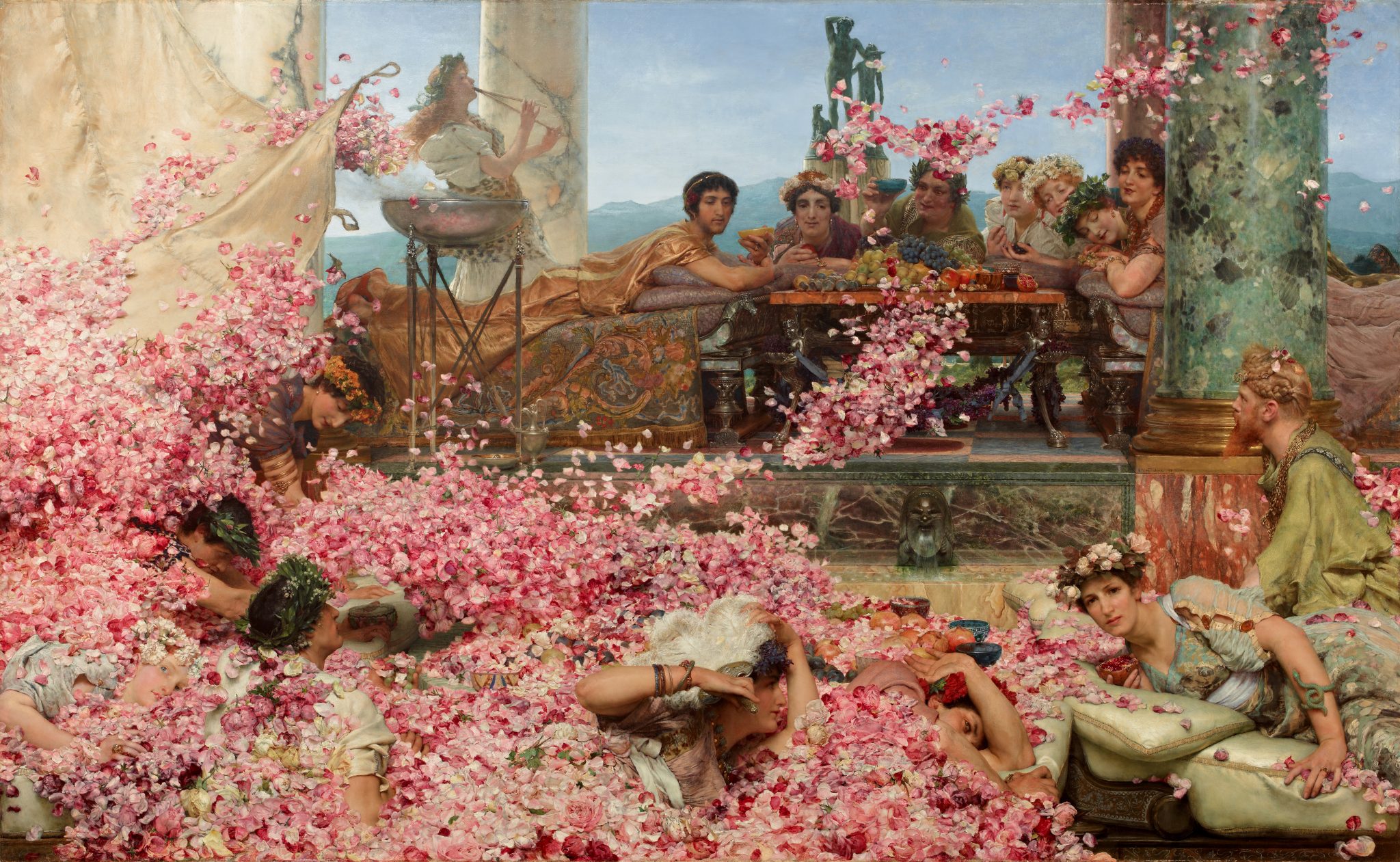
Sir Lawrence Alma-Tadema: ‘The Roses of Heliogabalus’, 1888 – oil on canvas,133 x 214 cm
Leighton House is a sympathetic environment for the significant
Alma-Tadema retrospective (to 29 October) which has arrived in London
from his native Friesland, for Lord Leighton’s residence is as close as
we’ll get in spirit to the houses which the Dutch émigré (1836 –1912)
commissioned.
Those homes fed into the classical and archaeological settings he
depicted, often including the objects with which he surrounded himself.
The best idea of what those settings looked like ‘straight’ is probably
provided by the jewel-like watercolours which his daughter, Anna
(1867–1943) painted of Townshend House in 1885. On the other hand, the
setting does the paintings few favours: many of those in the first half
of the show are poorly lit or hung too high, with the result that
Alma-Tadema’s lightening and brightening pallet after 1880 is
exaggerated by the better conditions the later paintings enjoy in the
studio area. One of those well-illumed later works, a highlight which has
travelled from Mexico, is ‘The Roses of Heliogabalus’. Despite
containing such characteristic tropes as beautiful women, marble,
flowers, classical statuary and Roman dress, its attention grabber is
the remarkably perverse and possibly apocryphal tale of how the Emperor
(who ruled 218-222) ordered a false ceiling be removed so as to
suffocate his victims in petals. Given that Heliogabalus – who came to
power at 14 – declared himself a god, insisted on marrying a vestal
virgin and liked to force the senate to watch his dance performances,
the flower downing has some consistency. The effect is aesthetically
dramatic, though I submit that that a far greater volume would be needed
than Alma-Tadema shows if the air pockets were to be fatally
eliminated.
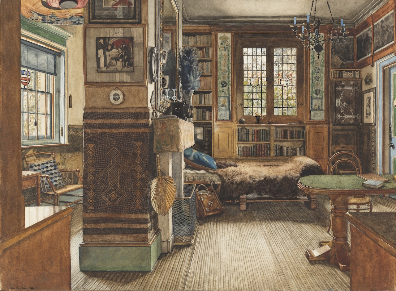
Anna Alma-Tadema: ‘Sir Lawrence Alma-Tadema’s Study, Townshend House, London’, 1885
'While the Hayward’s refit inches forward..'
Paul's ART STUFF ON A TRAIN 225
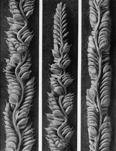
Karl Blossfeldt: Common globe thistle Echinops sphaerocephalus, part of a flower head –
photogravure approx. 8 x 10 inches
The Hayward’s interminable refit inches forward, I presume (it’s
meant to reopen on 25 Jan with Andreas Gursky after a 28 month closure),
but South Bank shows still tour the country. The highest profile
currently is Elizabeth Price’s curation ‘In a Dream You Saw a Way to
Survive and You Were Full of Joy’, at the Glynn Vivian Art Gallery,
Swansea (to 28 Aug), but six more modest shows are also available for
the very reasonable-sounding fee of £750*. ‘Art Forms in Nature’
presents 40 prints from the 6,000 negatives which Karl Blossfeldt
(1865-1932) made in 35 years of somewhat obsessive documentation of
plant forms using a homemade camera and lens that could magnify a
subject by 30 times. He originally meant them as reference tools for
botanical research, but the 1928 publication Urformen der Kunst showcased
their microcosmic aesthetic: Blossfeldt was deemed an artist. The
surrealists were particular fans, and George Bataille included
Blossfeldt’s images in the periodical Documents in 1929… All of which
is, I suppose, well known, but the variably magnified and cropped black
and white precision still makes the photographs unexpectedly varied and
characterful ‘in person’. Some plants, moreover, appear quite other than
you’d expect (as in the close-up of a thistle’s flower), or repeat
hypnotically within an image. So – having seen the Southampton leg – I’d
recommend looking in if you’re in Letchworth (23 June – 10 Sept) or, en
route to the Turner Prize perhaps, in Beverley** (23 Sept – 9 Dec).
Most days art Critic Paul Carey-Kent spends hours on the train,
traveling between his home in Southampton and his day job in London.
Could he, we asked, jot down whatever came into his head?
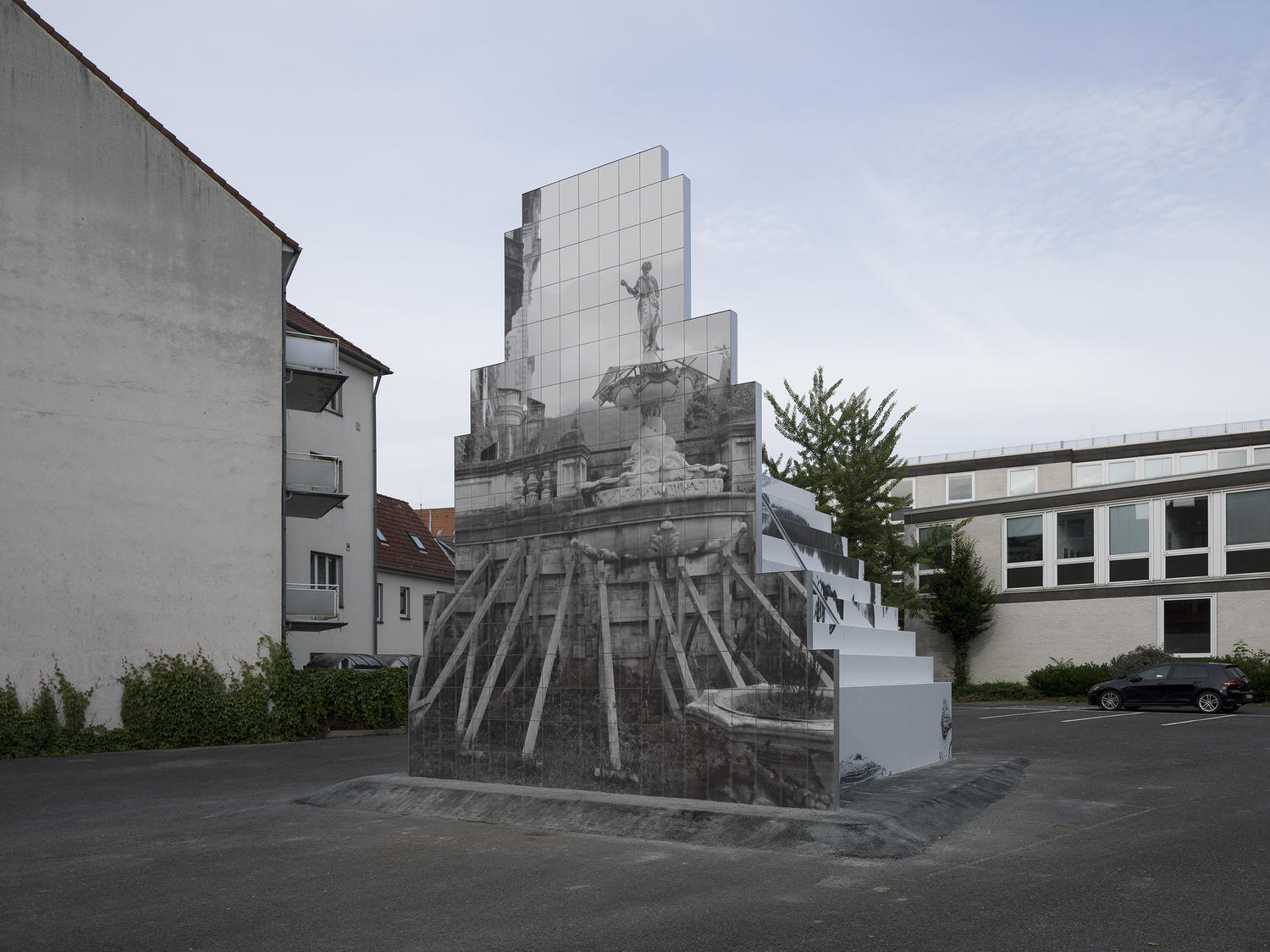
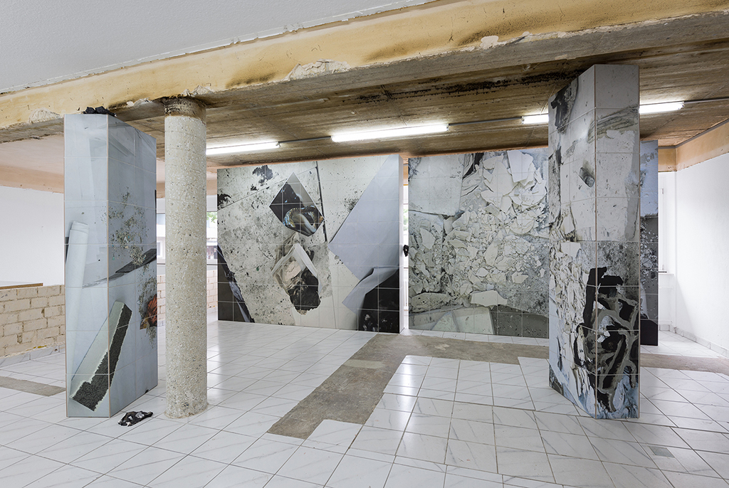
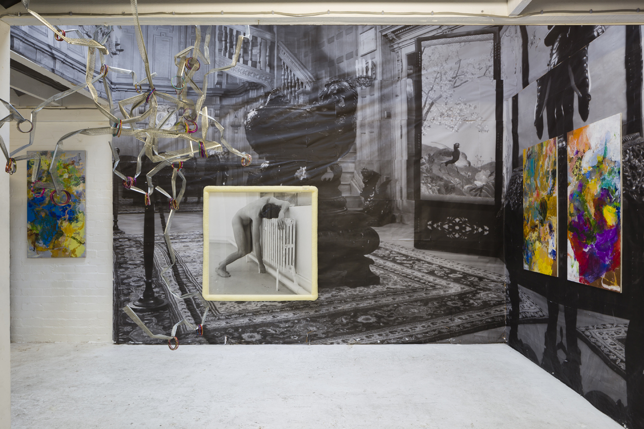
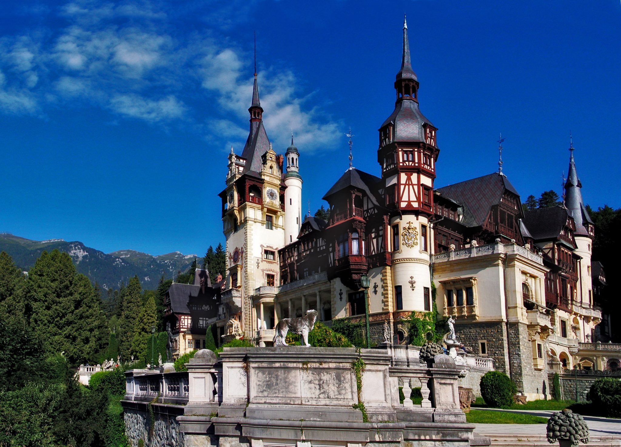
'Peles Empire's Empire':
Paul's ART STUFF ON A TRAIN 224
Peles Empire in Hanover: ‘Grid’, 2017
Peles Empire in Munster: ‘Sculpture’, 2017
Peles Empire in Kassel:’Remnant’, 2017
Passing through Munster, Kassel and Hanover last week, I saw work by
the collaborative project Peles Empire (Barbara Wolff and Katharina
Stoever) at all three. What’s more, there a sense in which all their
work is part of one: since 2005, both their own shows, and the space in
which they exhibit other artists (they currently run one in Berlin,
following on from London and Cluj) collide their actual architecture
with photo-copy-derived features from the Neo-Renaissance Peles Castle
in Romania, a grand palace which imitates other architectural styles to
an absurd extent. Peles Empire copy and dislocate the Castle, applying
printed images of its rooms to walls, sculptures, and other surfaces to
complicated effect. It can get hard to tell 2D images on a 3D surfaces
from 3D versions of a 2D images: their room in Hanover, part of an
admirable quinquenial survey of art being made in Germany, features
plenty of such play, including detritus in the floor which proves
surprisingly easy to walk across. As part of the decennial sculpture
festival at already much-reconstructed Munster, they have built a
castle-derived meeting place in a car park; and though in Kassel they’re
not part of Documenta 14, they have a bigger presence than most artists
through a solo show at the Kunstverein. So they are making a good fist
of ruling, all confusing levels of reality and time – making the point
perhaps that contemporary cultural production inevitably acts similarly,
even when that isn’t acknowledged.
The show ‘Da Da Da’ in Peles Empire’s London space, 2014
Barbara Wolff and Katharina Stoever
The 170-room Peles Castle in the Carpathians, built 1873-94
Most days art Critic Paul Carey-Kent spends hours on the train,
traveling between his home in Southampton and his day job in London.
Could he, we asked, jot down whatever came into his head?
Sculptural Weight in the City:
Paul’s ART STUFF ON A TRAIN 223
Martin Creed: ‘Work No. 2814’, 2017
The seventh version of the annual ‘Sculpture in the City’ places 18
artists’ work in the stimulating context of the square mile. This year,
for example, sculptures by Karen Tang and Nathaniel Rackowe, both
exhibited previously in London, gains fresh impact: Tang suggests that
the sci-fi energies of her ‘Synapsid’ echo the hidden activity in the
surrounding offices, and enjoys how their workers spill out to eat their
sandwiches while sitting on it; Rackowe delights in the contrast
between the ‘anti-architecture’ of his upturned shed structure ‘Black
Shed Expanded’ with the surrounding big statement buildings. Another
diversion in the stroll around is to consider the different sculptural
weights involved. On the heavy end, I was surprised to find that Peter
Randall Page’s ‘Envelope of Pulsation’ is at 6.5 tons, twice as heavy as
Damien Hirst’s colossal painted bronze ‘Temple’, which at 21 feet high
is the most spectacular work, and well sited. Seven tons, according to
co-director Stella Ioannou, is the limit after which even the strongest
pavement locations are too likely to collapse. At the other end of the
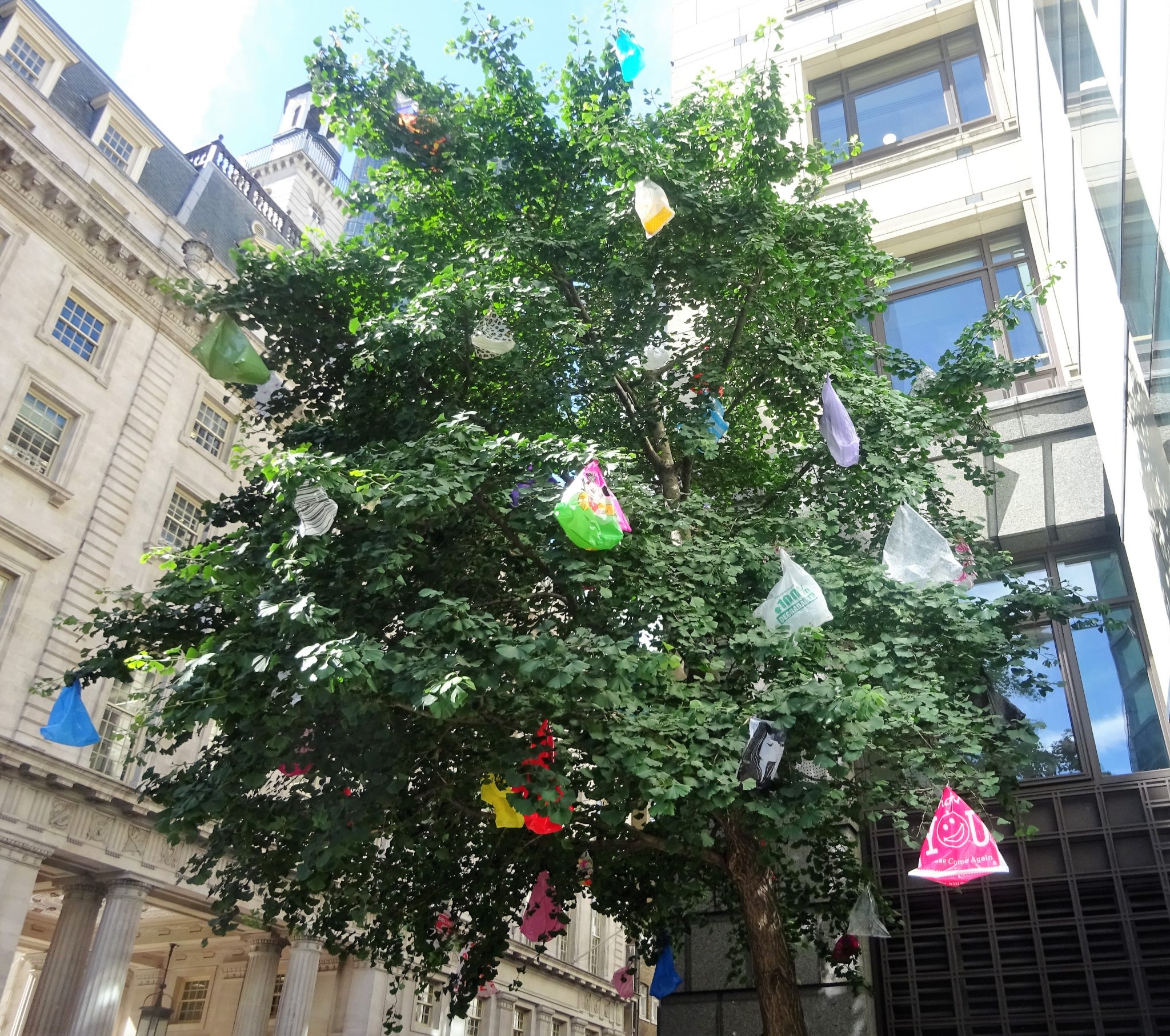
scale, Martin Creed’s materials are mere plastic bags, but the way he
places them on a tree has considerable impact. And Mhairi Vari uses TV
aerials and poly-tunnel repair tape to attach delicate lung-come-clouds
to several buildings.
Damien Hirst: ‘Temple’, 2008
Most days art Critic Paul Carey-Kent spends hours on the train,
traveling between his home in Southampton and his day job in London.
Could he, we asked, jot down whatever came into his head?
56 x Bloomsbury at ‘Masterpiece’
Paul’s
ART STUFF ON A TRAIN 222
From Vanessa Bell and Duncan Grant ‘The Famous Women Dinner Service’, 1932-1934
The 8th edition of Masterpiece fair (29 June – 5 July at the Royal
Hospital, Chelsea) features 150 exhibitors with all manner and periods
of fine and applied art. It’s easy to range from to a late Paul Klee to a
mummified ibis to an erotic feather painting by George Taylor to a 19th
century Indian ebony and bone-inlaid rosewood turban stand to Ivan
Navarro’s political yet abstract installation of lightworks to a set of
six coco de mers, and so on… Artists more ‘on trend’ than in previous
years are John Hoyland, Alexander Calder and John William Godward (1861
–1922). The last was a protégé of Lawrence Alma-Tadema (1836 – 1912)
with a commonality of subject – women disporting themselves in classical
architectural settings – but more availability and lower prices, though
‘A Happy Awakening’ is £0.6m, so hardly a snip. Alma-Tadema himself has
a major show shortly at Leighton House, so this is a teaser of sorts.
All that all caught my attention, and you should look out for it, but
what surprised me most was to find two dealers showing remarkably large
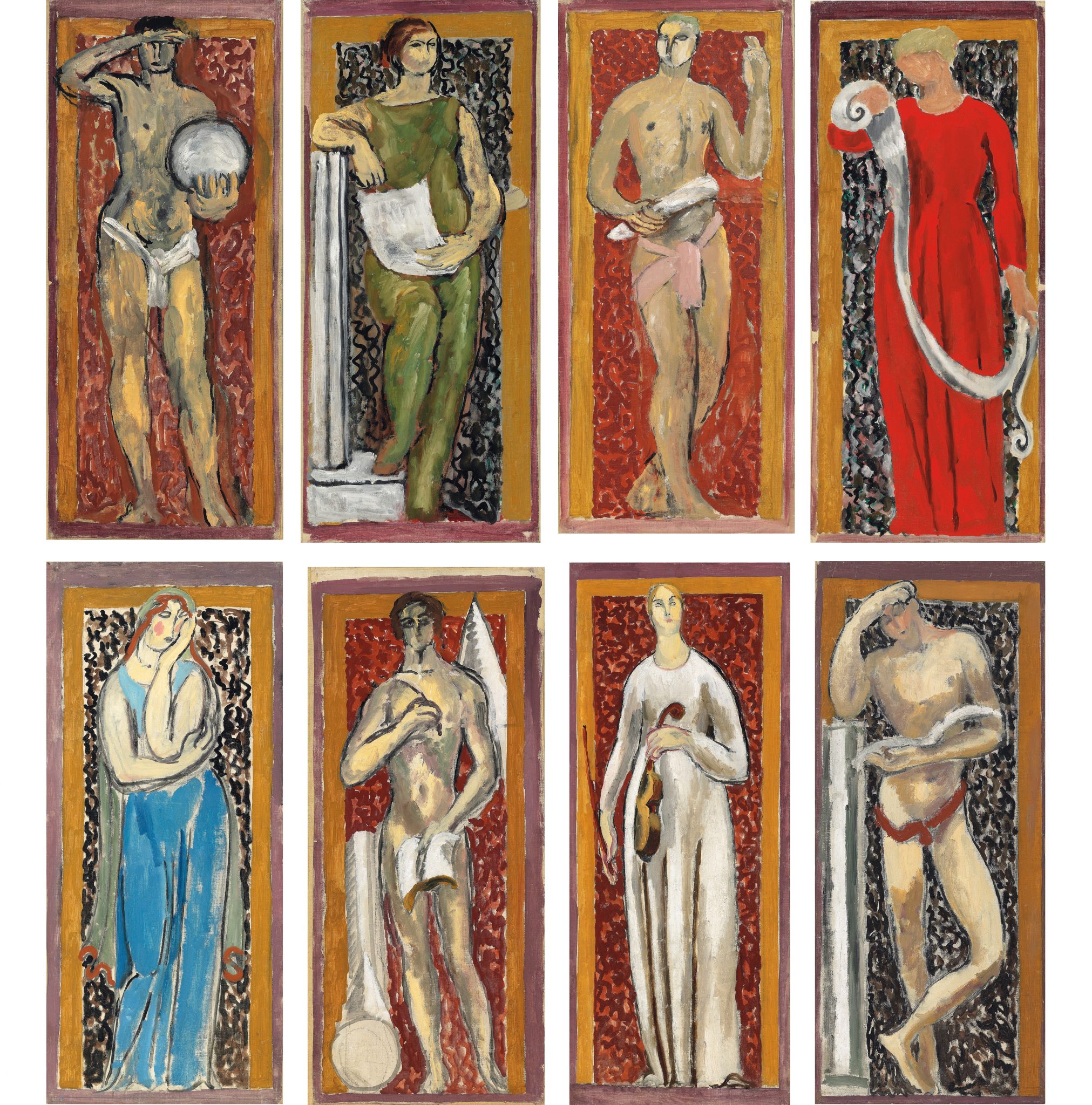
and well preserved collaborations by Vanessa Bell and Duncan Grant. In
1920 those two seminal figures of the Bloomsbury Group were commissioned
by a third – John Maynard Keynes – to make murals for his rooms at
King’s College, Cambridge. Philip Mould has a wall of eight studies they
made in preparation. The second Bell-Grant collaboration was produced
in 1932-34 for another distinguished commissioner: Sir Kenneth Clark.
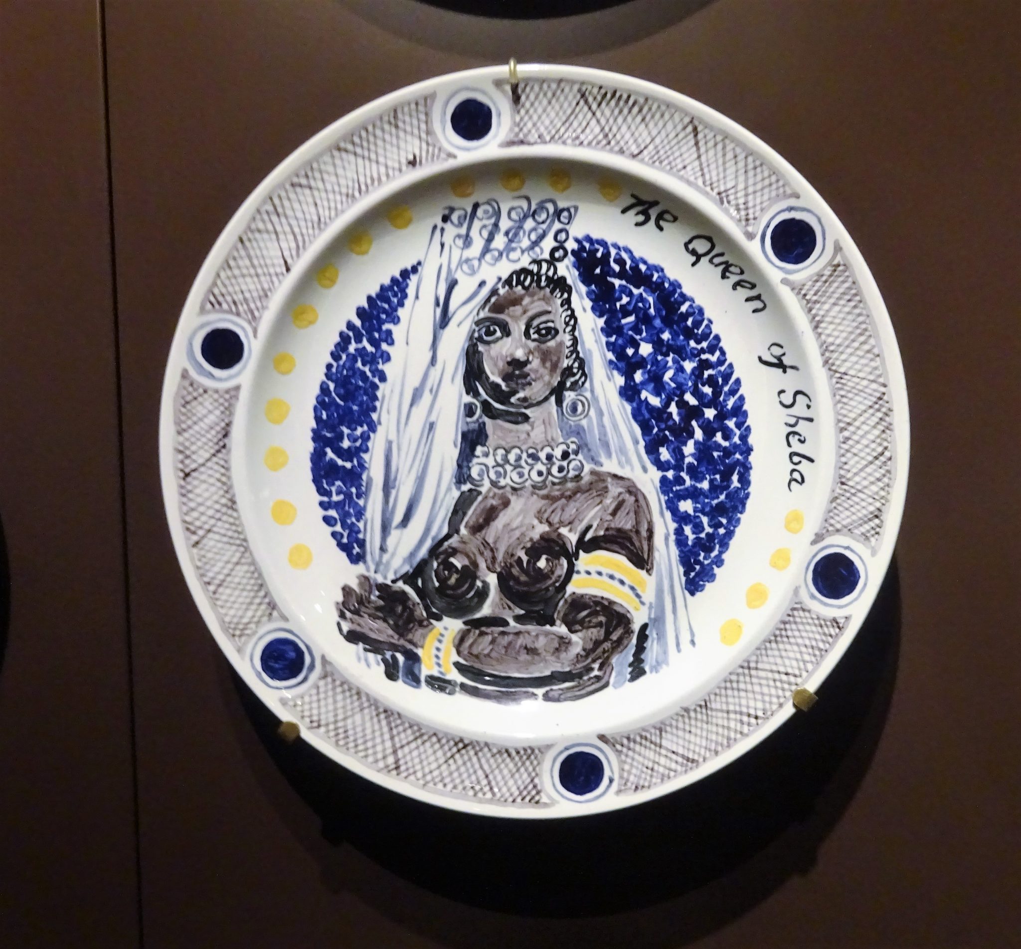
Piano Nobile have the complete set of 48 plates on which they painted
agreeably camp portraits of Famous Women – 12 Queens, 12 great beauties,
12 writers and 12 artists (including Bell, and Grant as an honorary
woman). Clark’s diners had the option of eating off, for example, Great
Garbo, Charlotte Bronte or the Queen of Sheba.
Vanessa Bell and Duncan Grant ‘The Famous Women Dinner Service’, 1932-1934
Studies for The Muses of Arts and Sciences, 1920, by Duncan Grant & Vanessa Bell
John William Godward: ‘A Happy Awakening’, 1903
THE ART OF KNITTING PICTURES
Paul’s
ART STUFF ON A TRAIN 221
Channing Hansen: ‘Software’, 2017, Hand spun, hand dyed wool and tulip wood, 218 x 244 cm
Typical! You wait years for a solo show of knitted paintings to come
along, then two open in the same week. Both use the material as a means
of confusing the picture and its support. That aside, they are
perfectly contrasted. Rosemary Trockel’s Strickbilder (at Skarstedt to 4
Aug) have been central to the famous German artist’s practice since
1984. They challenge the status attributed to traditionally female
craft, both by presenting it as fine art, and by having the knitting
done by others on computerised machines. The results shown here are
rigorous, coldly analytical black and white representations of knitting
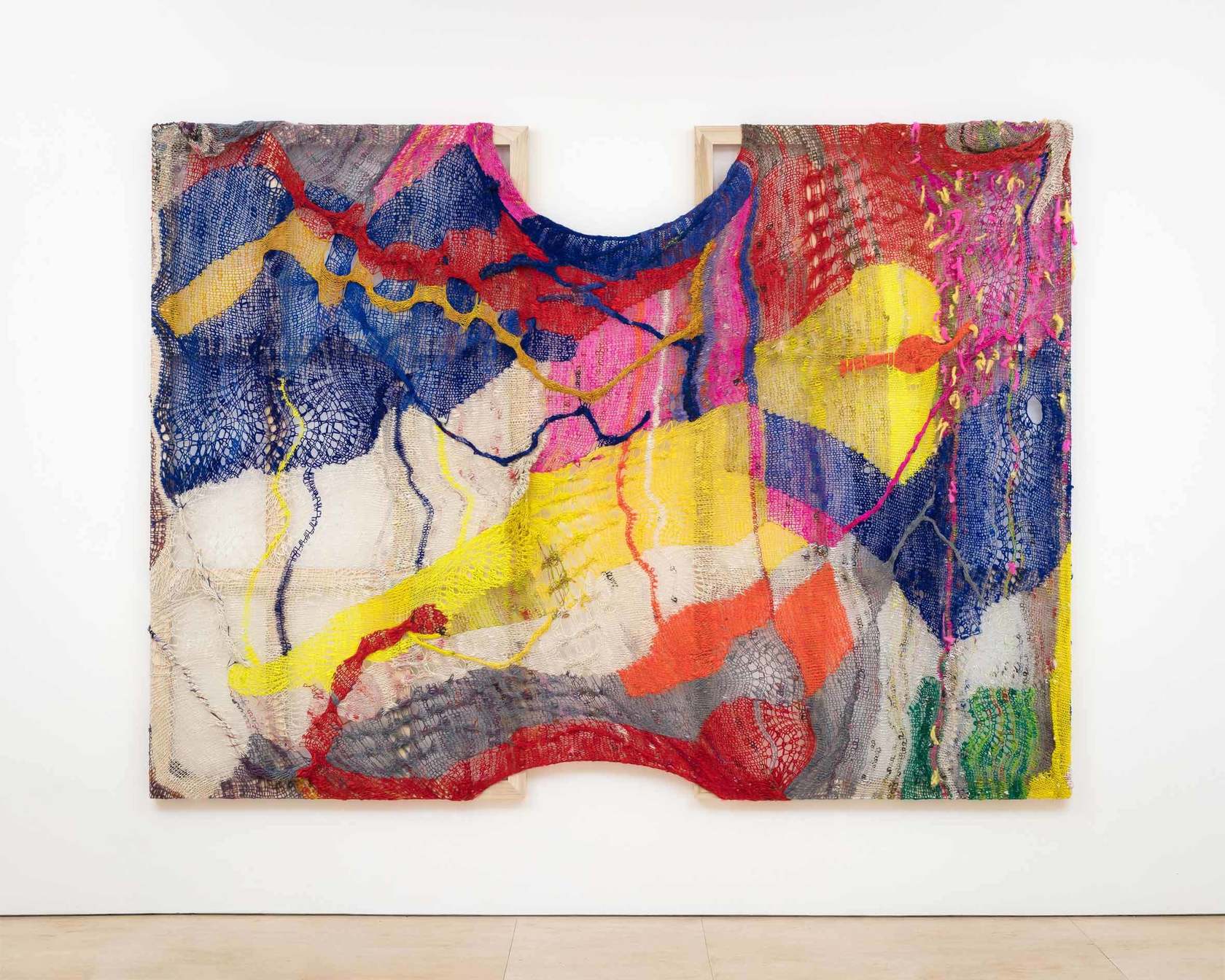
patterns and political and commercial motifs. Channing Hansen is a
new-to-London Californian man who shears, washes, dyes, blends and spins
rare breeds of wool himself before using his own designs of stitches to
make unwieldy multicoloured textiles full of holes, as if parodying the
expected level of male knitting expertise. He then stretches them
around his own wooden stretchers, which remain visible (at Stephen
Friedman to 29 July). As if that’s not enough personal input, the
patterns are derived from computer coding of his own DNA. And if that’s
not enough knitting, the highlights of ‘Playing Mas’, a six artist show
themed around carnival and masquerade (at Vigo to 21 July) are wool
works: Zak Ové’s crocheted doilies and Caroline Achaintre’s hand-tufted
wall rugs…
Rosemarie Trockel: ‘Untitled’, 1985 – knitted wool (black and white), 30.5 x 40 cm.
Caroline Achaintre: ‘Moustache Eagle’, 2008 – Hand tufted wool on fabric 240 x 154 cm
Most days art Critic Paul Carey-Kent spends hours on the train,
traveling between his home in Southampton and his day job in London.
Could he, we asked, jot down whatever came into his head?
I was in my leisure time Editor at Large of Art World magazine (which ran 2007-09) and now write freelance for such as Art Monthly, Frieze, Photomonitor, Elephant and Border Crossings. I have curated 20 shows during 2013-17 with more on the way. Going back a bit my main writing background is poetry. My day job is public sector financial management.