Tuesday 21 June 2016

ZURICH AND BASEL: A MANIFEST FESTIVAL OF ART


ZURICH: MANIFESTA, PICABIA, DADA AND THE OVERLOOKED
 
Maurizio Cattelan / Edith Wolf-Hunkeler project, 2016
There's plenty of interesting stuff in the artfest which is Zurich and Basel this week. Both deliver a winning combination of what you might call big wow and little wow: large-scale highly visible and installations of great immediacy, and quieter, smaller works over a sufficiently self-effacing nature or location such that they won’t have been widely noticed – yet which still carry a charge. 


Mike Bouchet: The Zurich Load, 2016

Manifesta – cuarated by artist Christian Jankowski – has a nice simple set-up: everything was based on ‘What People Do For Money’. Jankowski commissioned 30 artists to interact with local professionals from dentist to dog hair stylist to translator to gym instructor: you could see the resulting work at the central venues and visit the professional bases for extras. Maurizio Cattelan and Mike Bouchet got the most PR: Cattelan set up the illusion of a Paralympic athlete wheeling herself across the surface of Lake Zurich; Bouchet made an 80 tonne installation out of one day’s worth of Zurich’s human excrement - somewhat piquant, even in its treated form. Jankowski complemented those projects with lots of extra non-commissioned pieces on related themes. 

 
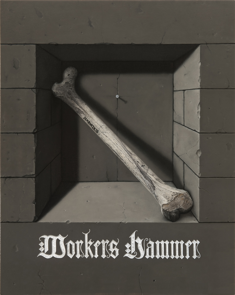
Gold leaf and acrylic on canvas


I wasn’t too surprised that no artist sought to buddy up with my profession of accountancy, though it does seem from Jonathan Monk’s cheeky painting that one of us was involved in the installation. It also serves to illustrate how non-commissioned pieces were set up on scaffolding so you could look around the back and see the work of labelling.  
  
 
Francis Picabia: Femme aux Allumetes (II), 1924-25 at Kunstaus Zurich
  
The 200 work Picabia retrospective at the Kunsthaus Zurich was a predictable highlight. His serial switching of styles, wilful perversity, mocking of all camps and embrace of ambiguity engaging and influential. And the works have their own punch beyond that narrative. I’d say there were 20-odd main phases on show: photo-impressionism; his version of Fauve / expressionist modes; pseudo-cubism; dance abstraction; mechano-morphic portraiture; techno-eroticism (Picabia loved women, cars and art equally); Spanish kitsch; straight portrait drawings; enamel anti-paintings; ancient worlds with fake craquelure; the ‘transparences’ (which triple layer disparate images over each other); monstrous anti-hedonism; paintings destroyed by painting; object collage paintings; pseudo-classical realism; anthropomorphic abstraction; late figuration; and the endpoint  of dot works. His most-heard quote ‘Our heads are round so our thoughts can change direction' never seemed more apposite. Femme aux Allumetes (II), 1924-25, is one of a series which ask what is being depicted: the object or what they apparently amount to: is the subject a woman, with hairgrip eyes and the implicit value of her necklace reduced to small change, or is it mainly a presentation of the implied spark – Picabia is rarely far from the erotic – of the matches? The going rate for a reasonable Picabia at Art Basel? About £2m.


Thomas Wachholz: Ohne Titel (Reibfläche), 2015 at RaebervonStenglin - red phosphorous and binder on wood, traces of ignited matches
RaebervonStenglin’s main show was of a favourite of mine, Andrew Dadson. But the office drew me in too with paintings in which Cologne-based Thomas Wachholz had covered a canvas with printed colour then attempted to paint it off with alcohol. Tucked away round the back of the gallery's second space was the result of a previous project by Wachholz. The role of the artist is often to get people to do things, and here he had - not without considerable effort - persuaded a manufacturer of matches to cover the whole of a large canvas with the phosphorous used on matchboxes. He then struck on the marks, and the public also got a chance last year in a version on the wall.


Francis Alÿs: Untitled (Two Sisters), 2005-2006 - Diptych, each oil paint and pencil on tracing paper, each 46.5 x 36.5 cm, framed at Galerie Peter Kilchmann, Zurich

 An easily missable work by a famous artist was in Peter Kilchmann's room of stock subsidiary to the main show. This diptych is typical of Francis Alÿs' hesitantly poetic paintings, which feel like rehearsals for the real thing - and, indeed, often relate to the film projects they help to fund - yet achieve an icon-like aura which you don’t associate with a mere study. These two sisters give an engaging new spin to the idea of racial harmony achieved by uniformly coffee-coloured people.
 
   
Kurt Schwitters: Electric Ha, 1935 at galerie gmurzynska
Zurich was celebrating 100 years since Dada started in the city, hence Museum Reitberg's the wonderful show of African influences fed through the movement (one highlight being Richard Huelsenbeck and Raoul Haussmann’s sound poems) and galerie gmurzynska’s striking creation of a MERZ-type environment setting 70 works by Kurt Schwitters in amongst Zaha Hadid. That had his famous sound poem  Ursonate, 1922–32 and a good selection of the 3,000 collages he made.  The smallest was this postage stamp sized scrap thought to have come from a Norwegian fishing company. Schwitters, of course, destroys one meaning to create another. Here it is tantalising tricky to guess what phrase ELECTRIC HA might be extracted from, but as presented it seemed to be mocking modernity.  Rather desirable, but even at this size, you’d be looking at around £20,000.
 

Bastian Gehbauer: Cress growing Greenhouse. Monster, The Netherlands 2013
I blundered across the Swiss Photography Awards, which are well off the track, looking for something else which was closed. No matter: I was impressed by the German Bastian Gehbauer: clinically controlled images of unusually well-targeted subjects – I don’t think serendipity would cut it for him. His series 'Zirkel I' includes a sperm bank’s nitrogen tank , an automated crematorium, a garage of sorts designed to allow prostitutes to have sex in cars more safely, and this  Dutch greenhouse which uses a mixture of blue and red LED diodes to enable cress to grow with minimal sunlight.

 
BASEL: FROM THE FAIRS


There's even more art in Basel than in Zurich at the moment. Art Basel, with closing on 300 galleries, is only the third of it given various other fairs, and the many shows around the city, including the Kunstmuseum's opening of a swanky third building. The highlight was the main fair's 'Art Unlimited; section of 88 major projects, which was the best I’ve ever seen it.


Alan Charlton: Wall of 8 Greys, 2016 - acylic on canvas, 3.38 x 19.75m in Art Unlimited
Installations tend to take the most space in Art Unlimited, but there were plenty of competitors for the title ‘biggest painting’, depending on just how you defined a painting. Two multi-part works made a for a remarkable chromatic contrast. Alan Charlton has been making – only – monochromatic grey painting for close on half a century, but this most be the most quietly spectacular, combining 32 canvases in same-coloured columns of four in eight different greys to a total width of 20 metres.
 
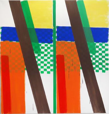
Peter Halley: Weak Force, 2016 - 4 x 18m in Art Unlimited
Peter Halley, on the other hand, has been using fluorescent colours to make his characteristic  ‘cells’ and ‘prisons’ since the mid-80’s. Weak Force is an eyeball-searing combination of four multi-panelled paintings set on wallpaper printed with colourful explosions which, says the show text ‘wryly links the sundered histories of geometric abstraction, abstract expressionism and pop, intimating the destruction that underlies the solidity of what we construct’.

 
Rayyane TabetThe Dead Sea in Three Parts, 2013 - mixed media, 150 x 300 x 400cm, in Art Unlimited
It’s tough to make work which addresses a political agenda in a manner which doesn’t preach, has some aesthetic impact, and resonates as a work of art.  I liked three works which did this. First, Lebanese artist Rayyane Tabet’s ‘The Dead Sea in Three Parts’, modestly-sized by the standards of ‘Art Unlimited’ but nonetheless potent. The Dead Sea in Three Parts is consists of made-to-scale representations of the  Dead Sea, as partitioned in 1947: the largest piece - Jordan's - stands balanced while the West Bank's and Israel's parts have fallen away. The topography of instability is captured in the artificiality of division.


Lawrence Abu Hamdan at Mor Charpentier


It’s only logical to follow that with Jordan born, Lebanon-based (but currently Goldsmiths studying) Lawrence Abu Hamdan - and his political work had a practical impact. He investigates sound and politics forensically, and this work shows the evidence behind a murder charge. Left to right above is the audio analysis of live bullet, a live bullet with rubber extension, and a rubber bullet. The artist explains: ' as part of Forensic Architecture’s (Goldsmiths College) study for Defence for Children International, Palestine, we looked at cases where Israeli border guards shot to death two teenage boys and then denied the charge against them, claiming that they had only fired rubber bullets. My job was to identify from the sound of the shot if it was in fact live ammunition, or rubber bullet gunfire. An important conclusion from this audio forensic investigation was the identification of a distinct sound that is not a rubber coated bullet sound, nor is it the sound of live fire but rather a confluence of the two. A rubber bullet extension mounted on the soldiers’ rifles ostensibly made them look like they were firing rubber bullets, but the sound of the shots told a different story. The extension suppresses the sound of live ammunition and, to a lesser extent than a silencer, it can be used to disguise the presence of live fire. This is an important sound signature to identify because, coded within this cloaked sound, there is an intention to conceal the act of murder'.


Yngeve Holen: Butterfly, 2015 (two from the series, each aluminium fence, 251 x 151 x 54cm 

Yngeve Holen, a rising star of the Berlin art scene, opened his moxt substaintial show yet at Basel’s Kunsthalle during the fair. One room held sections of airport security fencing, bracketed onto the wall to form an adjusted readymade which referenced the modernist grid while calling to mind the refugee crisis undermining current borders. The implied narrative was of breaking through the perimeter, though actually the fence was merely sourced from Frankfurt Airport’s supplier. Holen has cut out six sections in ‘butterfly’ form for sale, and all were on sale in Basel - at Liste (Frankfurt's Neue Alte Brücke) and Art Basel (at Modern Art and Gallery Neu).


Jeppe Heine: There is Always Someone Else, 2016 -  powder-coated aluminium, two-way mirror, powder-coated steel, two candles at Galleri Nicolai Wallner

Danish artist Jeppe Heine was responsible for the Appearing Rooms fountains which have become a regular South Bank feature in London, and he has often made comparably crowd-pleasing use of mirrors. Here a simple trick leads to a seemingly trancendental effect: the cabinet unit can be opened from the side in order to make the necessary seven hourly change of the candle which viewers see through a two way mirror, so plotting it onto their reflections.


Jakub Julian Ziolkowski: Candle Girl, 2016 -  oil on canvas, 40 × 34 cm at Foksal Gallery Foundation

Polish painter Jakub Julian Ziolkowski is currently producing his fantastical canvases in Vietnam, staying on following a project there. Wherever he is, Ziolkowski has said 'I don't know where it all comes from', but obviously it wasn't from looking into Heine's mirror. 'Bosch-meets-Ensor' is Jerry Selz's summary, spot on for this flaming vision.


Thomas Ruff: Press ++3042, 2015
Thomas Ruff continues to come up with new strategies to challenge the conventional documentary expectations of photography while not taking any photographs himself. His latest, ‘‘Press’ series is very much in the zone of Picabia’s 'transparences': he blows small analogue press photographs of various subjects up to poster size, and prints the reverse of the card – labels, totes, technical specifications etc – onto the front as well, so enriching the image with a sort of functional graffiti which tugs the tail of the eternal problem that extra information may obscure as much as it reveals.


Anri Sala: Lines recto verso (Jung, Huxley, Stravinsky), 2015 - Graphite, coloured pencil and eraser on either side of Chinese paper, 139 x 139cm at Gallery Alfonso Artiaco

Anri Sala, best known for film and installation, made Lines recto verso (Afif, Sala, Flavien) (2015) by tracing the palm patterns on the hands of himself and two artist friends into a comparable linked shape, using Chinese paper so that the double tracing, front and back, of these left hands  can be seen, a reference to the slippages between versions of Sala's Ravel Ravel (2013) where two different interpretations of Ravel’s Left Hand Concerto for Piano and Orchestra are heard alongside one another. Building on that typical combination of simple and complex, a second such drawing featured the lines from another empathetic set of contemporaries: Stravinsky, Jung and Aldous Huxley.


Cao Fei: Rumba II: Nomad , 2015 -  video / 14mins 16secs at Vitamin Creative Space

In China’s leading new media artist, Cao Fei, showed a film in which domestic vacuum cleaning robots were set free to roam a building site on the fringes of Beijing on which – as is the Chinese rule - the structure of the past was being pulled down. Evidently the cleaning task is utterly hopeless. The bots came across as alien and threatening yet friendly and comical. Sometimes chickens stand on them, sometimes they knock items off table tops. In front of the film, three bots acted out their edge-sensitive dance on top of plinths.


Fiona Connor: Community Notice Board (One Life), 2016 corkboard, silkscreen and UV print on aluminium plates, vinyl, wire, pins, tape, staples
Finally, one way of being overlooked is not to look like art. New Zealand gallery Hopkinson Mossman achieved that entertaining fair trick at the young gallery fair Liste by placing a plausible-looking well-aged notice board in the corridor just outside their room. Only when you saw similar work in their space were you drawn into the discovery that New Zealand artist Fiona Connor made all the components herself, including printing the original paper elements pinned to the board in aluminium. This, then, was art about attending afresh  freezing time. Connor also plays off a long tradition of related noticeboard deception, from Cornelius Gijsbrechts and Edward Collier to Ryan Gander, Hany Armanious and Lucy Mackenzie.


Thursday 9 June 2016

STARK REALITIES


John Stark's DOL PO runs to 25 June at Charlie Smith. It features a striking sandpaper-covered catalogue. Here's my text for that:


It’s not so rare to find that the ideas to be unpacked behind explicitly conceptual art turn out, when you examine them, to be rather thin. John Stark’s work operates as something of an inversion of that: one’s initial attention is likely to be on the technical assurance with which he constructs an alluringly glossy realism through the hyper-controlled application of multilayered varnishes of oil on gesso on board – but that’s the means to access a complex web of thinking. Stark has always painted in thematic groups of images, behind the seductions of which we sense a hidden agenda. By now he has several series he can use as a backdrop to enhance the resonances in a new set, ranging across witchcraft, warfare, apocalypse, apiculture, alchemy, shamanism and black mirrors. Let’s look, then, at what’s in play in DoL Po, what the individual works depict, and then how the whole might fit together.

The installation is dramatic...
First off, two concepts are conjured by the title. DoL is Division of Labour, the productive merits of which were promulgated by Adam Smith as a major driver of the Industrial Revolution: manufacture is broken down so that individuals can specialise in sub-tasks. That makes it easier to learn what to do, so that less expert – and less expensive – labour can be used. That was regarded negatively by Thoreau, who feared a reduced connection with society and nature as people lost the self-sufficiency he himself sought to develop by spending time living alone in the woods; and also by Marx, who held that workers who were restricted to the repetition of unskilled tasks became alienated from the process of production. That could only be overcome, he believed, in the cooperative model of a socialist society. That seems an unlikely destination from where we now stand: Thoreau’s vision seems more plausible, and more probable, surely, is that the Division of Labour will be ratcheted up to a potentially transformative degree by the development of robots, so that almost every task becomes divisible into units which require no human intervention.


‘Po’ is a term invented by Edward de Bono, who developed various methodologies to enhance creative or lateral thinking in such books as Po: Beyond Yes and No (1973). The idea was that, rather than aiming to develop ideas which are good (‘yes’) rather than bad (‘no’), we should concentrate non-judgmentally on moving forward by applying a ‘Provocation Operation’ (PO). According to de Bono it ‘signals that what follows is to be used directly as a provocation’ which ‘provides the same sort of value that has been provided historically by accident, mistake,
eccentricity, or individual bold-mindedness’. For example, how do you measure the height of a skyscraper? Provocatively, lie it on its side.

DoL Po, then, could be an approach which breaks down a conventionally coherent overall process into sub-units which can be thought about in adventurously different ways by those not responsible for the whole process. That could be good – surprising innovations may arise – or not so good – the participants might be diverted from the overall goal, lose their self-sufficiency and become alienated from the task. Stark’s paintings themselves seem to operate with plenty of Po – who knows what will come next? – but not a lot of obvious DoL – Stark makes his own work, though I suppose others in the chain do manufacture the paint, brushes and varnish he uses. The result has some of the polished gloss of magazine advertising. That’s a contrast with – for example – the assembly line of assistants through which a Jeff Koons painting comes about. Maybe there’s a critique smuggled in there – Stark’s is an artisanal approach in which he is present in the joyful production of meaningful work.


DoL Po, however, does feature DoL: Stark’s co-conspirators Rebecca and Mike have worked alongside as a provocative soundboard which might be thought of as the positive side of the division of labour: the ability it provides to bring various talents to bear in a joint production. The evident fruits of that are the double-sided painting Medium of Exchange , the painting Workers Hammer and this publication, which features the decidedly Po idea of a sandpaper dust jacket, imperilling any other book shelved alongside it. That, in turn, comes from Guy Debord’s Mémoires (1959), the ‘book to destroy all other books’ – discovered via the cover of the 1980 record The Return of the Durutti Column, which also borrowed the ploy. That’s typical of Stark, whose sources tend to blend horror films, gaming graphics, prog-rock album and sci-fi art with commerce, agriculture, politics, old master painting and the avant-garde, as if all belong together as readily as the internet suggests. So it is that he combines what may seem contradictory co-existents: witchcraft and spacecraft, bees and people, religion and superstition, capitalism, militarism and environmentalism.

The catalogue contains yet another somewhat unfashionable remnant of the last century: an excerpt from Steps (1968) by the Polish-American novelist Jerzy Kosinski (1933-91), remembered as much for his suicide under the clouds of illness and accusations of plagiarism, as for his writing. Steps explores social control and alienation and employs the distancing device of naming no characters or places. The Polish-born novelist’s work, largely emerging from his own experience as a child wandering war-torn Europe, can be characterised as survivalist.

In his words the ‘whole didactic point’ is ‘how you redeem yourself if you are pressed or threatened by the chances of daily life’. Kosinski emphasises the worth of individuals and how they form their own moral sense, but this often leads them to act at a remove from society – just such an action being evoked by the extract in which, after a violent rampage which wages war on the city ‘as if it were a living body’, the narrator is sufficiently sated to go to sleep in the morning, ‘smiling in the face of the day’.

Hold those four things in mind, then – the Division of Labour (negative and positive), Edward de Bono’s Po, oppositionality, Kosinski’s character seeking to liberate himself from convention and morality – and we’ll move on to what DoL Po’s paintings depict.


Vampyre shows a military drone, seen as if through the night vision of a surveillance camera. That explains the rather poisonous ‘DoL Po green’. It’s framed – as are several other paintings – in a Brechtian manner which betrays its origin as a photograph which didn’t quite fit the shape of the computer screen (that’s all well and Po, though, as the consequent crop bars are a neat aesthetic echo of the shadow of the drone’s wings). What is military surveillance but an explicit version of the menace which lies behind all such scrutiny, from Bentham’s panopticon to CCTV? ‘Yes’, Stark concedes, ‘I have become the drone, scanning the internet to target images to appropriate.’ In which case he is also the vampyre, sucking the blood from our culture as he does so. Violence is built into the very act of observation.


Where else do you find drones? In the structured society of the bee colony of course, with its natural division of labour. The painting Wage War presents a version of Stark’s apiarists, faces obscured, a mysterious transaction going on, the protective suits remodelled to suggest youths in hoodies and soldiers in uniform. The title comes from the Kosinski excerpt, which was later lifted by Robert Calvert of Hawkwind fame and titled Wage War. It conflates the economic (‘we’re battling for a fair wage’) with the military (‘we’re going to war’). And what is that ceremonial laying on of hands? A honey sale agreed or the swearing of allegiance to a plot?


On the face of it, Workers Hammer depicts a signed and dated bone – presumably stolen from a museum – which could be used as a weapon in the wage war, but there’s no apostrophe in the lettering (lettering which is based on Albrecht Dürer’s typography, but with definite Nazi echoes). That means the title reads correctly as the action taken – ‘workers hammer bosses’, for example – rather than the object portrayed.


Invisible Hand is another reference to Adam Smith, this time to his theory that markets left to themselves would balance to an optimum point as if guided by an invisible hand. Now the phrase is applied to an automated operating theatre. Do we trust either of those unhuman forces? In fact, Stark says, this image is actually retro-futurist: it may be the way things will go, but the particular set-up shown here has already been replaced with the advancement of nanotechnologies. Perhaps there’s a link to the art of painting, which Stark effects with surgical precision. The thought of how an abstract expressionist surgeon might operate comes to mind for one queasy moment …


Exit could show the washroom facilities of any factory or office, but the reappearance of what now reads as radioactive green suggests a further site of decontamination. The subject may also recall its domestic equivalent: Hammershoi’s poised explorations of domestic interiors, typically featuring more portals than people. They, too, have a disquieting atmosphere, for all that they may look a long way from Kosinskian actions or nuclear meltdown.


A similar mix is evident in Nuke Descending. A pose from Duchamp is stymied by the absence of his depiction of movement, although that’s hinted at by indication of a scrolling screen. Assuming this is a place threatened by contamination, we see a robotic aided suit, used by the workers in the Fukushima Daiichi disaster: no wonder the red badge on the heart looks like the nuclear button. Military and scientific combine with the disturbing thought of how a nude body might be exposed.


The title of Flashpoint suggests that an emergency did occur. It zooms in on a firefighter in the employ of DoL Po, complete with CND sign ventilator, the number of angels and essence of the holy trinity (333) penned on the walkie-talkie, and praying hands embossed on the helmet, the visor of which becomes a tour de force of views seen through and reflected. Stark sees this as a Promethean figure, so taking us back to his theft of fire on behalf of mankind and subsequent suffering as eagles ate his ever-regenerating liver. No shortage of symbols here, then: what might be just a faceless portrait is awash with cosmic references and menace.


There are two paintings of pig farms. Stark lives in rural Suffolk, near the rapidly eroding coastline so the mid-winter view over Covehithe is a natural subject for him. Harvest combines ‘Preview’ crop lines and the night vision view finder of the drone to line up on a centred swine. The pigs are also dignified by the largest painting in the show, as would have been expected on Orwell’s Animal Farm, where the power was porcine.


And indeed, Beasts of England takes its title from the anthem which expressed the original socialist-style pro-animal principles before the pigs took over as Orwell’s master race:

Rings shall vanish from our noses,
And the harness from our back,
Bit and spur shall rust forever,
Cruel whips no more shall crack …

Beasts of England, Beasts of Ireland,
Beasts of every land and clime,
Hearken well, and spread my tidings
Of the Golden future time.

Very fine sentiments, but we know the anthem will be replaced by a paean to the dictatorial hog, Napoleon:

Every beast big and small
Sleeps at peace in his stall,
Thou watchest over all,
Comrade Napoleon!


Finally, there’s the double-sided Medium of Exchange , which divides its labour between Stark, Rebecca and Mike. An apparently untenanted beekeeper’s glove in a trompe-l’œil alcove suggests another invisible hand. There could be a coin trick involved, or masonic symbolism, or some other system involving the alignment of the planets, hence the alternating words ‘Half Moon Inn’ and ‘Full Moon Out’. The paintings are presented to rise out of a monolith, hung back to back on a sheet of Plexiglas – as if a holy relic has landed, if not from another planet, then from 2001: A Space Odyssey. Though the two-sidedness and the wording strongly suggests a more quotidian pub sign.

So what does the unbridled whole amount to? ‘It is my intention’, Stark has said, ‘to express the transient nature of reality whilst exploring the shadows that humans cast upon it.’ If that’s the atmosphere nailed, consistent with that in Kosinski’s Steps, what’s the message? There’s a lot of detail here, and a lot of data, but even when we know what we’re looking at, there’s the sense that secrets remain to which we lack the key.

We probably need to take the hint, and apply the principle of Po, leaping forward with no fear for whether we are right or wrong. For example, is Stark asking whether we can find a point of stability in which people retain their integrity while machines do all the hard work? That might be our equivalent of Marx’s vision of the communist society. Is he suggesting what apparent contradictions lie behind the facades of our society? Might it be superstition behind Christianity? Surveillance behind technology? Medievalism behind science? Militarism behind capitalism? Or perhaps an analogy is being drawn between the way we are separated from each other and joined up differently by the move from analogue to digital worlds, with how the Division of Labour appeared to Thoreau and Marx. That would
suggest an era in which new opportunities come at the price of a profound disconnection from our roots.

But we’ve probably got beyond expecting answers from artists. Perhaps we should finish on Stark’s way of painting, on the time he takes to control so exactly the elements in his dance of themes. That invests them with the value of his labour, elevates them and the questions they raise to a status worthy of the kind of attention we give to the grand narratives of classical painting.


Wednesday 1 June 2016

BERLIN ART WEEKEND - WITH PIFFARETTI REBOOT


Bernard Piffaretti: ‘No Chronology’ at Klemm’s, Berlin

29 April – 6 June 2016


Parisian painter Bernard Piffaretti winningly combines durational performance, playful conceptualism and joy in paint. The title of his Berlin show pointed to the long-running, fundamentally unchanging and slightly obsessive nature of his practice, which might be compared with On Kawara or Roman Opalka. For 25 years he has been following a three-step procedure: first he makes a vertical  division down the middle of his canvas, then he paints abstractly on one side or the other; then he attempts to reproduce that side on the other half. We wonder which came first: as Piffaretti has pointed out ‘the state of difference and repetition in my painting inevitably conjures a thought about time’. It might also remind us of Robert Rauschenberg’s famous Factum I and Factum II, 1957. But here we have one painting, not two, and Piffaretti doesn’t attempt to make a mechanical simulacrum of a spontaneous mark – as was Rauschenberg’s approach. Rather, he re-enacts the thought and spirit of the original, so that, for example, the equivalent procedure may result in a comparable splash, but it’s unlikely to look optically similar to the first such mark.


Piffaretti’s process is in a sense the subject of his paintings, and also provides a rich basis for contemplation. As he starts at random on either side of his vertical division, the viewer cannot tell which came first, and so can’t work out which is ‘a copy’: usual hierarchies are circumvented. Oppositional thinking is gently mocked, and while Rauschenberg foregrounds the face-off of the creative right side and the analytic left side of the brain, that contrast takes a subtler form in Piffaretti, tempered by the physical similarity of the two processes as actions. One might also ask: are these abstract or representational paintings? It seems obvious that one – unknown – side is abstract, but the other is actually a representational depiction of an abstract painting. Another opposition is dissolved. Moreover, Piffaretti sometimes samples previous motifs in new paintings, both from day to day (as he starts in response to the previous painting) and across the years - imitating at the macro level of the oeuvre as well as the micro level of the individual painting.


As for the paintings themselves, they use a casual, almost study-like handling of unmixed colours to lyrical, slightly poppy, sometimes somewhat comic ends. Piffaretti is at ease in his constraints. Matisse is in there in the colour dance between the two halves, which might even stretch into the sexual territory of searching for a mate.  Klemm’s throw some 1988 and 2002 works into a mainly 2016 mix, demonstrating the ongoing freshness of the project.  ‘The critical moment in my paintings’, says Piffaretti, ‘is the first mark down the middle, which declares THE SURFACE IS HERE’, and the selection at Klemm’s was a good illustration of the different effects the central line can have. It makes a big difference whether its colour is found elsewhere on the painting or not. And, for example, if both sides are relatively symmetrical within themselves, the line relates similarly to each side of the painting, so acting as a neutral divisor:


  Untitled, 2016 - Acrylic on canvas, 100 x 100 cm 

Where the line divides chromatically varied, asymmetrical units, ‘twinned’ marks appear differently due to their differing distances from the now-rogue colour of the central line, for example the dark orange here has a different dynamic when close to the central green:

Untitled, 2016 - Acrylic on canvas, 135 x 130 cm 

If the central line is very close to a similar colour, we read it as attempting to merge with the half which has a similar colour abutting it:


Untitled, 2016 - Acrylic on canvas, 100 x 100 cm

And sometimes the dividing line is very like a line within the duplicated composition, causing it to become integrated into what looks like a unified single image:

Untitled, 2016 - Acrylic on canvas, 240 x 240 cm

You might ask whether, after thirty years, Piffaretti needs to move on from his formula. The question is no more appropriate than asking the run of artists why they don’t start painting everything twice.


BERLIN ART WEEKEND 29 April - 1 May 2016


It costs 7,500 Euros to be one of the 54 galleries in the Berlin Art Weekend programme, so getting on the map, in the impressive catalogue and served by the VIP cars. You might see that as a lot of money to put on a show in your own gallery, or as a cheaper means than an art fair to increase the gallery’s exposure to the right sort of collector – a particular necessity, perhaps, in Berlin, given that the local collector base – as opposed to the local artist base - is generally held to be thin. Of course there are hundreds of galleries in Berlin, and I guess it’s a sign of the Art Weekend’s success that a couple of other groups organised themselves into satellite art weekends on the back of the big one. Nonetheless, the official 54 include the big hitters. I got to 47 of them, and the quality was generally excellent.  If there was a trend, it might have been somewhat conservative choices, not very much film, and the near-absence of directly political work. One exception to that was at Barbara Weiss, where Maria Eichhorn's Lexicon of Sexual Practices required visitors to ask the projectionist to screen their choice from a menu ranging from Male Masturbation to Ear Licking. That said, Eichhorn (who has just closed the Chisenhale Gallery in favour of a staff holiday) deals with issues of representation, and they were generally prominent: for example, doubling and  the difference between original and copy:


Bernard Piffaretti, at Klemm’s, proved there’s plenty of life left in his long-running practice of painting similarly either side of a dividing line. 
  

Mark Wallinger showed eight of his monumental ‘id Paintings’ at carlier / gerbauer (others can be seen in London) in which he paints simultaneously with left and right hands to reach a  doubled Rorschach-like image.

Peles Empire complicated their long-running use of a multi-styled Romanian castle to drive their art by replicating Wentrup gallery’s own features and inserting that into the mix  - so that we stood, for example, on a photographic copy of the floor.


Victor Man had two solo shows (at Plan B and at Gallery Neu) of historically based, ineffably atmospheric existentialist paintings. He does gloomy tonalities brilliantly, and included two versions of Early Paradise 2015-16, either side of a doorway at Plan B:  essentially the same, but differently (un)finished.


Here are another ten I was pleased to see - nine in the official programme plus one choice from other galleries - and my favourite institutional show:


Rachel Harrison at Kraupa-Tuskany Zeidler: a bureaucratic setting featured a home-made gym and sculptures satirising means of improving business efficiency – with items such as stress relieving supplement pills, mouse pads and office-friendly sit-up facilitator installed as the agenda on a  table in a typical conference room.


Ed Fornielles at Arratia Beer: the LA-based Briton (soon to move to Canada) concentrates on self-management in a less corporate context – through diet – and on his self-identity as a fox (the choice of a Japanese cartoonist to whom he sent his picture) in film, sculpture and a  display in which vegetables form other characters. A dietary starter pack was on offer for 20 Euros. 


Olaf Holzappel at Daniel Marzona: all sorts of commentaries might be read into  the German’s use of straw: tradition and modernity, nature and culture, environment and our impositions on it. But they also worked really well as pure paintings.


Mike Bouchet at Peres Projects. The American artist continued his commentary on consumption with a spectacular combination of input and output – big paintings of hundreds of waste items, their somewhat dulled colours explained by the sludge having just been drained away, together with outsized and colourful glass versions of coke bottles complete with nipple-textured caps.


Philippe Decrauzat's 'bright phase, dark phase' at Mehdi Chouakri: a mesmerising two room installation in which false walls became paintings with paintings (through the application of  vinyl), and contrasting lighting and varying sizes of chequerboard patterns transformed the space. The dark room also contained a film of swirling coffee presented as abstraction.


Alice Channer at Konrad Fischer: a persuasive sculptural investigation of the fold and of inside and outside, set in a sea of entertainingly slippery polystyrene regrind which acted as a plinth of sorts, changing both our and the sculpture's relationship to the floor.
 
Ghader Amer is known for her provocative mergers of paint and thread and image and text - but Kewenig concentrated on her recent ceramics, which use both sides of bent or folded self-standing shapes to great effect. 


Martin Honert at Johnen Galley: three typically hallucinatory reconstructions of past experience through the sculptural imitation of photographic effect: his school dorm, the view from a child's hide-out and a black and white photo of a sports club for the wounded.


Sebastian Black at Croy Nielsen: extreme abstractions of a puppy’s face are the basis for titles (almost as long as Christopher Williams’ famously thorough ones, as at Capitain Petzel), which wittily describe and theorise on what we might see and initiate shaggy dog tales.This is 'I seen a flower once with all the petals blowed off by the wind except for two (muzzle, eyes). There was a big cruel horsefly on each weighing them down (pupils). In the middle of the flower was an old bumble bee (nose, mouth) doing his thing in the pollen (whiskers). When he was finished with his rounds he went back to his hive (head) and did a jig for the queen. I don’t know what the flies did though. There’s so much I don’t know! My excuse is I had to run home to take some sheets off the line (ears) before the rain came', 2015. 


Jacob Dahlgren at Feldbusch Wiesner: the Swede’s off-programme 'How Lines Move Beyond Geometry Into Space' was a riot, including the chance to walk through multi-coloured silk, buy abstract paintings which plug into your domestic appliances and chuckle at the reductio ad absurdum of fair-friendly art in tasteful abstracts made from the spines of Frieze magazines.  


Stephen Shore at C/O: Exemplary retrospective with particularly clear explanations to show how Shore derails the usual photographic conventions, even those he helped to create. Here's his wife, Ginger, in Tampa in 1977.


About Me

My photo
Southampton, Hampshire, United Kingdom
I was in my leisure time Editor at Large of Art World magazine (which ran 2007-09) and now write freelance for such as Art Monthly, Frieze, Photomonitor, Elephant and Border Crossings. I have curated 20 shows during 2013-17 with more on the way. Going back a bit my main writing background is poetry. My day job is public sector financial management.

Followers