During 2017-20 I wrote 13 visual essays for ELEPHANT magazine on the principal theme of each issue. The magazine oved from quarterly with themes to twice-yearly without themes from 2021 onwards, so that proved the full set.
You can see material from my themed picture essays below - but including some unpublished material, as you always need the odd reserve / allowance for editorial flexibility for such items.
These were, in reverse order of publication, as below:
FASHION written 2020 but only published online (Spring 2021) following the revamp of the magazine.
OPTIMISM in Issue 44
COMMUNITY in Issue 43
AGE in Issue 42
ENVIRONMENT in Issue 41
SELF-CARE in Issue 40
FOOD in Issue 39
MASCULINITY in Issue 38
BIRTH in Issue 37
LUXURY in Issue 36
ANGST in issue 35
SEX in Issue 34
COMEDY in Issue 33
FASHION
Where Do the Catwalk and the Gallery Intersect?
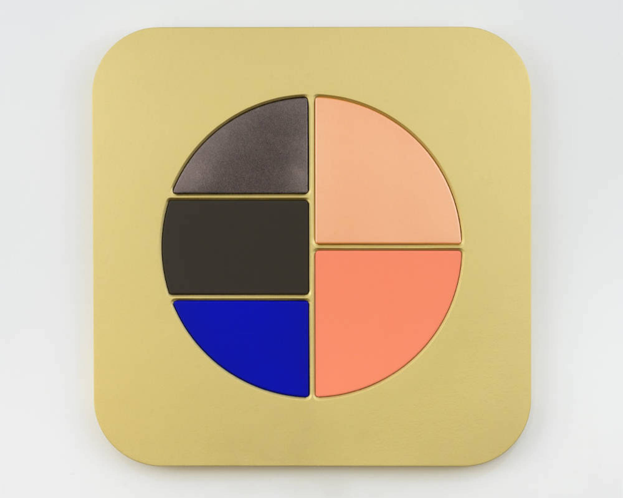
Sylvie Fleury: Solar Gold and Moonlight Shimmers, 2018
Sylvie Fleury used to say that she was a painter—but only on her own face. In 2018, though, the Swiss artist debuted a series of acrylic on canvas on wood versions of make-up palettes. Blown up to gigantic scale, they are seductive as minimalist abstractions through which we might travel from fashion to art, and wonder about the differences in objects of desire. She’s explained them as a feminist counterpoint to the paradigm defined by the all-male exhibition The Shaped Canvas, held at the Guggenheim Museum, New York in 1964.
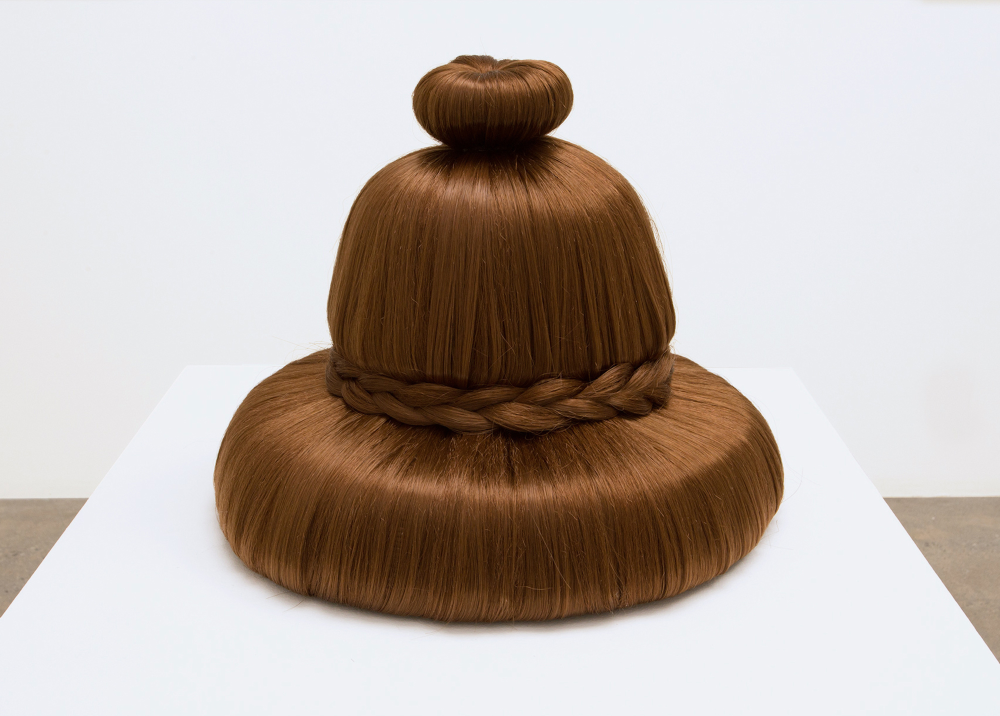
Julie Curtiss: Bun, 2018
A red-hot painter in the market with her precisely obsessive psycho-sexual dramas, Julie Curtiss is visibly inspired by the Chicago Imagists, a 1960s tendency who themselves have become more prominent recently. Some of them were also known as The Hairy Who, and hair is a sufficiently obsessive motif in Curtiss’ paintings that this sculpture, made by fully covering a hat with synthetic strands, is a logical extension of her language. It has an uncanny yet comedic presence which makes you long to see it being worn.
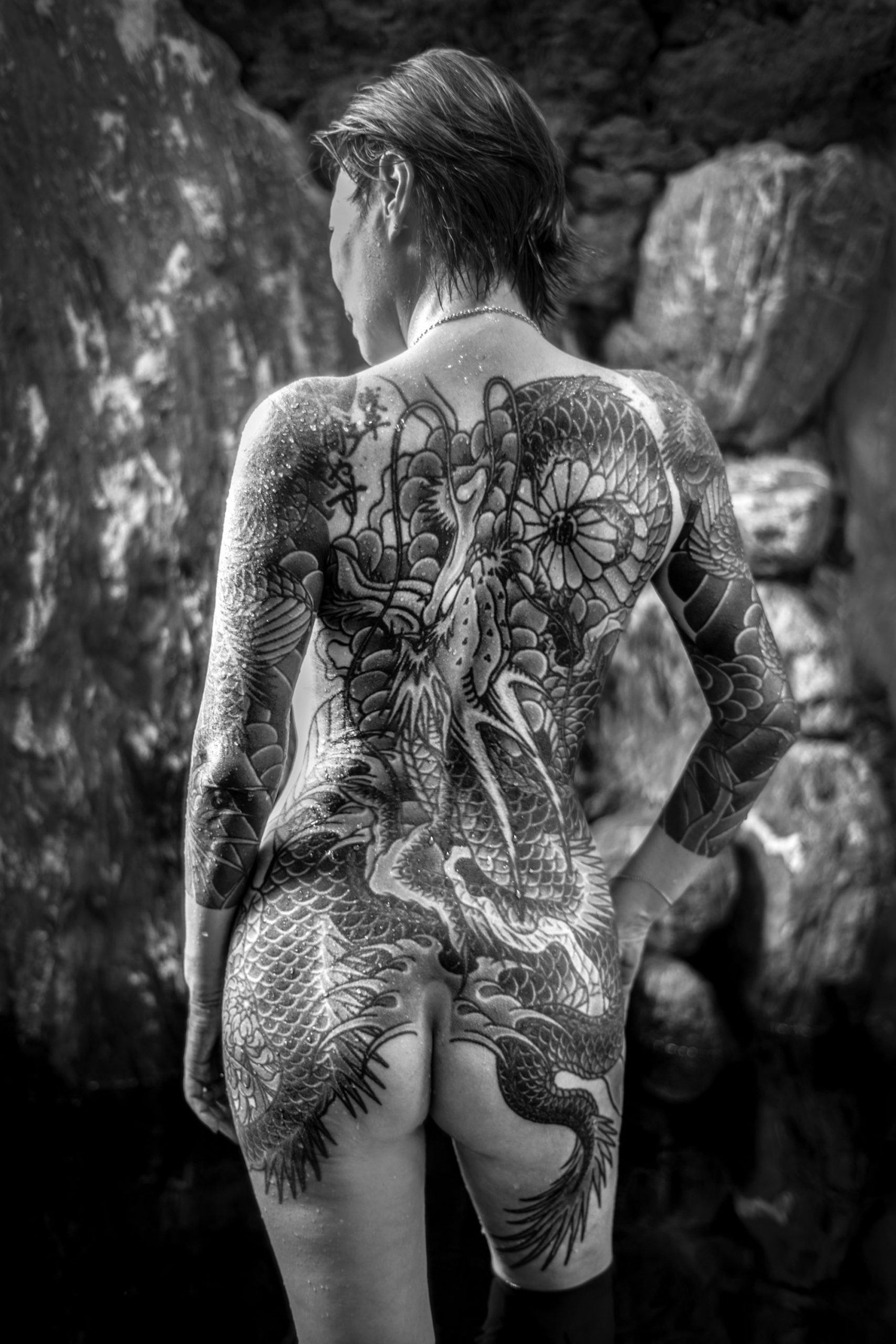
Yumi san in the Japanese traditional bath (onsen), Chiba, 2018. Courtesy the artist - from Chloé Jafé, I Give You My Life, 2014-2017
The skin is more of a fashion site now than it’s ever been, and much of that picks up on older cultural traditions in which tattoos were used as signals of belonging. French photographer Chloé Jafé lives in Tokyo and met a Yakuza boss who agreed to let her document the women associated with the organised crime syndicates. The women allowed Jafé to photograph their ‘irezumi’ tattoos: made painfully by hand over years using a wooden handle and a needle, they represent a strong statement of commitment to their partners within the organisation.
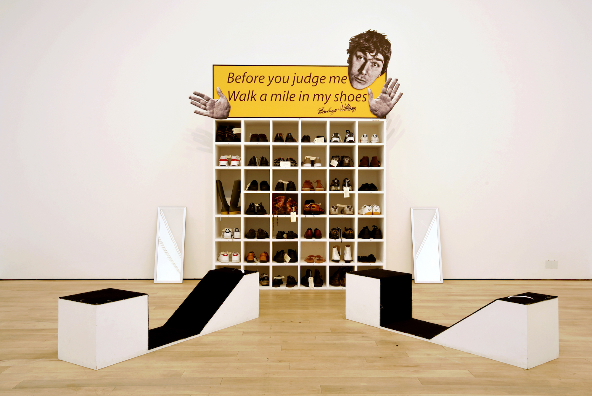
Bedwyr Williams: Walk a Mile in My Shoes
At the Saatchi Gallery, Bedwyr Williams recently presented an impressive choice of 45 pairs of shoes to try on in this installation. Any thieving thoughts of making off with his footwear were tempered, though, by the fact that Williams takes a whopping size 13. Walking a mile in those would definitely be a challenge. Not only that, but he bought them all second hand as a way of demonstrating that he’s not alone in having big feet, even if only 0.5 percent of adults share the size.
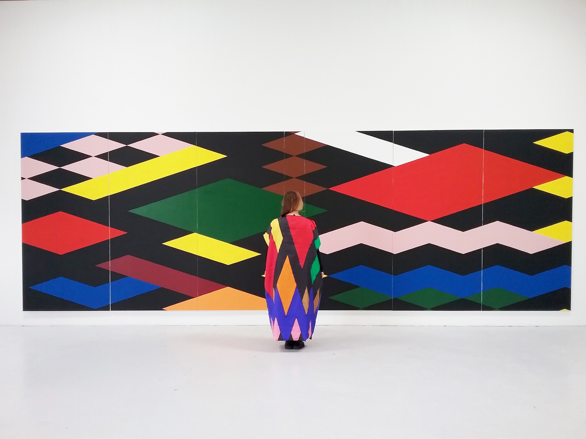
Karina Bisch: La Grande Diagonale and La Robe Diagonale, 2016
French artist Karina Bisch’s painting practice feeds into performance, sculpture and clothing to make, in her words, ‘a protean activity that merrily defies categories, mediums, styles and genres’. Typically, as here, fresh, forward-looking combinations of motifs derived from research into the historical avant-garde move beyond her colourful canvasses and into the world of ‘peinture-à-porter’. Is she wearing a painting in these two works always shown together, or is the painting really a giant pattern for a dress?
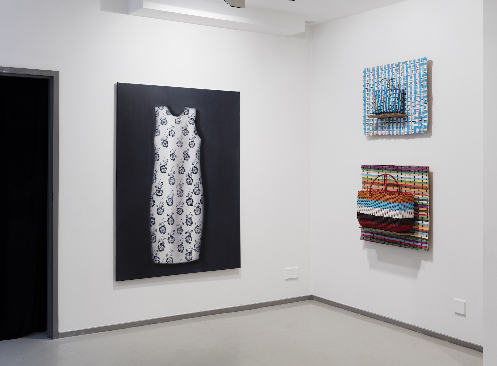
Lisa Milroy: Installation with White Dress, 2011
Often intersecting with fashion, shoes are a favourite subject in Lisa Milroy’s work, and she has made many ‘interactive’ paintings on dresses designed to be worn. Milroy has also woven canvas into reversible paintings, sometimes presented as handbags. The distinctions between object and painting, art and fashion, patterned design and painterly abstraction are collapsed, all of which performance can alternatively be categorised rather traditionally as still life.
OPTIMISM
THUMBS UP FOR OPTIMISM?
'I've always been an optimist' Francis Bacon liked to declare, somewhat implausibly, before the wicked clarification 'an optimist about nothing!' And there are, indeed, many shades of optimism. Dr Pangloss may have preached that all is for the best in this best of all possible worlds - but he was a parody of Leibniz, invented by Voltaire to allow Candide to discover otherwise. You can even argue that if you believe matters are going to get worse, you’re an optimist: a pessimist would be someone who believes things are going to end. There’s a possible echo of that in Guy Allott’s painting below, one of six works which effect optimism in different ways and to varying degrees… It does make sense, though, to gives the Emma Hart thumbs up to optimism itself: optimists are more likely to be grateful for their lives than pessimists, and gratitude leads to a happier life.
Guy Allott: Alien I, 2016 – oil on linen, 23 x 20cm
Courtesy of the artist and MOUNTAINS, Berlin
You could argue that to speculate on the future is inherently optimistic, as even a dystopic vision assumes that there will be a future for people to be unhappy in. Guy Allott has often painted spaceships which apparently come from the distant future, yet embrace a retro-design aesthetic. His series of imagined aliens, who might perhaps have arrived by that means, are doubly optimistic – as not only do we get to see them, but they look decidedly friendly….
David Altmejd: Crystal System, 2019 - Expanded polyurethane foam, cement, resin, epoxy clay, epoxy gel, synthetic hair, acrylic paint, quartz, steel, coconut shell, glass eyes, paper, graphite, pearl mica flake and glass gemstone (Overall: 72 x 45 x 43 cm)
© the artist. Photo © Lance Brewer. Courtesy White Cube
Canadian artist David Altmejd’s sci-fi-meets-gothic aesthetic combines physical disintegration with limitless possibility, here through double smoking and a surfeit of facial features but a paucity of limbs. Altmejd acknowledges that his figures often resemble our image of Jesus, so summoning the optimism integral to religious belief. He associates the exquisite grotesquery of Crystal System with the body experiencing ‘a detachment from physicality’ – so the hope of resurrection might be in there, too.
Dieter Mammel: Into the Light, 2013 – acrylic and ink on canvas 40 x 30 cm
Courtesy of the artist and the Kunstmuseum Reutlingen, Germany
German painter Dieter Mammel has mastered an unusual way of mixing black ink and a colour on a drenched canvas placed on the floor so that they pool into chance-freighted contrasts of shadow and incandescence. From 2013-17 Mammel worked with yellow, allowing his characters to appear hypnotized by sunlight of an almost religious intensity. The optimism is ambiguous: there’s something foreboding about the towering door through which a boy moves into a future which we suspect is implausibly bright.
Annie Morris: Stack 8, Ultramarine Blue, 2019 - Foam core, pigment, concrete, steel, plaster, sand - height: 230 cm.
Courtesy of the artist and Timothy Taylor, London / New York
Annie Morris’s ‘stacks’ of improbably balanced boulder-like forms are essentially paintings in which the key is the interaction of colours and textures - right down to sourcing two sizes of sand grains to vary the surfaces. They might seem straightforwardly cheerful, yet the stacks originate from a dark place: Morris began the series a dozen years ago when she and her husband suffered a stillbirth. Their component shape references the womb, and they were a way of asserting optimism at a difficult time - which proved pleasingly well founded as the couple are now parents.
Markus Vater: The first car powered by love, 2011 – ink on paper, 30 x 21 cm
Courtesy of the artist
The power most often cited for overcoming adversity must be that of love. After all, it’s all you need. Yet one problem it is hard to see love solving is climate change. Step forward the witty German artist Markus Vater, who proposes a touching means of reducing the impact of cars on the atmosphere. The key is that it also works visually: there is something about the size, shape and interlinked complexity of a paired of curled-up lovers which could be the engine of more than their intimacy.
Emma Hart: Thumbs Up For Swans, 2019 – digital print, dimensions variable
Courtesy of the artist and The Sunday Painter, London
This nifty transformative tessellation sees swans become optimistic thumbs, complete with fingernail beaks, while the spaces between emerge as blue flowers. Escher or Dali would have been impressed! Emma Hart explains that this is her stab ‘at thinking about how elements in life fit together and how a repeated hand gesture accumulates in the mind to become a mode of thinking’. She’s ‘a big thumbs upperer’, and now gives one to every swan she sees!
COMMUNITY
The Art of Combination
What makes a community? And how does it maintain the right positive, mutually reinforcing spirit? Philosophers have tackled those questions, from Plato to Hobbes to Rawls. The answers are likely to involve common values such as respect for difference, avoidance of gross inequality, and a sustainable lifestyle. Artists often present and advocate for the issues involved - as do Rosa Loy, Prem Sahib, Chad McCail and Rena Effendi, from the perspectives of gender, sexual orientation, wealth and rurality respectively. Art may assist directly in setting up the right conditions, like Julian Opie's in a hospital setting. Artists may also seek to live and work in an appropriate manner, or even set up a community to do so, as has Andrea Zittel.
Rosa Loy: In This World, 2019 - casein on linen, 120 x 100 cm
© Rosa Loy, VG Bild-Kunst Bonn, Photo: Uwe Walter Berlin
courtesy Galerie Kleindienst Leipzig
Rosa Loy’s dreamily allegorical images have the atmosphere of an alternative world, some of which may be down to them featuring many women but no men. Loy sees that as part of a vision for strengthening the role of women in society. Her pictures echo myths and fairy tales as they search for a new mode of living which feeds on traditional female knowledge - and its associated mysteries. How do you speak like a tree? Why does the fairy have asymmetrical wings? Are those wings of fire?
Prem Sahib: Helix IV, 2018: plaster, chromed steel - 82 x 67 x 15 cm
Image courtesy the artist and Southard Reid. Photo credit, Lewis Ronald.
Prem Sahib explores how the spaces we inhabit help to make us who we are – in particular those which helped form his own gay identity. That has often amounted to a memorialisation, as venues close: this work combines the classical style of décor taken from the Chariots Roman Spa in Shoreditch – knocked down in 2016 to make way for a luxury hotel development - with the minimalist language contingently inscribed in sex toys. Does the death of such spaces and their associated communities, asks Sahib, threaten their associated identities?
Chad McCail: Toy, 2017-20
Installation at Northern Gallery for Contemporary Art, mixed media
Photograph: Colin Davison
Chad McCail has just spent two years developing a monumental new work in which the world is a plaything, complete with the institutions we have to negotiate: school, hospital, workplaces, housing, an airport... On set, a battle is being fought with gigantic capitalists who tower over the ordinary people swarming on them, as indeed they would if measured by wealth, when the richest 1% would be hundreds of feet tall. This satirical representation of an unbalanced macro-community was itself - a hopeful sign, perhaps - made by a micro-community of a dozen people learning art skills in lowland Scotland, where McCail lives.
Rena Effendi: The whole Borca family, Romania, 2012
Courtesy of the artist
Rena Effendi's series 'Transylvania: Built on Grass' documents the survival of traditional ways of life in the Carpathian Mountains in the centre of Romania - all shot luminously on film. The small villages, hundreds of miles from the nearest city, have a highly sustainable lifestyle. They've raked hay with the same type of wooden fork for 500 years, build houses from materials nearby, use water as their primary source of power - including for weaving and to distil considerable quantities of brandy. But the lure of the city threatens village life, and they are 'too small for EU subsidy, too large for government help'. Such communities of the past, then, have much of what we need for the future, if only that can be retained.
Julian Opie: Running 2, 2019
Courtesy of the artist and Hospital Rooms
This busy and colourful application of Julian Opie's distinctive figural style has an admirable community purpose. It was commissioned by Hospital Rooms, which - in conjunction with local NHS Trusts - seeks to counter the tendency for mental health facilities to be cold and clinical, when the opposite is needed for people at their most vulnerable. Opie is one of several leading artists commissioned for the Junipers Psychiatric Intensive Care Unit and Jasmine Lodge Mother and Baby Unit in Exeter. Staff and service users were involved throughout the project, and interacted with the artists through creative workshops.
Andrea Zittel: A-Z WAGON STATIONS: SECOND GENERATION AT A-Z WEST, 2012-present, Joshua Tree, CA, USA
© Andrea Zittel, courtesy Andrea Zittel and Sadie Coles HQ, London. Photo: Lance Brewer
Andrea Zittel, based in the California high desert for 20 years, describes her art-life practice on the 70 acres of A-Z West as creating 'a place in which spaces, objects, and acts of living all intertwine into a single ongoing investigation into what it means to exist and participate in our culture today'. Weavings, ceramics and textiles are made collectively and sold to support it. Artists and writers can rent the sleeping pods shown - alongside communal kitchen, open-air showers and composting toilets - at the Wagon Station Encampment, where they recall the horse-drawn wagons of the Wild West. Zittel explains that she is 'drawn to the frontier mentality, and having to figure everything out from scratch'.
AGE
Who Wants to be Young?
As everyone knows, life expectancy is rising: the UK average was 42 in 1850, 52 in 1900, 69 in 1950, and is now over 80. There are some 15,000 centenarians - an increase of 85% this century - and by 2030 there are expected to be 21,000 (ONS statistics). That is often presented as a problem, given the costs of pensions and care, and old people are not accorded the respect in Britain that some other cultures give them. But surely the trend should be seen as triumph, compared with the alternative for us as individuals. In line with that, here are some positive aspects of age in art, whether that be in production, aesthetic, self-valuation or activity.
Ryan Mosley: Lost Mountaineer, 2019
Oil on linen on board, 50 x 40 cm
Courtesy Galerie EIGEN + ART Leipzig/Berlin
Various distinctive worlds - such as the fairground, the Edwardian, the cyclist's and the history of art - come together to make Ryan Mosley's own distinctive world of literally and figuratively colourful characters. It's no surprise, then, that the full beard typically indicative of advanced years is re-purposed as a chance to revisit how the face can contribute to the formal design of a painting. How not to relish the bushiness of this mountaineer, who seems to have dipped his beard into the sky - maybe that's how far off track he's got...
Fiona Tan, Rise and Fall, 2009. Still.
Courtesy the artist and Frith Street Gallery, London.
David Hume famously remarked that he could detect no continuous self, only a bundle of perceptions. Fiona Tan leaves room for doubt, but her imposing two-screen installation, Rise and Fall, moves between simultaneous views of an older and younger woman – implying that they may be the same person – and images of moving bodies of water. That seems to suggest how the flows of time and memory can act as unifying means of living reflectively in the present.
Aleah Chapin: Our Voices are Still Singing on the Margins, 2019
Oil on canvas, 203 x 254 cm © Aleah Chapin, courtesy of Flowers Gallery
The American painter Aleah Chapin celebrates bodily diversity - and age variations in particular - in her unified depictions of the human body and the natural environment. She sees her recent work as describing a world concerned with ‘in-betweenness and edges’ - from the juxtaposition of soft human flesh and landscape, to the symbolic representation of emotional edges and extremes. At any rate, and in spite of the lowering sky, it looks like fun on the margins.
Georg Baselitz: There are Two Figures in the Old Style, 2019
Oil and painter’s gold varnish on canvas, 300 x 212 cm
Courtesy Gagosian Gallery. © Georg Baselitz 2019. Photo: Jochen Littkemann, Berlin
Baselitz's recent portraits of himself with his wife, Elke, invert the subject in the renowned octogenarian's long-running means of - as he has said - 'emptying the content out of what he paints' to emphasise abstract qualities. Yet the couple emerge as ghostly yet monumental presences. The series began darkly, but this recent 3m high example puts the 'old style' in 'old' by suggesting traditional gilding by the use of painter’s gold varnish to bring warmth to a double celebration of the value of age.
Regina Hügli: Portraits of Herbert G., Drifting Identity, 2016
Courtesy the artist
Increasing life spans and improving medical technologies mean that the number of people living with dementia is expected to triple from 50m now to150m by 2050. These portraits are from 'Drifting Identity', a series exploring how identity is affected by Alzheimer’s disease. In her notably empathetic portrayal of expressions of delight, confusion, bemusement and vacancy, Vienna-based photographer Regina Hügli connects us to them as ongoing - if altered - human presences.
Anthony Eyton: Rocking Chair, 2017
Oil on canvas, 43 x 48 inches
© Anthony Eyton, Courtesy Browse & Darby
Royal Academician Anthony Eyton may be able, at 96, to lay claim to being the oldest artist currently showing regularly. Eyton's case makes a piquant contrast with his mother, who was herself a talented painter but died in a riding accident aged 29. His own work remains vigorous and chromatically adventurous, even when he takes on subjects - such as this rocking chair - compatible with advanced years, and contrasting with the many earlier works which drew directly on international travel, particularly to India.
Samuel Zealey with Inverter Wing, 2017
Courtesy of the artist
This is from a series for which the starting point is a folded piece of A4 paper turned to steel, as if Samuel Zealey has manipulated a flat plane of metal with his super-sculptor powers. Here the jet, an unusual model with forward-swept wings, is blown up to impressive - if not quite life-sized - scale. The chemical rusting of the surface suggests that this is how aeroplanes need to end up: as monuments to what could not be sustained - as an ageing which is a positive for the environment.
ENVIRONMENT
This Mess We're In
What's the role of the artist in dealing with what we're doing to the environment? They might evoke the consequences subtly, like Hannah Maybank, or call direct attention to the issues - as have John Akomfrah with memorable scope over six channels of video, and Simon Faithfull in an appropriately futuristic setting. In doing so, they might use recycled materials, as in Evan Holloway's re-purposing of spent batteries, or reduce their own carbon footprint: Peter Matthews make a good start on that by dispensing with the energy impacts of a studio in favour of living in the open with his work. As for possible solutions, Anna Reivilä and Laure Prouvost's pseudo-proposals call attention to their inadequacies to date rather than coming up with practical answers. That last might be too big an ask, but it's fair to say that any answer is bound to require an interface between the technical and the natural: something which Bettina von Armin has been exploring for many years. That heading, by the way, is from PJ Harvey: 'And I have seen / The sunrise / Over the river / The freeway / Reminding / Of this mess we're in'.
Hannah Maybank: Sarah - 13th November, 2018, 76 x 52cm Watercolour on Stained paper. Courtesy of the artist.
British painter Hannah Maybank captures the dangerous beauty in blight through a floral image which could stand in for the attraction we find in lifestyles which corrupt nature. These flowers, though, carry a personal story as well as metaphorical potential. Sarah Bernhardt peonies are a staple of the cut flower industry, accounting for almost half the 50m annual Dutch peony sales, but these particular blooms originate from a clump which has been in the Maybank family since the 1920s. That makes them, says Hannah, 'a living heirloom'. She adds that the peonies start off in small, tight buds before opening out more and more - and then falling apart in a particularly dramatic slow-motion destruction.
John Akomfrah: still from Purple, 2017, 6 channel HD colour video installation with 15.1 surround sound, Dimensions variable © Smoking Dogs Films, Courtesy Lisson Gallery.
John Akomfrah's immersive six screen installation 'Purple' explores the nature of the Anthropocene in overwhelming fashion through his typical combination of archival footage and newly shot film. Above is Scotland, but we see ten countries across an epic timespan from the industrial revolution to the digital age: the past always haunts the present in Akomfrah's bricolage. A lone figure appears from time to time to bear witness, standing in for both the viewer and the artist to ask the climate change question he formulates as: 'what is philosophically, ethically and morally at stake here if we continue on this course?'
Simon Faithfull: still from re-enactment for a future scenario no.2: cape romano, 2019.
Courtesy of the artist and Galerie Polaris - realized with the support of ArtSail & ArtCentre, Miami
English multi-media artist Simon Faithfull’s projects typically see him roam the world to performatively test and report back on its extremes - often collaborating with scientists, often engaging with environmental issues. His newest films 're-enact' possible future scenarios by extrapolating from recent trends. Here he probes how our boundaries will shift, exploring the ruins of a futuristic beach house off the coast of Florida. The Cape Romano domes were built on dry land in 1972 before hurricanes and erosion left them stranded in open water. The sea, ominously, ruled most of 'Fathom', Faithfull's recent retrospective in Penzance.
Evan Holloway: Figure Form with Batteries, 2014
Courtesy of the artist and Xavier Hufkens
Evan Holloway has been working with spent batteries for several years. Initially, he says, piles accumulated round his house in LA, recycling being a mystery to him. He found his own way of recycling them as the ultimate useless item, and one speaking to environmental concerns. Here they animate the surface of a half-classical, half-robotic figure, giving it a slightly outsiderish vernacular typical of Holloway's deliberately anti-hierarchical aesthetic . The form also combines the traditional art material of plaster with industrial steel and the global pollution problem of the batteries - which have passed their functional lifespan and so introduce time and death into the mix...
Peter Matthews: Ek`- Balam, 2018
150 x 140. Oil, acrylic, enamel, pencil, oil stick, pen, earth, clay, found objects and thread on canvases from the Pacific coast of Baja California Sur, Mexico and the Atlantic coast of Cornwall, England. Private Collection - Mexico. Courtesy the artist.
Peter Matthews takes plein air painting to extremes as he works alongside oceans, seeking to capture his experiences of the sublime. He lives with his large spreads of unprimed canvas, carrying them on his back - they double up as sun screen, roof or hammock. He lets the sea wash over them, attaches objects found on the shore, and is as likely to use sticks and stones as brushes to apply the paint. No wonder Matthews covers a lot of territory: 'Ek' Balam' was made partly on the Pacific coast of México and partly on the Cornish Atlantic coast - hence the two sections sewn together - and is is named after an archaeological site where the Mayan way of using glyphs and signs inspired him.
Laure Prouvost: We Will Feed You Cooling Fountain (For Global Warming), 2018.
Painted metal, pump, blown glass, plastic tubes, water and framed watercolour on paper, 183 x 75.8 x 75.8 cm, 72 x 29 7/8 x 29 7/8 in © Laure Prouvost, Courtesy Lisson Gallery
'Ideally' as one of the 2013 Turner Prize winner's characteristic notices might say 'this work would save the world' . Laure Prouvost's bunch of balloons turn out to be individually blown glass, as well as squirting breasts. They provide a quirkily absurd means of mothering the world through global cooling, though the immediate beneficiaries in this case are the goldfish swimming happily around a reef of two sunken smartphones. Come the time when there's more plastic than coral in the sea, the world will need millions of Prouvost's systems to be installed... Good maternal intentions, we might conclude, won't be enough to deal - but what else have we got, so far?
Anna Reivilä: Bond 29, 2017, Photo print on fine Art paper
100 x 72 cm / Edition of 5, 42 x 301 cm / Edition of 5
Courtesy the Artist and Purdy Hicks Gallery London
Young ‘Helsinki School’ photographer Anna Reivilä ‘draws’ on remote Finish landscapes, using rope which she knots around trees, rocks and ice. That proves a beautifully ambiguous way to muse on our relationship with nature. The nets of rope, intuitively rather than systematically formed with sailor’s knots, hover between protection and strangulation. In the case of the ice used here, of course, rope is a particularly hopeless stay against melting, triggering the thought of how little chance we seem to have of protecting it in the larger scheme of global warming. Are current efforts no better than Reivilä's rope?
Bettina von Arnim: Sunny With Cloudy Intervals, 2017. Oil on canvas, 120 x 120 cm.
Courtesy of Bettina von Arnim and PPC Philipp Pflug Contemporary, Frankfurt.
In the 1960's the veteran Paris-based artist Bettina von Arnim was already exploring the technological permeation of the human body by depicting cyborg-styled man-machine interfaces. It’s not surprising, then, that her recent, knowingly dramatic, landscapes feature various artificial insertions, suggesting a conflict between technical and natural. Here the foreground sits on a colour spectrum which hints at how the electric colours may have been exaggerated. It's enough to remind you of how the classic European landscape is already a construction, even before the more malign aspects of human activity come to bear on it fully.
SELF-CARE
Who’ll Care if You Don’t?
There’s no shortage of advice on the keys to good self-care. My choices touch on the following, which a surfing session showed to be popular online: stay balanced (Shana Moulton); get a good night’s sleep (Paul Maria Schneggenburger); spend time outdoors (Juergen Teller); eat well for your body and the planet (Chloe Wise); consider the benefits of having a pet (Martin Eder) and, in all that, understand yourself (Nell Sully). Art itself might be a helpful component of self-care. But is it a mental activity and source of stimulation that improves life balance and reduces the chances of dementia, or an obsessive activity which tortures its creators with a fear of failure? I’m not sure we can expect the artists themselves to answer that question, but Clare Price has found a way for her practice to assist.
Shana Moulton: Every Angle is an Angel, 2016
Still from high-definition digital video, 6:19 min.
Edition of 3+2AP
Courtesy the artist, Galerie Gregor Staiger, Zurich & Galerie Crèvecoeur, Paris
Shana Moulton admits that there is much of herself in her videos’ surreal character of Cynthia, an anxious, isolated hypochondriac keen to try any therapeutic product which combines self-medication with new age spirituality. ‘It’s me as if I’m a bit more naïve’, says Moulton, seen here as Cynthia with various devices in a still from a recent instalment of her comical search for healthy self-fulfilment. She’s forever knocked back by mundane reality, and Moulton’s deliberately kooky use of editing technology seems to be in on the act. Self-care is good, yes, but don’t get obsessed…
Paul Maria Schneggenburger: The Sleep of the Beloved No. 63, 2010
Archival pigment print, 65 x 80 cm
Courtesy of the artist and Galerie Johannes Faber, Vienna
How much sleep should you have? That’s a topic of much advice. But is the quality of sleep – as well as the potential for other healthy intimacies - better if you share your bed? The go-to artist for that question might be the Austrian photographer Paul Maria Schneggenburger. He has a bed in his studio, where he has made 120 photographs to date of lovers and families overnight, capturing the dance of their mutual rest with a single six-hour exposure lit only by candlelight. The series is ongoing - indeed, you can take part by contacting him at www.paulmariaschneggenburger.com.
Juergen Teller: Kanye, Juergen & Kim, No.33, Chateau d’Ambleville 2015
© Juergen Teller, All rights Reserved, Courtesy Alison Jacques Gallery
Much of the Kardashian brand is about self-care of one sort or another, and marketing its ramifications for make-up, diet and lifestyle. The benefits of fresh air in the countryside are not what springs to mind among her endorsements, but that’s what Juergen Teller captured in his typically madcap shots taken in France, achieving the impressive feat of showing the mega-photographed couple afresh. Here Kim demonstrates how to let plenty of fresh air reach the body while ensuring that long socks protect against prickles and stings...
Chloe Wise: Gluten Freedom, 2017
Oil on Canvas, 183 x 152 cm | 72 x 60 inches.
Courtesy the Artist and Almine Rech. Photo: Rebecca Fanuele
Diet is at the heart of self-care, and there seems to be an ever-expanding range of factors to take into account. Young New York based Canadian Chloe Wise catches something of that in paintings in which women display food and drink against an idealised Alpine background. The question here might be: are the non-dairy alternatives to milk (which feature throughout the series) actually better – for us and the planet – than the traditional products to which the background alludes, or is that just an advertising line? Less methane from cows farting, in the case of soya milk for example, but more deforestation to grow the crops. Aside from that, Wise gets to show off her ability to paint both varied still life textures and up-to-the-minute character studies.
Martin Eder: The Inescapable Unity of Love, 2010/18
Oil on canvas, 285 cm x 380 cm
Courtesy Galerie EIGEN + ART Leipzig/Berlin
Photo: Uwe Walter
Pets are widely seen as beneficial for mental health and - in the case of dogs – physical health, too, as they encourage exercise. Likewise, practical interests like playing an instrument. Here German painter Martin Eder takes the former to excess and adds the latter as a bonus. Indeed, one might wonder whether it’s the ridiculous and walk-problematising scale of the pooch which triggers the need for a diversionary tune. Typically with Eder, a ludicrous subject triggers luridly bravura painting as he satirises through exaggeration such trends as the fashionable lapdog.
Nell Sully: Self preservation instinct shape no 2, 2019
Ink drawing: 21 x 21 cm
Courtesy the artist
A pre-requisite of optimal self-care is self-understanding. Nell Sully has made a series of drawings that focus on the three main instincts identified in the Enneagram, a widely-used framework for distinguishing personality types. Sully believes, in accordance with the associated teachings, that ‘to become ‘well’ we need to understand our instinctual energy drive, how we hold it and how to shift it’. Moreover, she is convinced that there is geometric form to these emotional energies. Hence this drawing, which imagines a structural shape which might, in her words, ‘twist / avoid / shake off anything that threatens’. A lively abstract drawing becomes the potential starting point for a theoretically grounded discussion of self-care.
Clare Price: Untitled
(#ithinkthatmaybethesephotoshavehelpedmetohealfromalotofstuff), 2019.
Photograph with oil on canvas painting, courtesy the artist.
It is important to ‘say yes’ to your own self-care, recognising it as a priority. Perhaps art can contribute. Clare Price makes rapid gestural paintings scaled to her body, and often adds to their performative aspect by photographing herself remotely as she strikes dance-like poses in front of the works. That suggests an autobiographical angle, confirmed by the photographs’ original publication on a private Instagram account alongside hashtags indicating emotional states: '#needs', for example, '#fragile'. As suggested in the title above, Price sees the process - which has become part of her publicly exhibited practice – as having had ‘a healing quality from experiences of trauma and oppression, a reclaiming of the self in safe spaces, both physical and online’.
FOOD
IS IT GOOD FOR YOU?
It's natural to see food is a good thing. Eating is enjoyable and keeps you alive. But we have increasing doubts: well yes, but how well, for how long, at what cost to the world? That leaves plenty for artists to pick up on. How sweet, asks Will Cotton, is too sweet? Is there poison in the system? (Mai-Thu Perret) Insofar as food made me, did it do a good job (Roxana Halls)? Could meat be healthier if it were different? (Broughton & Birnie) Might agriculture itself be a mistake? (Alastair Mackie). Perhaps it's better to concentrate on food as ritual (Gareth Cadwallader), or on its form and history (Paulette Tavormina). That's not exactly gourmet relish but maybe it's the more nourishing path...
Will Cotton: Cupcake Katy, 2010
American painter Will Cotton satirises indulgence in his world of ill-chosen food, with landscapes made of candy and models parading their sweetness. That fitted singer Katy Perry’s aesthetic, and she asked him to collaborate on the video for her single ‘California Gurls'. Not only did he do that, making some kind of reality of his fantasy world, he then used the video as a source to make paintings of how his own paintings came to life. That circularity stands in nicely for how hard it can be to escape the cycle of our unhealthy desires...
Nutritionally, apples aren’t the obvious example of food being bad for you, but consider the poisonous one offered to Snow White by the wicked witch - a story which carries a trace of the originating bad apple which got us expelled from Paradise. Moreover, Mai-Thu Perret’s basket of slightly rotten, half-eaten pomes, being baked in glazed ceramic, look a little like toffee apples. They’re not healthy on any level.
Roxana Halls: Carvery, 2013
If 'you are what you eat' then it will be your childhood consumption which defines you. Roxana Halls’ self-portrait, from a wider practice which questions how gender and class norms circumscribe our choices, calls attention to the food from her youth. Halls says she’s very rarely seen such fare in paintings ‘as though, in contrast to its nostalgic importance to me, it were not considered of sufficient value for examination'. Here, then, she attempts to carve a life from a laden table - it isn’t easy, as the awkwardness of her action testifies.
Broughton & Birnie: Meat Garden, 2015
London-based collaborators Kevin Broughton and Fiona Birnie conjured up a 'Dream America' in ten paintings from 2014-15. Their garden of processed meat wittily emphasises how unnatural the suburban can be, while also blurring the line between animal and plant life. If sausages grew like this, I guess everyone would be vegetarian. Let's hope they'd contain less saturated fat than the conventionally-farmed version.
Alastair Mackie: Cast, 2019
Medieval reapers believed that the last sheaf of corn standing contained a dangerous spirit, so they fashioned it into an effigy to be kept safe - in propitiation - throughout the winter. Alastair Mackie had such a sheaf plaited into a traditional spiral, then encapsulated - and, presumably, transmigrated - the spirit implied in bronze. With supplies of the critical food source of wheat threatened by climate change and population-fuelled growth in demand, the gesture has an uncomfortable relevance for today.
Gareth Cadwallader: Pile of Oranges, 2017
Gareth Cadwallader has a curious way of painting intimately-scaled hyper-realistic representations of unrealistically structured vegetation. Against these backdrops his characters play out such everyday rituals as selecting an orange with enough intensity to suggest they are symbolic - but of what? Perhaps this refers to Roelof Louw’s Soul City (Pyramid of Oranges), 1967, but reshown at Tate Britain in 2016: a stack of some 6,000 oranges replaced on a rolling basis as visitors take part by 'consuming' the work.
Paulette Tavormina: Italian Plums, After G.G., 2015
The still life of fruit is the most resonant image of food in classical art. So here is one - or, rather, not - for the one-time food and prop stylist Paulette Tavormina expertly recreates arrangements typical of the genre in her New York studio, then captures them as photographs in a sort of reversal of photorealist painting. These plums are arranged in the manner of Giovanna Garzoni (1600–1670), an Italian famed for the meticulous realism of her botanical compositions, which typically featured a single insect. She's of additional interest as one of the few women able to prioritise an art career at the time.
MASCULINITY
Who Needs Masculinity?
Masculinity isn't what it used to be: a valued assertion of physical power and a fixed role as provider for and protector of wife and children. In many ways, of course, it never was. But the loss of apparent certainties, together with the reducing economic importance of manual labour roles traditionally filled by men, has arguably led to such well-reported effects as girls doing better academically than boys and 75% of UK suicides being male. Artists haven't been slow to reflect the new uncertainties and the positive changes which go with a more flexible approach to gender roles and, indeed, gender itself. Here Hayv Kahraman, Paul Pfeiffer, Jean-Baptiste Ganne and Tala Madani and call attention to the nature of stereotypes and the need to undermine them; while Erez Israeli, Brian Dawn Chalkley and Hassan Hajjij assert the new freedoms.
Hayv Kahraman: Five Court Compound, 2013, oil on wood
Having fled Iraq with her family during the Gulf War aged 11, US-based Hayv Kahraman combines the modern experience of living between Western and Middle Eastern cultures with the historic aesthetics of the Renaissance, Persian miniatures and Japanese prints. All that feeds into the graceful, female figures who recur as her painted proxy. They float like spirits over the plan of a traditional Baghdadi house in the series 'Let the Guest be the Master', centred on the courtyard as the place where men meet while women must remain inside. There is consolation in the domestic domain, but also a critique of the male assumption of power.
Paul Pfeiffer: Caryatid (Margarito), 2015. Digital video loop, chromed 12” colour television, 0:31 minutes duration
If the essence if the old-fashioned ideal of masculinity is seen as power and conquest, then the most primeval sporting arena in which to demonstrate that is in boxing, a subject to which Paul Pfeiffer's video manipulations have returned regularly. In the ongoing series Caryatids, started in 2003, he selects sequences in which a fighter receives unrelenting heavy blows from his opponent, but with the dominating boxer erased. We are left with the suffering of the body crumpling and recoiling under the blows and the question of what sort of victory it is when the victor is erased from the scene. A hollow way of being?

Jean-Baptiste Ganne: Détumescences, 2012
Mixed Media ©Jean-Baptiste Ganne, Adagp, Paris, 2018
Continuing with sport as a traditional arena for the assertion of masculine values, maximum bragging rights come with the lifting of a trophy. But the phallic triumphalism of that act is undermined by the French multi-media artist Jean-Baptiste Ganne’s ‘Détumescences’, in which the winners' cups have been tellingly melted. Maybe there's something in there about the rise of women's sport as well as the wilting of male pride.
Erez Israeli: Madonna of the Flowers (2018)
C-Print, 110 x 120 cm
Young Israeli artist Erez Israeli takes on all forms of oppression, exclusion and occlusions of memory. His blooming self-portrait cheekily cites Jean Genet's identification with those excluded from mainstream society in his book 'Madonna of the Flowers'. Israeli's head as still life might be seen as act of self-marginalisation by embracing flowers beyond the masculine norm, more fully than even Frida Kahlo's assertive use of the floral fascinator in her self-portraits.
Brian Dawn Chalkley: from Missing, 2018
Each: watercolour on paper, 21.0 × 29.7cm
Before his recent retirement, Chalkley used to lead the MA at Chelsea College as Brian and go out as Dawn by night. He also painted carefully fashioned portraits of Dawn as she wanted to be. The recent series 'Missing', at the Lungley Gallery, featured 454 characters much more loosely washed in with thin and dirtied colours. Many of the androgynous, figures, which could all be aspects of Brian Dawn, were accompanied by imagined monologues. They read as swings in mood and self-perception, building up to suggest an identity in flux: 'I am longing for attention from the right person' / 'I said fuck you baby' / 'grappling with my self-image is a daily task'...
Hassan Hajjaj: Mr M. Toliver, 2012/14
Metallic Lambda print on Dibond with wood and found objects
34.5 x 25 in
Pink specs to play Mozart? The masculine as dandy - a man paying particular attention to his style - isn't unusual in the long sweep of historical styles, but has become rarer in the west since the word's Victorian coinage. Hassan Hajjaj - Moroccan-born, but long-time London-based - glories in the use of extreme dress to assert black presence in portraits which fuse the languages of fashion, pop and the African tradition of studio photography. He maximises the effect by framing his images in found objects such as the chewing gum packs seen here.
Steven Cohen: Performance, 2014
For over two decades, South African artist Steven Cohen, ahead of the curve in positing sexual identity as unfixed, has performed in exaggerated drag. He often chooses non-art contexts the better to shock and provoke the audience into recognising their prejudiced views of what a man should be - most famously at a Rugby Cup Final in Pretoria in 1998. Exposing his penis asserts his gender clearly and incongruously, though it got him arrested when - having moved to France for a while - he danced in an outlandish costume with his cock attached to a cockerel, punning on the national symbol in front of its most phallic source of pride, the Eiffel Tower.
BIRTH
When Are You Born?
There's a bit more to it than the date which will feature in your
obituary. Other points might be considered, as
illustrated here. An act of conception (Emma Talbot), leads to pregnancy (Oskar
Diwicki) and expulsion (Gauri Gill). Then comes the official matter of the
birth certificate (McArthur Binion) followed by the birthdays which punctuate
growing up (Wayne Thiebaud provides the cake) before the emergence as an artist
giving birth to creations (Elina Brotherus). And if that doesn't work out,
there may be a need for rebirth (Luke Gottelier) - otherwise it's downhill all
the way to unbirthing (or death, as it's sometimes called) which is beyond our
scope.

Emma Talbot: Love is Fluid,
2018 - watercolour on Indian paper, 30 x 42 cm
Emma Talbot has said she aims to show 'what it's like to be me,
alive today' along with 'the kinds of thoughts that are in my head', though the
facial blankness of her characters makes it easy for the viewer to project
themselves into her world. Talbot often builds up multiple images, patterns and
texts, with remembered experiences alongside a ragbag of references from
popular and literary culture. Unsurprisingly, love scenarios - as in this
simpler watercolour - often surface, with the potential for conception to
operate through a natural harmony of method and subject.
Oskar Dawicki: Armatura Polonica Utilitate Graviditatis, 2017 - steel, 60 x 45 x 45 cm. Courtesy of Raster gallery,
Warsaw.
Given that pregnant women ensure the continuity of the species,
shouldn't they be the natural model of the super-hero? That seems to be the
thinking of Oskar Dawicki, a Polish artist best known as a practitioner of what
he terms 'total performance'. He built a whole exhibition in Warsaw around a
vision of such a pregnant woman, for whom he had this refreshingly
unorthodox ‘Polish utility armour for pregnancy’ forged by a metalsmith.
On to the battles for better child care, workplace equality and beyond...
 |
Gauri Gill: from the Birth Series, 2005
The Indian photographer Gauri Gill has been documenting marginalized communities in rural Rajastan since 1999. In the eight-image Birth Series, made in a remote village in Ghafan in 2005, the great dai Kasumbi delivers the baby of a veiled mother-to-be. A close relative presses her feet against the soles of the expectant mother's feet, and grasps her hands to create resistance. Gill told me she was asked to help by boiling water and so on - engaging her fully in being there, as well as in presenting the dramas of life with the same matter-of-factness as applies in the region's daily existence.
McArthur Binion: DNA:Sepia:V, 2016, - Oil paint stick, ink and
paper on board, 121.9 × 101.6 cm - Photo: Robert Chase Heishman
Courtesy Massimo De Carlo, Milan, London,
Hong Kong
In his DNA series, ongoing since 2013, the veteran
American McArthur Binion (born 1946) presents variations on the modernist grid
which disguise - until you get close - his use of such private documents
as his birth certificate. His personal archives are subsumed into the authority
of canonical art, so reflecting on his own identity as a black artist in the
white-dominated history of abstract expressionism - a narrow account now being
broadened to include him along with such as Jack Whitten, Frank Bowling
and Sam Gilliam.
Wayne Thiebaud: Wayne Thiebaud, One and a Half Cakes, 1981
Wayne Thiebaud is still painting at 97 – including the cakes for which he is best known. Fired by his memories of bakeries, diners and plenty of birthdays, they are exercises in the formal possibilities of geometry, colour, sharp shadows and thickly creamy textures through which the paint takes on some of the appetising quality of its subject. They also tap in to a collective American nostalgia: Thiebaud says he saw the same meringue pies ‘in every restaurant from Sacramento to New York. So it began to make a lot of sense to paint them.’
 |
Elina Brotherus: Portrait Series (Yellow Music with Sunflowers) 2016, 70 x 96 cm
/ 80 x 110 cm – Courtesy of the artist and camara oscura galeria de arte, Madrid.
For an artist, the birth of creation is critical. What if you have
no inspiration? The Finnish photographer Elina Brotherus plays on that in a
series based on a list of 'art ideas' John Baldessari gave to his indecisive
students at CalArts in 1970s. Brotherus so enjoyed teaching with them, she decided
to do them herself. Here she responds to Baldessari proposing that the face be
hidden in portraits, ‘trying to allow other information to surface and define the
person'. Brotherus chooses a setting which might also remind us of Van
Gogh as the archetype of the inspired artist.
 |
Luke Gottelier: Hamster Studio, 2016
The past is bound to feed into any artist's present, but few make
that as explicit as Luke Gottelier, who returns to old, potentially discarded
paintings to oversee their rebirth in new forms. There's often some cathartic
abuse involved: he's set fireworks off on one old painting and turned another
into an ashtray. Perhaps the most extreme reuse to date has been to use the
painting as a base for a hamster cage which duplicates an artist's studio in
miniature. But surely rebirth is one thing one cannot delegate
LUXURY
WHO NEEDS LUXURY?
A luxury is an item for which demand increases disproportionately as income rises. It is something you might want, but don't need, likely to be valuable but pointless. Is art itself a luxury? On the one hand the job of a gallerist might – cynically - be characterised as persuading people who already have everything to buy more; on the other hand, self-expression is more an instinct than a luxury, and most artists make art because they must. Here are some works which ask questions of that interface between luxury and art.
Jeff Koons: Diamond (Green) - mirror-polished stainless steel with transparent color coating
1994-2005
Llala Essaydi: Harem Revisited series, 2012, No 33
Moroccan
artist Lalla Essaydi - now based in the USA - gives voice to women in
the loaded contexts of the harem, the historically male art of
calligraphy, and the Orientalist vision of the odalisque. The use of
lavish 17-19th century ceremonial textiles further positions women as
decorative objects, but the female tradition of henna is used to signal
defiance through Essaydi's signature technique of covering her models
with writing. The scripts, mysterious in their unreadability, are a
poetic stream of consciousness on the artist’s and models’ experiences as women.
Nicole Wermers:
Infrastruktur, 2015
Nicole Wermers has often worked with how goods are displayed. For Infrastruktur, 2015, vintage fur coats, relined to match the seat colours, are sewn onto classic Marcel Breur chairs. Is this a high-end version of towels reserving sun loungers, or a break in some convention of the glamorous rich? The contrast of sculptural materials is striking, and the exclusivity implied by the reservation of space is magnified by the value of the possessions employed. Moreover, the wall holds ceramic versions of those tear-off flyers through which to obtain the phone number of a potential flatshare. Luxury is contrasted with crude utility, but both represent systems of social organisation and an infrastructure of sorts.
Nicole Wermers has often worked with how goods are displayed. For Infrastruktur, 2015, vintage fur coats, relined to match the seat colours, are sewn onto classic Marcel Breur chairs. Is this a high-end version of towels reserving sun loungers, or a break in some convention of the glamorous rich? The contrast of sculptural materials is striking, and the exclusivity implied by the reservation of space is magnified by the value of the possessions employed. Moreover, the wall holds ceramic versions of those tear-off flyers through which to obtain the phone number of a potential flatshare. Luxury is contrasted with crude utility, but both represent systems of social organisation and an infrastructure of sorts.

Juno
Calypso: Rosemary's Room, 2018 from ‘What to do with a million years’ 2018
In 2015, Juno Calpyso created something of a sensation with her staged self-portraits taken in the would-be-luxurious and odd-for-one location of the American ‘love hotel’. Her new series does likewise in an even more surreal - and genuinely luxurious - setting. ‘What To Do With A Million Years’ is finds Calypso's alter ego in an underground house built in the 1960’s by Avon cosmetics founder Jerry Henderson. Hyper-pink bedroom, gold and crystal taps, swimming pool and waterfall are present, correct - and untouched for decades. The lighting imitates natural cycles, and murals at the windows give the impression of outdoor scenes. The current owners, Calpyso discovered, are cryonics enthusiasts – rather creepy seekers of immortality, the one luxury you cannot buy.
Josh Kline: Alternative Facts, 2017 - cheap cellphone, luxury cellphone, hardware, duct tape, and unique customized wooden display
Josh Kline makes upbeat films of possible ideal societies, featuring, for example, racial harmony and a universal basic income. But he conjoins them with installations anatomising the dystopian consequences of increasing inequality, automation putting millions out of work, and an imagined new civil war in the US. 'Alternative Facts' is from a series which crudely tape together 'cheap' and 'luxury' versions of everyday objects like fridges, blenders and laptops with titles such as 'Resentment' and 'Denial' emphasising how they give sculptural form to social divisions.
Michael Craig-Martin: Credit card from Objects of our time, 2014
What can’t be yours if you wave the right plastic? Michael Craig-Martin has an uninfected yet distinctive way of finding beauty in quotidian objects through colours brought to their maximum intensity. This credit card is an extreme example of how, as he puts it, “there’s very little information in these works, the information is in the viewer” - for we can fill in the cultural and social connotations. Craig-Martin’s 2015 Serpentine retrospective ‘Transience’ positioned him as an archaeologist of items now in the past, like VHS tapes and traditional light bulbs. Perhaps, though, his is the future of credit cards: coolly reduced to abstraction, all data invisibly encrypted.

Adham Faramawy: Still from Vichy Shower 2013
Adham Faramawy’s pair of films Vichy Shower and Hydra, 2014, show naked men and women, sumptuously coated in soap suds and mud masks, drinking endless bottles of mineral water. Consistent with how that's marketed, water is presented as a luxurious product – indeed, it is fetished as it runs over skin in maximum definition, and the showering figures can't get enough. Yet, of course, water isn’t a luxury at all, but a necessity - and one with severe concerns over the long-term adequacy of supply: the future likelihood of ‘water wars’ is widely accepted. That’s one half of an equation, the films might suggest, in which we increasingly treat luxuries and necessities the wrong way around.
Adham Faramawy’s pair of films Vichy Shower and Hydra, 2014, show naked men and women, sumptuously coated in soap suds and mud masks, drinking endless bottles of mineral water. Consistent with how that's marketed, water is presented as a luxurious product – indeed, it is fetished as it runs over skin in maximum definition, and the showering figures can't get enough. Yet, of course, water isn’t a luxury at all, but a necessity - and one with severe concerns over the long-term adequacy of supply: the future likelihood of ‘water wars’ is widely accepted. That’s one half of an equation, the films might suggest, in which we increasingly treat luxuries and necessities the wrong way around.
Harmen Brethouwer: Exquisite Corpse, 2015-2016 3D printed, pigmented sandstone - Collection Museum Boymans van Beuningen Rotterdam. Image: Courtesy Hidde van Seggelen, Hamburg
Decoration is by definition functionally redundant, and so luxurious. For 30 years the Dutch artist Harmen Brethouwer has been channeling the history of decoration and the skills which made it into repetitive forms, one being the cone. He commissions experts in such dying crafts as filigree and fake marbling to apply their skills. The recent Exquisite Corpse project tweaks this by using as its source The Grammar of Ornament (Owen Jones, 1856) which presents patterns of many cultures and materials in a common format. That suggests the potential for interchange which Brethouwer then applies by combining traditions on the layered sections of each cone: here colours and characteristics of four materials - Gold, Cardboard, Strawberry and Jellyfish - were combined with the patters of four styles: Indian, Moresque, Chinese and Egyptian.
ANGST
WHAT'S THE WORST THAT COULD HAPPEN?
At its purest, angst is due to ‘the human condition’, rather than a specific cause. That’s central to the existentialist tradition developed from Kiekegaard’s liberating yet horrifying realisation that he had the ‘dizzying’ freedom to control his own fate (The Concept of Anxiety, 1844) to Roquentin’s sickening estrangement from the world in Sartre’s Nausea (1938). Munch tapped into that sense with The Scream, and it was prominent in post-war art, most powerfully through Francis Bacon. Yet there are reasons for anxiety, and just as the threat of nuclear war loomed in the 1950’s, we have plenty of potential triggers for our anxieties - from data overload to terrorism to being watched to global warming to failed ideals – as well as the unavoidable fact that life is a process of dying. Contemporary artists speak to all of those angst-ridden concerns…
At its purest, angst is due to ‘the human condition’, rather than a specific cause. That’s central to the existentialist tradition developed from Kiekegaard’s liberating yet horrifying realisation that he had the ‘dizzying’ freedom to control his own fate (The Concept of Anxiety, 1844) to Roquentin’s sickening estrangement from the world in Sartre’s Nausea (1938). Munch tapped into that sense with The Scream, and it was prominent in post-war art, most powerfully through Francis Bacon. Yet there are reasons for anxiety, and just as the threat of nuclear war loomed in the 1950’s, we have plenty of potential triggers for our anxieties - from data overload to terrorism to being watched to global warming to failed ideals – as well as the unavoidable fact that life is a process of dying. Contemporary artists speak to all of those angst-ridden concerns…
Bronze,138 × 120 × 120 cm
Rodolphe Janssen (Brussels)
Belgian artist Thomas Lerooy is visibly inspired by the macabre humour of James Ensor. Here the absurd conjunction of a collosal head with a body it is bound to immobilise undercuts the seriousness of the public scultures from which both elements could plausibly have come. The other implication seems to be that there's more to survival than the mere size of your brain, it's how you use it that counts. And surely that's our present condition: all the technological advances and understanding of the world combined with the angst of knowing that's no help in saving the world.
Pieter Hugo: Portrait #9, Rwanda from the series '1994', 2014
Stevenson Gallery, South Africa
South African Pieter Hugo has spent two decades photographing marginalized and unusual communities, most famously Nigerians with hyenas in 2007. His recent series '1994' has a far more restrained power: images of children in bucolic settings but posed in adult clothes ask the question: being born after the end of apartheid and the Rwandan genocide 20 years previously, can they escape the past to bring new hope and innocence, or will what went on in these very landscapes infect their lives with residual angst? Moreover, how much can their parents do - and Hugo includes his own in the series - to steer the next generation away from the burden of the past?

Robbert Weide: Breather Holes, 2017 – chewed straws inside verneered chipboard, stress - Martin von Zomeran, Amsterdam
Plenty of angst can attach, of course, to the production of art. So it is for Robbert Weide (born Amsterdam, 1975), who relieves the stress by chewing on straws - which he then found himself poking into holes in chipboard. The title ‘Breather Holes’ adds the suggestion, however, that we could breathe through the straws if only he hadn’t chewed them up, or through the holes if only he hadn’t blocked them with straws. Time to get seriously worried…
Ena Swansea: get out, 2017 - oil and acrylic on linen,241 x 279 cm - Ben Brown Fine Art
Pathetic
fallacy or not, it's easy to read moods into landscapes. Here I find
the branches, not really recorded but defined by the snow on them and
and some sort of black rain effect, trigger a troubled mood heightened
by the title - from what threat does the rider have to escape? The
particularly unnatural luridity of his outfit is worthy of a chemical
spill. That said, the American painter may well see this as an upbeat
vision of how wonderful it is to get out in the fresh air in the latest
cycling kit. But that's the thing about angst, once it gets a grip...
Amalia Pica and Rafael Ortega: Music para 429 Megaponeros, 2017 - 2.17 minute video loop with music by Rigo Quesada - Herald Street
London-based
Argentine artist Amalia Pica and her film-maker partner, Rafael Ortega,
have recently spent time in the Congo researching how chimpanzee
societies operate, That's where they made this
film of ants. Their witty intervention is to give each an identifying
number as it comes into view: while we assume ants fold naturally into the social organism with no sense of individual identity, we now wonder. If that self-perception of being an insignificant individual subject to larger forces can be imputed to an ant, what wonder we humans get caught up in the same angst?
Théophile
Blandet: Fountain of Knowledge, 2017 - Galerie Fons Welters, Amsterdam
I
suspect the contemporary equivalent of la
nauseé is feeling overwhelmed by the constant stream of information by
which we’re bombarded. Eindhoven-based French artist Théophile Blandet laboriously
paints over the results of his own internet searches, so that the images are
radically frozen on the screen just as we become frozen in the surfeit. Here
his searches for Siemens engineering and on an Internet shopping site leave
only residual room for technology. You might as well have a fish tank in the room:
cue the ever-changing background formed by the online live stream of an
aquarium...
Monika Sosnowska: Pavilion, 2016
Monika Sosnowka's practice originated from photographing the architectural impact of the upheavals following on from the 1989 revolution in her native Poland: hasty, and largely cosmetic, renovation alongside neglect, dereliction and demolition. She uses the original fabricators to make precise copies - here the steel frame of a shopping pavilion in Lublin - then twist and squeeze the idealism out of them, just as history did in their functional lives, to leave a slumped, animalistic form to do battle with the gallery's clean new space. The results are tortured, for sure, yet oddly graceful.
Monika Sosnowka's practice originated from photographing the architectural impact of the upheavals following on from the 1989 revolution in her native Poland: hasty, and largely cosmetic, renovation alongside neglect, dereliction and demolition. She uses the original fabricators to make precise copies - here the steel frame of a shopping pavilion in Lublin - then twist and squeeze the idealism out of them, just as history did in their functional lives, to leave a slumped, animalistic form to do battle with the gallery's clean new space. The results are tortured, for sure, yet oddly graceful.
Pietro Mattioli: Untitled (Angst on Wheels / Paravan), 2015
Pietro Mattioli captures the lorries of a wholesale butcher's firm founded in Zurich 75 years ago by Heiri Angst, and combines eight images into a perspectival play. That might seem no cause for anxiety - unless you're a cow - but the resulting 3D form echoes the distinctive roof of an artists' studio complex built by Ernst Gisel. That features in other work by Mattioli as a surrogate self-portrait, for the Swiss photographer has chaired the managing committee since 2002. Is he suggesting that the role has its stresses?
SEX
ELEPHANT: SEX Issue 34
While
there’s nothing wrong with being attracted to an image for sexual
reasons, the possibility makes for a potentially awkward interplay when
considering art which takes sex as its subject. Wherein lies the
interest? I suspect, for example, that it's the sex, not the art, which
generates the strong reactions to Allen Jones' work, which falls
somewhat flat when his art plays the lead role. To make satisfying art
about sex typically requires an indirect approach, a leavening of
humour, the introduction of a wider agenda, or a foregrounded engagement
with aesthetics beyond those of the body. None of which need stop us
starting off, as a Cockney might say, with a bottle and glass, a stick
of rock and Sir Anthony Blunt.
Eric Yahnker: Golden Asshat,
2017 - pastel on paper, 49 x 46 in
LA-based former animator Eric Yahnker tweaks pop sources into
witty scenarios in order to make a point. For
example, a southern girl finds her dress straps make a negative union cross out
of her sun tan. The sleek pastel ‘Golden
Asshat’ is closer to straight comedy, as it emphasises at double life-size the cleavage of an
attractively androgynous bum through a ridiculous – yet persuasive - visual
pun. Yet there’s a dark side, too, as
the possible implication is that this body ends at waist level - in which case a
critique of objectification is implied.


Sarah Lucas: Angel, 2016 - beer can penis with wings
Sarah Lucas has various ways of making penises - not
just, she's said, because she hasn't got one, but for reasons of
'voodoo, economics and totemism'. The simplest squash two beer cans
together to construct a near-tautological male package through a
stereotypical symbol of the male. Here Lucas builds on that suggestion
of an old-fashioned evening down the pub using her more recent and
differently double-edged signature material of cigarettes. Given that
they form wings, conjuring and poking fun at the classical sacred
phallus and the tradition of the unsexed angel, her bawdiness gets quite
complex.
Stephane Graff: Untitled (Courbet / Fontana), 2015 - acrylic silkscreen, oil on wood, 61 x 86 cm
Franco-British artist Stephane Graff's source for his 'Catalogue of Errors' series is auctions: referring
to the typical double-page spread featuring a
work of art to one side and its accompanying description on the other,
he pairs faithful reproductions of the illustrations of one work with
the catalogue entry for another in order to undermine artistic identity
and set up ricochets of meaning and value. Here Graff points up the
sexual interpretation of the incisions which Fontana made in his cuts
series by choosing a fleshily pink example, and by matching it with
Courbet's famous 'Origin of the World', much the most famous artistic
depiction of a pubic region.
The Mexican photographer Flor Garduño, who trained with
Manuel Alvarez Bravo, deals sensually and often surreally with the body
and with organic items such as fruit and flowers. They come together in her
most famous images, of nudes with giant leaves. Here chirimoyas, also
known as custard apples from their creamy texture, carry a hint of the exotic
which, say, the banana can no longer claim. Add the implied temptations of taste and touch and the
interplay of inner and outer form, and plenty of passion seethes beneath this still life.
Annie Attridge: Should of Could of Would of, no. 7, 2016 - porcelain, tin glaze, concrete pillar - porcelain 17 x 10 x 6cm
Annie Attridge: Should of Could of Would of, no. 7, 2016 - porcelain, tin glaze, concrete pillar - porcelain 17 x 10 x 6cm
Annie Attridge
is in
love with porcelain - putting its seductive qualities through its
baroque paces - and with love: this is from a series which relish the
pleasures of actual or imagined lesbian interaction, shamelessly taking
over the prototypically male
interest in comically exaggerated bodies and mysterious masking. Is all
about
sex? She says not, for the act is raised on a pedestal of veneration,
the
concrete of which provides a strong foundation for a relationship, and
the bed is
on a scaffold, offering further support - though some doubt is surely
allowed,
if your scaffold is of porcelain.
Daniel Sinsel: Untitled, 2016 - Oil on woven linen support, hazelnutshells, lime
wood stretcher 150 × 130 × 12 cm
London-based German Daniel Sinsel has a
way of fetishising modernist tropes. Here woven tape sets up a grid which is
disturbed by the bumps of hazelnuts over and under it. They’re set into painted
fig - rather than hazel – leaves: the art historical cover for
nudity. Given Sinsel’s stated aim of realising a ‘universal and
suggestive, dormant eroticism’, the nuts can be read as testicular, the salmon
spot as a nipple, and the weaving as a summoning of actions in and out. The
whole is also a chance to explore spatial tensions which have a frisson of
their own.
Form follows function in young German photographer Bastian Gehbauer's cool depictions of little-seen spaces in which processes take place: a pink-lit greenhouse, an automated crematorium, and this garage of sorts - literally a 'performance box' - designed to allow sexual services to be provided more safely in cars. The set-up, he explains, enables the prostitute to flee the passenger seat on the right in case she is threatened, whereas it is almost impossible for the driver to open his door. An emergency button is also located in almost every unit. The property has a generous fence and is opened and closed by the regulatory authority every day in accordance with its 'business hours'.
Dale Lewis: Sunday Roast, 2015 - Oil, acrylic and spray paint on canvas, 200 x 400 cm
There
are many means of censorship, but Dale Lewis comes up with the most
logical: hide the cocks in the orifices. The resultant chain of
connections just add to the all-over energy typical of
the upcoming Lewis’ enormous multi-figure widescreen format compositions
- this is four metres wide. They’re planned in some detail, with compositions derived from Renaissance masterpieces, but the
daringly rapid paint handling comes while the paint can be moved around best - often over one day's frenzied
sixteen hour session. As for the title, is that sexual slang, or does
the action take place while the more conventionally behaved are tucking
into their meat and veg?
Cary Kwok: Arrival (La Belle Époque), 2016 - Dalbergia
Odorifera Wood, Resin, Brass, Pearlescent paint, Wood Wax, Cable,
Inline Switch, Lightbulb holder, Plug, E14 Lightbulb - 160 x 50
x 49 cm
London-based Hong Kong born Cary Kwok’s camp
pastiche comes into its own in the baroque flourish of improbably leaping
ejaculate. His series of detailed blue biro portraits at the point of orgasm concentrates on faces
partially obscured by abstract expressionist splurges, most memorably when
Popeye’s self-decoration is revealed as spinach green. Lately Kwok has played
the knowing excess into would-be architectural designs, complete with priapic
fountains and - as here - internal decor. The lamp rather suits semen's origin
story: let there be life, let there be light...
Sue Williams: Busy Blue, 2016 - oil on canvas, 122 x 148cm
The – scientifically controversial - principle of homeopathy
is that vanishingly small amounts of a diluted substance can trigger a
reaction. Sue Williams might be seen as testing a parallel art theory. In the
1990’s, the explicitly sexual content of her paintings critiqued patriarchal
society. Those morphed into all-over semi-abstract swirls of body parts,
orifices, and betokened organs. Her latest work goes further: not much looks
bodily, but you can still spot the odd hint. Sex has been swallowed up in
everyday life – from which it may emerge at any moment, as we know…
Extension to cover Frieze New York, 2018:
There’s usually a smattering of sex at art fairs. Frieze New York is no exception, but the most interesting sex-themed works on show this week typically have a dark undercurrent. Louise Bourgeois (Cheim & Read) and Tracey Emin
(Xavier Hufkens) set the scene with couplings born out of angst. Tom of
Finland’s explicit, celebratory and increasingly celebrated drawings
(David Kordansky) now represent the prelapsarian world before Aids. Los
Carpinteros’s film Skin (Peter Kilchmann) connects sex and death with
ingenious directness by showing what seems to be one couple ageing
progressively during ten minutes of making love. Here are some works in
which the sex is more than a little complicated
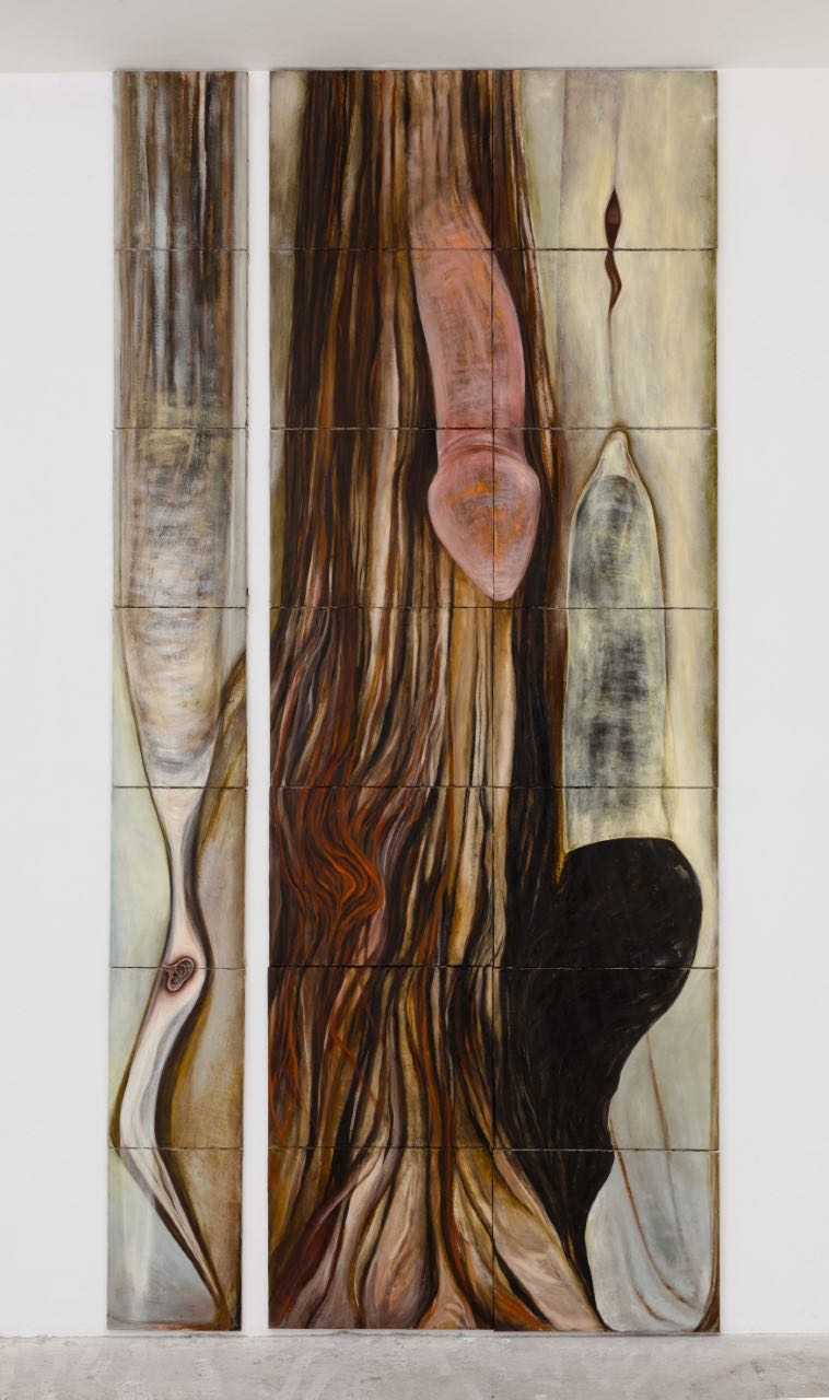
Mira Schor, Dicks or The Impregnation of the Universe, 1988
The
Spotlight section is dedicated to solo artist presentations of work
made in the twentieth century, with an emphasis on rediscovery. Mira
Schor’s Dick paintings from 1988-93 have never been exhibited before,
but in the gallery’s words “with a self-professed groper in the White
House, Schor’s paintings of limp members and receptive ears feel
searingly relevant”. So much so, perhaps, that Schor (born in New York
in 1950) has returned to the theme in new work made after Trump’s
election. This huge work (ten feet high) is built up of twenty-one small
canvases, suggesting both diminution of phallic pretension and the
possibility of more healthy approaches to intimacy.
Lyles & King, New York
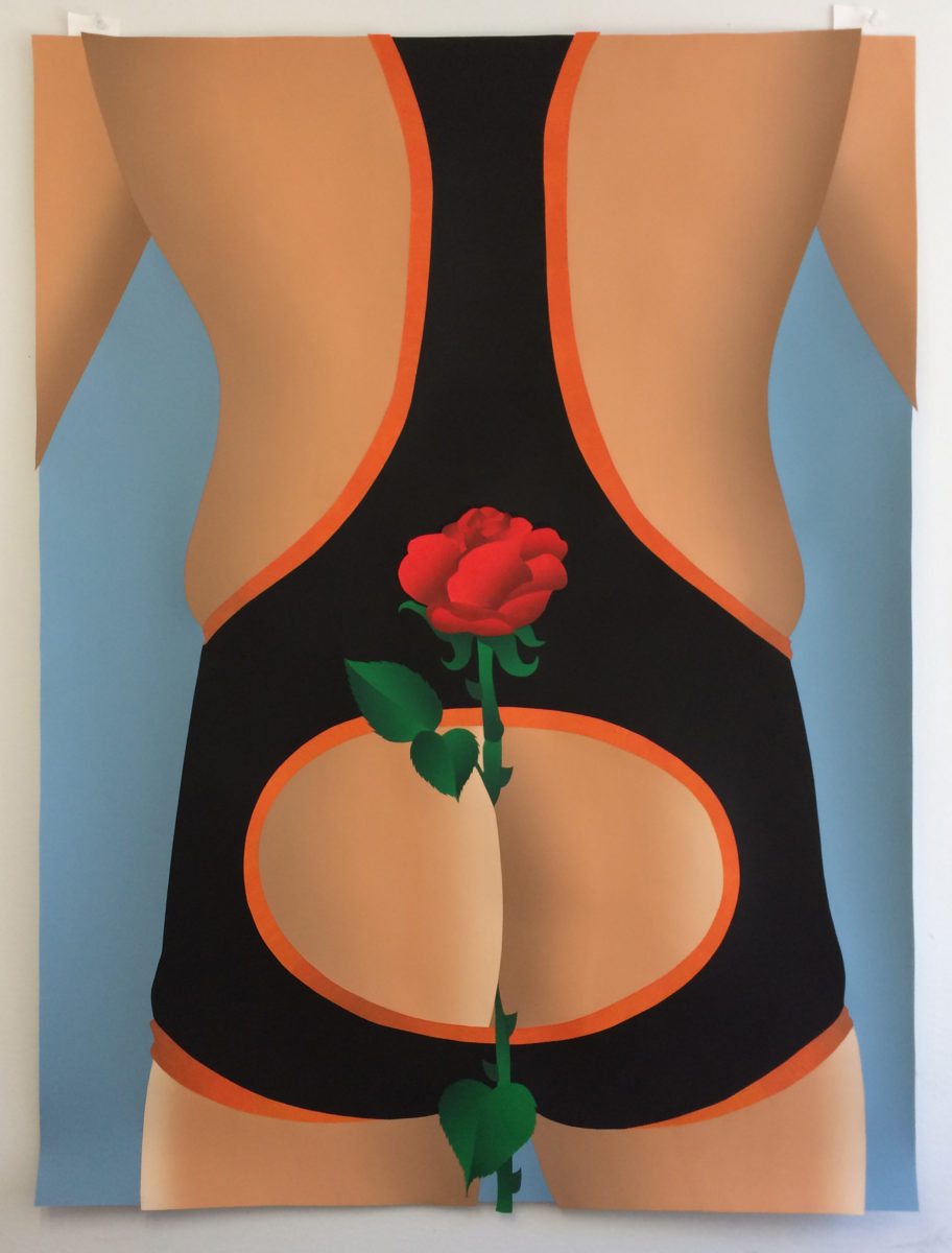
Anthony Iacono, Rose, 2017
New
York artist Anthony Iacono trained as a sculptor, which is evident in
the treatment of his crisp images, collages made from painted paper
which is cut and assembled with the intricate precision of parquetry.
Iacono uses the technique to make observations about sexual mores,
balancing a sort of detachment, which could be read as boredom, with a
sense of fascination, which could be seen as desire. Here I am reminded
that roses have thorns, even as I recall Morrissey’s predilection for
singing with gladioli stuffed down the back of his trousers.
P·P·O·W, New York
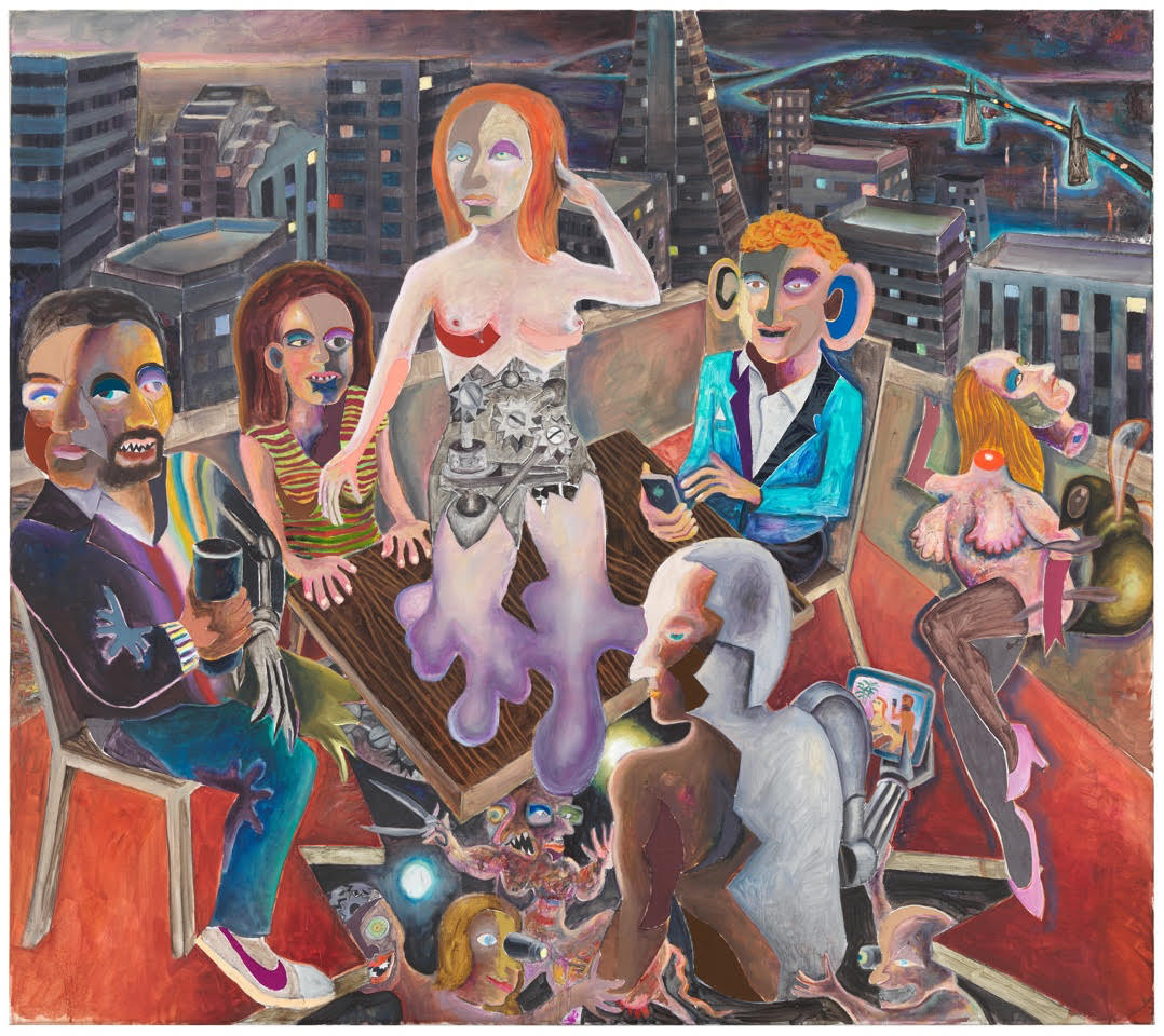
Armin Boehm, Mountain View, 2018
German
painter Armin Boehm’s complex painting shows politicians alongside tech
world leaders such as Sundar Pichai of Google, Sheryl Sandberg and Mark
Zuckerberg. I take it to critique how technology alters the way in
which people see themselves and what they might become. A woman
seemingly obsessed with self-presentation is melting like a
semi-mechanical figure into a table, under which the floor is torn apart
to reveal a glimpse into another world where a cyborg is being
constructed. It, in turn, holds a tablet displaying a pornographic
scene: will even robots be affected by the modern excess of sexual
images?
Galerie Peter Kilchmann, Zurich
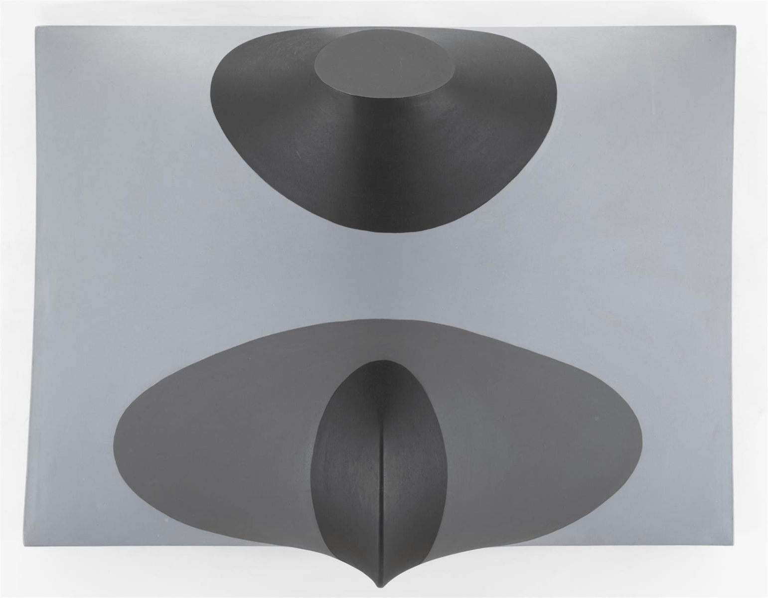
Zilia Sánchez, Topología Erótica, 1982
Cuban-born
Zilia Sánchez, now ninety-two, lived in Havana, New York and Madrid
before settling in Puerto Rico in the early 1970s. Her work, though
formally abstract, has a bodily sensuality, especially in the undulating
shaped canvases she’s been stretching over hand-molded wooden armatures
for over fifty years. That undercurrent is emphasized by the title of
“erotic topography”, but the typically dark and muted tonality and a
suggestion of decapitation takes this some way from a straightforward
invocation of pleasure.
Galerie Lelong, Paris / New York
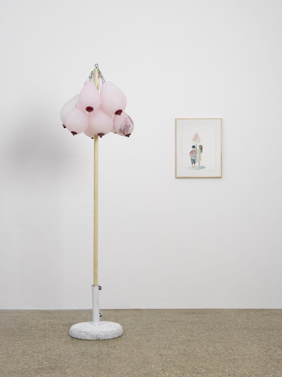
Laure Prouvost, Cooling System (for Global Warming), 2017
Lisson’s
newest signing, 2013 Turner Prize winner Laure Prouvost comes up with a
typically quirky and sexually provocative answer to global warming. The
individually blown breasts—glass, not balloons—provide a means of
mothering the world through cooling. Temperatures soared unseasonably
high during the fair, which was too much for the air conditioning, and
rather made me wish Prouvost’s proposal had reached the stage of a
working prototype.
Lisson Gallery, London / New York
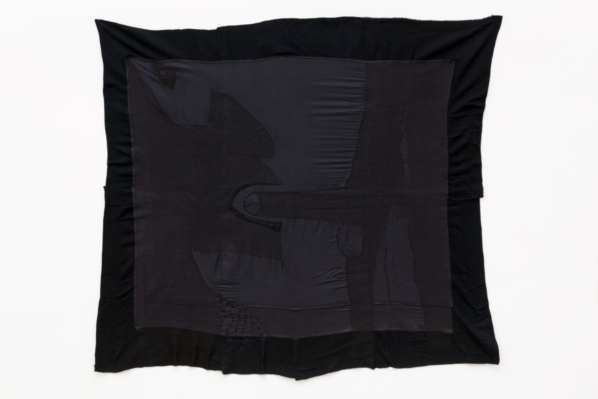
F.marquespenteado, Butched In from the series Identifique as Palavras do Vernáculo Das Prisões, 2012
Portugal-based Brazilian-born artist F.marquespenteado does
not align with a specific gender. Their use of embroidery links
clothing accessories, books and found objects in complex scenarios,
which often explore the performance of gender. This beautifully sewn
black on black example literalizes the darkness in drawings by Jean
Cocteau which depict sex in prisons, so applying a tradition often seen
as feminine to male relationships, in circumstances in which power and
violence are in play.
Mendes Wood, Sao Paulo / Brussels
COMEDY
ELEPHANT: COMEDY Issue 33
What makes for successful comedy in art? If there were
rules, it wouldn’t work, but the key may be that surprise or incongruity leads
to a recognition that there are deeper issues to dig into under the surface of
the joke. That may, of course, bring in disturbing
or melancholy or aspects: Richard Prince rubs the punchline in just too hard; Bruce
Nauman is one of many artists to edgily play out the cliché of the sadness
behind the clown’s mask. Here are six recent examples which lure us with humour
only to reverberate with psychological, environmental, economic or social
concerns.
Paola Pivi: I am Tired of Eating Fish, 2017
Italian artist Paola Pivi is best-known for working
directly with live animals, putting ostriches, zebras and donkeys in
surprising, yet unphotoshopped, situations. Her full size bears surprise
differently: they act in a far from ursine manner, and are made of feathers,
absurdly parodying the possibility of flight and, perhaps, idealists who talk
up how ‘you can be whatever you want to be’. Recent examples take the surreal
turn a stage further by sporting neon colours and bearing light-hearted titles.
It’s almost enough to banish their frightening aspect, but a slight frisson
does remain when one looms over you…
Sarah Anne Johnson: Uck, 2016
– chromogenic print with glitter
It’s not so easy to be funny about the environment, so credit to
Canadian photographer Sarah Anne Johnson: what seems at first like an immature
– if still amusing – fallen letter gag turns out to incorporate a protest
against immature thinking which betrumps nature. The addition of real glitter
ties Uck into her series Field Trip, in which she alters her images with paint
and digitally to revisit the in psychedelic colours the idealistic hedonism of
her own festival-going youth through a nostalgic yet more knowing lens.
Martin Creed: Work No. 2814, 2017
2001 Turner Prize winner Martin Creed tries to
avoid the stress of taking decisions in his art - not even whether to turn the
lights on or off. As something of a hoarder (presumably he can’t decide what to
throw away) Creed has recently been evading choosing his art materials by
using stuff that’s piled up incidentally in his house – plastic bags, for
example. We’ve all seen the odd bag tangled in branches, but multiplying them
into synthetic blossom plays on the language of abstract painting while
making for an ominously absurd vision of the dangers of waste displacing
nature.
Cao Fei: Rumba II: Nomad, 2015 - 14 min video and
installation
China’s leading new media artist, Cao Fei, set domestic vacuum cleaning robots free to roam a building site on the fringes of Beijing on which – as is the Chinese rule - the structure of the past was being pulled down. The bots come across as alien and threatening yet friendly and comical. Sometimes chickens stand on them to hitch a ride. Evidently, and metaphorically, their ‘cleaning’ task is hopeless: there’s no reversing the rolling cycles of urbanisation. In front of the film, to stress the point, three bots acted out their edge-sensitive dance on top of the traditional form of plinths.
Dana Schutz: Boy with Bubble, 2015 - Oil
on canvas 100 x 128 cm
Dana Shutz’s characters tend to seem stuck between composition and
decomposition as they attempt the absurd, such as eating their own faces.
They’re funny, yes, but troubling. Here she wittily rhymes all sorts of
circles, including the head of a bubble-headed lederhosen lad, and sets them
against the angularities of the Alps. Is that a smile or just a concentrating
tongue as he anticipates popping the bubble? Does art, we might wonder, transform
the surroundings or merely reflect its creator? And either way, how long will
it - or we - last?
John
Smith: Steve Hates Fish, 2015 – still from
5 minute video
John
Smith – that’s the John Smith, of course – has subversively exploited misunderstandings
since his seminal The Girl Chewing Gum, 1972. In Steve Hates Fish
he scans signs with a translator app – but having set his phone to convert
French into English, causing the programme to thrash around hopelessly
when faced by a London street. ‘Fruit & Vegetables’ becomes ‘Profit
Venerable’ and ‘Current’ rentals become ‘Surreal’, parodying the verbal clutter
of the cityscape and challenging our instinct to make sense of it. And what
could it mean, in the Brexit context, to see a Briton self-defeatingly misapply
what comes from Europe?
Christian Jankowski:
Massage Masters, 2017
Christian Jankowski has a way with public statues
as part of his wider strategy of playing people outside the art world into his
multimedia productions. For Heavy Weight History, he challenged powerlifters to
raise the great and the bad, a light-hearted way of engaging with such burdens
on history as Stalin and Reagan. Now, he has recruited masseurs to optimise the
wellbeing – and, who knows, maybe in consequence the communicative effect - of
stone figures around the streets of Yokahama. When he screened his film of the
event, viewers in turn received massages, surely rather wasted on flesh.
James Hopkins: Scaled Ladder, 2014 - Wood and Stone
James Hopkins presents an implausible object, its spindly wooden slats bearing heavy rock to no apparent purpose. We’re tempted to seek a logic. Have the small rocks risen because they weigh less? It can’t be that, their density’s the same. Is it that the relative mass of a mountain as you climb it is echoed by the stones’ sizes as we imagine ascending the ladder? Meantime, the title puns on 'scale' as the act of climbing a summit, a fundamental concept of sculpture, and a reference to the diminishing size of the stones – and that brings out the resemblance to an abacus.
Gelitin: Golem, 2015 - Glazed ceramic, 21 × 23 × 25 cm
The
sexual and scatological are perfectly unrespectable zones for art humour, and
Gelitin are often found there. That said, their series of Golems seem innocent
enough – until you see the film of them being made in what the Austrian
collective term ‘an oneiric ritual to unhinge their primordial spirits’ for
which, in their gallery's deadpan words, 'they immerse themselves in clay and
model it using their own bodies as a medium'. Never mind the macho male artist
metaphorically ‘painting with his penis’, or Henry Moore’s spatial use of
holes, the film shows the four men literally fucking the forms into
being.
Sofia Hultén,
Reality Plural, 2017 – three drain covers, cement, asphalt, preserved leaves
Berlin-based
but Birmingham-raised Swede Sofia Hultén draws you in to what looks like three ‘slices of reality’, perhaps in
the style of the Boyle Family’s casts of the earth’s surface. Has she
pulverised them and recast the material tautologically into a new version of
itself, as in her ‘Partical Boredom’ series? No, there’s something else amiss:
the tarmac underlay, paving surface and fallen leaves are presented in three
different orders, as if the world could easily be differently scrambled. Maybe
it could… Hultén has made films documenting
such comparable actions as eating an apple before removing it from the plastic
bag.


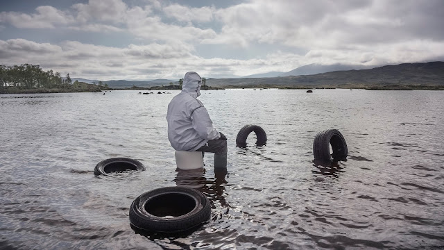


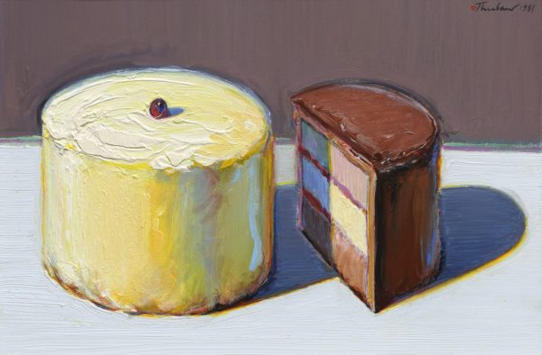


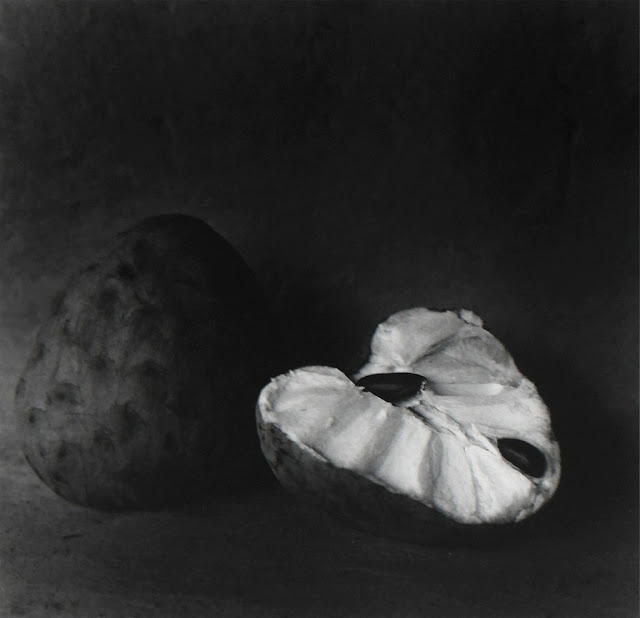


No comments:
Post a Comment
Note: only a member of this blog may post a comment.