Paul’s ART STUFF ON A TRAIN #130: ‘Art in Warrington? I had no Ikea…’
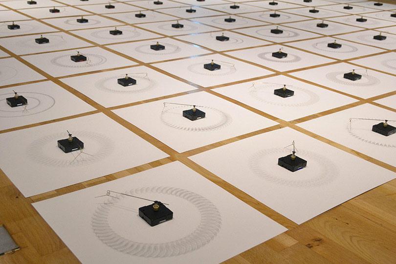
Nick Kennedy: Timecasting
I was a little surprised to be invited to curate in what proved to be the third Warrington Contemporary Arts Festival (2-31 October), expanded this year under the guidance of Copperfield’s Will Lunn to incorporate ‘N()RTH’ – pavilions along the mode of the Venice Biennale, but representing cities rather than nations. Sheffield, Leeds, Liverpool, Manchester, Birmingham and Newcastle were dotted around Warrington, mostly in disused shops. Middlesbrough’s artist-run Platform A Gallery showed particularly well with Tony Charles’ viscerally industrial scraped metal abstractions and Nick Kennedy’s hypnotic floor installation ‘Timecasting’ – 64 electronic clock mechanisms, each fitted with differing loops of gold wire and left to run – with a murmorous collection of flicking sounds – so that 64 different circular drawings slowly built up on the paper beneath. 25 years ago the UK’s first IKEA opened in Warrington, and my own show at the reassuringly traditional Warrington Museum & Art Gallery takes that as a starting point for 13 artists to look at such issues as consumerism, the corruption of modernism and the difference between art and design.The central work is a twenty minute film, ‘Stealing Beauty’, in which Guy Ben Ner’s family carry on their everyday life and arguments in a succession of IKEA show homes. Ryan Gander’s ramshackle lamps, made for his wife as a way of stopping her going to IKEA, and Joe Scanlan’s coffin built from Billy bookcases, made the most headlines – there was even a mention on Radio 4. That ‘The Dream of Modern Living?’ was well received no doubt reinforced my sense that Warrington is becoming an interesting new arts destination.

Still from Guy Ben Ner: ‘Stealing Beauty’, 2007
Most days art Critic Paul Carey-Kent spends hours on the train, traveling between his home in Southampton and his day job in London. Could he, we asked, jot down whatever came into his head?
Paul’s ART STUFF ON A TRAIN #129: ‘The Bad Pavilion Made Easy’
The determinedly lower case herman de vries takes the plaudits for his display of different soil types at the Netherlands Pavilion
Visiting Venice last week, I wondered: what’s the best way to make a bad pavilion at the Biennale? Enough nations succeed to make me feel they probably don’t need my advice, but there are several reliable tactics available. First, try too hard to say something important. That’s often flagged in the title: I feared the worst for ‘The Violent Necessity for the Embodied Presence of Hope’, and I was right. Second, stretch limited artistic resources too thinly, for example through a group show requiring more good artists than a small nation is likely to have without repeating former entries: Guatamala and the UAAE were among the strong performers here. Third, present shocking content without making the necessity apparent. Why did the main work at the Estonian Pavilion, which was taking a stand against the persecution of homosexuals, consist almost entirely of one man urinating into another man’s mouth? Fourth, bungle the information: you might make the press release long and indigestible, omit it all together, or – as in one case – claim there are five works even though, by October, you’ve known for five months that one work was withdrawn at the last minute. In conclusion, there’s no need to make bad art to make a bad pavilion, though it does of course help, and many of the above used that as a back-up method. As for Australia, Cyprus, the Netherlands, India-Pakistan (jointly) and the Czech Republic – perhaps they did need my advice, as they were among those who avoided all those mistakes and made excellent presentations, two of which I’ve chosen to illustrate..
Fiona Hall in her exhibition Wrong Way Time for Australia
Most days art Critic Paul Carey-Kent spends hours on the train, traveling between his home in Southampton and his day job in London. Could he, we asked, jot down whatever came into his head?
Paul’s ART STUFF ON A TRAIN #128: ‘Card Givers’
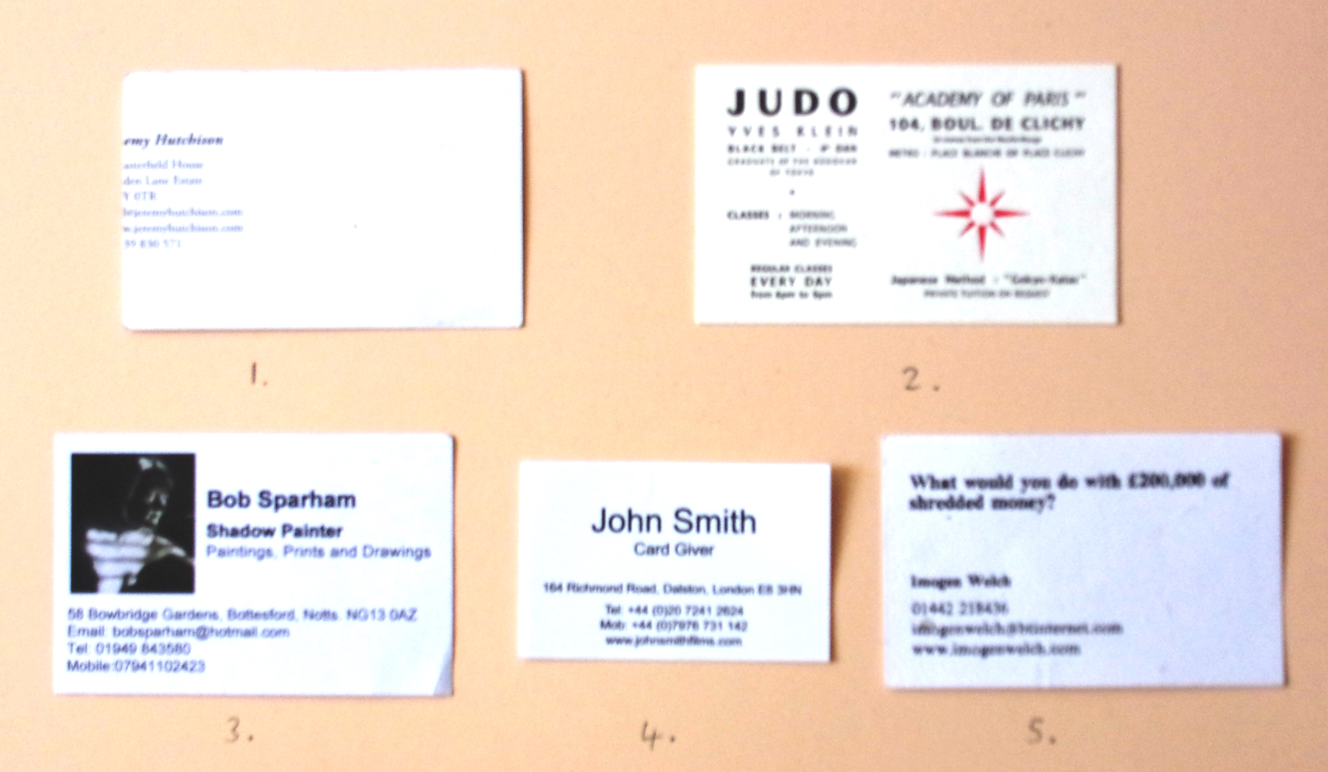
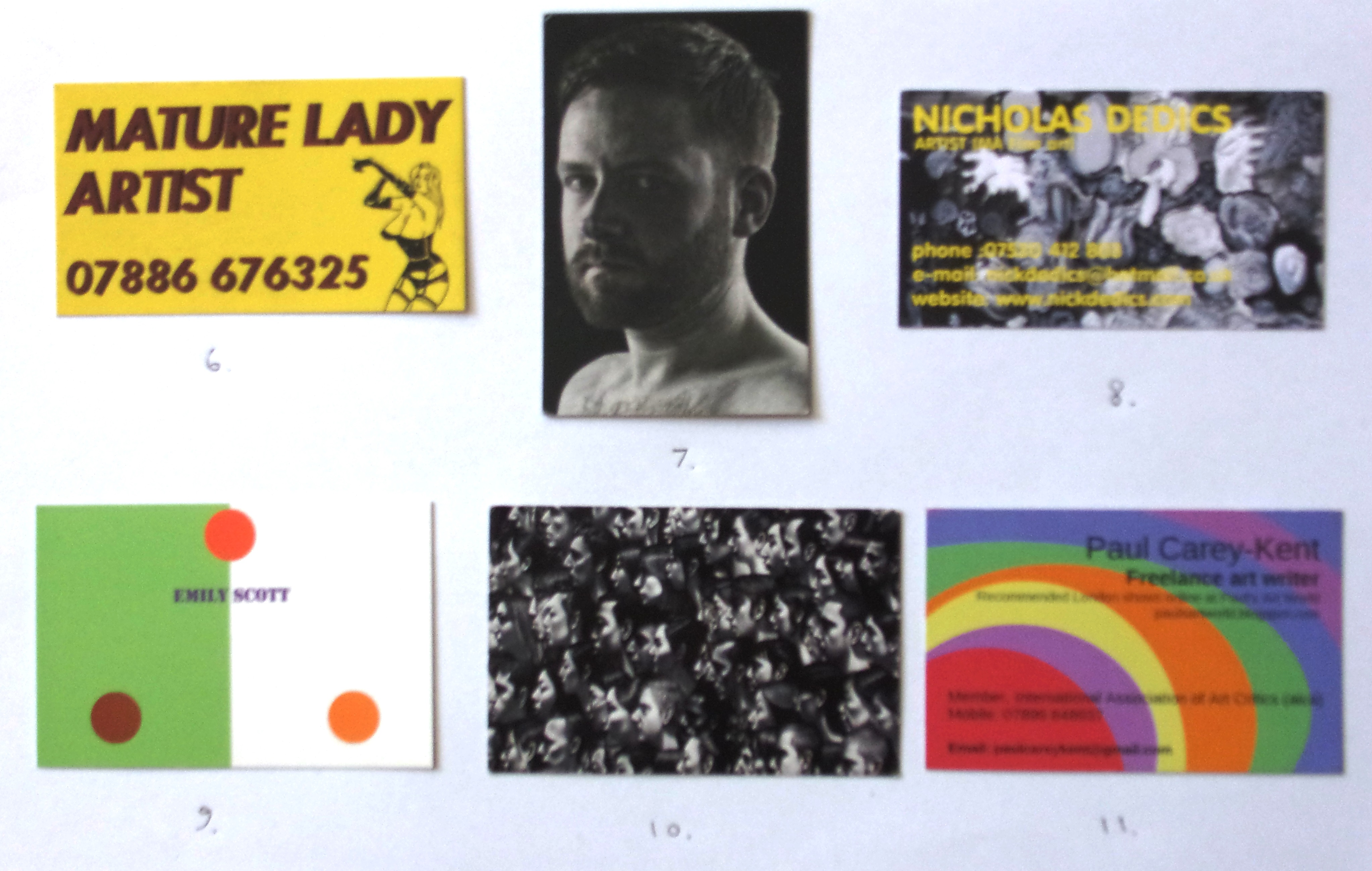
Over the years a fair few artists have given me their card. The majority are pretty plain, with minimalist white designs particularly popular. That seems a bit of a missed opportunity, so here are a few which do more to assert an artistic identity. Jeremy Hutchinson’s (1) is minimalist and white… but with the neat twist of splitting his name between front and back. (2) is Yves Klein’s card in his alternate role – as a judo instructor. Bob Sparham (3) provides the similarly mysterious self-definition ‘shadow painter’ – because the theme of his paintings is ‘Shadows, particularly shadows cast on the figure’. Film maker John Smith not only has an unusually small card (4), he makes a performance out of handing it out by claiming ‘Card Giver’ as his profession. Imogen Welch’s way of drawing you in with a question (5) is consistent with her art, as is Sadie Hennessy’s cheeky play on a sexual parallel (6). There’s a case for putting your photo on the back to remind recipients whom they met, and that serves a double purpose if – like James M Barrett (7) – you are a portrait photographer. Things get more crowded if you paint group portraits, as does Carl Randall (10). Nicholas Dedics (8) and Emily Scott (9) use elements of their paintings as the design, the latter using that device to move some way towards seeking attention through colour. My own, in case you wonder, plays that card (11) rather shamelessly to the max.
Paul’s ART STUFF on a train # 127: ‘Better Than the Real Thing’
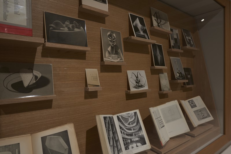
Charlotte Moth: ‘Inserts’ 2015, ten tailor-made structures fitted inside permanent wall mounted vitrines showing selected archival material about Hepworth (photo Sylvian Deleu)
Don’t miss the best Barbara Hepworth room at Tate Britain Why might you? Well, it isn’t in the ‘Barbara Hepworth’ exhibition. The retrospective (to 25 October) is an acceptable if somewhat plodding presentation of Hepworth’s career with most of the sculptures undermined by their presentation not just indoors (as was inevitable) and without natural light (avoidable) but enclosed in Perspex boxes, often with curiously prominent measurement devices to make sure the conditions are right. Step out and walk a few yards to the Tate’s Archive Gallery, however, and it’s a different story. The Paris-based British artist Charlotte’s Moth’s display ‘Choreography of the Image’ focuses on how Hepworth produced and herself chose to present her work. Ten elegant vitrines, each with a handy text, present photographs and ephemera in a suitably sculptural manner. They’re accompanied by a nicely pitched short film showing ‘the staging of the sculptural object before the camera as an extension of the eye’ in relevant locations, including the Cornish coast and Hepworth’s studio. In the vitrines we see, for example, Hepworth’s predilection for collaging her work against cloudscapes or photographing them with vegetation; the comprehensive planning which preceded filming the sculpture in 1961; her own photographs of works by Nuam Gabo on a windowsill; her proposals for public commissions and the ensuing correspondence; and an interesting diversion into the work of Simon Nicholson, one of Barbara’s triplets with Ben. Moth brings us closer to Hepworth than the main show and with not a Perspex box in sight.
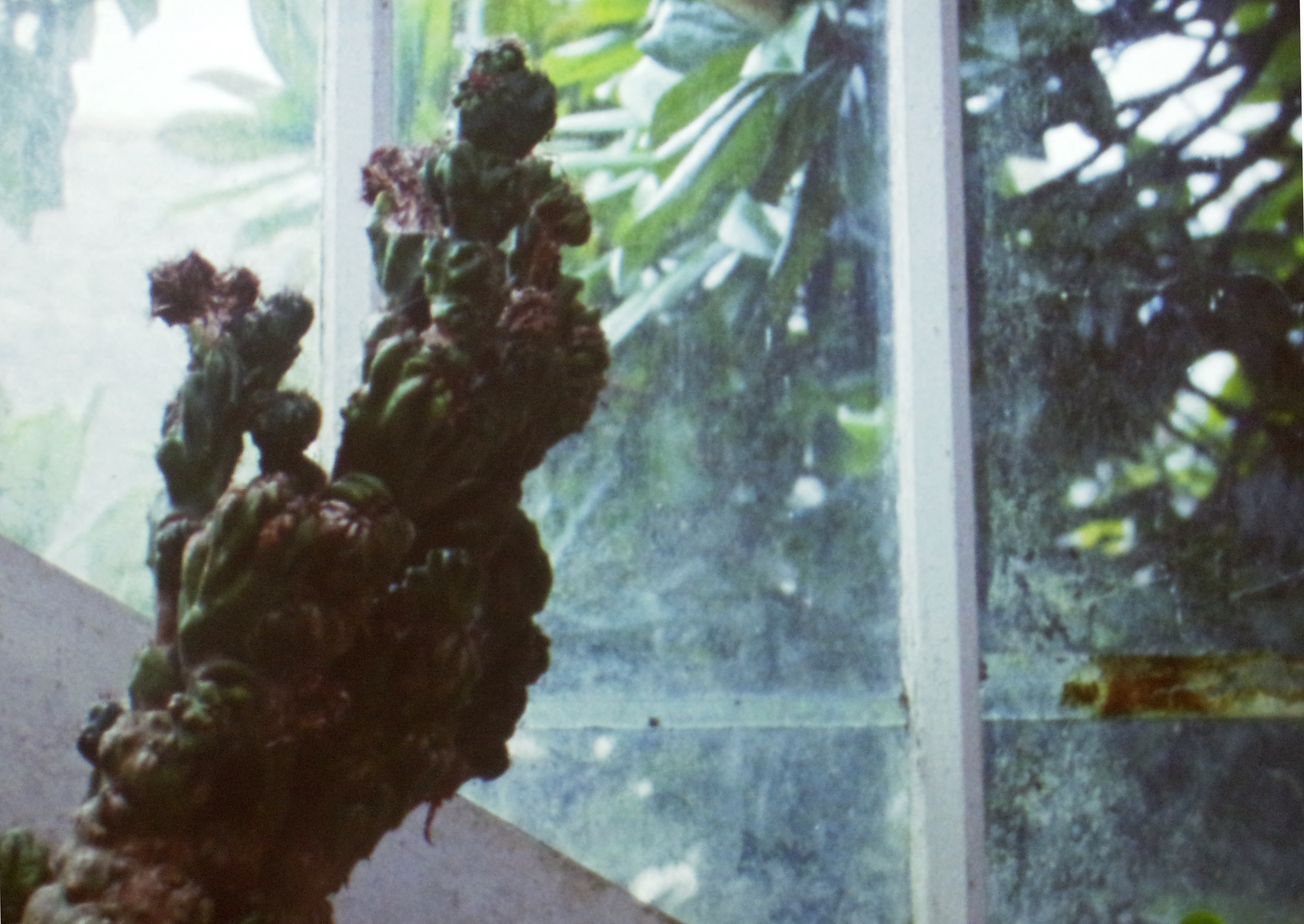
Charlotte Moth: still from ‘Filmic Sketches’, 2015
Most days art Critic Paul Carey-Kent spends hours on the train, traveling between his home in Southampton and his day job in London. Could he, we asked, jot down whatever came into his head?
Paul’s ART STUFF ON A TRAIN #126: ‘Farming Cornell ’
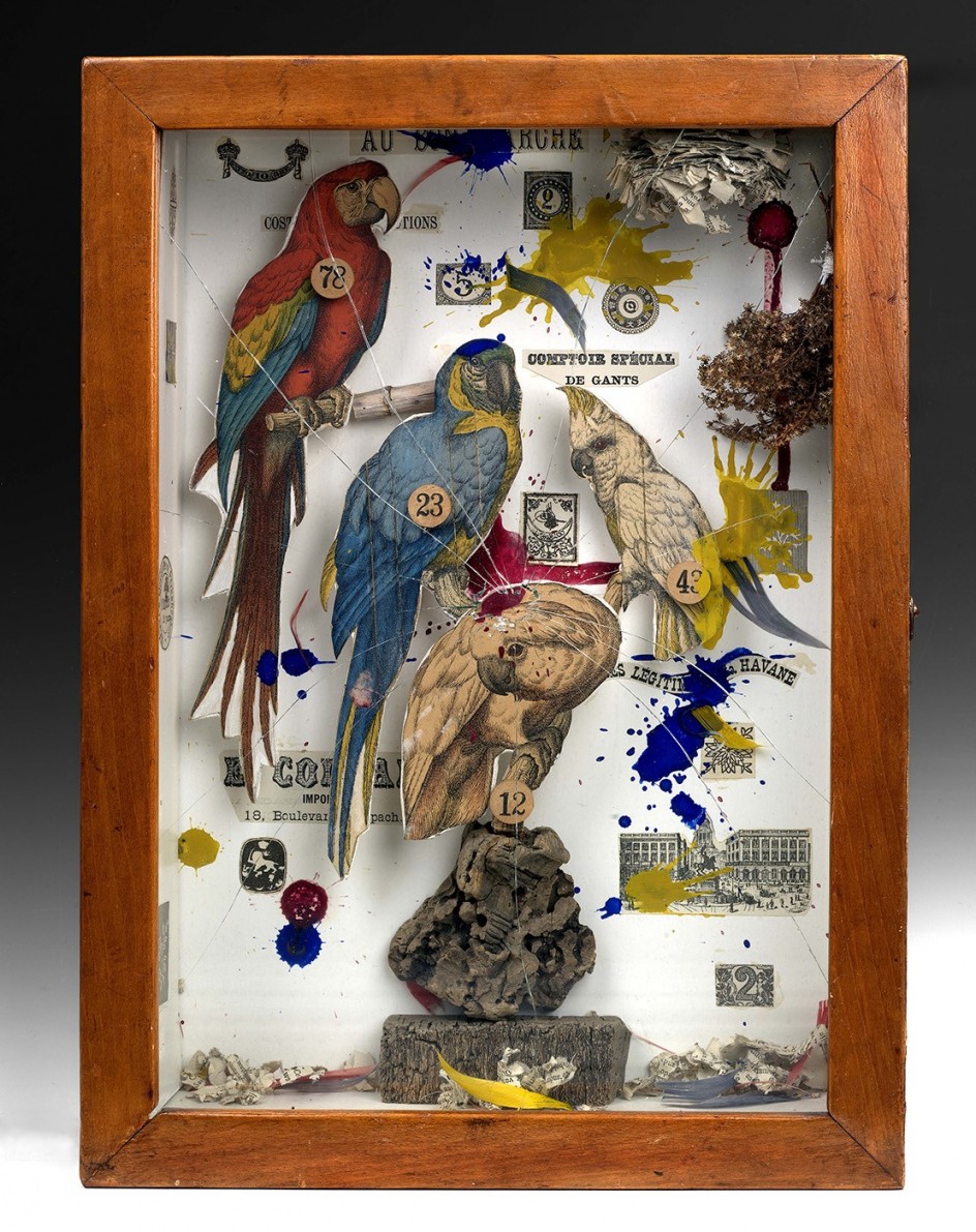
Joseph Cornell: ‘Habitat Group for a Shooting Gallery’, 1943
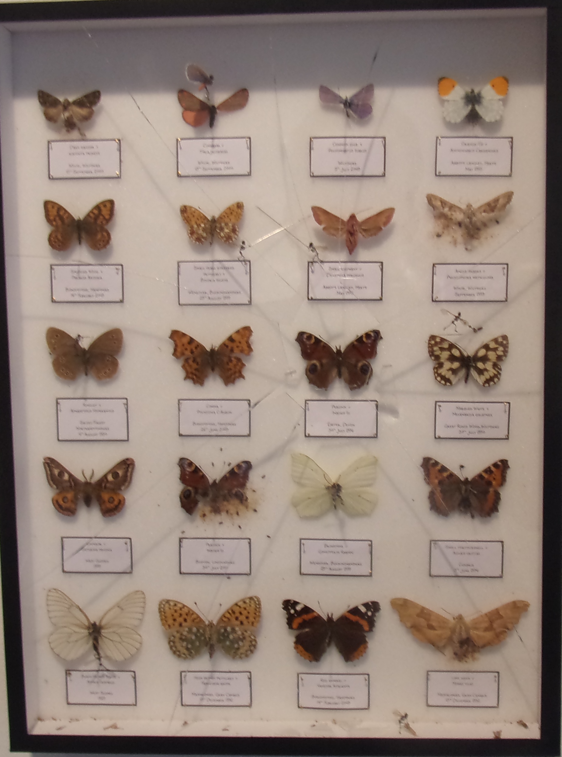
You have a couple of weeks left to see far more of Joseph Cornell’s boxed creations of other worlds than you’ll find in London again (‘Wanderlust,’ at the Royal Academy to 27 Sept). The eighty works on show include Habitat Group for a Shooting Gallery, 1943, one of the most iconic, and one of the few to reference external current affairs directly. Birds in a museum cabinet case have been shot at, which could be a light-hearted fairground spoof, but according to the catalogue it registers both Cornell’s ‘disturbance at the loss of life and destruction of culture in Europe during the Second World War’ and his awareness of the emergence of ‘action painting’. Charlie Smith’s current group show (‘Das Unheimliche’, to 3 Oct) includes among its explorations of the uncanny a collection of butterflies which had been invaded by the tiny yet fearsome winged skeletal humanoids which Tessa Farmer makes from plant roots and insect wings. Evidently they have smashed their way into the case, part of Farmer’s imagined world in which malevolent fairies stand in for the violent fight for survival and supremacy that takes place at every scale in nature. It’s also, surely, an homage to Cornell, an artist with whom Farmer shares much, including the rather effective practice of homage…
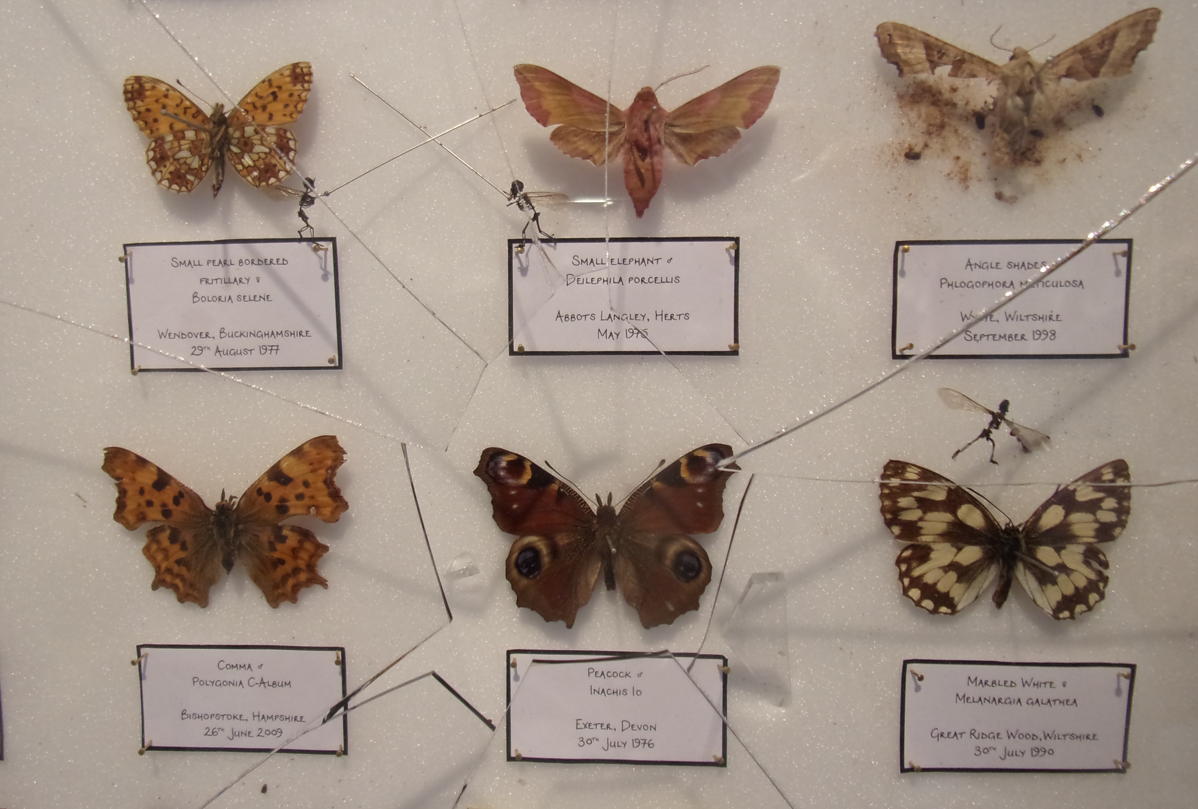
Tessa Farmer: ‘Infested Lepidoptera Collection’, 2015 – insects, plant roots, pins, glass shards
Paul’s ART STUFF ON A TRAIN #125: ‘The Upcurve Down in Kent’
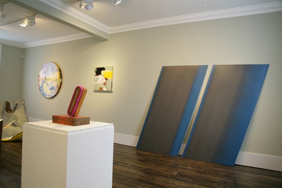 Loukas Morley installation view
It’s easy to assume – after all, it’s pretty-much true – that London has the only significant commercial exhibitions of contemporary art in England. One exception, though, is the UpDown Gallery in Ramsgate, now three years old. And while I can’t honestly recommend Grayson Perry currently, a visit fits well with the Turner Contemporary in Margate. At the UpDown the Cambridge-based Loukas Morley (to 18 Oct, above a diverting show by Martin Grover in the two level space) presents a varied and imaginative retrospective, elegantly tied together. First, Morley has a great eye for finding objects in which to discover art: squashed supermarket baskets, samples of wood veneers, bent curtain rails… Second, that process of discovery carries over into his fully self-made works, in which multiple layers of paint and resin, applied on board by drip and swipe more than by brush, are differentially sanded away to reveal chance gestures or windows onto the base wood, or else left to form monochrome zones. Third, that process of rubbing plays back into the found objects: those curtain rails were polished into pristine distortions; used industrial sanding belts are revealed as found drawings; a sculpturally posed chalk duster looks ready to wipe the belt clear, as well as suggesting a teacher losing control. And, under cover of their being objects, there’s also a found painting of sorts: the lids, that is, of four cans of spray paint. This show, relocated, would be in my London top ten.
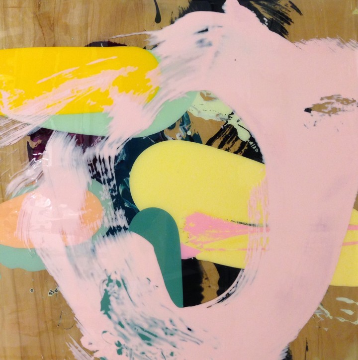
Loukas Morley: ‘Stratum Journey 7 (Pink Circle), 2014 – spirit based pigment, resin on board
Paul’s ART STUFF on a train # 124: ‘Getting into Gear’
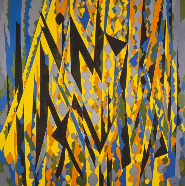
William Gear: ‘Broken Yellow’, 1967
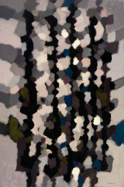
A century after his birth in Edinburgh, both the Redfern Gallery in London (to 5th Sept) and the Towner Gallery in Eastbourne (to 27th Sept) are celebrating the perhaps under-appreciated art of William Gear (1915-97).He showed with the radical CoBrA movement in 1950, when he was based in Paris; and was in 1961 one of the first abstract artists to be – controversially – selected for the Royal Academy summer show, though he didn’t become an Academician until 1995. Gear really shifted up when he found financial stability through being appointed curator at the Towner Gallery, where he spent 1958-64 in a post with accommodation and a studio thrown in (those were the days!). His distillations of landscape experience never quite represent anything directly – Gear said they were not of nature, but of his ‘thoughts of nature’ – but they often have the feeling of wind moving through trees in leaf-dappled light. In formal terms, Gear’s achievement was to combine hard-edged vertical elements with more horizontal and blurred patches to set up a collision between structure and intuition, sculptural and decorative, rhythmic and lyrical. He also tended to contrast black with intense colours, an inspiration he ascribed equally to Fernand Léger and a love of the mediaeval, though there are also wintery paintings in which greys predominate. It’s not obvious, then, why Gear shouldn’t be rated comparably to say Ivon Hitchens and Bryan Wynter.
William Gear: ‘Vertical Landscape’, 1960
Paul’s ART STUFF on a train # 123: ‘Agnes Martin’s Paths Not Taken’

Agnes Martin: ‘Friendship’, 1963 – 6 x 6 ft
Among the many things of wonder in the Tate Modern’s quietly intense Agnes Martin retrospective (to 11 October) are her oracular thoughts (‘The conscious mind is awareness of the sublime’) her eccentric ways of living (‘I don’t get up in the morning until I know exactly what I’m going to do. Sometimes, I stay in bed until about three in the afternoon, without any breakfast’) and her own clarity about the subject – emotional states – of work which looks abstract to most. Her variety is less often remarked, but look at room 4, and you see three potential paths from the early 1960s which she did not really follow through. Friendship, 1963, sees her score marks in gold leaf to reveal underlying gesso, pairing narrow and wider incisions to set up a conversation, perhaps between friends. The Islands, 1963, uses a 96×96 grid to yield 9,000 units, a third of them occupied by two ovals each. That’s just by way of warm-up, though: A Grey Stone, 1963, is made up – I reckon – of some 75,000 tiny hand-made squares. Gold leaf appears again in Night Sea, 1963, which looks as if it might use the threads cut out of Friendship. She does return to islands regularly, notably in the show’s central room, in which The Islands, 1979 are twelve white canvases which constitute one of only four multi-canvas works which Martin painted. But, so far as I know, she never revisited obsessive squaring or the oval in her later years, and the only subsequent example of prominent scoring is the wonderful late work The Sea, 2003.

Agnes Martin: ‘Night Sea’, 1963 – 6 x 6 ft (not in the Tate show)
Most days art Critic Paul Carey-Kent spends hours on the train, traveling between his home in Southampton and his day job in London. Could he, we asked, jot down whatever came into his head?
Paul’s ART STUFF on a train # 122: ‘Let’s Get Together’
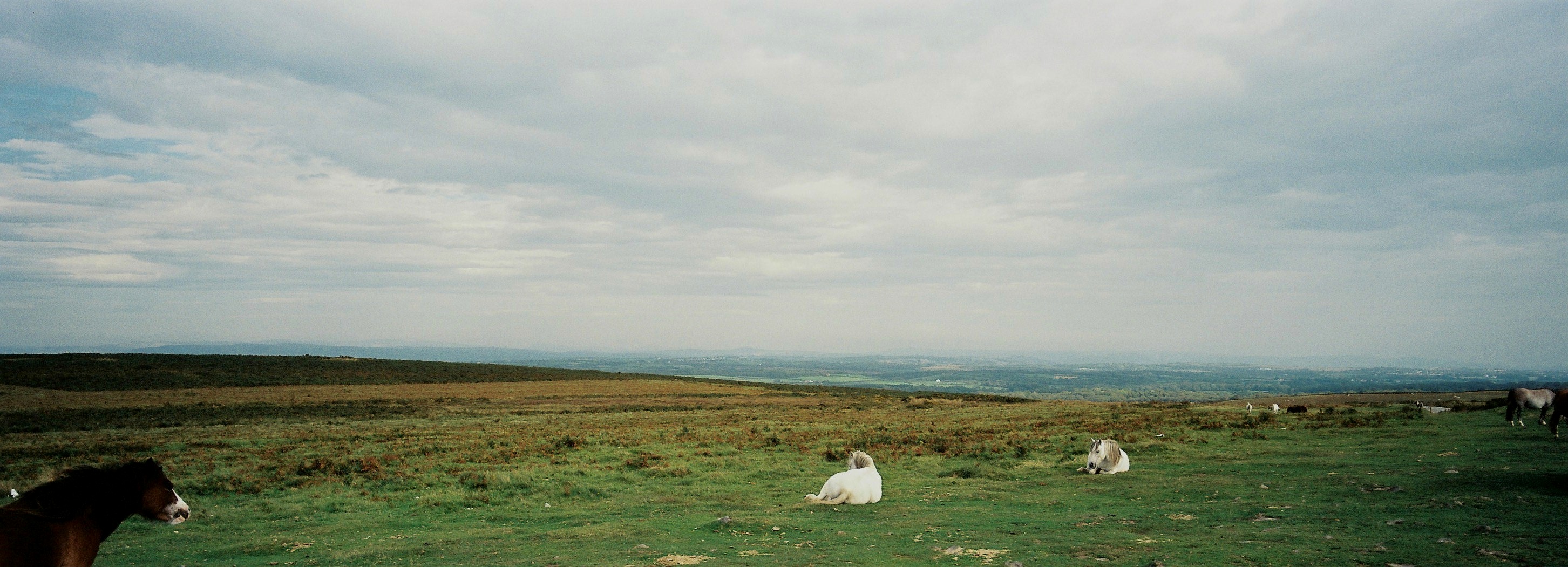
Richard Billingham: ‘Horses’, 2011
Company mergers have long been routine in the private sector, and in the public sector scene I work in by day, collaboration is now very much the name of the game. Successive governments have made local authorities smaller, split off their functions, and then reduced their funding to the point at which they’re forced to work together to survive. Why shouldn’t some of the same logic apply during tough times in the art world? Just so, Anthony Reynolds’ has moved from having his own separate space to a strategy of sharing the space of other galleries. First up, his retrospective of Richard Billingham’s landscape photographs in the lower of Annely Juda’s two floors, which comes with the added advantage that the long, airy room suits them better than his own former space would have done. As for the work, one could complain that these quiet vistas (‘Panorama’, to 28th Aug) would never have made Billingham famous the way the documentation of his parents did when ‘Ray’s a Laugh’ emerged in 1996 – or one could be pleased that his previous success has generated a wider audience for these subtle pictures in unusual elongated formats. Exploiting such contingencies as ageing film stock and wind moving the trees to atmospheric effect, they feel like photographs taken as studies for paintings, only for the artist to find that they already achieved the painterly effects planned.

Richard Billingham: ‘Untitled’, 2014
Paul’s ART STUFF on a train # 121: ‘Sylvia, Chantal, Ishbel & Felicity’
Ishbel Myerscough’s ‘Two Pregnant Women’, 2004 – of her with Chantal Joffe
Two of the most striking paintings on display in London now are by women firmly seizing the traditional male territory of the female nude. Sylvia Sleigh’s painting from 1972, is something of an anomaly in Sadie Coles’ summer survey of otherwise recent painting (to 15 Aug), but its hyper-intensification of Matisse’s pattern and flatten approach to the odalisque rather blows away the competition. The Welsh-born Sleigh (1916-2010) moved to New york in 1961. She’s better known for her male nudes – often in poses from famous paintings of female nudes – but has remained slightly below the radar compared with, say, Alice Neel. As a solo show at Tate Liverpool in 2013 indicated, her stock is rising, and that will surely continue. The NPG’s small exhibitions are often good, and rooms 41-41a currently combine the unflinching focus of Ishbel Myerscough’s precise delineations with the enlivening awkwardness of Chantal Joffe’s more casually-styled depictions of each other, themselves and their daughters – cue uninhibited nakedness (up to ten feet high) and heavy pregnancy (much smaller). They shared models, friends and a studio – though not painting speeds – as students in Glasgow, and these warm ‘Friendship Portraits’ track them across the following 25 years.
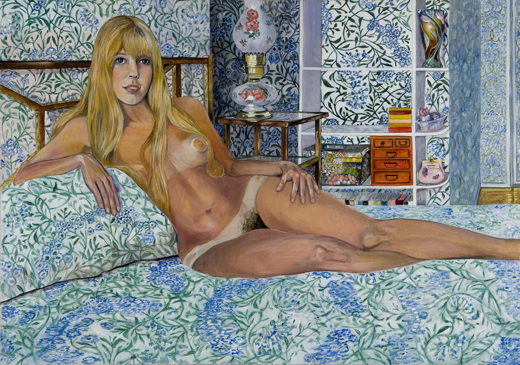
Sylvia Sleigh, ‘Felicity Rainnie Reclining’, 1972


No comments:
Post a Comment
Note: only a member of this blog may post a comment.